AuxWelTak
Good morning. Another painting complete. I started this painting last night and finished it this morning. It works out well even if I just get the reference sorted, I can jump straight into it. Once I get started painting I generally don’t stop till it’s finished - unless I’m interpreted and that’s usually only by Dad.
Here’s the painting - 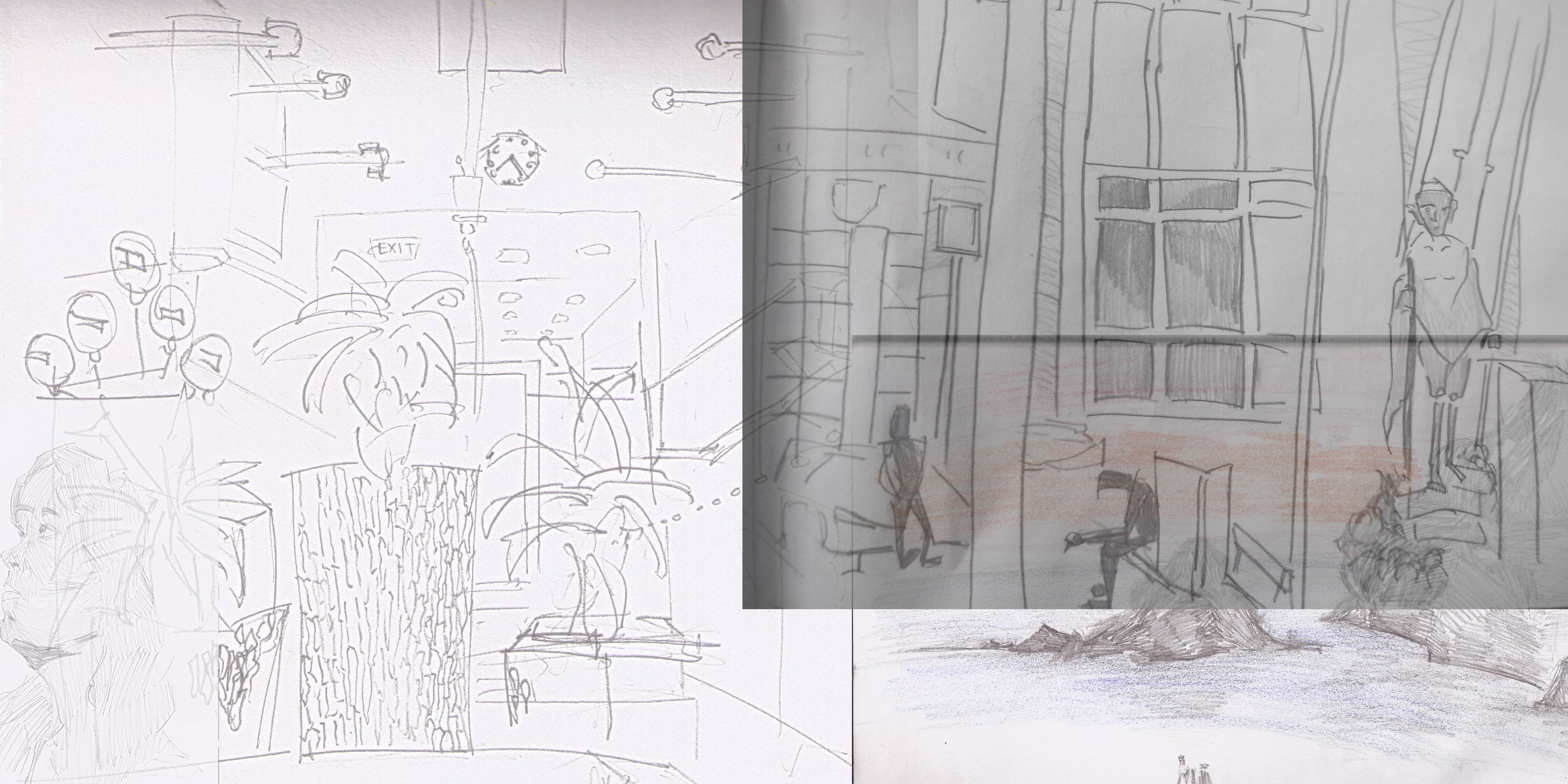
Reference. Several of these drawings I have used previously but like yesterday I thought I’d redo them, something fresh. May help with the continued theme of subject manner. Plus I reakon I’m better now than ever before :P.
On the left is a drawing I did during my trip to Auckland in July. It’s in the Westfield mall. It was always one of my favorite drawings of the trip.
Top left is a bridge drawing from Wellington Waterfront.
The top right is the Auckland Railway. I did this several visits ago in Wellington, but happy with the drawing, and I always get decent digital paintings from it.
This third reference is from Takaka - a drawing I did on the beach. I don’t believe I’ve taken this digitally before but I have produced a acrylic painting using it as reference.
I almost forgot about my last reference - a portrait I did of a friend - Hannah. This is in the far left. I was happy with the drawing but the portrait didn’t work well in this painting.
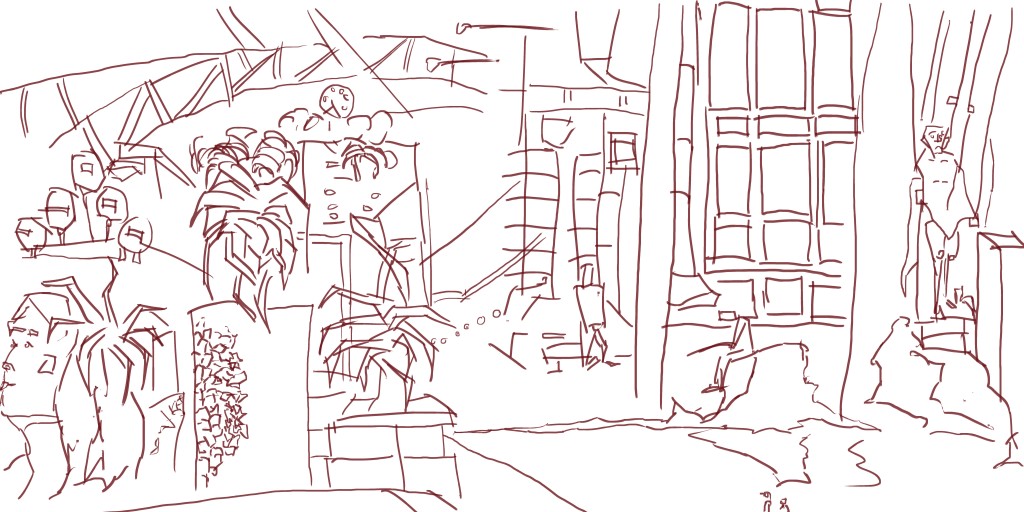
Line. Simple really, I traced the reference. I didn’t change the reference much, only little things like making the figures look larger than life and standing on rocks in the distance.
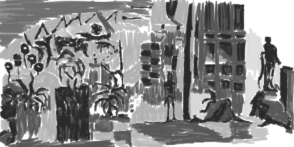 Grayscale tone added. This is always the most fun stage, I love tone and building up those lights and darks. It brings the scene out of plain line into something that’s real.
Again I made the characters dark and light for the background. I used the same brush in this whole painting attempting to create a range of textures with it.
I wanted to create a water type effect for the ground. I’ve been told the way to paint water is paint reflections. 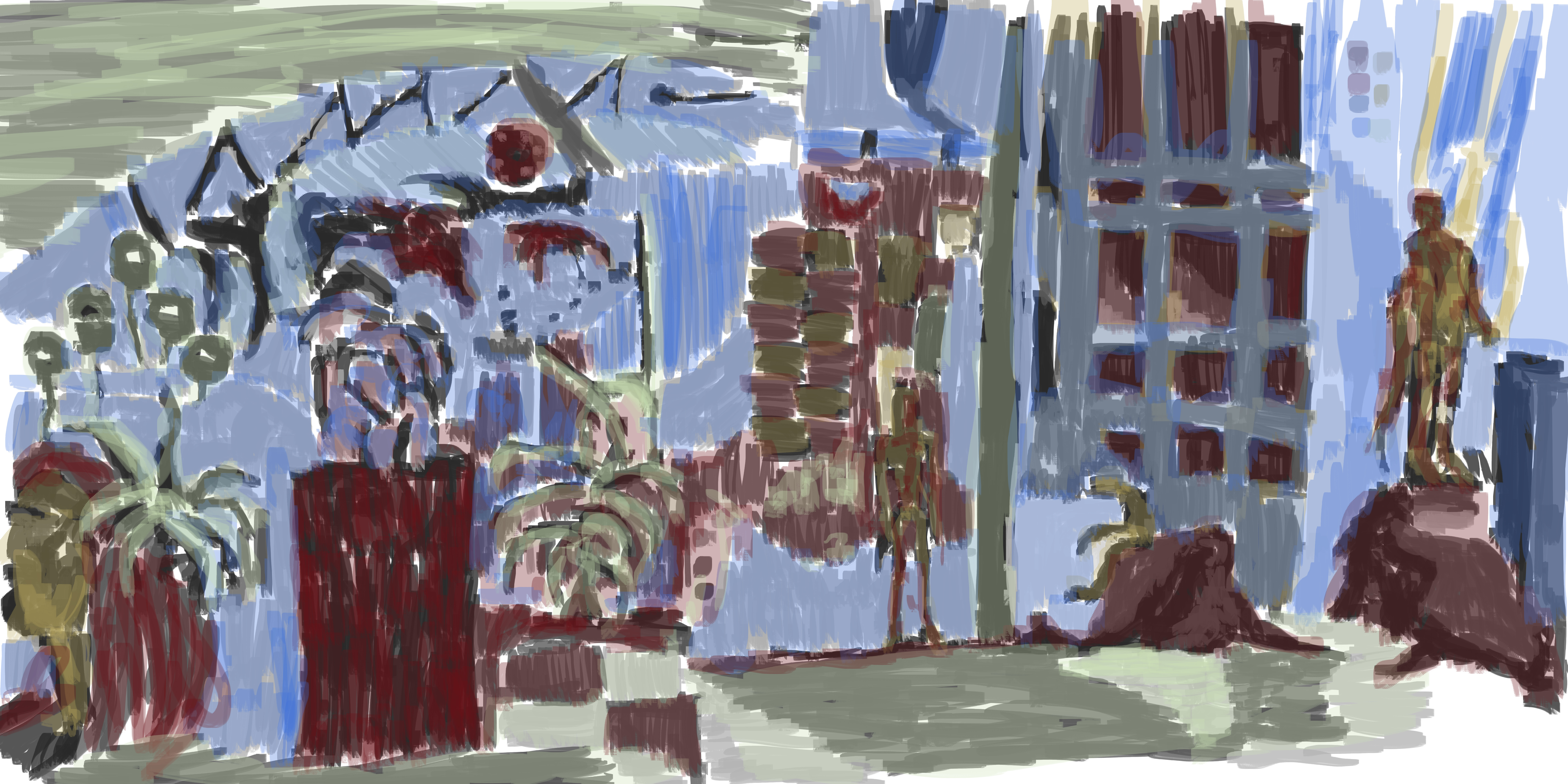 And finally color. My normal color trends here. I used the green for the sky area in the top left and for the water area on the ground. Something a little different, though I’ve used the green for water in the past. I wasn’t scared to mix the colors together, mixing yellow and red for the figures.
Overall I’m happy with this painting, time to get off the computer, take some photos and eat.