Color explored with RedditGetsDrawn Paintings
Here’s some more digital works. This time I used reference from RedditGetsDrawn.
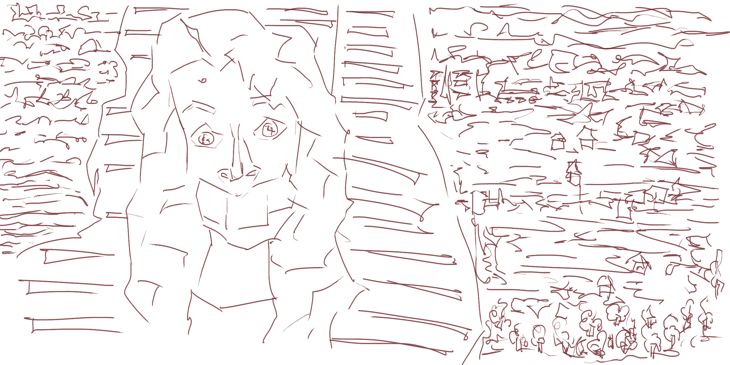
Portrait photo reference. I usually go for photos that have more of the body but this one was interesting with the tape covering her mouth. The background was plain, with only the vertical tiles. I added in quick flicks. I wanted to work different here - created a map top down view rather than a perspective looking over the ocean to the hills in the distance.
The tone changed the map idea with more of a focus on perspective - the normal way I do these scenes. I’ve used range of brushes. Normally I stick with the one brush in the whole painting but adding more adds texture and variety to the piece.
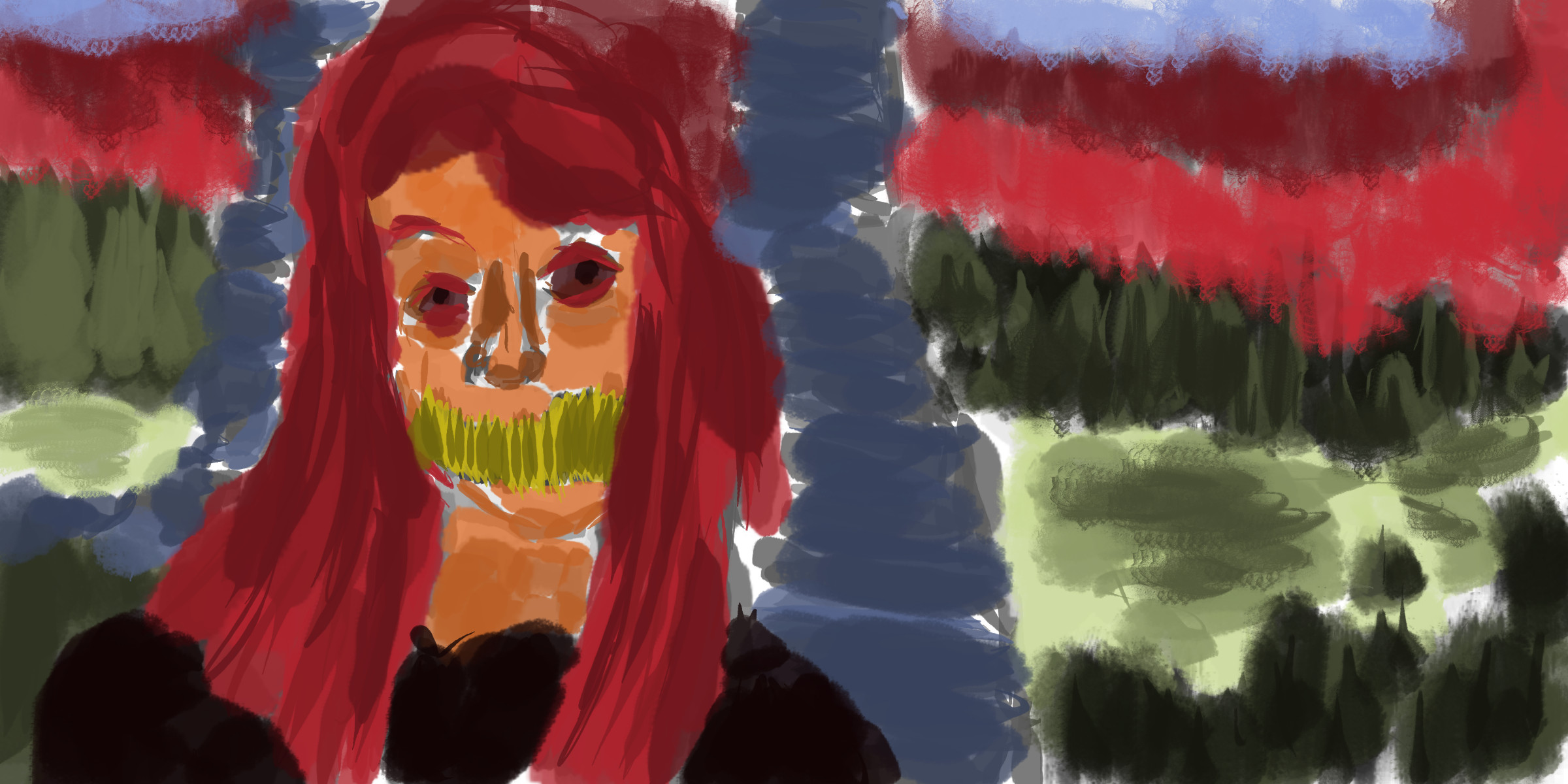
Color. Went with a orange for the skin. Since I’ve been using a range of tones with the color I feel I can explore other colors without having problems of the colors not working together - like in washes. Using the range of tones allows for clarity and flow within the color - and spreads throughout the whole painting.
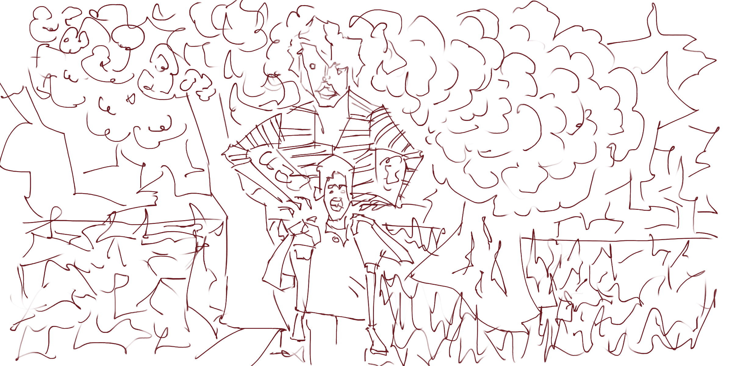
This was a great reference of these two people. When I was little my uncle would give me piggy back rides. Extremely large scale for the figure sitting on the others shoulder.
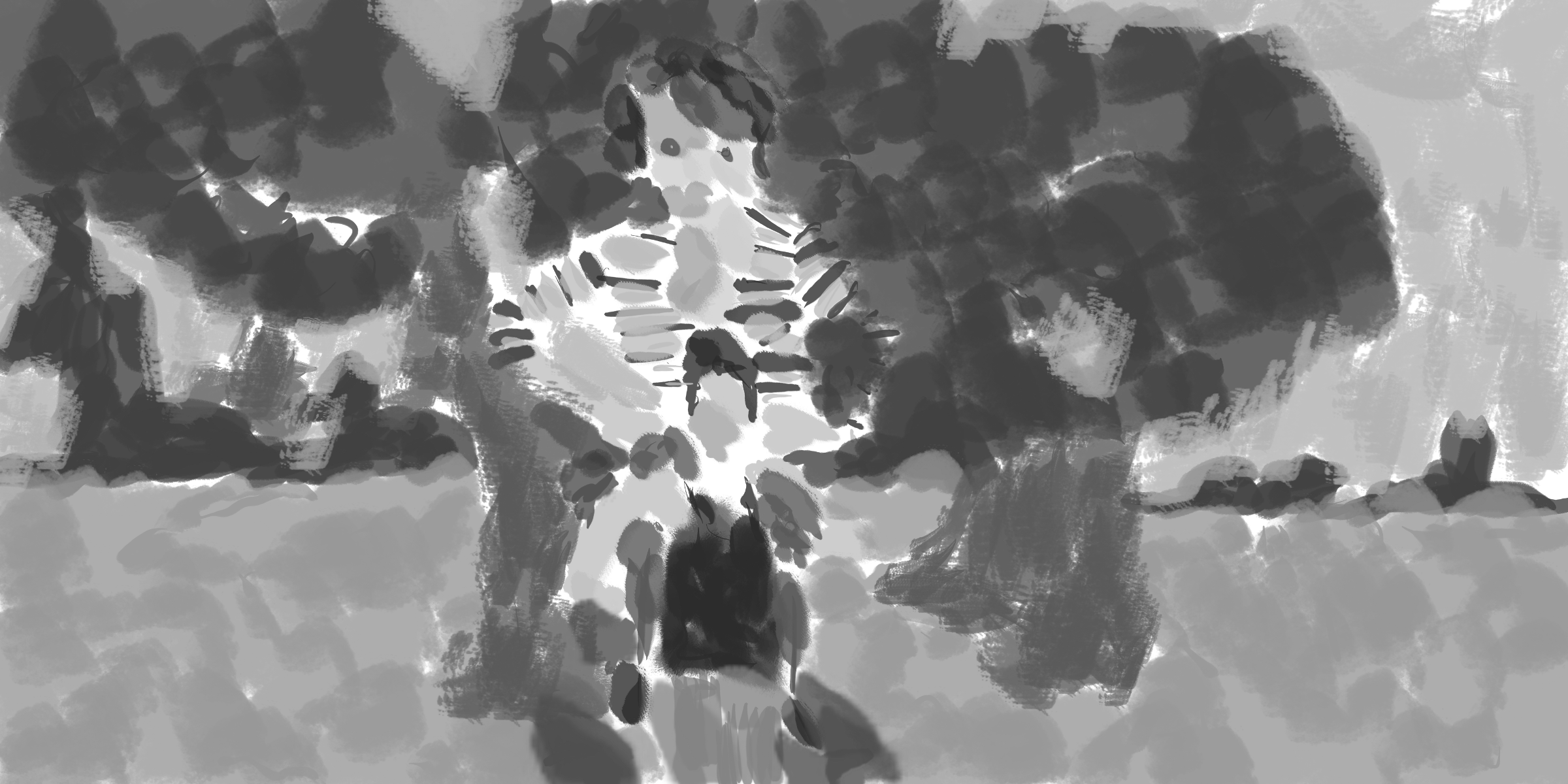
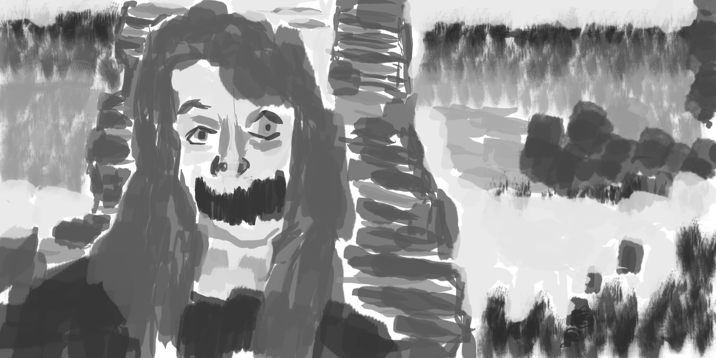
Grayscale tone. Much of the work is flattened out - the ground area doesn’t contain the texture that the line version had. Minimal focus on the face details - leaving out eyes/nose/mouth.
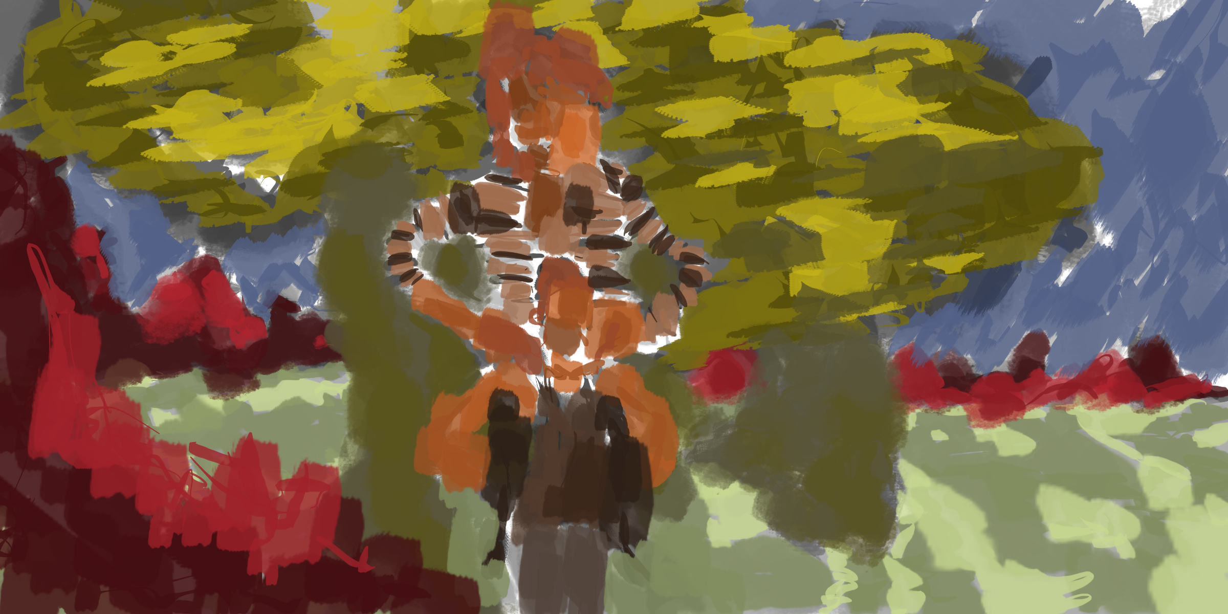
A range of saturation was used in the figure. Previously I had only worked with adjusting values. I love the brush for the leaves. 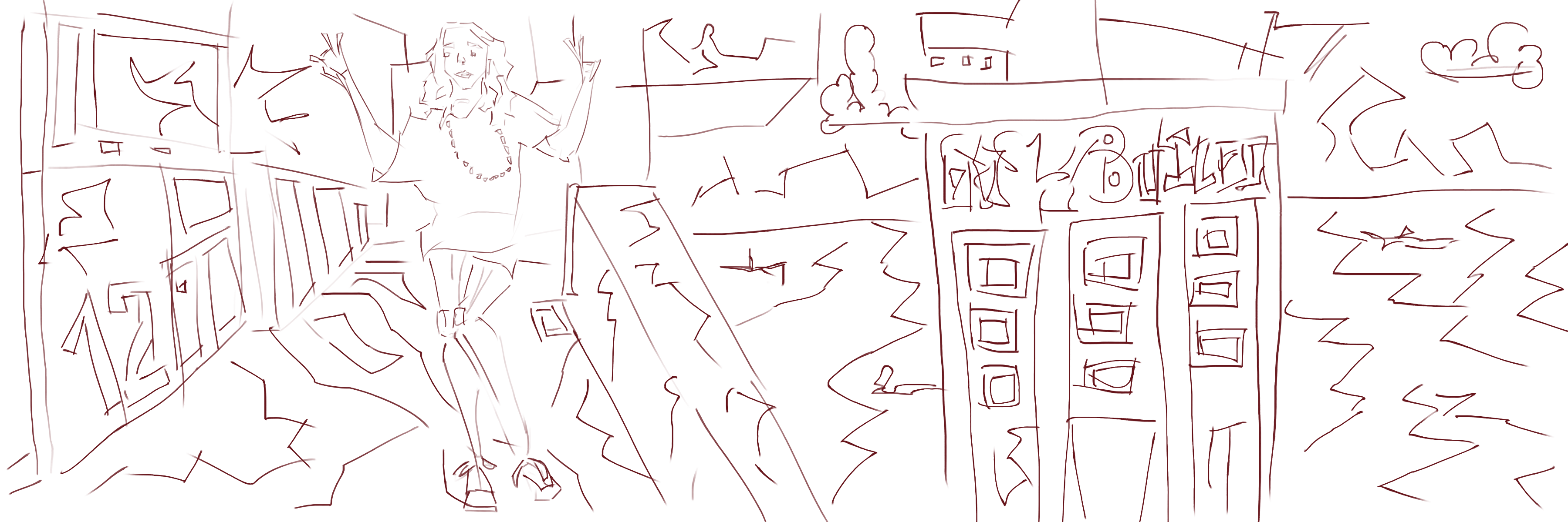
Figure on the left. I used a photo I took in Wellington for the environment I often just use my imagination. Working from reference will be helpful. Especially using my own photographs.
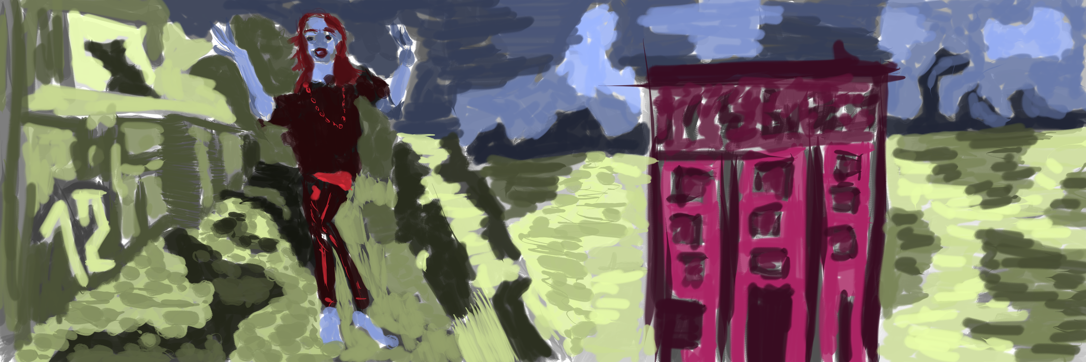
Mixing up the colors with a blue for the figure. Pink was used in the building, not sure how I feel about it - doesn’t fit the flow of the painting. Maybe a nice brown would have worked better. Fun times with the green, covering the majority of the painting. The hills and sky in the distance are painted blue.