milv paint
This is the paintings I did with children on Thursday. The paint I was using was cheap poster paint - it was cheap but did the job. It’s the surface that totally makes a difference - I used thin white card for these works - certainly better than the brown paper but it doesn’t take the layer of say - wooden board.
Most of these works are painted by me but a couple were collaboration efforts between me and children. We can both learn from one another.
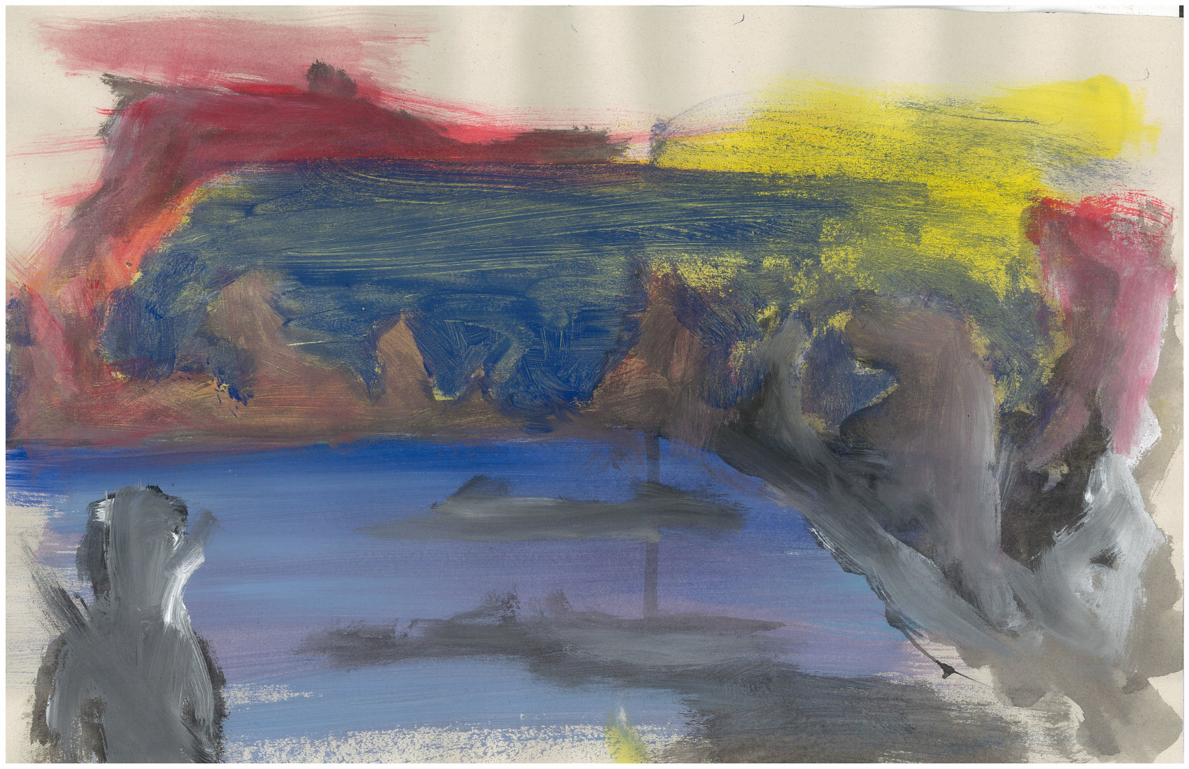
Gross. Not only do I find the composition boring - square ocean surrounding land that scales up to the bottom right. I created landmass in the center and bottom right of the ocean in order to help the composition - it’s still not enough. To help with the scale I painted a figure into the bottom left. Originally this was pure black - I added light highlights in order to help with scale and give more information to the left side of the piece. What could of I done better. More dark (especially on the left) 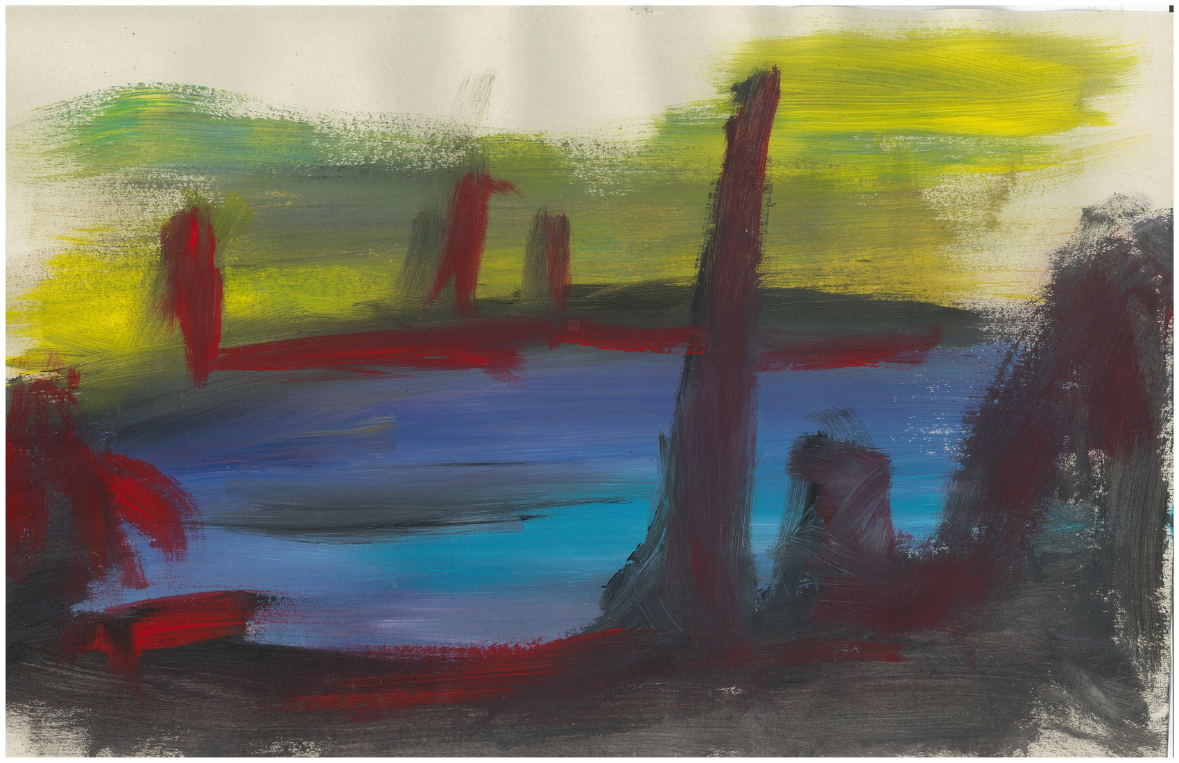 I like the blue ocean in this work.
 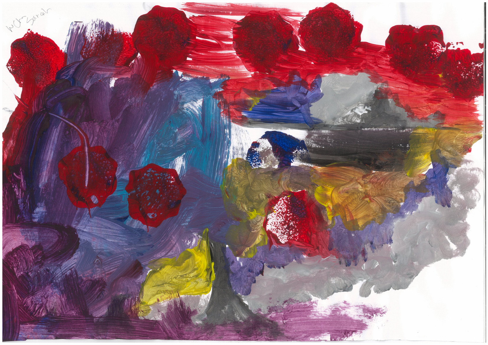 I focused on the right side of the page, and Sarah painted the left. I focused more so on grayscale well she went with more vibrant colors - purples and blues. There is some yellow which was my doing! I like the circular marks being made - they give layers to the work.
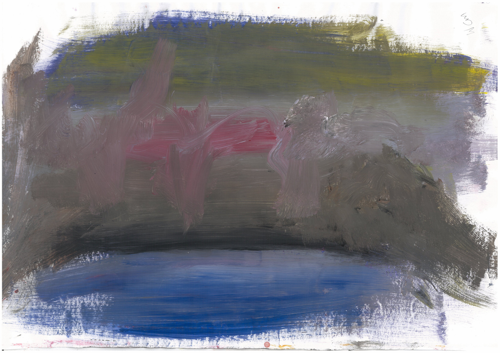 This is an example of a painting gone bad. It’s gray, muddy, and generally disgusting. It lacks substance.
 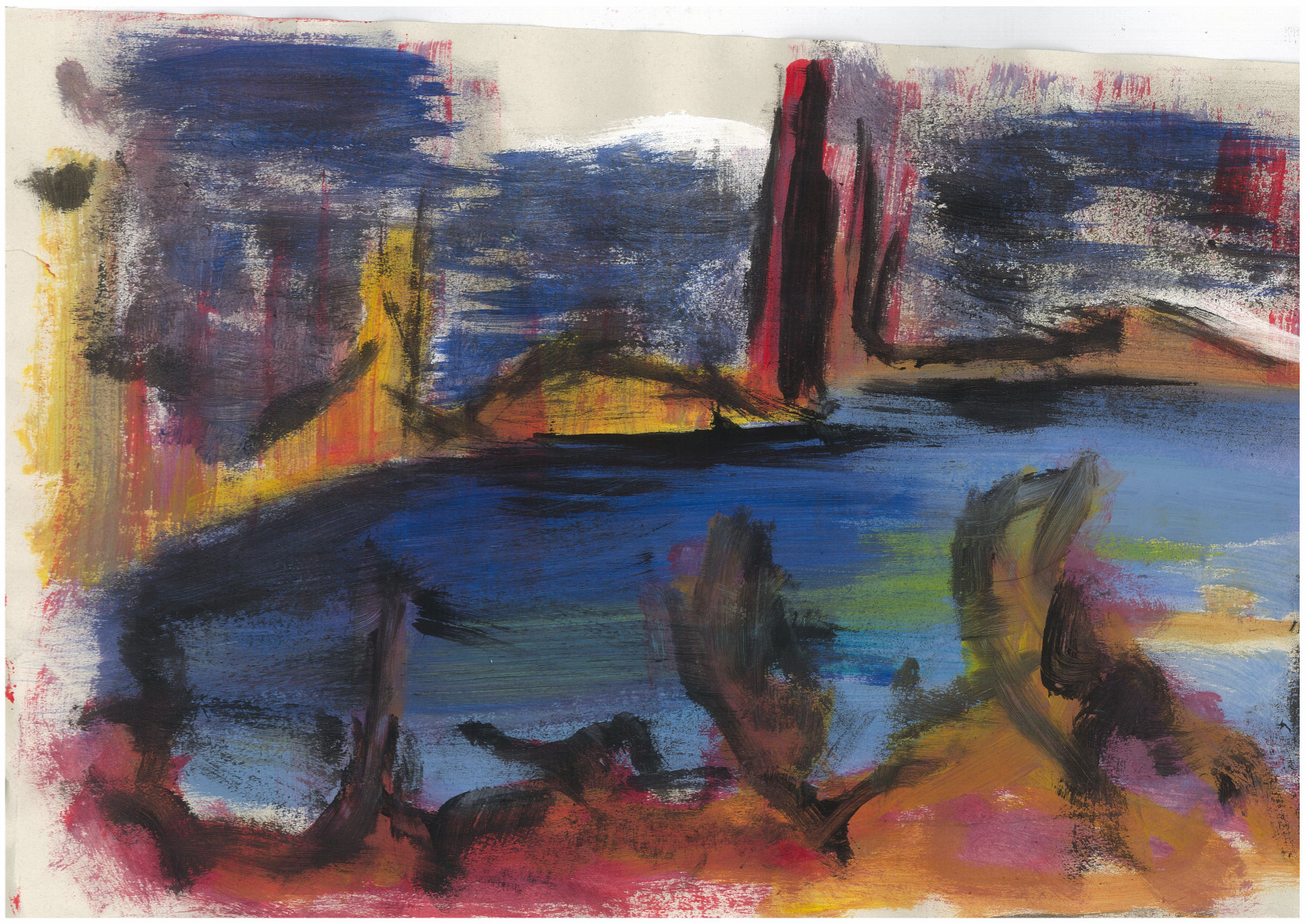 This was a favorite I did - so much so that the kindy ended up keeping it for their wall.
There are more paintings - need to get photos from my Mum.
I’m going away tomorrow so not sure about updates to the site - I will take my laptop with me so may just write up blog posts about older works.
Check out my code blog here.