Roger Friday Lee Model
First time doing one of Rogers life drawing this term, and as always - brilliant. His life drawing classes always goes well.
Lee was the model. She had only modeled once before (for Dan). I enjoy drawing her. We started at 9:30am with a long pose that went though to 11am. There isn’t much chances for me to have a life drawing session with these long poses so when it happens - got to make the most of it!
I spent the whole day working with oil pastel - and black and white wax crayon.
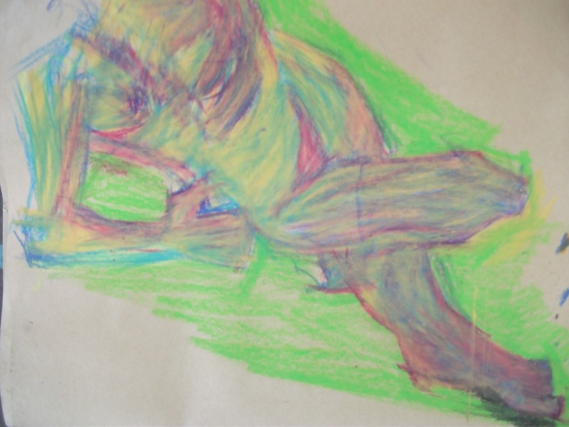
This is my warm up. It set the general flow for the day. I’m happy with the figure but extremely annoyed with the foot - the proportions are totally wack. Those toes needed to be under the height of the knee.
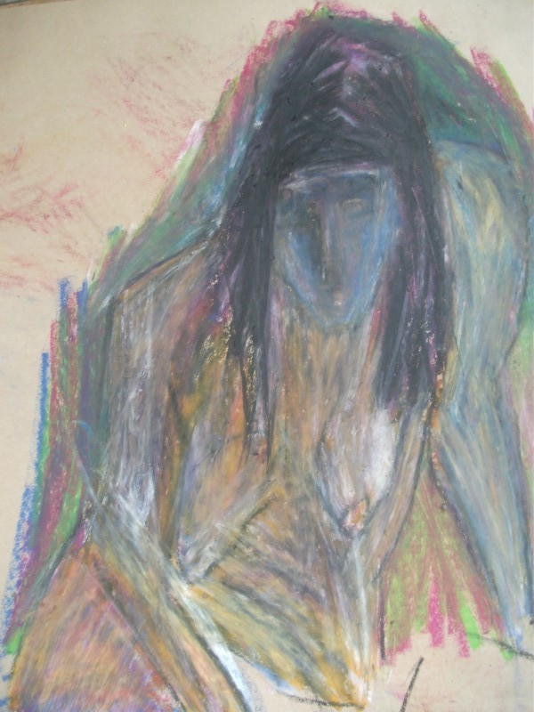
Main thought was layers and conveying the light though layers. This is the reason why I choose oil pastels - it’s easier and faster to layer than colored pencil. I love the subtle nature that colored pencils offer but I wanted to treat this with GRIT.
Blue was the first layer - reds - then yellows. It’s similar to my ideas that I’ve been working with in painting. 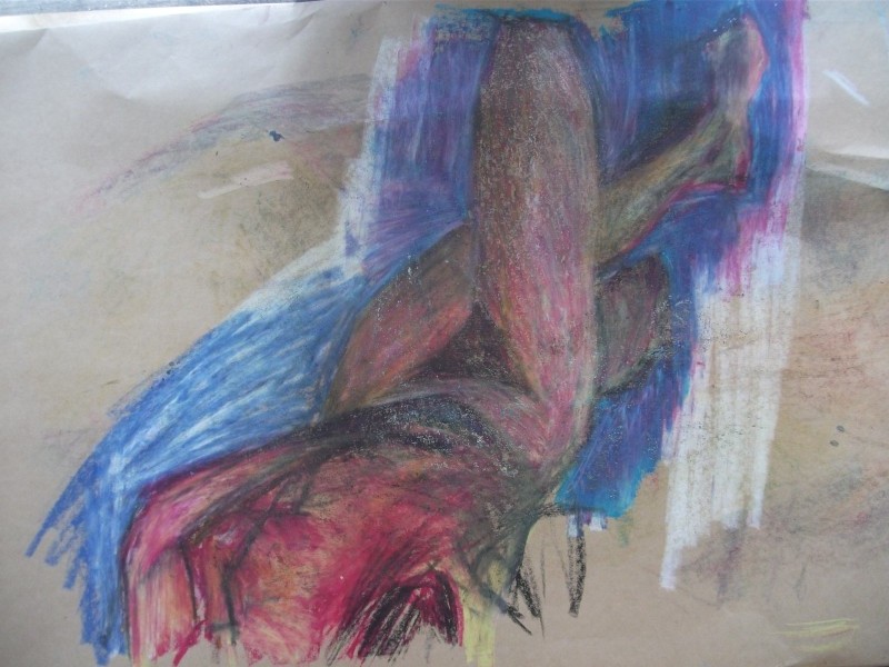
Here’s the second attempt at getting those proportions sorted. Multi studies of the same pose helped me understand it. The color palette is much more red than the first - much tighter.
I went in first with crayon to create line - giving a basic shape to the figure. This of course was straight lines - easy to measure. I feel I’m developing a real feel for measuring proportions correctly with the straight line technique.
Blue was used for the negative space - this gave a strong contrast to the yellow and red of the figure. Contrast! So important.
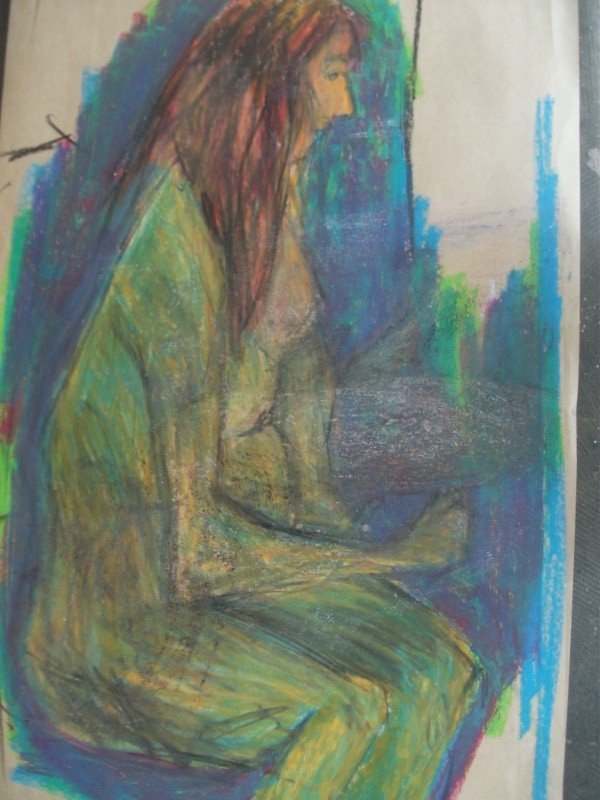
This pose was an hour. I’m not happy with it. Contrast with light and dark is lost within the figure - I didn’t focus enough. Could be better if we used a spotlight, using nature light gives a flat light rather than strong contrasts.
I’m still learning how to work with the oil pastels, but I wouldn’t hang this on my wall.
This was a 20 min pose. Surprising one my favorite for the day. It’s important I remember how much I can get done in a certain time frame and work to beating my time (no rushing though!).
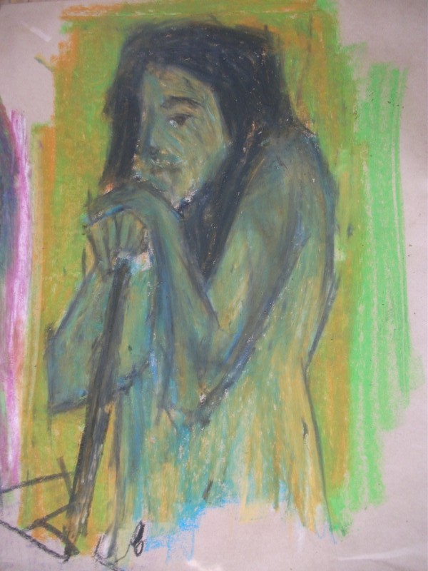
Whats working is this colors - the balance of lights and darks. Roger mentioned that the dark in the hair helped the contrast with the skin. I choose green for the negative space over blue as I had used blue in the figure. A red could work as well.
I’m happy with this work and think it’s the strongest piece of the day. Plus it’s a standing pose!
This was a struggle. But I feel I learnt about the proprieties of oil pastel. Standing back I felt it lacked whites. Roger told me to go in with more whites then color over it. This helped but I needed more time to fix it. Whatever, it was a good resolving learning moment.
Roberts life drawing next week, and I might take a few of these works digitally.