Blackhead Sitting
It’s another RedditGetsDrawn.
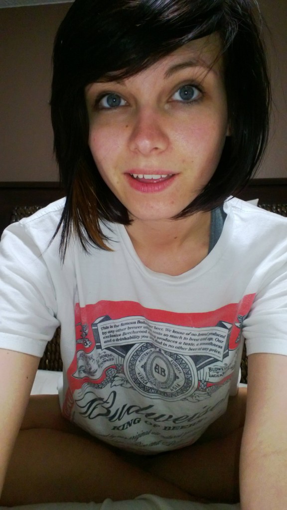
 Reference photo.
Reference photo. Decent lighting - enough shadow for two or three tones in the face. The background is lacking somewhat, but it doesn’t matter as it’s going to be made.
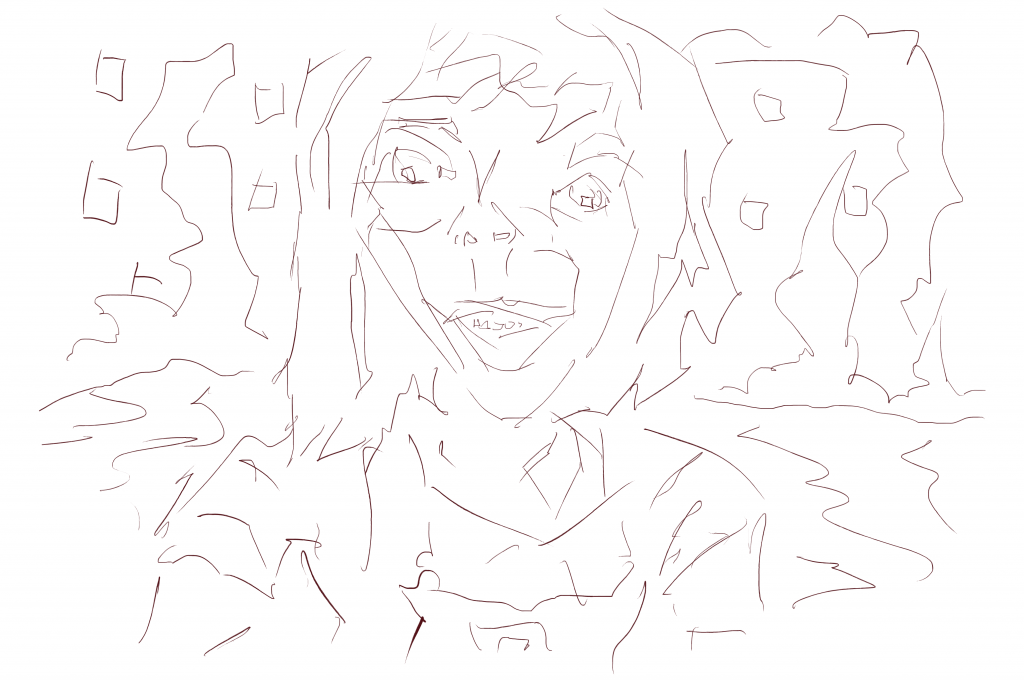
 Line
Line
Here’s a critic:
The left eye should be below the right eye. The nose is much shorter than it should be. Bottom lip is too fat.
Good points. I need to be careful with my observation skills to capture what’s really in the image. Comparing the two I’ve mirrored the image - not only are the eyes opposite but the hair line as-well.
A new shape has been used recently in my background - squares. I use these square shapes in both the sky and land.
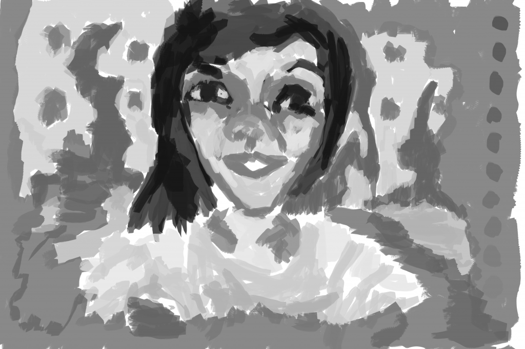
 Tonal Gray-scale
Fixed the mirror problem in the face. The line layer is my first chance to get it right, and often don’t get it right on my first chance. That’s why I get a second with the gray-scale tone layer. Isn’t life wonderful with all these chances?
Custom made flat brush has been used for this whole piece. The opposite to this is the circle chalk brush that I often use. To be honest I prefer the sharp, flat look over a round. Mixing the two together works wonders.

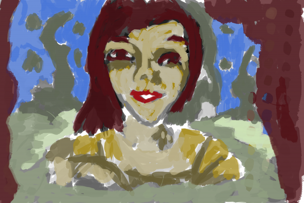
Everyone I’ve painting on Reddit recently have been turned into redheads. I don’t think that’s a bad thing because redheads are pretty damn amazing.
Color is the layer I struggle with the most. Maybe using more tones of a color will help. I use two, maybe three tones if I’m lucky of each color. Increasing this number would help with detail and depth of painting deeply.