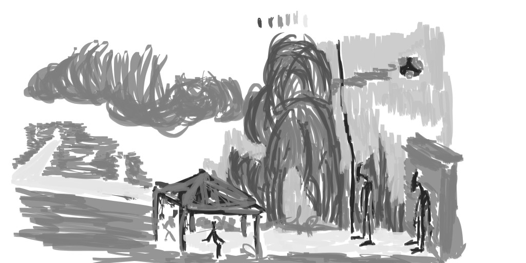
EOW: Birth of a God development
I’ve been following the Environment of the Week for years over on Conceptart.org, but rarely brave enough to enter. This morning though I warmed up with that birthday card for Erik then afterwards got straight into creating a concept art painting for the EOW. The reference I used for it was of the Auckland waterfront, but I used the reference very little. These are certainly not finals - but it’s a great start.
Here goes -
The reference used:
Reference thanks to my stock images over on FreshFigure 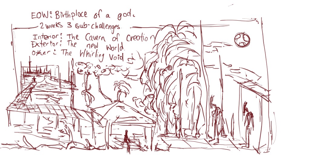
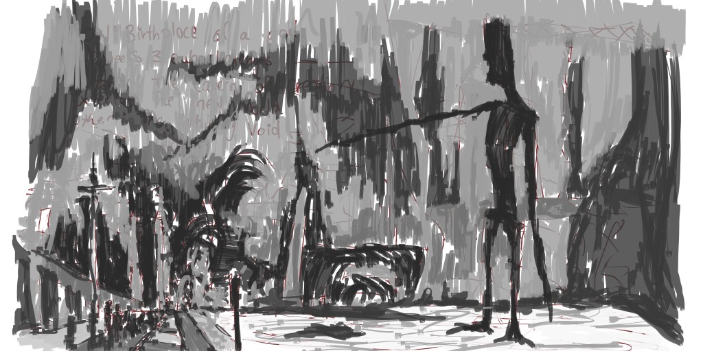
I started this with using my first reference and creating a small thumbnail on the left. This extended and I build the scene from that. Though I started this as an exterior work it developed into Cavern of Creation. The idea was to have these figures travel on a escalation - being created. This is why there is a guzabio in the middle. I guess that character could be the queen.
Tone added. I wasn’t happy with this. Maybe it needs more darks in areas? Anyway, it’s unfinished and I moved on to the next one. I’m just treating these like thumbnails.
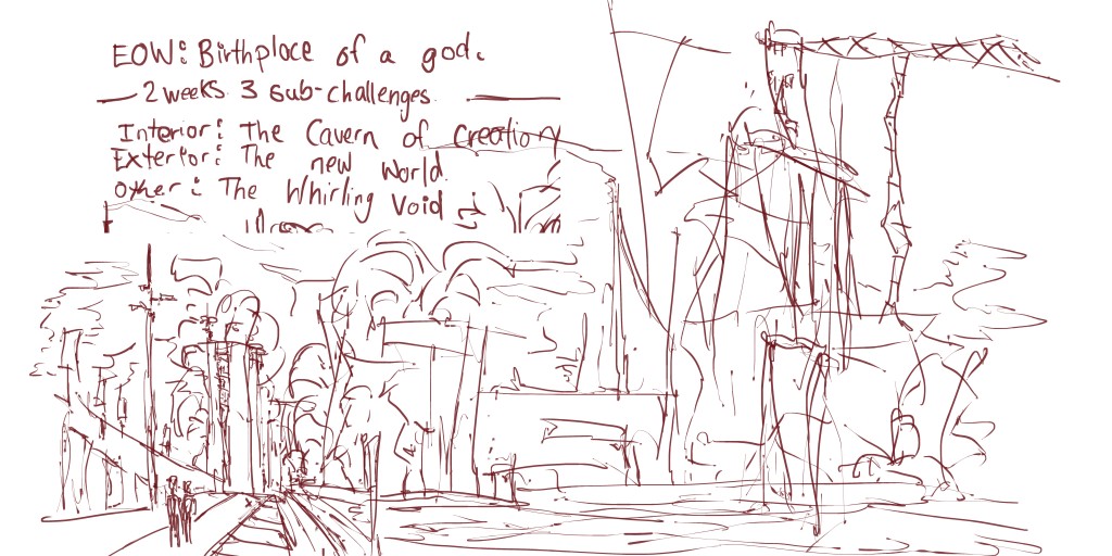
I used the second reference for this. I stuck with the reference but added extras to it. I especially wanted to add vegetation as I believe a new world would have plenty of beautiful vegetation It’s common for me to draw it on the street - so why not include it in this!
I also created a large character in the water (right side). This character represents God watching over the smaller characters as they walk down the path to their new home. He could be there also to build as well - not everything can be completed in a day.
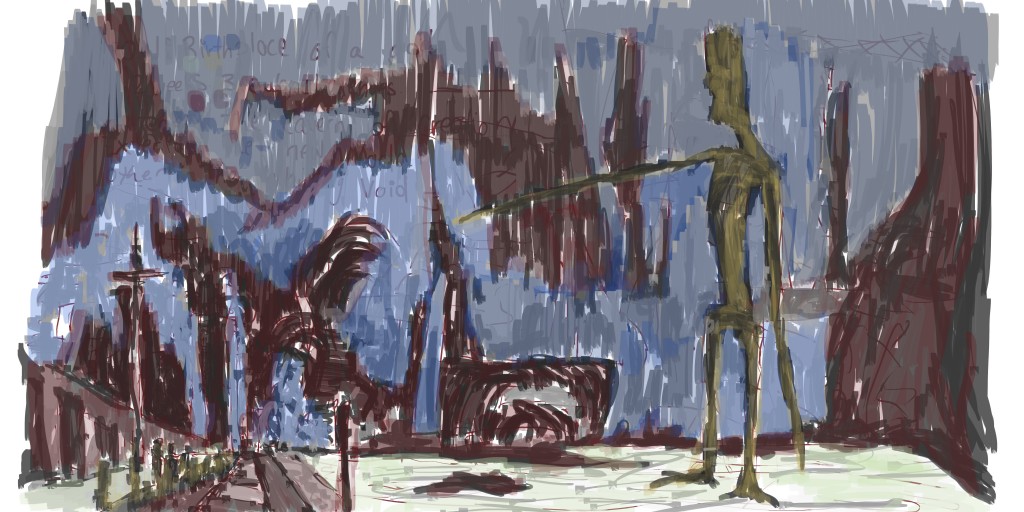
Tone helped flesh out this piece and give it a sense of direction. Overall I’m happy with the left side but have concern over the right and the lack of information. This is true for the background. The best option for this will be to treat it like a thumbnail and develop the scene further - with my own reference photos. I’ll work on this idea tomorrow, but for now here’s a color layer added -
Colors are what I’ve been using regularly. Though looking at this now I should of used more yellow - especially mixing it into the red areas. The red tends to dominant the work. I used the green for the water but it’s hard to notice - maybe needs more colors mixed in.
Oh and here’s the video:


