Figure Weekend
Sunday was spent working from PixelLovely and on Joy’s Massage business cards. Business cards - completely different to what I usually do. I had hoped to bring some of my drawing and painting talent into the cards but Dad and Joy seem to both want something that’s just large text and no graphics. I disagree with this as I believe imagery is far more powerful then simple text. It’s up to them at the end of the day though so no point arguing with them. Plain cards it is.
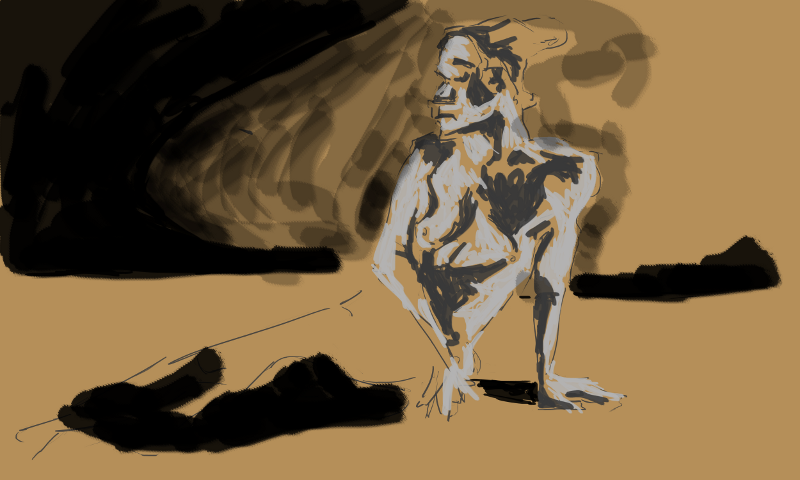
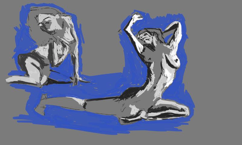
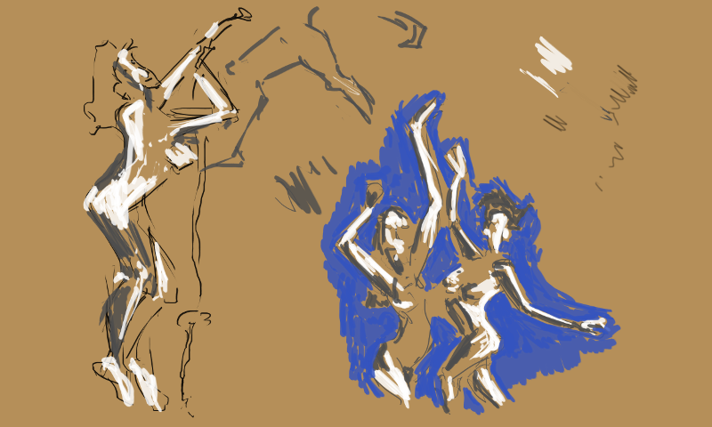
I did have fun with PixelLovely No environments (though small doodles that could turn into something). As always the focus on these studies was looking for the light and the darks. I sketched in the overall figure first then filled it in with two tones - back and white. Color wasn’t really a focus - though I did use a blue for the negative space.
The largest of the days studies. My canvas was huge - working 5000 by 3000 px. The legs were hard to see in the reference photo so I got them completely wrong - once I went in with the black for the negative space I noticed they were in the wrong spot altogether. I didn’t bother with attempting to finish these off - instead just started a new drawing
The blue around the figure helps to guide me on what’s working with the anatomy and what I’ve got wrong. It’s a great safeguard I enjoy working with a plain color for this but should look into creating a scene more. I did this with perspective towards the end of term 2 at TLC. Maybe take some of these ideas into digital?
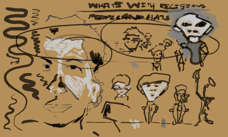
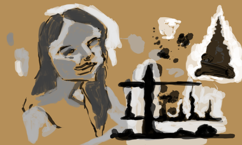
Doodles and such. The large face on the left is traced from a oil painting I did of my Nana. These rest is experimenting with the new tablet - attempting to use my elbow to create the line over my wrist. Also practice curvy line - going on light, then heavy, then finally coming off light. This is something that Marc Hill gets people to practice with the transitional pencil. The same principal are applied to digital.
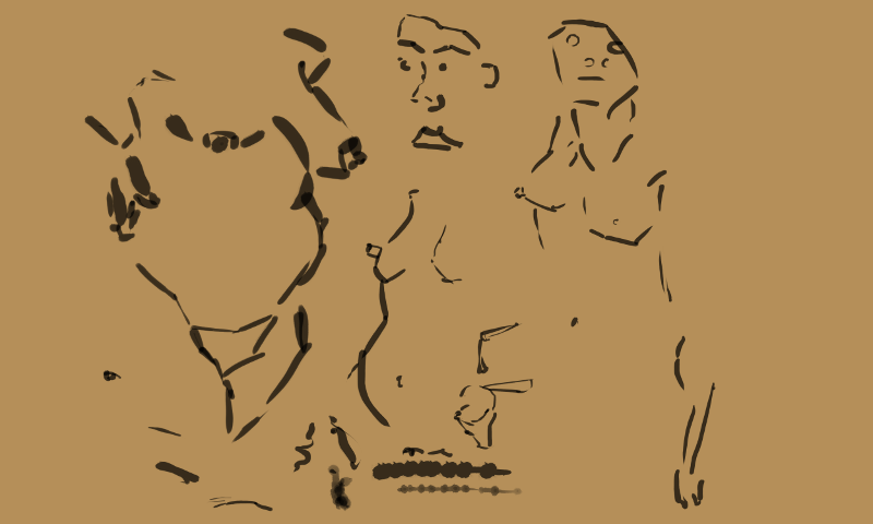
Tracing some of my favorite life drawing. There wasn’t a whole lot of information in the life drawing but taking it digital will allow me to develop it further with tone and color.
Portrait study on the left. Quick work but helpful. On the right I doodled with environment ideas. I need to work o compassion - maybe thumbnails of ideas. I notice this is done for the EOW on Conceptart.org
Was happy to get a double figure reference on pixellovely. So often it’s just a single figure. Double is easier as you have more points to line the figures up. Working brown on the background has been helpful it’s allowed me to focus on a range of greys for the figure rather then finding the off greys. Easier to notice the incomplete areas.
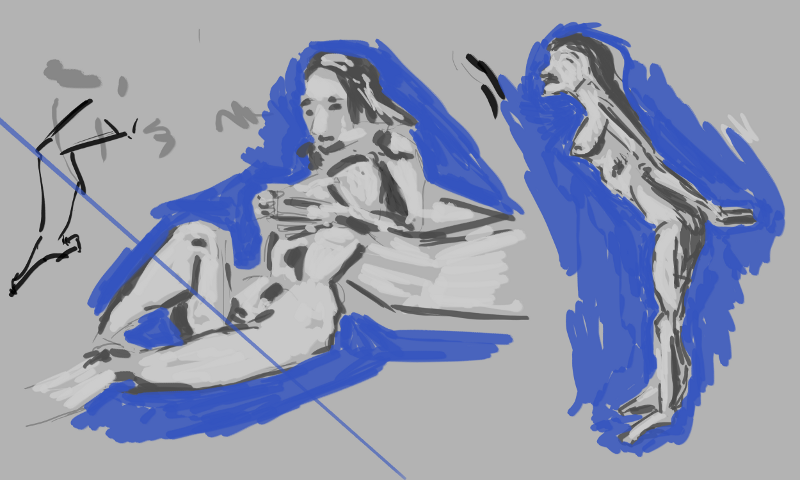
Going back to the grey for the background. I like these figures - especially the right. There is something special about standing poses. I’ve really noticed them this ear with my increase want to capture the full model. Often the sitting or lying poses hide reads of the body. This is much harder to do with a standing pose. Standing pose ftw!
That’s all with the figure works for now. My sister took some photos on the trip to Palmy the other day. She needs to email me these as I want to use them for some digital painting. It’s annoying that my camera broke. I should just buy a new one. Maye I’ll look on trademe.
