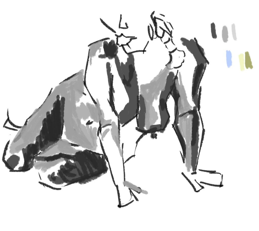
Life Drawing OctNov TLC
Busy week of life drawing. Last time I did it was over two months ago. Refreshing to get back into it. It will likely be sometime before I do it again. I should try to make it to Life Drawing in Palmerston North.
Here are digital works I did in Christinas class on Wednesday and Rogers Friday. Christina had very quick poses - and Roger long. I enjoyed both classes. I used pencil in my sketchbook
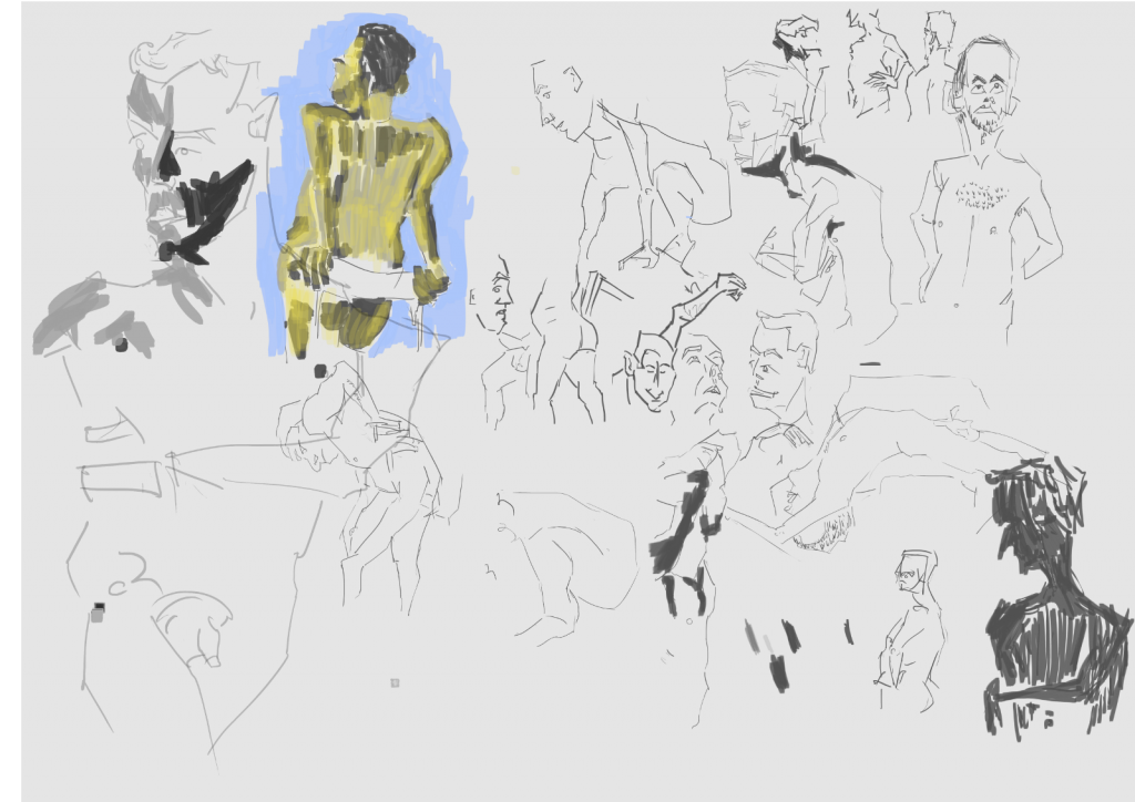 Works for the whole day. The poses were extremely quick so I didn’t have time to capture tone or full figures. Instead I just focused on capturing areas of the body - like I use to. There was one longer pose (top left) that I was able to add tone and color too. In Rogers I extended this idea further.
Rogers today. Geogetete was the model. She’s a fantastic model to work with - stays still and interesting curves. For all the works I went with a chalk brush. I’ve used this for my landscape works. I didn’t bother with experimenting with other brushes but rather just concentrated on capturing the lights and dark of the model. 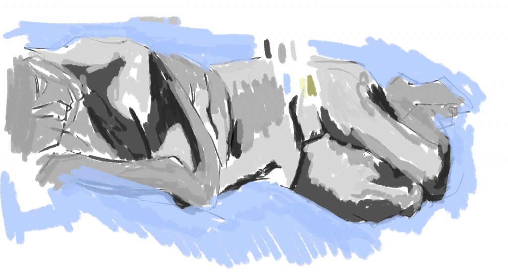
This was a longer pose that allowed me to capture the whole model and even color it (see next piece). Areas of this still need some development - most notable the foot and calf area. The portrait could do with tonal values as well. 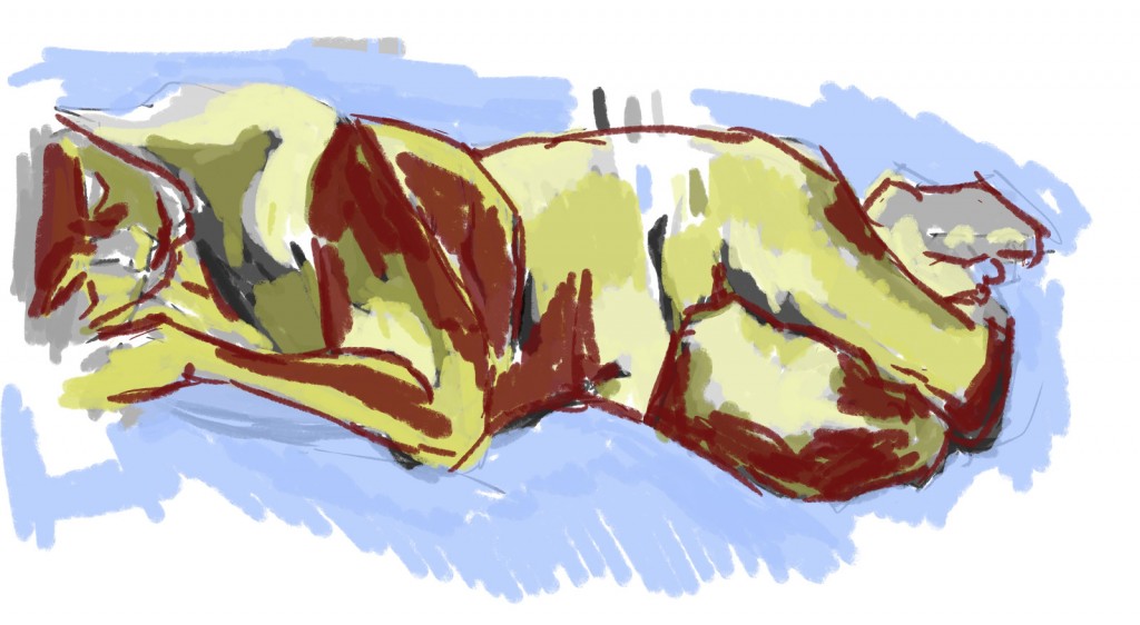
Color added. I started with the yellows - light and dark. Afterwards I added a red. Roger noticed the red and said it helped the work. This piece reminds me of the acrylic life painting I use to do in Dans Friday drawing class. It’s got that expressionism feel to it - mixing the tonal and line together. A range of colors helps. 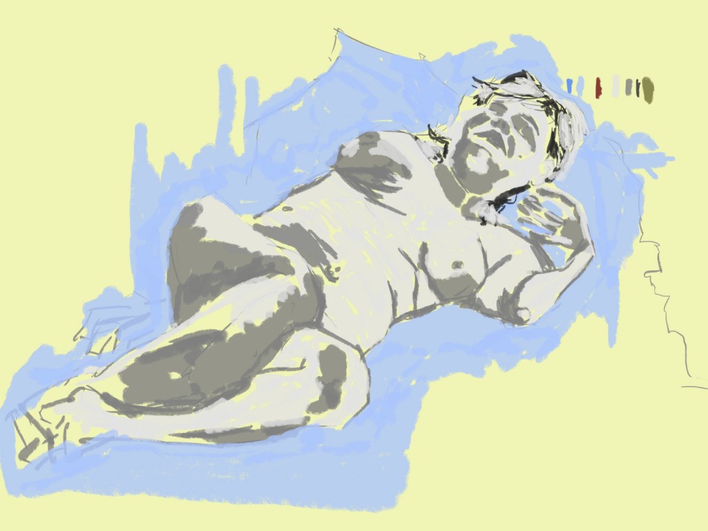
I started this piece with a yellow background instead of white. This allowed me to use a light gray without having to worry about lack of contrast. I used a mid gray for the darks, and a black for the hair. The hair wasn’t working so I covered it mostly with a light gray. For the negative space I used a light blue I had used in previous works. 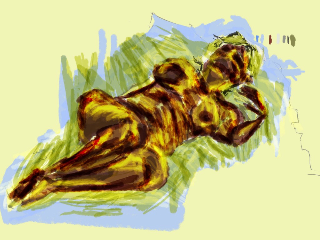
Color added to the figure. A red multiply brush was used first. This allowed me to preserve the under-layers. Yellow was then added as an overlay. This gave the image a very bright, and glowing look.
