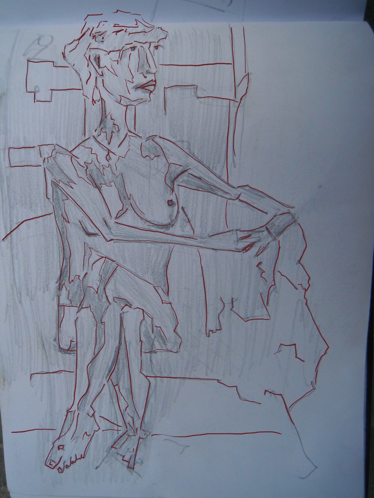
sit model, look left
Long walk today to St Lukes but afterwards I opened up GIMP and imported pencil works to work on.
I choose to work on two works - the first, a figure drawing I did during my time in Wellington last. Seems like such a long time ago now.
The line was created on the same layer as the drawing sadly. Normally I’m good at creating a new layer first - but this time I messed up. It’s alright. I normally don’t use the line for much but rather develop the painted layer further. I decided to draw the light and dark separates inside the figure rather than just tracing around. This makes it easier for the next stage…. 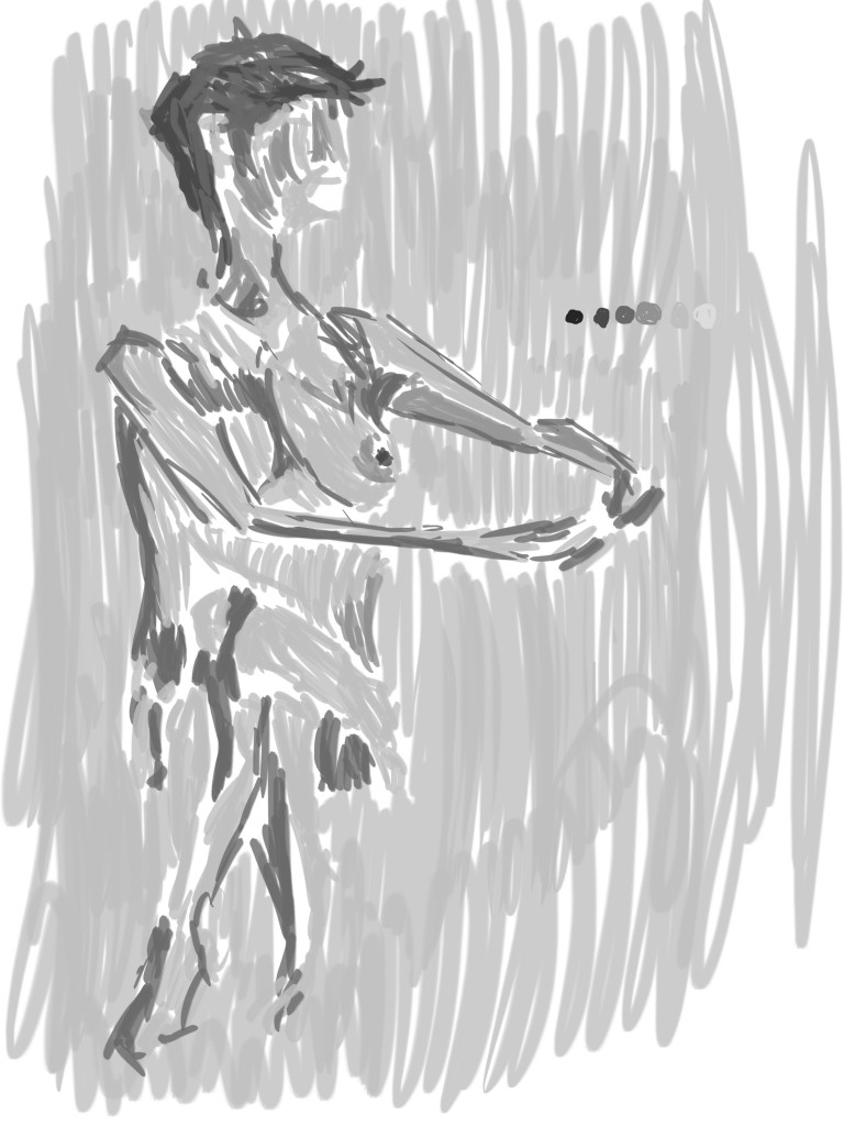 Black and white tone added. My favorite area is the top half, but I guess the bottom is interesting as well, how it fades into the background. Maybe some more dark in the bottom/right could help the contrast?
ok, onto the second painting I did today - 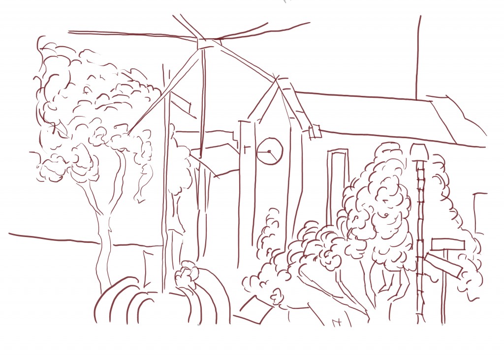 The reference for this was a drawing I did during my time in Napier visiting my Grandfather. It was one of my more successful drawings during the time. As you can see I didn’t make the same mistake as the previous work and it’s on a new layer. The detail is somewhat lower than some of the previous environmental works I have done. I had considered adding the right page drawing onto it - at one point I began scaling this image down in order to make room. I decided against it in the end, though I could mix other line drawings into this in the future and repaint.
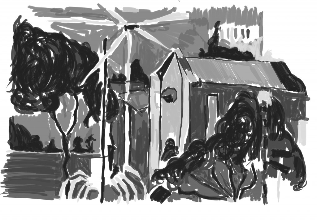 Gray-scale tone added. I used two brushes for this - the first a standard flat brush that offered no texture and the second a charcoal. I guess it’s good I’m trying new brushes, but maybe I should be making my own. I used the smooth brush on the Church and charcoal brush on the trees to give a contrast in the objects. For a long time I just kept with a single brush but looking at this I know it’s very important to create a range of textures using several different brushes.
You may notice there is no figure or other object to help show the scale. I added in some figure that I had recently painted.
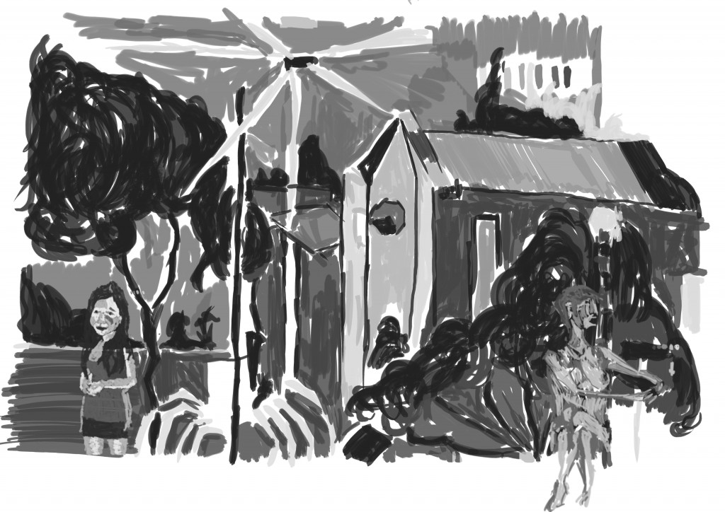 Ok. I played around with this for awhile, experimenting with scale and location of the figure. In this mock up I added Annabels figure to the left and scaled it large - in other versions I had scaled her right down and added her higher (where her face is currently). This didn’t look right and it worked bigger as a larger figure. I also tried adding the nude to this side of the page also but wasn’t happy - mostly because of the strange angle of the arms (still not happy about those arms). Added the nude to the right seems to work better.
I am going to the Auckland library today, I’ll look for concept art books for some inspiration.
