Skull Girl painting from RedditGetsDrawn
Currently in Wellington.I have my tablet with me but likely it won’t get much use - the weather in Wellington is beautiful. I plan on getting out and photographing and maybe drawing. Spent one night in the city and snapped off 100+ photos.
Anyway, here’s a painting before I left to Wellington - 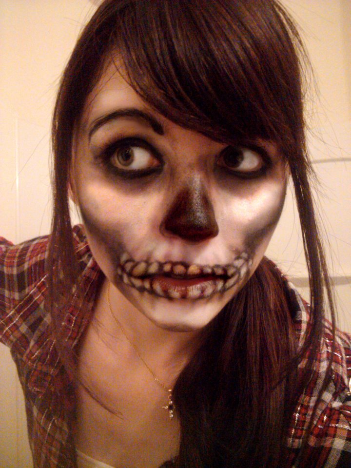
Photo reference. I choose to paint this photo because of the makeup. She looks like a girl I went to The Learning Connexion with. The photo is OK, if it wasn’t for the makeup I would struggle with the tones in the skin. I like how the top of the hair is cut off - in December 2011 I did a series of drawings of Harry Potter characters with the top of their hair removed. I was working landscape instead of portrait and it can happen.
Anyway, here’s the painting -
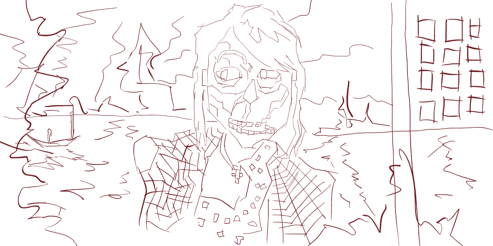 I started with line. Adding line to the face to define the light areas from the dark For the shirt I created long strokes of lines in directions to give an impression of the checked shirt. I created a horizon line on the same level as the mouth and added water movement below this line. In the water I also added a boat shape. Above I created jagged shapes for the hills/land in the distance. I repeated this pattern on the left edge. This creates depth in the painting. On the right side I created a vertical pole and square shapes. I’m thinking this could be a building with the squares being windows.
 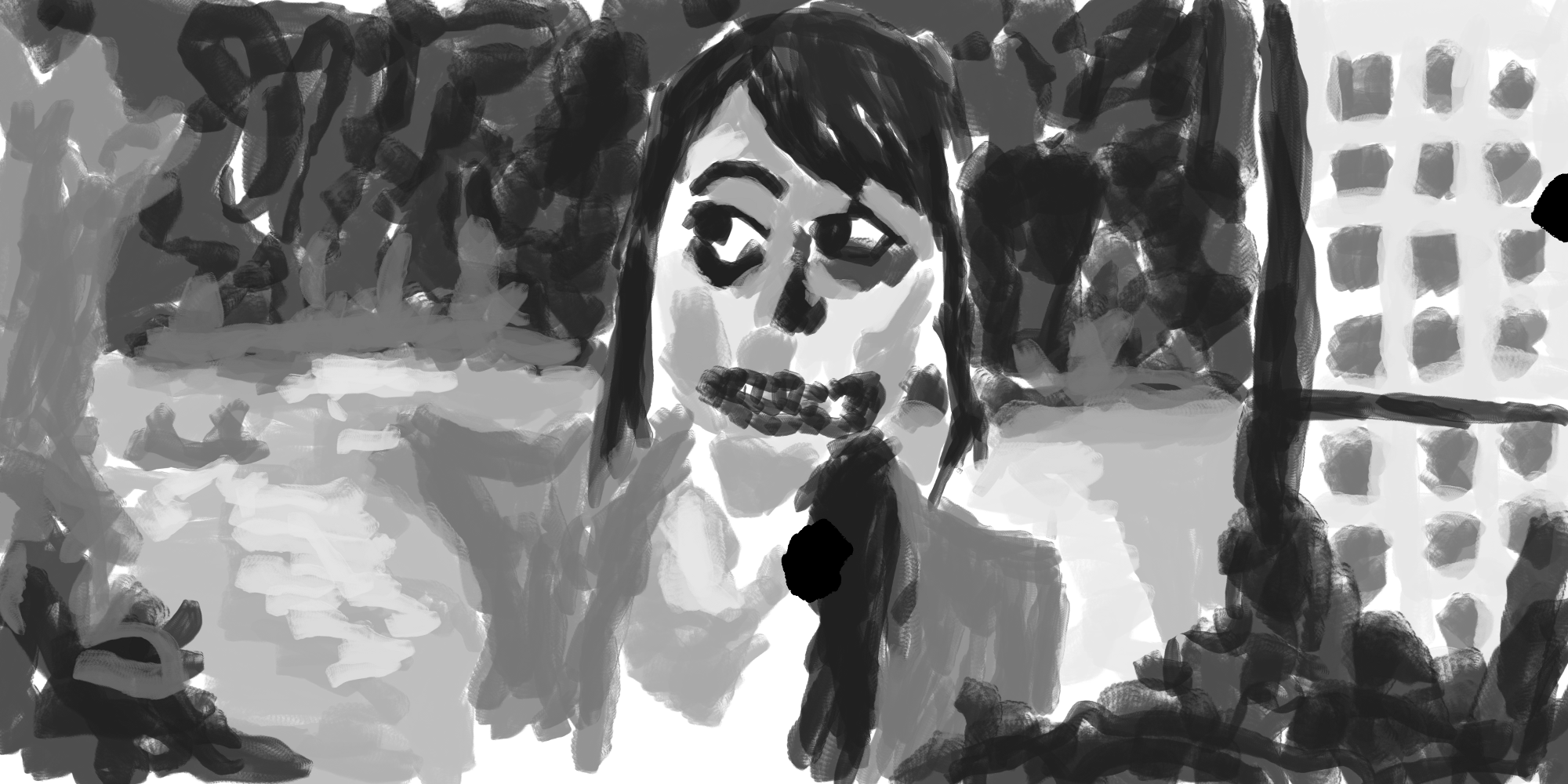 Black and white tone. I used a dark gray for the hair, eyes, nose, and mouth area. Slightly lighter for the sky in the distance, and repeating this in the foreground . Water is created with a light tone. Darker for the boat. I modified the design slightly with the squares on the right - created squares on the bottom half of the screen.
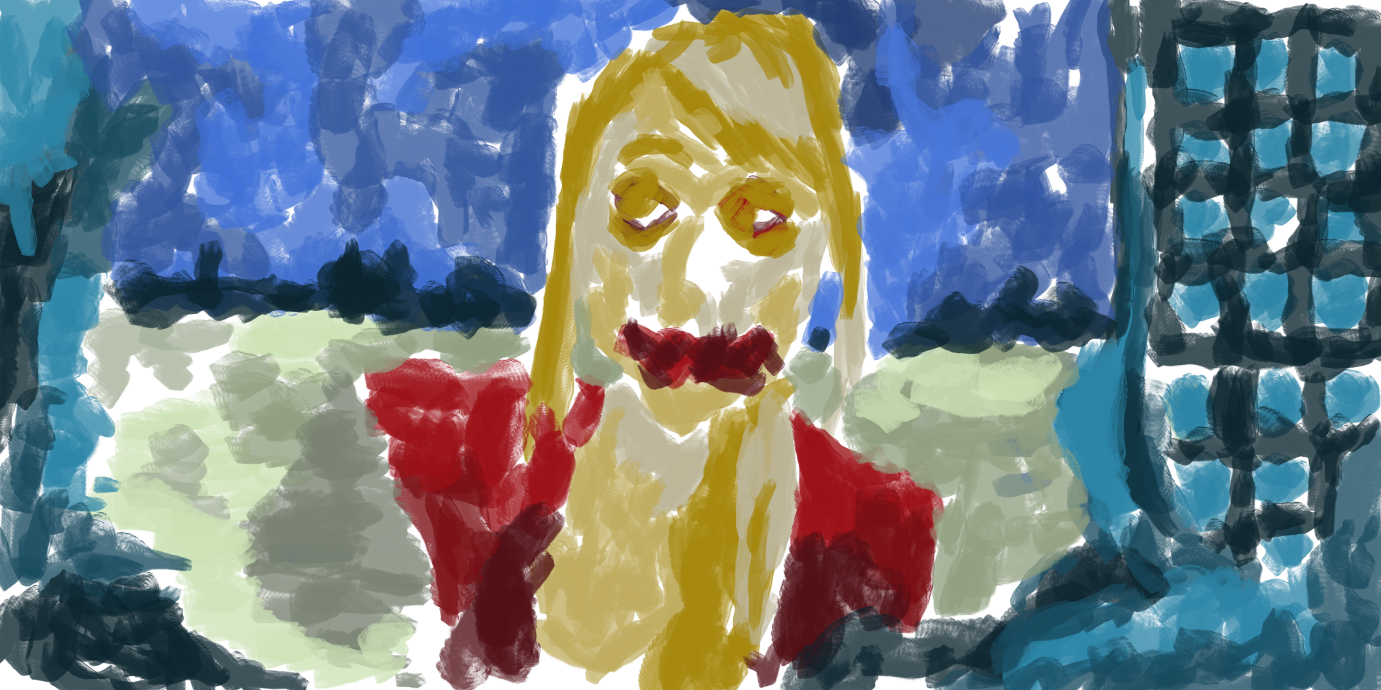
Colors added. Similar to the previous few color paintings - working with 5 different colors and a range of different tones of each color. For the skin this is my usual yellow. The hair is a new yellow/orange. It’s not much different to the skin tone.
For the sky - blue as usual. The land mass in the distance is a dark turquoise with a lighter version in the foreground - tone from the distance is also used to give it the areas common elements. There is a balance of dark and light tones of this blue spread around the painting.
The red is used is the same as the same as the skirt I used in the dress of a girl earlier in the week, It’s different to the red I usually use, very exciting! This same red is used for the mouth - something different. I used a light tone on the top of the clothing and darker at the bottom. 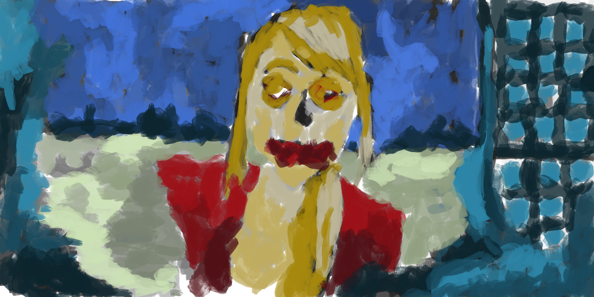
Color/black and white tone layers mixed together. Makes it feel complete.
Here’s an extra painting -
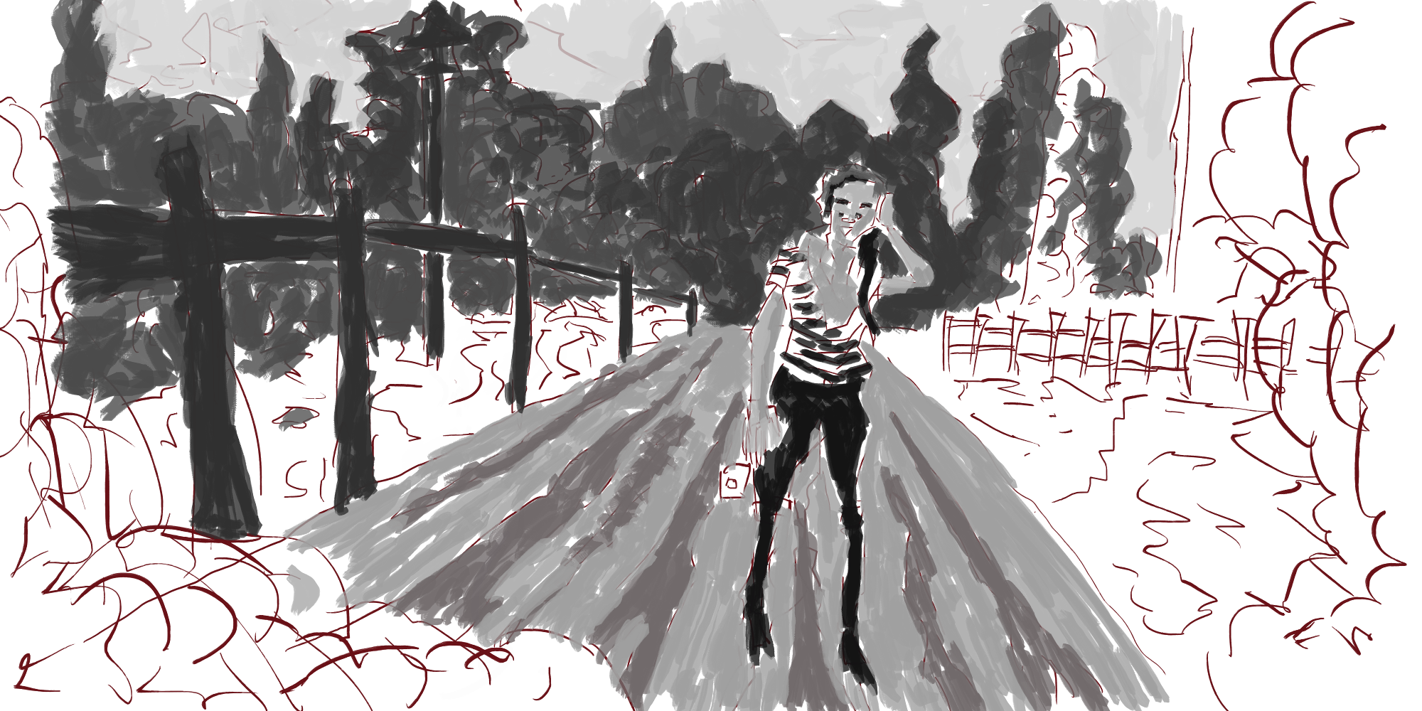
This was another from RedditGetsDrawn. I did the line and forgot to create a new layer for the tone layer, and never ended up finishing the tone layer. I like what I’ve done though. Figure is standing in the middle of the road. On the left side there are power-poles
