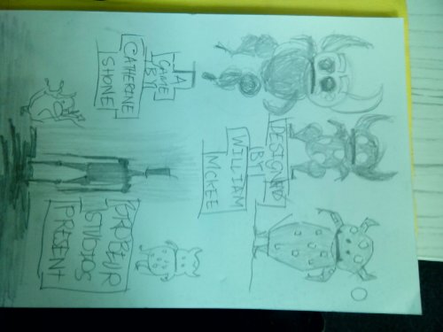
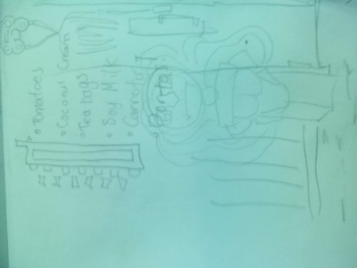
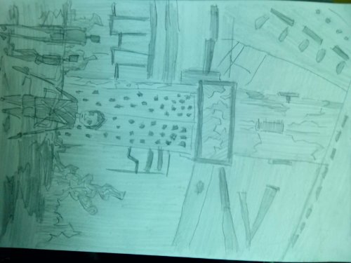
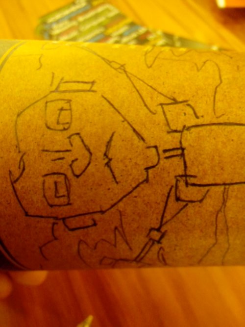
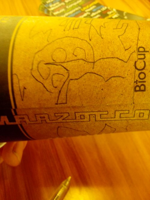
Open licenced artwork by William Mckee
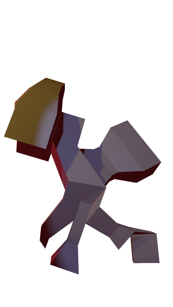
I’ve spent the majority of today sleeping so I have plenty of enemy for the next 15 or so hours to finish this game. It’s coming together well. Here’s some models that I’ve created in Blender and rendered out to be used as 2d art assets.\.
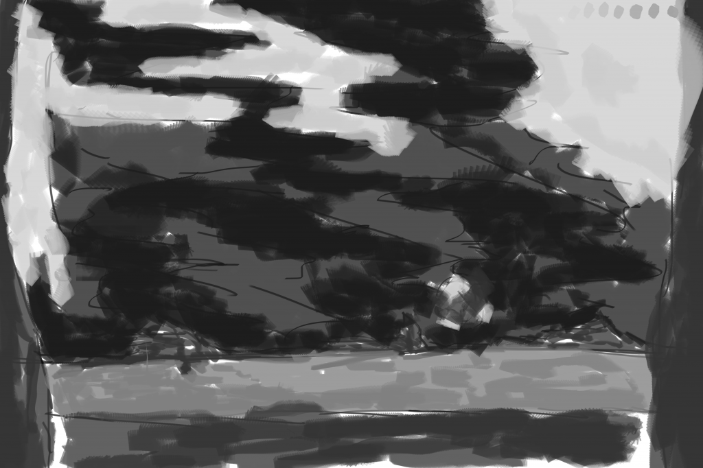
Read more →The following is a painting I did in GIMP this morning - it was to produce ideas and move forward with the BaconGameJam. I’m going to sleep soon and it will likely be a big sleep. When I awake I have plenty to work on and looking forward to where the programming and sound has gone.
3d model that i made - based of these character worked ive painted
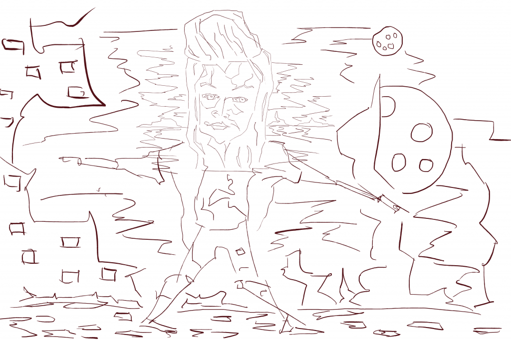
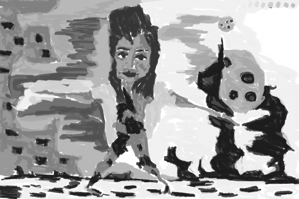
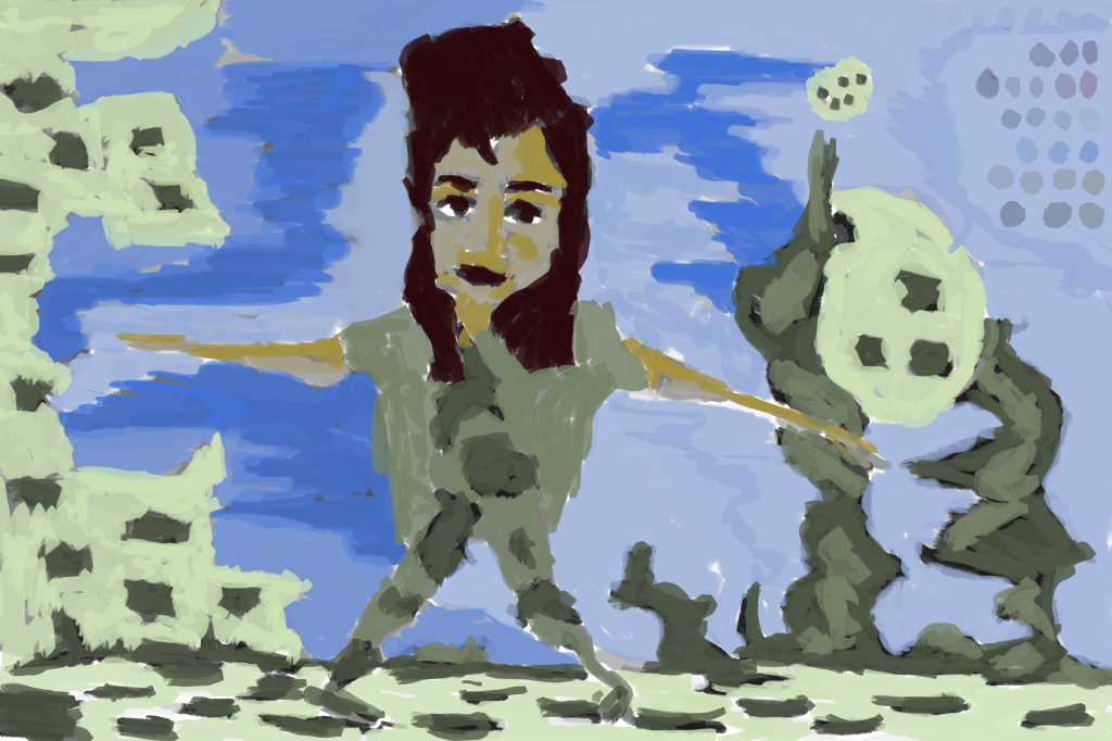
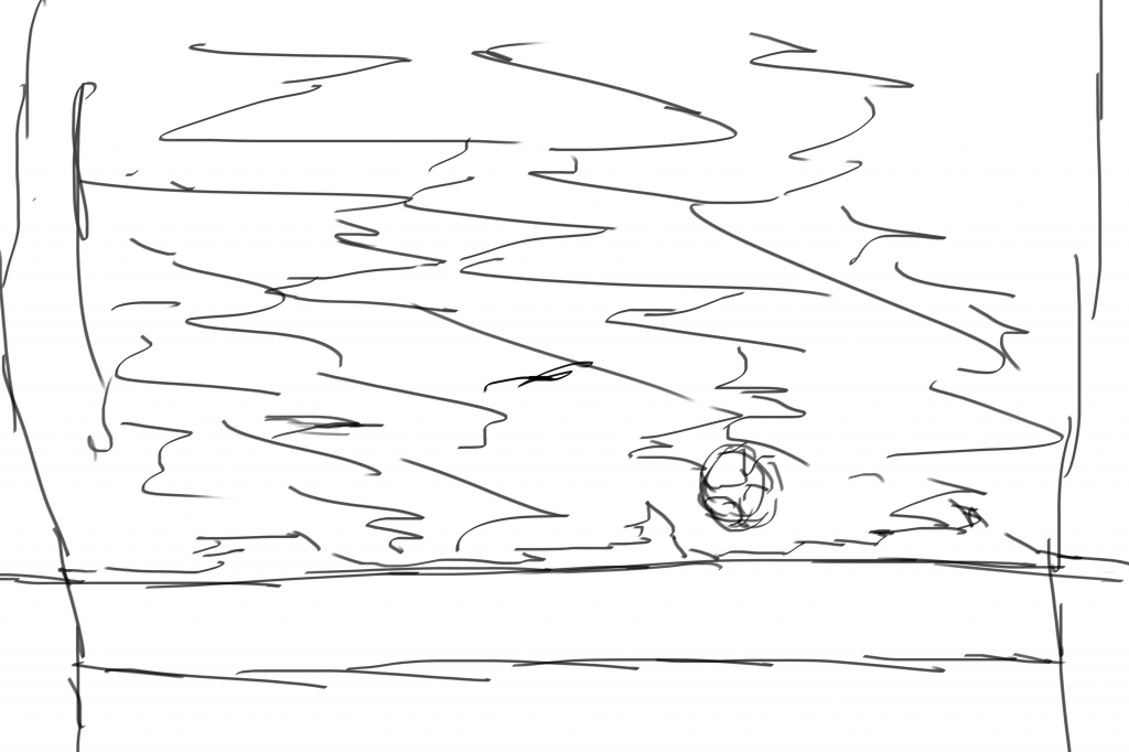
Read more →Onto my third painting. For this I decided to use the pencil tool over brush - creates a pixel effect. Here;s the reference along with the line/grayscale/color:
Read more →Keeping with similar idea as the previous painting. Here’s the second painting. I am currently working on a third - it’s pixel!
Read more →I’m doing the BaconGameJam. The theme is Lights Out. Three of us are working on it
Here we are live:
Read more →Tale of Tales - Realtime Art Manifesto.
Read more →A digital painting that isn’t referenced from RedditGetsDrawn. I like the band Vampire Weekend, they have recently released their third album recently titled Modern Vampires Of The City. It’s certainly on par or better than the previous two albums. My favorite track is Step.
In celebration of the album I decided to paint the band. Mixed it up a little by adding typography. Enjoy -
Normally the very awesome #67151b is used for line, but for this black. I guess it doesn’t really matter what color I produce the line layer, as long as it’s clear against the background. I’ll stick with #67151b I think….
No tone in the face causes the flatness. I mentioned this in my previous post. A mid/dare gray would help the image pop. Mixture of chalk and flattish brushes. You can see the areas that the chalk brush has been used due to the roundness. What’s your thoughts on flat vs round brushes?
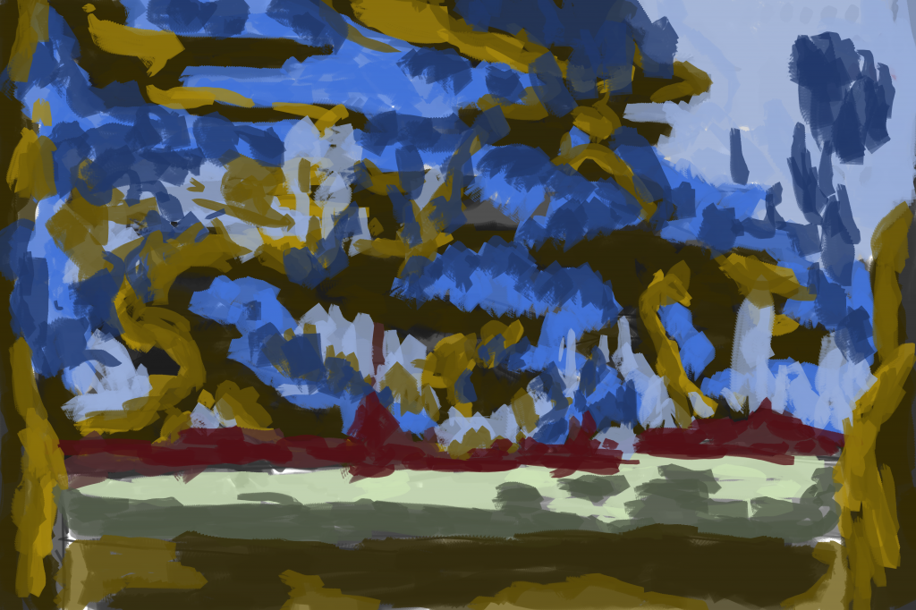
Happy with the background on this color later. Darkest red for the type, with a mid and light used for the land. The brush creates interesting effects of leaning areas. This is a result of cutting in with the blue that was used in the sky. A light blue surrounds the title with a darker tone on the outside. For the ground #c8d991 was used with a darker value used as a second color to add tone to the area.The same red that was used in title has been used for the band members hair. Yellow for the skin. I explored using red for lips but it wasn’t working so covered it up with the yellow. CTRL-Z is for losers.
Finally enjoy the video -
Read more →It’s another RedditGetsDrawn.
Reference photo.
Reference photo. Decent lighting - enough shadow for two or three tones in the face. The background is lacking somewhat, but it doesn’t matter as it’s going to be made.
Line
Here’s a critic:
The left eye should be below the right eye. The nose is much shorter than it should be. Bottom lip is too fat.
Good points. I need to be careful with my observation skills to capture what’s really in the image. Comparing the two I’ve mirrored the image - not only are the eyes opposite but the hair line as-well.
A new shape has been used recently in my background - squares. I use these square shapes in both the sky and land.
Tonal Gray-scale
Fixed the mirror problem in the face. The line layer is my first chance to get it right, and often don’t get it right on my first chance. That’s why I get a second with the gray-scale tone layer. Isn’t life wonderful with all these chances?
Custom made flat brush has been used for this whole piece. The opposite to this is the circle chalk brush that I often use. To be honest I prefer the sharp, flat look over a round. Mixing the two together works wonders.
Everyone I’ve painting on Reddit recently have been turned into redheads. I don’t think that’s a bad thing because redheads are pretty damn amazing.
Color is the layer I struggle with the most. Maybe using more tones of a color will help. I use two, maybe three tones if I’m lucky of each color. Increasing this number would help with detail and depth of painting deeply.
Read more →