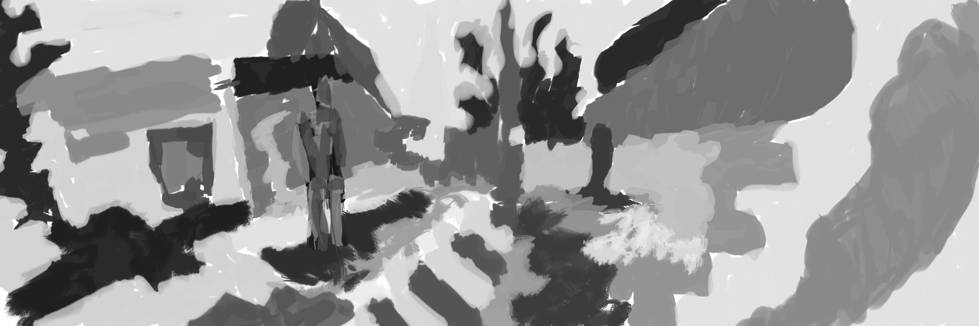
I’ve been doing other things rather than updating this blog. It’s a shame really. I do art. I do photography. I don’t get it uploaded. My laptop is a mess and I’ll really like to just start over with my file system. It needs a clean up.
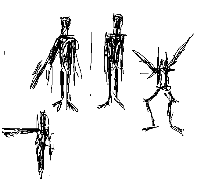
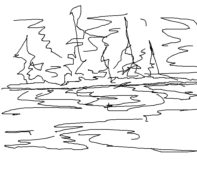
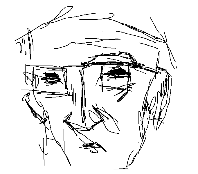
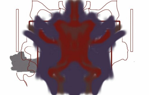
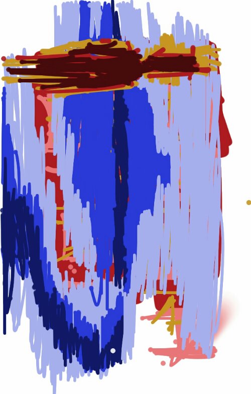
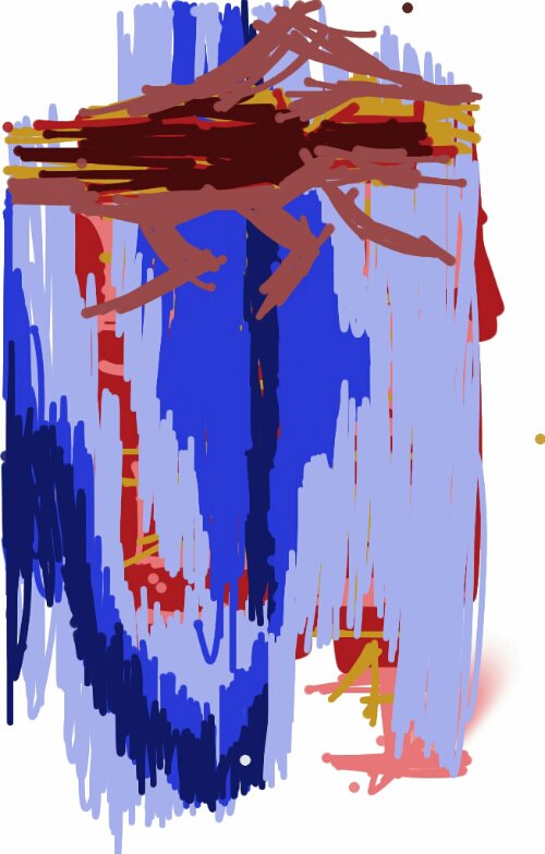
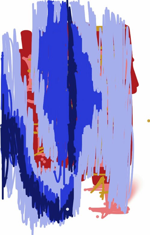
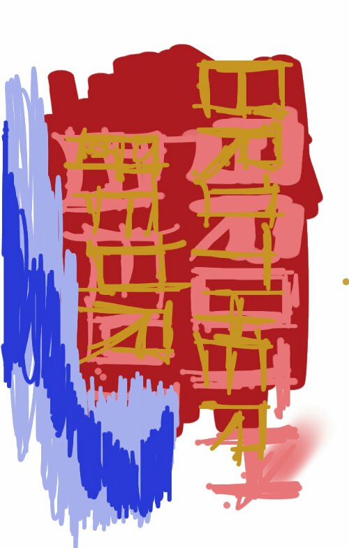
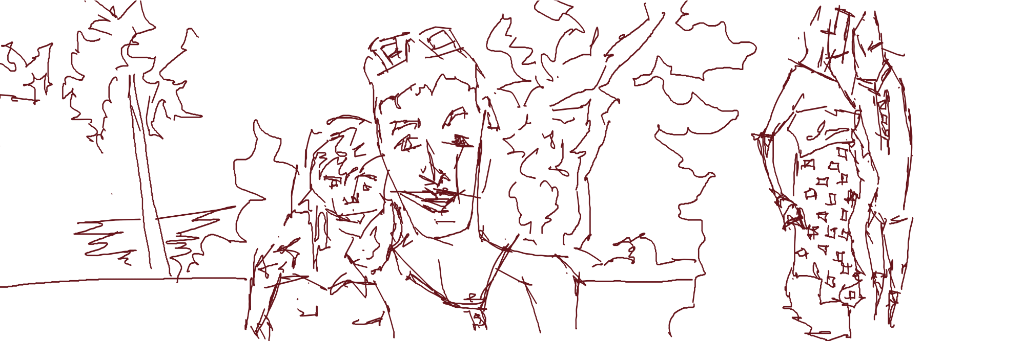
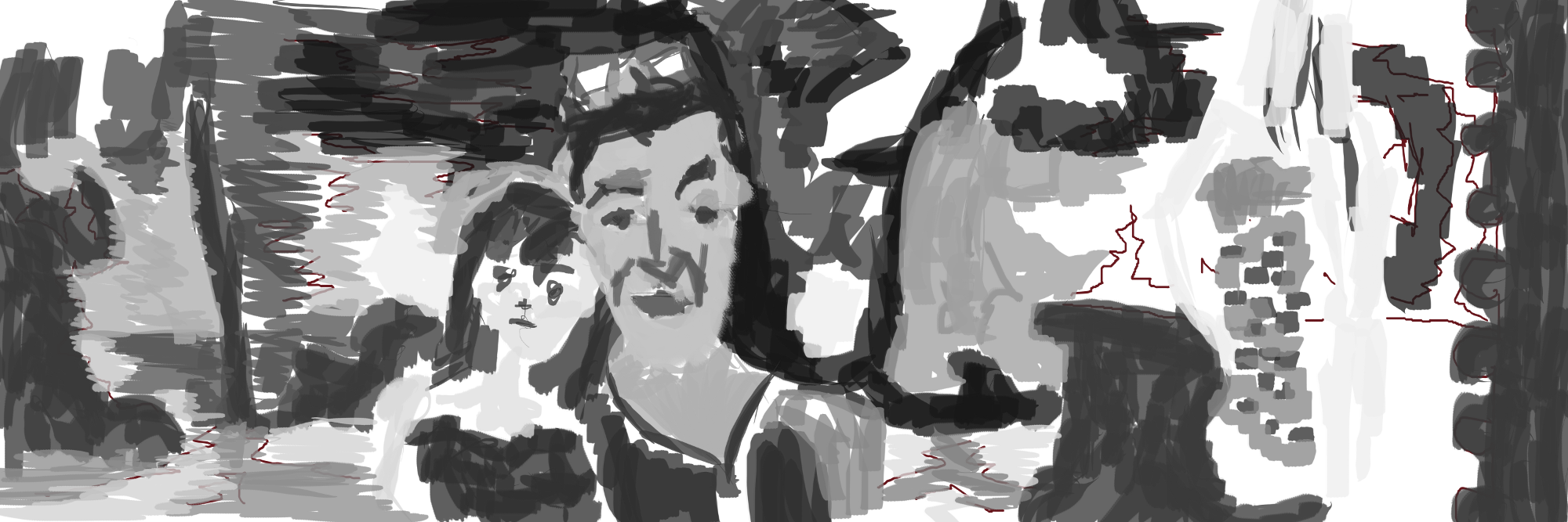
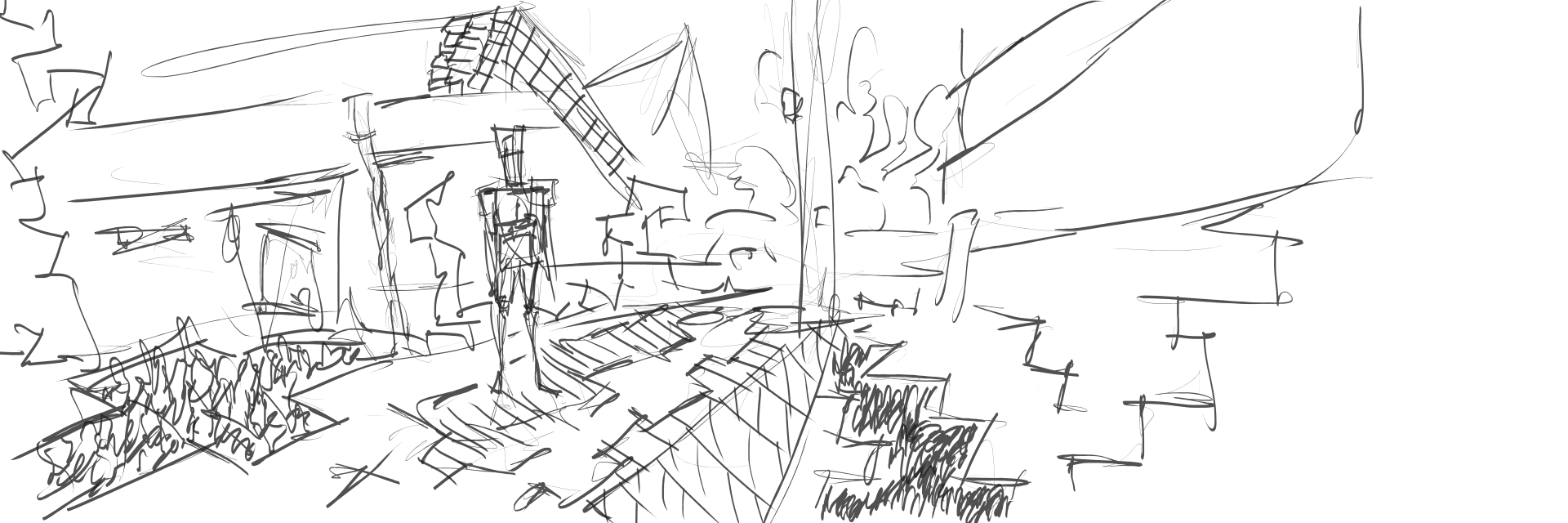
Anyway, this post is a start of many to come. 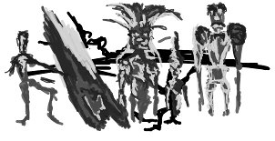 Created in GIMP, my old tablet small square tablet was used. Three figures drawn. It’s nice to just doddle away in GIMP. It needs a color layer!
Read more →
Hello.
It’s been sometime since I’ve written on here. 3D and webdesign have taken up most of my time lately. I’ve been working in HTML5 - Canvas and Javascript, as well as Unity3d.
In terms of art for here though. My wonderful tablet is still broken. I need to get it sent away and fixed. I’ve been using my old small one. It does the job alright.
But anyway. I gotmyself a tablet, but sadly that broke this morning. Back to pen + paper I believe
Read more →
Sketches on the Kobo for a project. hese can then be developed digitally in GIOP


Read more →
So I’m working on a website for a game development company. BroBeur Studios.
Read more →
Currently my drawing tablet is broken. Usb won’t recognise the device. I’m working on getting it fixed. In the meantime, pen and paper plus digital painting on the android tablet

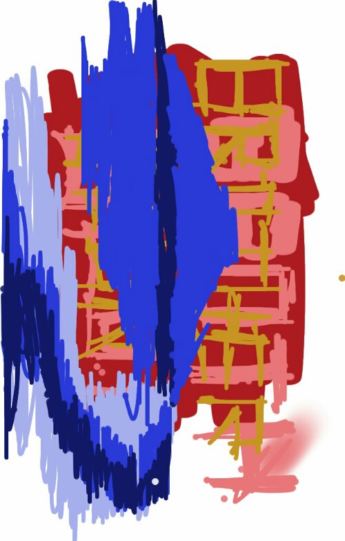
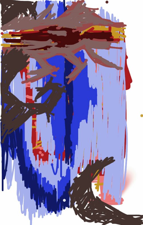
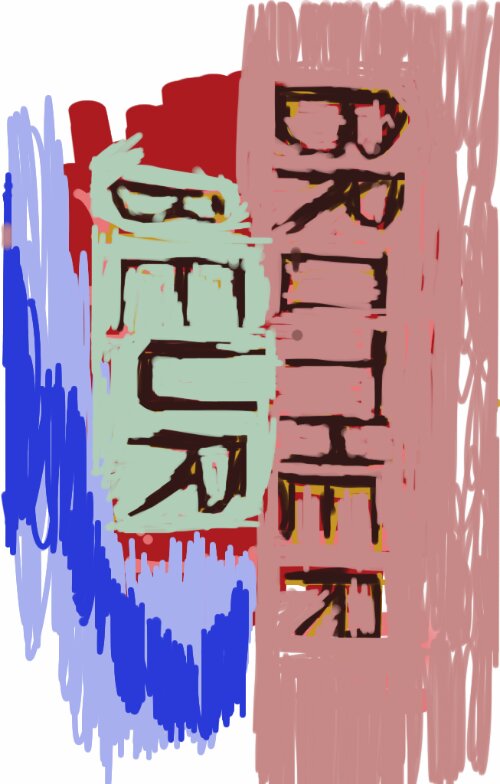
Here are some digital paintings I did with my fingers in the app sketchbook

Read more →
William got a 7' Android tablet. It’s not a Samsung but it does the job.
The following images are created in sketchbook, an app that in the past William used for digital painting.


Read more →
RedditGetsDrawn is a helpful resource. Usually William works digitally from the site, creating color or grayscale paintings. Sometimes the tablet will be dropped and replaced with pencil and pad.
In his previous pad (the a5 landscape, black bound, white pages) he produced a series of works from reference found on redditgetsdrawn.
The following images are in the new sketchbook, which is a similar size to the previous. The paper quality is far higher. The off white look is appealing.
Full figures are more fun to draw than portraits for William. The idea of creating a character in a world works better with a full figure over a portrait.
HB pencil was used. William swears by his clutch pencil. It doesn’t go far from his side. If it does, he’s looking for it. He’s likely stressed and worried that he will have to buy another.

Read more →
It’s a rare moment when William takes his pencil drawings digital. He has been focused on working from photo and imagination. That’s something that needs to change - a balanced approach.
On Tuesday he imported two photos of pencil sketches that he had drawn during his time in Wellington. This is the result.

The line layer. He believes the pencil line looks more professional and there is more control. But he’s use to producing the digital line. It may serve some use in the future.

The tone layer. As usual William has used a range of brushes in order to show texture and variety in the work.
Read more →
I have a new sketchbook. It’s likely the most expensive paper I’ve used. Slight texture, but nothing too major.
Here’s drawings from around Wellington: 
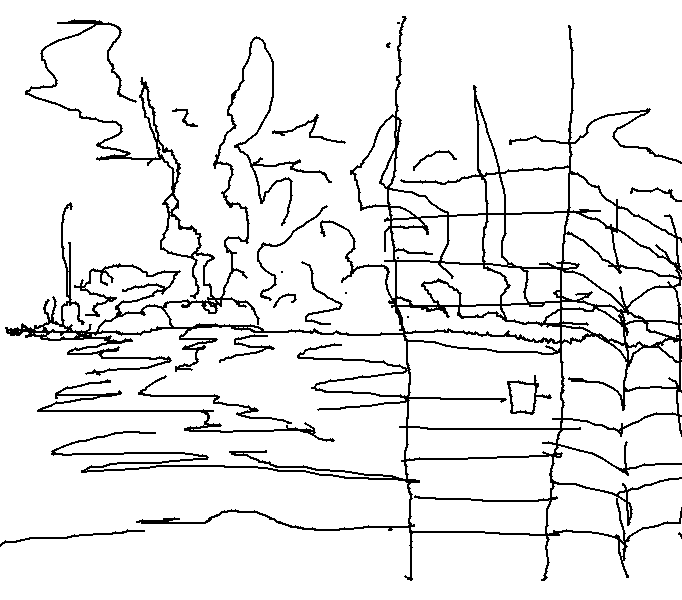
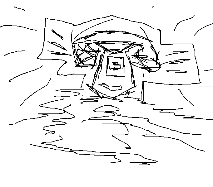
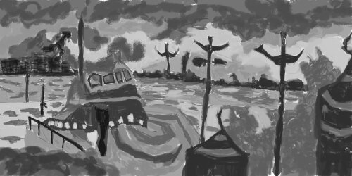
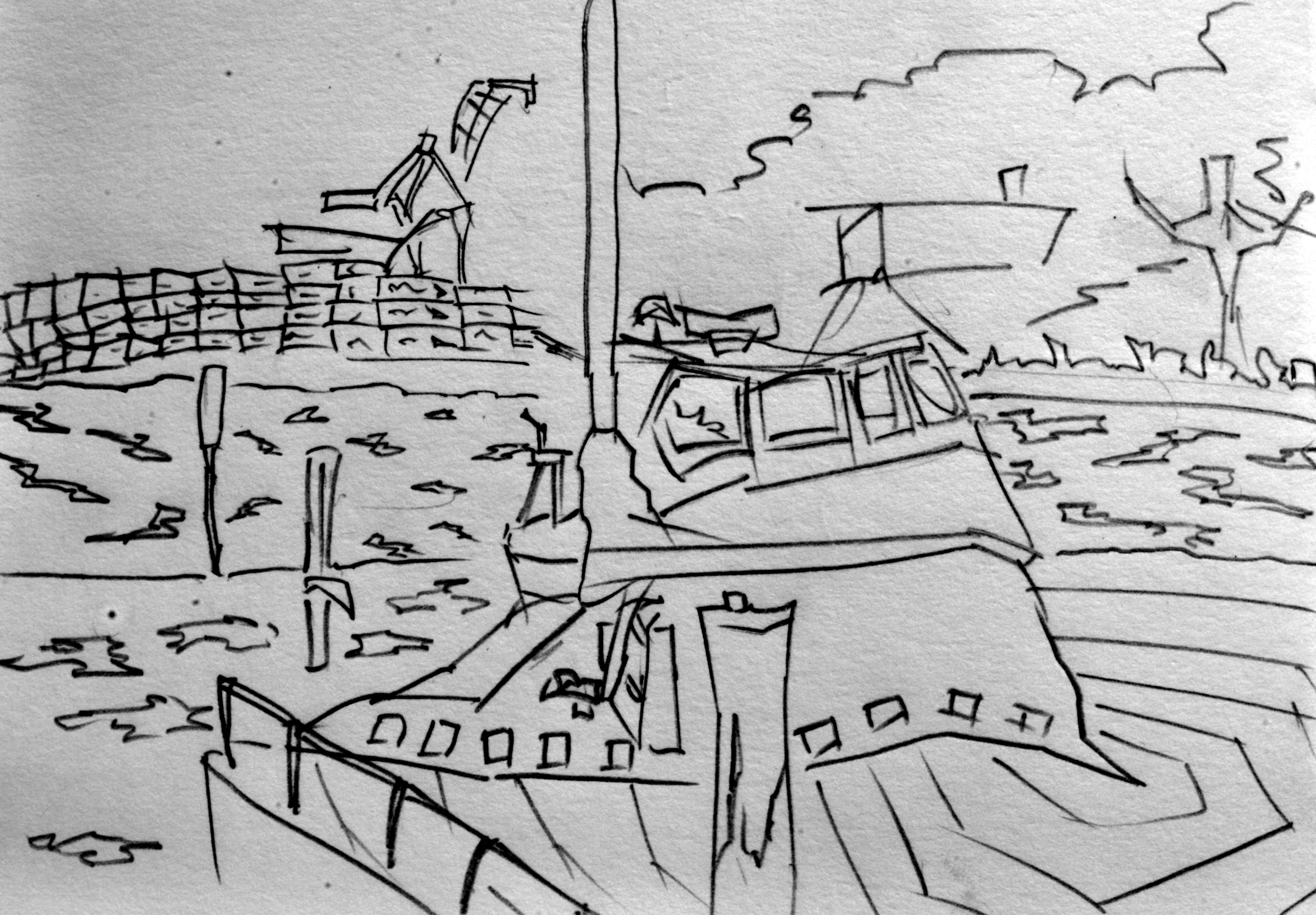
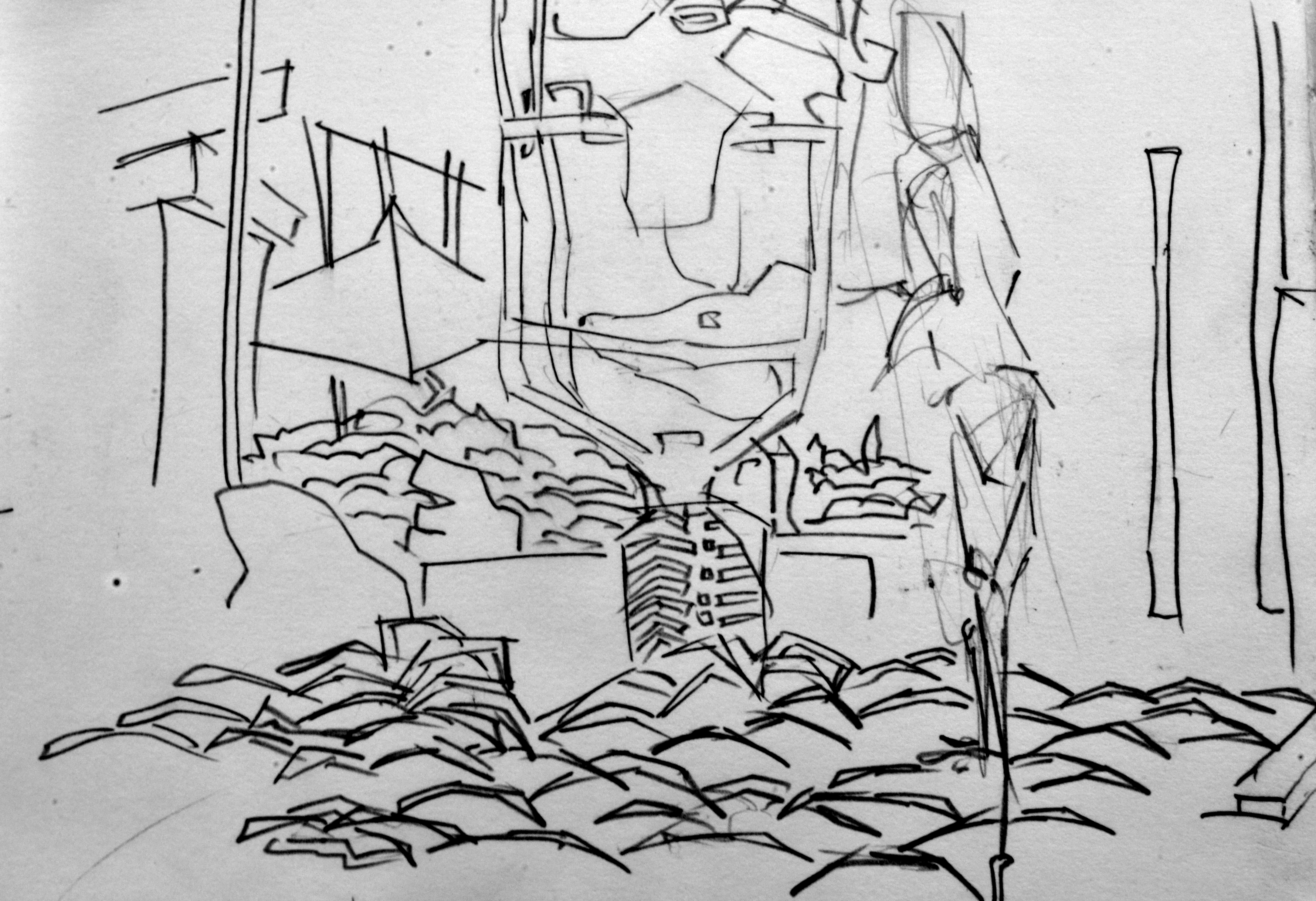
The waterfront. In the distance on the left is containers being loaded onto the dock. Traveling across to the right is land. Lines above represent clouds. This was drawn in the morning. 
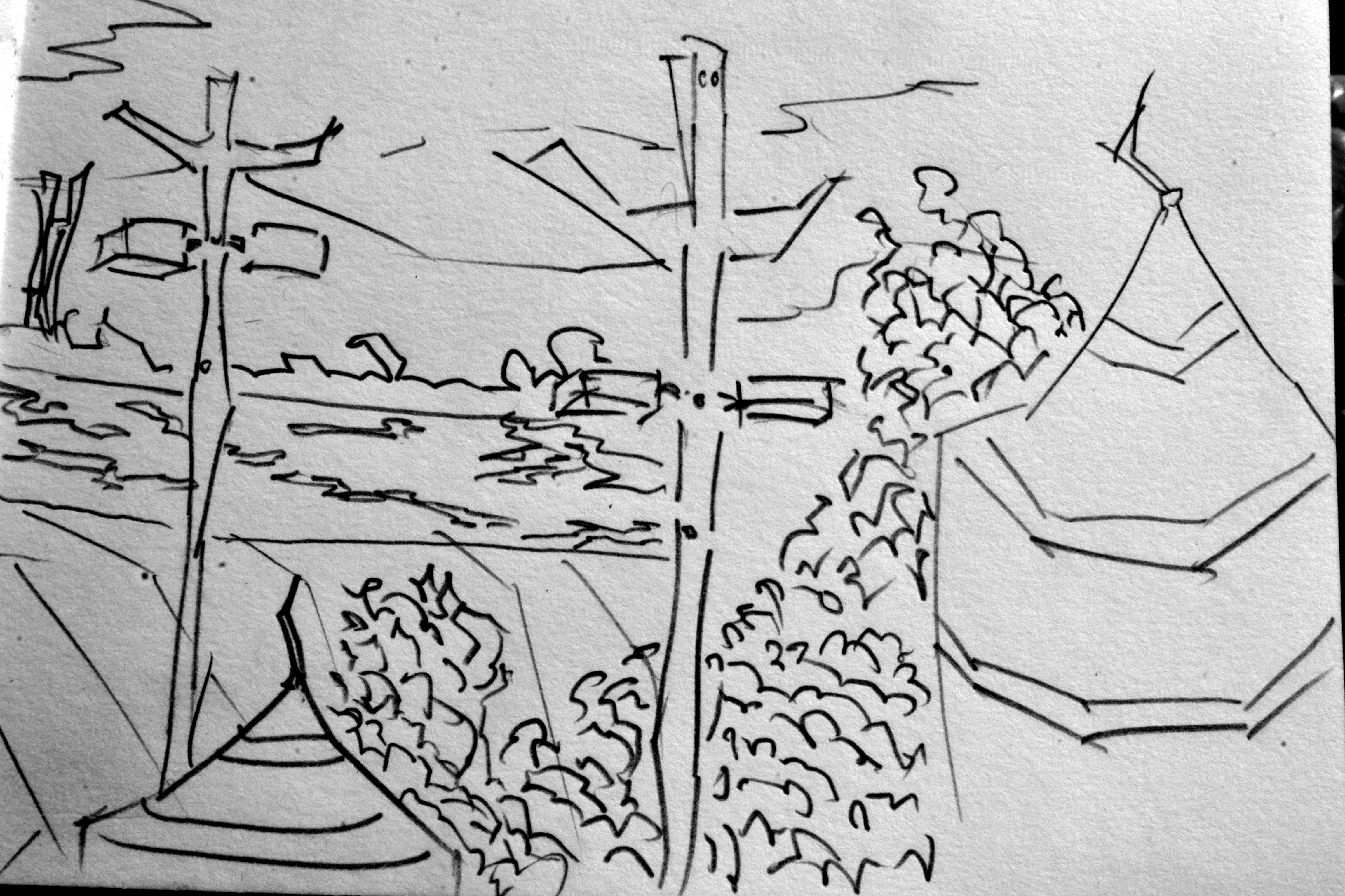
The right side of the page. I decided to mix up the scene by drawing the majority of this side in a different area than the previous drawing This allows me to work on more detail and not get frustrated with lack or detail and information - especially on the second page when I often get tired.

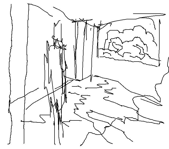
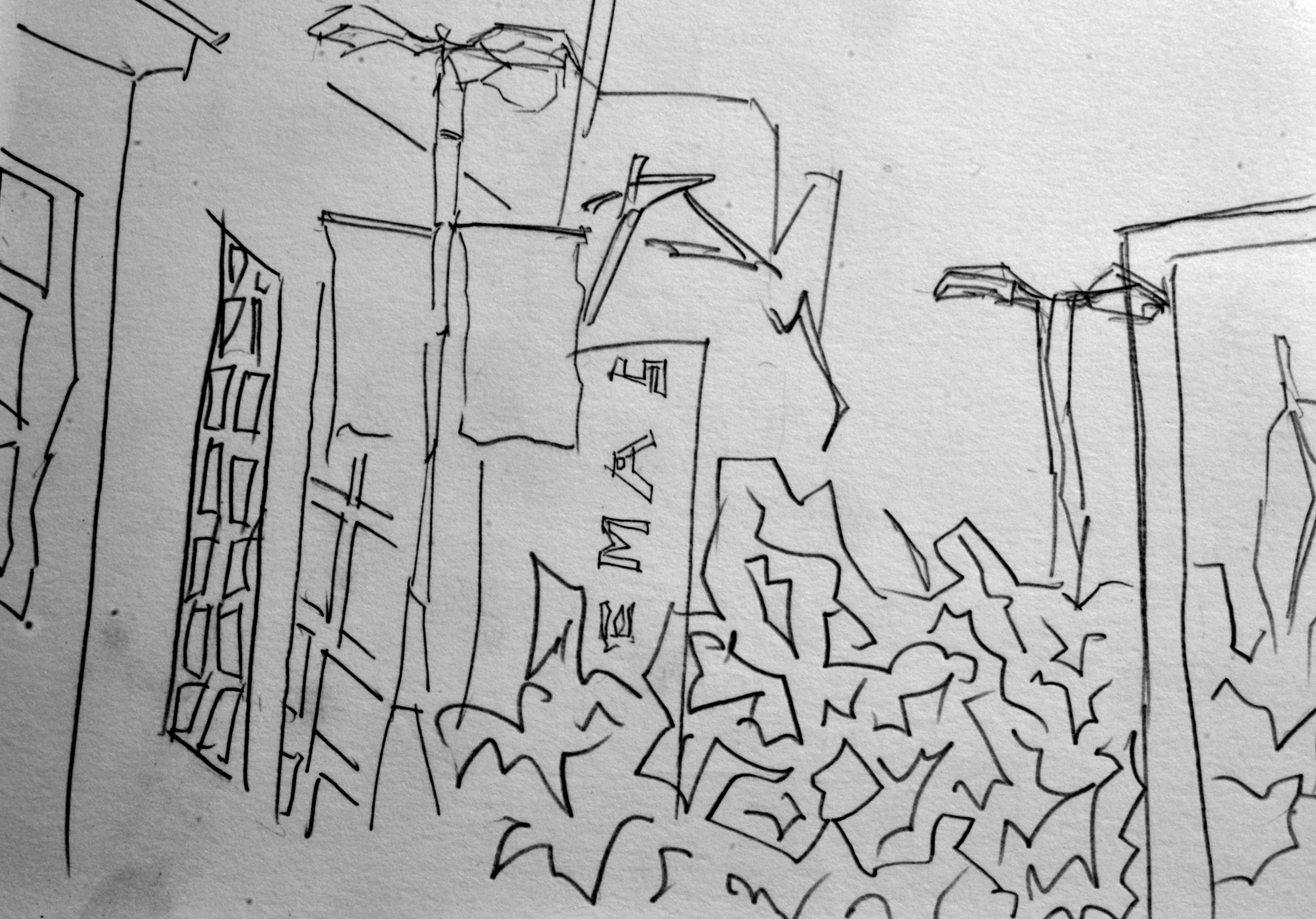
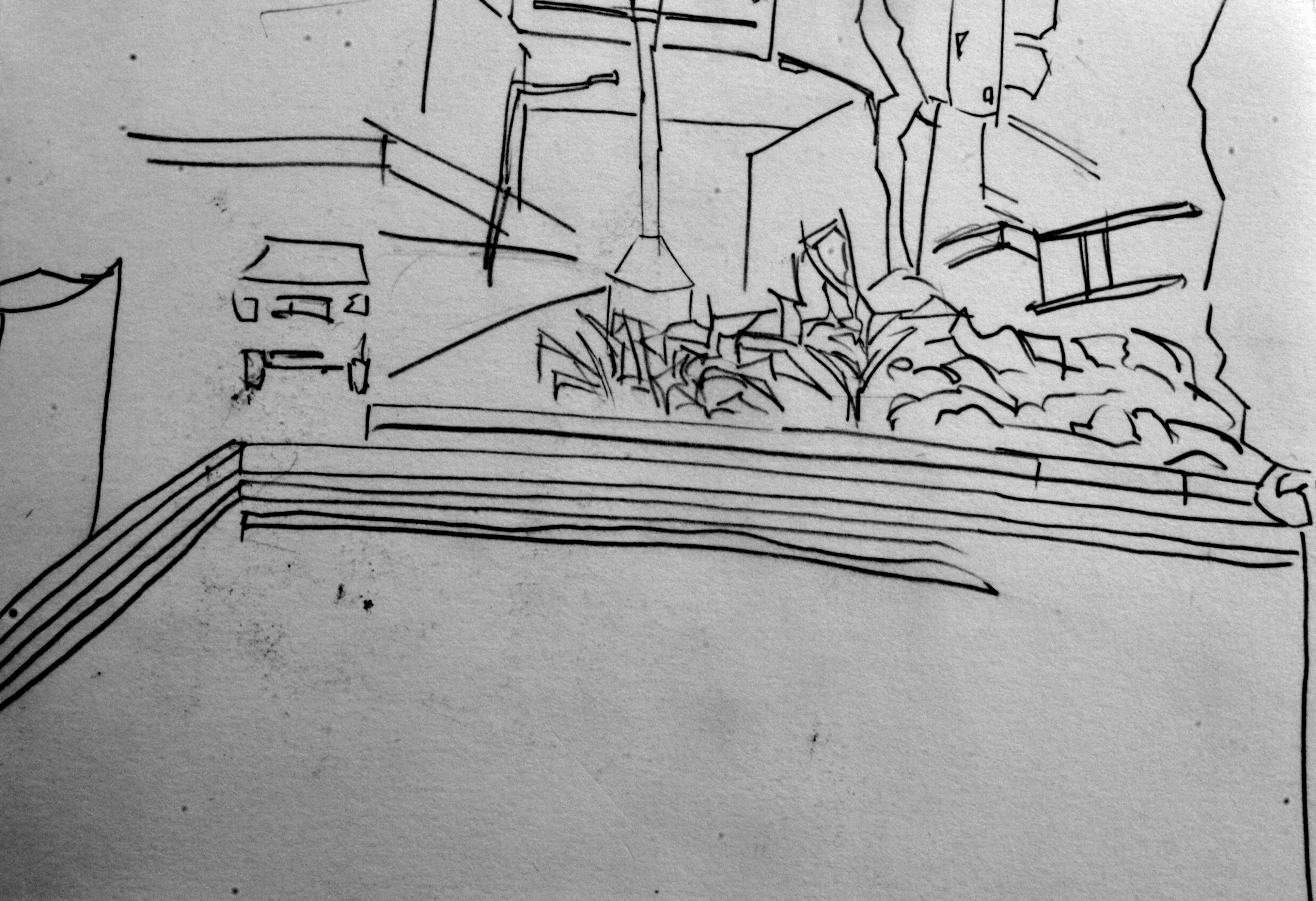
Sat on Coutrney Place for this drawing. Looking up at the lights , buildings, and vegetation surrounds. 
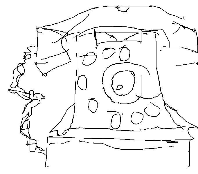
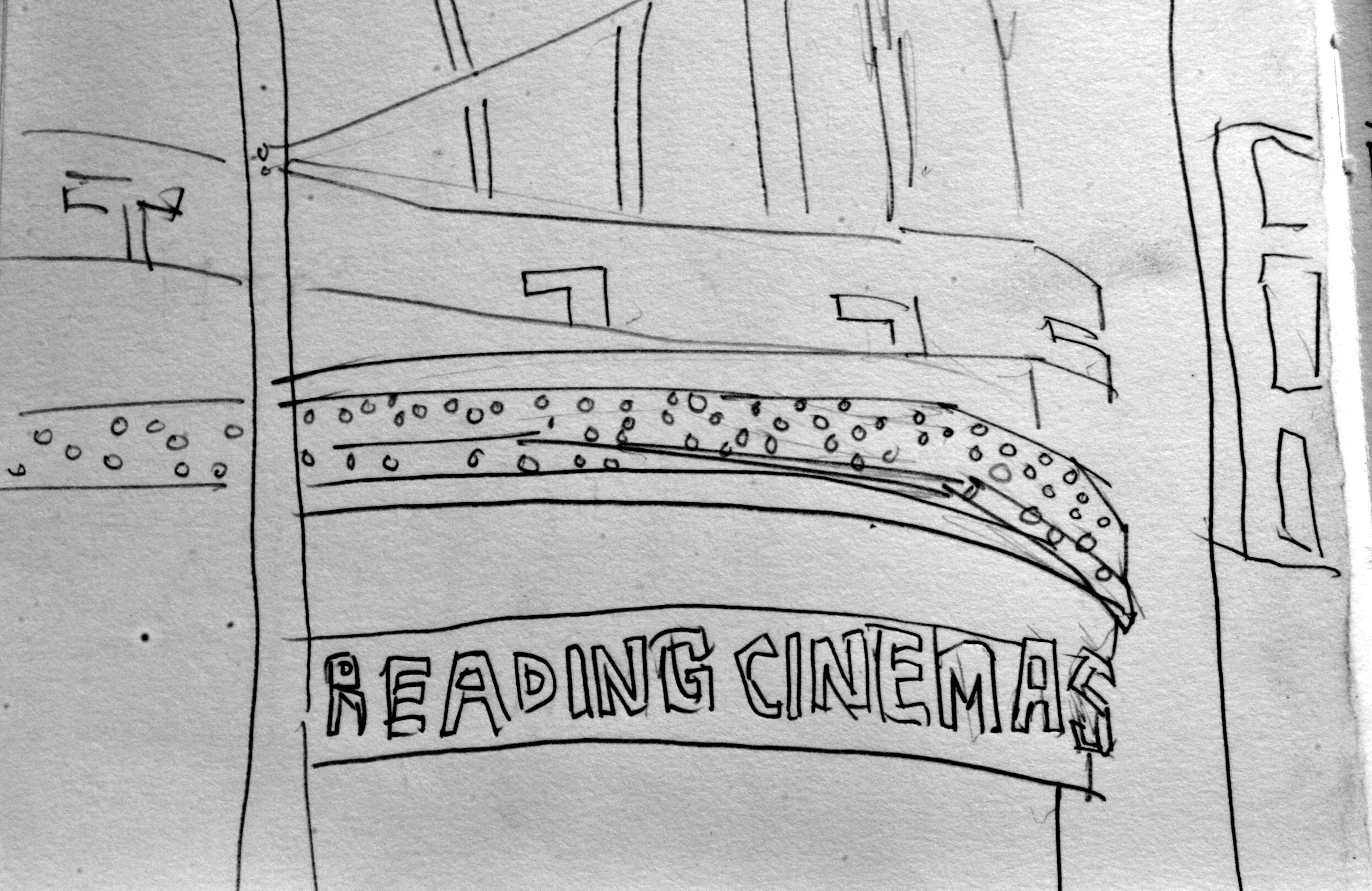
Reading Cinemas sign. Another view from Coutrney Place.
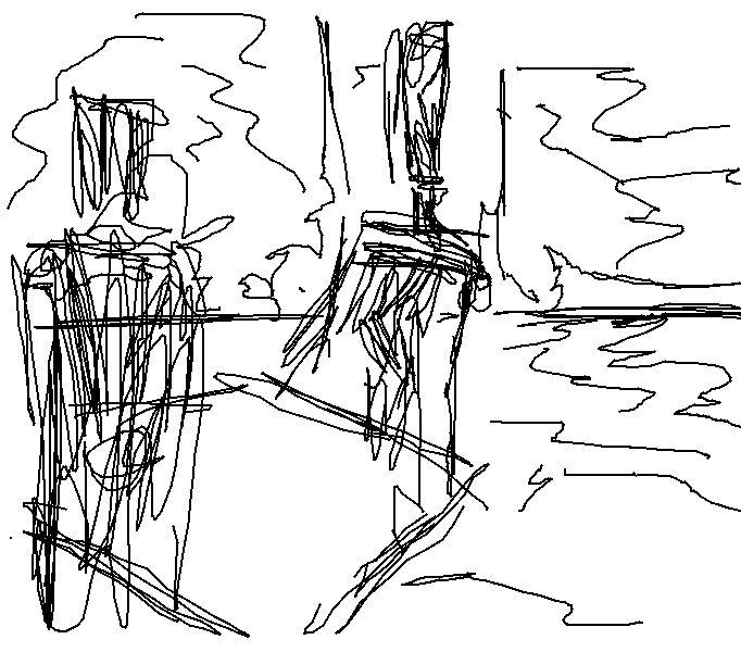
 Bucket fountain on Cuba Strett. The figure was drawn earier and I worked around the figure with the drawing of the water fountain. This included the grass on the ground. Focusing on a small area and getting it right is aften better than looking at a large area and getting it wrong.
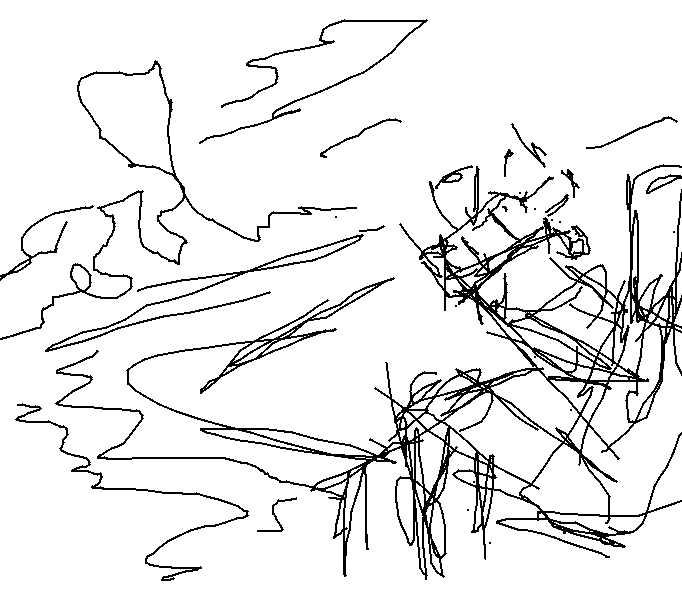
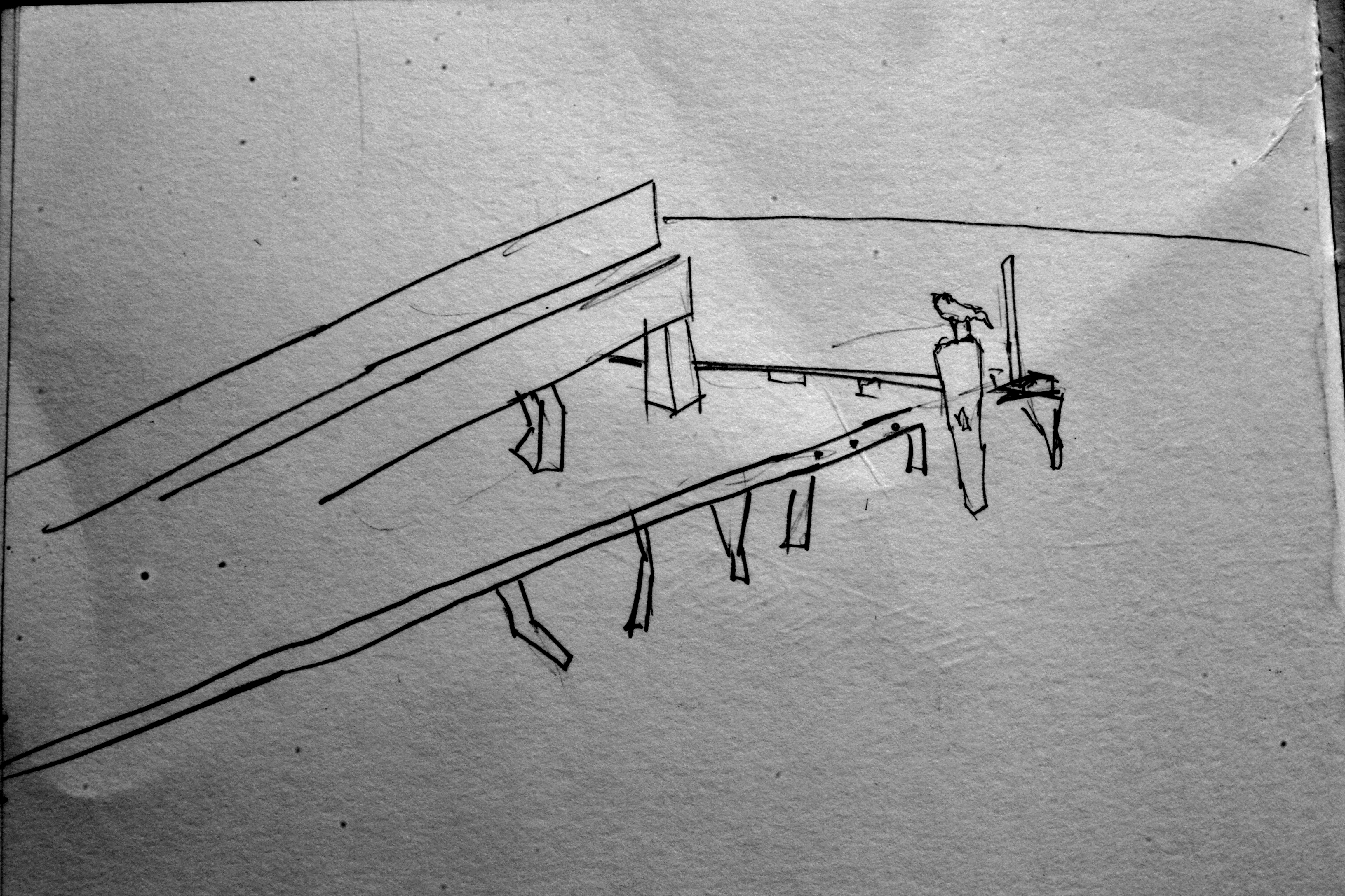
View looking out to the water.

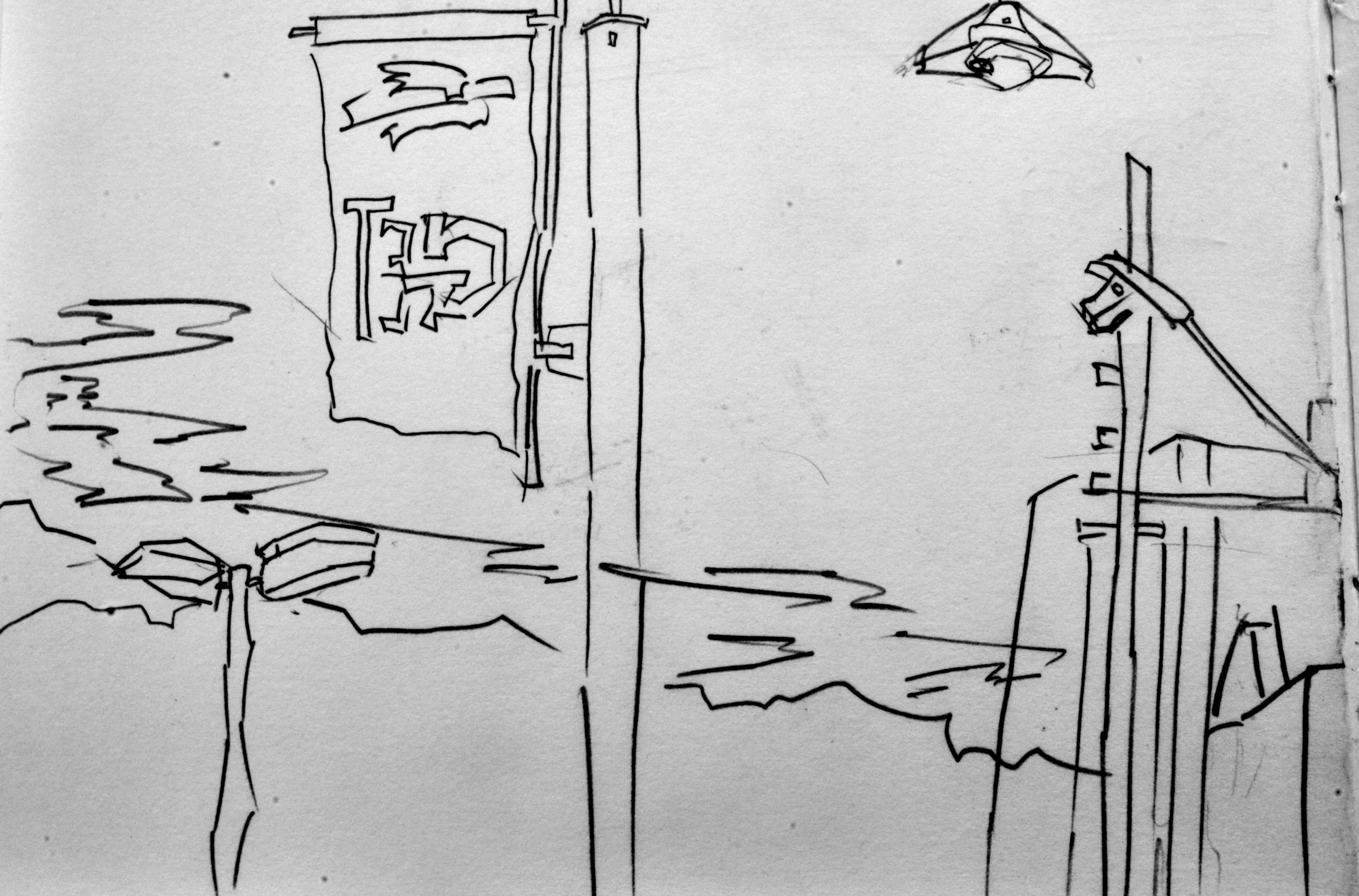
Lights, sky, flag. 
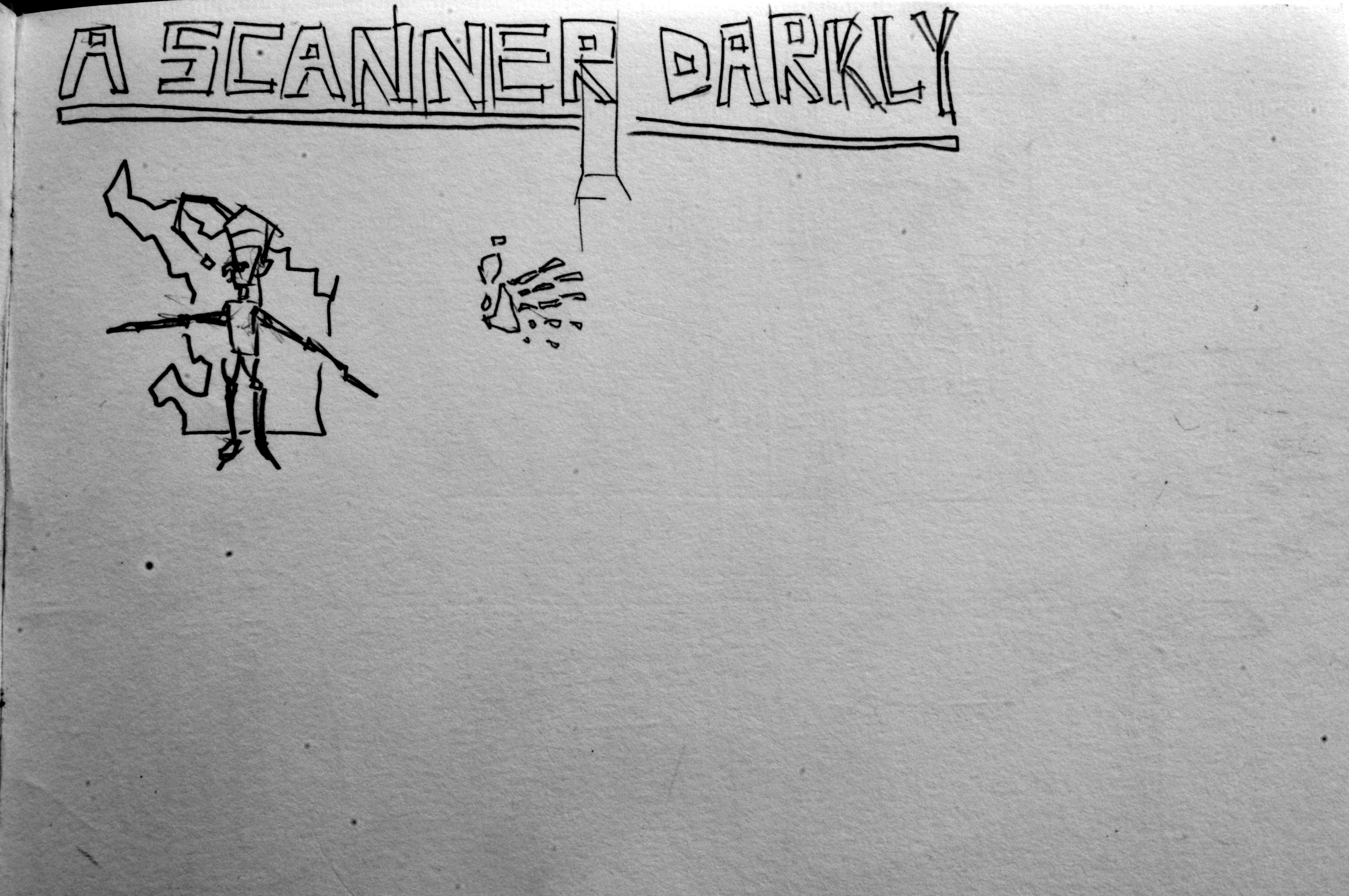
A scanner Darkly. Book by Phillip Dick that I recently read. It’s great I’m reading more - I want to illustrate novels. 
Another quick city drawing.
Read more →
I’ve been wanting to complete some digital paintings for days. I’ve been busy with other art related activities. I have so much work to sort though. Create a portfolio book and get it printed. So far it contains pencil portraits from 2008.
Here’s two paintings I did last night. Both in GIMP. The first - RedditGetsDrawn

Brother and Sister portrait. Close to being a full body shot. Cut off at the knees! I did two drawings of these two. The first is in the center - cropped down. It’s been awhile since I’ve used the Wacom Tablet (4 days I believe) so felt somewhat rusty. The facial area is especially messy. I could have been more gently. Oh well. Onto the tone. 
And tone added. Range of brushes used. Messed up with the layers and painted over a line layer. Didn’t realize this till later. 
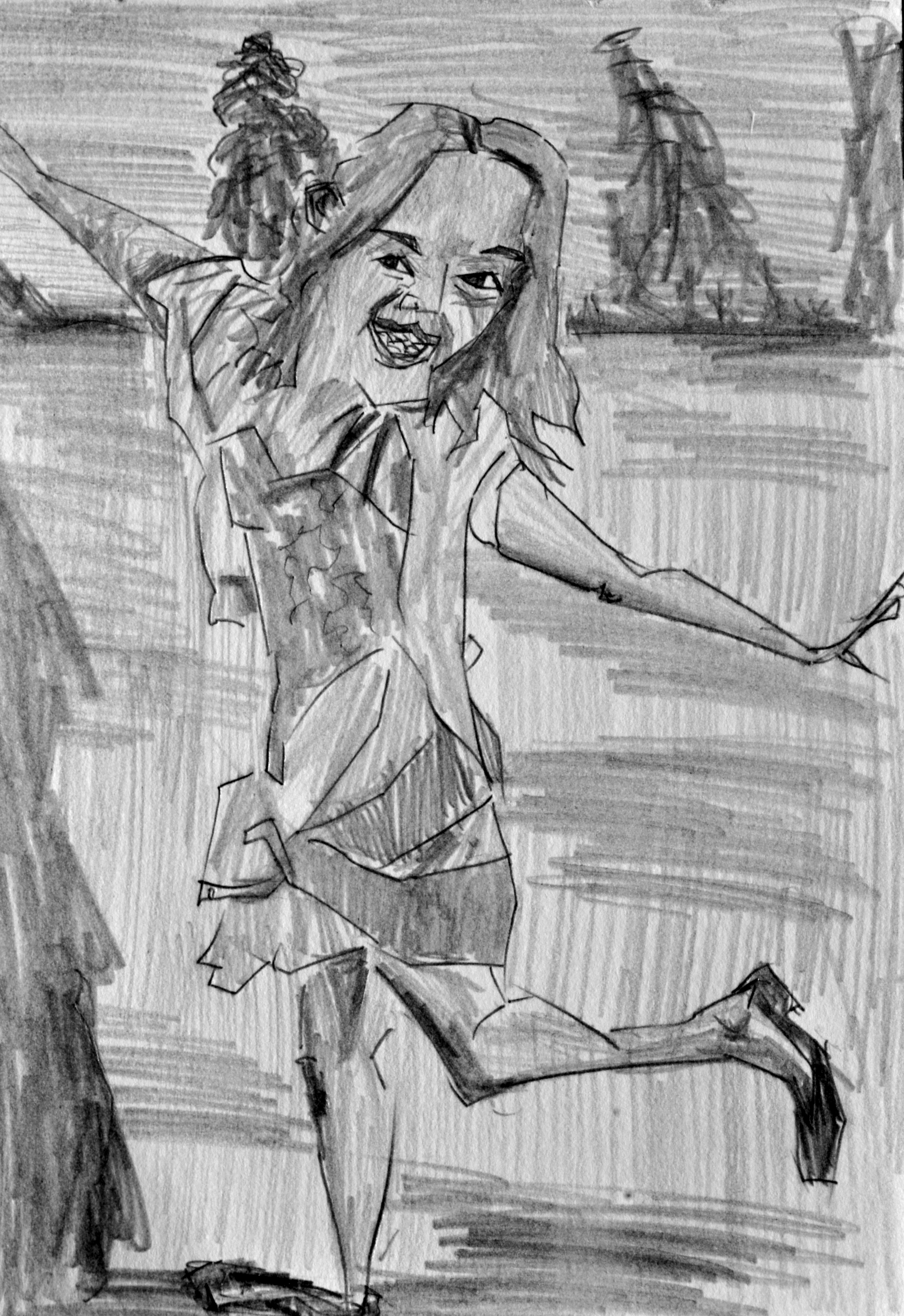
Line layer. For this drawings I didn’t use RedditGetsDrawn instead a photo I had taken on Cuba Street. The figure in this drawing was a child that was running. He jumped in front of the camera yelling, ‘Take a photo of me’.  Tone added. Somewhat simple and minimal feel. Layered up the figure with a range of tones.
Read more →
 Created in GIMP, my old tablet small square tablet was used. Three figures drawn. It’s nice to just doddle away in GIMP. It needs a color layer!
