Badly Painted Microsoft Paint Works
Slow recently on the blogging. I’m not that motivated to upload my photographs to my photography blog here due to the slow connection and continued timeouts. I need to head to the library and see how the connection is there. When I was in PakiPaki I had a decent connection that allowed me to queue 5 or so photos without a timeout. In Wellington I uploaded 200 no problems. I really need a fast and reliable upload speed.
Anyway, I shouldn’t talk about uploading photography - let’s talk art. During my trip to Hawkes Bay I took my A5 landscape notebook, clutch pencil and Fallout 3 art book. Together these allowed me to work from reference anywhere. This is especially handy in the car where I don’t have my laptop for reference (no smartphone, but really should invest in one). I also used the clutch pencil and a5 pad to draw street scenes - Hastings and Napier CBD. Sadly I lost my clutch pencil on one of my final nights in Hastings. I’m off to Wellington tomorrow so will likely buy another from the French Art Shop (I tend to not draw if I don’t have one).
I often draw from photo reference thanks to Reddit and the subreddit RedditGetsDrawn. There is another similar related subreddit known as RedditGetsDrawnBadly. Here people can post photos and they will be drawn badly. Microsoft Paint is recommended. I decided to give it a shot and open Microsoft Paint and produce paintings with the similar technique as I do with digital paintings in GIMP. 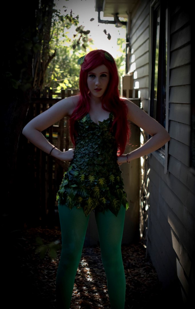
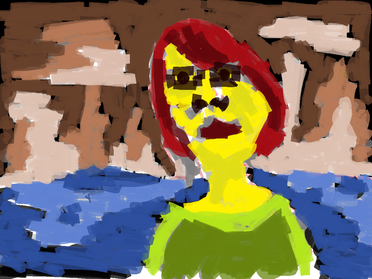
What a great photo. It’s high res (this version is smaller than the full version) and contains the majority of the body. Love the contrast of red hair and green clothing. 
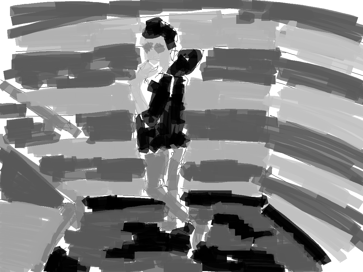
Natural Paint brush. Looking back at this now I will use the pencil tool for future works. It’s smaller, tighter and allows for more detail. This is super important as a majority of detail is lost with gray-scale color tone layers.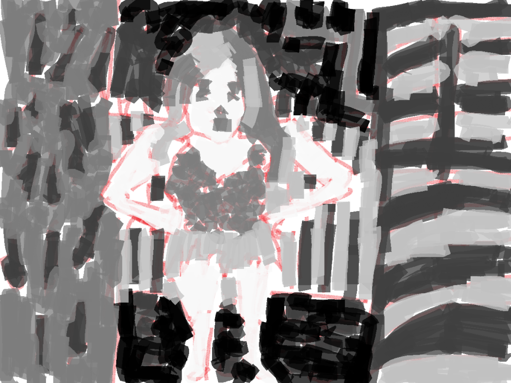 And grayscale tone added. I was surprised with how large the paint files were - 1200 by 900 pixels isn’t bad. It certainly allows me to do something with them in the future.
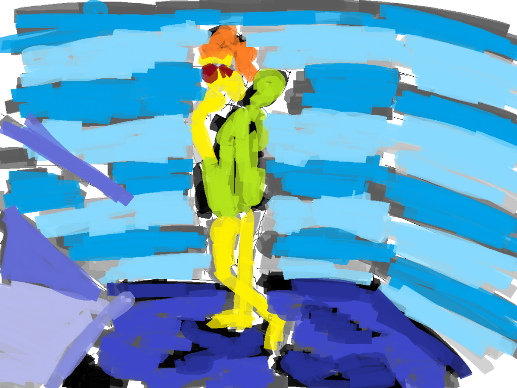
And color added. Limited colors (four in total) but a range of tones in the color. The green for the clothing is new, everything else has been used in previous works. Working in a new program and doing something different allows me room to experiment somewhat, I feel I tend to get stuck into the same trends at times with GIMP. 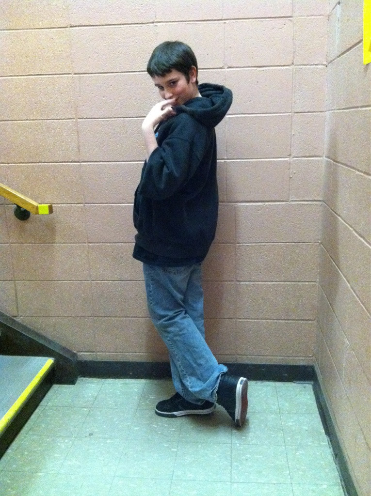
Full body pose reference. I’ll never turn down the chance to draw a full body, even if the quality isn’t the best. This allowed me to practice legs. The majority of the the character paintings I do are portraits. I work with arms and legs, but often legs are left out. 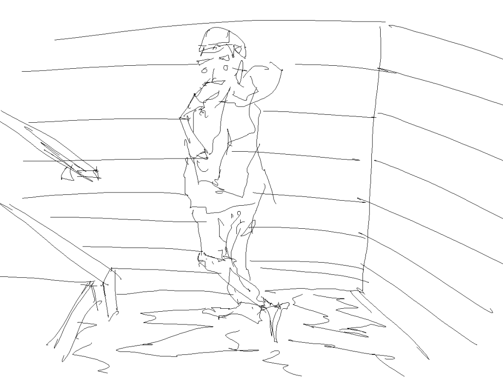
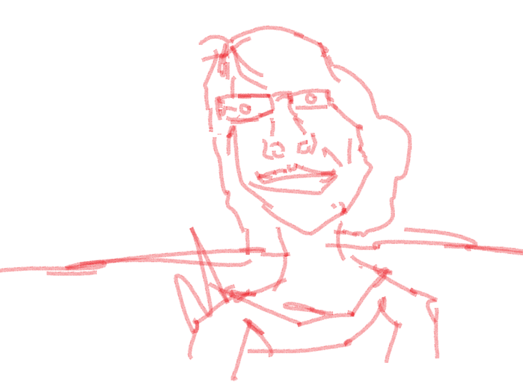
I’ve switched from the brush tool to the pencil tool. This feels like working on the line layer in GIMP. The only thing that’s missing - red. Less of a focus on the background (usually i create the hills in the distance/objects in foreground). For this I just created a basic scene using the reference in the photograph.
Grayscale. Keeping this simple. Black for the hair/sweatshirt. Skin is light gray. Didn’t bother with tones in the skin. Light and mid gray for the walls/step. Lastly, black and mid gray for the floor. Everything works together fine.
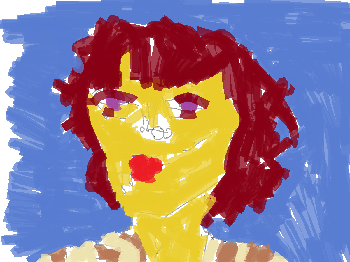
Color. I went crazy with this is added new colors to everything. I kept with the colors I usually use (yellow for skin/red hair/blue background) but it’s not the same hex number. For the floor and steps I went with a purple. Like the last painting I used a range of tones in each color. This is noticeable in the blues and purples. 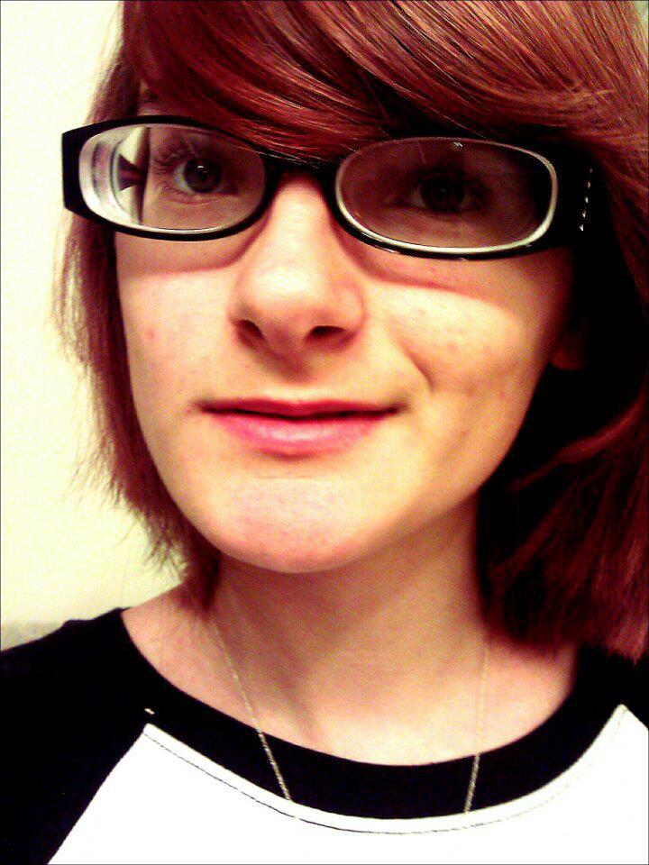
I remember seeing this on RedditGetsDrawn. I didn’t draw it though. It’s too much of a closeup. I prefer medium or full view shots rather than extreme close up. I guess if the quality of the photograph was higher it would be alright. Damn this out of focus photography!
This was done before I switched to the pencil tool. The line on this is very basic, I add information into the painting during the grayscale tone stage (normally it’s the otherwas around!). 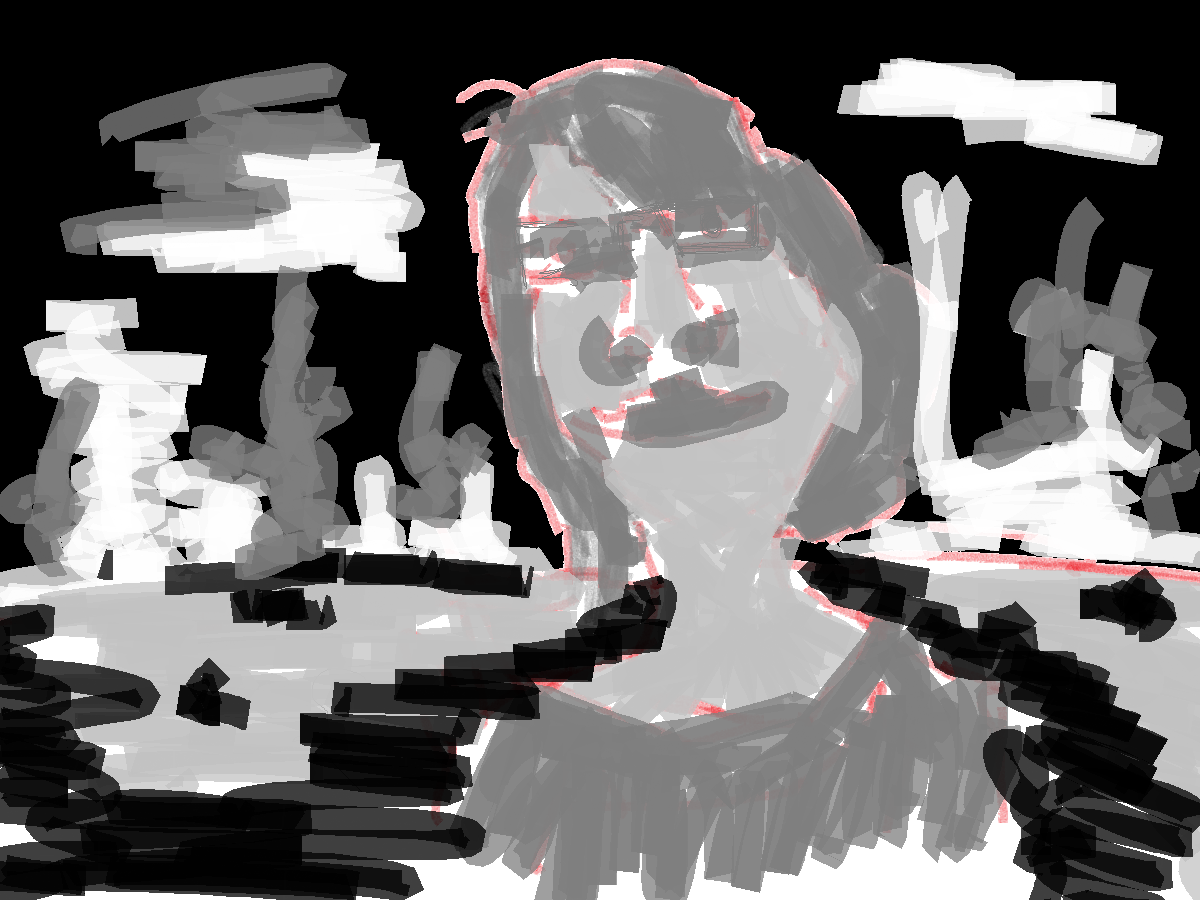
Went with the mountains in the distance and water coming forward to the foreground style. This is the basics for the majority of my RedditGetsDrawn character works.
Color tone. Switch around with the colors. Instad of using the blue for the sky I used it in the ground (usually I used a green for the ground). For the mountains and sky a brown was used. I think this works well for the mountains but I’d like to use a different color for the sky - could either be the blue or mix it up and use green.
Loved the mouth location on this. Had to draw it, too cute.
 This was the first painting of this series in Microsoft paint. I was still getting use to it and saved over my line layer with the color, so only the one image. I didn’t paint a gray-scale tone layer either. The usual yellow for the skin, and red in the hair/lips. For the shirt I went with a new brown. Blue in the background, but it’s just used as a fill and gives no location to the character.
I think I’m going to have to explore brown.