Landscape Binge Braid
Spent the day working with on more landscape paintings… all from imagination but trying to extend and develop them each time. These are turning into a series. I’ve been using the same colors throughout these works and only increasing the white or black in colors… this helps keep a constant.
I live with my friend Andrew now and I’ve been showing him the paintings to get some feedback. I get very little feedback on my artwork so it’s always good to talk about it.
Anyway, here’s the works I did today.
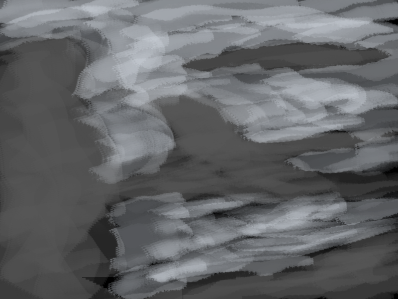
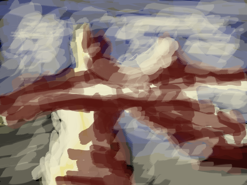
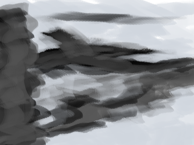
Starting off how I commonly do - with grayscale shapes. This is chaos. I don’t really know where I’m going but I just put down shapes that are pleasing to my eyes - with the intent to define them further later.
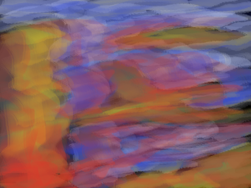
Color added. I feel color really helps me define areas. I should get better at defining with black and white. Maybe I’m too quick to move onto color at times. Got to love color though! The opacity in my brush is dropping… getting as low as 30% at times. I feel this allows me to layer easier which gives more depth into the painting.
The color was too powerful so I went in with plenty of white and black. I’m not sure if it helped greatly. This is one of my least favorite works I’ve done recently.
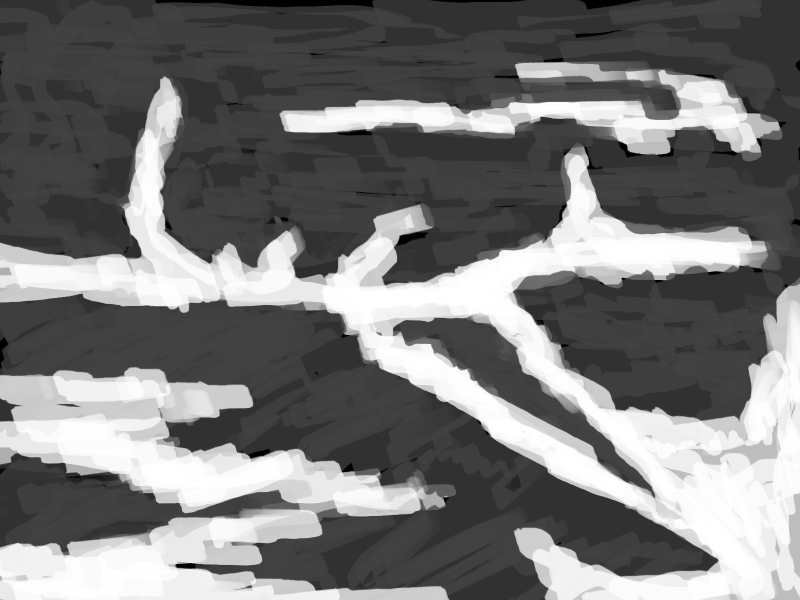
It’s important that I try different ways of working… here I’ve worked heavy on the contrast of lights and darks. Maybe a bit too strong but I can always go in with color later and blend.
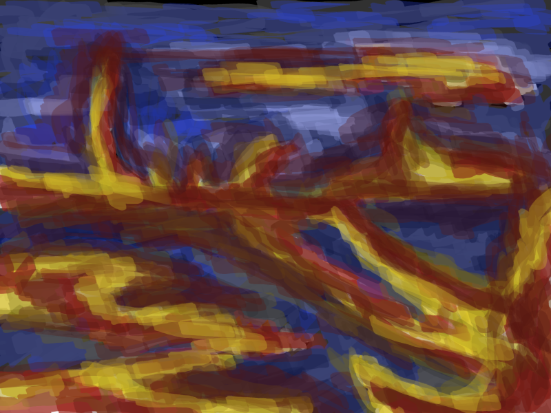
I’m enjoying taking these colors into landscapes… I’ve used them alot in my life drawing and the landscapes have made them fresh and interesting. Andrew gave me some feedback on this - he mentioned it looked hellish but the blue gave a strong contrast. Perhaps a nice balance? I still wanted to push this further.
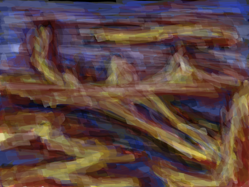
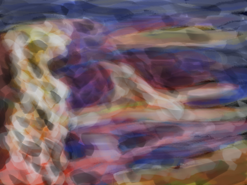
Followed the same process as the previous work and overlaid white and black. I went easy on the black and instead increased the black of the colors - especially the blue. This worked better in many ways - black tends to kill a color but tinting enhances and blends the color together. Exciting. I’m happy how this one one was shaping up.
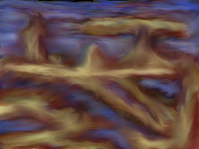
I havn’t used the blend tool recently in GIMP but decided to give it a go for this painting. I do enjoy the look of brush strokes and the blend tool does tend to kill these strokes. It’s certainly changed the painting somewhat - certain areas are really glowing. I partially like the small mountain in the middle - the green glow on the left with contrasting reds on the right. Marc Hill always says ‘balance your reds and greens’. I think this is a lovely balance of colors. More greens in the work maybe?
This is the last painting I started working on. It’s still a work in progress but I’ll keep working on it. Decided to use a darker version of the red… certainly makes the image feel different. Just shows how important color is to a work.
This is a random scrap that I didn’t end up taking further.
I’m really in a groove with these works so I’ll keep developing them further and see where I get.
These works are very inspired by the video game Braid.