I have left Hamilton and currently at my Mothers home for several days. I haven’t done any digital painting since the weekend (nice to have a break for it now and then) - but got the tablet out last night.
Here are all the
works I’ve done so far during my time at Mums. I was hoping to hit 20 before the end of the day… see how I get on though as we are going to the market.
Here’s a dump of digital paintings I did from RedditGetsDrawn:
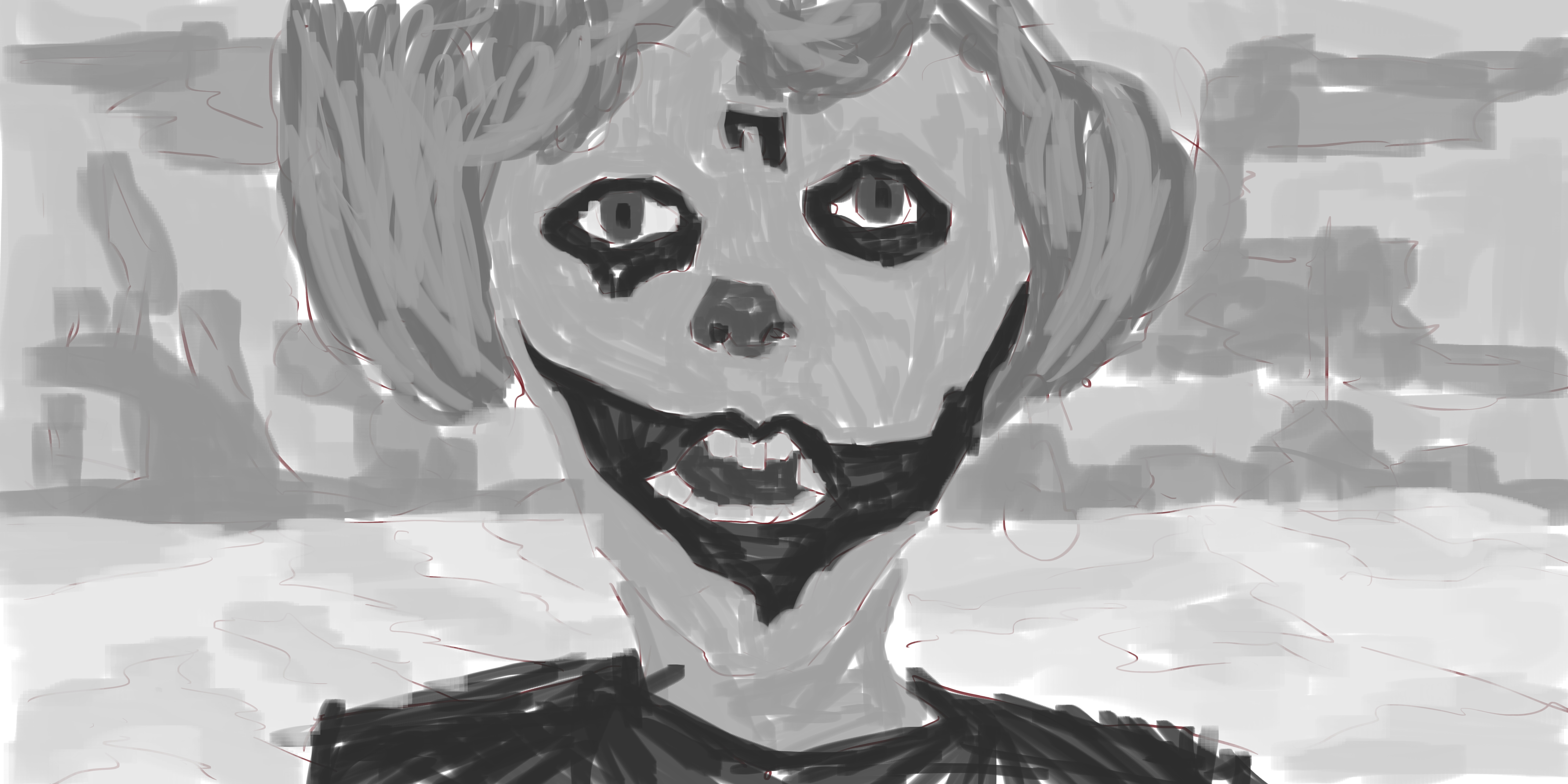
The reference for this involved a fake moustage stuck on this girls face. I made the moustage more realistive. She now no longer looks like a female. 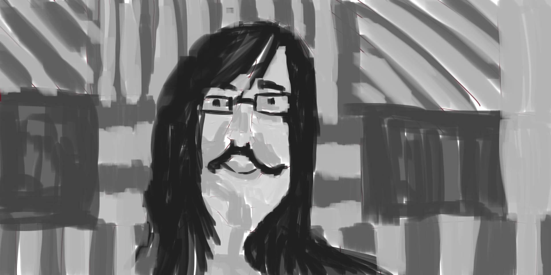 Tone added. Completely different effect Character is transformed. The mo could do with more tones. Background is ok but I feel other works have more happening in background.
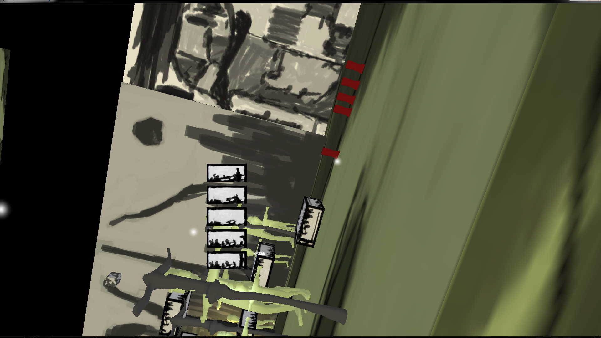
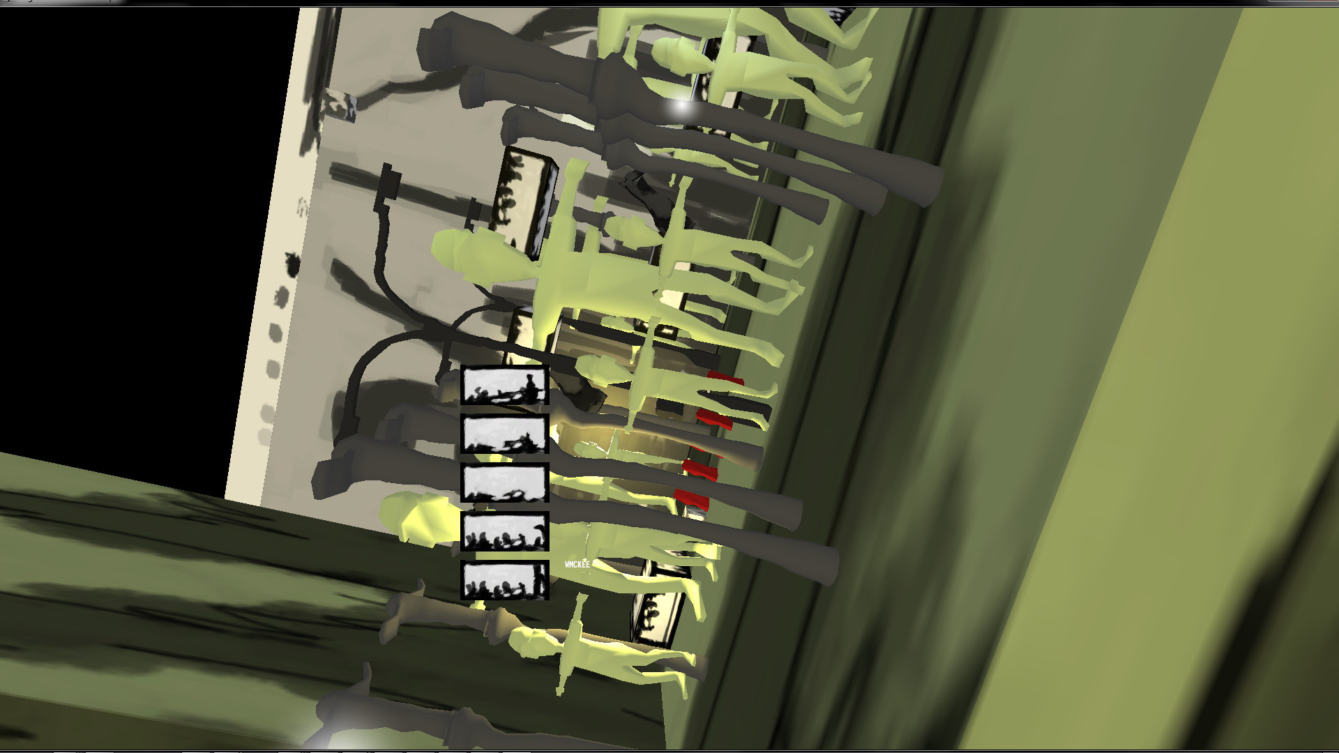
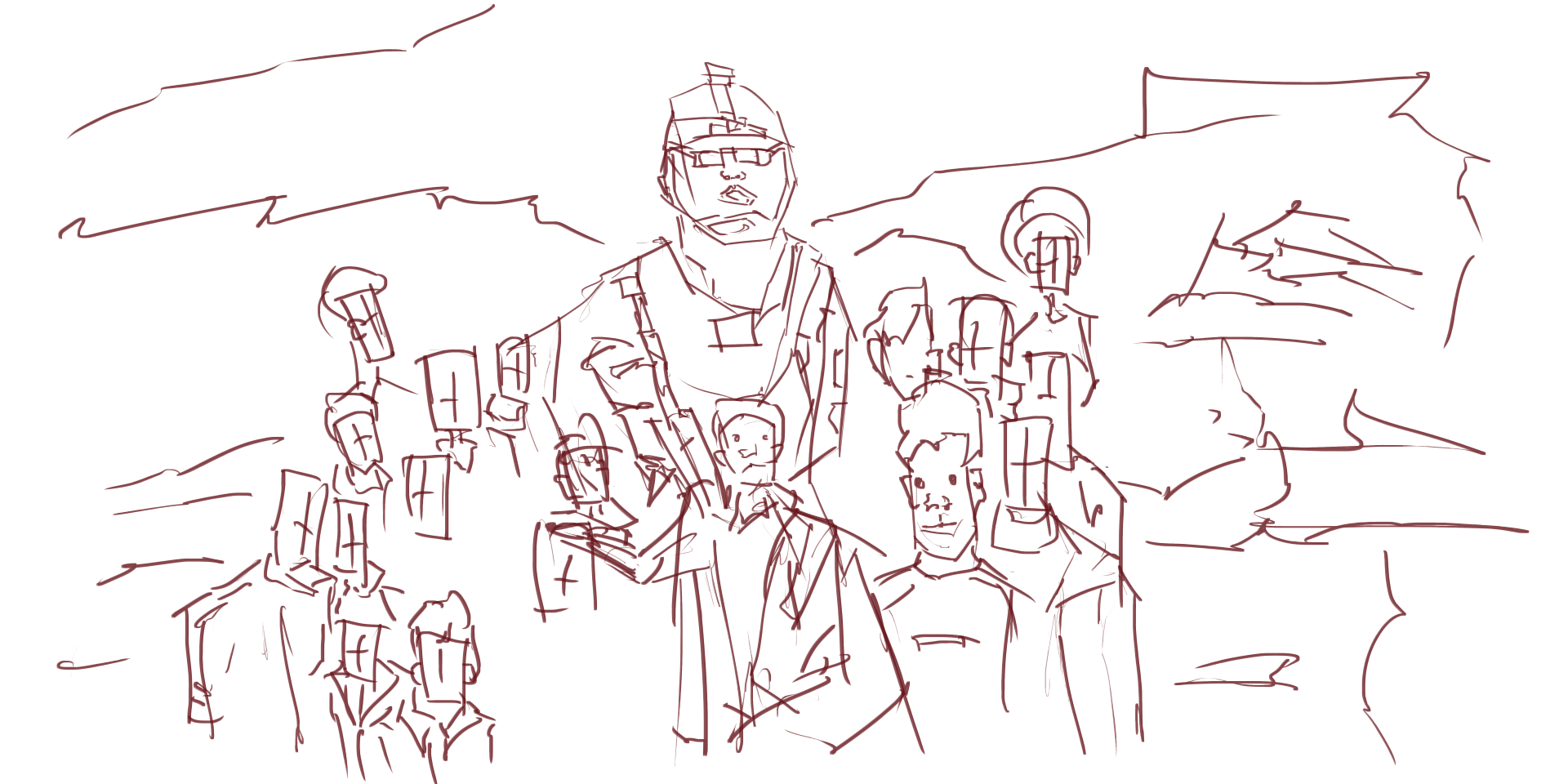 US Army. These are great to draw - real people. Many kids were standing around this man. Gun was especially fun to draw. My work needs more guns!
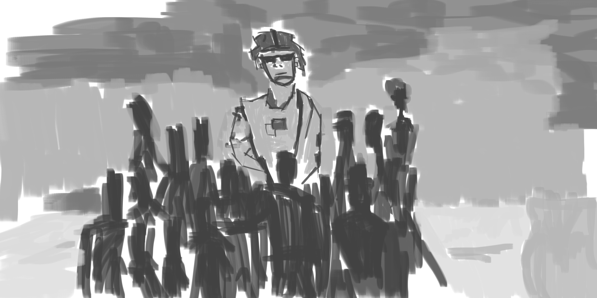 Tone added. Kids transformed in tone - black silihote. I normally do this for my
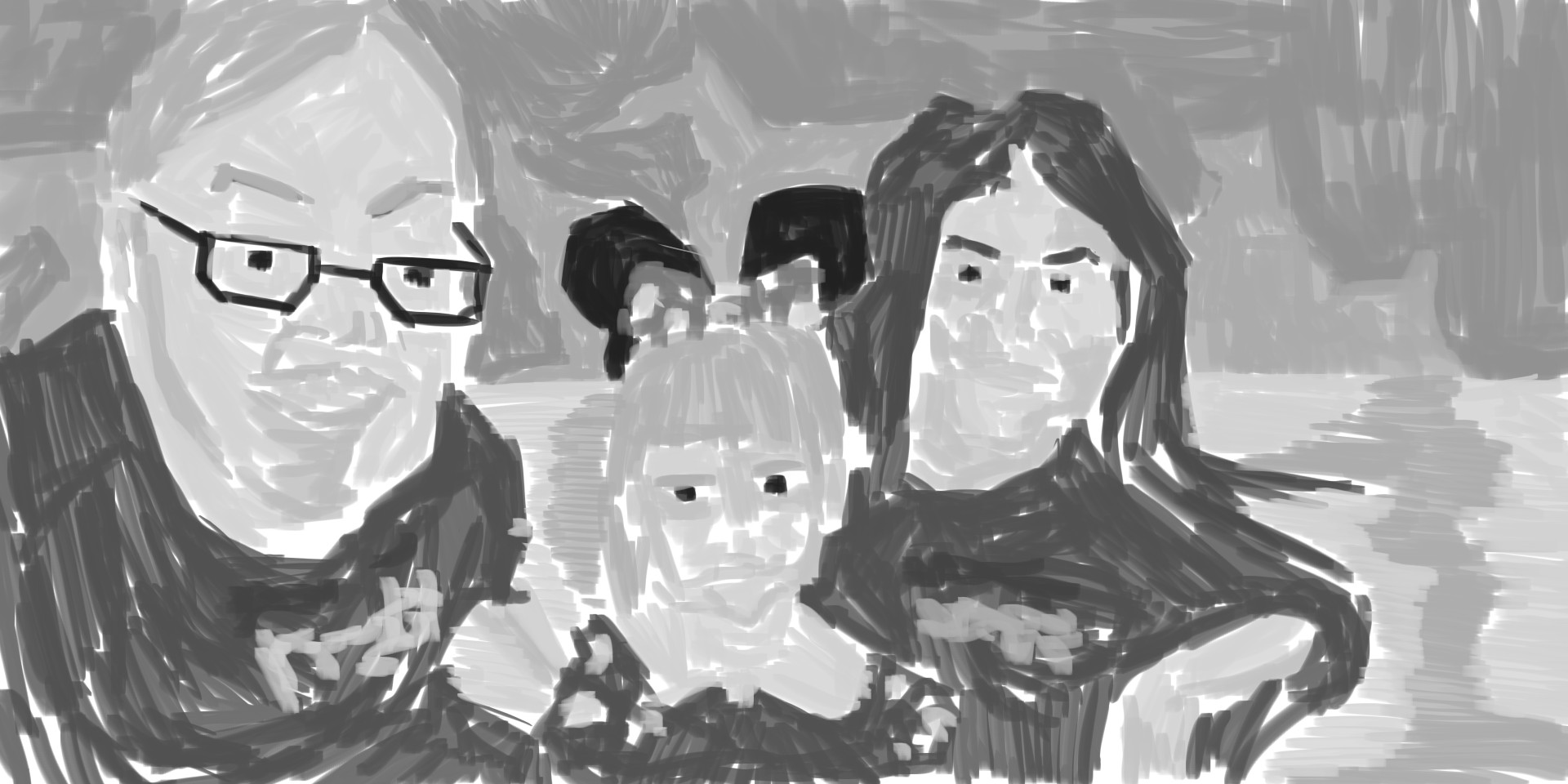
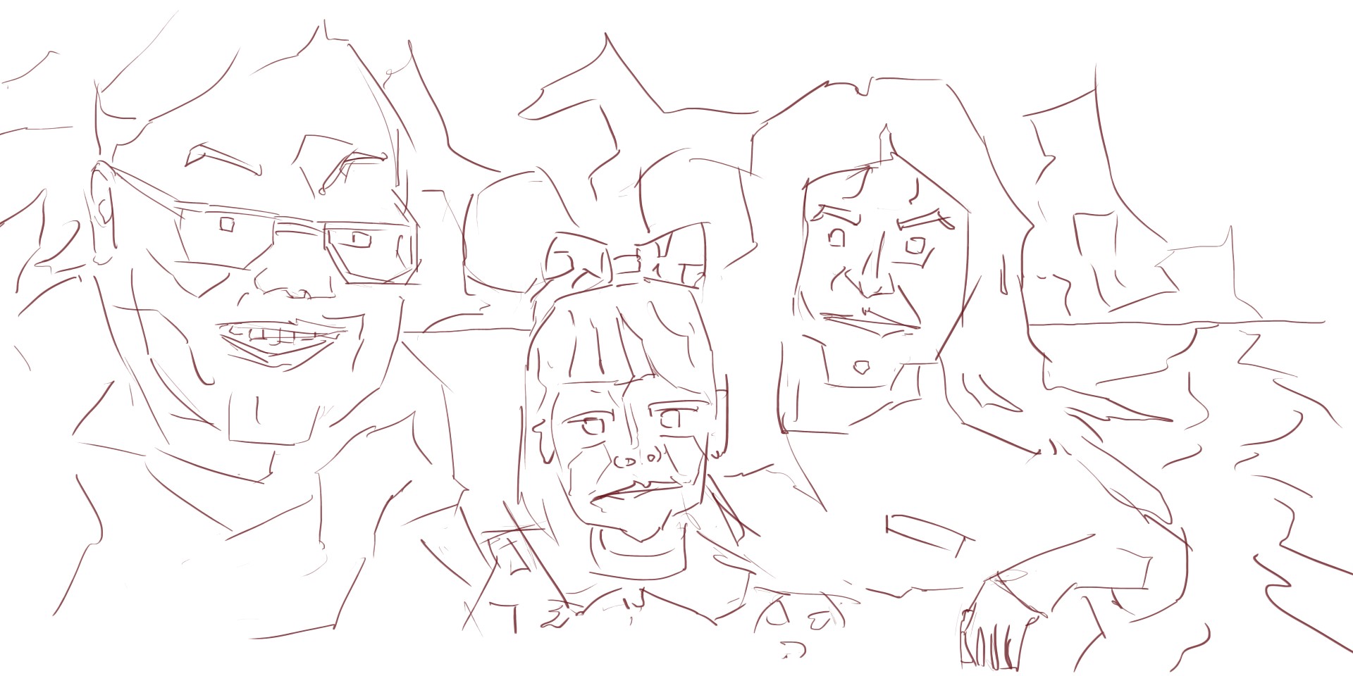
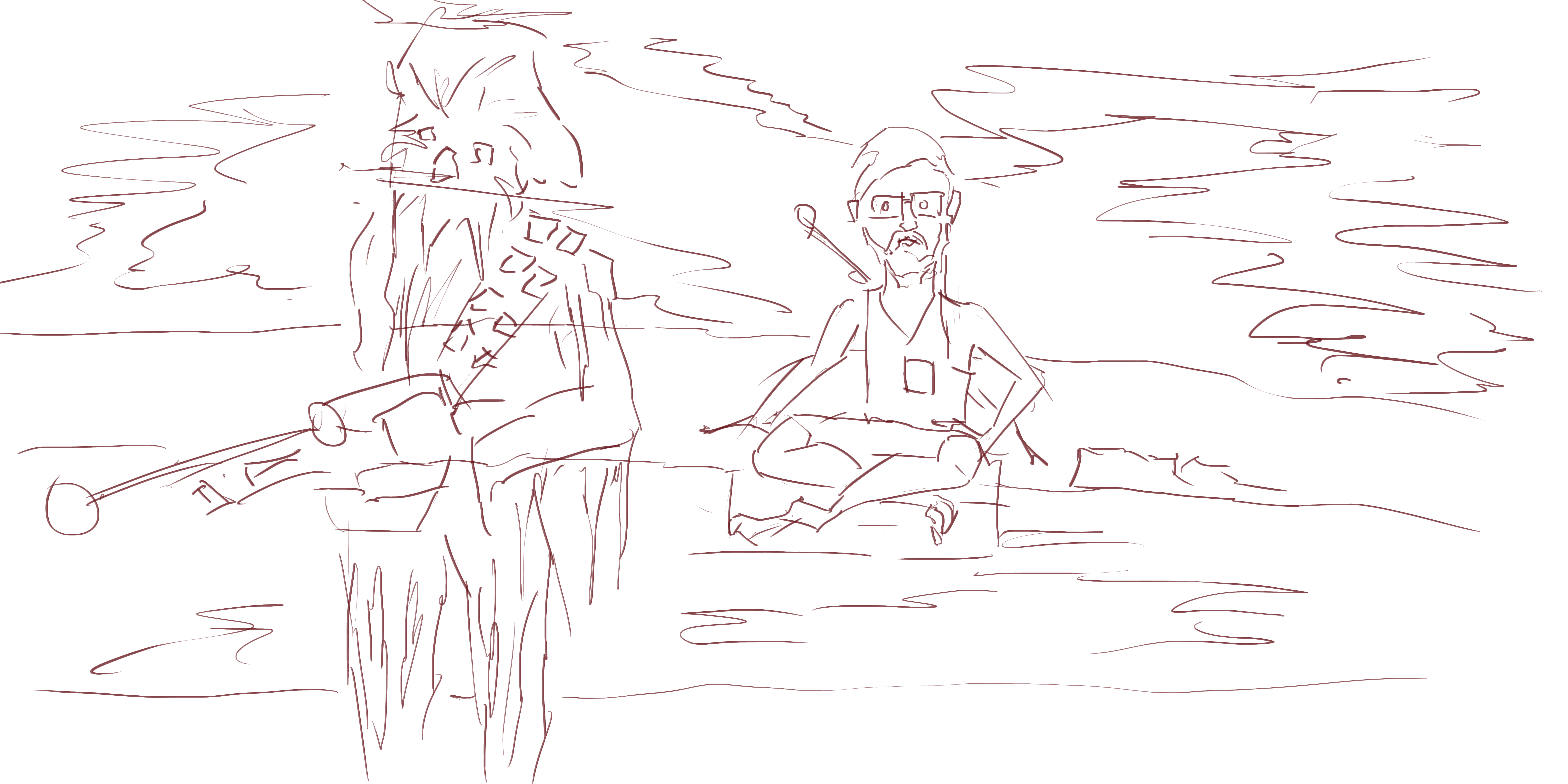
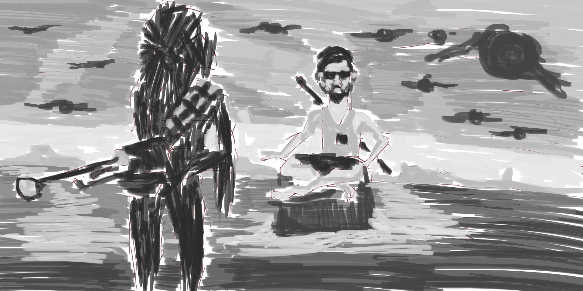
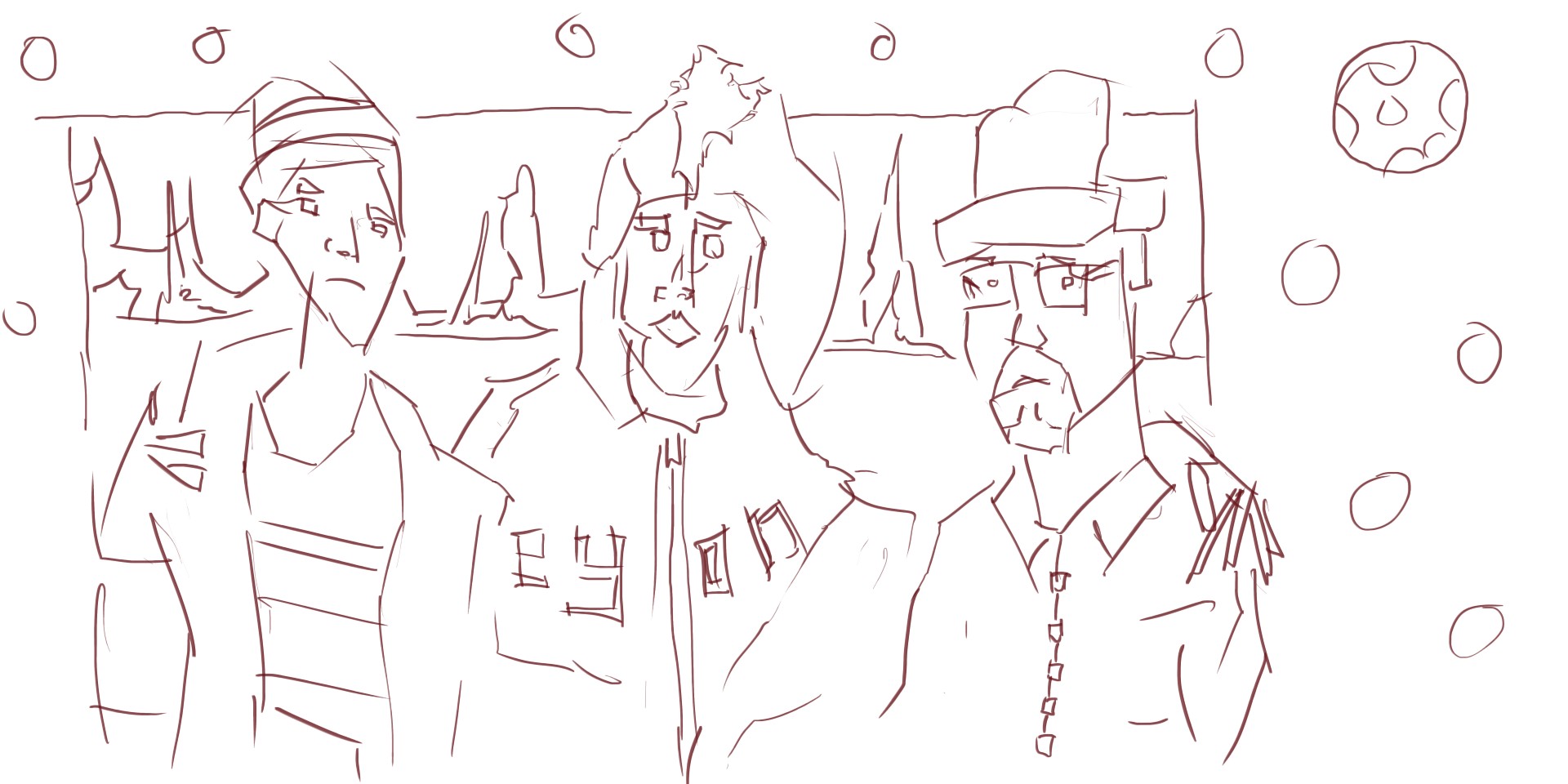
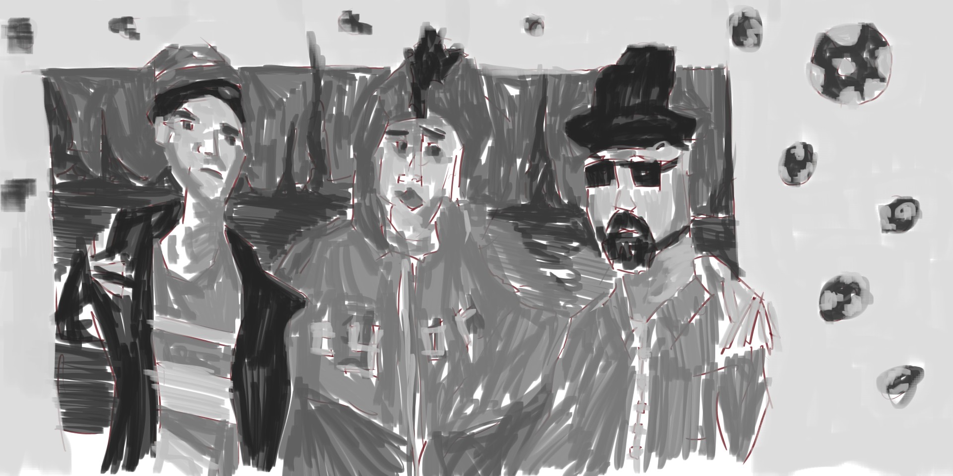
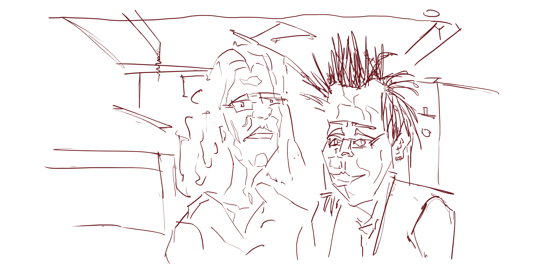 Always great to paint multiply people. This onces no different. I especially loved the hair on the man.
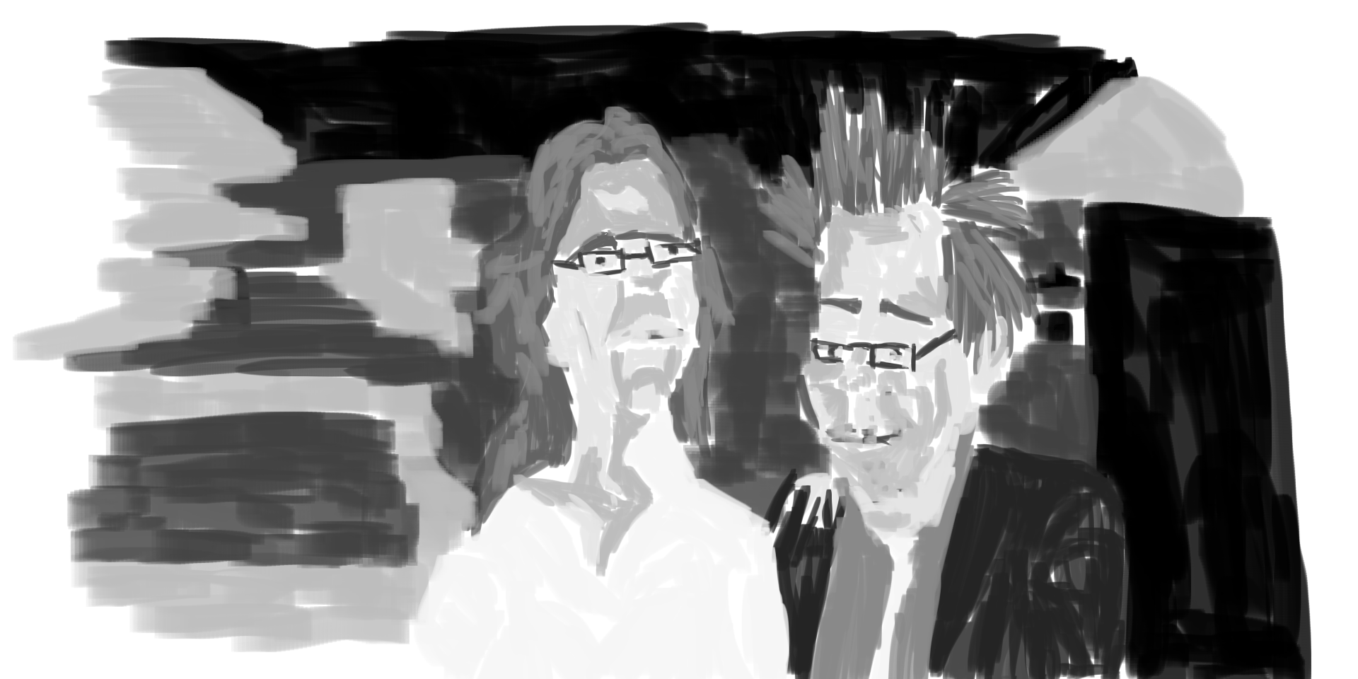
Tone. More time has gone into the guy with his shirt complete, the girl looks unfinished. I should of covered her top with a dark. In the background I have some basic shapes happening. 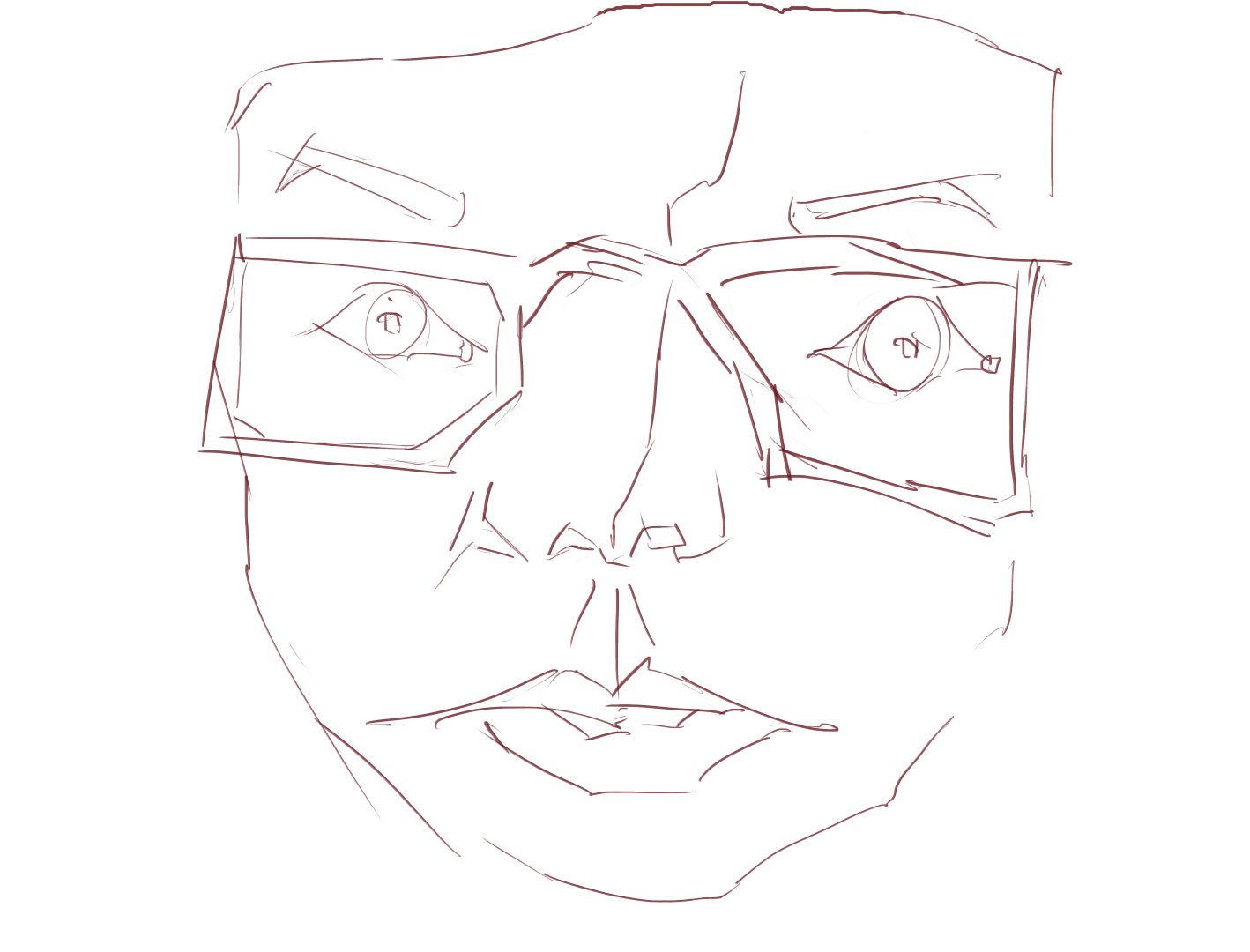
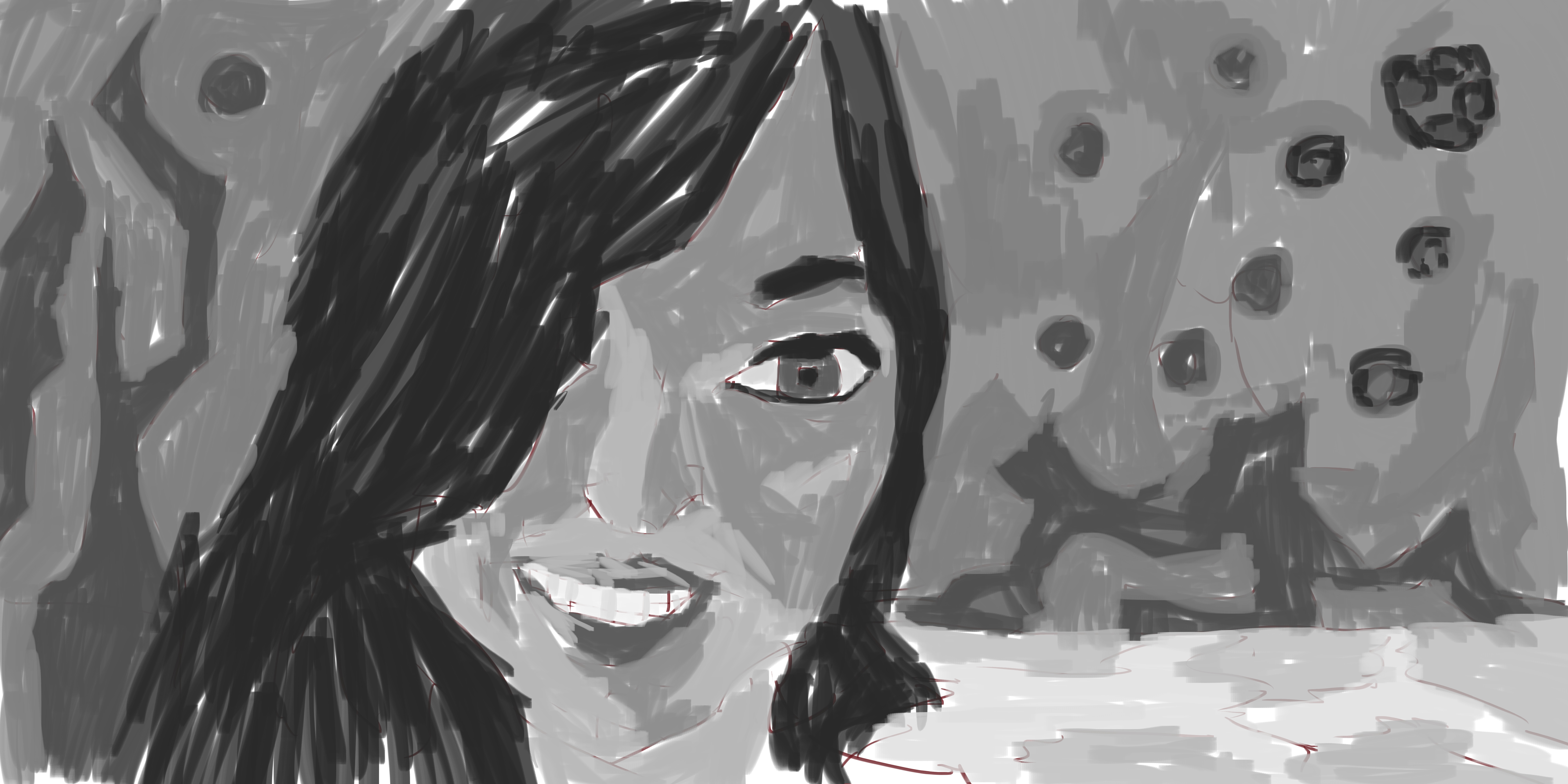
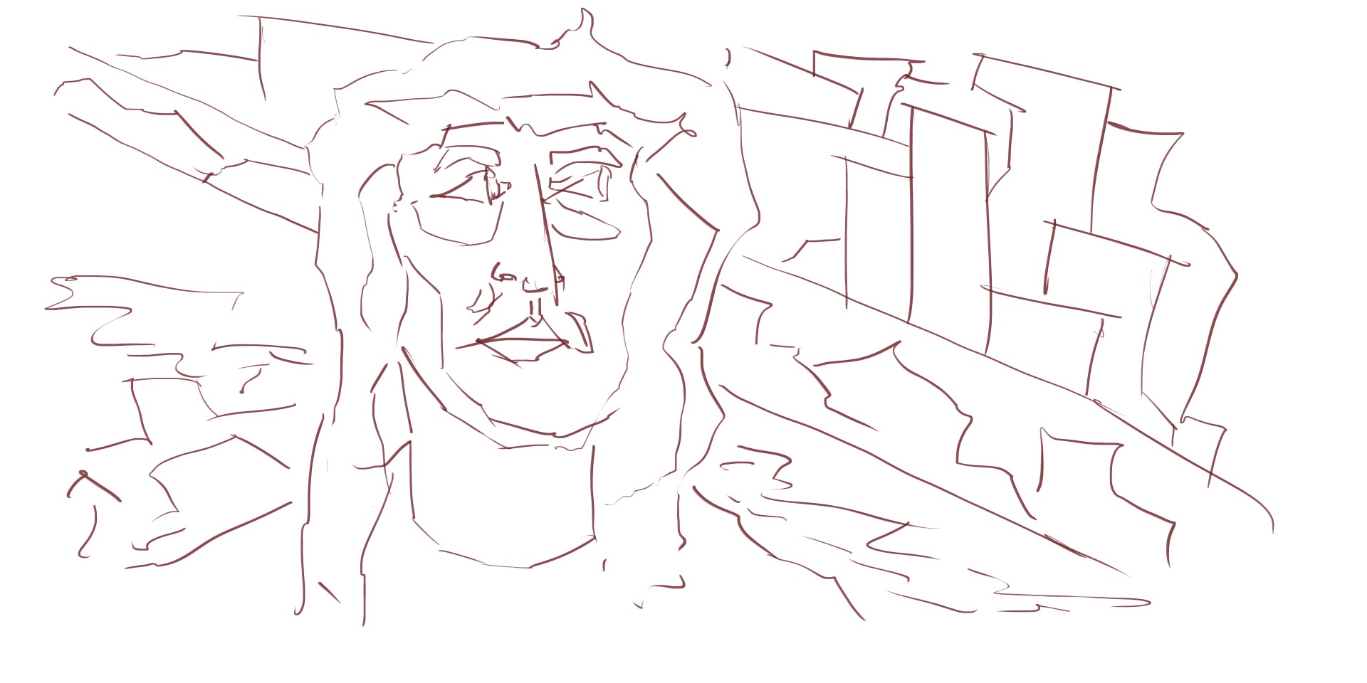
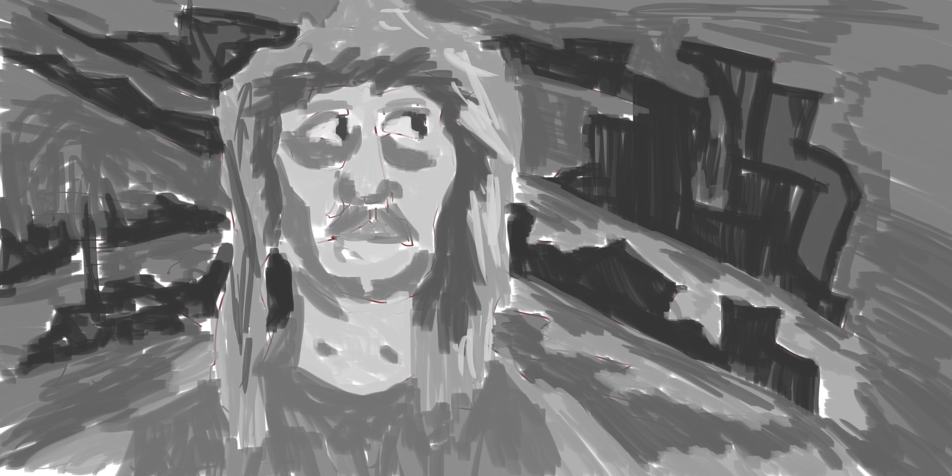
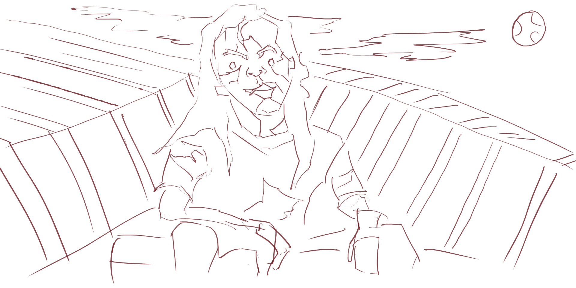
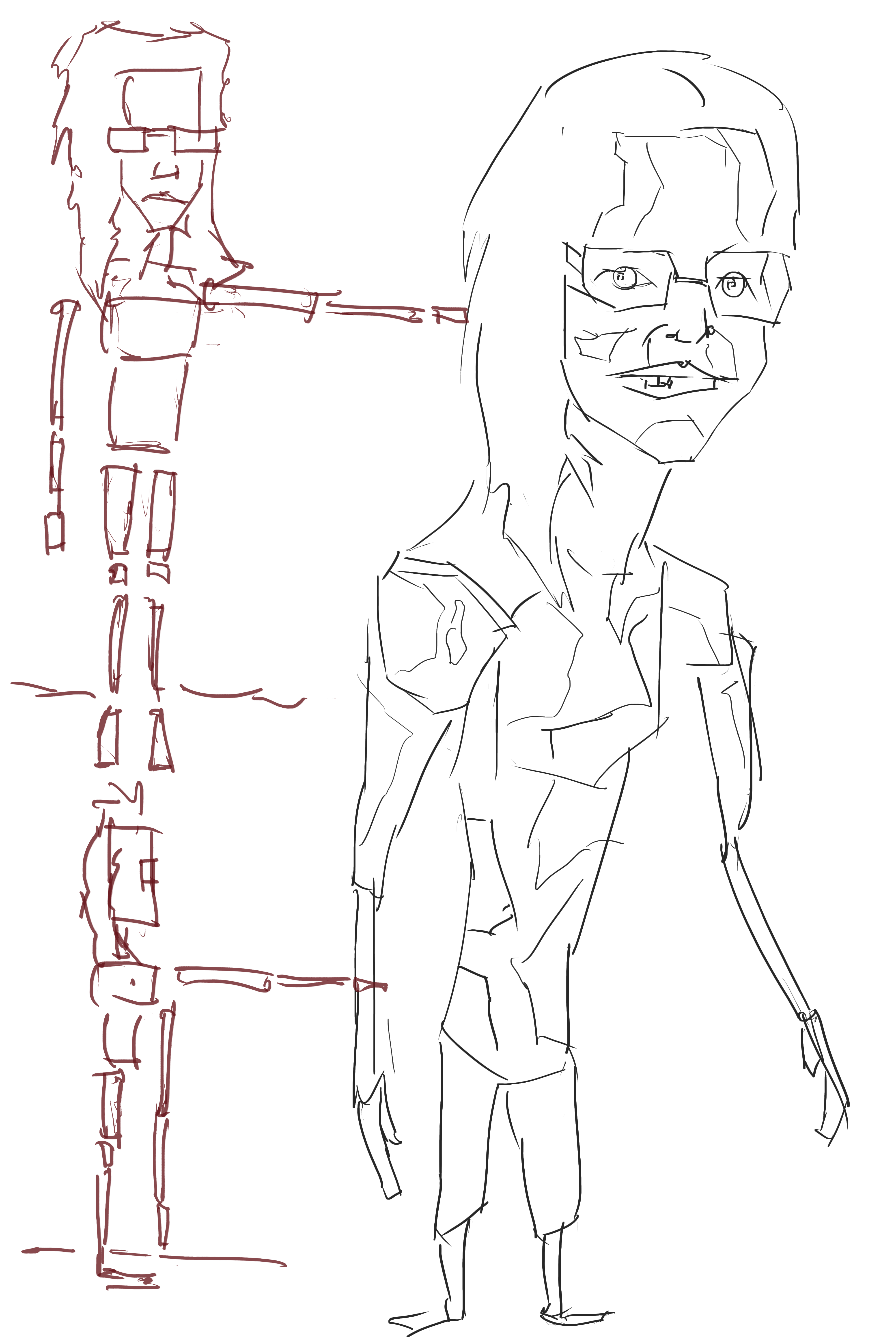
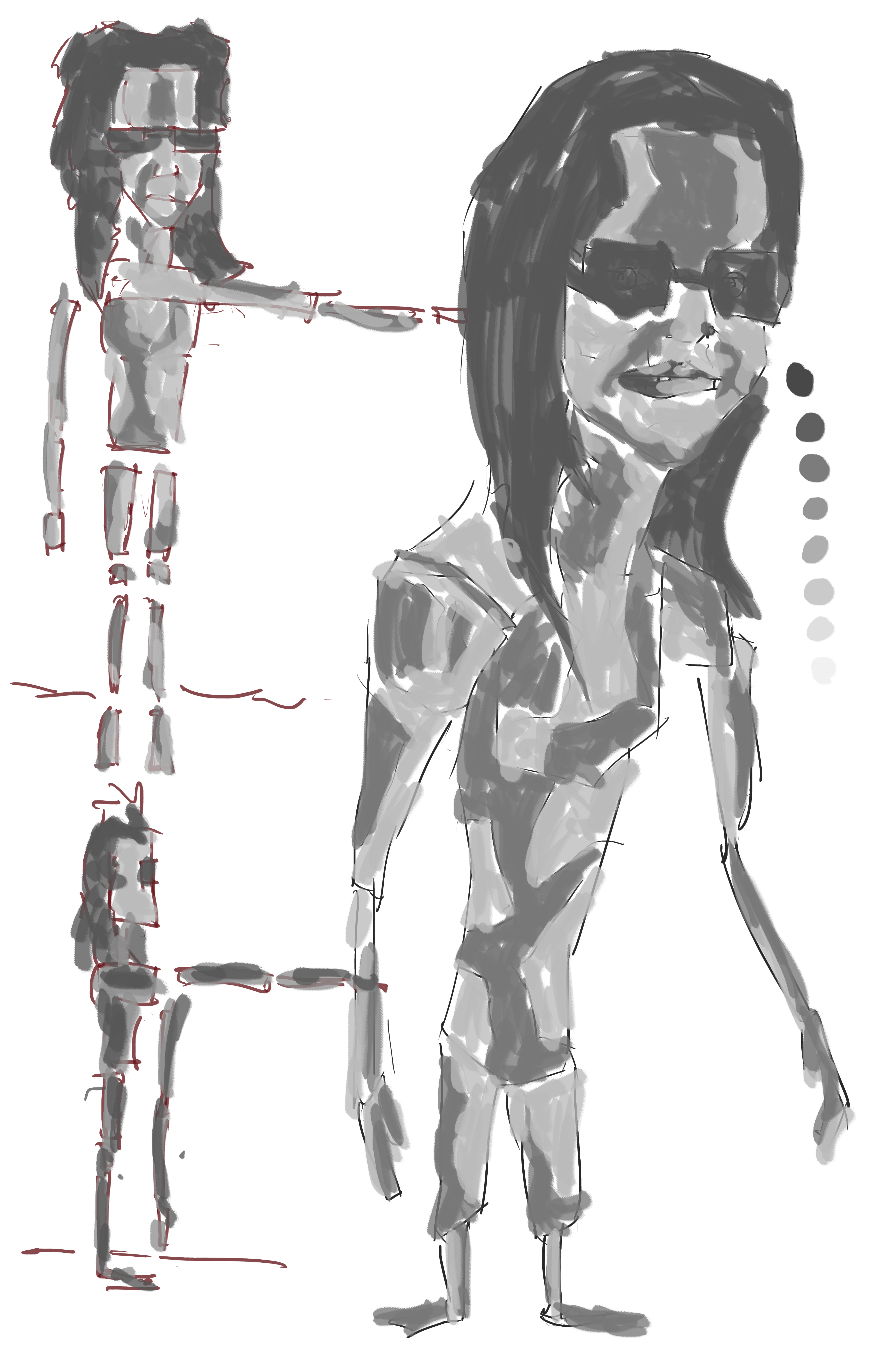
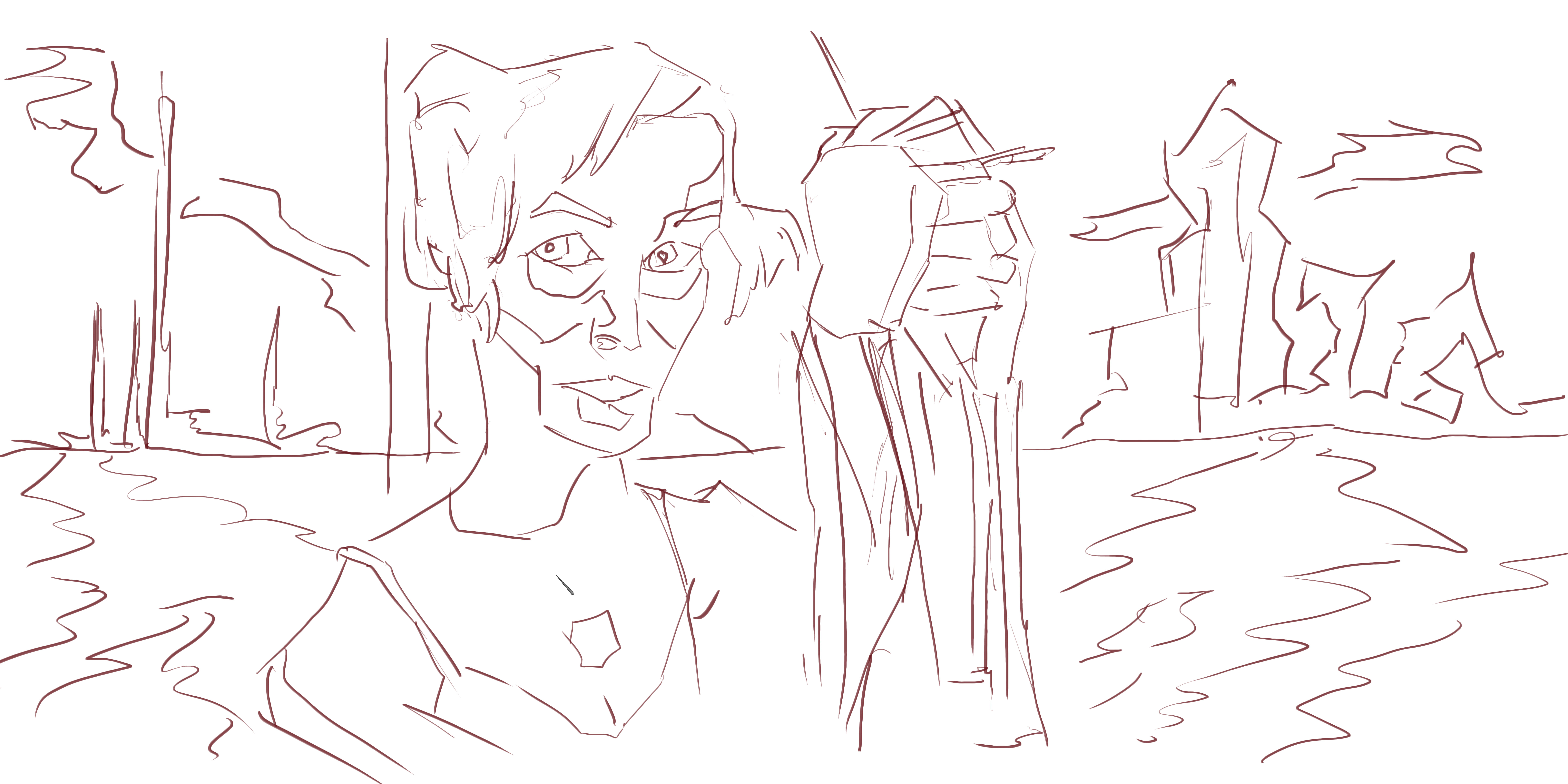 Interesting perspective happening with this. I struggled with the scale of her arms - but I’m happy with the portrait. I like the idea of breaking up the areas of tone during the line process. It makes it easy when coming into the tone process, and I don’t need to refer back so much. The line should be capturing detail with the tone being the 2nd defense in making sure everything is correct.
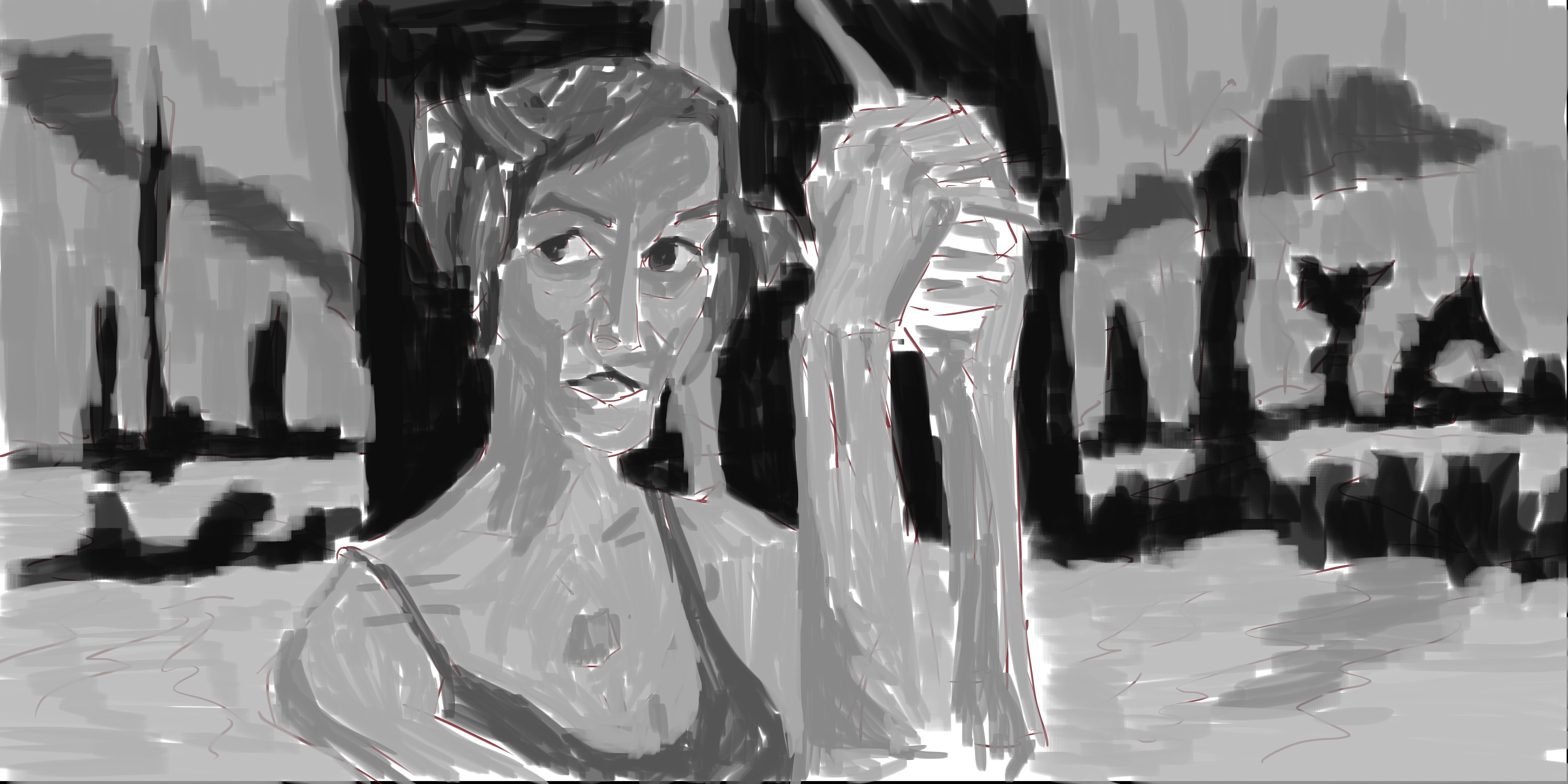
Read more →
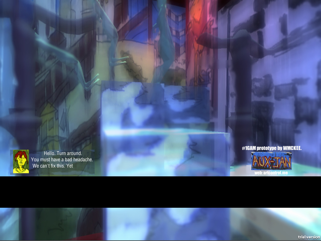
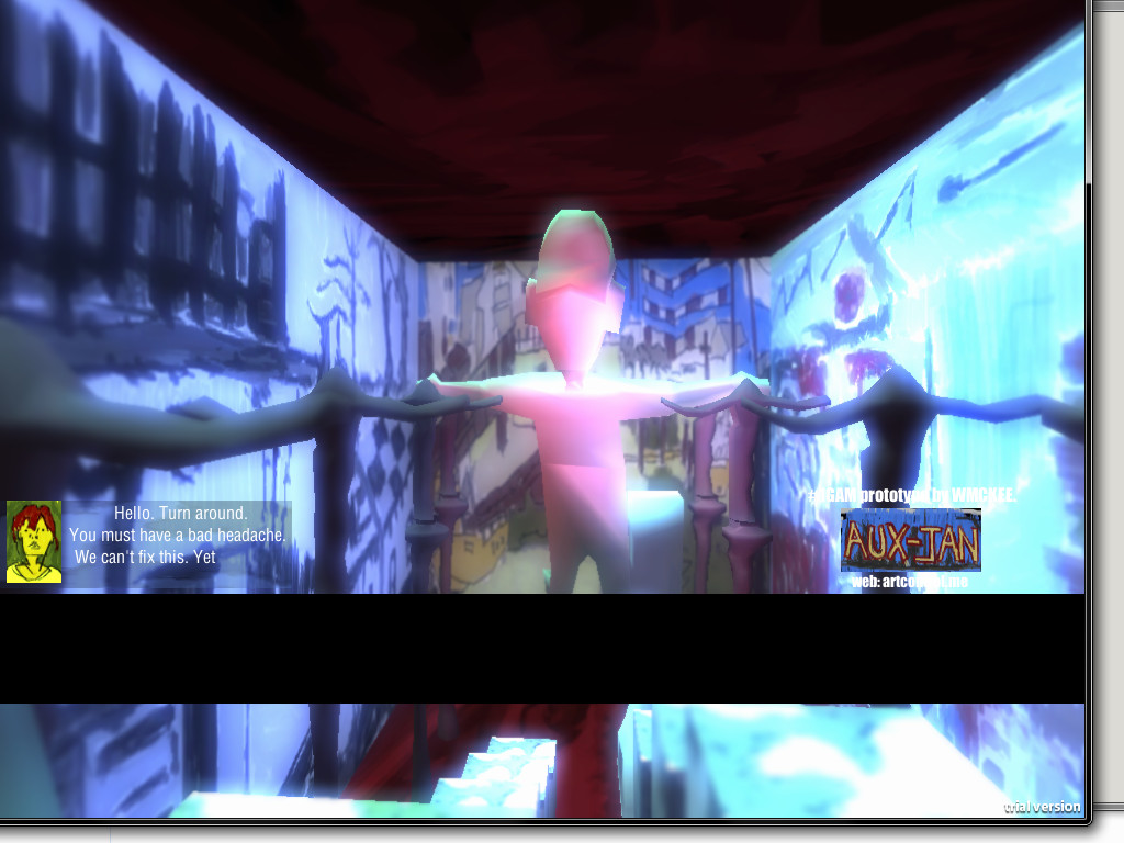
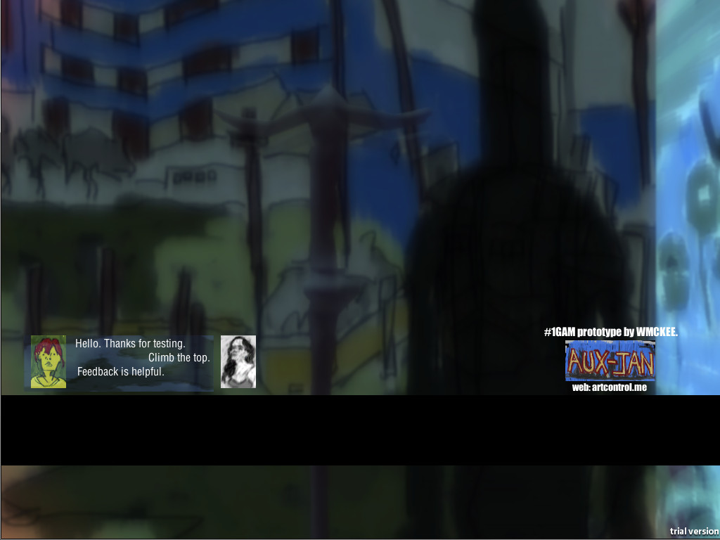
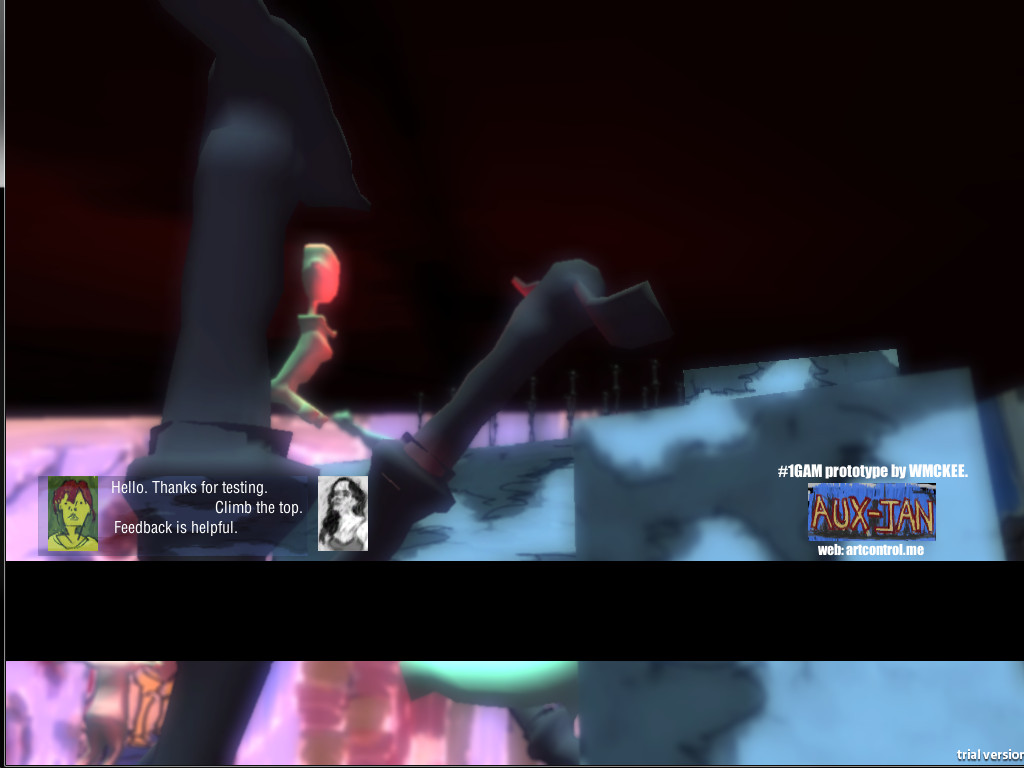
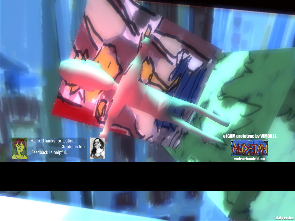
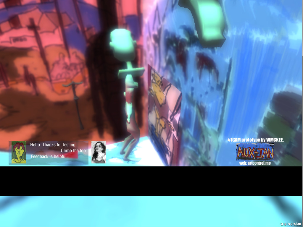
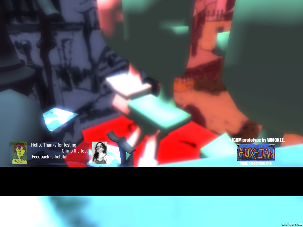
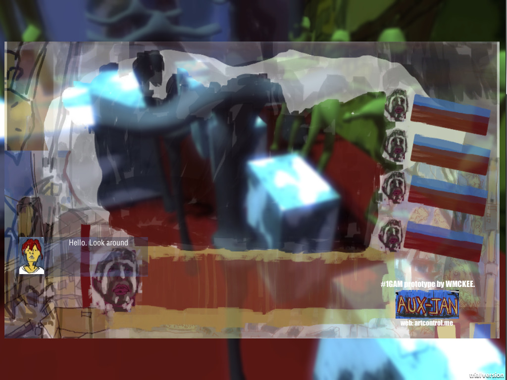
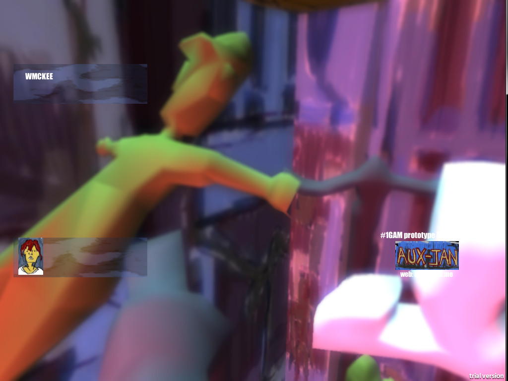
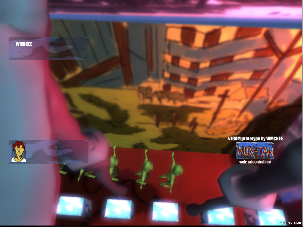
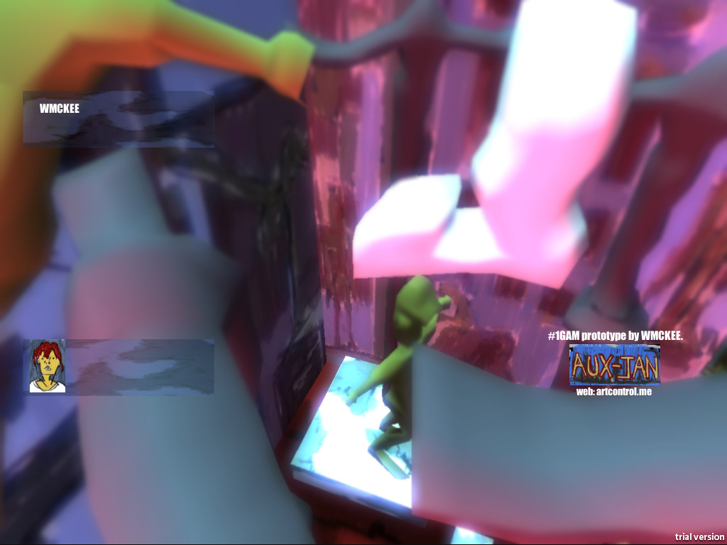
Another build.
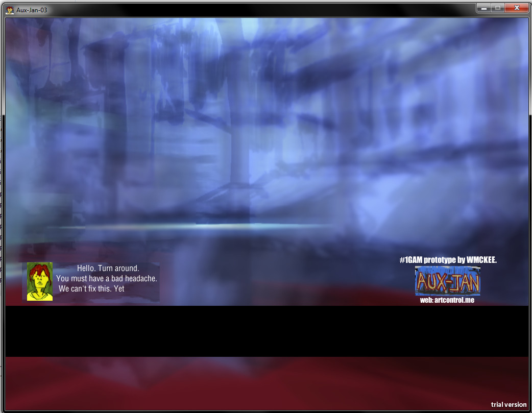
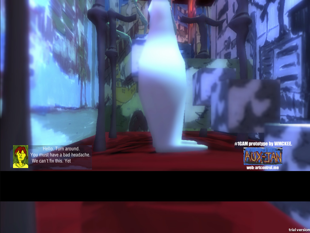
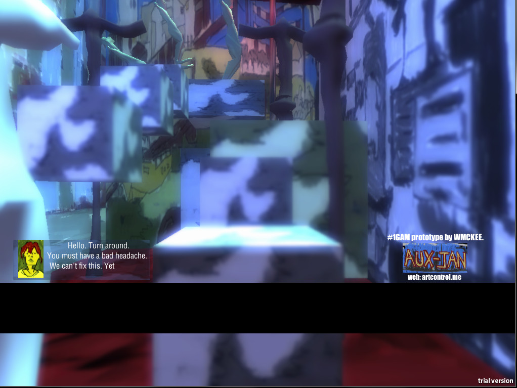
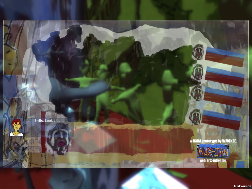
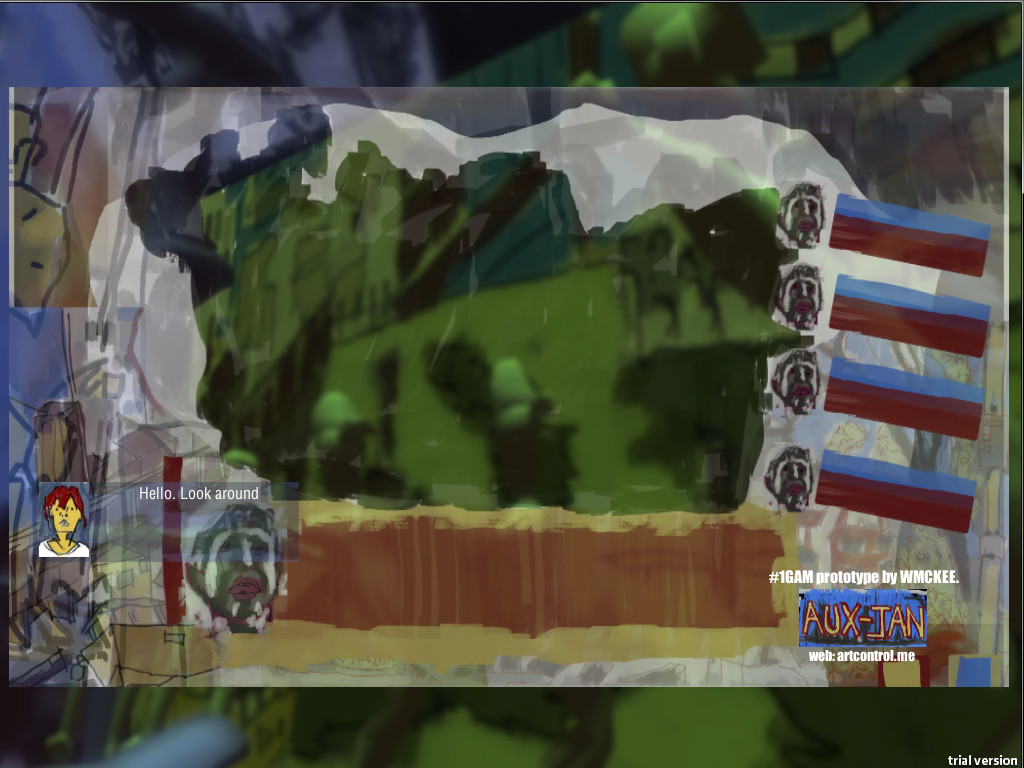
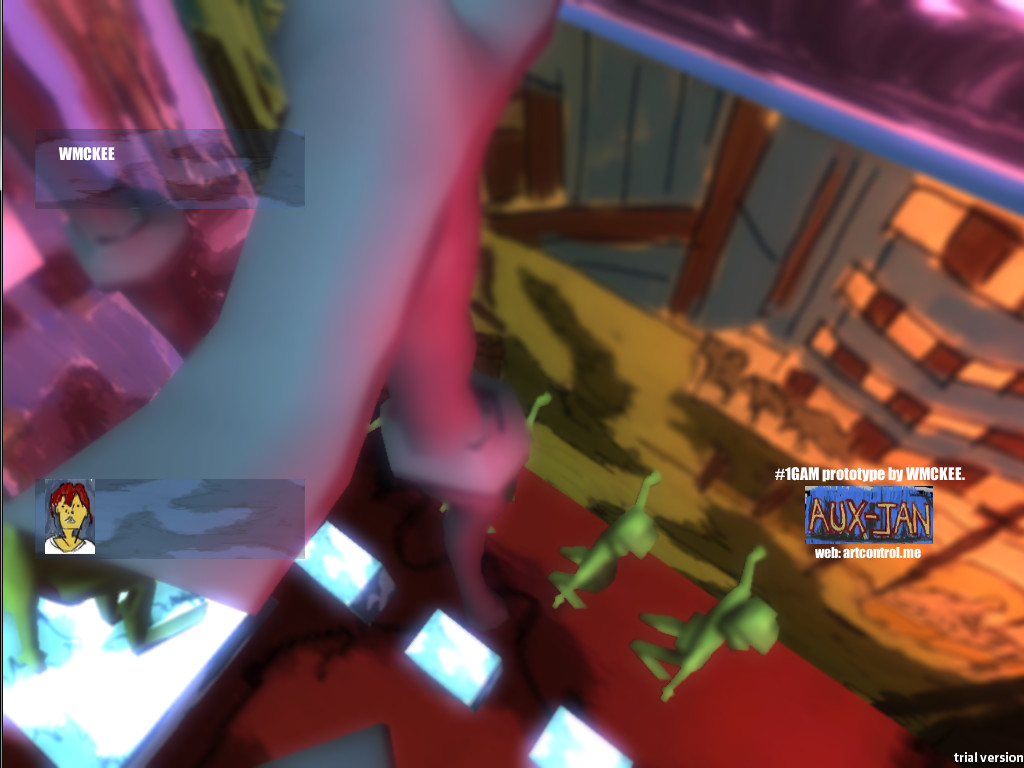
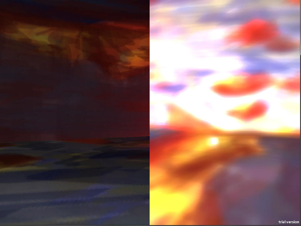
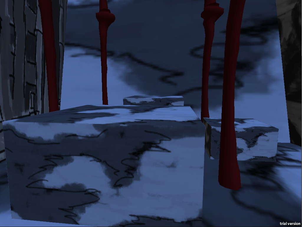
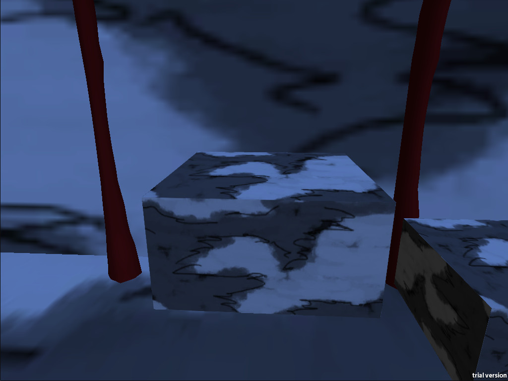
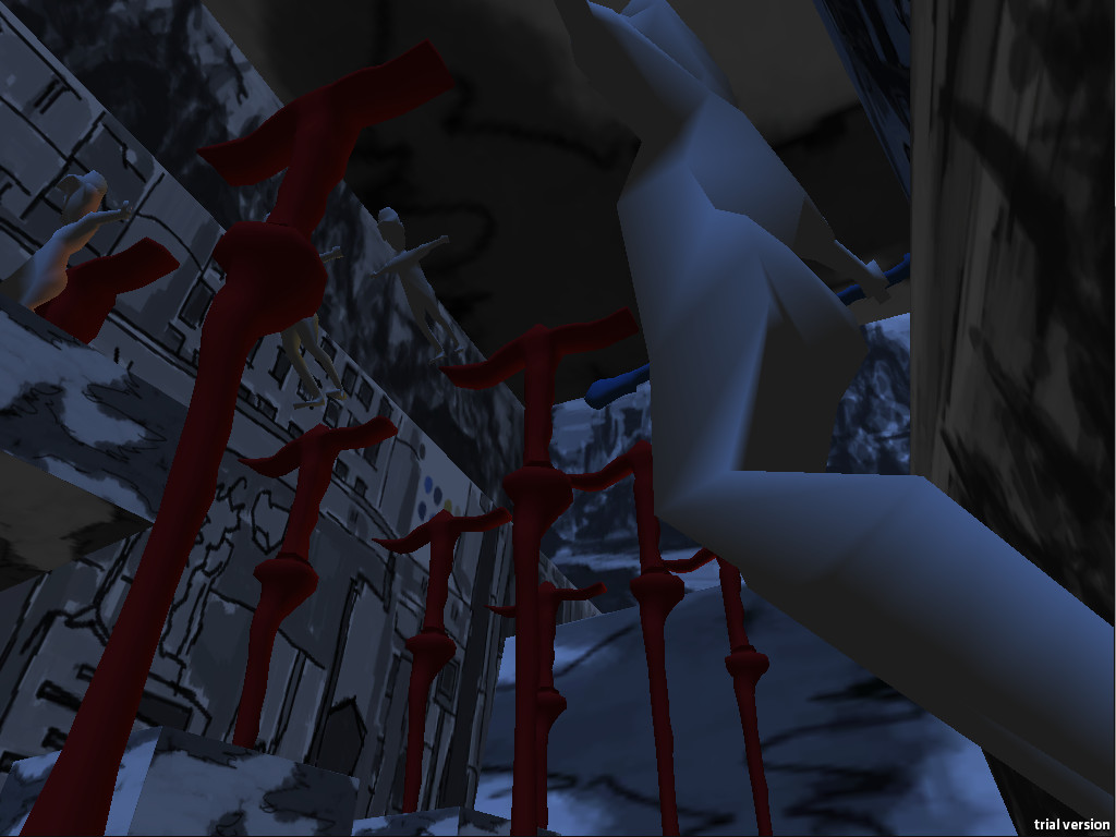
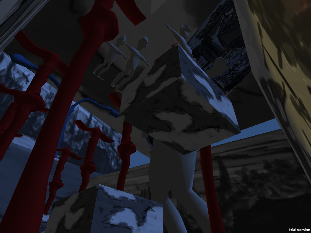
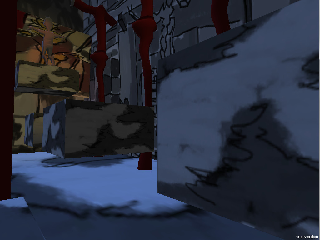
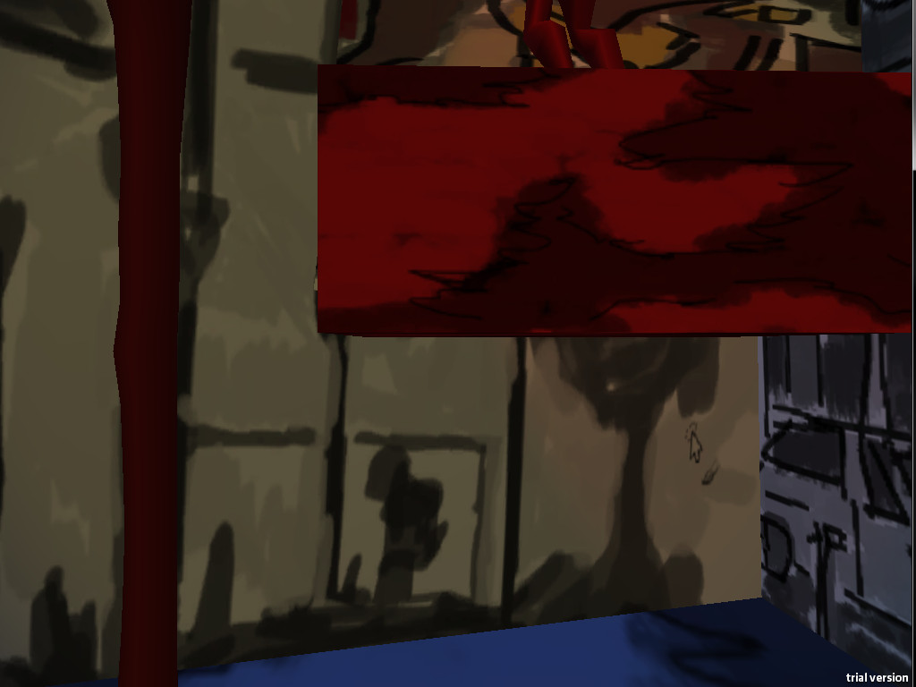
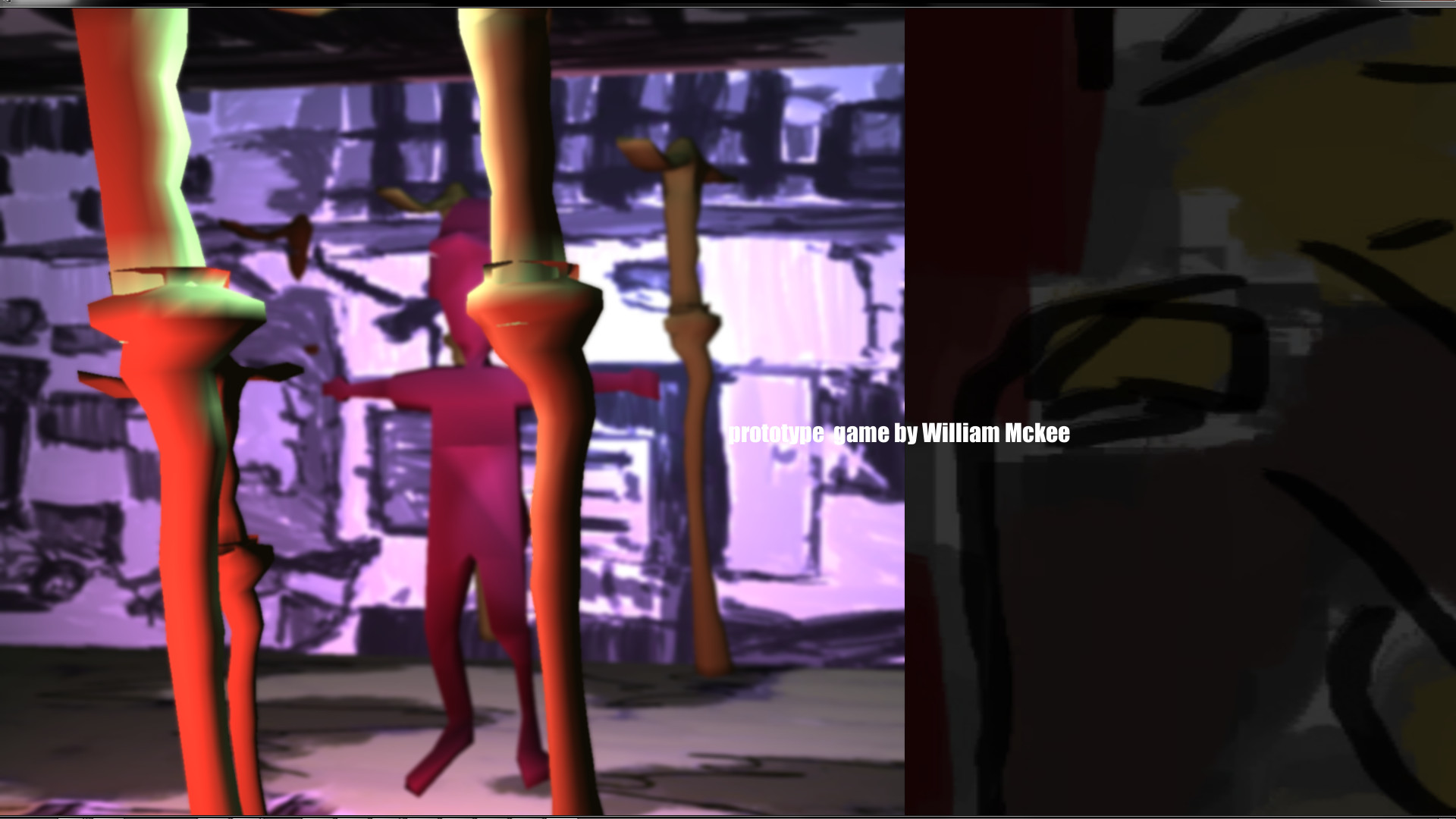
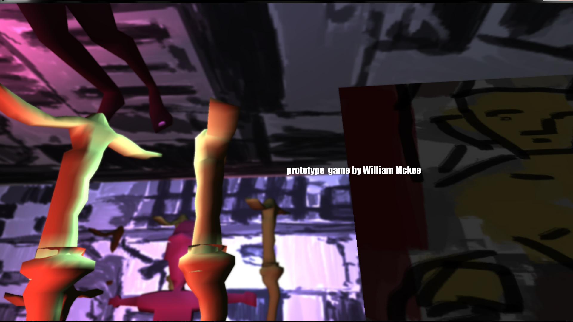
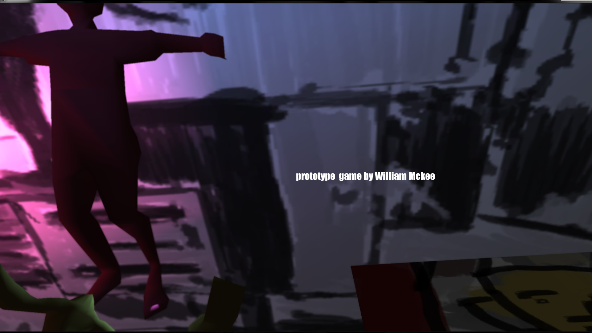
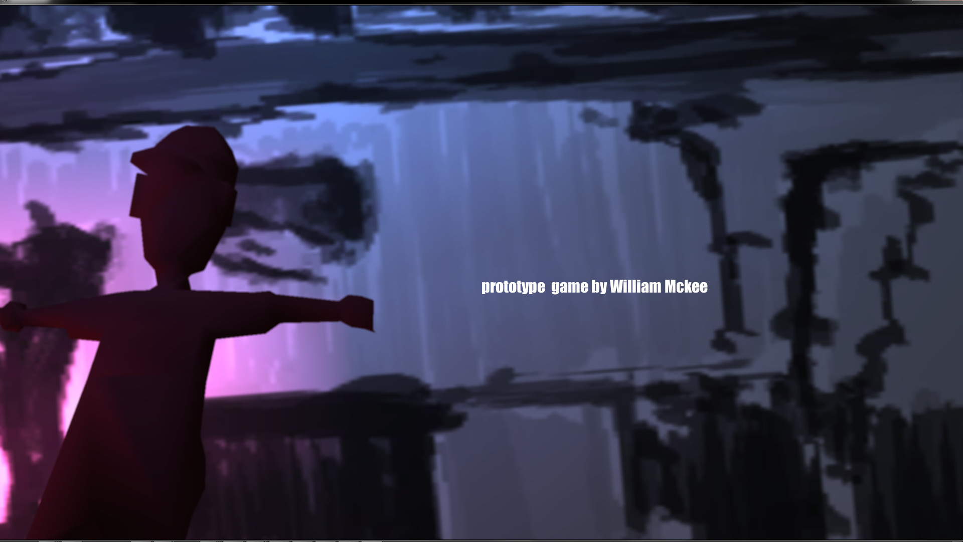
Platform-Feb-4
and bonus
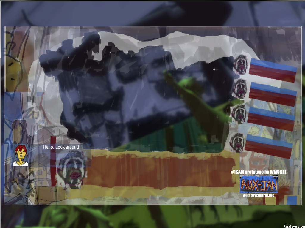
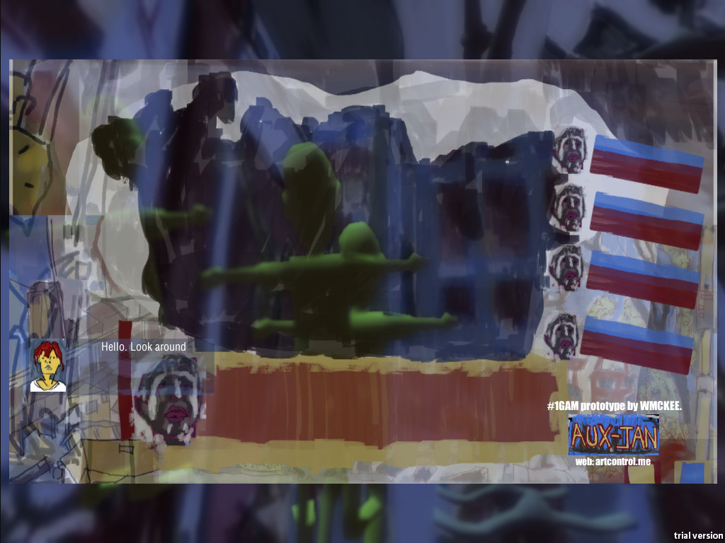
Platform-Feb-5
I’m also exporting off an Android build - id be interested in seeing how it looks/runs. I’ll also export a Windows/Mac/Linux build.
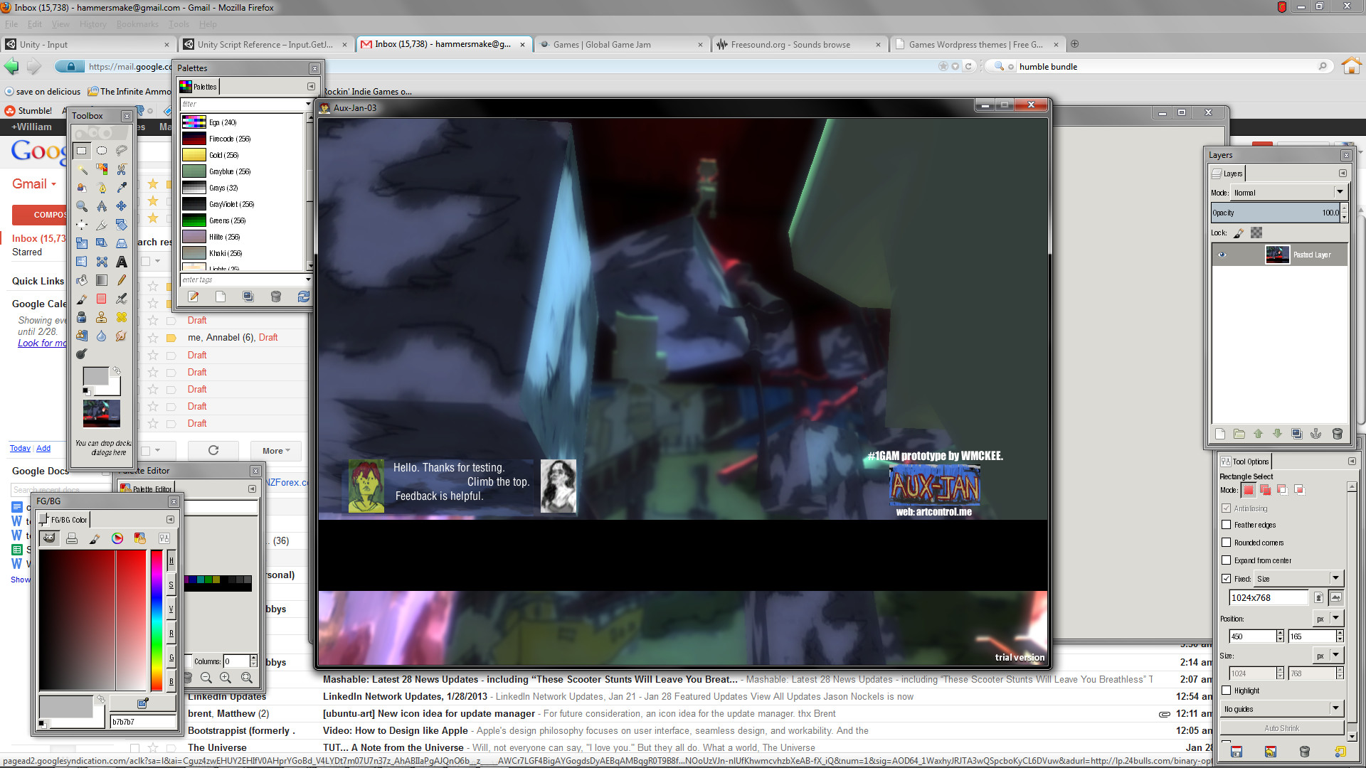
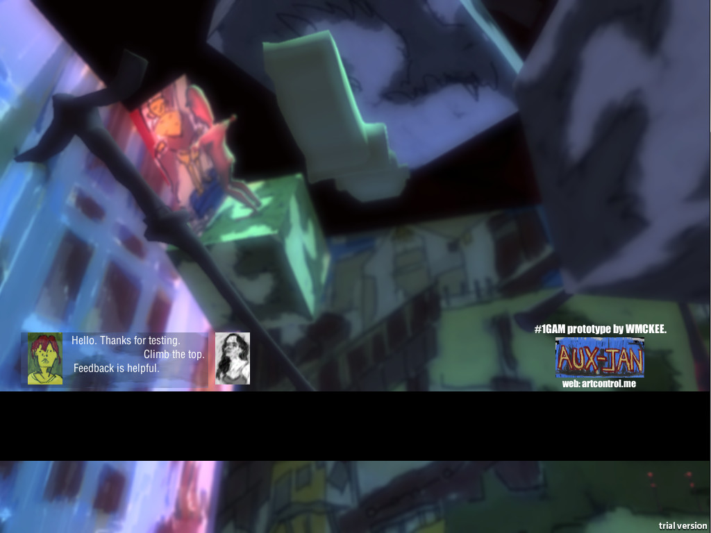
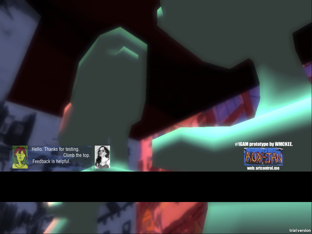
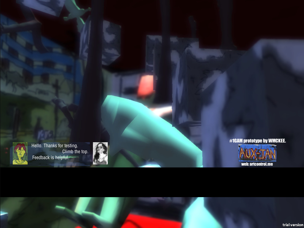
Playform-Feb is a playform adventure game from the game development site http://artcontrol.me
Developed solo by artist WMCKEE the game features
Read more →
I need to update this blog more often. I have many artworks to get uploaded. Maybe I need someone to write for me? If you are interested in any writing positions, please email me. I also need a theme makeover. Maybe connect the three blogs together. What other sites could I create?
Anyway, here is a painting I did before I left to Hamilton:
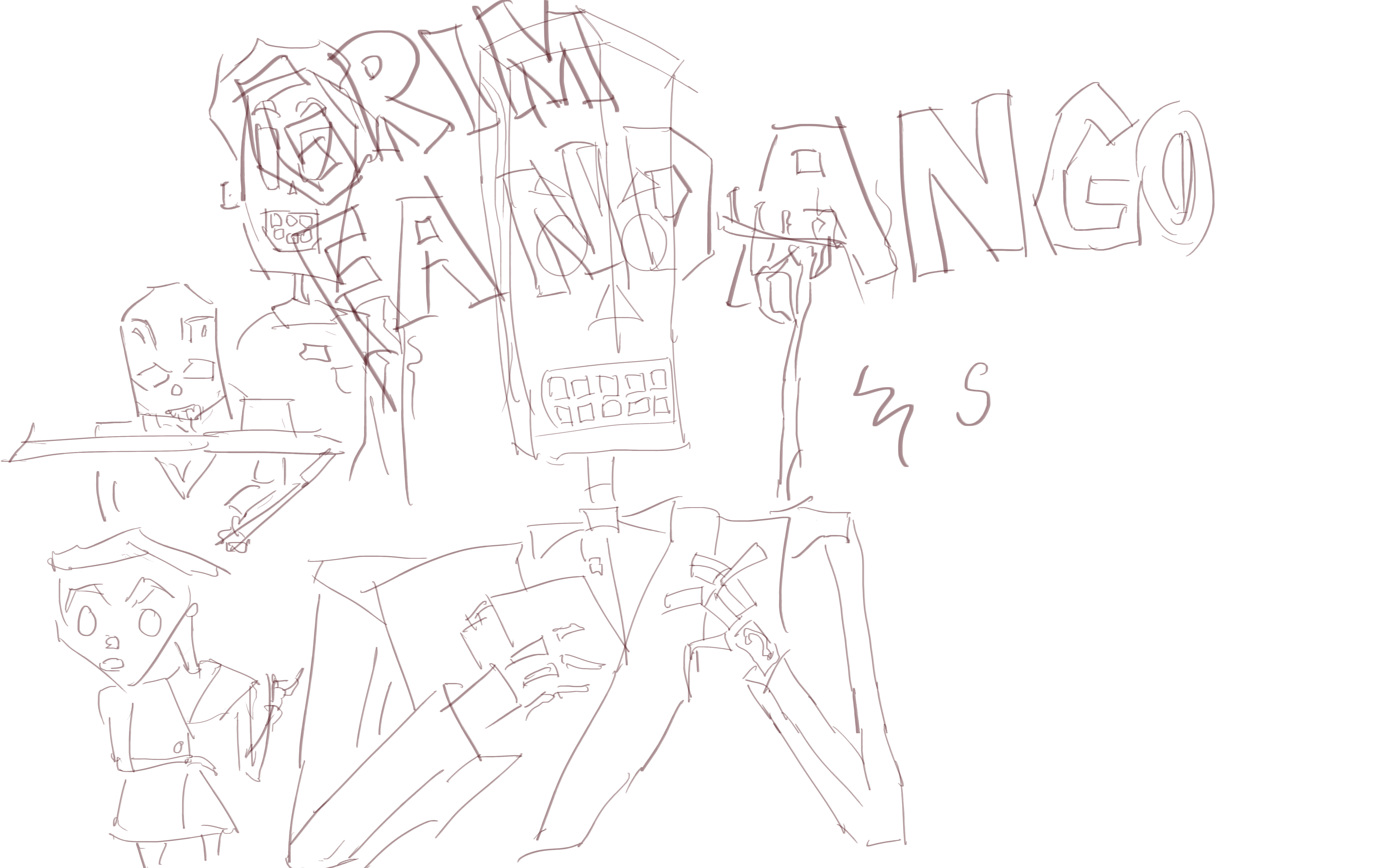 Another game related shot - this time Grim Fandango. I took some design liberty with this work and rearranged items - and leaving some characters out. Type is always fun to paint. Maybe I’ll
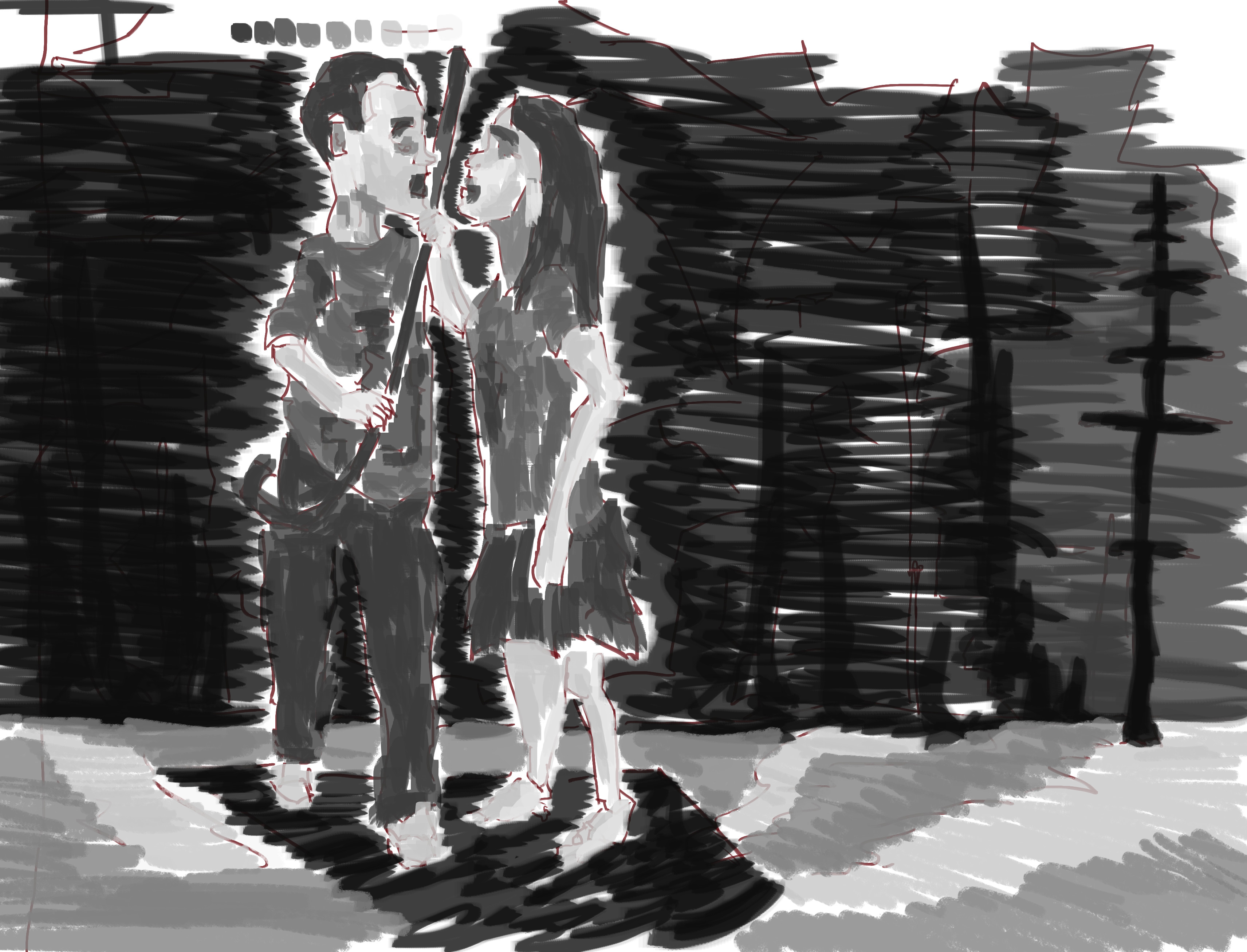
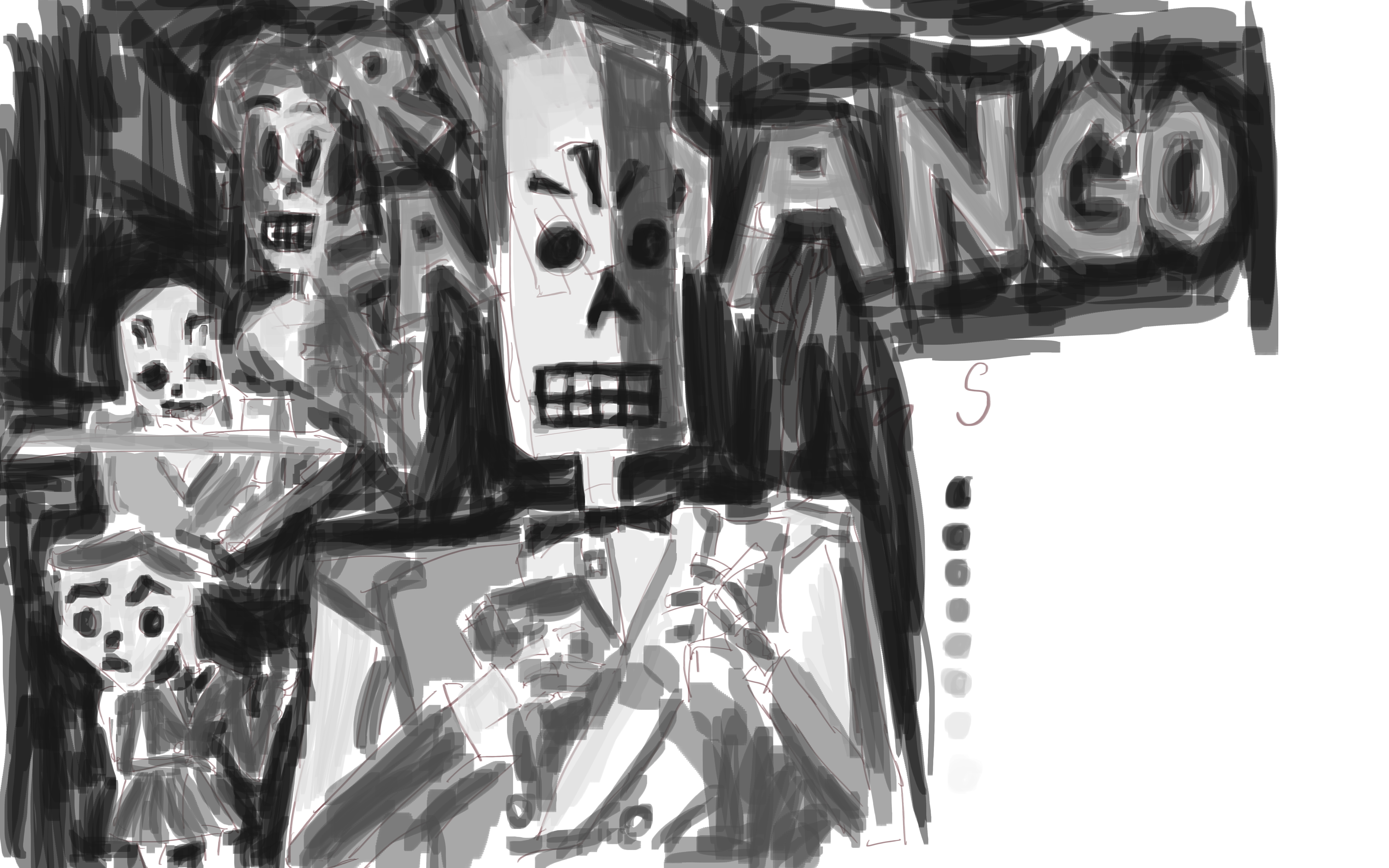 Tone. It’s interesting looking at this and comparing it to the work I just completed - my tones have really improved since I’ve done this painting marathon.
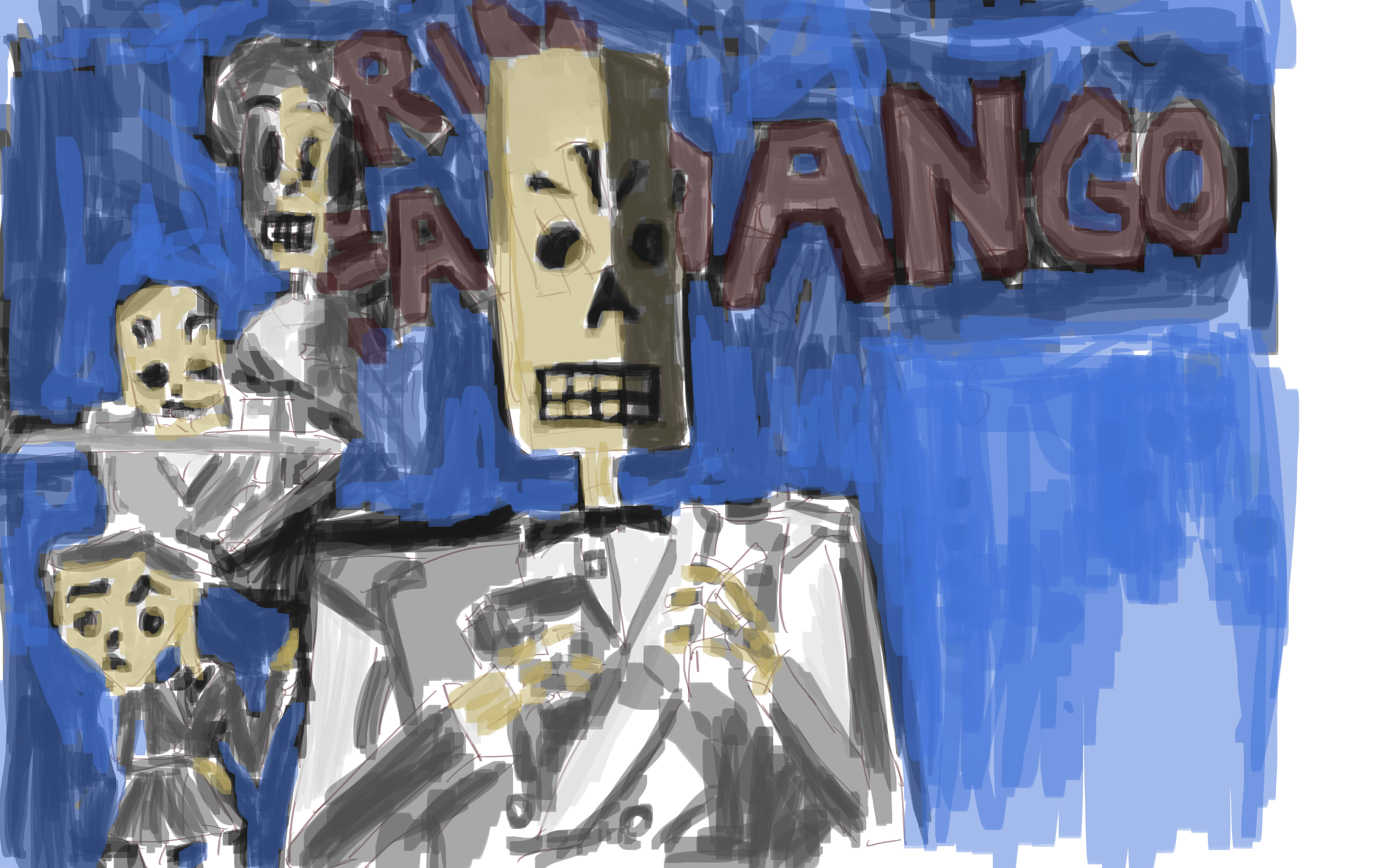 Color. I haven’t been working with color, instead focusing on graysale tones. Once I return to color I believe my tones will be stronger.
Anyway, I hope you like the painting. Till next time - 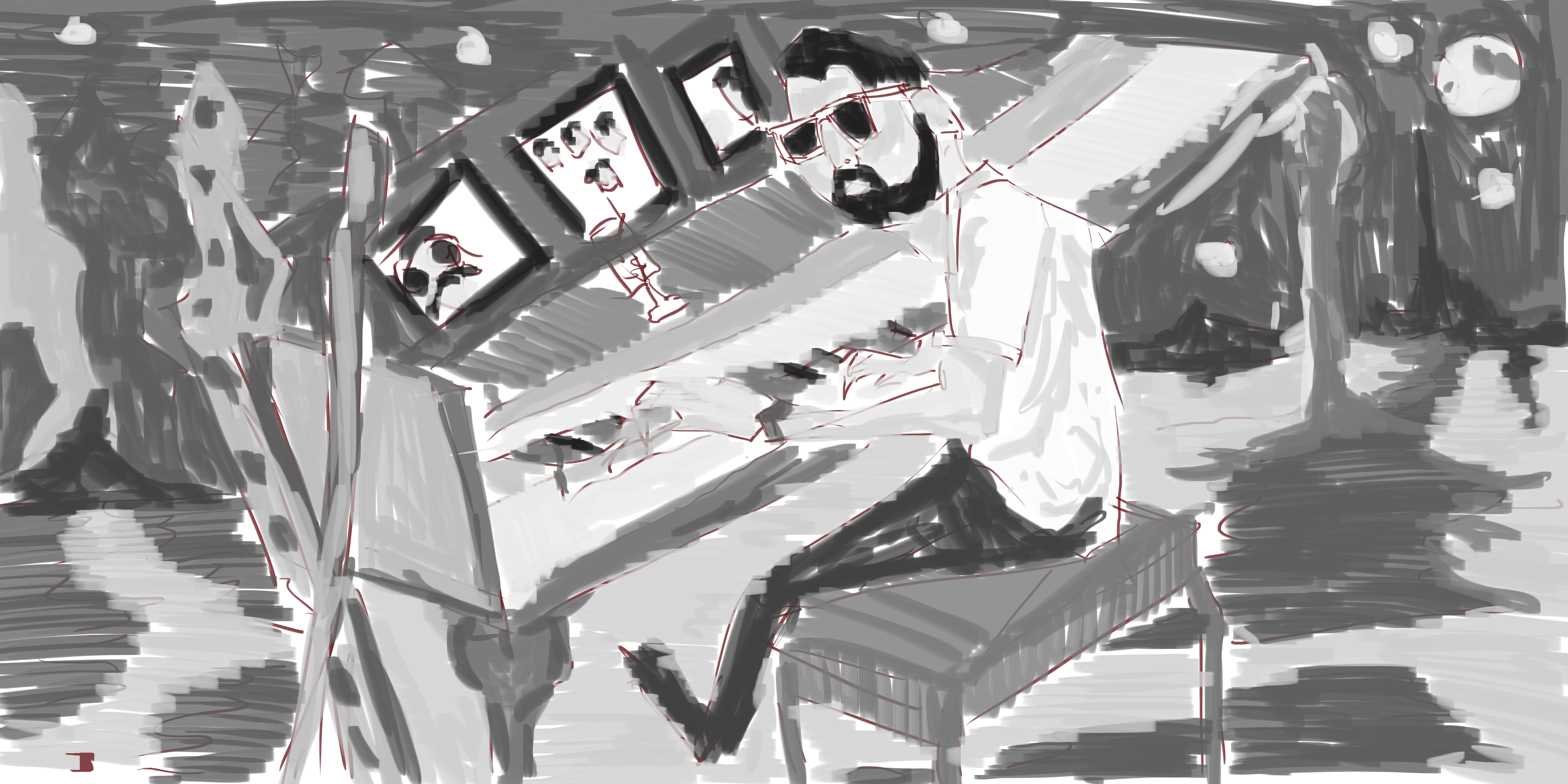
Rock on.
Read more →
Download my January 2013 game:
Created in Unity, exported to EXE, Uploaded for you. Please tell your friends.
Artcontrol-WMCKEE-Jan2013 - WINDOWS
Donations keep me alive, and bring you free games.
Here are the games that you can play on the web (may need Unity Web Player):
Aux-Jan-0 Aux-Jan-03 Aux-Jan-0301 Aux-Jan-0203 Aux-Jan-03021 Eifa-3 EIFA EIFE-02 Games JanGame Playform-Feb-3
NEXT MONTH: Platform-Feb 


Read more →
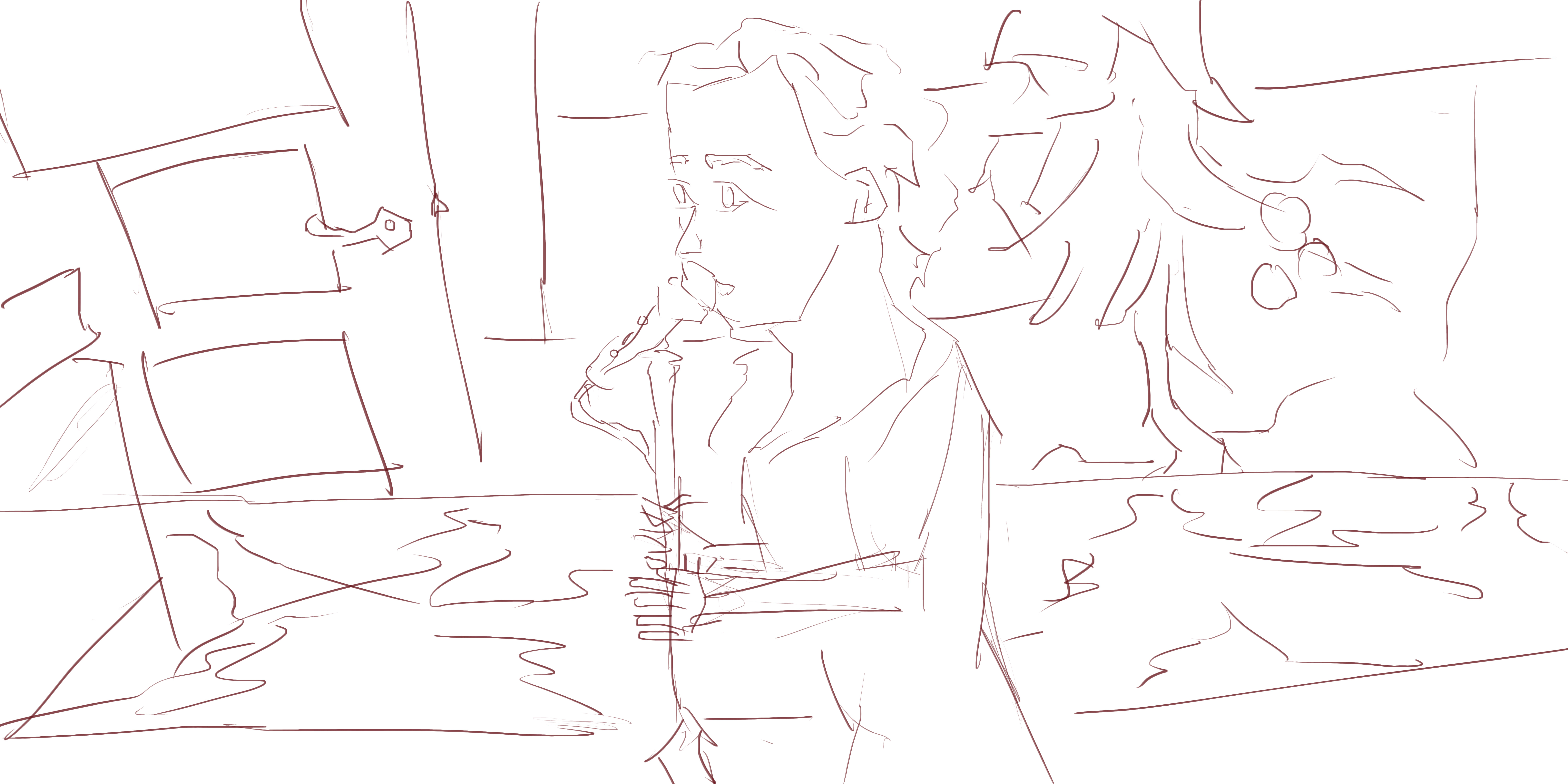
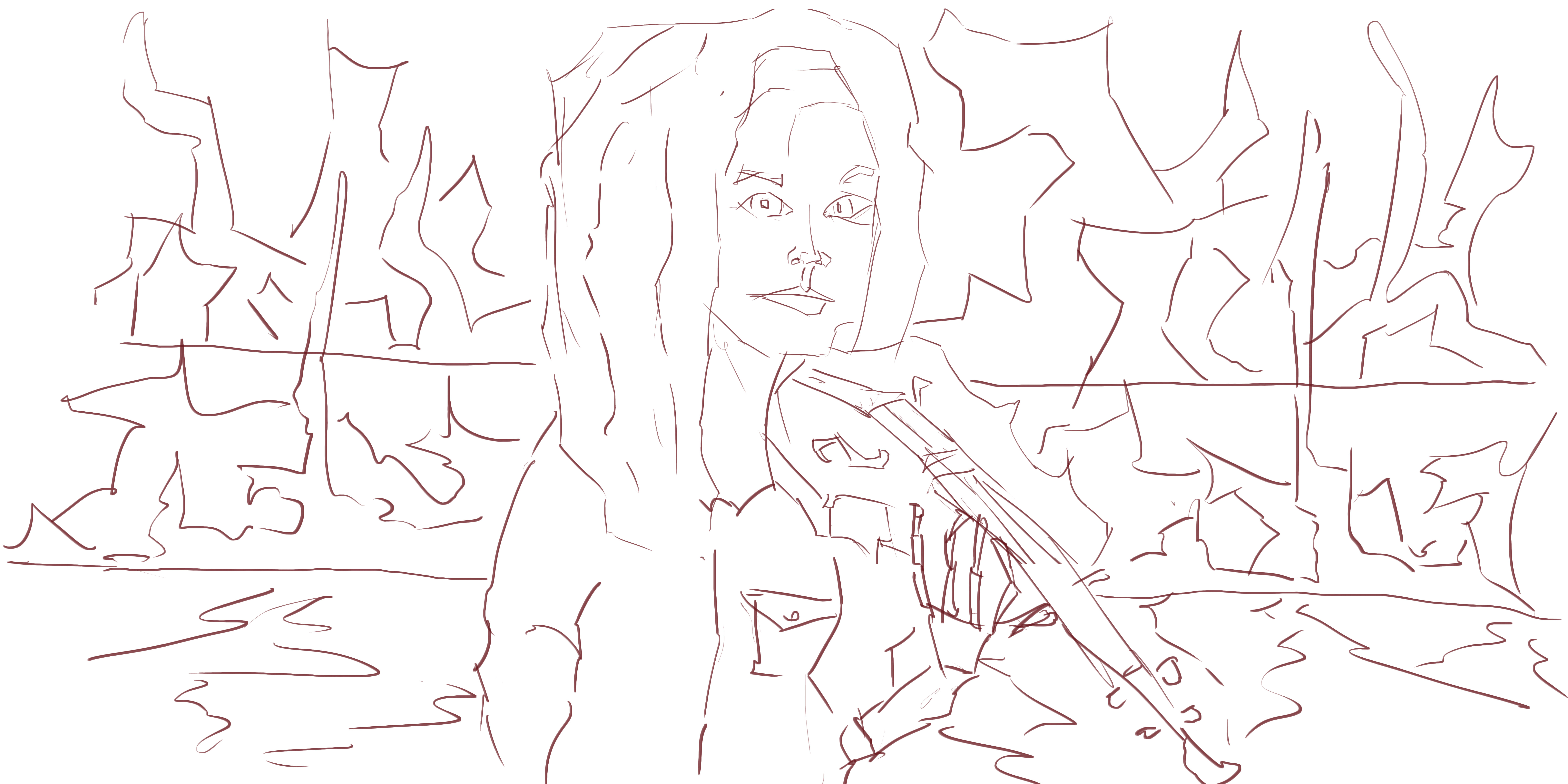
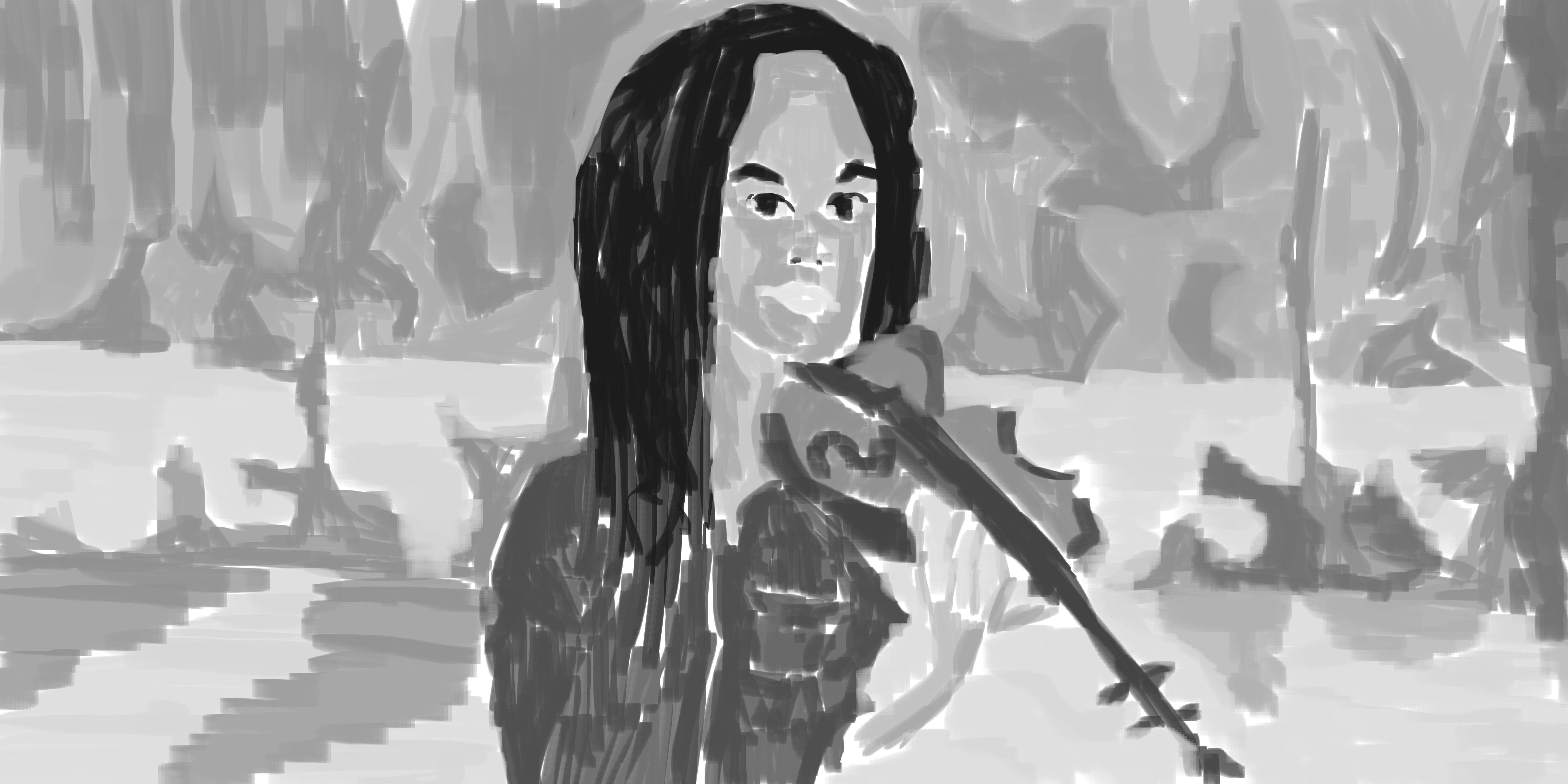
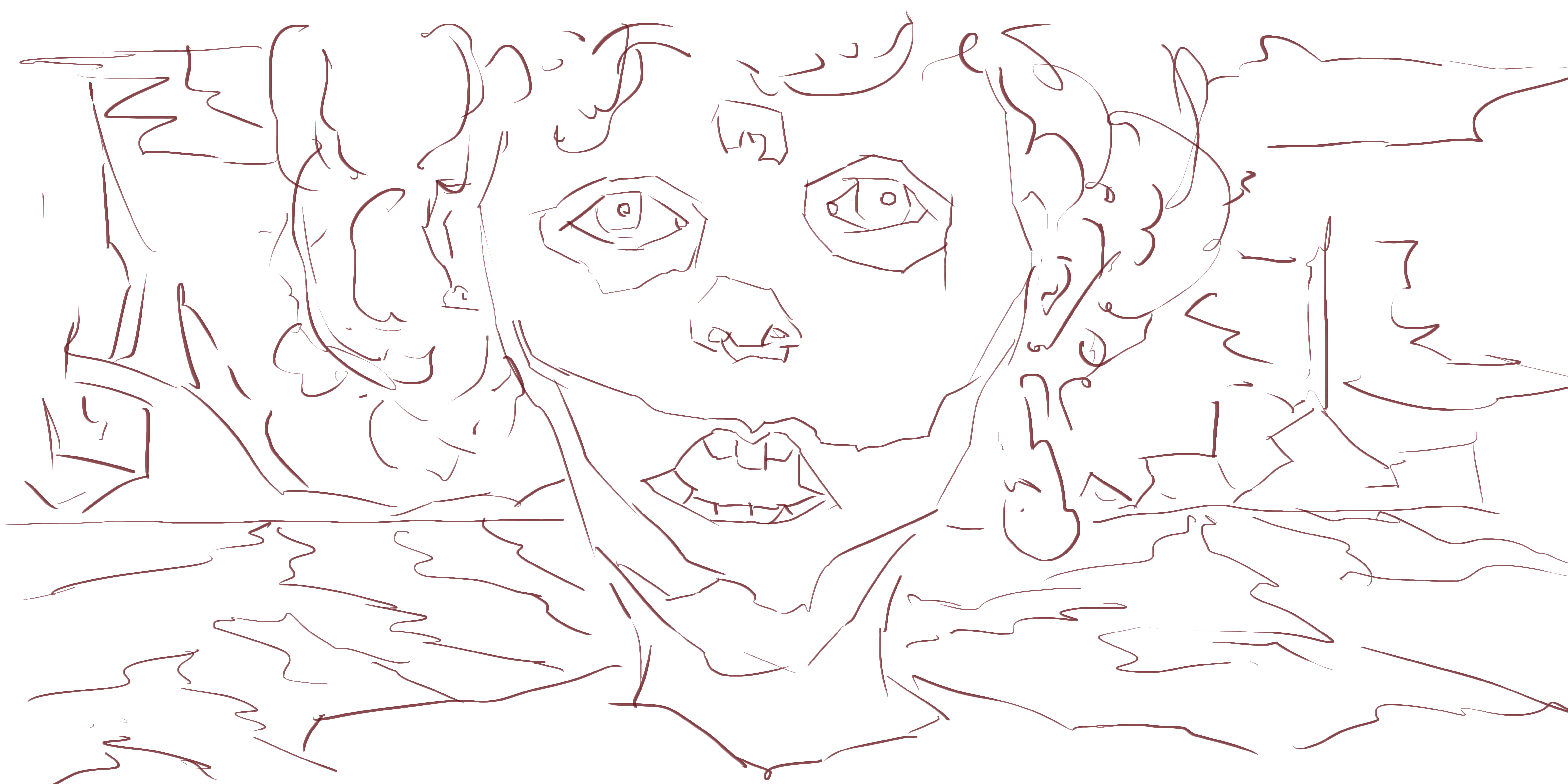
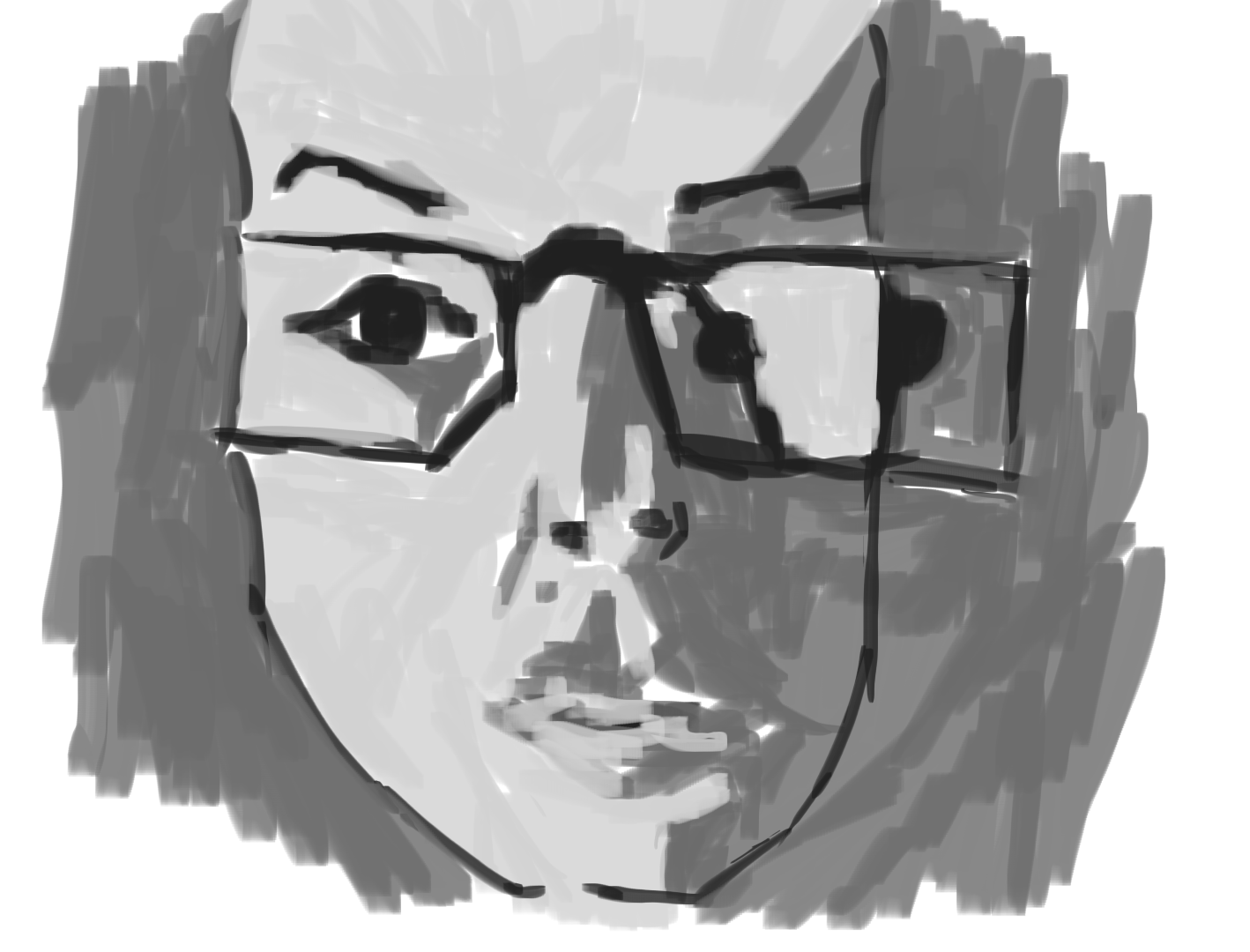
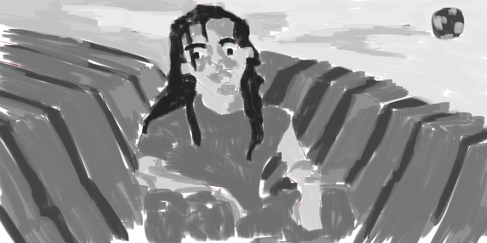
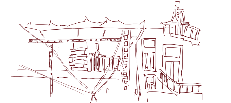
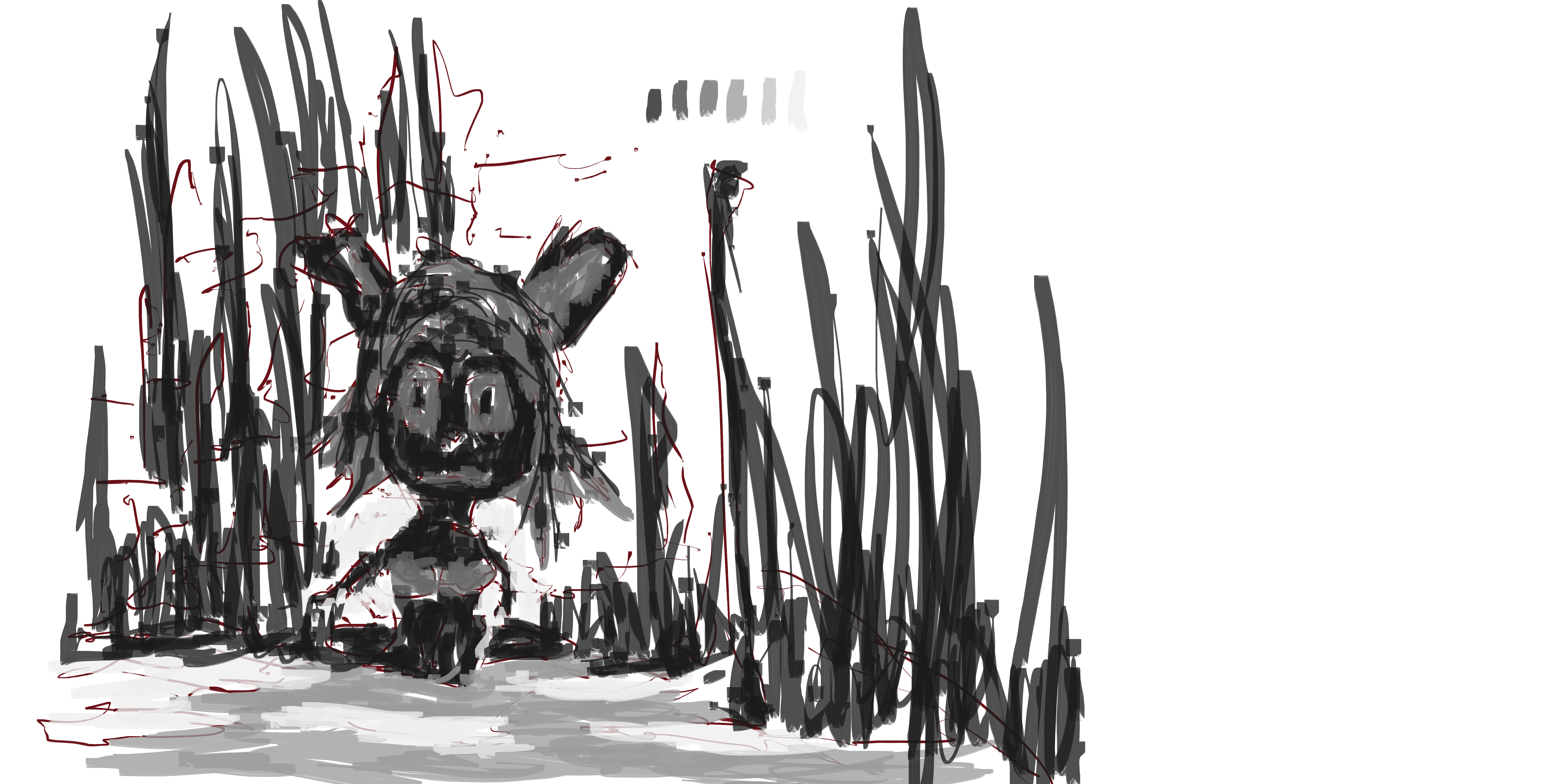
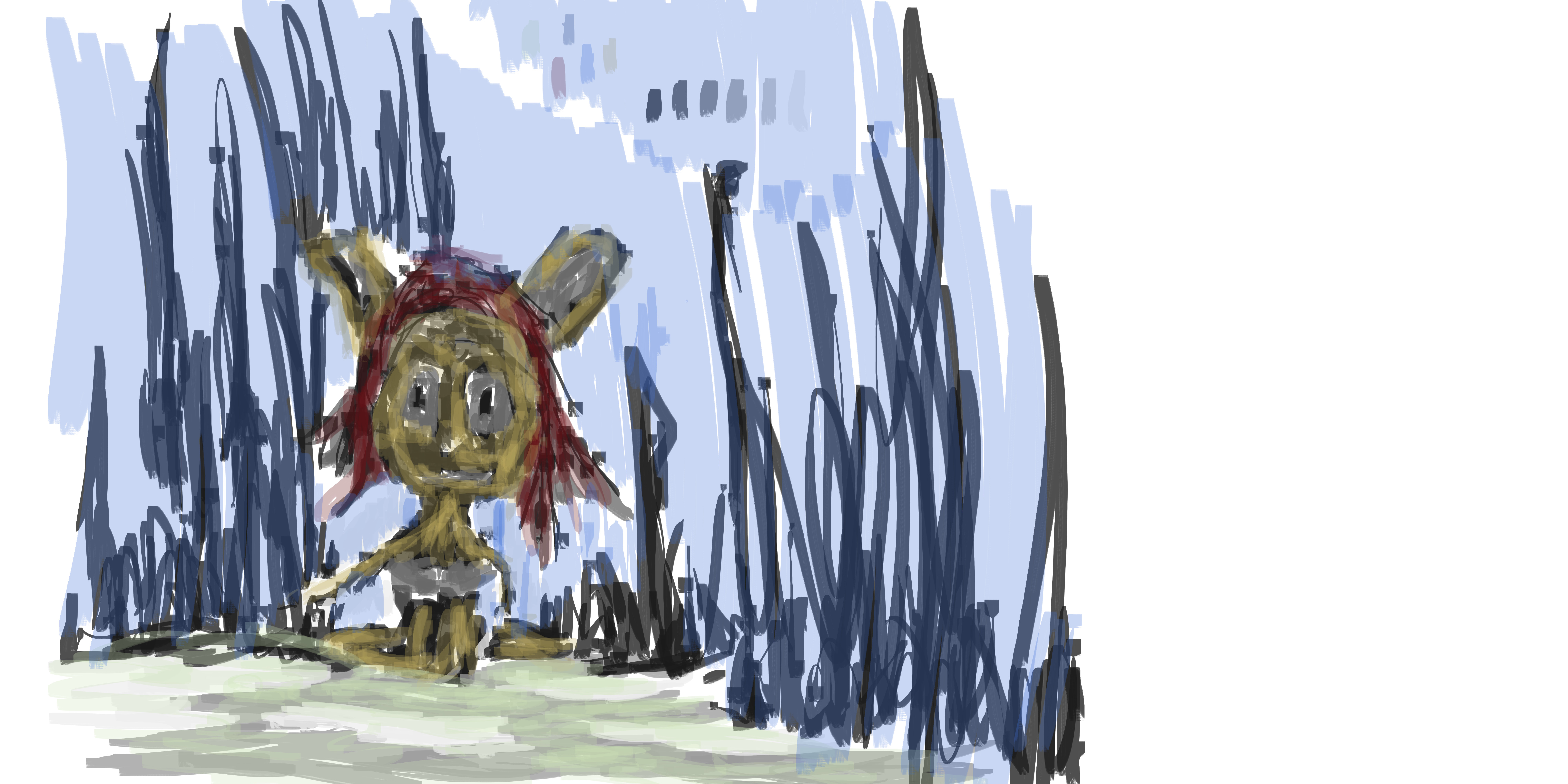
Last week I did a marathon of painting people from RedditGetsDrawn. The majority of the time the photos posted are only portraits, but I find fill figures to be more fun to draw. . 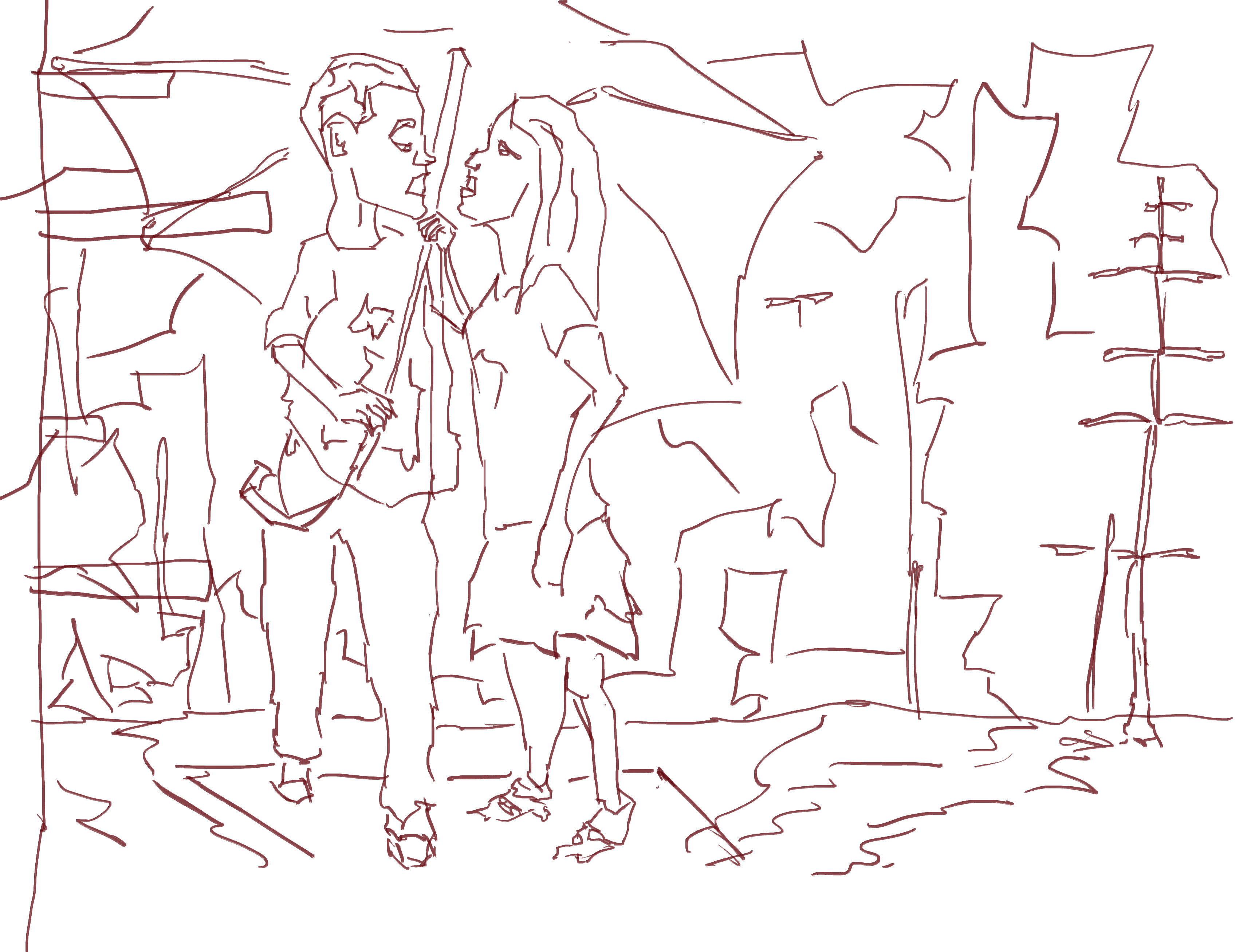
Line. Added in the characters first before the background. With the background I made up a scene based on my recent works, water, buildings, towers, and the sort.
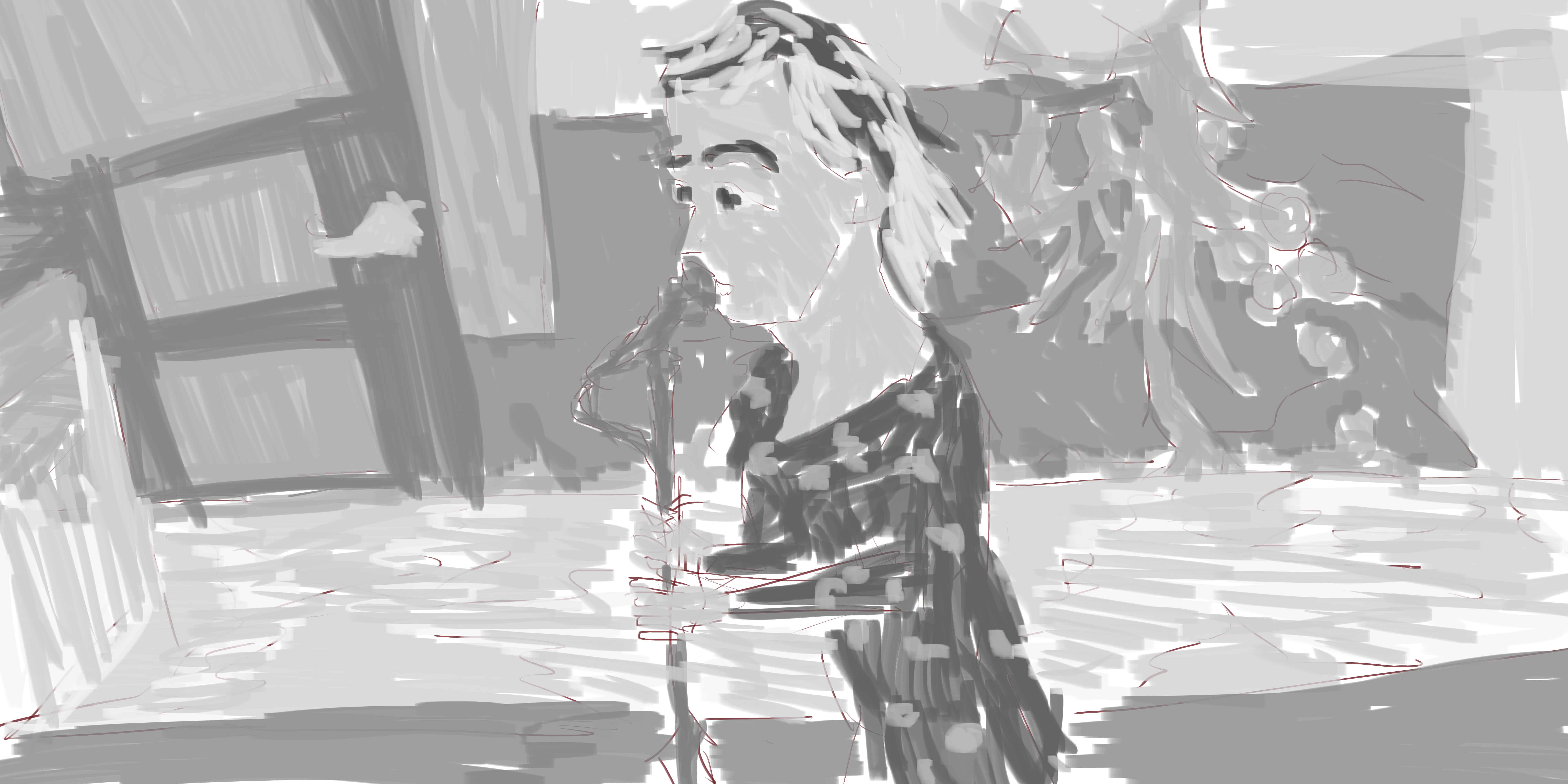
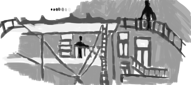
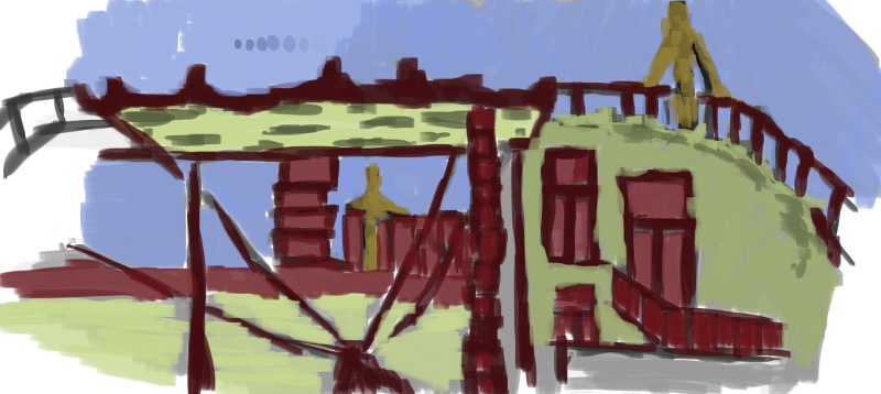
Tone. All the block areas in the background is basically covered with tone. Maybe I should of focused on keep with the background shapes more in the tone version… keep it more similar to the line version. I wanted to get alot of these works finished so was rather rushed for time. 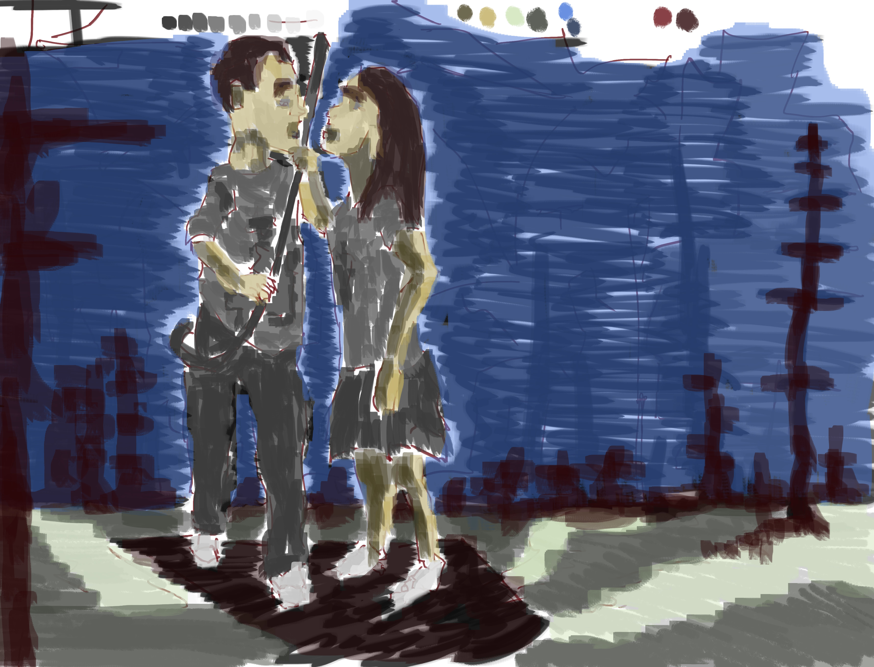 And color. I don’t like how the towers in the background are not sharp. Happy with the floor and characters.
Read more →
In the middle of making a game for The Global Game Jam. You can play the game here. 


 GGJ
GGJ
Read more →
I’m currently in Hamilton, at the University. Global Game Jam is happening. I have my laptop setup and am painting.
Here’s a tattoo painting I worked on the other day. 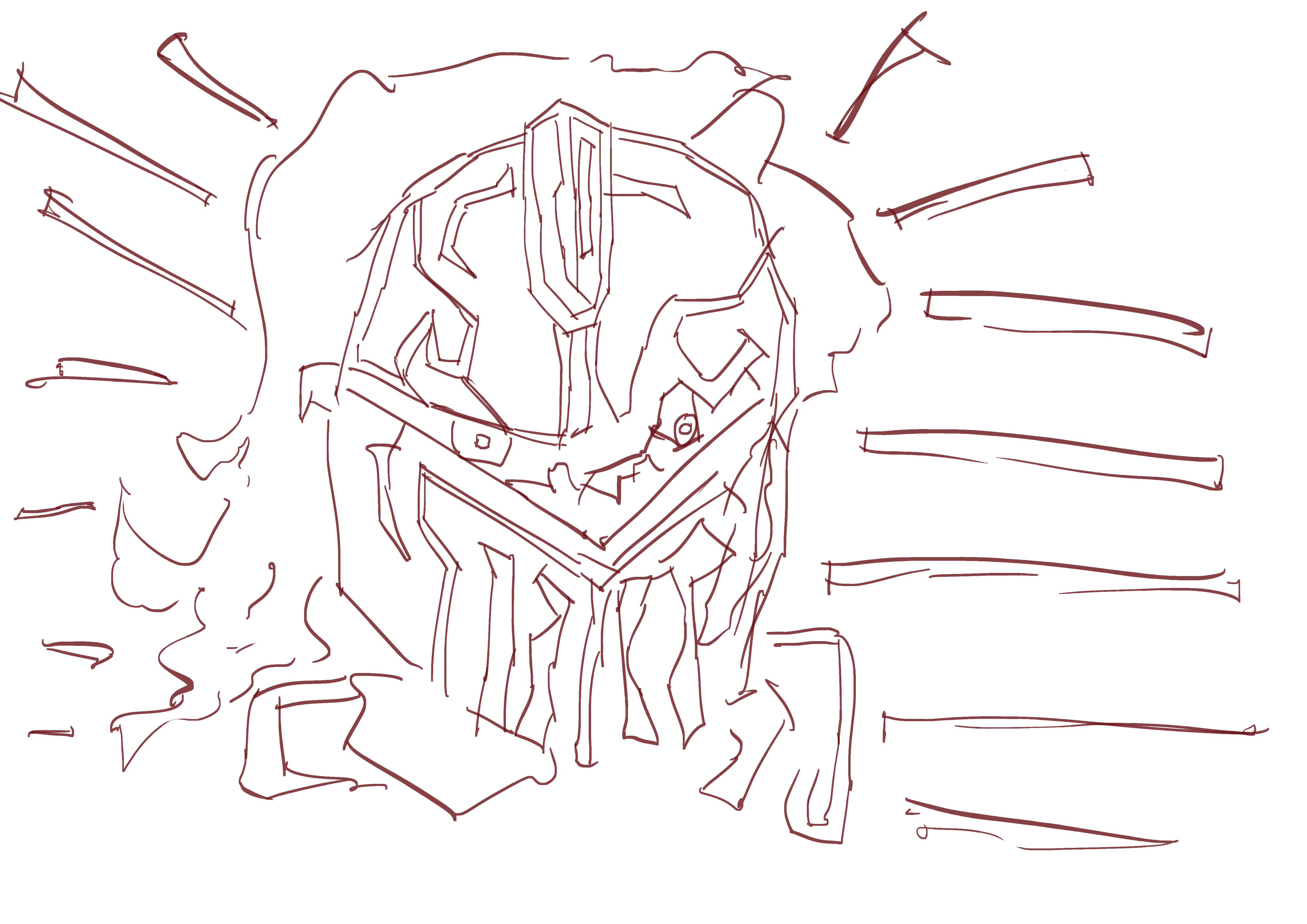
Line. Rough around certain areas - such as the eyes. Almost scribble like.
Tone added. I used a mid gray for the skin, light for the hair, dark for the background, and black for the line.
Dark yellow in the sky, red for the hair, and of course blue in the background. Exploring tones of these colors further.
And the video:
Read more →
Spyro was a favorite of mine when I was younger. I decided to carry on with the recent theme of painting in game screenshots. This one was suggested by one of my Twitter friends - @bladeITguy. if you have a favorite game or idea that you want to see done, flick me a email/comment or let me know on Twitter.
@ art_control a giant more realistic spyro the dragon breathing fire
— Blade Threepwood (@bladeITguy) January 22, 2013
Here’s the painting -
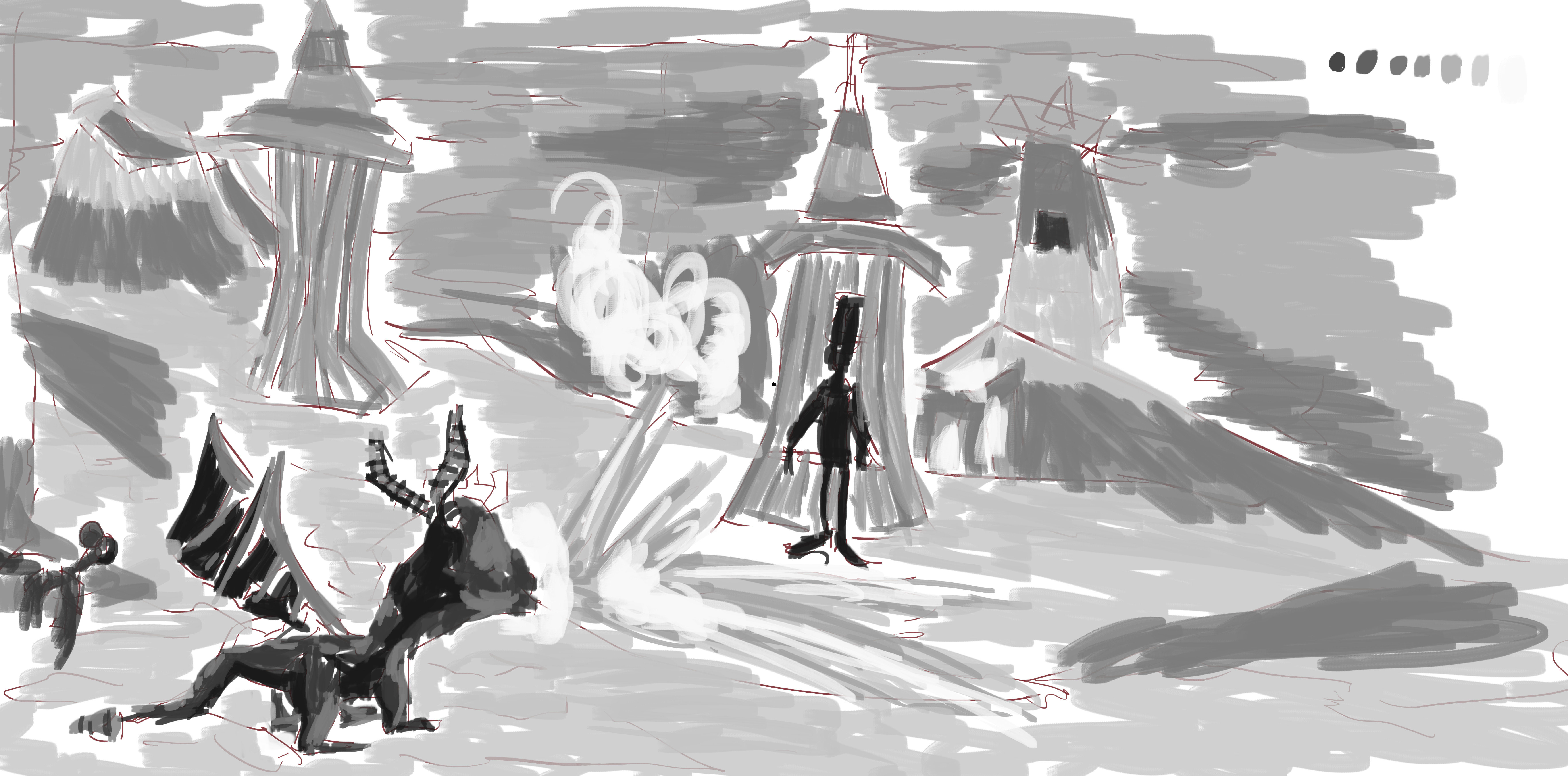
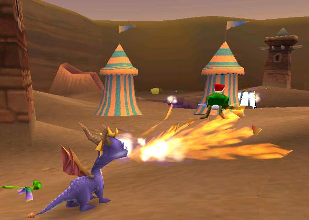 I wanted to paint a scene from a early Spyro game rather than later. I found this screenshot from the first Spyro via Goggle Images.he’s breathing fire which is what I wanted. A front view would of been cool - could always paint another!
Now onto the line - 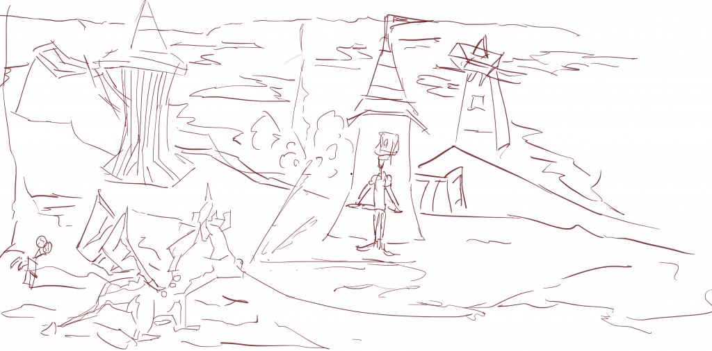 I started with the Spyro character first and sketched him in. Reference is so important for this - I was constantly looking to my 2nd monitor Even with the reference in front of me, I get things wrong, but that’s ok because it can be fixed during the black and white, and at worse - the color stage.
Some creative liberty was taken - such as a redesign of the enemy in the distance. It’s the type of character that I put into my pencil environments.
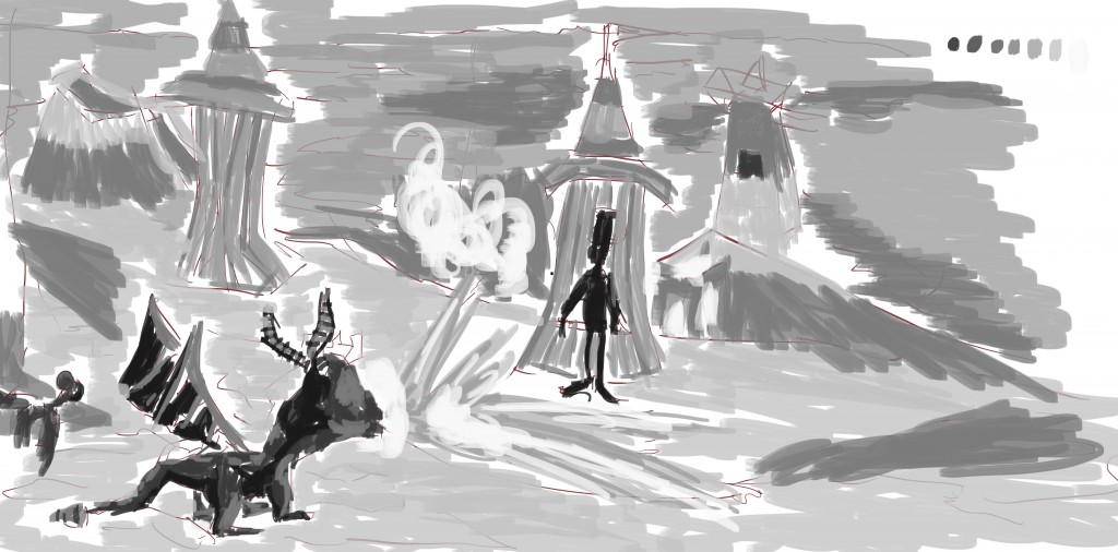 Ok tone. Characters were the darkest, with the environment a mid gray. I used a very light (almost white gray) for the smoke effects. The brush I’m using is a new flat brush that I created from my stock photography.
 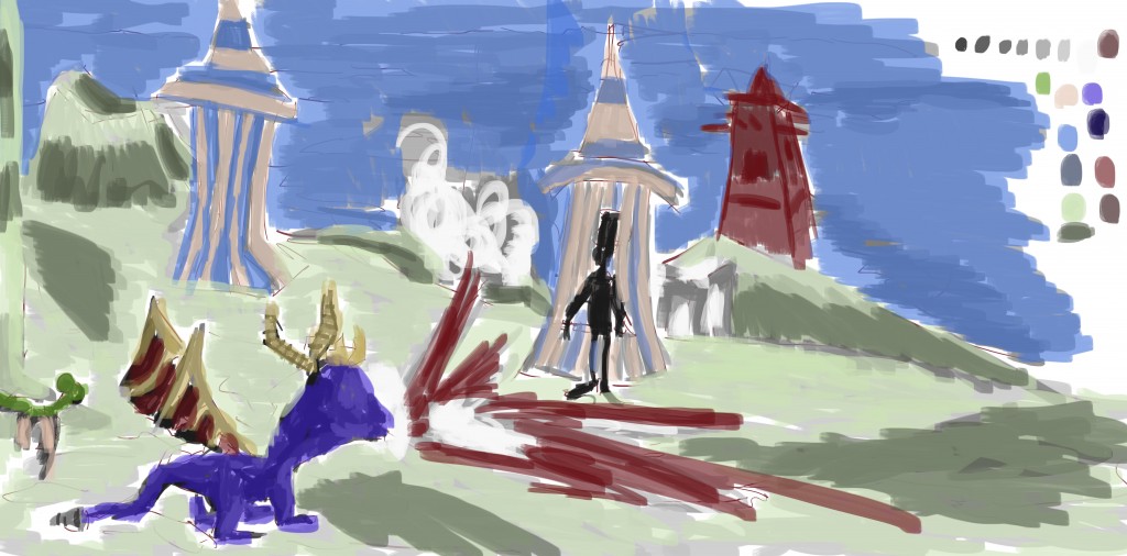 Color. I didn’t pixel pick this time, instead I looked at the color and guessed. I kept with similar colors for Spyro, the dragonfly, and the tents. Took liberty in other areas, such as the sky in the background and floor. Just to give it my own touch.
And finally, a demo video of the painting process:
[youtube http://www.youtube.com/watch?v=dWUAe8zwErA]
Read more →
Feng Zhu is a talented lad. His blog and Youtube channel are a wealth of information In October last year he posted two paintings of remade video game shots. Classic, but certainly dated with graphics. He posted two paintings - DOTT and Monkey Island. To be honest, I haven’t played them. I’m not a puzzle fan - I do enjoy Adventure games such as Heavy Rain and The Walking Dead, but as soon as puzzles are involved, I’m out.
Feng Zhu also posted a video of a painting he did for the game - Flashback! Another classic game…
[youtube http://www.youtube.com/watch?v=azP1im6SznA?feature=player_profilepage]
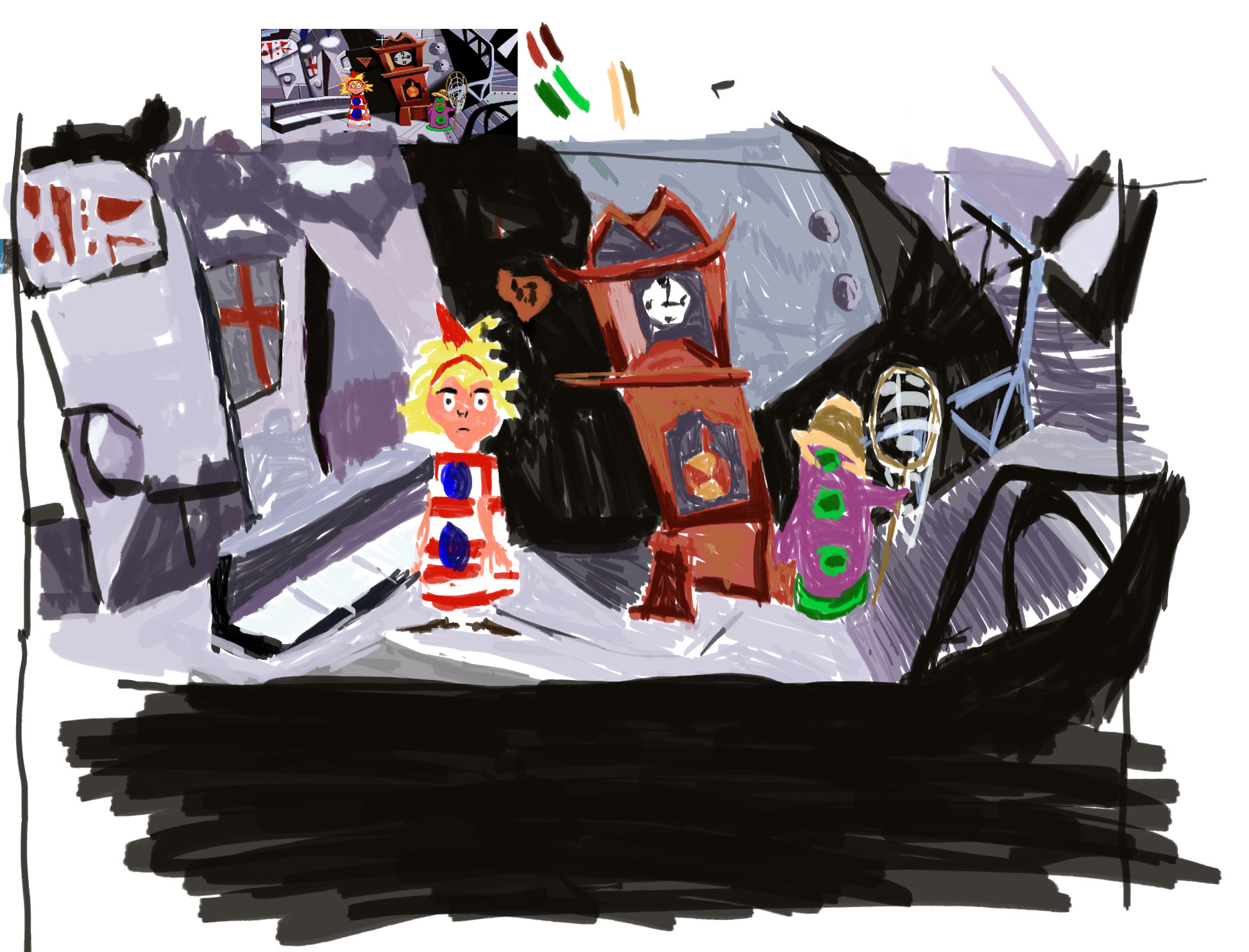
So being inspired by all these repainting of classic games I had to do one myself - for a game that one of my Twitter friends mentioned. Day of the Tentacle.

I found a screenshot from the game during my search. It’s still visible on my painting - at the top.
I had just finished my new color palette painting and decided to pixel grab again. There are some colors here I’d like to use again - the orange and reds in the clock. The environment is washed out. all the color in the characters. The green and pink contrasts greatly but has potential - maybe use a range of tones. Interesting purples with the walls.
Here’s the video:
[youtube http://www.youtube.com/watch?v=ffpPnSm6Mbc]
Read more →
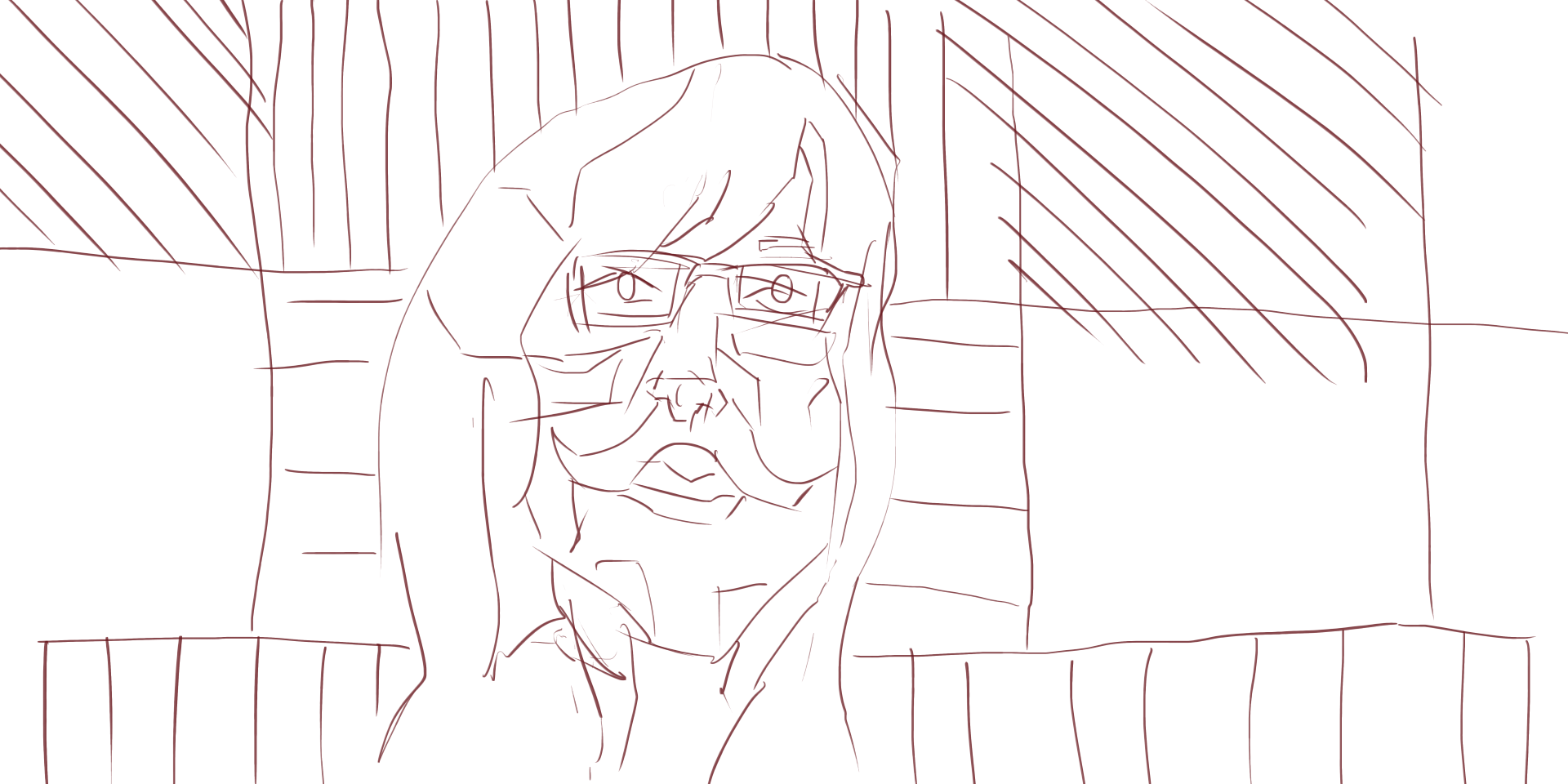
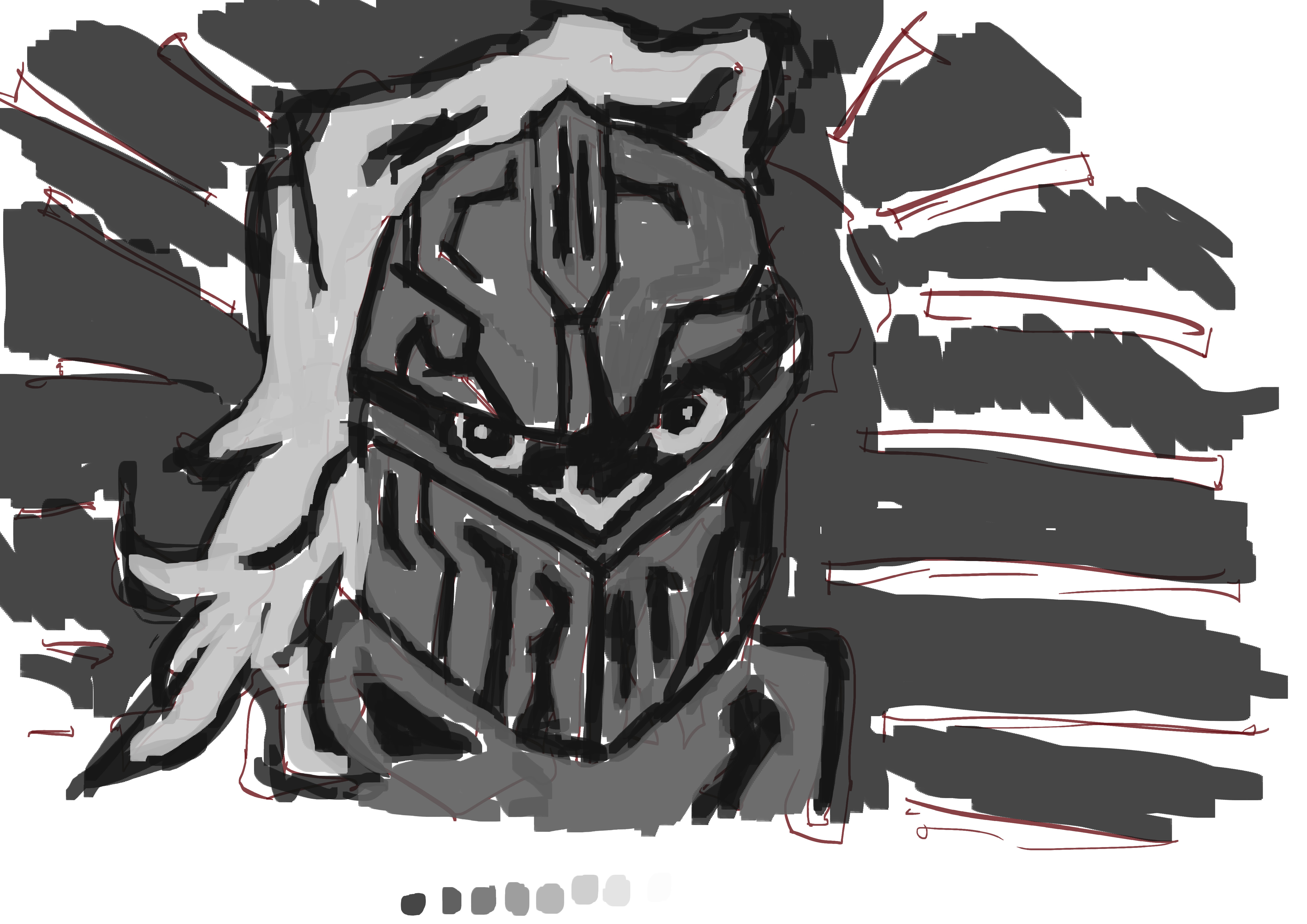
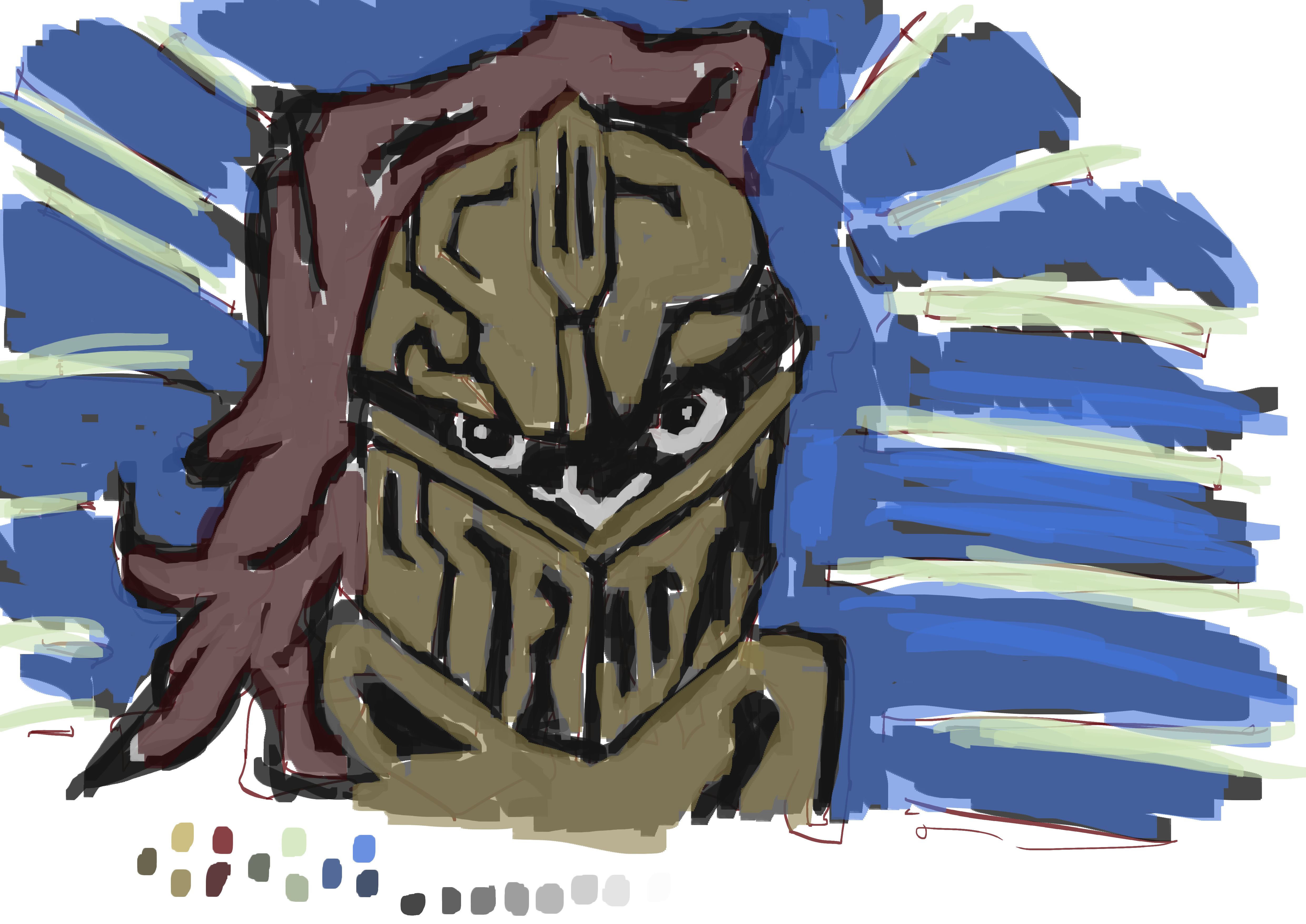
Quick character painting. 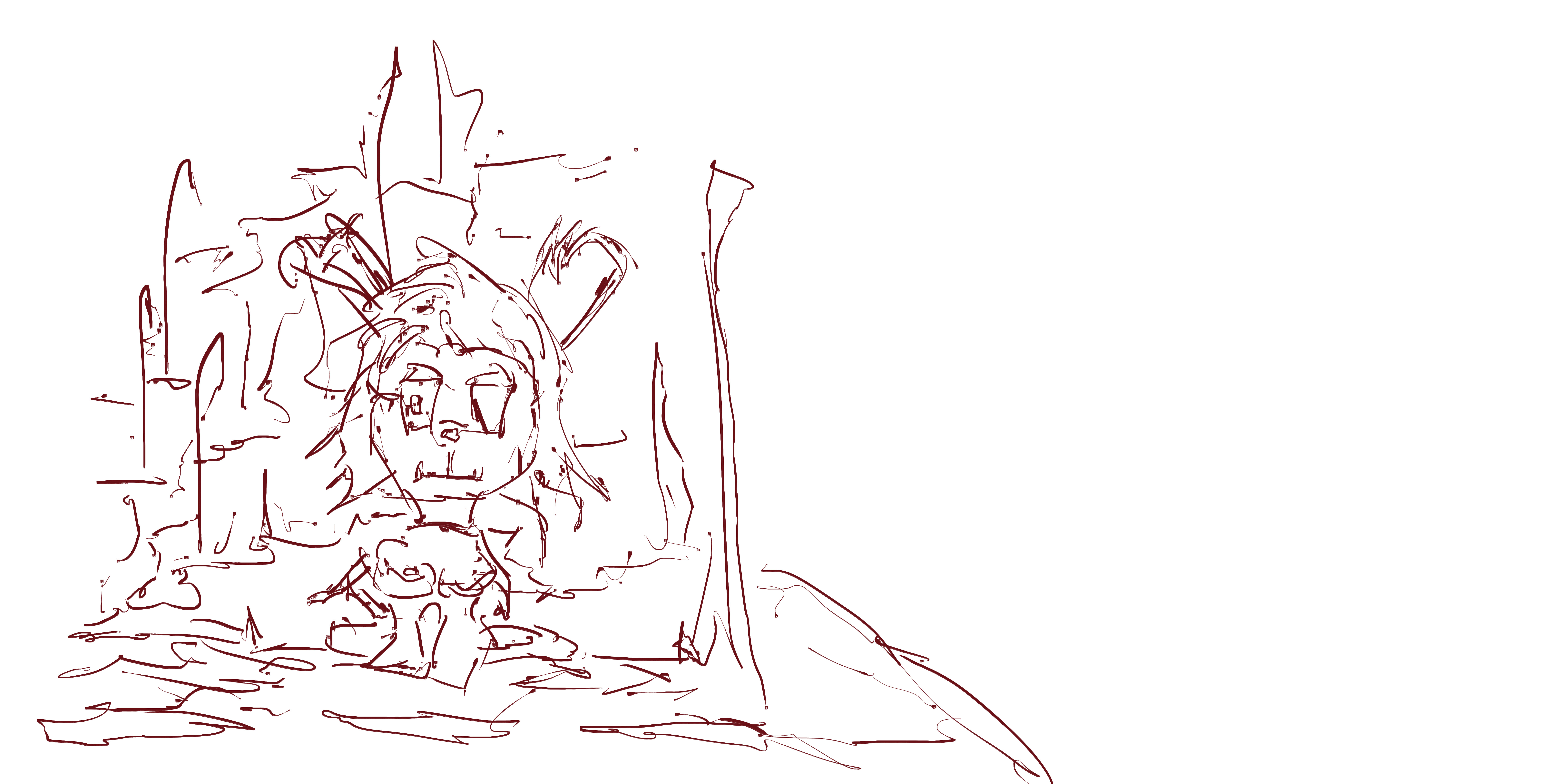
Read more →