Didn’t end up going into TLC this week. Spent the day working with Blender and looking into game engines. Over the last few weeks I’ve downloaded several game engines - steam (which I used years ago with Count Strike 1.5), Unreal, Unity3d, and the Cry Engine. I’d like to get some good models/textures and animation done in Blender then look into importing these models into a Engine. But that’s jumping ahead too far. For now I want to focus on learning Blender further. Everyday I’m learning something new from it.
I’ve drawn a little - mostly just sketches with no reference. Done when in bed. I’ll upload them in a future post.
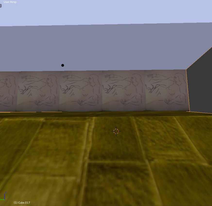
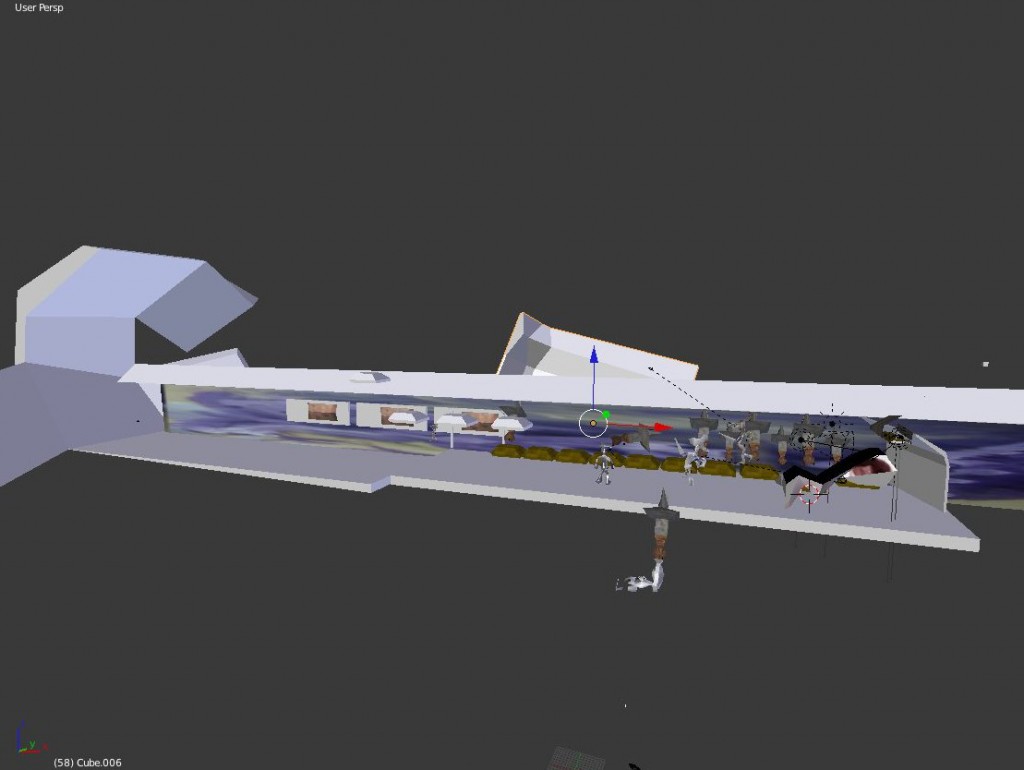 Long passageway. Used to make a long walk cycle and move various objects on the side. Need to improve textures and modeling on the overall scene.
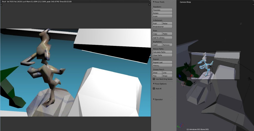 This was a better camera angle then the one I ended up Rendering. I’m work in Blender with two windows systems.
Color sceme ideas. I’m going to keep with my color pencil insprations here - blue for negative areas. Figures and objects will be in reds and yellows. Having a color set will help the scenes flow together.
Finally, here’s the video:
Read more →
Back in Wellington. Nice to be back I guess. I’ve been enjoying colored pencil, yesterday I didn’t work with Blender - instead sketched in my visual diary. I’ve got a strong mindset to take these ideas into Blender. Something is brewing.
Back in 2010 I got really into the Yeah Yeah Yeahs and I frequently drew the band.

This was one of the reference photos I completed a drawing of. In order to compare my drawing and check development I redrew this photo. Here’s what I came up with:
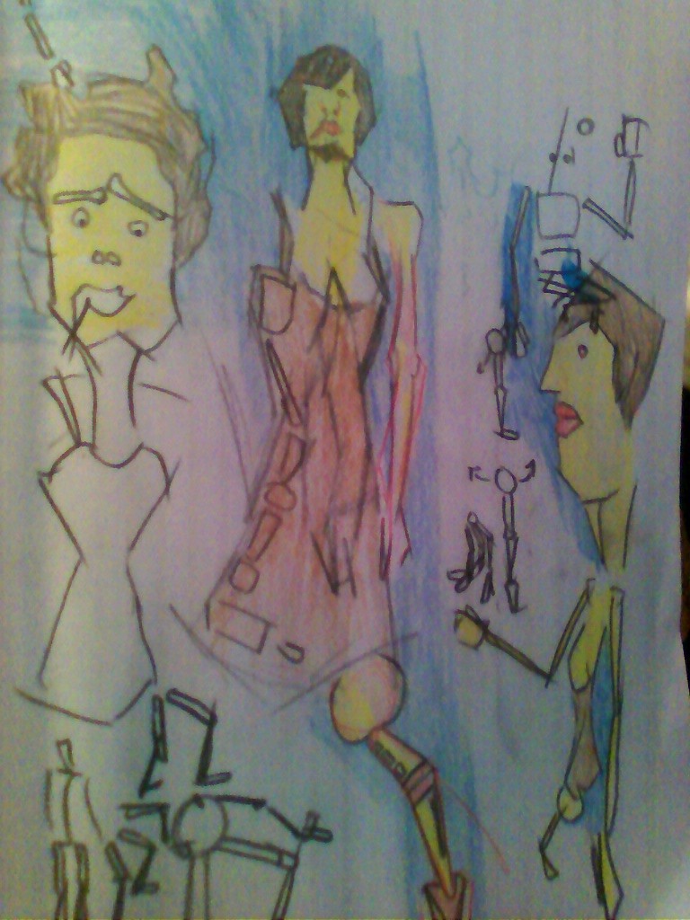
Strong straight lines, color used for tone. I love this color scene - red, yellow, brown for the characters and blues for negative space. Several sketches of wire frames to help understand walk cycles further.
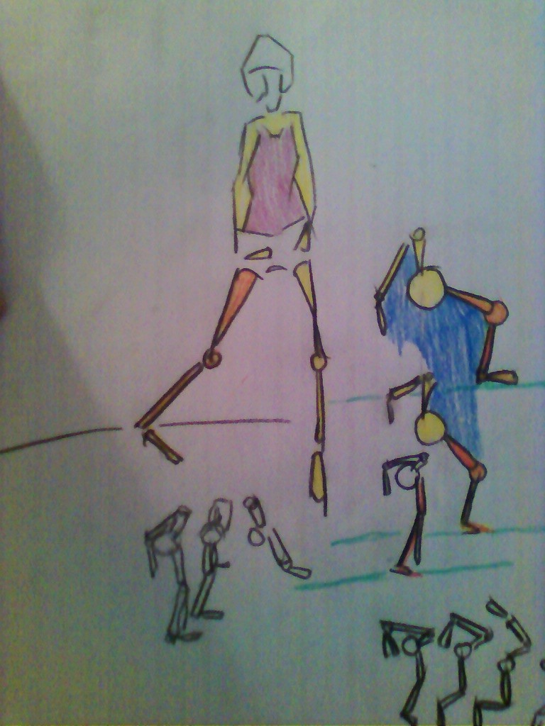
Less character based and more animation feel. I’m not sure what I’m doing with this but I’m going to take these into blender today and experiment.
Read more →
I brought myself a 6 pack of colored pencil today. I’ve felt an urge to get back into drawing. It started when I was hanging out in Andrews office and sketching in his a6 visual diary. I was using a .5mm mechanical pencil. I use to own one and use it regularly, during my time at the Palmerston North School of Design. I also used his colored pens - black, red and blue.
I just remembered I have the originals of the pen works. Here you go:
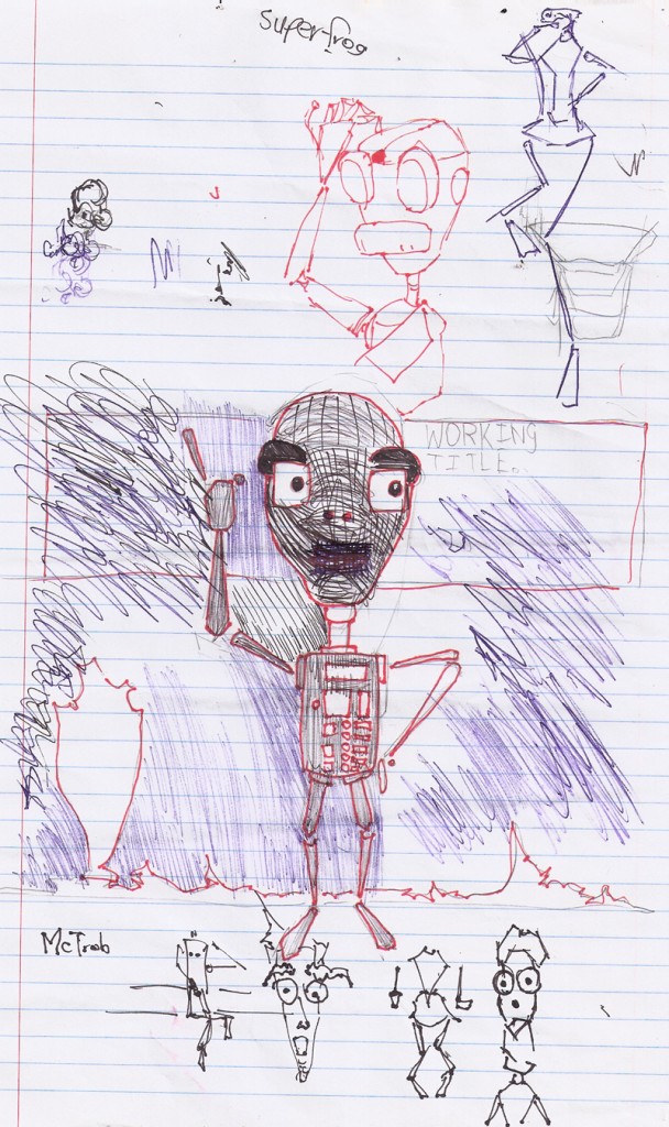
Robot design I guess. For the background I held 3 pens - creating marks with all 3.
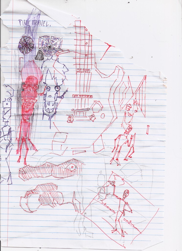 The second page. More robot drawings. Pens been fun to use after such a log time with dry media.
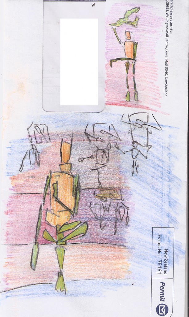
Envelope drawing. Exploring poses. With life drawing this term I’ll focus on capturing a full character.
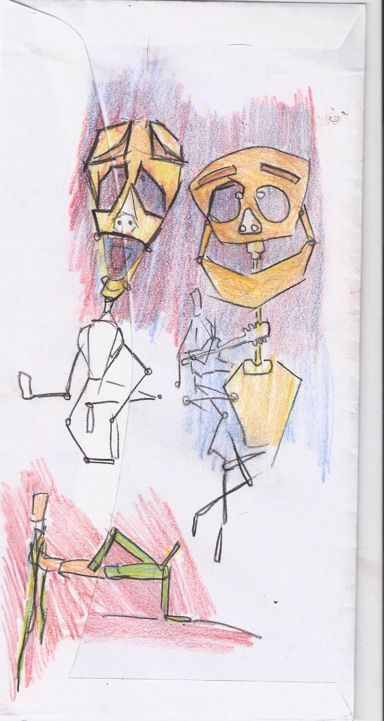
I like these colors. Makes me happy.
Read more →
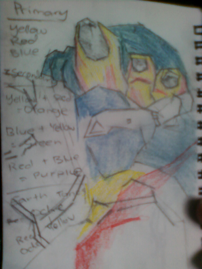 My toe. From life. Started with a pencil then colored with colored pencils - matching the color as best as I can. Quite happy with this - really looking forward to the life drawing next week!
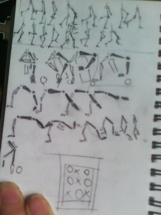 Animation tests in the A6. I will take these ideas and apply them to blender. The first cycle is a basic walk cycle - a large lift of the leg as its brought forward and the front is brought backwards.
The second animation is a simple movement of rectangles out then a flick of the end - followed by quickly bringing it back in and back at the start.
Maybe it could be a looping animation of something being dropped.
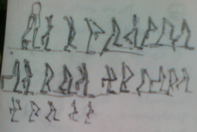 A second walk cycle. Andrew mentioned this was working better.
Read more →
I’ve been up north so n access to the internet. Fun trip away, I did have my laptop with me and worked on a little Blender.I haven’t drawn. Next week I’m spose to be back in Wellington and I’ll have a model on Monday, Tuesday and Wednesday. Looking forward to it. I’ll like to keep the Blender learning happen this term. I had a good talk with Andrew yesterday with ideas of what I could do.
Here’s an render of recent blender animations:
The first 5 secs is the model recent work I’ve been doing. These models can be seen in another recent test. This time it’s less animated (just the camera), but UV textures have been applied. I’m still trying to understand how UV textures work. I found this video that was a great help:
Changing the mapping coordinates from Generated to UV was what I was missing. The texture was being rendered - but not correctly.
Screenshots of the animation currently:
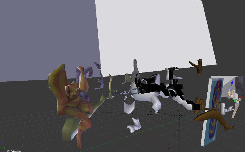 Overall shot of my workspace. It’s a bit messy but gives me lots to work with.
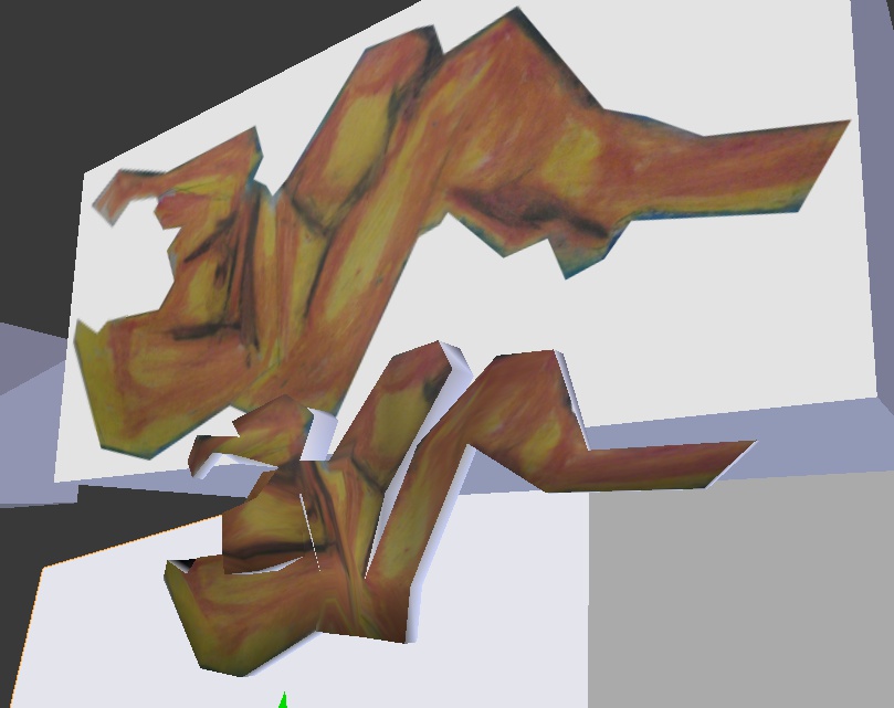 This shows how I traced my drawings - lining a cube in front - then extrude, rotate, and scale. Working in a 2d plain.
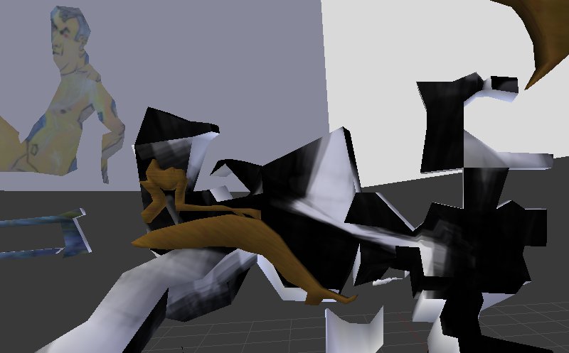 These are not correctly UV mapped yet but I plan to fix them. I’m not sure where this is going but I’ll keep experimenting and learning.
Read more →
I did a scribble in Andrews a6 visual diary. It was the first time I’d used a pencil all holidays. I’ve mostly been spending my time with Blender - creating animations. I imported some of my artwork into the program and traced around it. I’d like to explore the idea of a 2d world further with the help of my artwork and blender.
Can you spot my artwork in amongst the mess?
Read more →
Still no drawing. This must be the longest time I’ve taken a break from it for years. That’s alright. I’ve been keeping busy with Blender - most of my time is spent on it (I did have play Brick Force a little today though!).
Here’s what I’ve been working with in Blender:
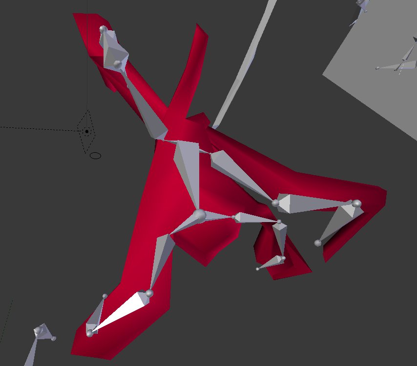
A simple creature model. Bones have been added and attached to the mesh. It’s animating fine! It was great to get into using bones in blender, the weight paint tool is especially handy for this.
Red material was added to the model, but a UV map would be best.
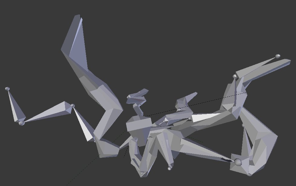
I got sick of working with that model so created this, it’s the same idea but many more limbs. This one isn’t animated so much - only small movements like legs and the spring on the top of the head moving up and down.
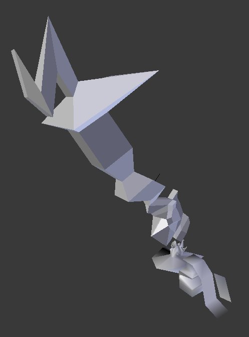
Modeling practice. I’m not sure what this is - it’s just been extruded, twisted and scaled. Maybe it could be a weapon of some sort?
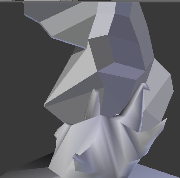
Large poly count in this one, I was working towards a face of some sort. Looks like horns.
I’ve been enjoying Half Life.
Read more →
I’ve taken a break from the blog well I’ve been in Levin. I’ve taken a break from artwork in general - the last week was a crazy time of life drawing and a break has been wonderful. What have I been doing? Playing Brick-Force lots - very impressed by it. It still has a long way to go but still - Minecraft meets call of duty.I enjoy the map editing mode. It got me interesting in looking into using the Source/
Blender. I got into Blender again several weeks ago and it was fun to fire it up again. This time instead of working on a character model I choose an environment.
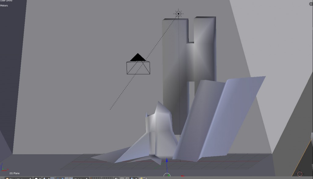 I worked on a building and the area around it. The H was a start of a character model - but I quite like it as it is. I’ll keep working on this scene this week.
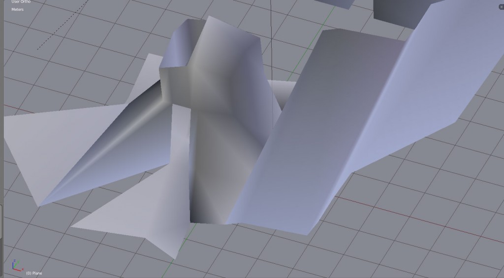 Here’s a closeup of the building. I’ll like to learn how to apply real textures to these - I downloaded this program from Wood Workshop to generate textures.
I’m going to buy a new pen for my tablet tomorrow (wont receive it till next week), must photograph and upload the life drawings from the Friday class last week.
Read more →
I think I’ve lost my tablet pen. I have either left it in the library or it’s fallen out of my bag. I’m a bit sad and disappointed as I was looking forward to digital painting over the holidays.
Nothing good ever happens.
Here’s some digital works that I started today. I had hoped to work on these further tonight but with no pen that won’t happen.
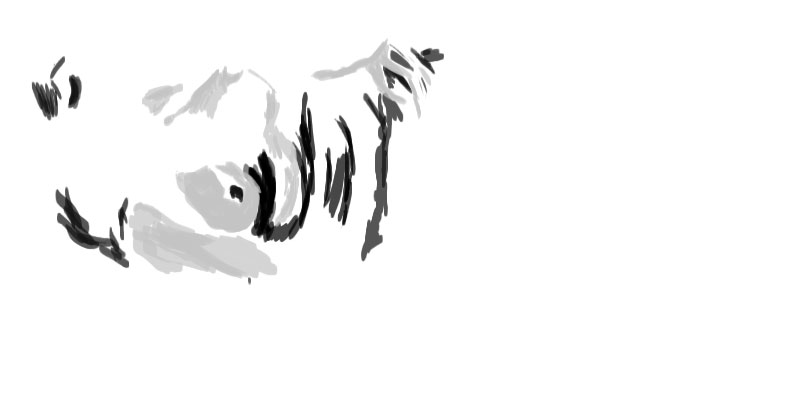
Started this in the library. It was a trace over a recent life drawing work. Long pose so the detail is high. By high detail I mean high tones!
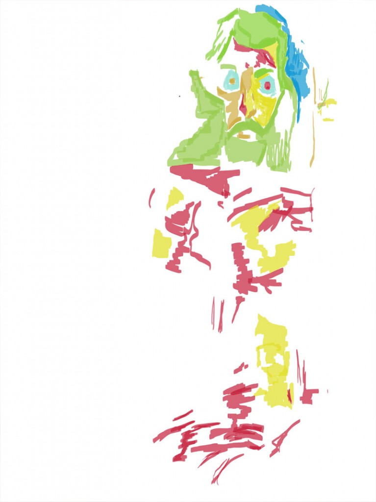
From Christenas. I really liked the drawing and felt I had to take it further digitally.
6 hours of life drawing tomorrow then done for a while. I’m not sure what content I’ll be uploading next week…. I may draw buildings and such in Levin (colored pencil most likely) and upload them.
Read more →
No more Roberts for the week - Instead I’m in Christenas. She created a block class as there were a bunch of foundation that weren’t told about signing up for classes and there was an overflow of students.
Christina is lovely and allowed me (and Angelique) to join into the class for the rest of the week.
I wanted to carry on with ideas that I had been developing since Friday. This meant continuing with oil pastel. Focus was on capturing light and dark. The lighting was brilliant - dark room and spotlight on the model. This made looking for the lights and darks easy….
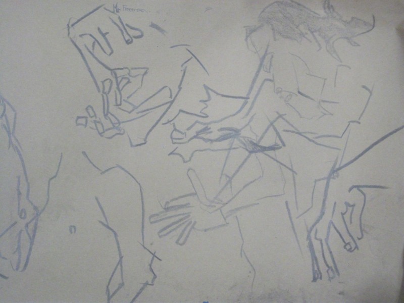 I started with how I started the other sessions this week - with quick 30 second drawings with a 8b graphite pencil. A large focus of these were hands - I’ve wanted to improve my skills in this department.
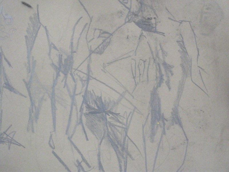
Slowing down to one minute poses - chance to add tone into areas. It wasn’t much but happy with some of these works. 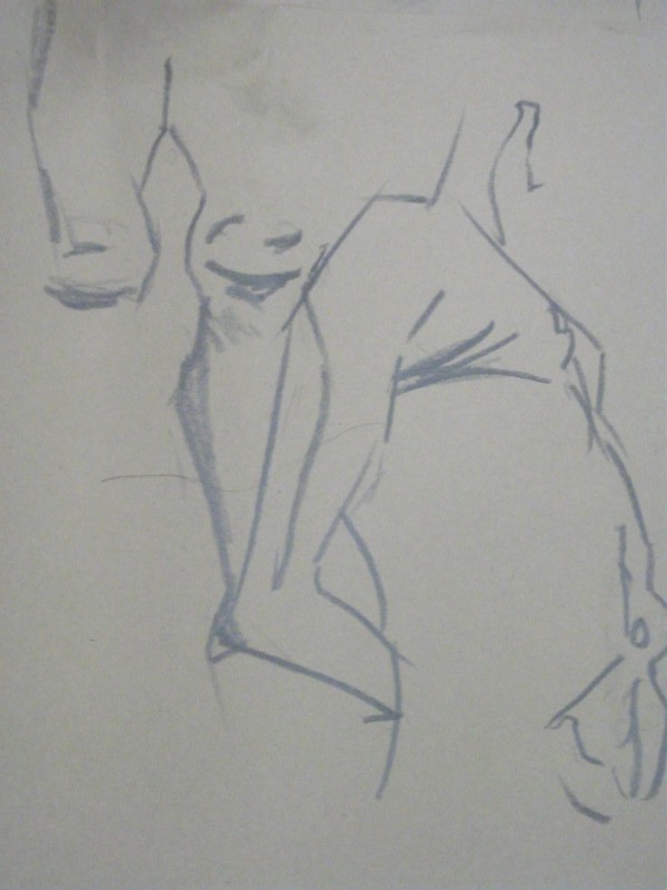 Christina liked this arm so I thought I better take a photo of it. I didn’t get a whole lot of feedback from her - but I enjoyed her attitude and enthusiasm to the class. She is certainly a life drawing ‘tutor’ and helps people greatly with their work. A balance with expressionism and studies I found.
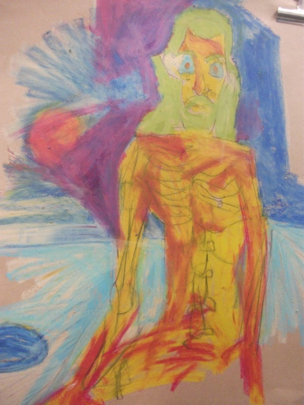
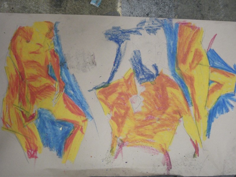 Oil Pastel. Similar colors and ideas that I’ve been working with these last several days. The light today is partially good - strong contrasts between the light and dark allows me to capture it easily.

Something a bit different. There was a skeleton model setup in class and for this pose the model and the skeleton held the same pose. I started with the skeleton and drew in James over top. Working the skeleton and model together is something I’d like to explore further. 
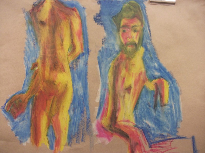
The drawing on the right is working well for me. The black helps the contrast well. I’ve applied a white over the black to help with blending. Progressing from earier sessions I feel.
I’ve done 21 hours of life drawing since Friday and have another 12 to go. Out with a blast - it makes me happy!
Read more →
 Long passageway. Used to make a long walk cycle and move various objects on the side. Need to improve textures and modeling on the overall scene.
 This was a better camera angle then the one I ended up Rendering. I’m work in Blender with two windows systems.


 Oil Pastel. Similar colors and ideas that I’ve been working with these last several days. The light today is partially good - strong contrasts between the light and dark allows me to capture it easily.