Six hours of life drawing with Robert. Normally it would be three hours on Monday/Tuesday/Wednesday but this term it’s switched around. Fine with me as I get the chance to jump into Christenas class for the rest of the week. So much life models - but great to end the term with a bang
I spent the day carrying on with oil pastels - seemed fitting to keep the development and exploration happening. 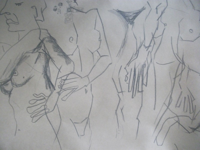
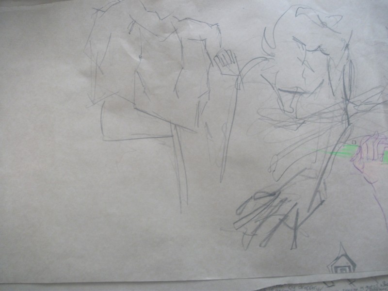
Graphite 8b warmups. Some tone is applied to areas. Alot of this is done blind which I feel I’ve been neglecting. Good practice. I like the strong straight line work on some of these. These were just warmups and I switched to oil pastel for the rest of the day.
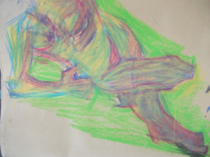
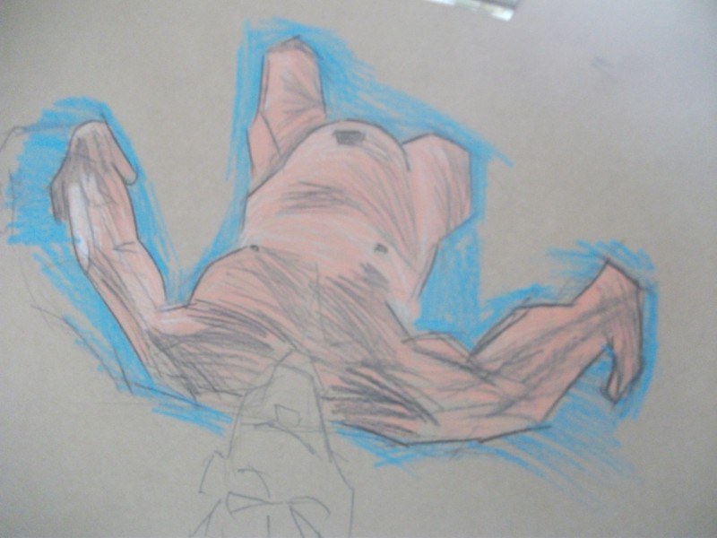
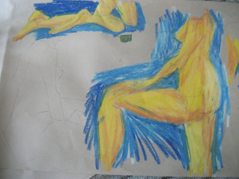 Color scene is similar to yesterday I focused on limbs - looking at the light and dark. Those feet on the top left are looking better! It’s certainly something I have to focus more on - feet and hands.
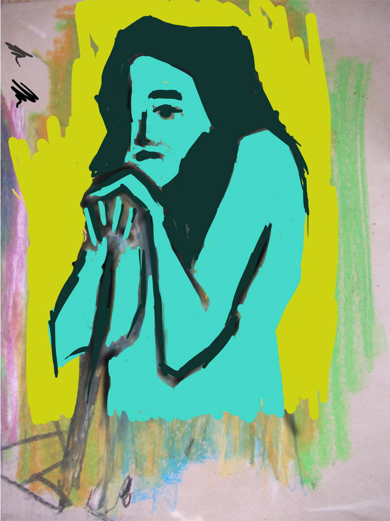
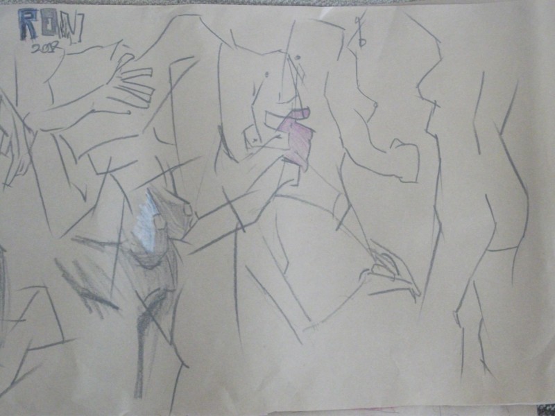
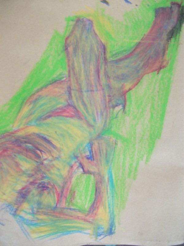
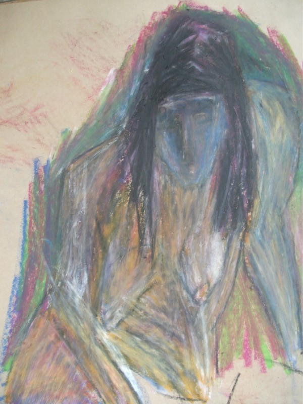
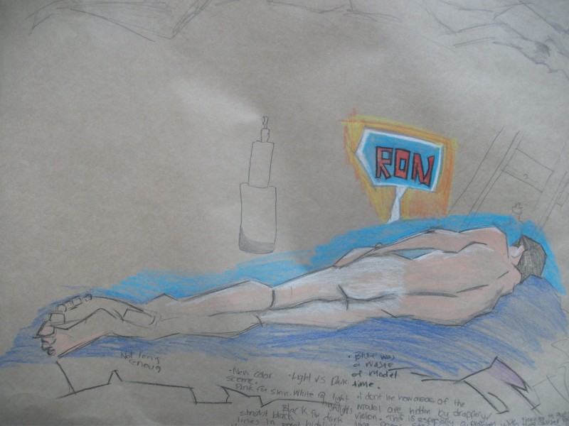
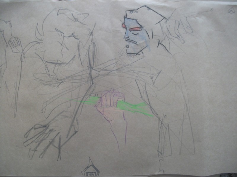
 This is a good example of a work I started but never had time to finish. You can see the pencil lines. More curvy lines are used in areas - and they work. I’m always worried that the curvy lines wont look at good as my normal straight lines. But I wont know unless I do them!
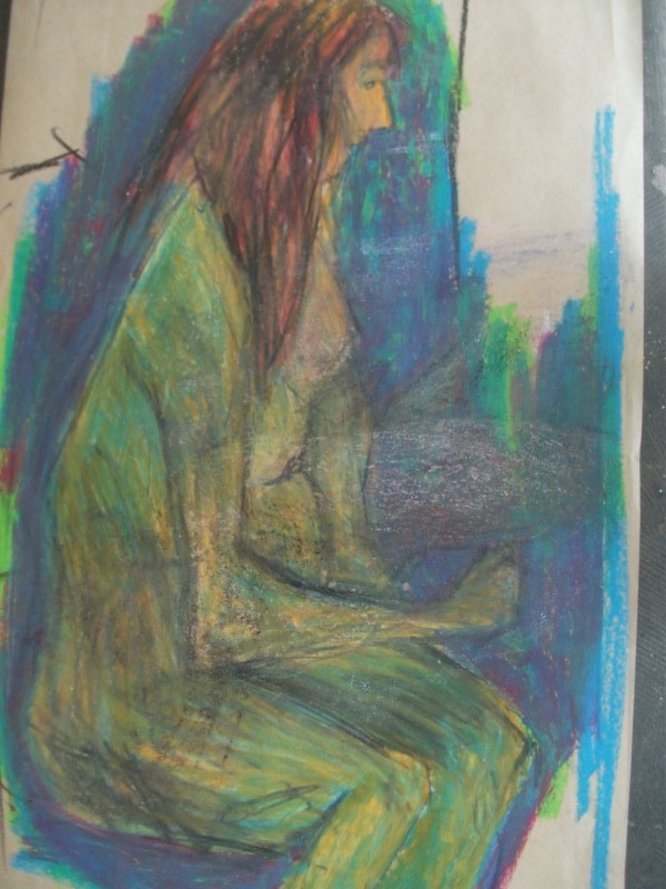
 Sitting pose. This was the only time I used white crayon - I used it more yesterday. Rachel said she liked this one, but I don’t think much of it.
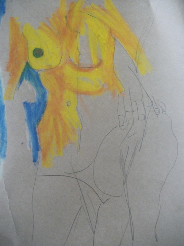
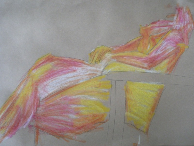
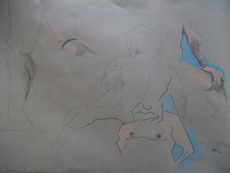
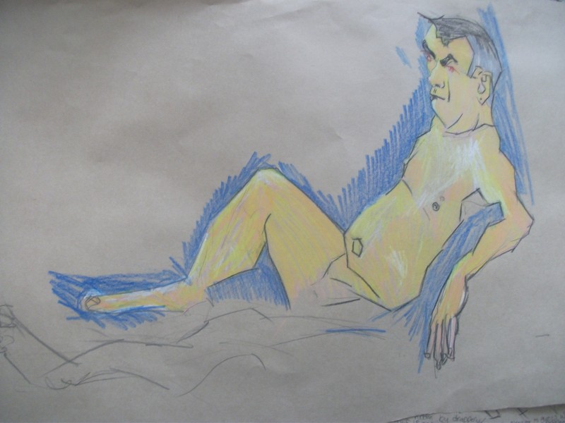
I talked about the chair with Angelique - I found it helpful using the chair for reference in measuring the anatomy. The proportions are certainly blown up here.
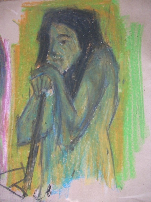
Another couple of pieces that I’m not happy with. Something it just doesn’t work.
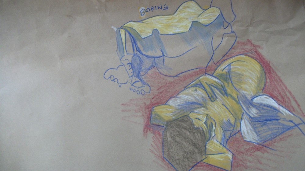
Here I’ve progressed from yesterday and decided to use a black. This was a hard choice as it destroyed the color somewhat - I got around this by using a cloth and smudging the black into the work. This gave it a more painterly effect and wasn’t so over whelming,
 When black is added to yellow green is often created. This happens here. I’m not too sure about this color. It’s getting quite muddy.
 This was the long pose. It was spose to go all afternoon (3 hours) but people didn’t want a pose that long. Instead this went for 1.5 hours. I’m happy that I got a long pose in that really allowed me to develop the drawing.
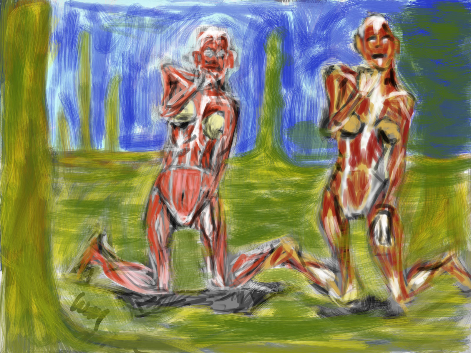
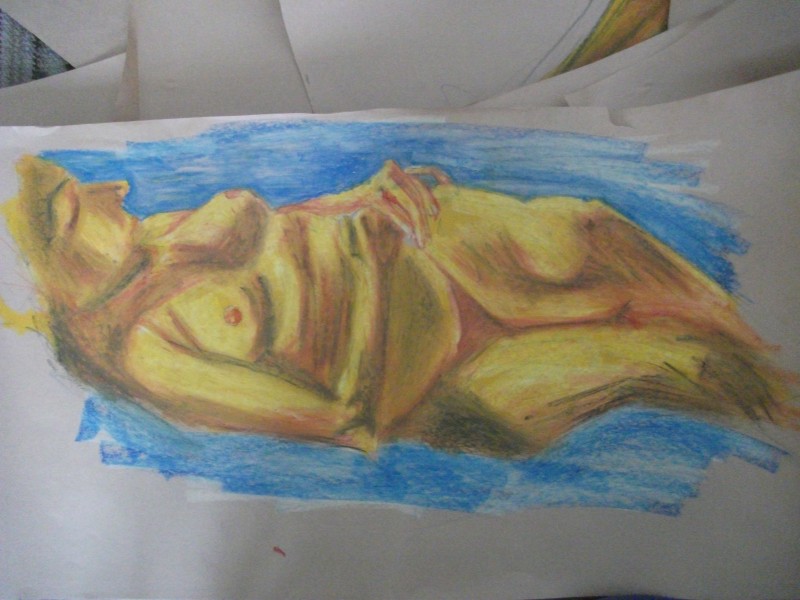
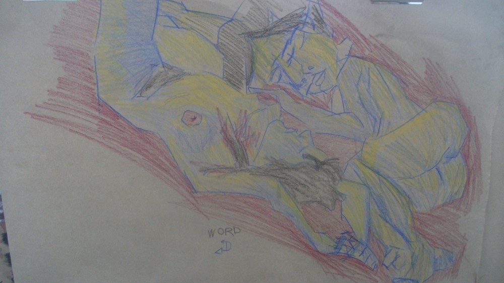
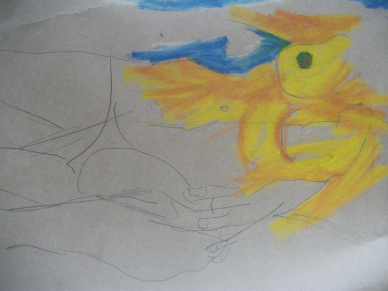
I started it how I started the rest - with a pencil outline of the figure and features. Then went in with red for the darks. Yellow for the lights. I covered reds with yellow as well. This helped give it depth. I then added a white - especially on the yellow areas - which hadn’t had any layers yet. This gave a interesting texture and of course depth to the piece. Finally finished it off with black - used a hand towel and rubbed into areas. This really brought areas forward. This is the suggestions that Roger would of given me. I wish I had him there today to help!
Tomorrow I may work in my visual diary - I’ll switch to pencil and colored pencil if so. Or I’ll keep working on an easel with brown paper and pastels. See what happens at the time!
Read more →
It’s block week at TLC and Robert has a model Monday (3hours) and Tuesday (6hours). Here’s my life drawings from Monday.
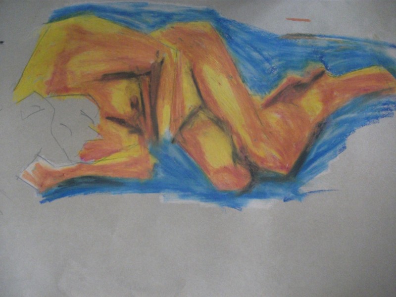
I decided to keep exploring oil pastel - though I decided to start with an HB pencil and create figures out of straight lines. Getting the full figure down wasn’t a focus - instead I focused on capturing limbs (something I feel I’m weak at). If I had time - tone was created with oil pastel. Yellow was used for light and a red brown (it looks purple) for the darks. I used a flesh tone over these to blend the works. Blue was used for the negative space.
 These are warmups. Quick poses - 30 seconds roughly. These are all completing with my chunk of 8b graphite. As you can see - limbs were a focus.
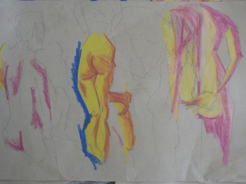
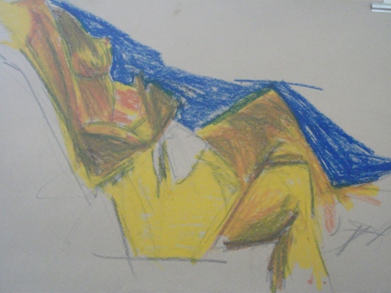
More warm ups. But some development is happening. Oil pastel is used to look at tone. The middle drawing of the back of the lower body is the strongest and most developed. The blue contrasts well against the yellow and orange.
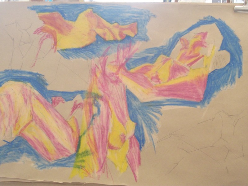
These are longer studies. I focused hard on looking for lights and darks and capturing them how they are. I feel my eyes are getting better at picking these ideas up naturally. A white tone has been added over these - I don’t like it as much as the powerful reds that were created with mixing the yellow and pink together. Maybe if I had applyed the white over the red?
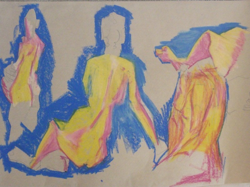
The final works for the day. Some I feel are becoming too flat with color - in some ways I like the bottom right drawing the best (though the lines are messy). More depth is needed.
Read more →
Recent digital works - taking the life drawings I did on Friday and working over top on Photoshop. Matt painting was a focus 
This was a struggle in digital. I had problems finding lights and darks in the drawing - it was all a blur and didn’t offer a strong contrast. I painted a very flat image - this could of been created in photoshop. Opacity is set to 100%. I attempted to layer but had problems.
I perfer the original oil pastel works. I looked at oil pastels in Frech Art Shop. Consided buying a white…… I need a part time job!
 Here I’ve worked differently. Layers have been used. I want to paint more like the old masters - I’m attempting that with the oil paints - Layering the paints up. This is much cheaper with digital paint than oil of course. White has been a large focus with over laying it onto the color.
Read more →
First time doing one of Rogers life drawing this term, and as always - brilliant. His life drawing classes always goes well.
Lee was the model. She had only modeled once before (for Dan). I enjoy drawing her. We started at 9:30am with a long pose that went though to 11am. There isn’t much chances for me to have a life drawing session with these long poses so when it happens - got to make the most of it!
I spent the whole day working with oil pastel - and black and white wax crayon.
This is my warm up. It set the general flow for the day. I’m happy with the figure but extremely annoyed with the foot - the proportions are totally wack. Those toes needed to be under the height of the knee.
Main thought was layers and conveying the light though layers. This is the reason why I choose oil pastels - it’s easier and faster to layer than colored pencil. I love the subtle nature that colored pencils offer but I wanted to treat this with GRIT.
Blue was the first layer - reds - then yellows. It’s similar to my ideas that I’ve been working with in painting. 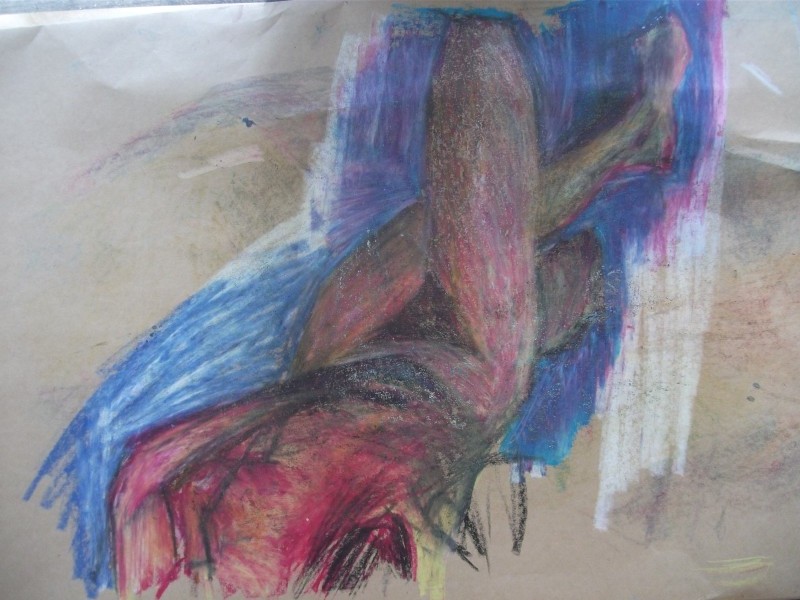
Here’s the second attempt at getting those proportions sorted. Multi studies of the same pose helped me understand it. The color palette is much more red than the first - much tighter.
I went in first with crayon to create line - giving a basic shape to the figure. This of course was straight lines - easy to measure. I feel I’m developing a real feel for measuring proportions correctly with the straight line technique.
Blue was used for the negative space - this gave a strong contrast to the yellow and red of the figure. Contrast! So important.
This pose was an hour. I’m not happy with it. Contrast with light and dark is lost within the figure - I didn’t focus enough. Could be better if we used a spotlight, using nature light gives a flat light rather than strong contrasts.
I’m still learning how to work with the oil pastels, but I wouldn’t hang this on my wall.
This was a 20 min pose. Surprising one my favorite for the day. It’s important I remember how much I can get done in a certain time frame and work to beating my time (no rushing though!).
Whats working is this colors - the balance of lights and darks. Roger mentioned that the dark in the hair helped the contrast with the skin. I choose green for the negative space over blue as I had used blue in the figure. A red could work as well.
I’m happy with this work and think it’s the strongest piece of the day. Plus it’s a standing pose!
This was a struggle. But I feel I learnt about the proprieties of oil pastel. Standing back I felt it lacked whites. Roger told me to go in with more whites then color over it. This helped but I needed more time to fix it. Whatever, it was a good resolving learning moment.
Roberts life drawing next week, and I might take a few of these works digitally.
Read more →
It’s my Mums birthday today. Here’s some recent digital painting I’ve been working on. I downloaded the trial of Photoshop CS5 to give it a go… it’s nice to have a change from GIMP… I still like GIMP very much and it does have advantages over Photoshop 
This started as a study from Posemanics… I studied the figure twice. First ones on the left and 2nd on the right. I feel it’s an improvement.
It then needed an environment and I was inspired by my recent oil paintings and copied them…. lots of experimenting with different brush types.

Here I’ve painted on top of a life drawing. I really want to take my life drawings further and the digital realm works well for this. Again it’s experimenting with brush types. I wanted to continue working in a opacity style.
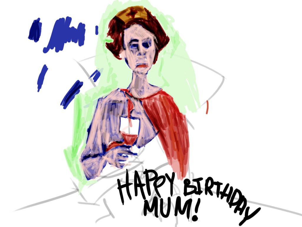 Portrait of my mum. This photo was taken at my 21st birthday. Mums holding what she loves - wine! She dressed as superwoman for the party. I painted this for her today and emailed… she should love it!
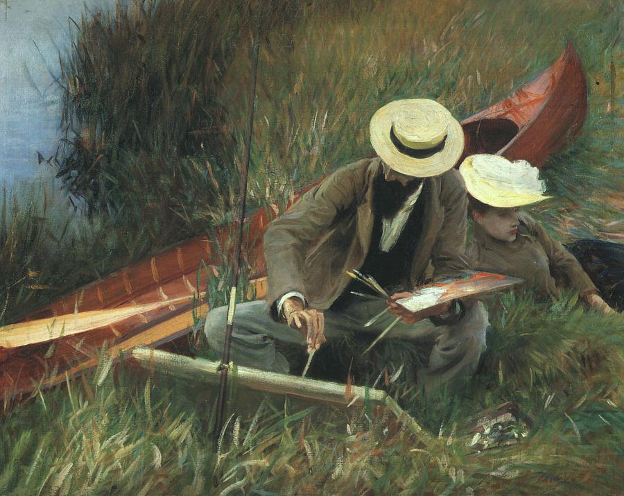
Sargent painting. I want to take an area of this and produce a copy with digital painting. It will teach me alot… best to take an area over the whole piece, work my way out. I really want to lean how to layer works - in direct painting.
Read more →
Ok, I’ve been sick recently so haven’t put time into any of my blogs. I’m felling better and starting to do more digital works (I downloaded the trial of Photoshop to give it a go - it’s been years).
Here’s some life drawings from a week ago - the final Friday of Dans. It was a most excellent session. One of the best of the term. Very happy with the results.
The model was Russel. He’s in his 50s and doesn’t look like Jesus
Gestural warmups. I’m never really happy with these but use them to get into the flow of the day. I guess they are helpful. 8b graphite stick was used.
Stretch! This figure is totally elongated, but I love the effect. Pushing those limbs to the limit. I didn’t mean to push it this far, but the effect works. Color! I have a bunch of watercolor pencils from 2010 that I have barely used - may as well put them to use. I love blue, especially that top one. The flesh tone is working well for the figure. I’ll explore these colors further.
 Extreme foreshortening Not a lot of information was present but I managed to capture the figure. I’m especially happy with the stomach area - certainly my strong point in drawing figure. I need to practice limbs further.
This was a fav amongst other students. Gestural works - but focused on a small portrait to develop it further.
 The hand in the top right was a beauty and got positive comments from my tutor - Dan. I really love these colors - The blue and flesh tone contrast beautifully.
Gestural. Exploring arms. It’s a bit rubbish, needs more time. Biggest problem with the gestural works - wanting to take them further but not having the time.
Working with wide screen paper - I’ve done this all term and the format has worked well for me. Here I’ve tried to emulate the
 This was my favorite for the day. The line is beautiful with the tone. Especially the upper leg. The hand has problems with anatomy. It’s a shame I didn’t finish the whole figure.
Read more →


Read more →
First update since the blog has been part restored. It’s mostly life drawing posts that have been re added. I will go though my artwork and create new posts for the missing work (especially traditional painting). The digital doesn’t worry me so much.
Here’s some recent life drawings of Georgette and Lee. The final Monday of the term involves double models (though we only had a 2nd model from lunch). I wasn’t happy with the work in the morning but once afternoon hit it improved. Georgette just wasn’t working for me. Strange really, in the past when I’ve drawn her it’s gone well.
It was nice to draw Lee, shes a TLC student but had mostly focused on Jeweler - she’s doing more life drawing nowdays.. Quite a regular at Vincents.
This is my favourite of the day. I’d like to take this style further. It’s working well. I’ve been timing myself in how much I can capture (not rushing). I should be able to capture the full model in 5 mins, no problem.
I used yellow to show the light and blue for dark/line. What do you think of this drawing? 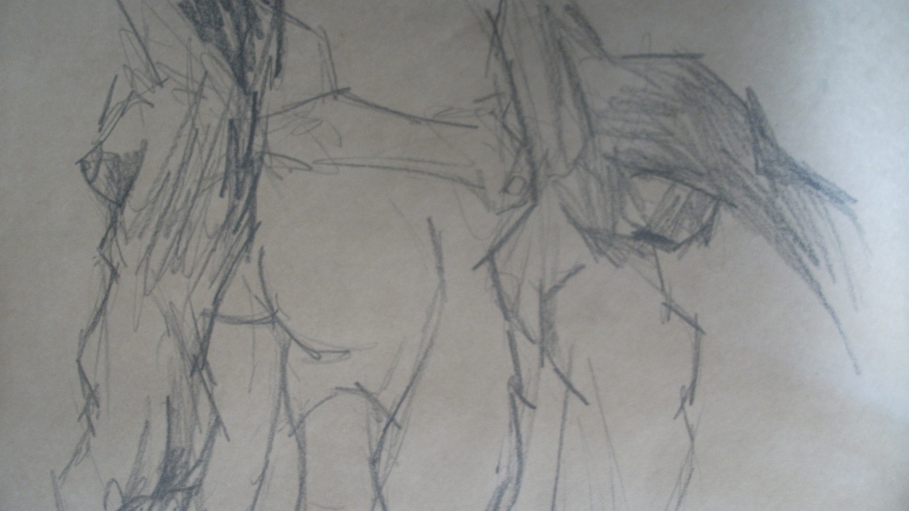 Graphite pencil. Messy, I prefer a cleaner look in my life drawings currently. This is the style I did 2 years ago.
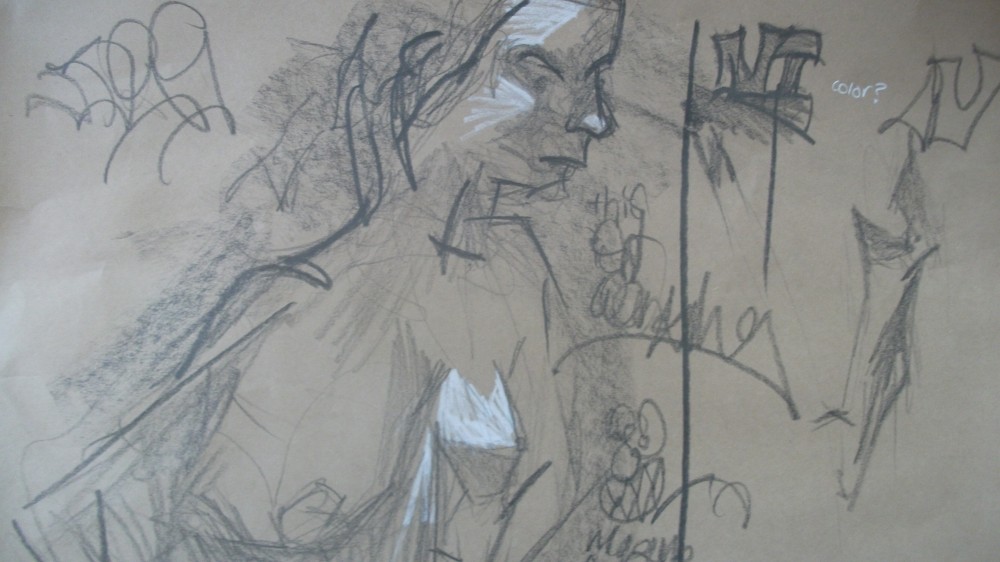
This wasn’t working. I have nothing more to say.
This is working. Same color scheme as the first. The top drawing - not so much. But the bottom is there. What more could I add to it? Maybe a green layer? The scale of these are small compared to what I’m use to working with.
Read more →
Todays theme for Reddit SketchDaily is: A study in Grays.
Interesting theme! Gray!
I used Flickr for reference images. Normally I use Deviantart for stock images but DA stock artists often get cranky at using their photos on websites that isn’t DA. I hate DeviantArt with a passion. I started going back on there again but realised again quickly just how shit it is. Conceptart.org is better.
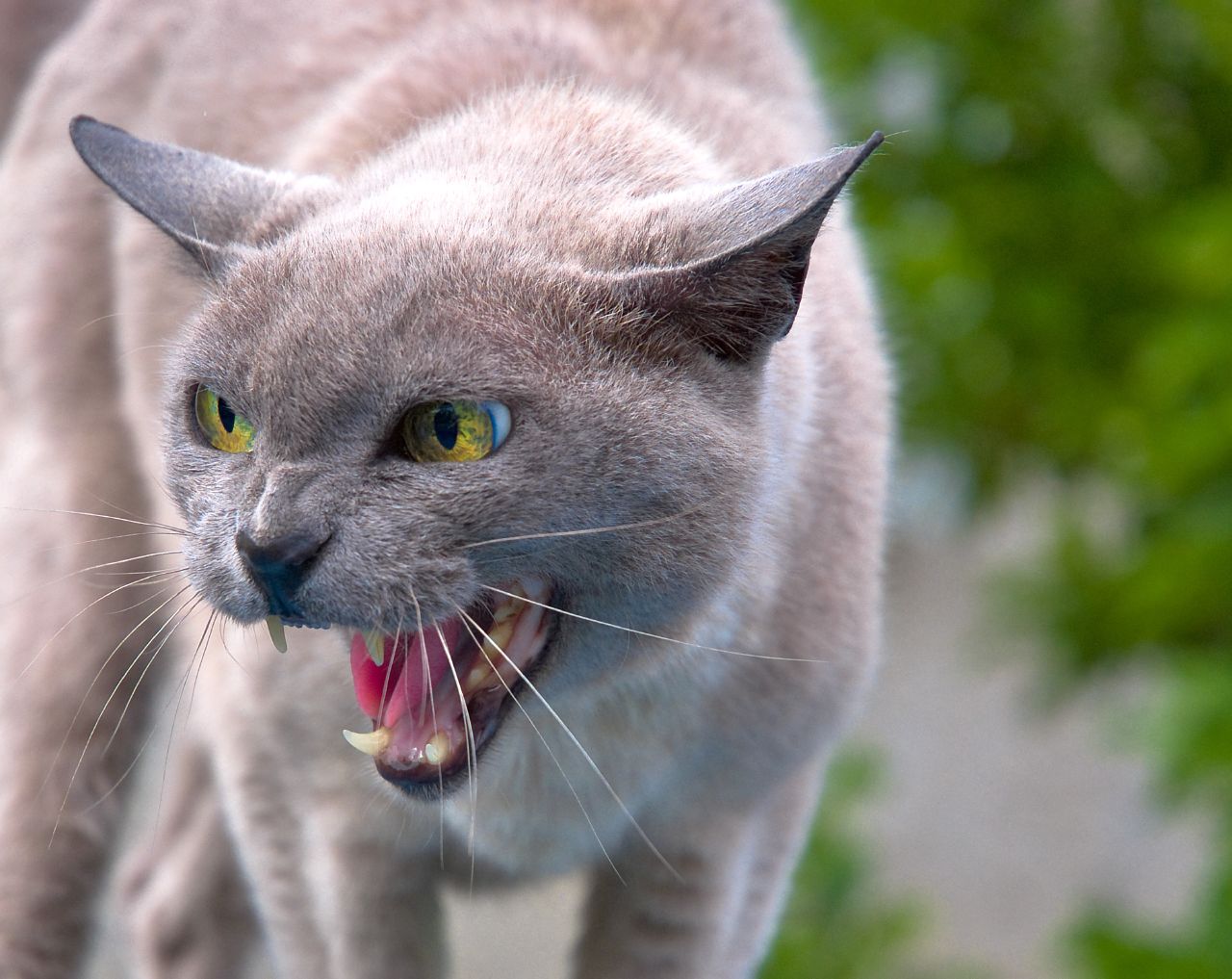
The reference I found on flickr:

My sister has a gray cat. She’s a sweetheart and never would hiss, delicate. Find it on Flickr here.
Ok, now a painting. I started with a quick line sketch. I’ve enjoyed using these lines recently. A small change.
Read more →
For my Facebook friends this year I am creating digital birthday cards. I am sick of seeing crappy updates on Facebook of posts that just say: Happy Birthday, have a great day. The majority of content I am sent from friends and such is reposted from other sources. I guess that’s a motivation behind this blog – to create original content.
Today my friend Joshua has a birthday. I met Josh during my visits with Occupy Wellington. During this time I drew portraits. Josh always wanted a portrait but I never got around it. For his birthday I completed a digital portrait for him.
The reference photo I used:
Read more →
 This is a good example of a work I started but never had time to finish. You can see the pencil lines. More curvy lines are used in areas - and they work. I’m always worried that the curvy lines wont look at good as my normal straight lines. But I wont know unless I do them!