I didn’t do a concept art environmental work yesterday so wanted to make sure I did one today. I haven’t been getting out and drawing on the street. I have been drawing everyday, but it’s been at Mothers rather than public. I need to start getting back out in public and drawing again.
Anyway, here’s a painting I did today.
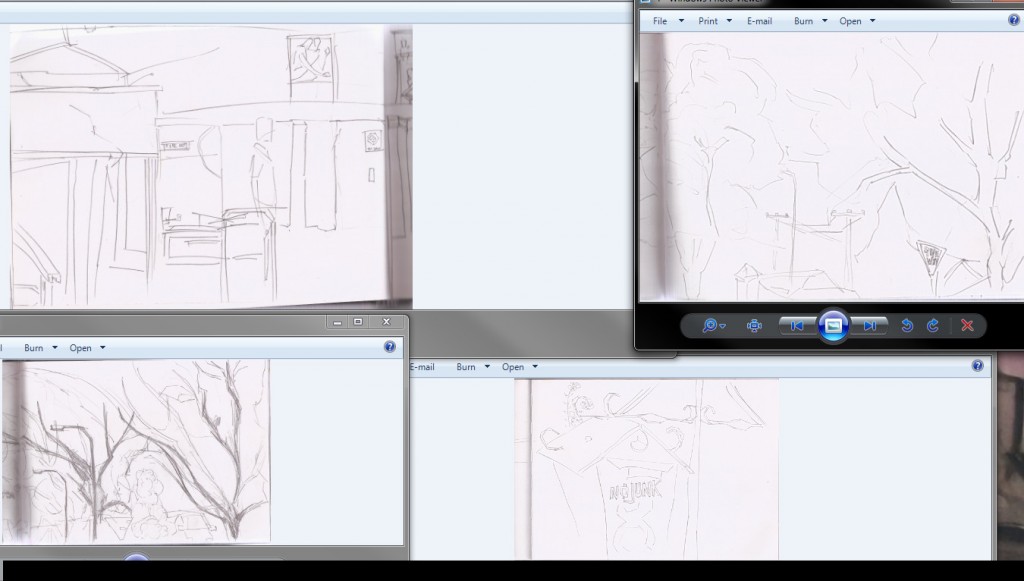
For the reference I opened a bunch of drawings up and used them as reference to create a new composition. I could mashed these works together into GIMP and traced over, but just decided to just use it as reference.
The drawings are various areas in Levin - including a Church that I went with family for a party. It’s very rare that you will find me in a Church - but when you do, I’ll likely be drawing.
 Line work. Size 7 pixels works best for me. The default 20px seems too large. Again, no black - just a lovely red.

Tone added I worked over the trees several times with a range of textures as I was not happy with them. My favorite area is the letterbox - the range of tone works well. The image may need more detail on left, especially behind the figure.

Color. Keeping with the same palette of colors - though this time I decided to use multiply and overlay brushes (like the portrait I painted yesterday . I used the I’ll keep working with the multiply and overlay settings as it gives the image a gutsy feel.
Finally, the video of the process:
Read more →
Awake early this morning - 5am. Wanted to get straight into the digital painting. I first checked Reddit SketchDaily - Free Draw Friday. Fantastic - can just do a street scene.

I mashed together three drawings I did in Levin. This system of mashing drawings together is working out well - it’s allowing me to cover more ground and use the drawings that I may not have used otherwise. 
The inking. I choose to use a brown over the black. It gives a more natural look over cartoonish. That’s what I want. Having the lines in the first place is wrong, but it’s been helpful for me to develop my work into more detail.  Gray-scale tone added. I used three brushes - two custom made flat brushes for the objects/sky and a vegetation texture brush for the vegetation (leafs). I should have added dark and texture to the sky.
  And color added. Same colors as the previous works like this.Not much happening in the foreground - focused on the background further by using a dark red in the clock tower in order to push it back. My favorite areas are the left and the clock tower.
Check out this artists work
And finally, the video of this paintings process:
Read more →
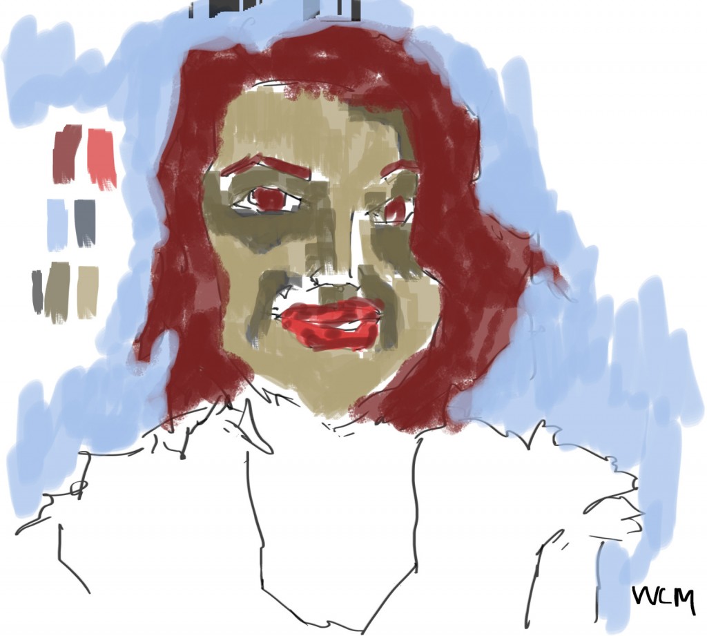
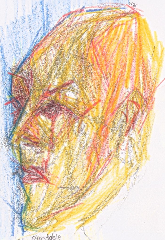
Here are a bunch of portrait paintings I did at the end of October. I kept with similar colors though the pieces - like the scape works - certainly helps the harmony of the overall look. 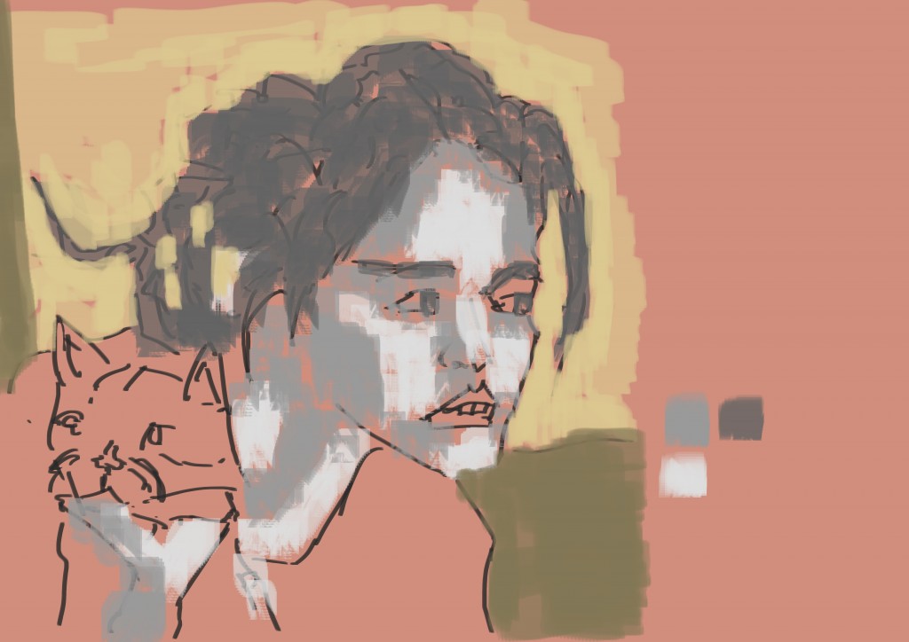
The cat was expecially nice to draw. More people need to upload portraits with their cats. I like this portrait. She looks similar to an old friend - Sky. With all these portraits I started with the line - then grayscale tone, then finally color. It’s a process that works for me. Sadly I didn’t preserve the line or grayscale layers - something I’ve been doing regularly with the digital street works. I think it’s importrant to keep these underlayers because it may be helpful to go back to the line work and re do the tone and color in future. Who knows what will happen with them?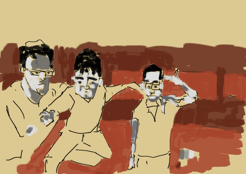
Work mates. Comment I got for the work:
thanks! it is pretty fun! We all had a nice laugh at the essence of each of us that you caught, got a nice convict-y feel ;)
Thanks so much!
It’s great when people point out things I don’t notice - such as the prison look. Those oranges and yellows do it. Bad ass.
 Top of the image is damaged - GIMP does a strange glitch with switching between brushes/colors when I’m working on the edge area. I just try to avoid the edge - can always just crop it down.
Video of the painting process.
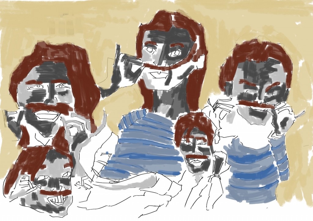
Remind me when I was drawing at Matchbox Gallery and had 6 people in one drawing. More people is easier - makes the measuring easy!
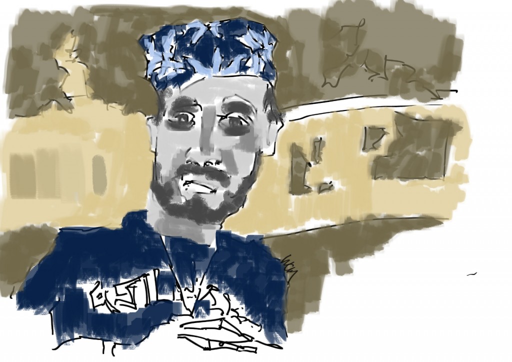 No reds in this. They may help in the face?
Read more →
Continued taking the drawings from Wellington into GIMP and turn them into Concept Artwork.
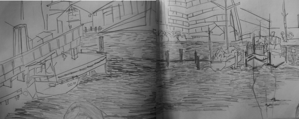
This was one of my favorite drawings I did well in Wellington - Waterfront on Sunday morning. When I lived in Wellington I would often make it into the Te Papa market to buy fruit and veges - and get some sketching done. It was lovely to do this again.
Here’s the painting process:
I started with mashing the two photographs together. I worked the same size as the previous work - 6000px by 200px. It’s a great long format that works well for these ladscape type works.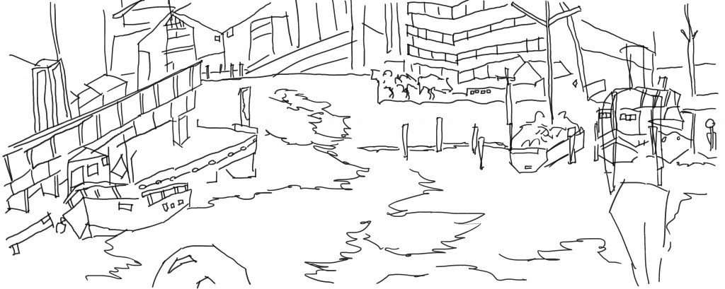 Line added. I kept with the black line but I should explore different colors - browns might be good. Using something that’s not black will help remove the cartoon feel I get.
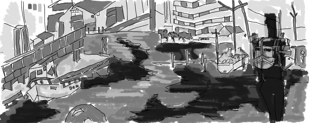 Tone added. I used a light and mid gray for the objects and a dark gray for areas of the water and the figure in the foreground
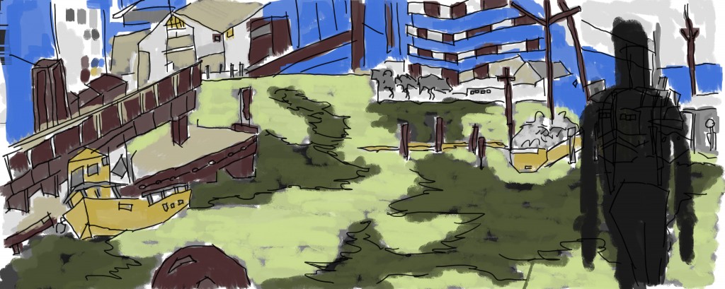 And finally color - same color as previous works. I want to create several of these works everyday - using the same colors (though I leave room for more colors to happen - especially lights and darks of current colors). I kept the figure in black as it helped give the sense of perspective. Looking at this now - more reds could of been using on the right side. Maybe even capture the figure with some reds. Would highlights of light on the figure help?
Read more →
Photopgraphy 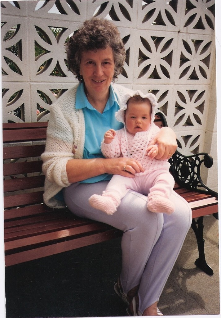
Read more →
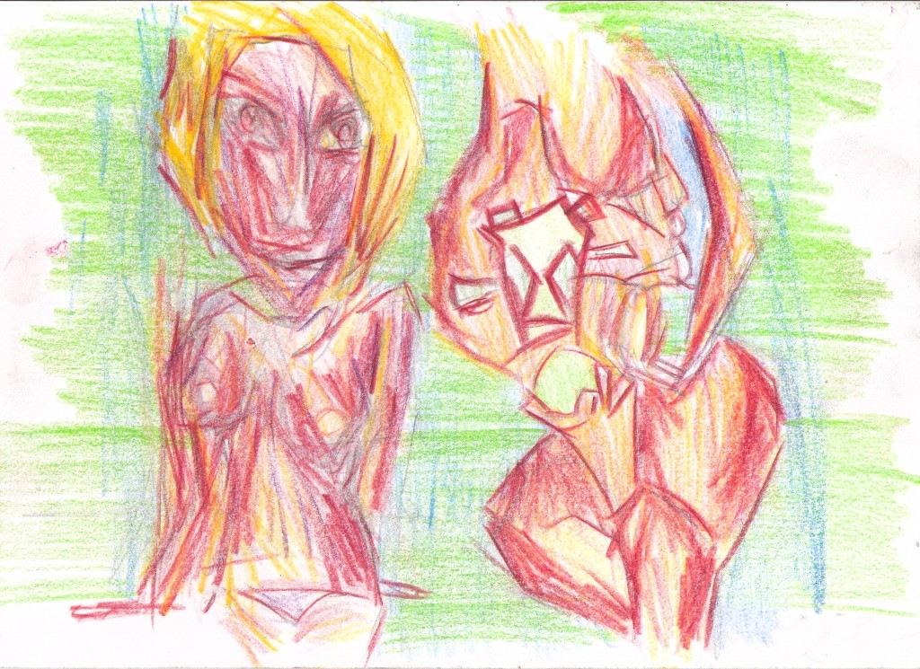
Colored Pencil
Read more →
I’ve started taking the drawings from Wellington into GIMP to produce digital paintings. I tend to do far more drawings than digital paintings. It’s my goal this month to pump out digital paintings of these drawings. I have a large backlog - including drawings from Levin.
Here is the first work. One of my favorite drawings from Wellington - the railway. 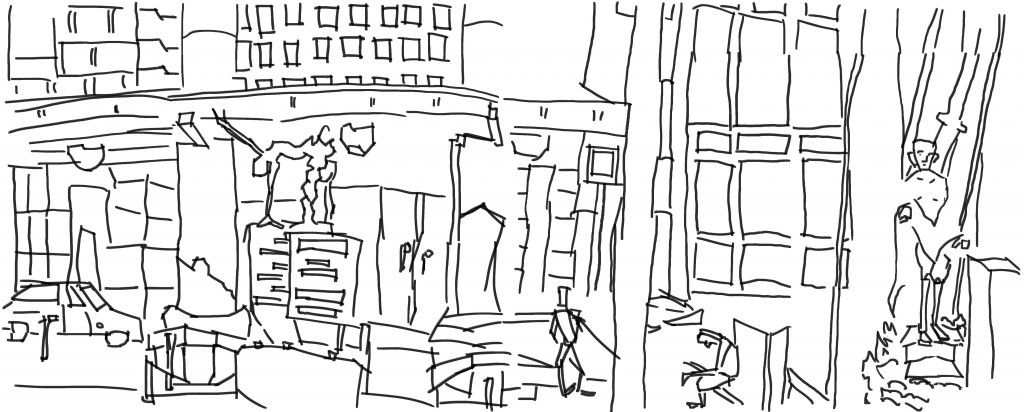 My first task was to ink in GIMP the pencil drawing. Looking at this now I wish I had used a smaller brush - it would of created a nicer line. This line seems too large - not enough thin variation The tone added next helps this problem…
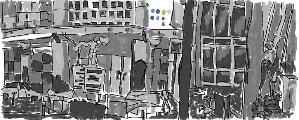 Gray scale tone added. I used the same custom made flat brush on my of the work - with the exception of swapping to the chalk brush for the grass area.
 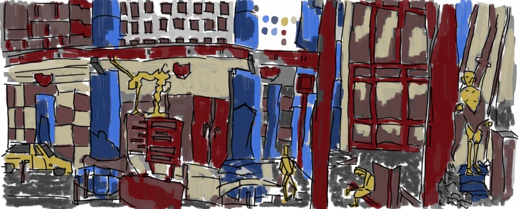 And color. For the colors I choose to use colors I had used in previous works - dating back as far as July. I haven’t used this set of colors for sometime. For now I’m going to keep with them - and see how they evolve.
During my trip to Wellington I saw some abstract paintings. They made me vomit. Marks on canvas. Whats the point? If you aren’t going to paint something, no point painting.
Read more →
I recently got back from a weeks holiday in Wellington. During that time I spent hours on the street of Wellington sketching. For months I have been doing these daily ‘sketchcrawls’ around Levin. It was great to draw Wellington.
Here’s the works:
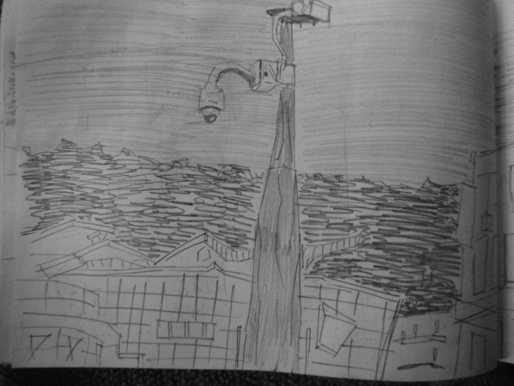
Tuesday evening. This was shortly after getting off the TLC bus. I needed to wait around town for two hours as life drawing was happening at Vincents at 7pm. I had just brought a new clutch pencil from the TLC store - had store credit which I needed to spend. It was weird getting use to the new clutch pencil - and took me some time to warm up.
This drawing is of the waterfront. The building behind the camera is the Rowing Club. 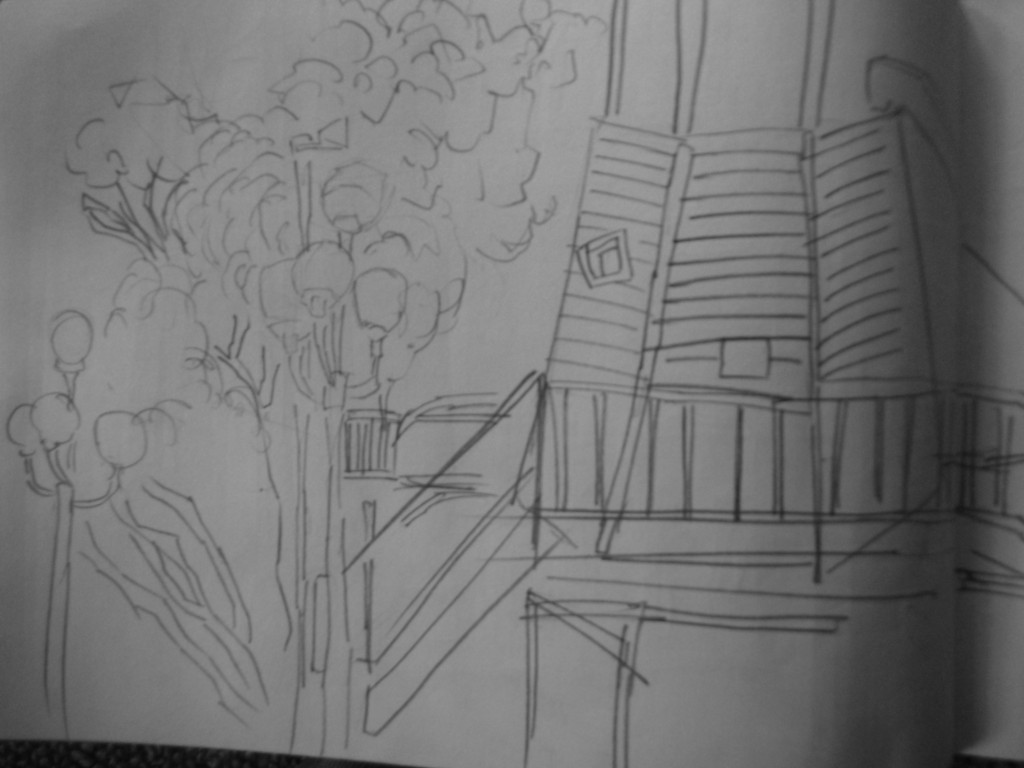
Another waterfront work. This one is of the playground area. I drew this on Sunday morning. The angles of the playground were a challenge I didn’t spent long on this - Wellington was cold so I had to keep moving
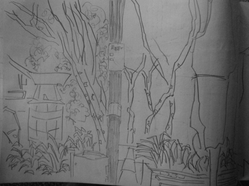 Typical Cuba Street view. This was drawn on the 31st of October - Halloween. I didn’t do anything for Halloween but people came out to town for it. Town was busy. This image needs more dark.
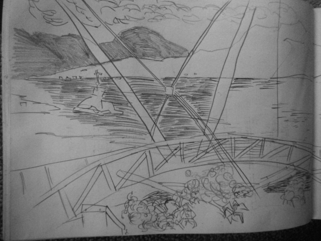 Waterfront. Somewhat happy with this. The composition is stronger than previous - and my line/tone is confident. I’ve been trying to create a range of textures using mark making techniques - such as small horizontal straight lines to represent water, curvy lines to show the plant material (but also straight lines in a leaf shape, the hills were created using directional lines to build up the 3d shape.
Second page. This is the outside of a bar. People are standing outside looking out into the water. Beautiful day. The bridge continues in the foreground. Somewhat empty than the first page.
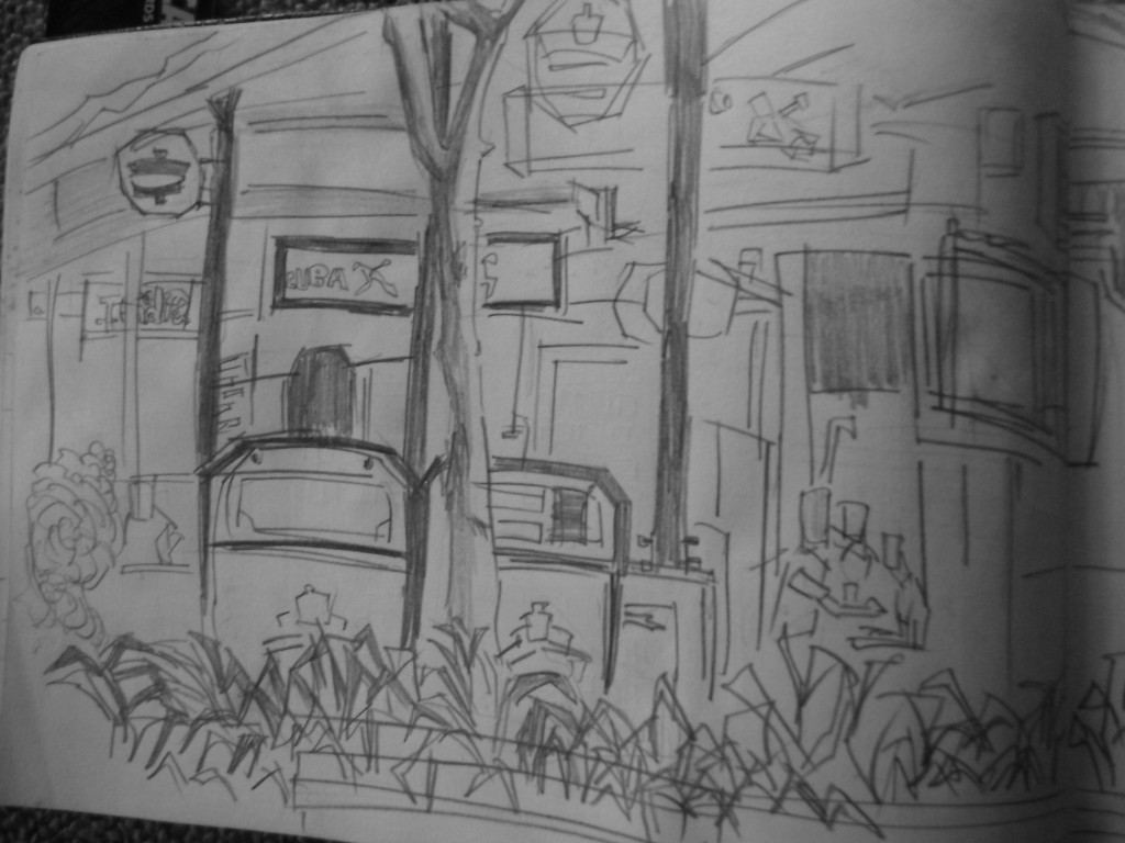
Cuba Street. Sitting on a bench looking toward the shops on the right. Capturing all the information that I can see. Managed to capture some figures. I don’t spent long on the figures but just use them to give a sense of scale to the work.
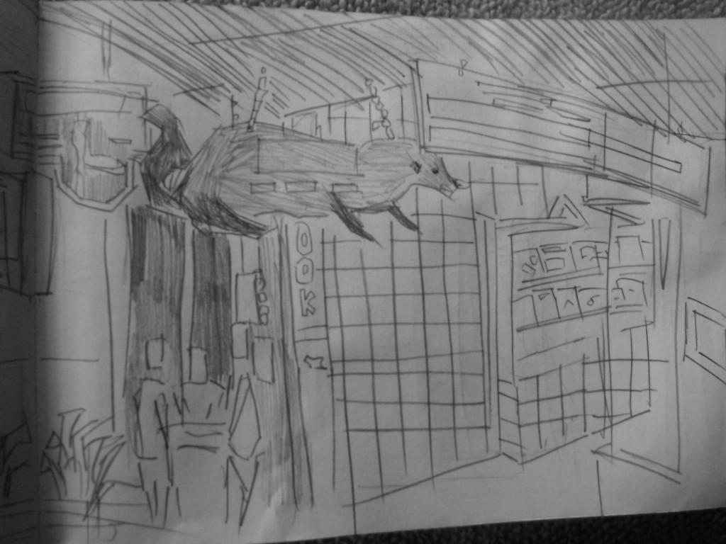
Second page. This is one of the most complete drawings I’ve done. I partially enjoyed drawing the animal outside the bookstore. It gave the scene - ‘oh yeah, I know where that is’. 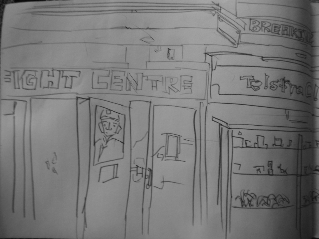 Courtney Place. I started drawing this scene but got ineruped with two Germans talking to me. We talked for sometime - I showed them my sketchbook and then they took off. It was getting cold (cold seems like a theme in Wellington) so took off home. I continued the drawing at the same spot on Sunday.
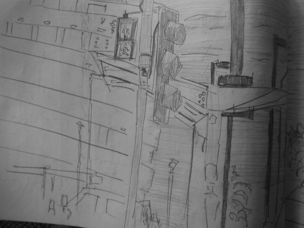
 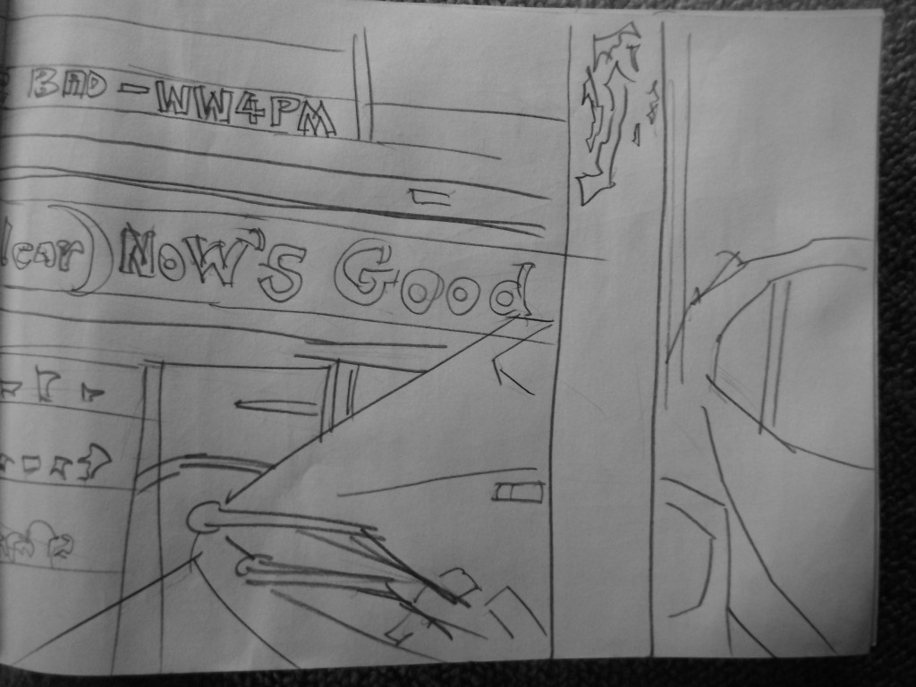 Second page. The Telstra Clear logo finishes - pole in the foreground blocks the view, and a car takes up most of the space. Capturing a range of planes helps the scale of the work.
View on Willis Street. I had just been to Gordon Harris. I stopped on a bench nearby to draw and rest. The view was a typical cafe view outside. I like the lights. The detail in these are improving - the tone helps. Captured several figures. People generally stayed still as they were waiting for the bus. 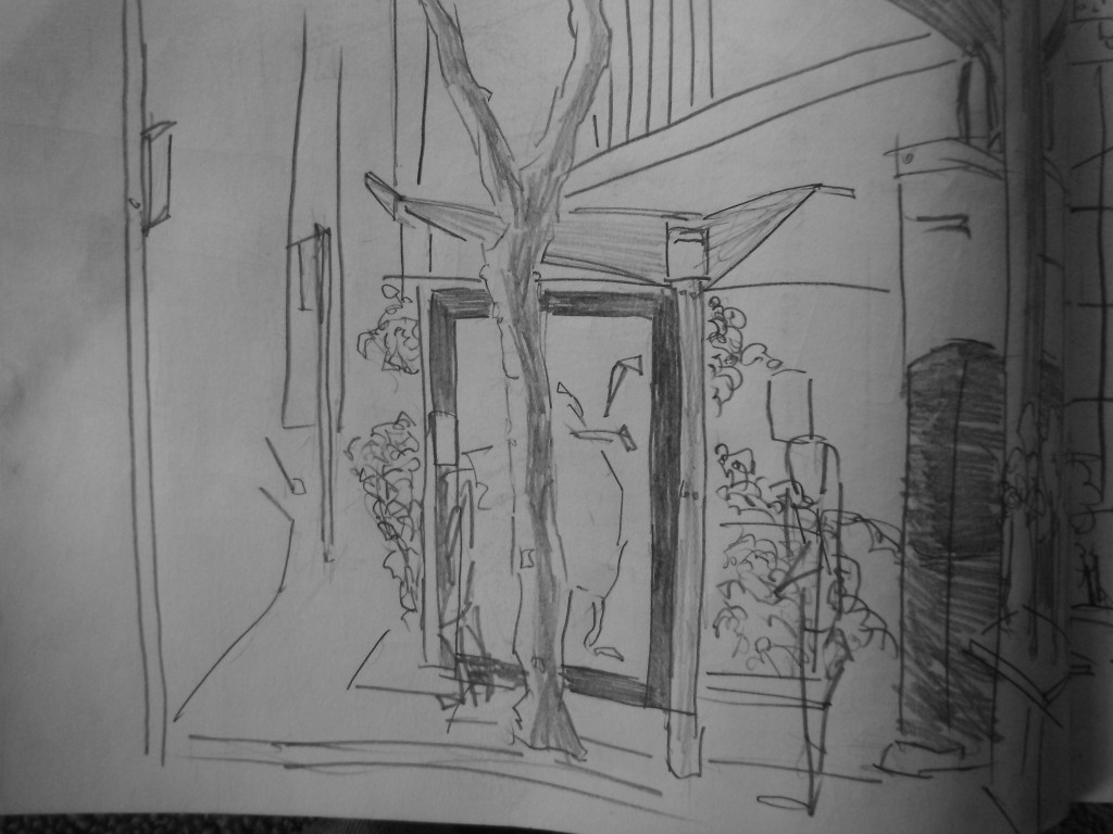
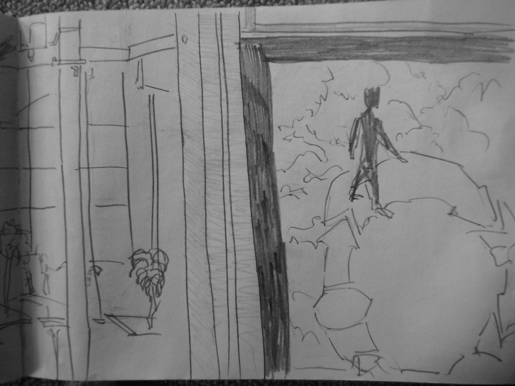 A billboard took up the majority of the page. It was advertising something about dumping rubbish and the circle that happens. I drew in areas of the poster into my work. I’m not sure about using brands in my drawings. Often I just create rectangles for writing areas. But then again - it will be more correct to add these elements in. I guess whatever feels right.
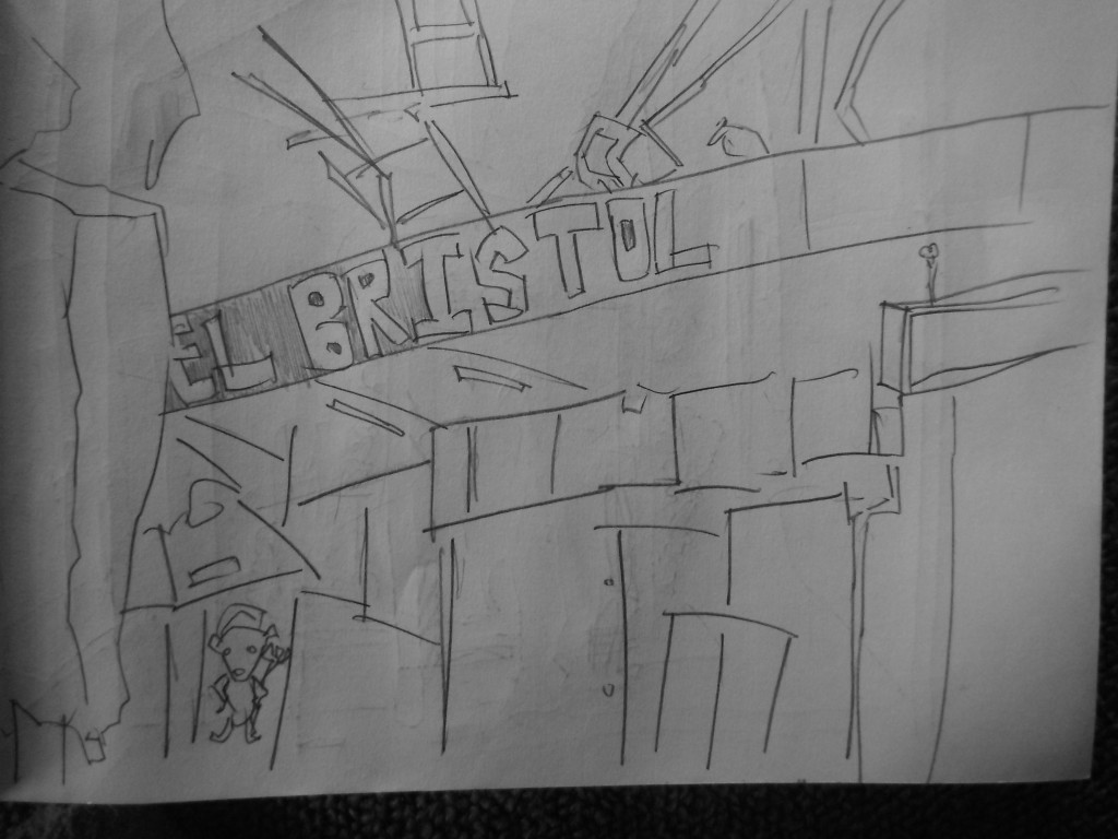 Hotal Bristol on Cuba Street. This was just a quickie. Nothing special.
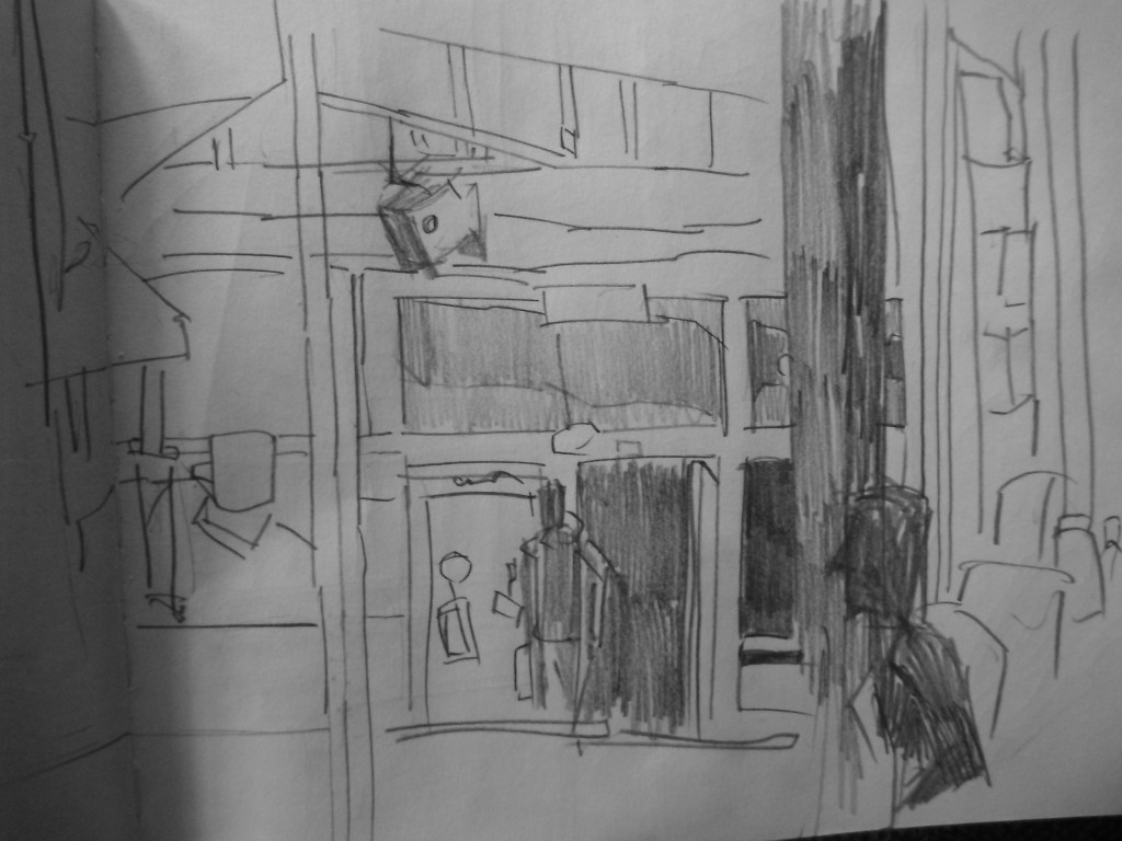 Cuba Street view from Mr Bun as I was having lunch. The dark tonal areas (on the left) feels very close.
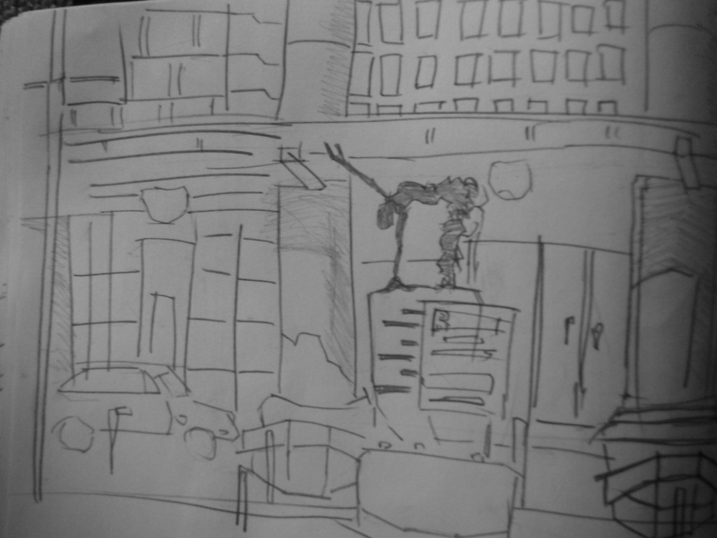
Railway station. This was the final drawing I did in Wellington. It’s my favorite - nice to leave on a high. I drew this same scene when I was leaving Wellington two months ago. Great to go back and compare they two. My level of detail has certainly increased. I feel more confident in using tone in these streetworks. 
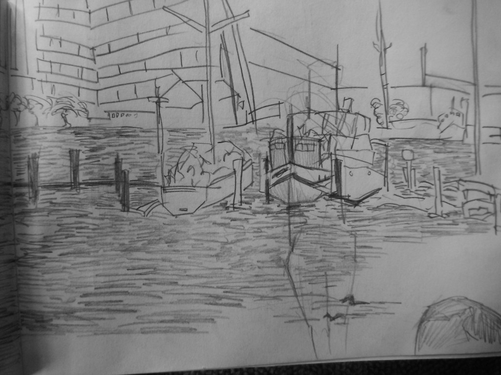
Tone wasn’t used hugely in this railway drawing, mostly in the figures/beams/and started on the windows. I spent sometime drawing the Gundi statue. He stayed still for me. 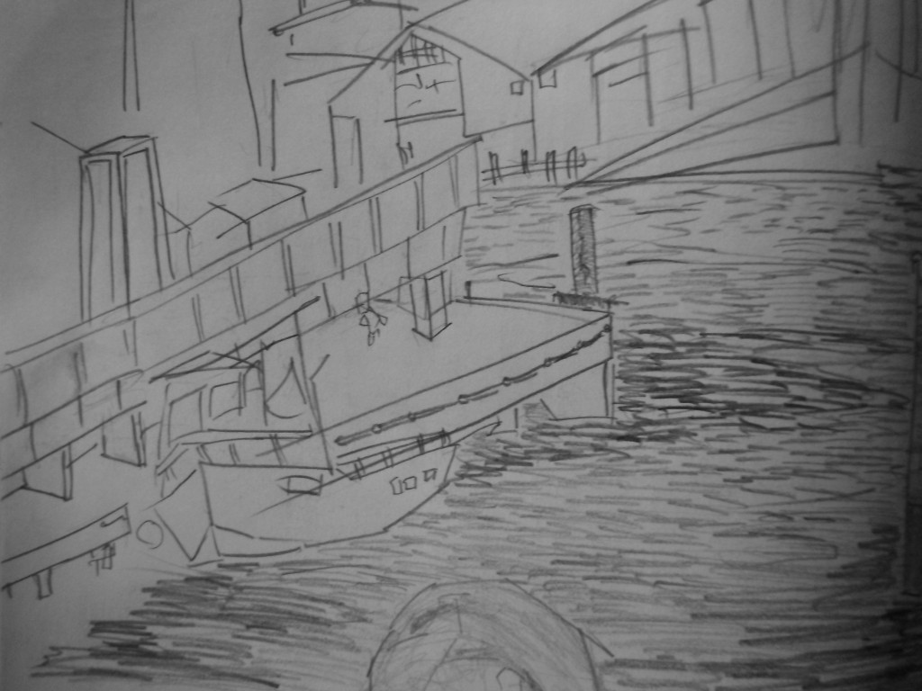 One of my final waterfront drawings. Very happy with this one. The boats were especially fun to draw into the scene - so often I draw the same objects it’s great to have something completely different. I struggled with the perspective in the distance - often I look, then make a line, then look again and see I did the opposite I need to focus on capturing the right direction. As always, Ball in the foreground helps give the scene a sense of diminision.
 And the second page. Several boats parked next to one another. They were helpful for measuring the scene, and filling up the water. It’s better to have a chaotic scene than empty. Quick outline of a figure in the foreground.

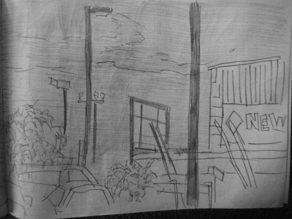
Just went to New World for lunch. Found a seat nearby to draw. Spent the majority of the time working on the lights and shelter behind. There was a large building the the background. Tone added to areas - the signs and the sky.

Second page. Clouds in the sky. Poles scaling up to show the distance. Some vegetation scatted in areas. New World building on the right. Cars on the bottom left - very rough.
Read more →
I’ve photographed both of my current journals I’m working on currently. The first - a A5 shaped, rip able, thick. It’s perfect for watercolor/gouache.
Here’s two paintings I’ve done in it so far:

This started as a life drawing in Christenas class on Wednesday. I was happy with it. There was nothing that annoyed me about the image - it was a life drawing that captured most of the body, it had tone, it worked.
I brought a red watercolor and white gouache in Wellington and had several colors of gouache
On Sunday night when I arrived home from Wellington I decided to have a go - I used my large flat watercolor brush. I quickly worked over the drawing - similar to how I work with my digital paintings.


 Here’s a landscape I did with the goache and red watercolor. Again, this is a very quick work with just minimal thoughts.
Maybe more of these worked in the future - I’d like to transfer some of my street drawings into watercolor. It was a suggestion from Roger Key - though he would prefer me to use oil paint (which I should really do - I’ve had oil paints sitting here for over a year not being used.
Read more →
Busy week of life drawing. Last time I did it was over two months ago. Refreshing to get back into it. It will likely be sometime before I do it again. I should try to make it to Life Drawing in Palmerston North.
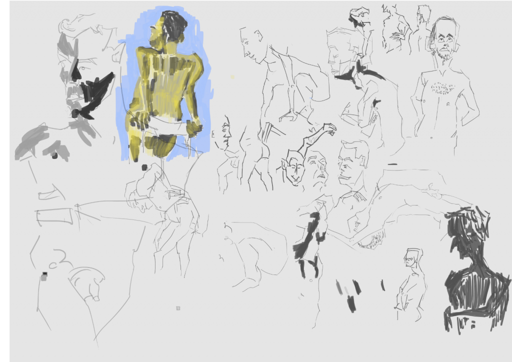
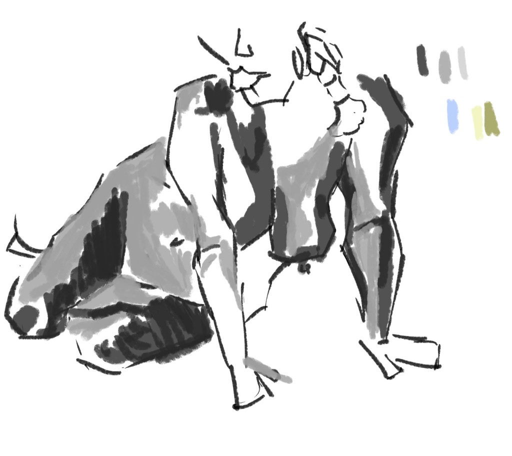
Here are digital works I did in Christinas class on Wednesday and Rogers Friday. Christina had very quick poses - and Roger long. I enjoyed both classes. I used pencil in my sketchbook
 Works for the whole day. The poses were extremely quick so I didn’t have time to capture tone or full figures. Instead I just focused on capturing areas of the body - like I use to. There was one longer pose (top left) that I was able to add tone and color too. In Rogers I extended this idea further.

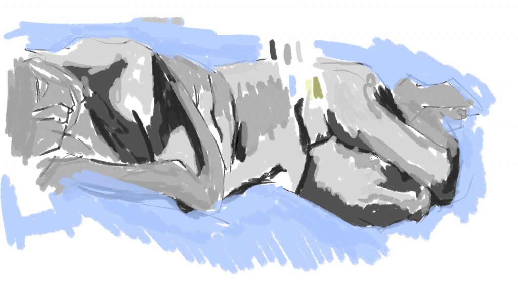
Rogers today. Geogetete was the model. She’s a fantastic model to work with - stays still and interesting curves. For all the works I went with a chalk brush. I’ve used this for my landscape works. I didn’t bother with experimenting with other brushes but rather just concentrated on capturing the lights and dark of the model. 
This was a longer pose that allowed me to capture the whole model and even color it (see next piece). Areas of this still need some development - most notable the foot and calf area. The portrait could do with tonal values as well. 
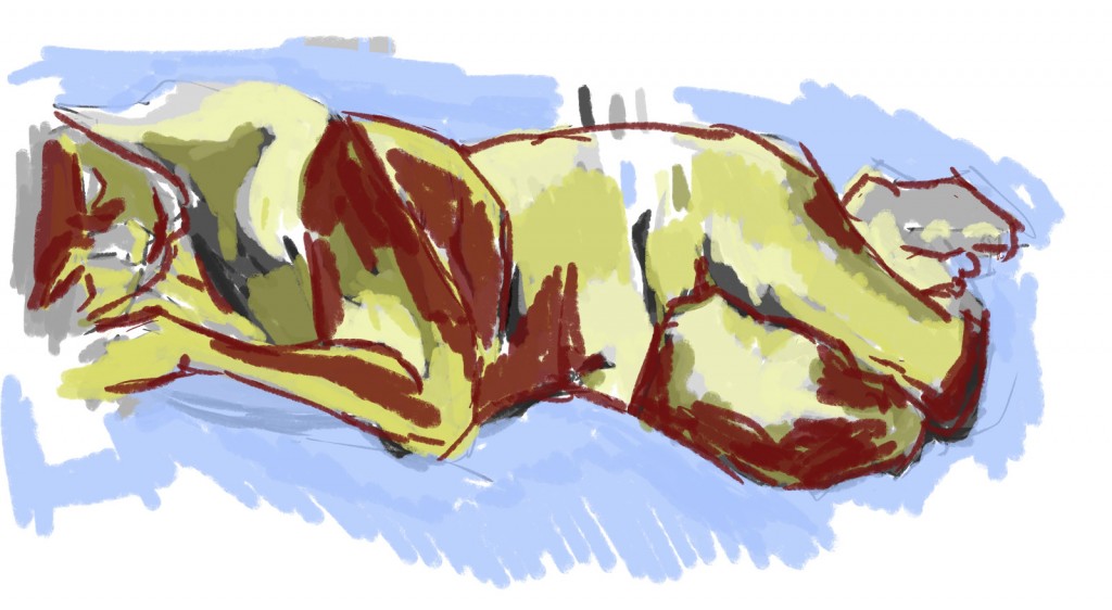
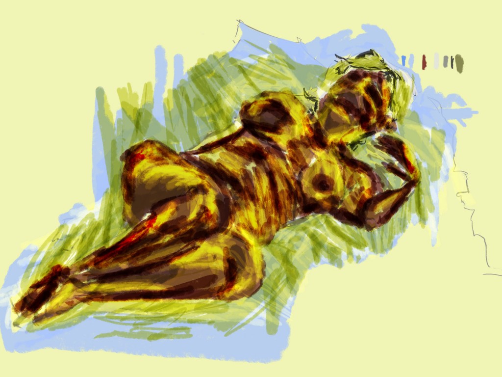
Color added. I started with the yellows - light and dark. Afterwards I added a red. Roger noticed the red and said it helped the work. This piece reminds me of the acrylic life painting I use to do in Dans Friday drawing class. It’s got that expressionism feel to it - mixing the tonal and line together. A range of colors helps. 
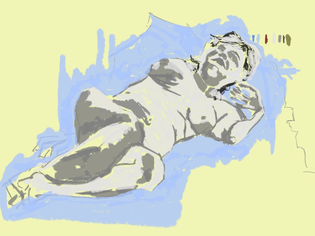
I started this piece with a yellow background instead of white. This allowed me to use a light gray without having to worry about lack of contrast. I used a mid gray for the darks, and a black for the hair. The hair wasn’t working so I covered it mostly with a light gray. For the negative space I used a light blue I had used in previous works. 
Color added to the figure. A red multiply brush was used first. This allowed me to preserve the under-layers. Yellow was then added as an overlay. This gave the image a very bright, and glowing look.
Read more →
 Line work. Size 7 pixels works best for me. The default 20px seems too large. Again, no black - just a lovely red.


 Line added. I kept with the black line but I should explore different colors - browns might be good. Using something that’s not black will help remove the cartoon feel I get.
 Tone added. I used a light and mid gray for the objects and a dark gray for areas of the water and the figure in the foreground


 My first task was to ink in GIMP the pencil drawing. Looking at this now I wish I had used a smaller brush - it would of created a nicer line. This line seems too large - not enough thin variation The tone added next helps this problem…
 Gray scale tone added. I used the same custom made flat brush on my of the work - with the exception of swapping to the chalk brush for the grass area.
  And color. For the colors I choose to use colors I had used in previous works - dating back as far as July. I haven’t used this set of colors for sometime. For now I’m going to keep with them - and see how they evolve.


 A billboard took up the majority of the page. It was advertising something about dumping rubbish and the circle that happens. I drew in areas of the poster into my work. I’m not sure about using brands in my drawings. Often I just create rectangles for writing areas. But then again - it will be more correct to add these elements in. I guess whatever feels right.
 Hotal Bristol on Cuba Street. This was just a quickie. Nothing special.


 One of my final waterfront drawings. Very happy with this one. The boats were especially fun to draw into the scene - so often I draw the same objects it’s great to have something completely different. I struggled with the perspective in the distance - often I look, then make a line, then look again and see I did the opposite I need to focus on capturing the right direction. As always, Ball in the foreground helps give the scene a sense of diminision.