Another video from my digital work. This time I added a commentary to it. The sound isn’t the best, and I’m nervous/tired. In future I’ll work on a script/prompts before hand. I need a new mic if anyone would like to donate! Button on the right —–>
No the reference photos and JPGfor this- I was working straight from Chrome and reset my computer earlier, losing the works. Oh well.
Here’s the video:
Read more →
The theme today on Reddit Sketch Daily is Inappropriate School Mascots. My first thought – Courage Wolf.
My friend Luca was the one to introduce me to Courage Wolf – though the app on Facebook. Many good generations!
Read more →
Here’s a The Lion King and The Dark Knight Rises mash up. I saw this on Mashable and love it.
The Lion King was the first film I saw at the Cinema Beethoven was spose to be the first but I saw the poster for Alien 3 and refused to enter – Mum had to return the tickets and we went to the video store where I hired out movies I had seen many times before. Mum was disappointed.
Skipping a few years, my sister Holley would watch The Lion King multi times a day on VHS. She loved it. It drove me insane. To this day I haven’t re-watched it since Holleys bursts. I have it on my laptop so may have to harden up and watch it. Excellent film.
Read more →
Merry Xmas.
Received Skyrim and Rage for PC. I’ve wanted to play since their release and it’s been fun to chill out and play some video games – without worrying about art or updating this blog. Taking a break once a week is nice. I need to work on a schedule and goals in my art and blog.
But I feel like updating it now. That’s how blogs should work. Besides – I’m on holiday.
At the end of the day I am writing this blog for myself. It’s a journal of information.
The Reddit SketchDaily theme for today was December 24th – He’s sneaking to your home when you sleep. I’ve decided to no longer make these sketches with Reddit in the title. Instead integrate into my every day posting schedule.
I am going to start using [comic] in the title of comic posts… like this one.
The weather is hot and everything is horribly sticky so sitting inside on the computer is not the fun experience. UPDATE: I had an afternoon sleep so nice to wake up feeling energized and ready to write a blog post.
Read more →
Welcome to WordPress. This is your first post. Edit or delete it, then start blogging!
Read more →
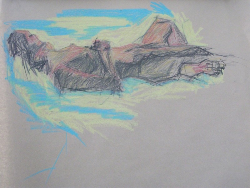
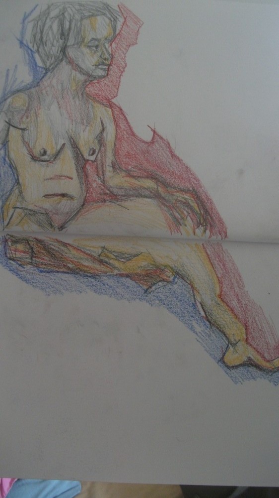
Friday. Experimenting Drawing. Georgette modeled. I hadn’t drawn her since sometime last year. It certainly wasn’t the most progressive life drawing class… but it was fun to draw Georgette.
I worked easel – brown paper – long strips. These strips fit on the board easily without folding areas over the board. I’ll keep working with this shape and explore where it leads…
15 min pose if I remember correctly. Could be longer. foreshortening is exciting. It’s nothing to be scared of. Nothing is impossible to draw. Especially with life drawing – all the information is in front of you. I used an old watercolor pencil for the negative space. These are a lower quality then the excellent Derwent Colorsoft I use. Worth using them up this year as I don’t want to take them overseas when I leave.
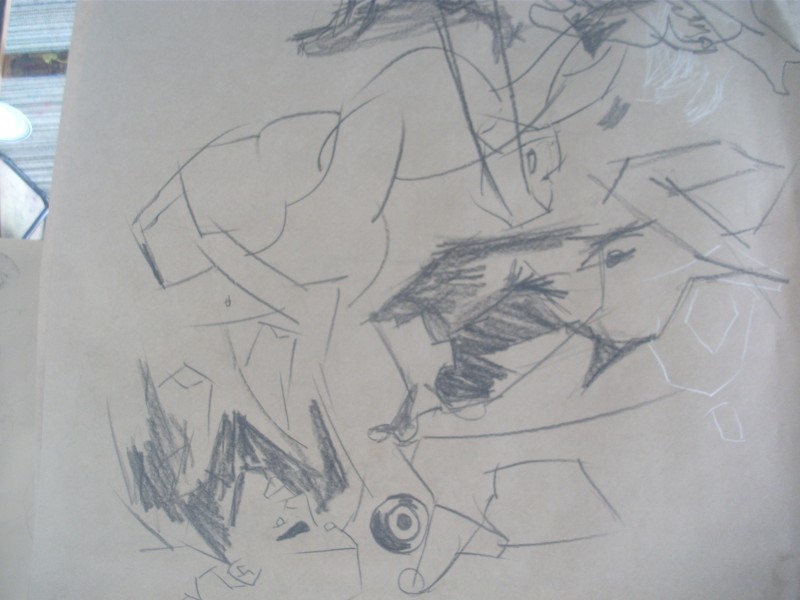
Chunck of graphite – 8b. I’ve had this since 2010 so it’s getting small. It’s a favorite for warmups. This isn’t a warmup – but I’m frustrated and not enjoying it. Why do some days life drawing works and others, fail.
Similar to the earlier drawing. This has structure. foreshortening is a major element. I was able to create huge thighs compares to smaller arms in the background. Certainly creates depth within the artwork.
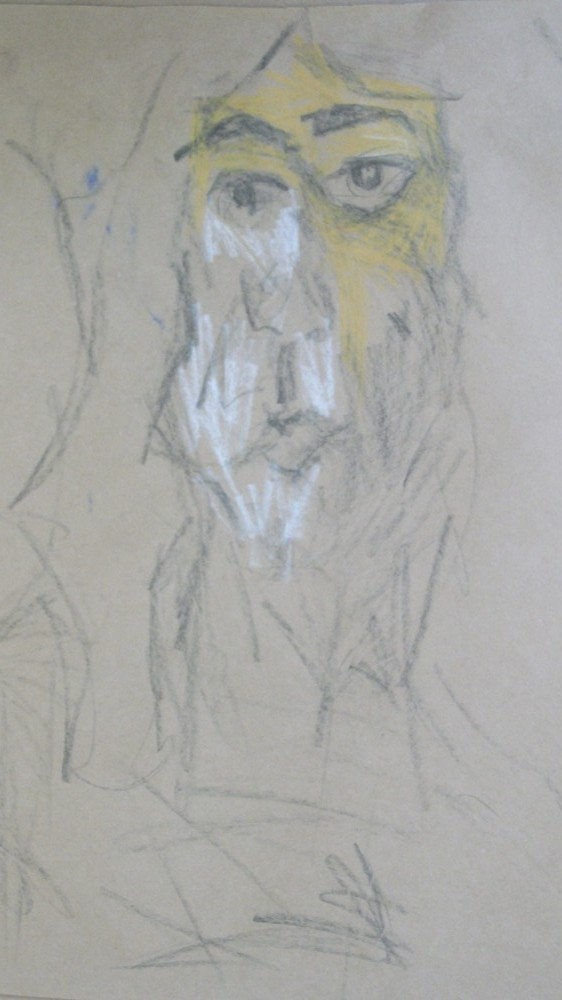
A portrait. I like to keep up my portrait skills so when I have a life model I try to get a portrait done.
I like this. It might be my favorite of the day. It’s a shame I didn’t get more time to work on it. I would enjoy more longer standing poses but they are hard for the model to hold. Longer poses tend to be sitting or lying. 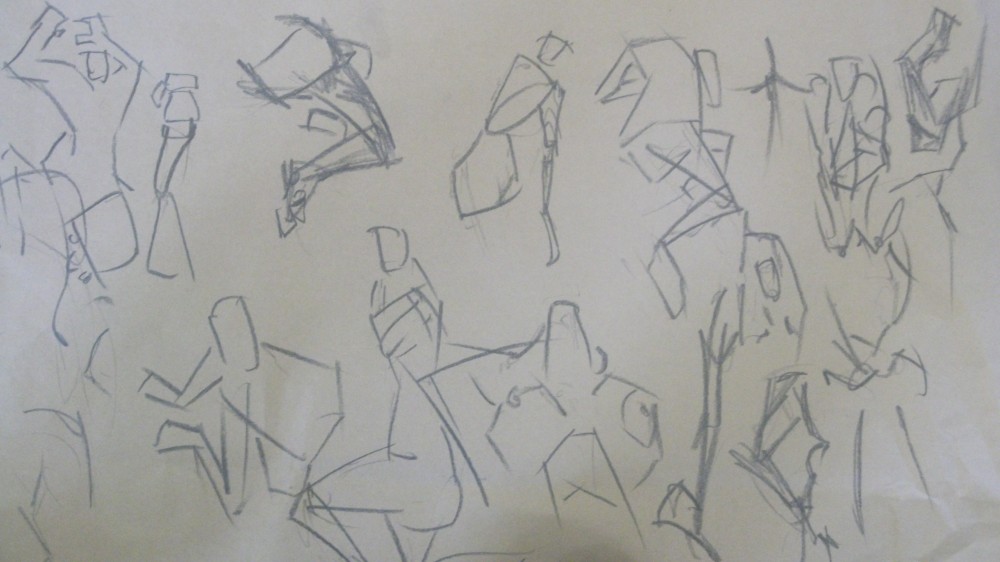
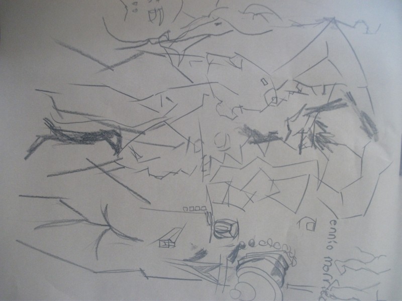
Bunch of quick studies. Looking at shapes. In several I’ve added tone. This boosts them out of the page. Action and movement is easily captured with this method of drawing. 
Another page of studies. Plus a portrait thrown in there! One to note is in the middle (to the right of the white) - the elbow is pointing out and hand wrapped around hip. This was a solid attempt of capturing the foreshorting with only line.
And the final gestural page. By the end of the day I was tired and left early. Hanged out in Marcs class. It was nice to have a break from life drawing as I was reaching 14 hours this week. You can over do it and it’s important to not burn out.
Dan will have a model on Monday.Rumor has it – clothed model. I’m not sure if I will go or not. I’ll see how I’m feeling. Marc Hill on Thursday which I’m looking forward to! OILS
Read more →
I can’t believe it’s Friday. A whole week has flown by. I haven’t felt I’ve updated or worked on digital works
These are the life drawings for Dans class on Monday. The model was Loraine. I used graphite/colored pencil on brown paper. No paint.
I love drawing. Enjoy
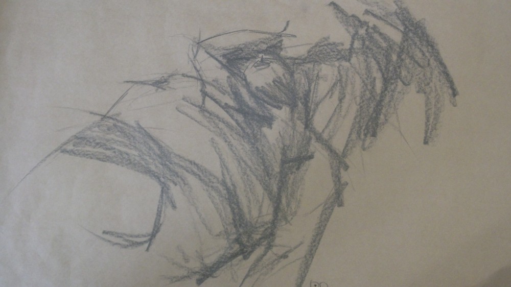
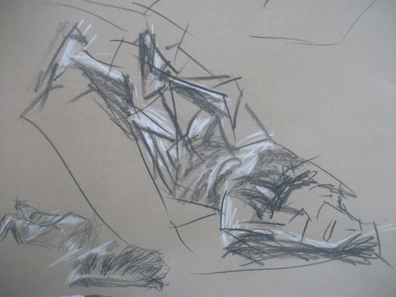
Attempts at using curvy marks with the graphite. This is the hunky 8b. It’s shrinking. I got it during my time in foundation. Favorite of mine. Especially for warmups. It handles tone and light in longer poses.
This was a longer pose. To draw for 1.5 hours of the same figure pose one must learn techniques of slowing down. I believe this is an important step as an artist – especially for me. I love long poses. I didn’t always love them. Techniques need to develop.
Longer poses. One of the best things about a long pose is getting the work to a finished stage. I’m use to having drawings that look part finished.
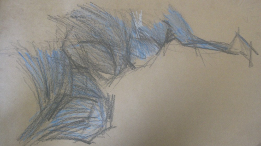
White charcoal for the light highlights. Using two colors makes it simple to mark the light and the dark areas. That’s really all looking for with a figure. A white pencil is worth investing in. This would mix well with the colored pencil. With Oil paint I would add white to colors to gain a muted effect (also increases opacity).
A goal for life drawing has been to capture more of the figure. I want to draw the figure highly representational. From there I can go anywhere.
A classic style I have developed. This is with layering colored pencil and graphite, using straight line, tone shaded with lights and darks. This is what I started in Rogers life drawing class. It’s a chance to take this idea further – especially with long poses.
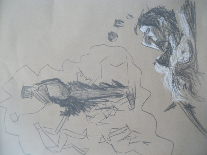
Here’s taking it right back to basics. Looking at the poses with shapes. I don’t like this style generally but have found it useful for proportions and perspective. I’d like to take ideas from this and merge with a more tonal, organic looking being. Dan mentioned that it looked like the figure was dreaming… and I could add thought bubbles.
Read more →
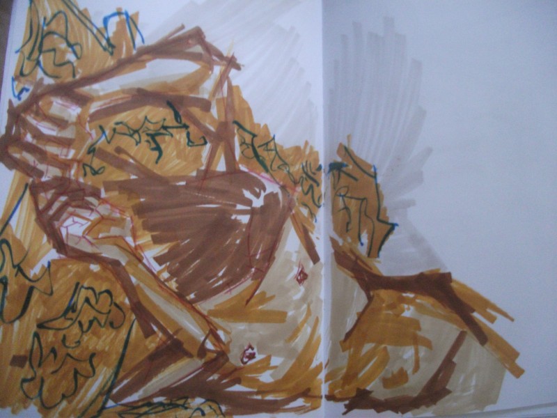
Here’s some life drawing from last weeks Vincents class. I attended both Tuesday and Thursday, plus I made it this week (Tuesday – not sure if I will go Thursday). Model on Friday so I think 14 hours is enough.
I can’t remember the model’s name – I’ve drawn her before.. Need to remember names as I hate writing these posts referring as model or them. I talked to her after class quickly – she had attended TLC years ago when it was in Island Bay
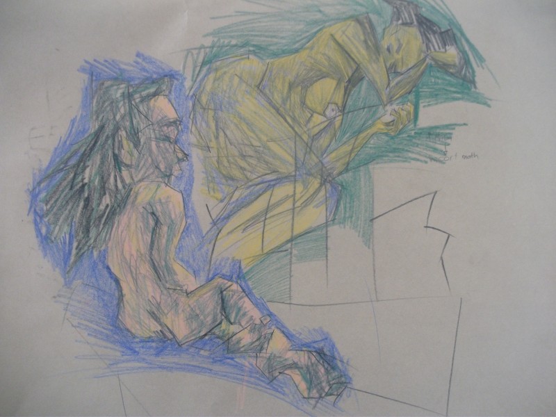
 A page of quicker poses. They start with 2 min poses. I like this length to begin with as it gives enough time to study an area and get some information down without having the problems of ’oh crap, hate this long pose, nothing to draw’. Out of these drawings I like the breast on the right. The tone is working well. I’ve put much study into the torso. Those crayon studies are paying off! Getting to torso correct makes measuring the limbs easier. Starting from the nipple and work out – this is especially easy on female (I find it easier to draw the female figure over male, but enjoy drawing both equally). On certain poses the shadow below the breast is helpful for measuring – this leads into the armpit and down to the bellybutton. It’s all about connecting that tone together to create one large mass of tone. That’s how I like to look at life drawing.
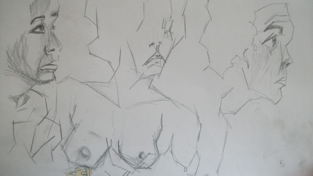
Portraits. These are on the verge of anime. They are certainly styled. That’s ok though, I am still focus on looking at the model and capturing whats there. By creating a more stylized look I am morphing it into how I see it. This goes against the last paragraph. I’d like to experiment with merging a stylized look with classical studies.
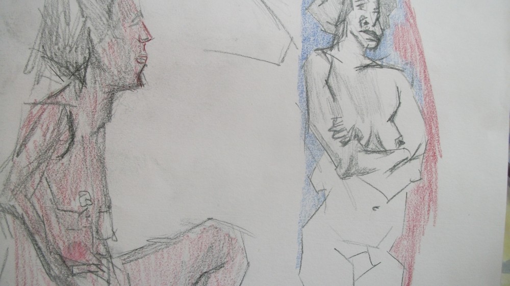
Color pencil. Recently discussed negative space with my flatmate. I talked about the advantages of using negative spare around the model to measure the model. Keep referring back to the model. This helps with creating a setting for the model – rather than blank space.
Longer pose. This style is certainly a favorite of mine and I’d like to develop it further. Majority of the model captured – plus I used negative space to measure distances. I was happy that I got it mostly correct – except for the head.
Need more technical feedback about my life drawings.
Read more →
I made it agian to Vincents this week. Another Female model – and someone I hadn’t drawn.
I used 5 promarkers. The colors are – Sandstone, Raw Sienna (a fav), Cocoa, Burnt Sienna, and Warm Grey. All colors have a brown/offwhite feel. Lots of yellow – lacking in blue.
Thursday had been a Marc Hill TLC trip to Wellington – I’ll post about the day later. For now here’s the drawings I did at Vincents:
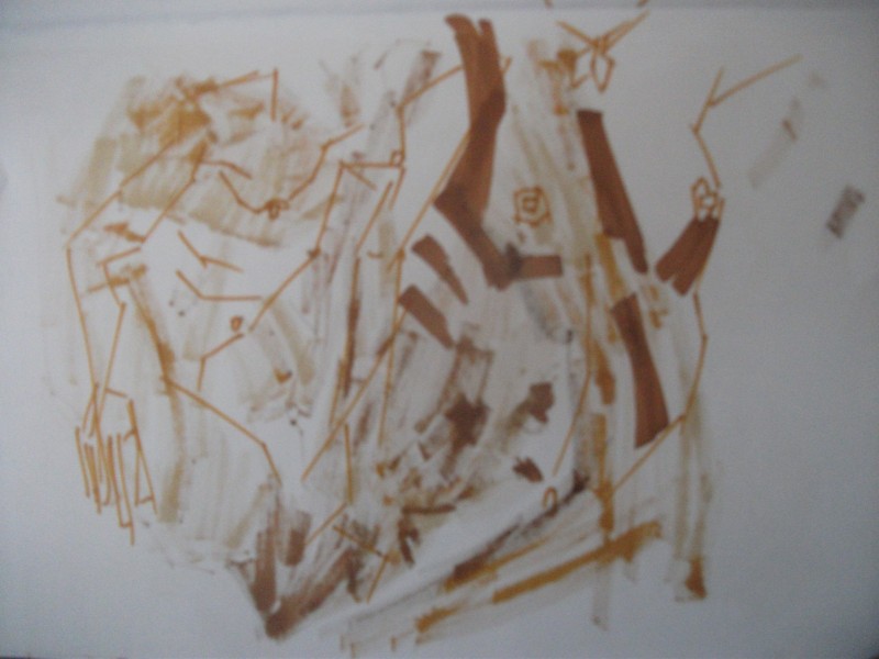
I arrived slightly late for Vincents, they had already started the first pose. The promarkers are two sided so I started with the point end – the other a chisel (best for creating larger areas of color). I normally perfer chisel as it covers a larger areas. Nothing very special about this piece. It’s just a two min warmup.
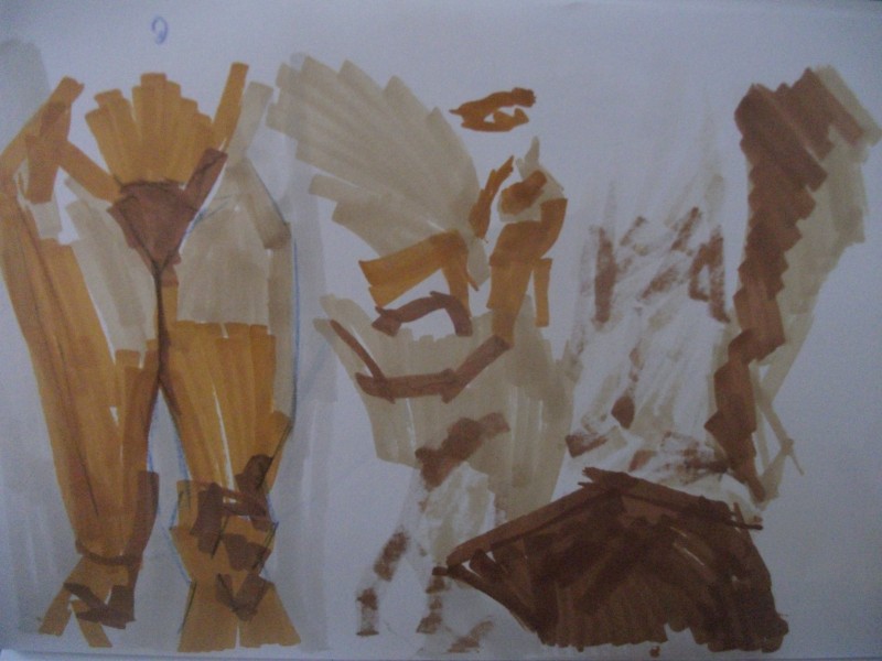
The legs on the the left is one of my favorite drawings I did that night. I had been drawing all day so wasn’t in the best mindset. The Promarkers are hard to get my head around – they are going to take lots of pratice. Watercolor techniques are important with them.
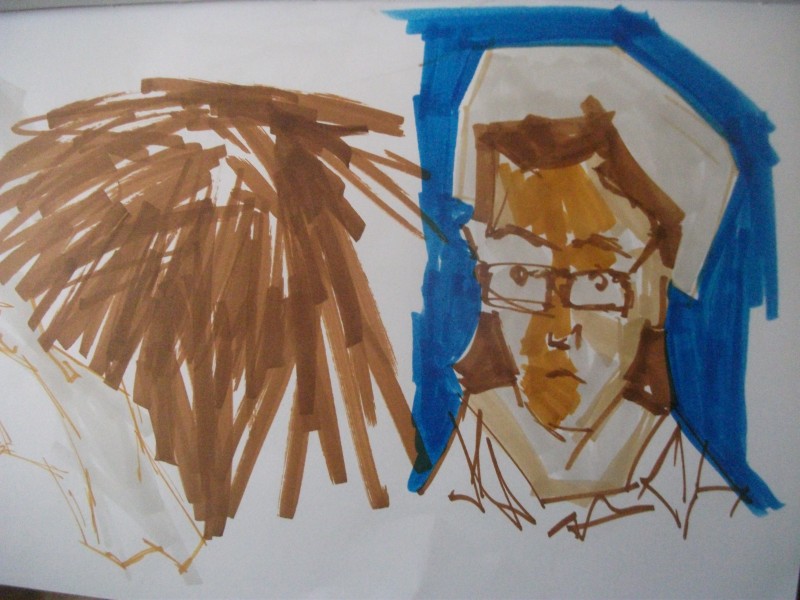
I wasn’t in the best posision for drawing the model (around the side rather then front) and this caused several back shots or poses where I would get minimal model because it was hidden behind a chair. I could of moved but the class was full so drew a portrait of someone else drawing. ha. I loved the models hair. It was very shot and straight – much like the drawing on the left. This caused some cool effects – like this:
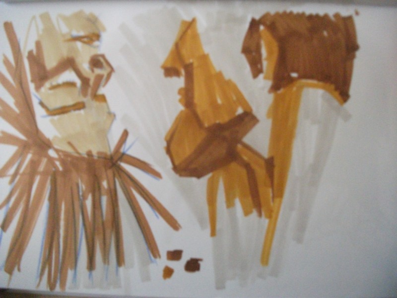
Portrait studies. I’m familar with the portrait so a good place to start when experimenting with new media. I love the drawing on the left – the models hair reminded me of a male character from Final Fantasy. Super cool. Exploring areas of tone further in the right portrait.
The final. 40 min pose. This didn’t take 40 mins – I ended up finishing early and coloring in other areas of my book. I’m really happy with this. I’ve managed to capture the model with several different colors. It hasn’t turned into a messs.
Landscape and portrait pro marker works will be uploaded this weekend. I will also be drawing at the Island Bay festival if you are in the Wellington area and want to stop by. I’ll draw your portrait.
Read more →
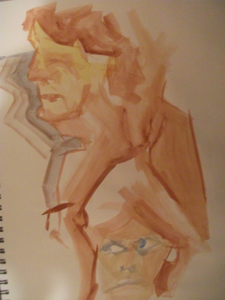
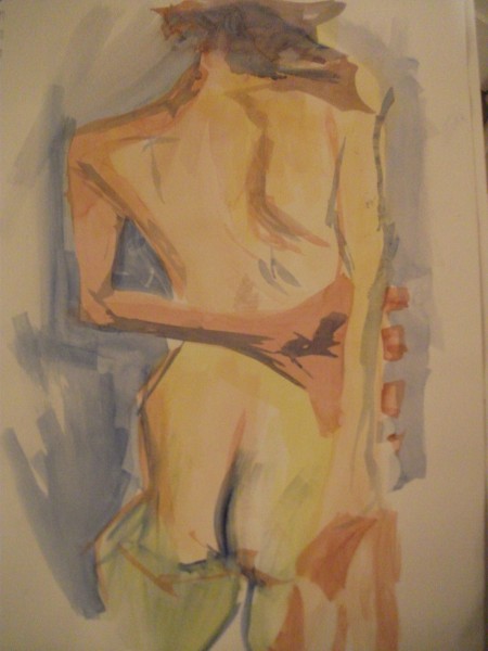
Today I arrived back in Wellington. I attended Vincents. It was a female model – Lyn. Afterwards I found out that she was the mother of Pri – a girl who I went to TLC with.
I painted - Gouache
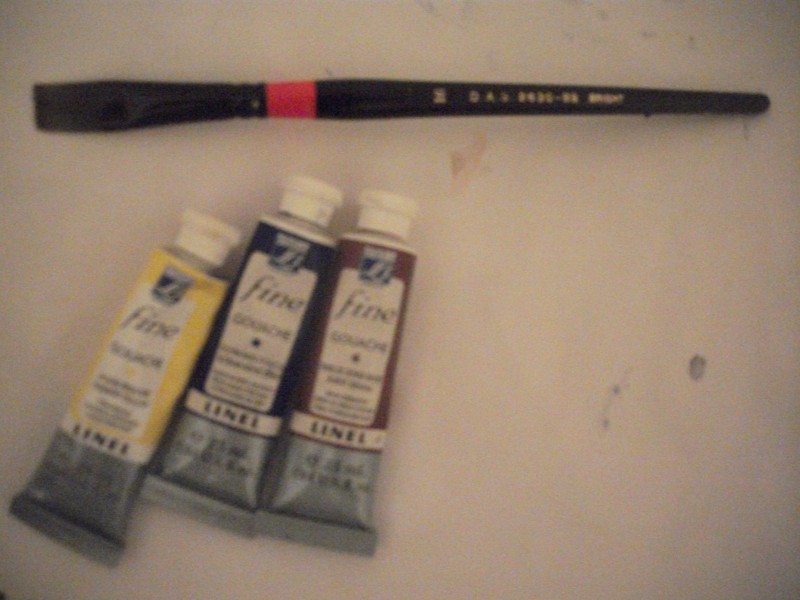
Photo of new watercolor brush – it’s a bright. And the gouache. Primary Yellow, Ultramarine Blue, and Burnt Sienna. 25ml tubes, costing 12 dollars each. These will last and I look forward to creating works with them.
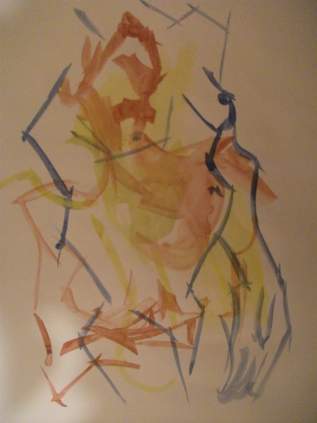
Here’s the first poses layed. These poses were 2 mins, standing. I changed color for each pose. This reminds me of the life acrylic painting. I was treating the acrylic paint very much like watercolor – think washes – allowing it to drip. Similar properties. The opaite nature of gouache will make it a interesting study.
Portraits. These two were 5 min poses. I like that painting is quick – unlike colored pencil where it takes a long time to cover a distance – painting is quick. Strong straight lines created – especially on the leg. I do like those lines.
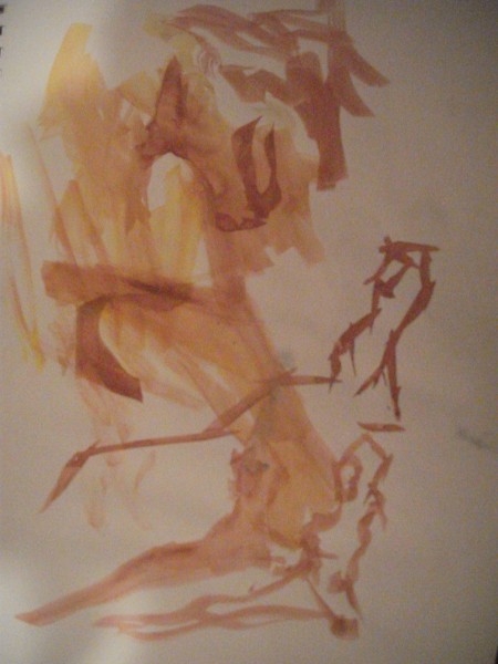
A thumb study. I attempted blind painting – not looking at the painting paper but focused on the model. I’m going to practice this more with my life drawing and painting. I’m getting better at drawing/painting with my right hand so will practice blind more as well
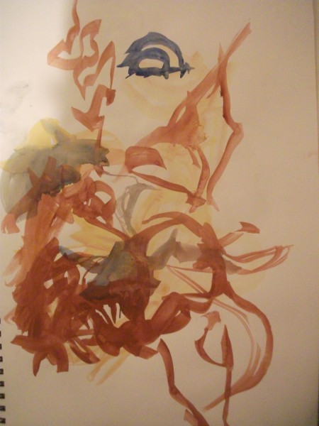
Looks a bit messy. Abstract painting anyone? This was done blind.
Some interesting lines created here. I like the leg coming down – and the bend leg in front. This gouache is working for me.
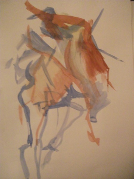
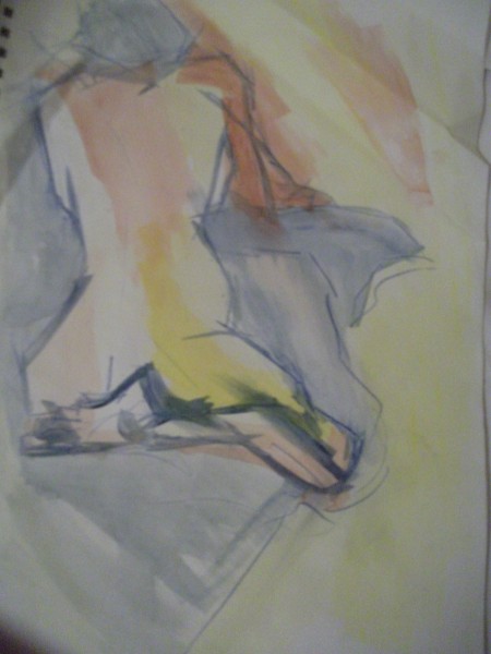
A longer pose. One of my favorite works of the night. Beginning to mix colors – beautiful green created. You can never not have enough blues. The negative space helps create a setting for the model. With the quick spread of the paint this is easy to create.
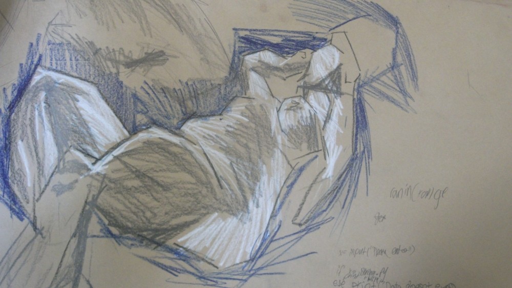
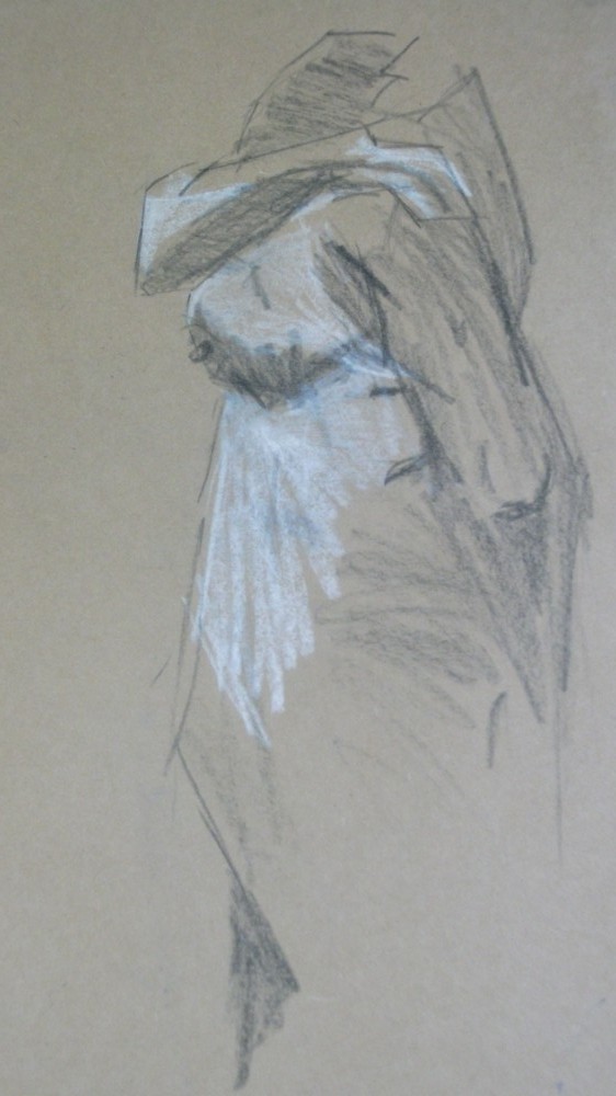
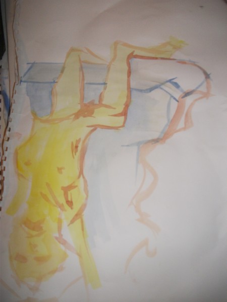
Smile! Here I’ve warmed up and started to create finished works. This work is hanging on my wall. Wonderful from a distance. The figure is subtle the negative space (blue) creates a interesting shape that leads your eye around the piece. I like how it’s cut into several different shapes – build from triangles. This is why I like flat brushes – creates a sharp and defining edge.
A sitting pose. Back facing me. This was the first time I had painted/drawn Lyn so was very refreshing. It’s what I enjoy about Vincents – a range in models.
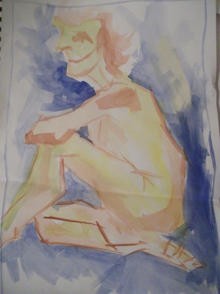
My favorite pose of the night. Lyn managed to hold this upside down pose for 10 mins. Very impressive.
I also painted landscapes today that I will upload in a future post.
Read more →