None


RedditGetsDrawn Kobo Sketches
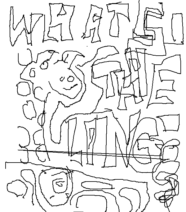
I’ve used my new Kobo for more drawings. I used my ipod touch to look at reference photos on RedditGetsDrawn and then sketch them on the Kobo. No color and such for the Kobo but at least this is a portable way to get the line layer done in my drawings.
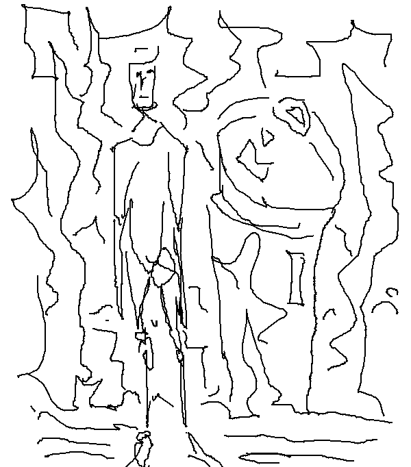
Character in the foreground with a landscape
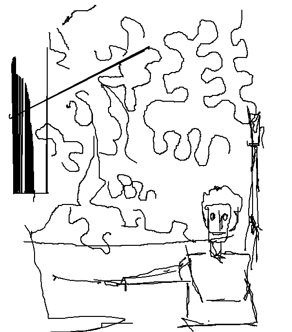
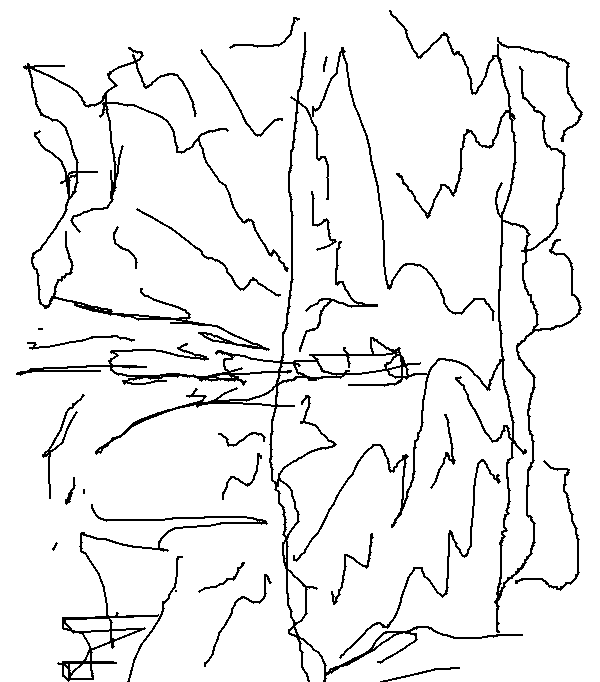
Drawing from life, a pillar 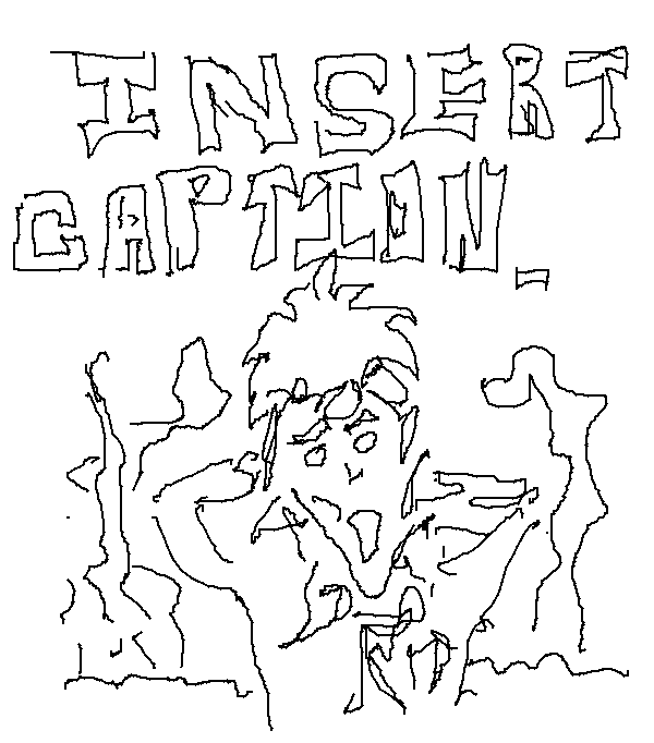
Reference for this was a print by Dan Ross. I noticed it on his page and did a quick digital drawing of the work.
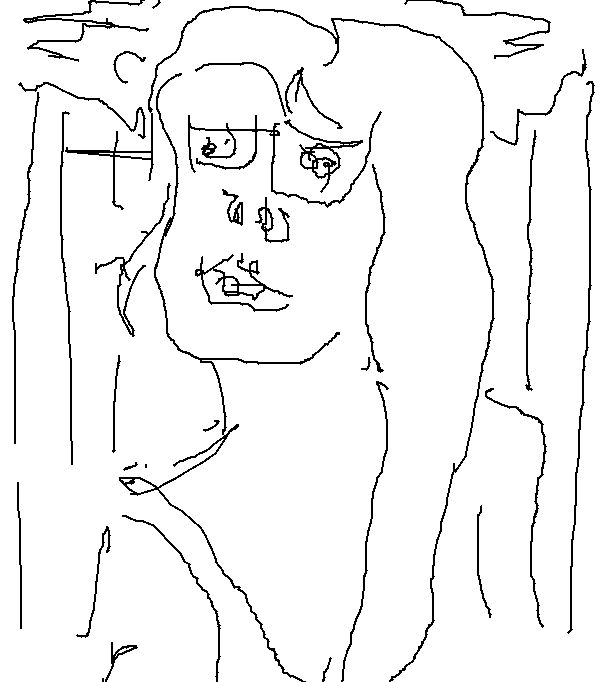
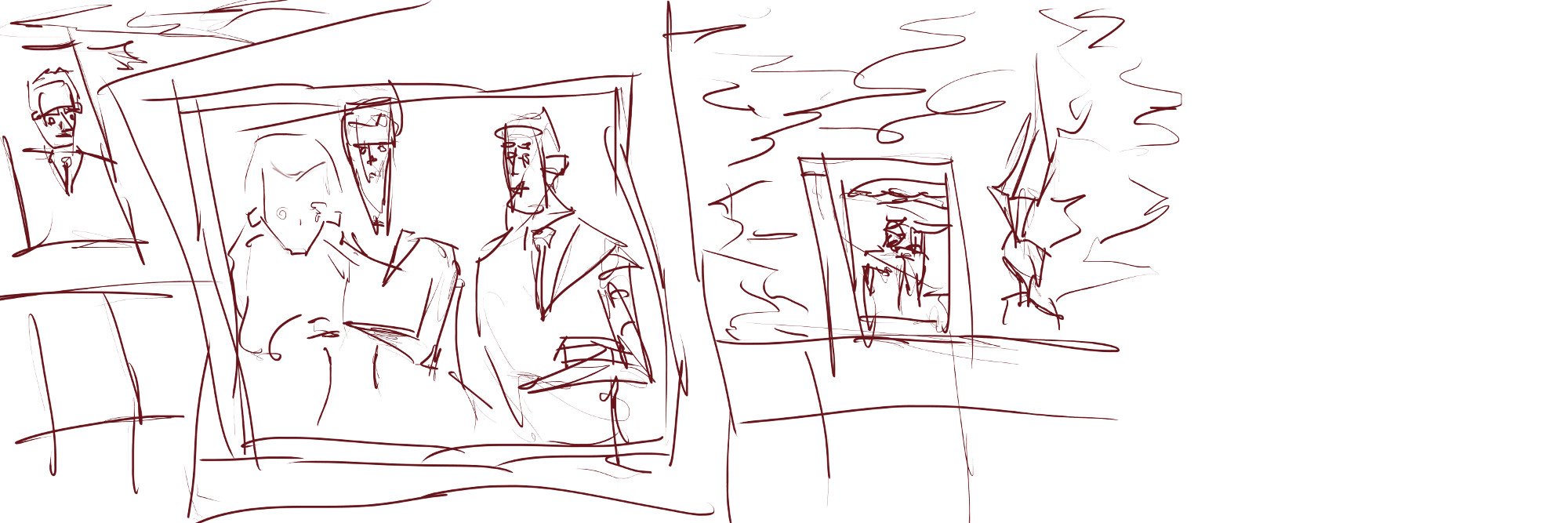
Two portraits from RedditGetsDrawn.
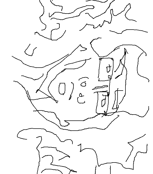
 Another RedditGetsDrawn. Here a painter is painting the gnome. Doing the job he loves.
 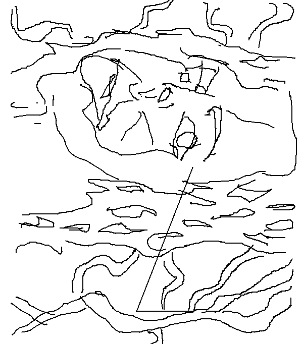 Sideways portrait. Sorry.
My plan for these is to take them into GIMP and work on them further - adding in grayscale and color
Read more →Kobo Mini Drawing
I now have a Kobo Mini. At 5 inchs it’s small, but it does the trick. I downloaded free epub files for it at first. But now I’ve uploaded a collection of epub files that I had sitting on my laptop. I now want to send wordpress/rss to epub and sync via calibre.
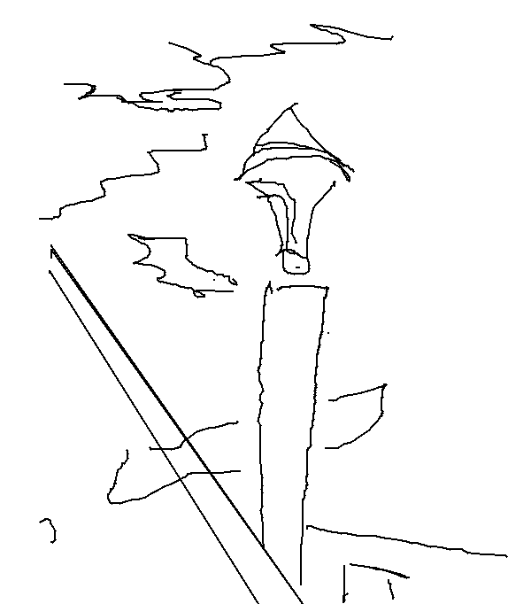
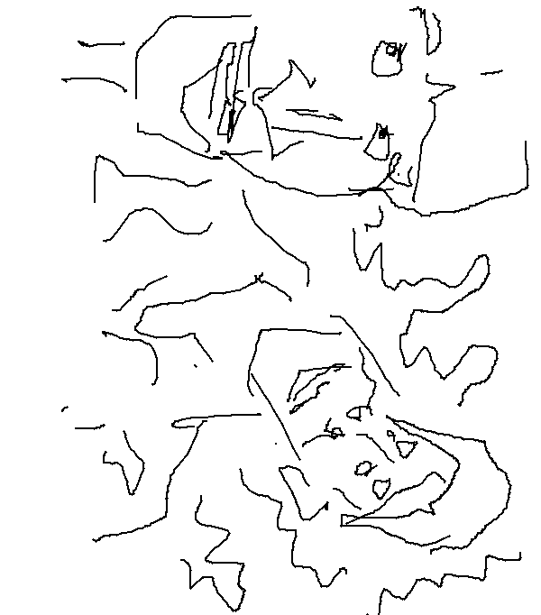
Drew the text/images from the milkshake container. Experienting with text. Larger brushes and the ability to change the opacity would be wonderful. 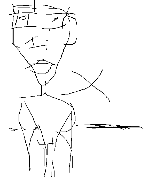 Character with a line behind him. Maybe the start of a landscape.
The format for this Kobo file is 600 x 682. At least this is larger than the ipod touch… just feel restricted by the lack of brush options.
Read more →Starbucks View Painting
After finishing that previous painting I had to start another. I choose to work from life (something I rarely do with digital) and paint the view in front of me. Here goes
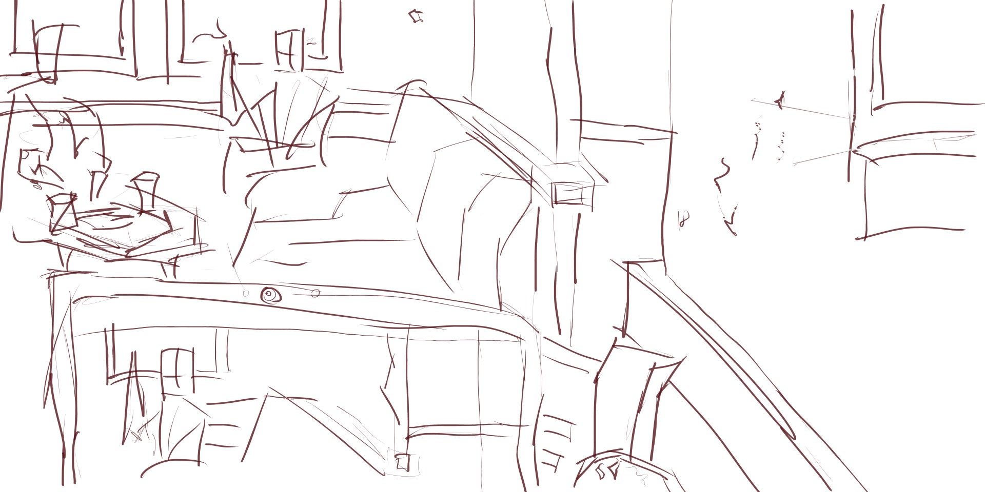
Two woman chatting in the corner. Captured then quickly without worry for detail. Focus was taken for the perspective and scale of the scene. I like how I’ve worked my laptop into the painting and painted the painting.
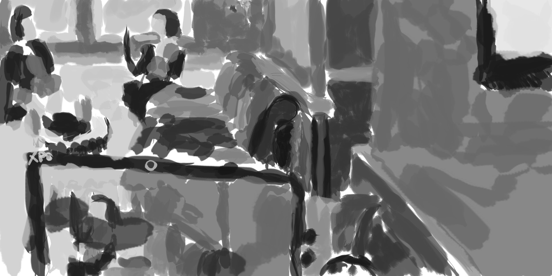
Grayscale tone. Again like the previous painting I’ve been working with a range of tones scatted about the work. Sometime I pick the tone, but other times I’m just pick a random number on the slider. It’s important to have a range though.
Color. I never finished this color layer. For the color I looked at what colors were there and went with that. The walls were a red so I used my usual red. For the yellow around the edge I color picked a new yellow. There is something satasfiying about Starbuck View
Read more →Circling Wellington building painting
Slow on the digital painting recently. I’ve been filling up my sketchbook with pencil drawings. This morning though I went to Lower Hutt Starbucks and finished a cityscape work and started a painting from life. Here’s the result. Great to get something uploaded since it’s been several days.
Here goes -
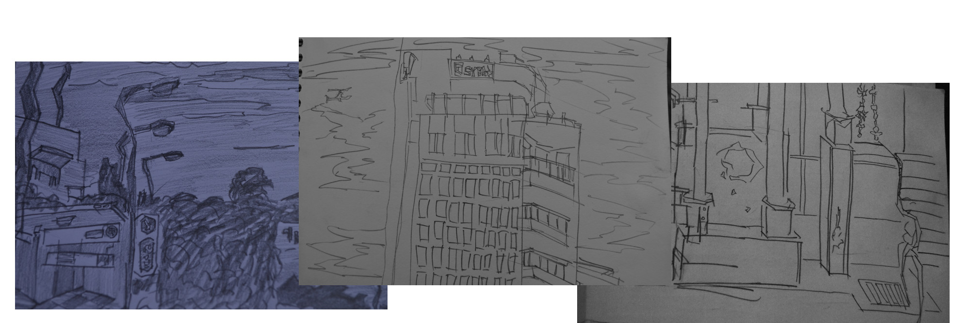
This is the reference I used. On the left is a sketch from Hastings, center is a building which is visible from parliament and the right is a pencil line sketch of an area on Cuba Street. I started merging together my pencil drawings into digital paintings towards the end of last year and it’s been great to get back into it again, I’ve really only been working on RedditGetsDrawn works so fun to do some work that involved just the environment - no characters!
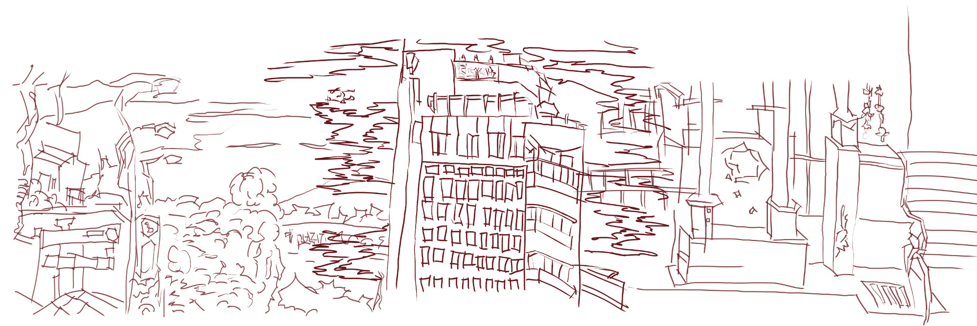
Line work. The center building was the first area to complete in line. I went and did the grayscale tone for the building as well before deciding it needed more detail and bringing in the reference on the left and right. Fills up the page.
I wanted to make sure that the three pieces worked together without feeling out of place, where they line up is important. Overlapping and such is not a problem.
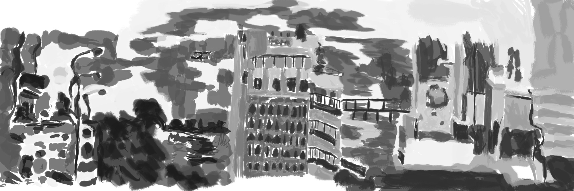
And gray-scale tone. I used a range of brushes in this work in order to give a variety in texture. Make sure to balance those lights and dark throughout the piece. Looking back
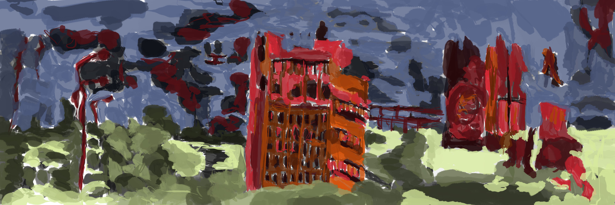
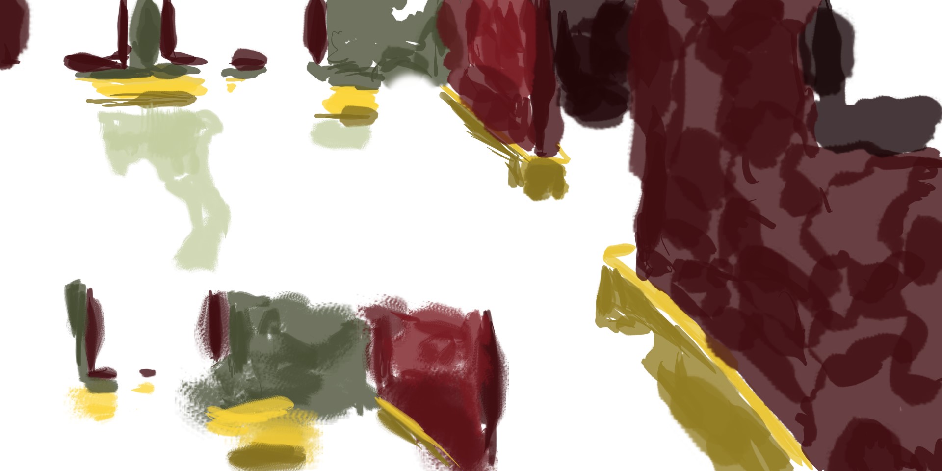
Color. Wanted to keep with colors I was familiar with, but added in a brown to experiment with. This is working well with the reds. The right side of the page has evolved since color has been added, no longer is it a pillar but instead it’s a building structure. These things happen.
Read more →Regina Spektor and Characters on the wall
Some portrait painting during my time in Wainui. These were used as demos to show Michelle how I digitally painted.
Here we go: 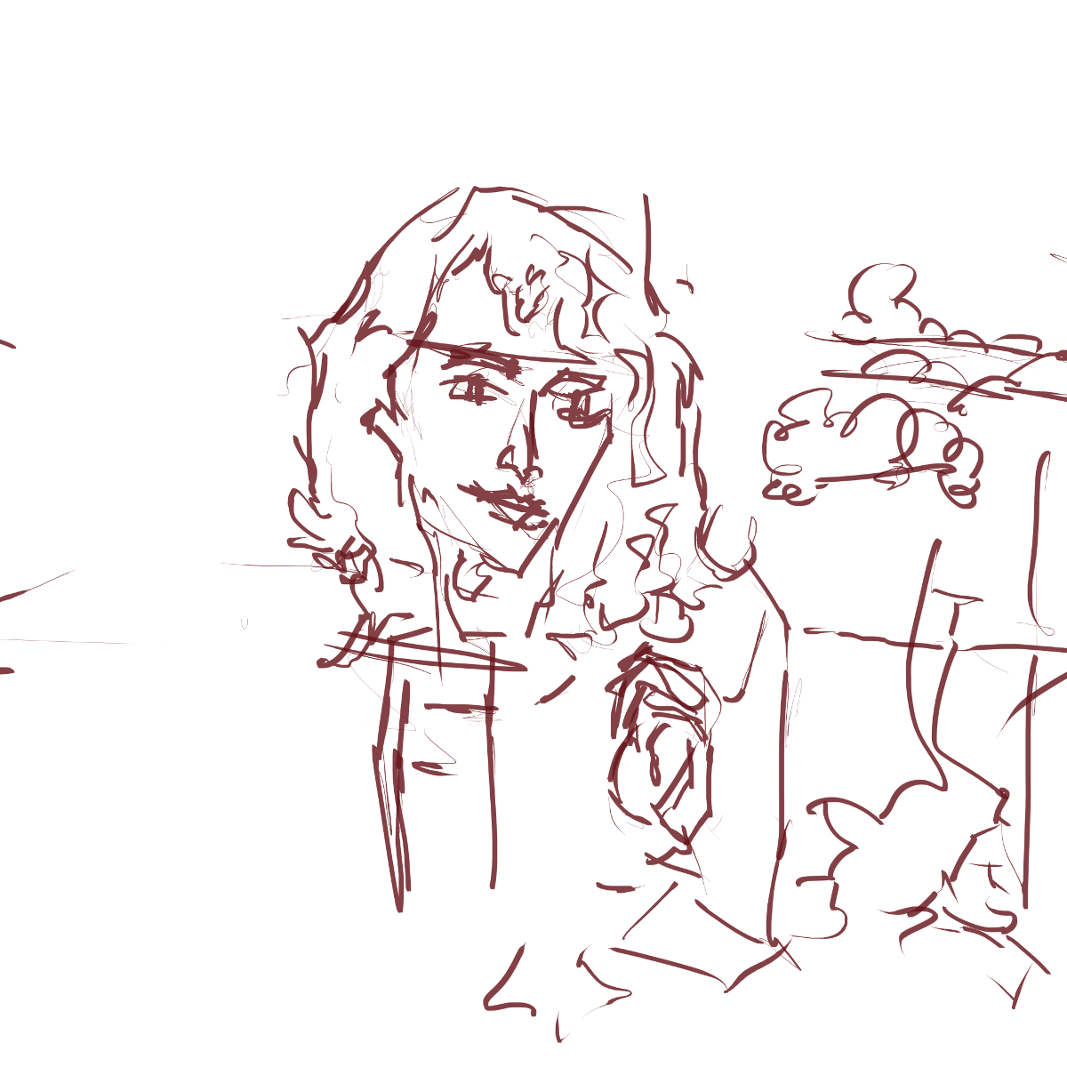 Since I only have the laptop currently I used one monitor for this. The reference was placed on the left side and I worked in the line on the right.
Regina Spektor. 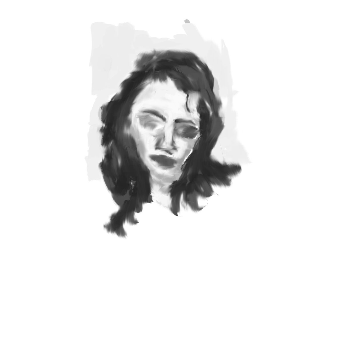 I was explaining to Michele about how I don’t use the smudge tool. I decided to show her the tool and this is the result. We compared the smudged to the non-smudged. She liked the smudged version better. Personally I like the non smudge. Being about to see the brush strokes and use them as part of creating the form.
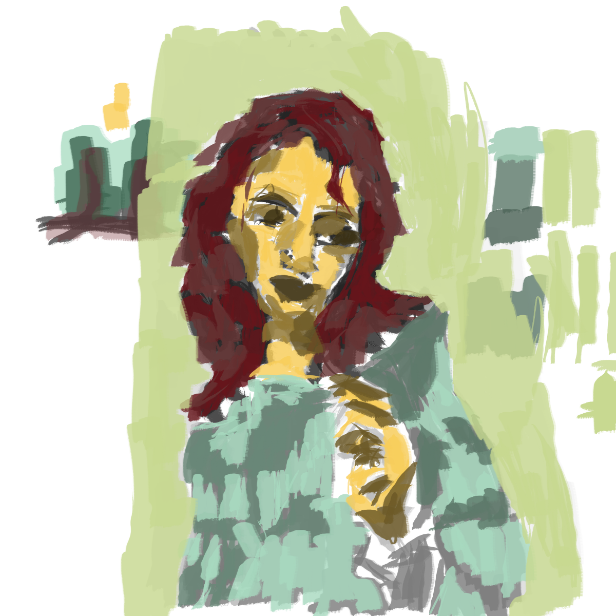
Color. Showed how I use a limited amount of colors but a range of tones of each color. New color for the shirt. 
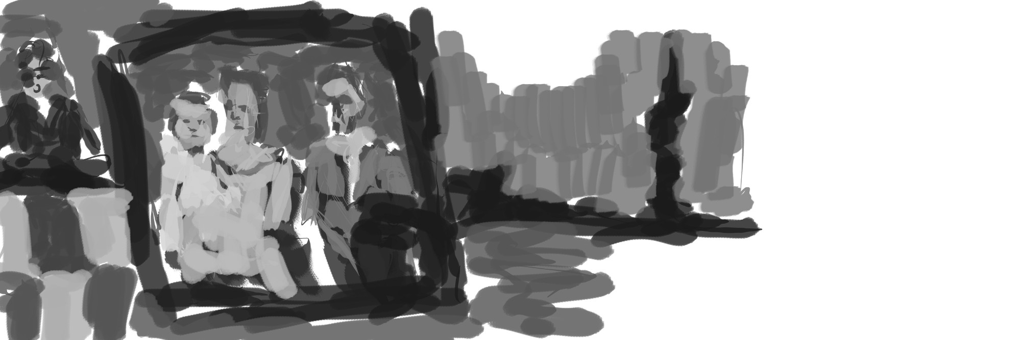
Reference for this were photos on the shelf. I drew the characters, the frame around them, and the mantel piece they sit on. Turned it into a landscape work with the clouds in the back and scaling of the photos. 
Black and white. Focused very little but instead just gave the impression. In the background I defined the land. The characters are lighter than usual. Black frame septrates them from the landscape scene. On the left is square tiles. I like these for the ground. Above this a character is erupting from the land.
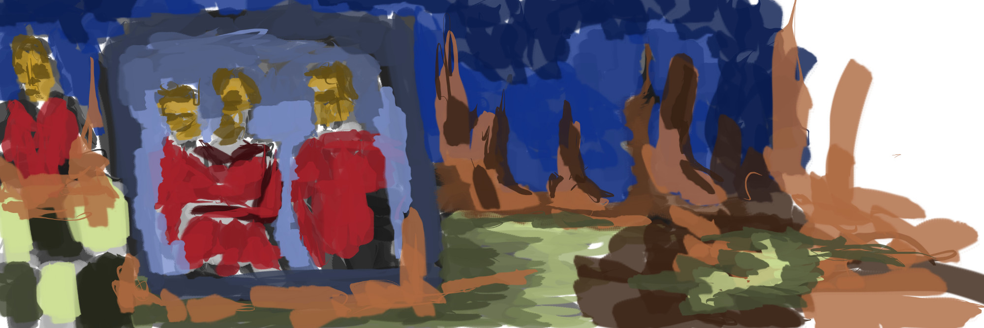
Color. I said in a recent post I wanted to use more browns in my work. Here I’ve done this with the land. Experimenting with the saturation levels of the brown - interesting grays appearing on the right hand center. For the water I used the green - exploring a range of brushes. I like the center area green - it has a flow to it that works. Building up those tones is helping.
That’s all for today.
Read more →None
None
[vslider name=“work”]
Read more →ut
Busy day today in Wellington. Opened up GIMP this evening and did one digital painting. This was from RedditGetsDrawn.
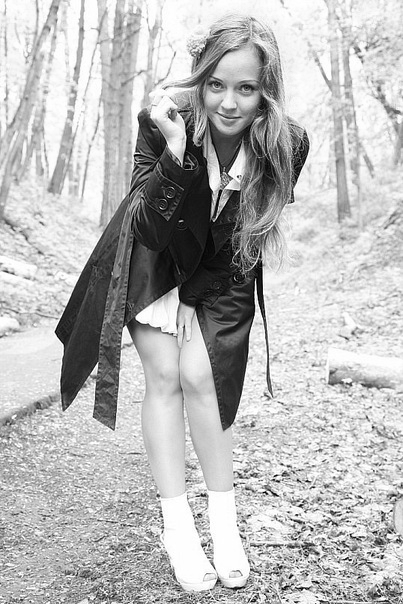
I noticed this photo in the morning, I did a quick check of RedditGetsDrawn and noticed this images straight away. It’s a full figure, and an interesting background with the trees and ground. Certainly something I can work with. The skin tones aren’t washed out either - there is a range to work with. 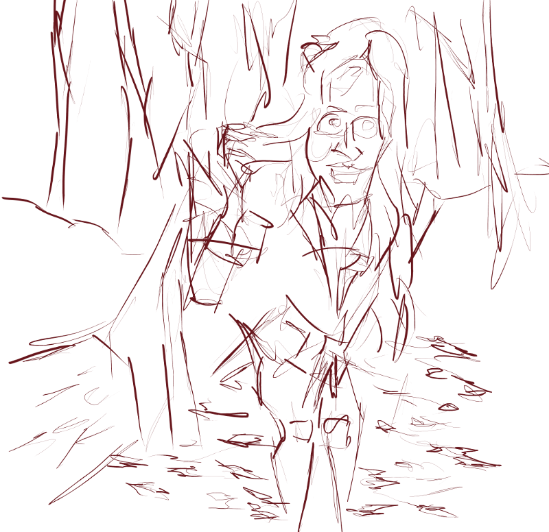 Line. I had a weird body posistion curled up in bed for this. The lines are rougher than usual. There is more line, even unnecessary line.
 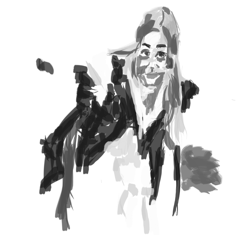 Grayscale. Focused on the character with the gray rather than the background. Struggled with elements of the character - the hands especially. Happy with the tones in the facial area.
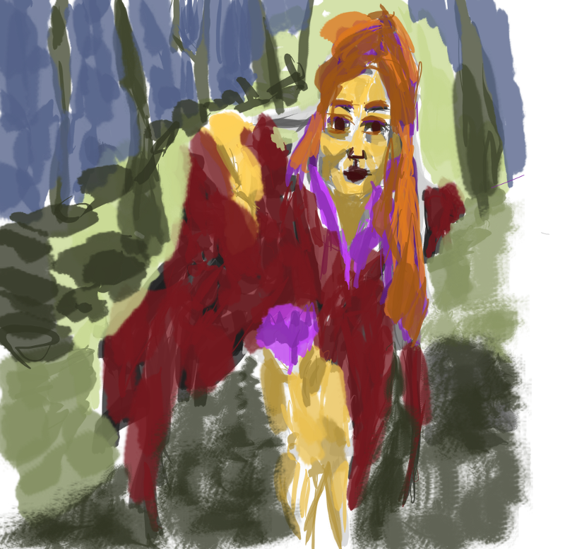 Color. Used a new purple for the ‘white’ areas. This looks fine when mixed with a range of tones. I tried the purple for the hair as well but it didn’t look correct so switched to an orange. Suits it better. For the jacket a red was used, no tones though. In the background - green for the floor and blue for the sky.
This was a demo I did for Michel