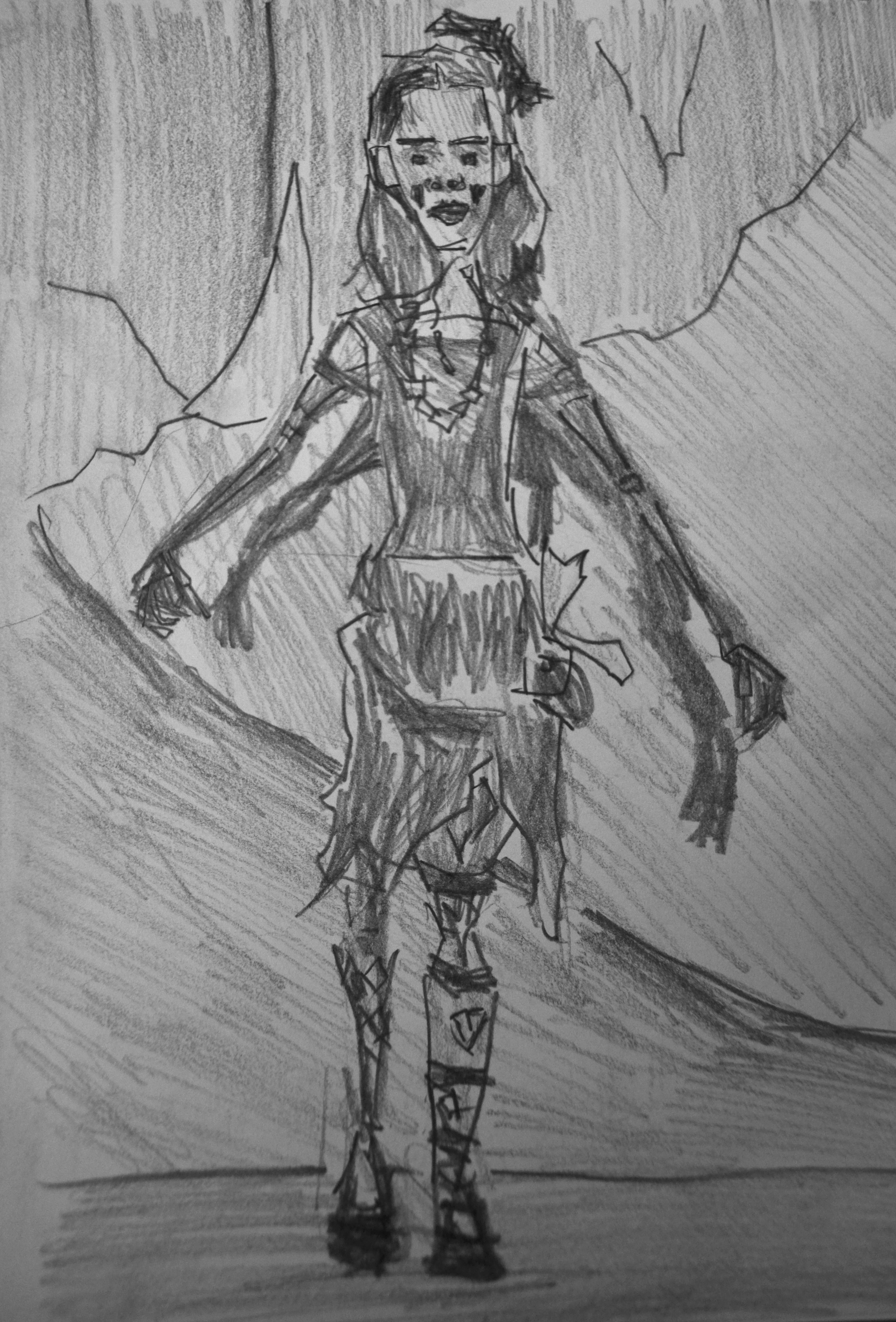
Here’s some more digital works. This time I used reference from RedditGetsDrawn.
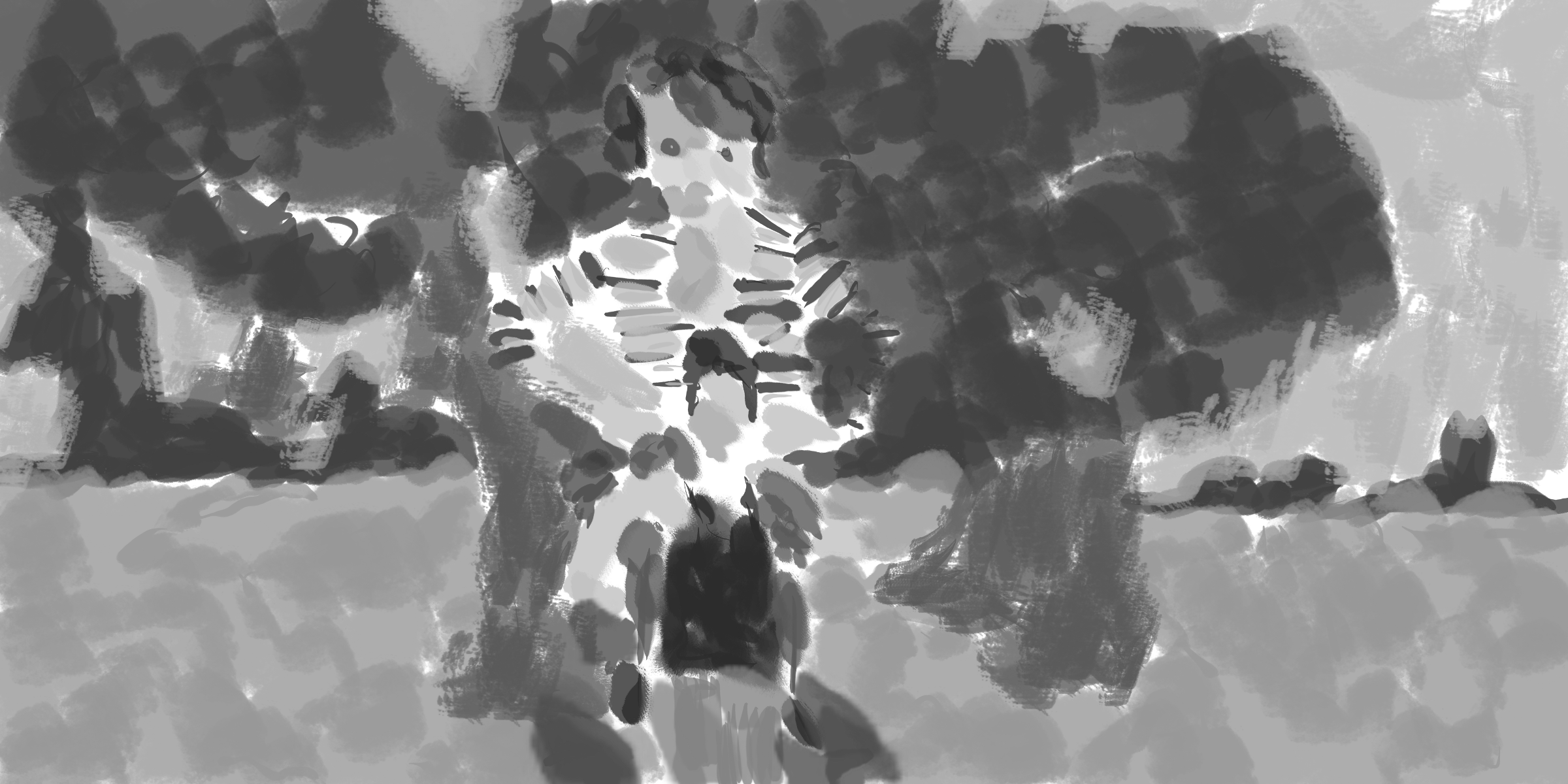
Portrait photo reference. I usually go for photos that have more of the body but this one was interesting with the tape covering her mouth. The background was plain, with only the vertical tiles. I added in quick flicks. I wanted to work different here - created a map top down view rather than a perspective looking over the ocean to the hills in the distance.
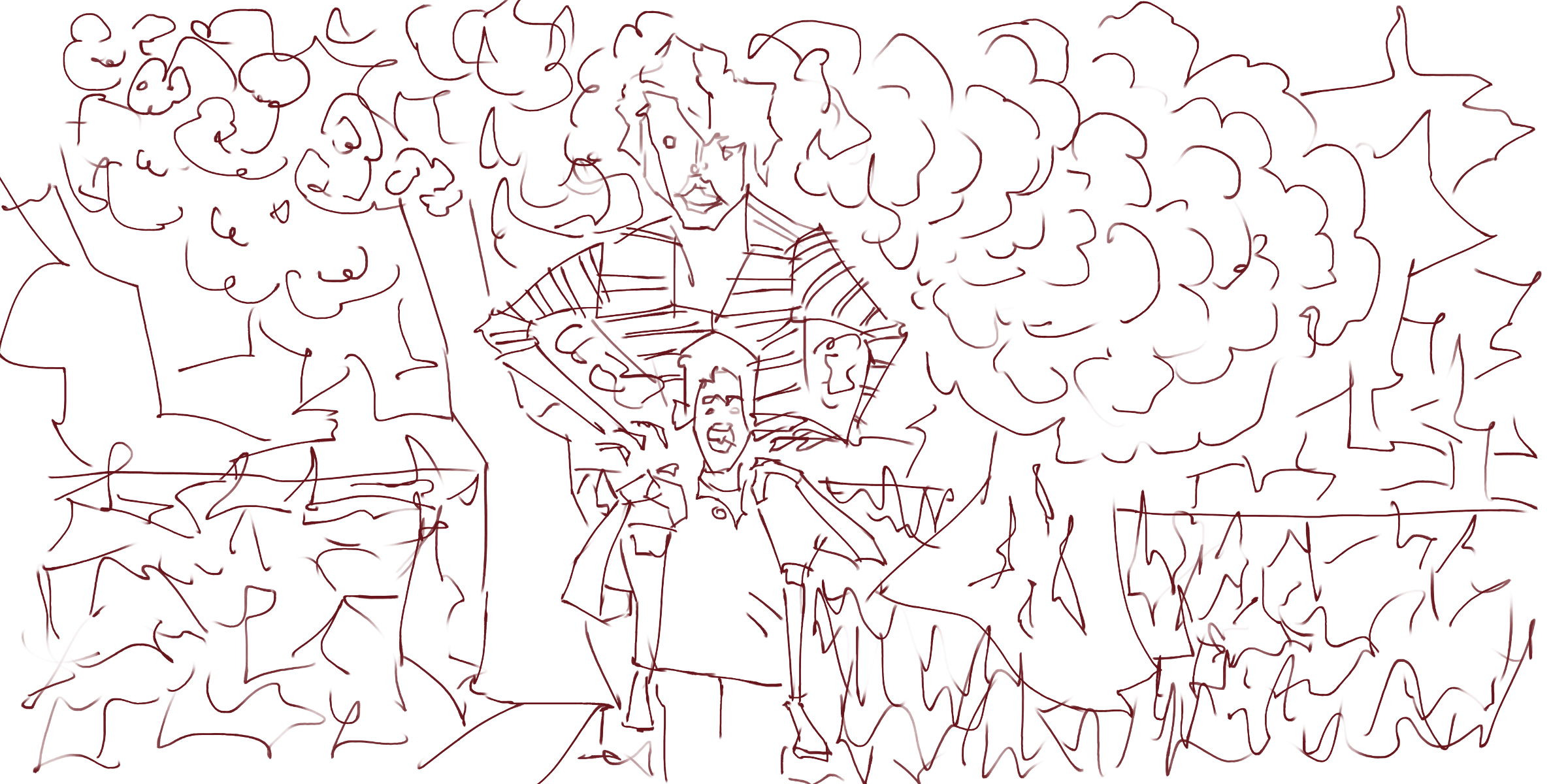
The tone changed the map idea with more of a focus on perspective - the normal way I do these scenes. I’ve used range of brushes. Normally I stick with the one brush in the whole painting but adding more adds texture and variety to the piece.
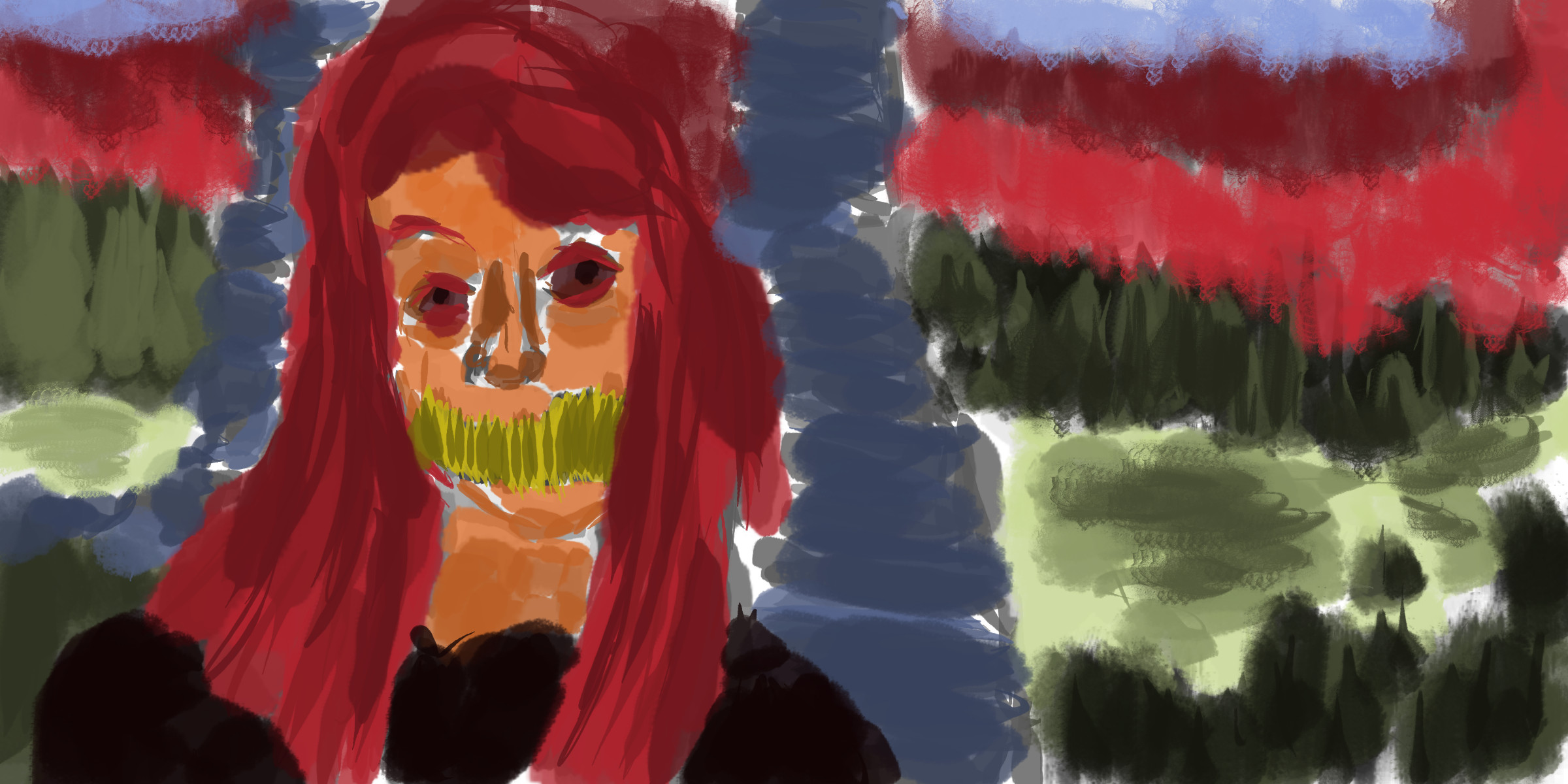
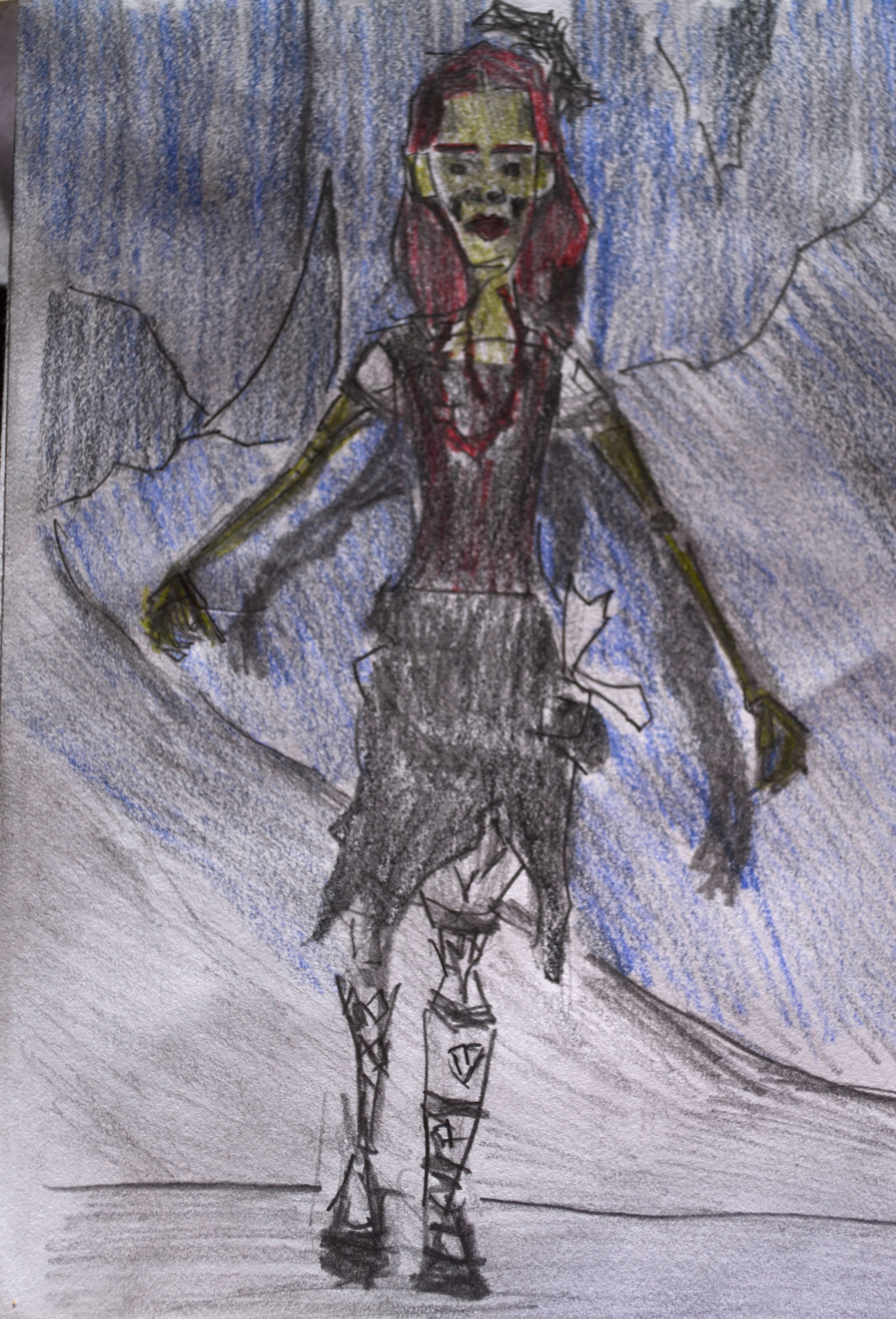
Color. Went with a orange for the skin. Since I’ve been using a range of tones with the color I feel I can explore other colors without having problems of the colors not working together - like in washes. Using the range of tones allows for clarity and flow within the color - and spreads throughout the whole painting.
This was a great reference of these two people. When I was little my uncle would give me piggy back rides. Extremely large scale for the figure sitting on the others shoulder.
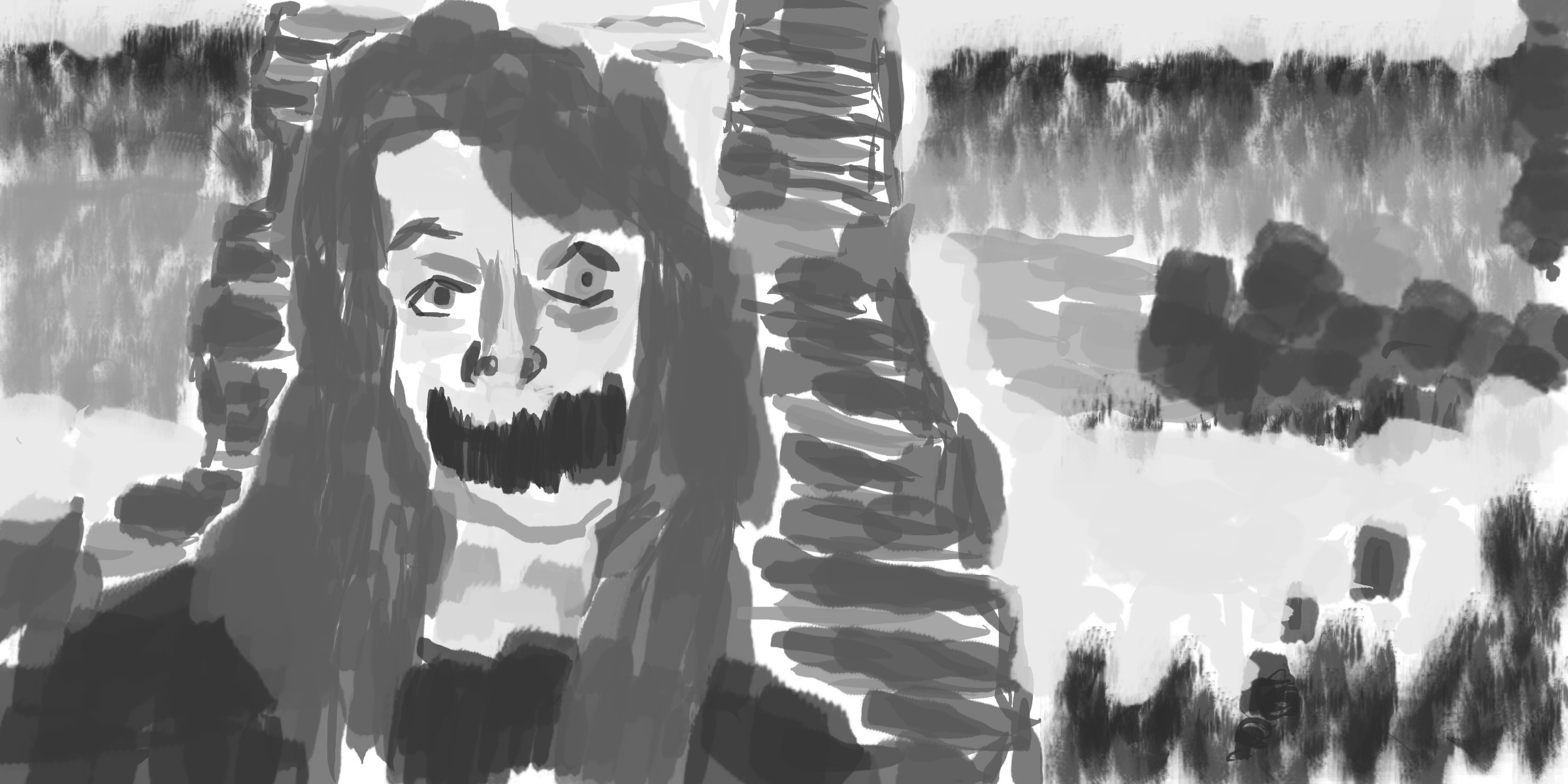
Grayscale tone. Much of the work is flattened out - the ground area doesn’t contain the texture that the line version had. Minimal focus on the face details - leaving out eyes/nose/mouth.
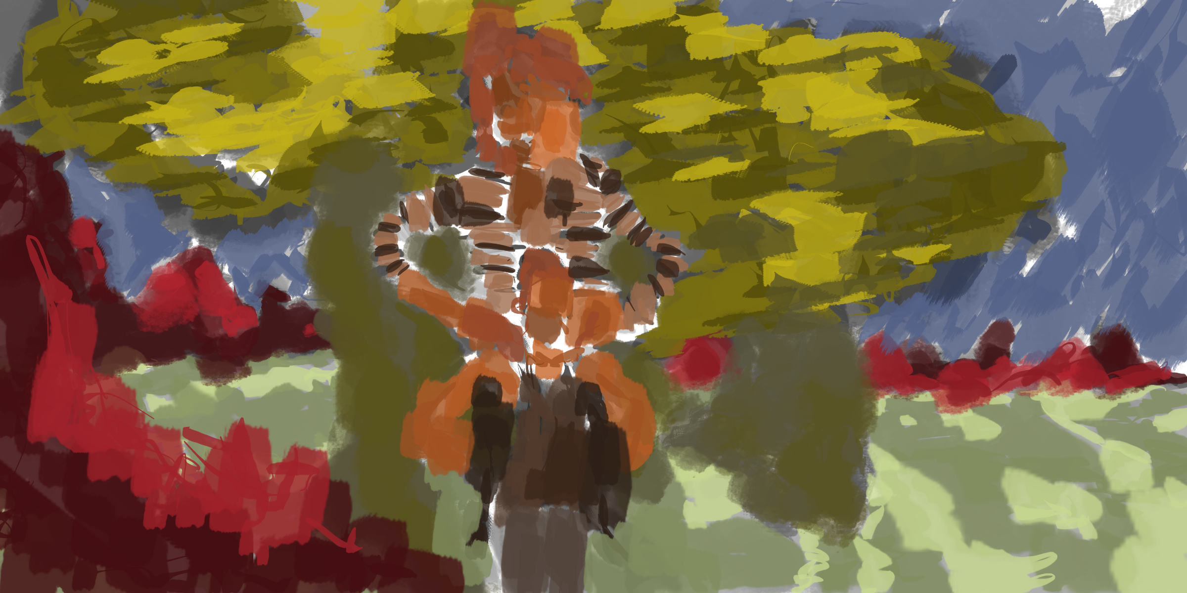
A range of saturation was used in the figure. Previously I had only worked with adjusting values. I love the brush for the leaves. 
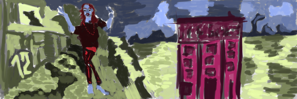
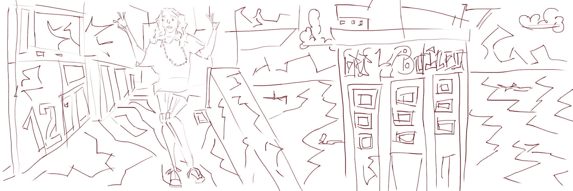
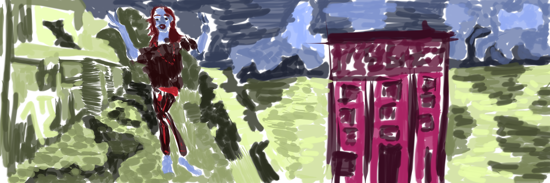
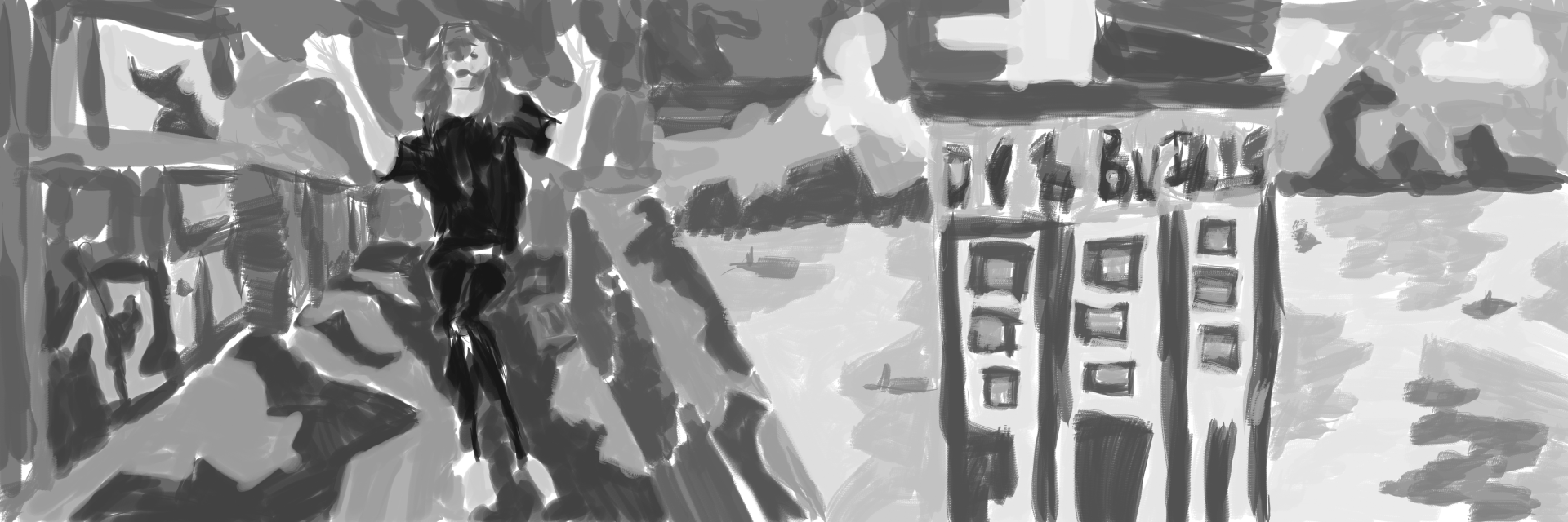
Figure on the left. I used a photo I took in Wellington for the environment I often just use my imagination. Working from reference will be helpful. Especially using my own photographs.

Mixing up the colors with a blue for the figure. Pink was used in the building, not sure how I feel about it - doesn’t fit the flow of the painting. Maybe a nice brown would have worked better. Fun times with the green, covering the majority of the painting. The hills and sky in the distance are painted blue.
Read more →
Slow recently on the blogging. I’m not that motivated to upload my photographs to my photography blog here due to the slow connection and continued timeouts. I need to head to the library and see how the connection is there. When I was in PakiPaki I had a decent connection that allowed me to queue 5 or so photos without a timeout. In Wellington I uploaded 200 no problems. I really need a fast and reliable upload speed.
Anyway, I shouldn’t talk about uploading photography - let’s talk art. During my trip to Hawkes Bay I took my A5 landscape notebook, clutch pencil and Fallout 3 art book. Together these allowed me to work from reference anywhere. This is especially handy in the car where I don’t have my laptop for reference (no smartphone, but really should invest in one). I also used the clutch pencil and a5 pad to draw street scenes - Hastings and Napier CBD. Sadly I lost my clutch pencil on one of my final nights in Hastings. I’m off to Wellington tomorrow so will likely buy another from the French Art Shop (I tend to not draw if I don’t have one).
I often draw from photo reference thanks to Reddit and the subreddit RedditGetsDrawn. There is another similar related subreddit known as RedditGetsDrawnBadly. Here people can post photos and they will be drawn badly. Microsoft Paint is recommended. I decided to give it a shot and open Microsoft Paint and produce paintings with the similar technique as I do with digital paintings in GIMP. 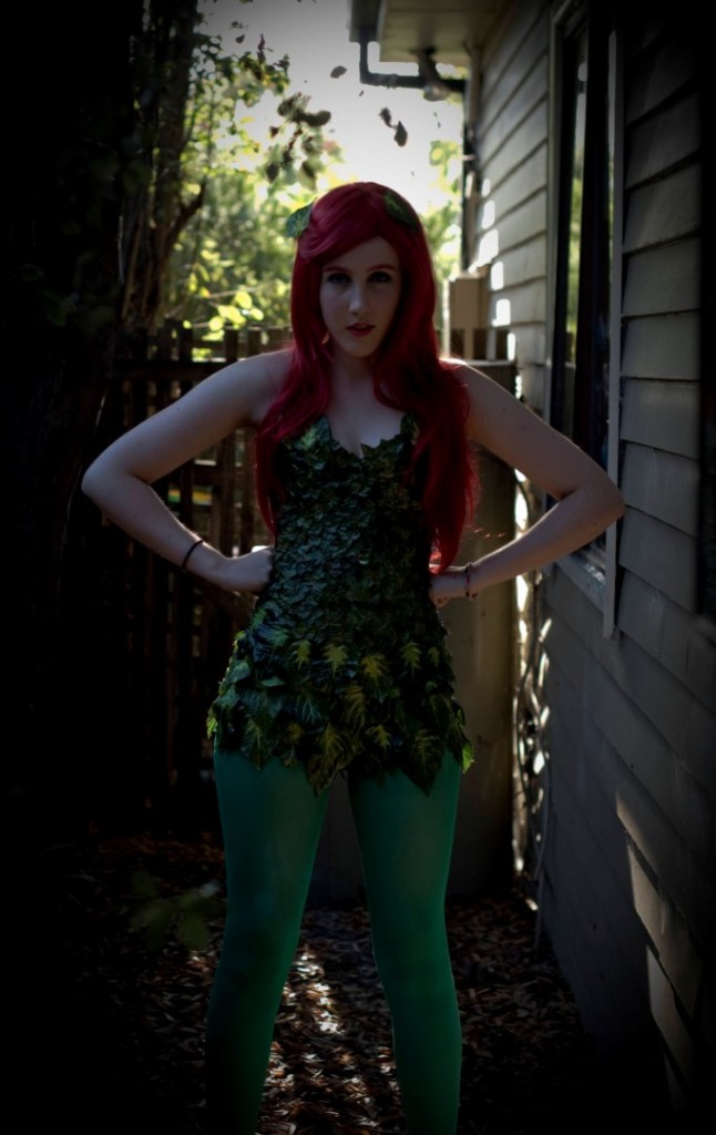
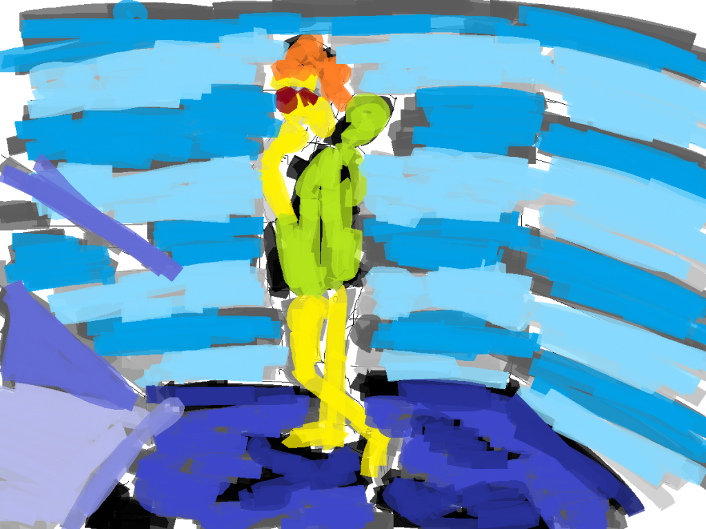
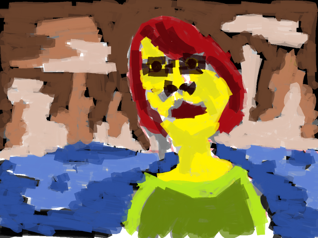
What a great photo. It’s high res (this version is smaller than the full version) and contains the majority of the body. Love the contrast of red hair and green clothing. 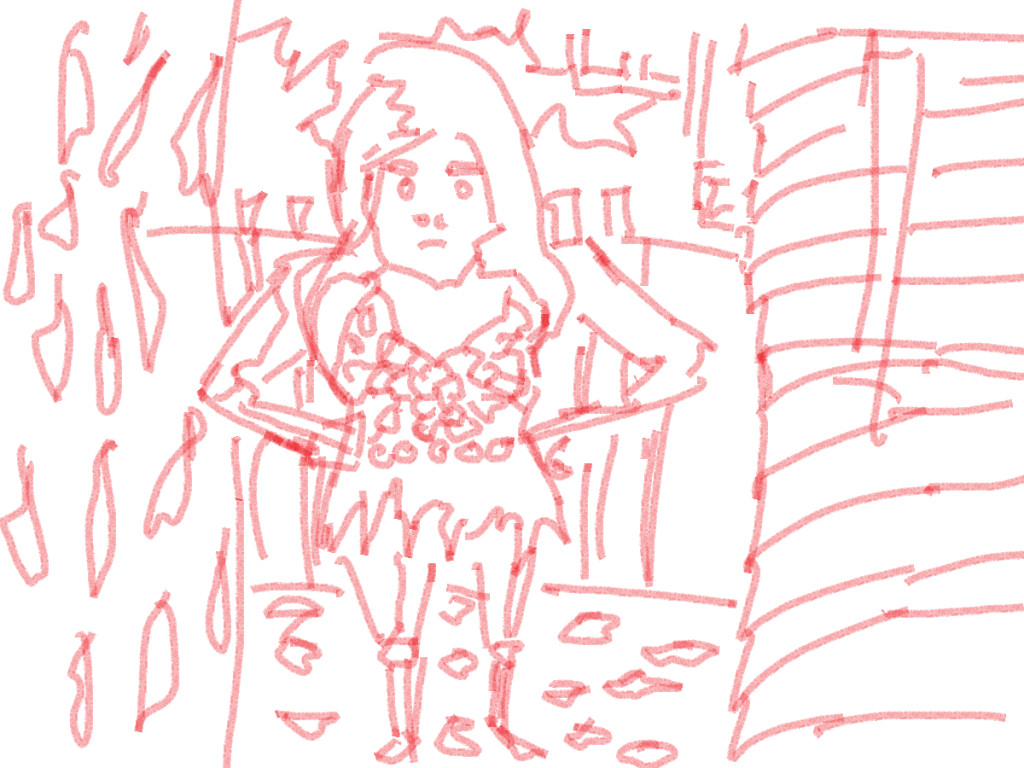
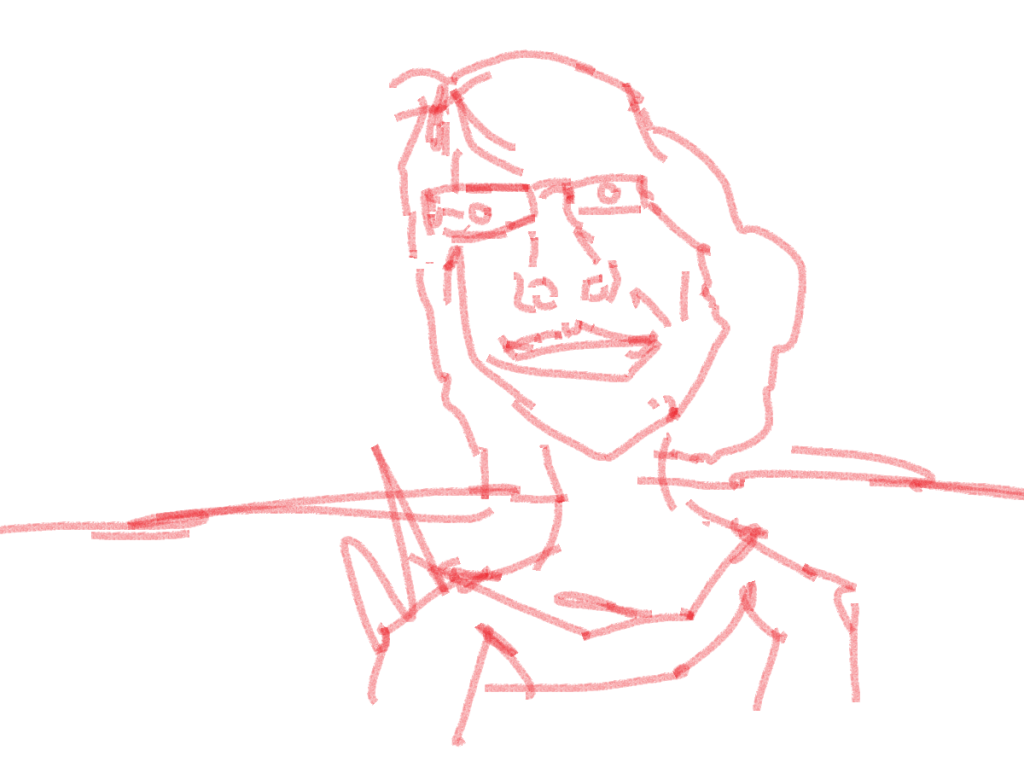
Natural Paint brush. Looking back at this now I will use the pencil tool for future works. It’s smaller, tighter and allows for more detail. This is super important as a majority of detail is lost with gray-scale color tone layers.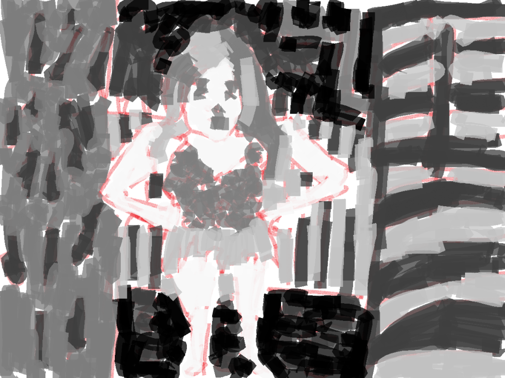 And grayscale tone added. I was surprised with how large the paint files were - 1200 by 900 pixels isn’t bad. It certainly allows me to do something with them in the future.
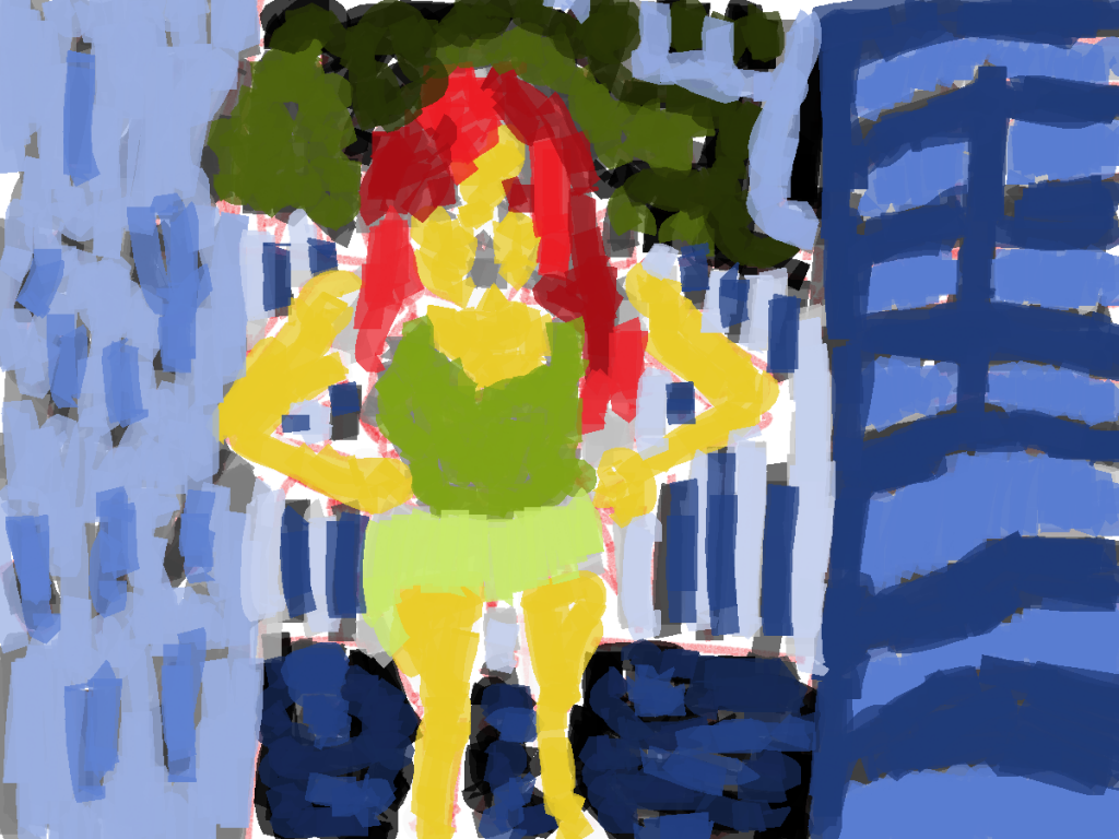
And color added. Limited colors (four in total) but a range of tones in the color. The green for the clothing is new, everything else has been used in previous works. Working in a new program and doing something different allows me room to experiment somewhat, I feel I tend to get stuck into the same trends at times with GIMP. 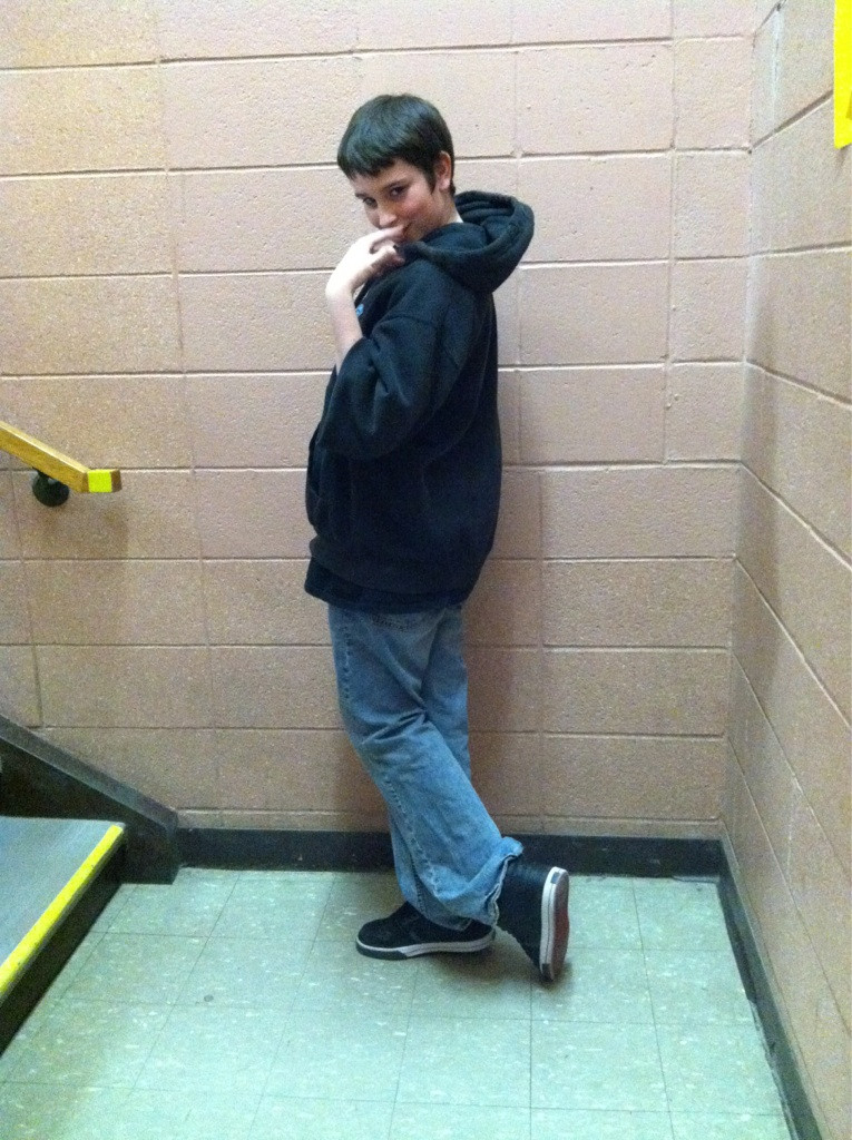
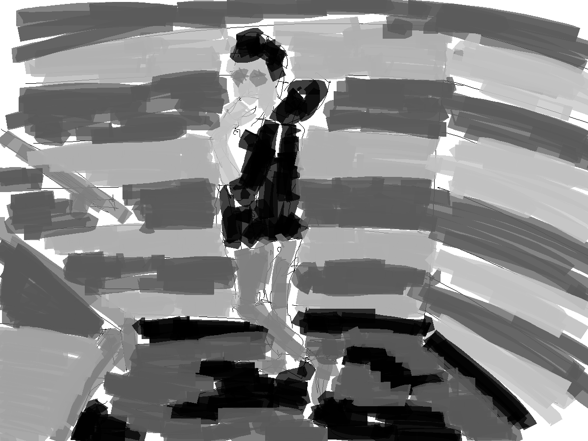
Full body pose reference. I’ll never turn down the chance to draw a full body, even if the quality isn’t the best. This allowed me to practice legs. The majority of the the character paintings I do are portraits. I work with arms and legs, but often legs are left out. 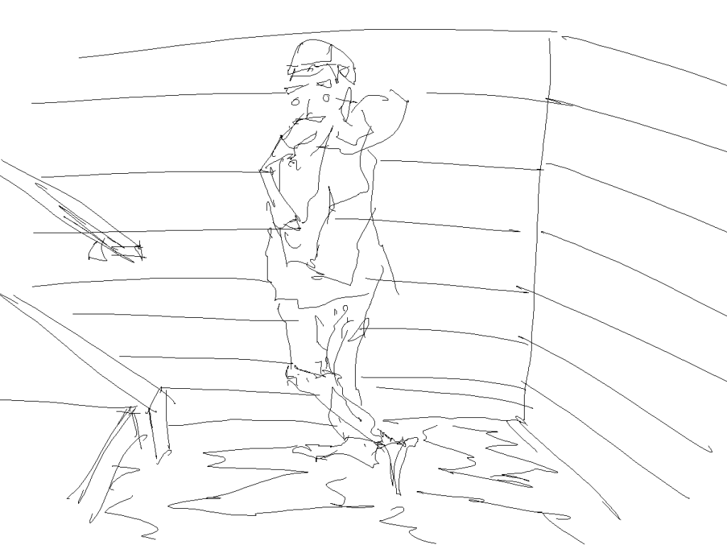
I’ve switched from the brush tool to the pencil tool. This feels like working on the line layer in GIMP. The only thing that’s missing - red. Less of a focus on the background (usually i create the hills in the distance/objects in foreground). For this I just created a basic scene using the reference in the photograph.

Grayscale. Keeping this simple. Black for the hair/sweatshirt. Skin is light gray. Didn’t bother with tones in the skin. Light and mid gray for the walls/step. Lastly, black and mid gray for the floor. Everything works together fine.
Color. I went crazy with this is added new colors to everything. I kept with the colors I usually use (yellow for skin/red hair/blue background) but it’s not the same hex number. For the floor and steps I went with a purple. Like the last painting I used a range of tones in each color. This is noticeable in the blues and purples. 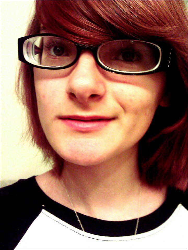
I remember seeing this on RedditGetsDrawn. I didn’t draw it though. It’s too much of a closeup. I prefer medium or full view shots rather than extreme close up. I guess if the quality of the photograph was higher it would be alright. Damn this out of focus photography!
This was done before I switched to the pencil tool. The line on this is very basic, I add information into the painting during the grayscale tone stage (normally it’s the otherwas around!). 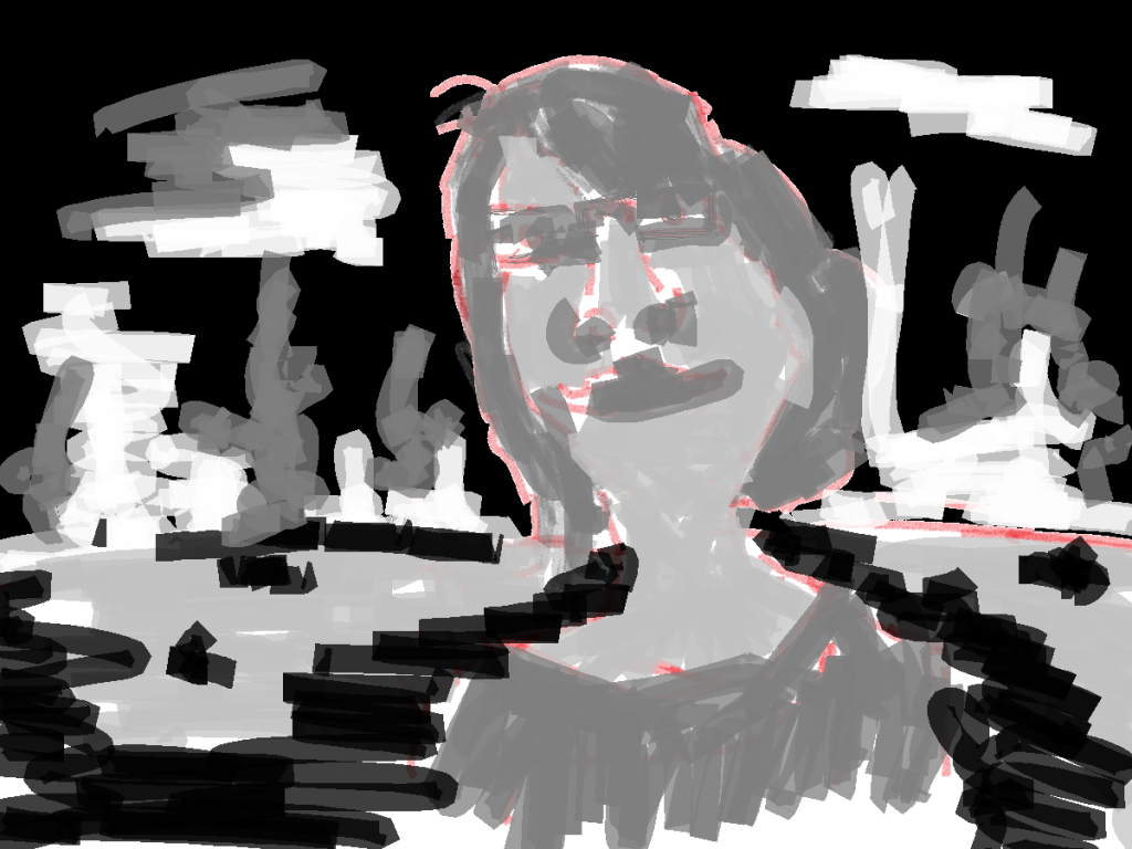
Went with the mountains in the distance and water coming forward to the foreground style. This is the basics for the majority of my RedditGetsDrawn character works.
Color tone. Switch around with the colors. Instad of using the blue for the sky I used it in the ground (usually I used a green for the ground). For the mountains and sky a brown was used. I think this works well for the mountains but I’d like to use a different color for the sky - could either be the blue or mix it up and use green. 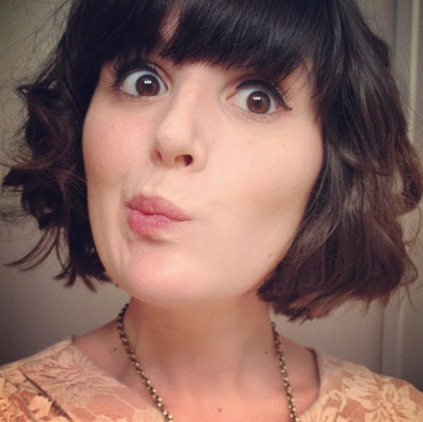
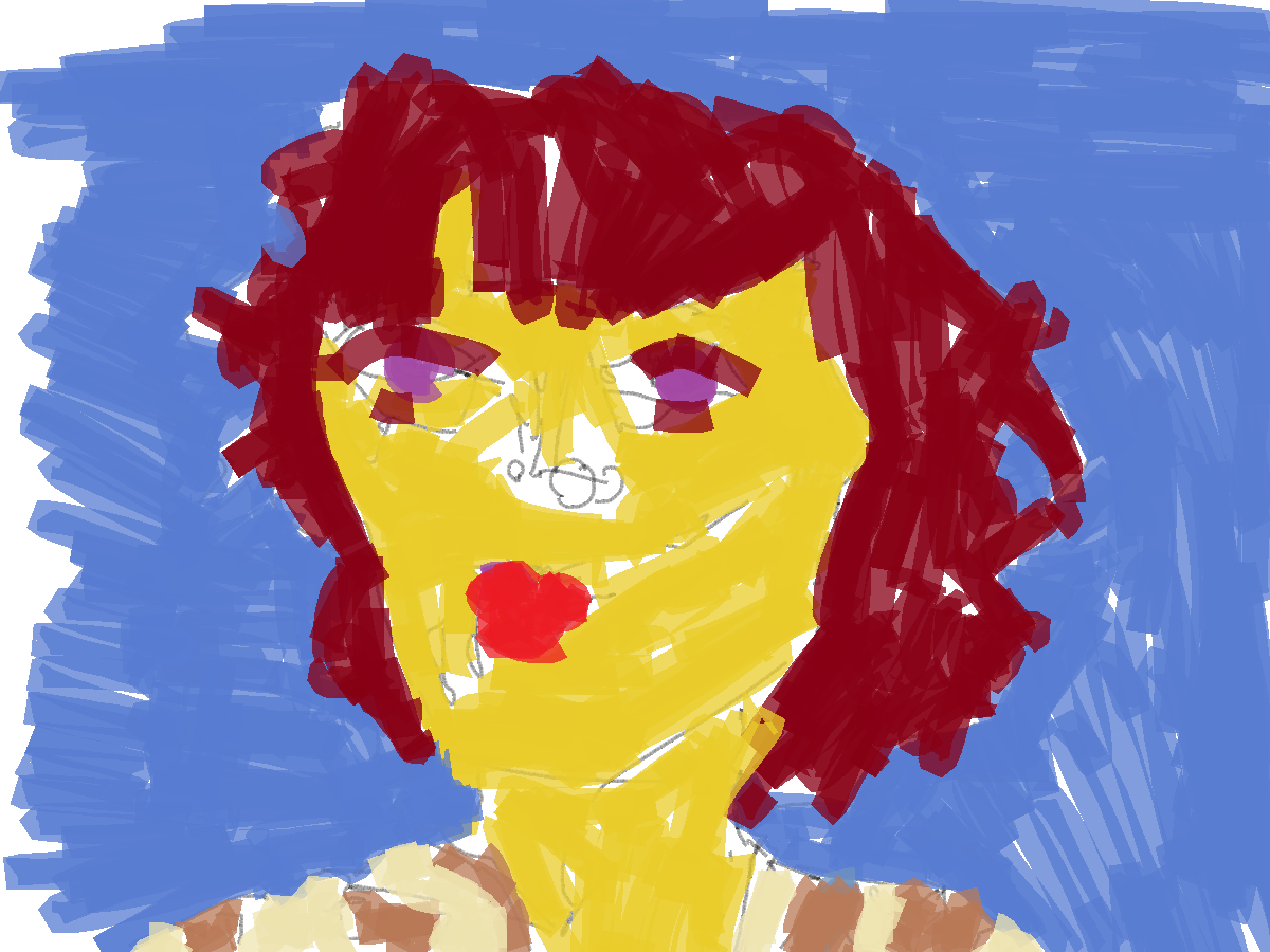
Loved the mouth location on this. Had to draw it, too cute.
 This was the first painting of this series in Microsoft paint. I was still getting use to it and saved over my line layer with the color, so only the one image. I didn’t paint a gray-scale tone layer either. The usual yellow for the skin, and red in the hair/lips. For the shirt I went with a new brown. Blue in the background, but it’s just used as a fill and gives no location to the character.
I think I’m going to have to explore brown.
Read more →
gghfjghjgf 


Read more →
Currently in Hastings. Busy with the photos, plus some drawings. This post is for the drawings I did during my time in Wellington. I have wifi.
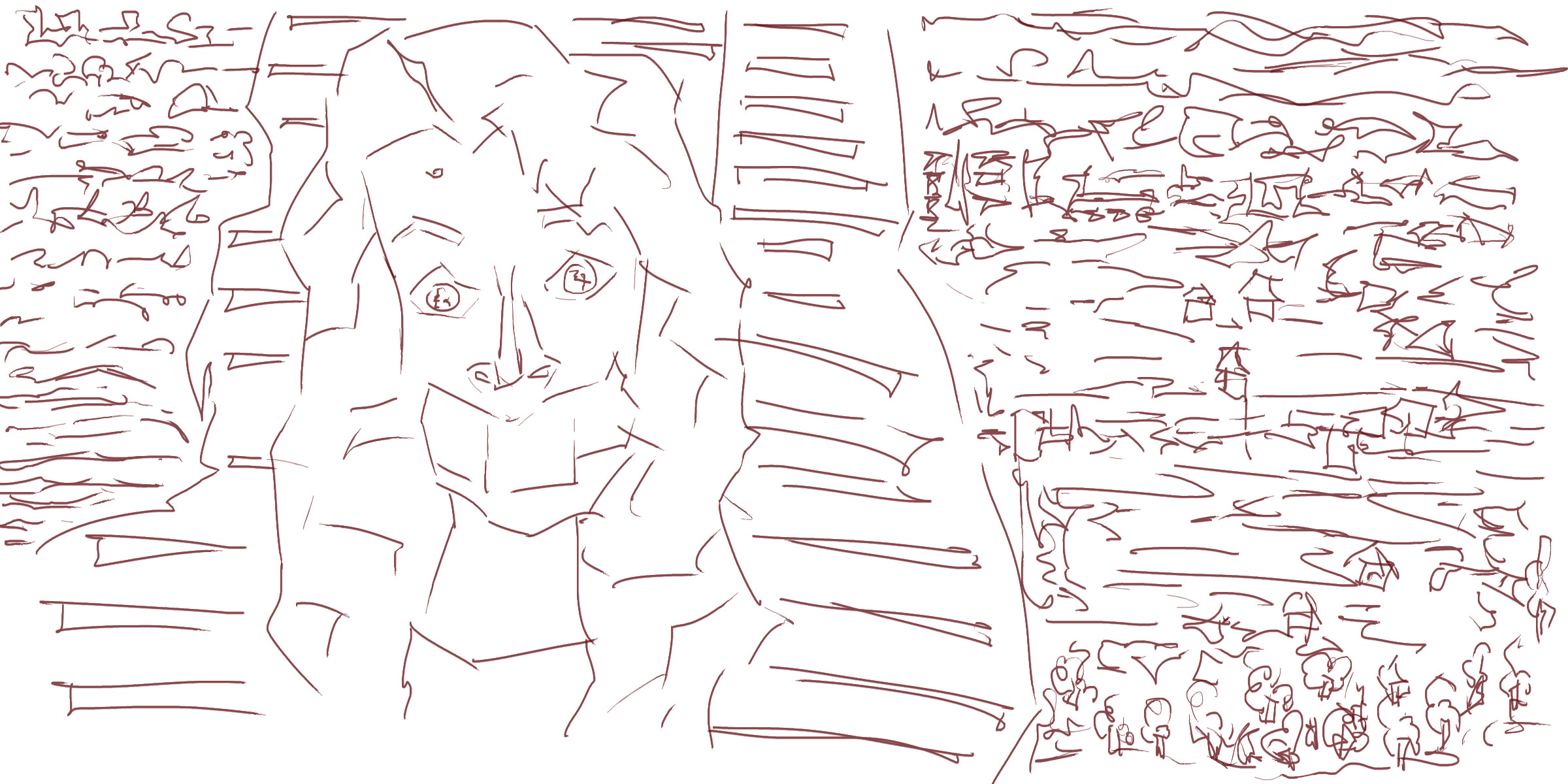
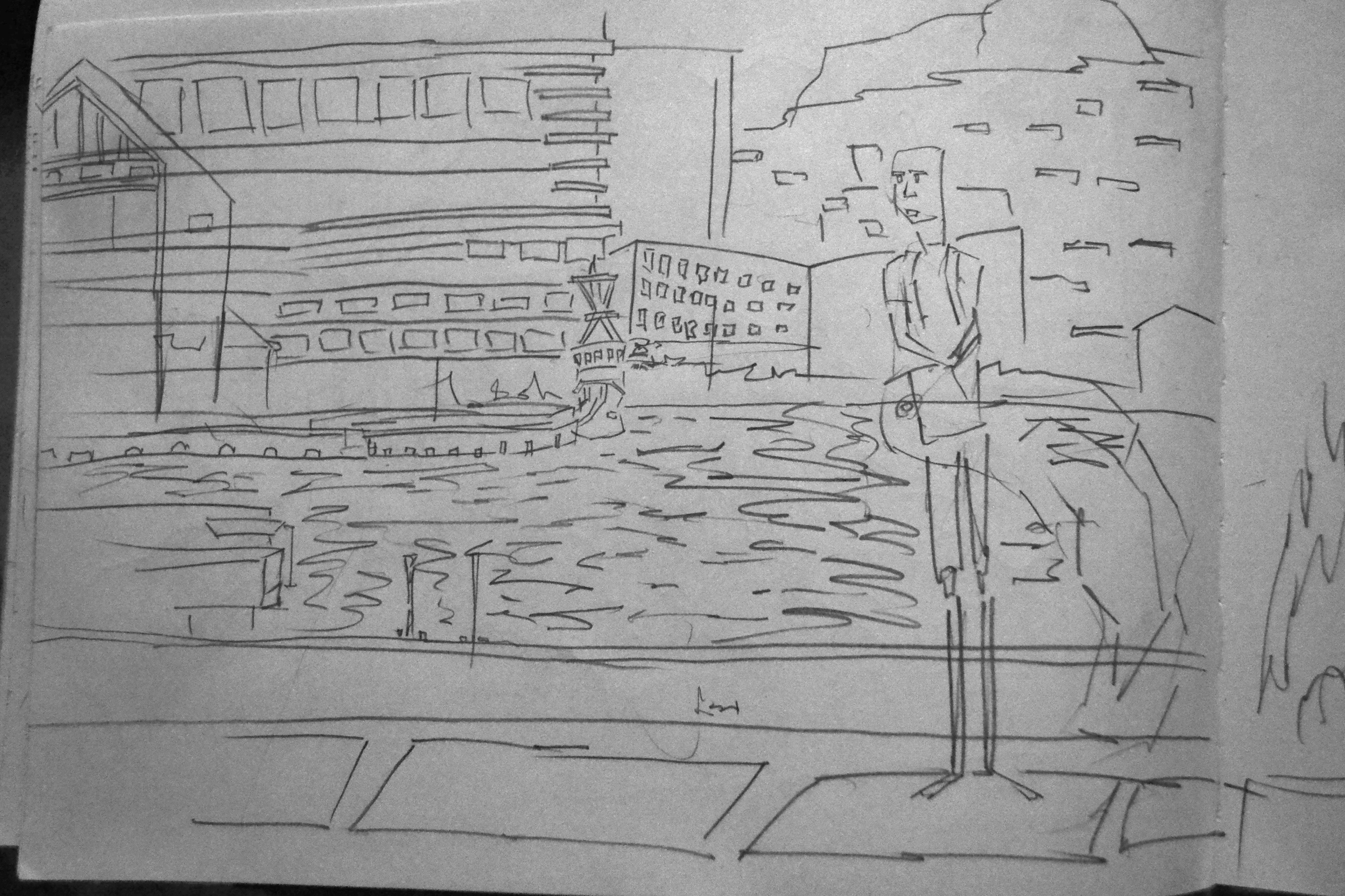
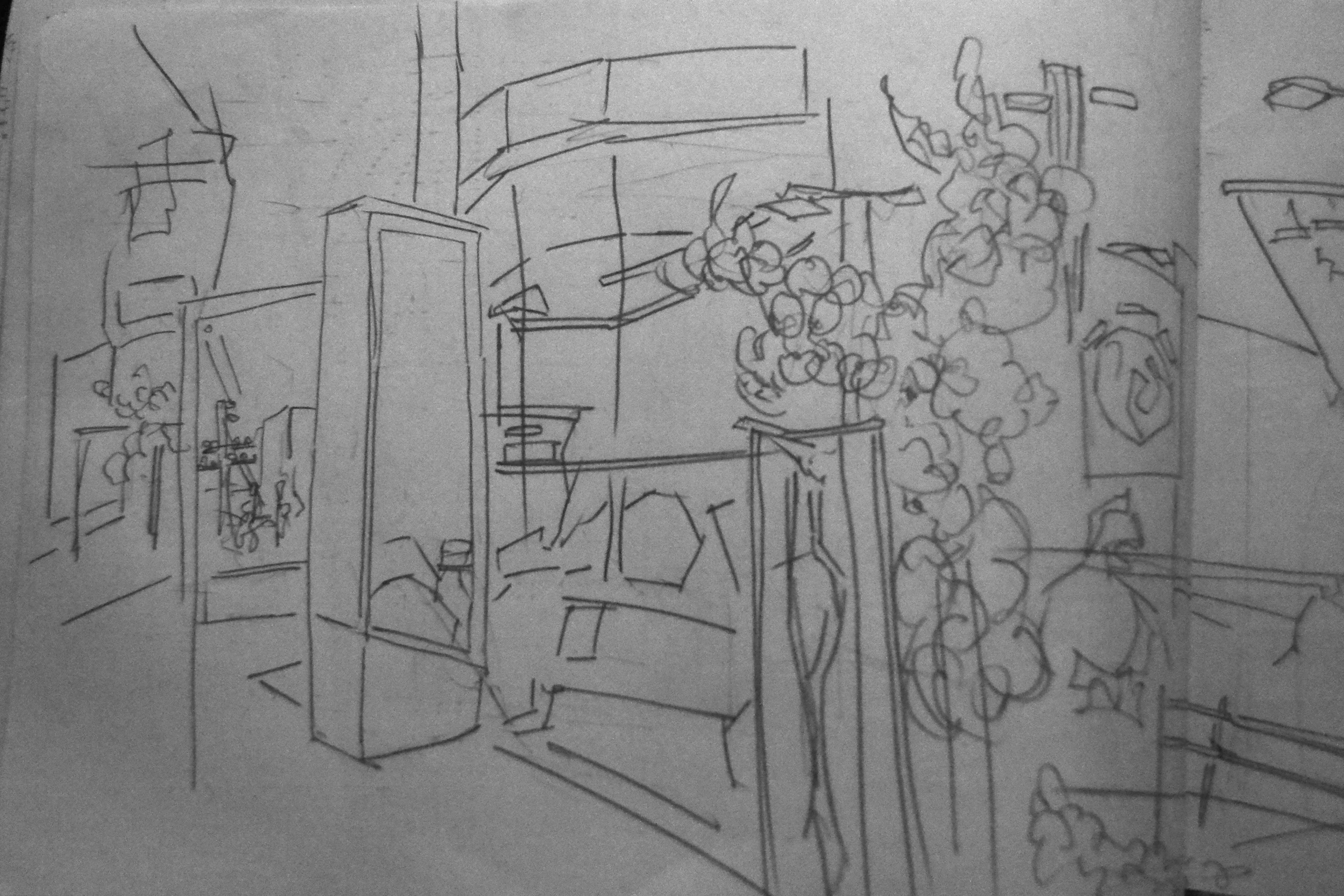
This view is of on the corner of Tory Street and Courtney Place.
Right side of the page. Here I’ve captured the end of the building is the rail traveling in the air. On the right is a black pillar shape. It’s a sculpture in the foreground, only able to fit part of it in so framed it up against the edge.
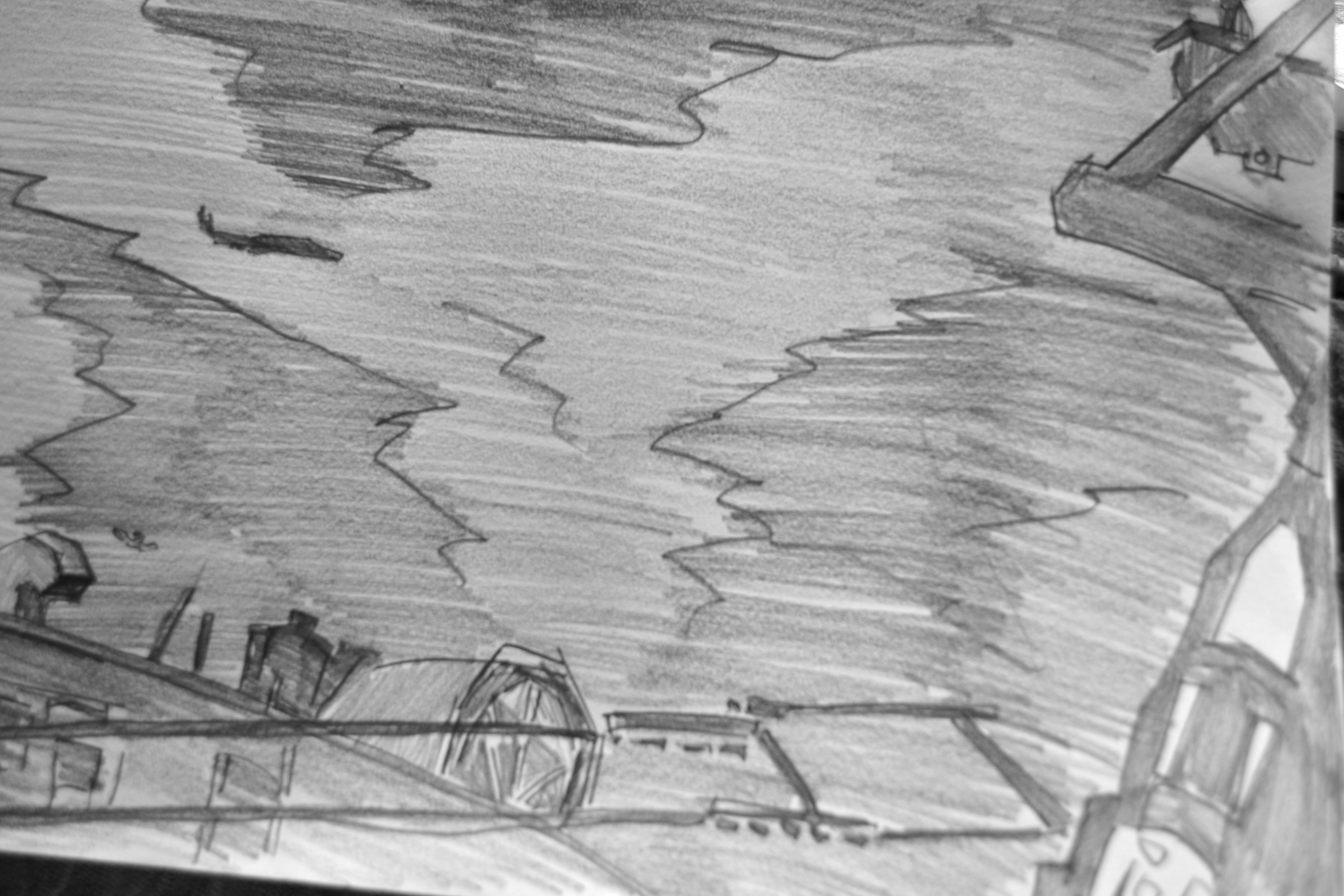
The waterfront. I sat on the Wellington Waterfront on a Sunday morning and drew this. In the distance a ship is docked. This is where I start. From here I build out
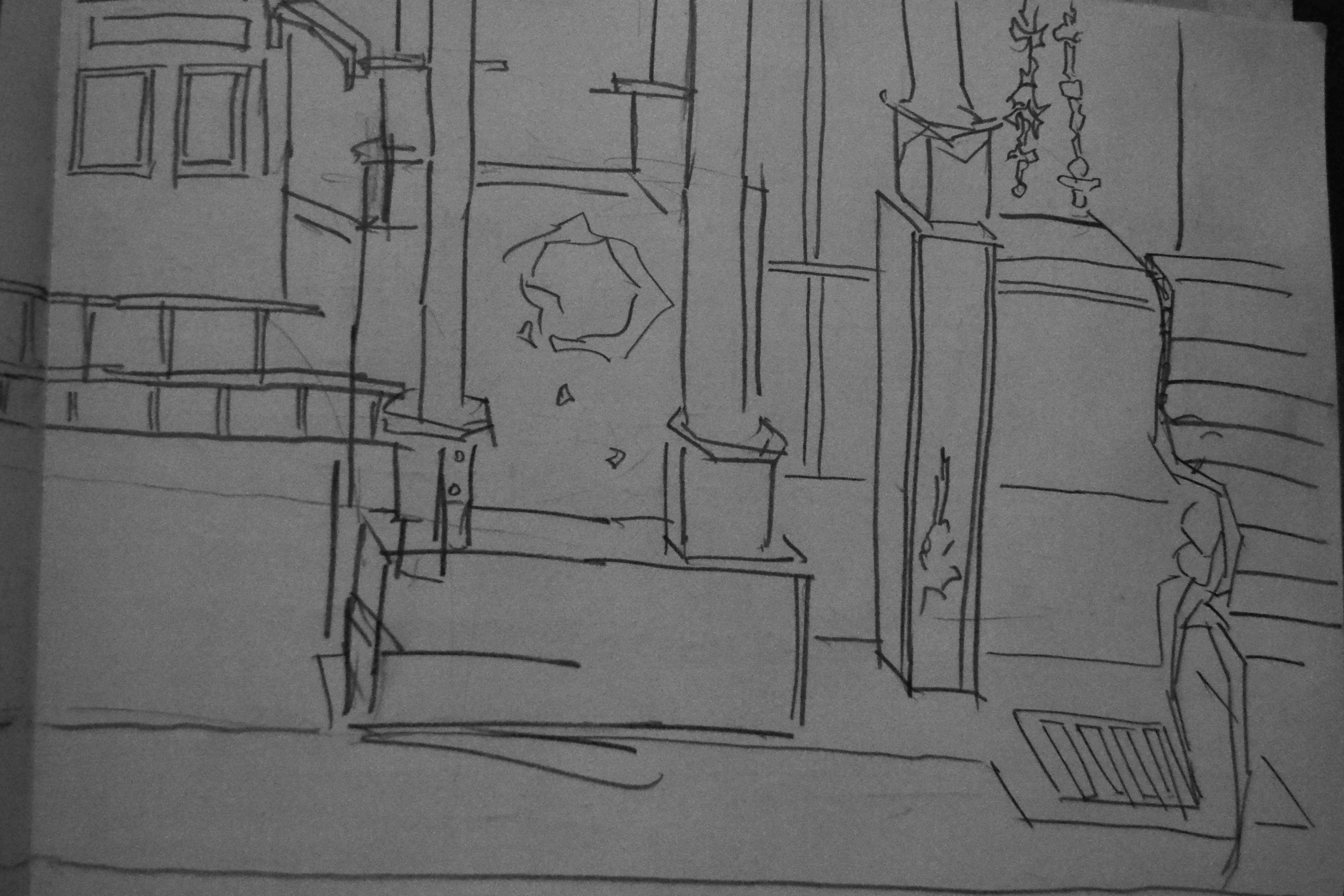
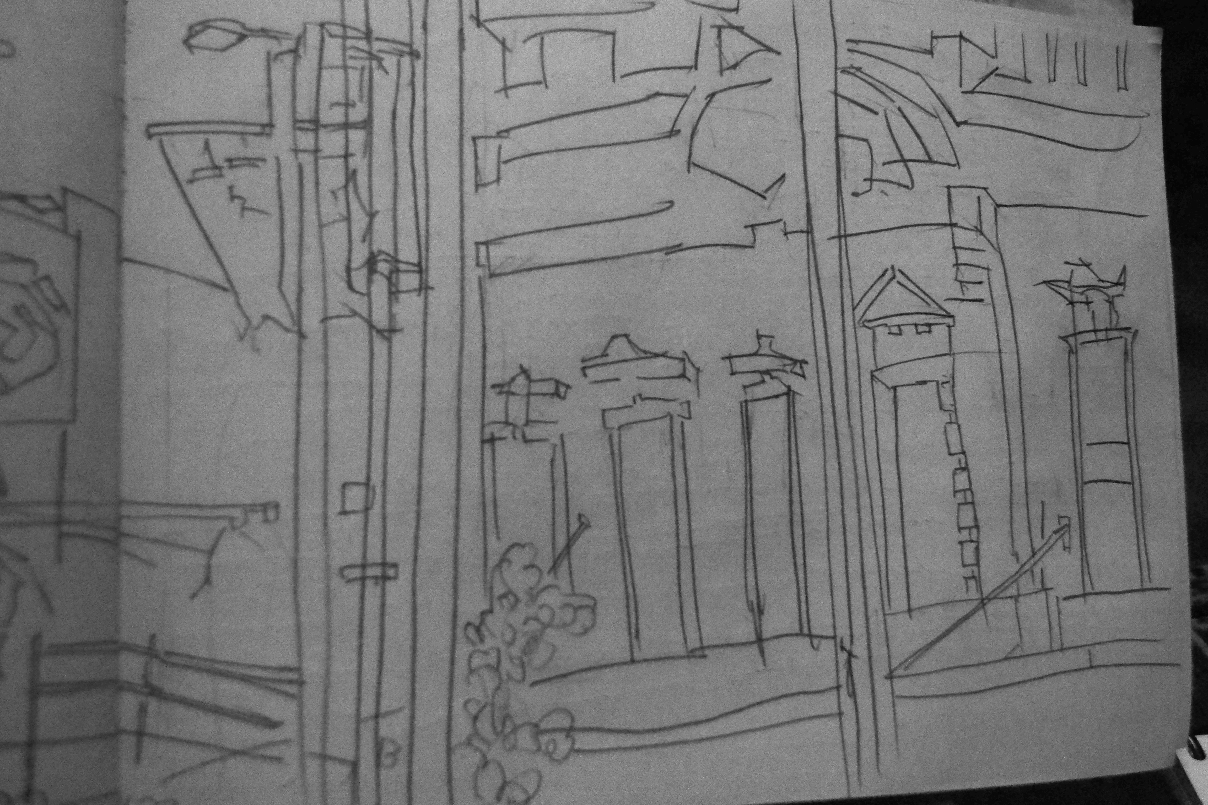
Sitting on Cuba Street. This is a favorite spot for me. The drawing is of the buildings in front of me. I love to draw Wellington. 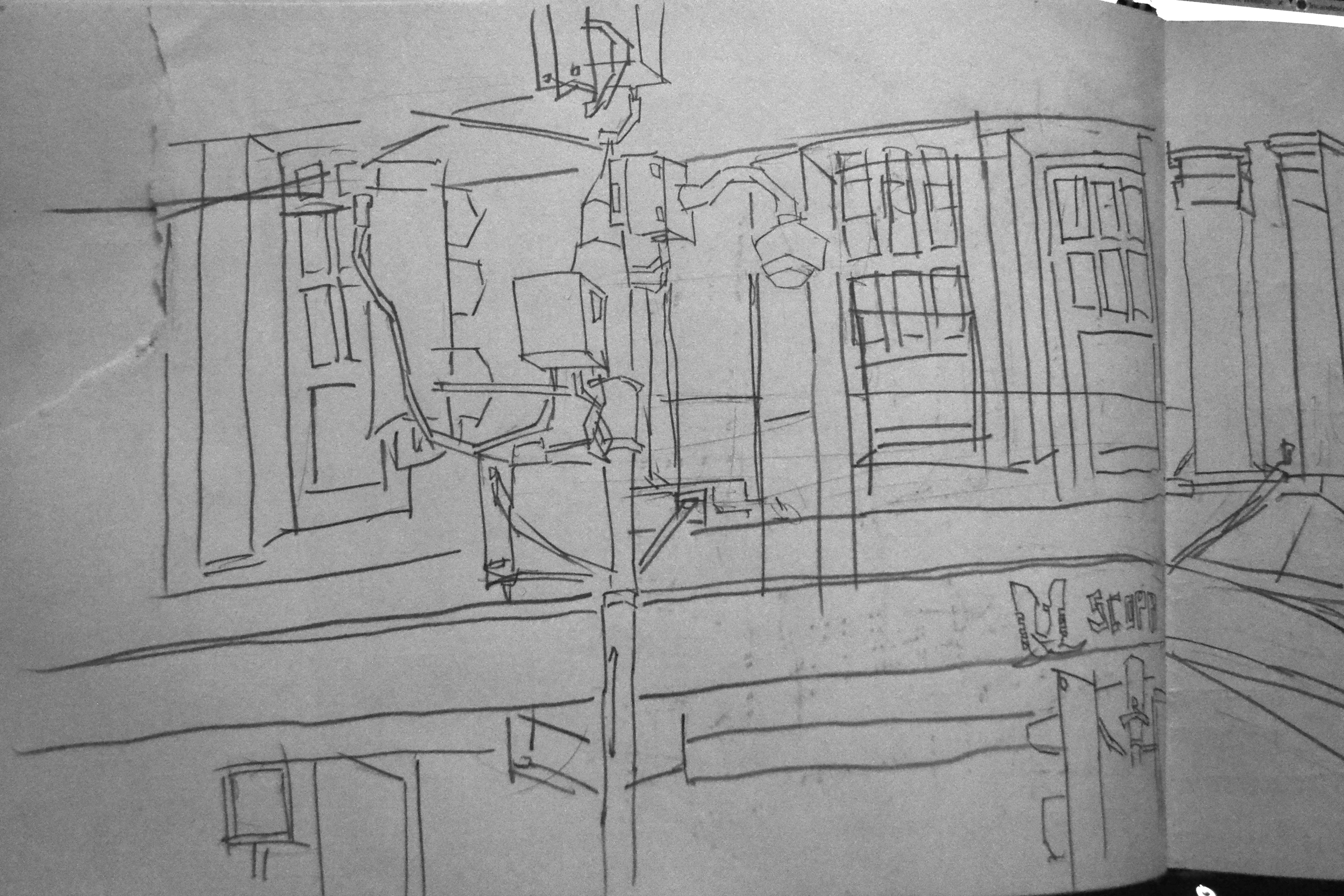
Another Cuba Street view. I’ve drawn this exact scene before so great to go back and redraw.
Read more →
Currently staying at a farm just out of Hastings. Slow on the digital painting, but getting plenty of Photography and Pencil Drawings done.
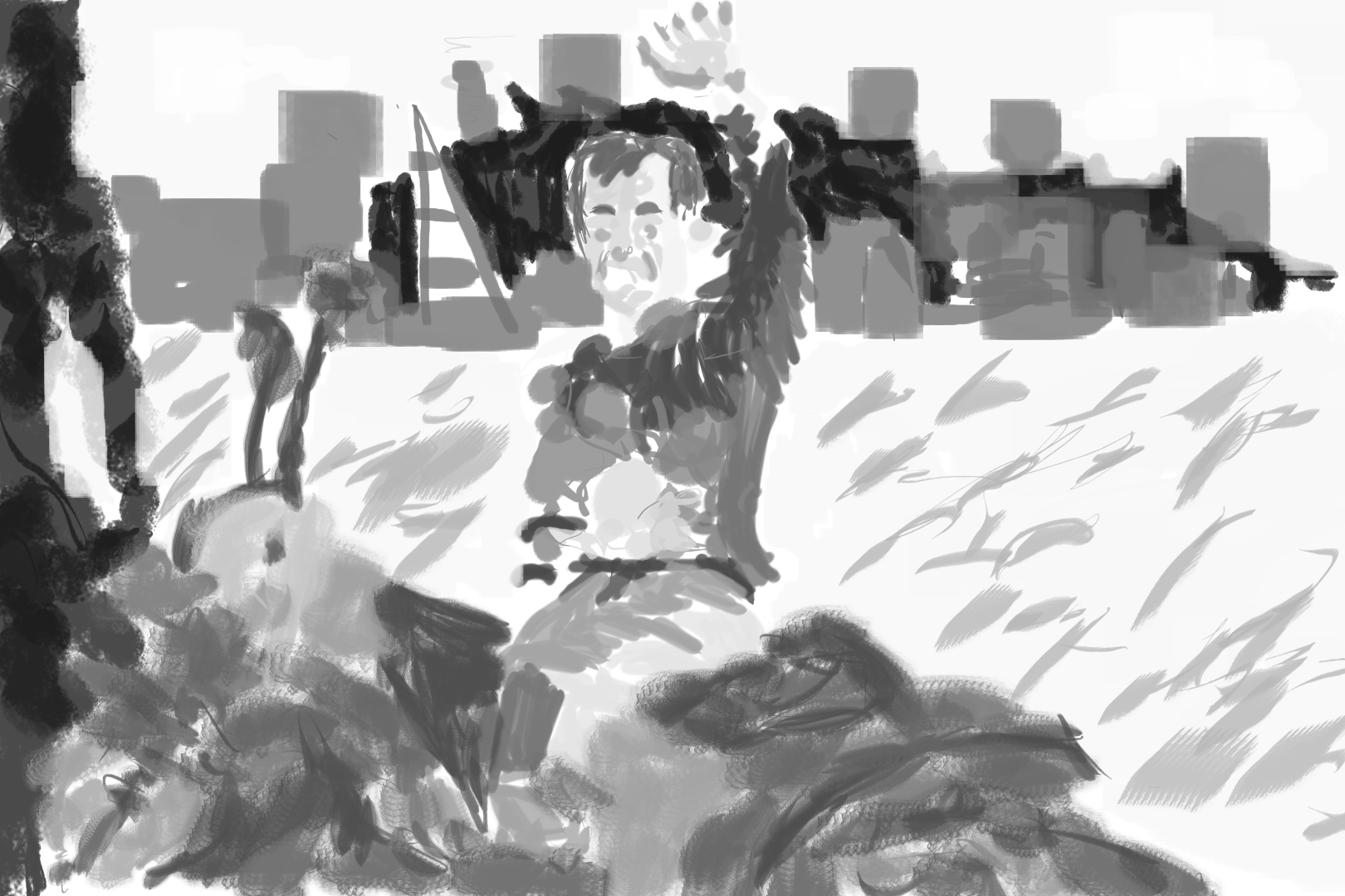
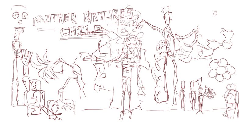
Here’s a digital painting I did from imagination. I had a kid observing me and giving me in instructions on what to add.
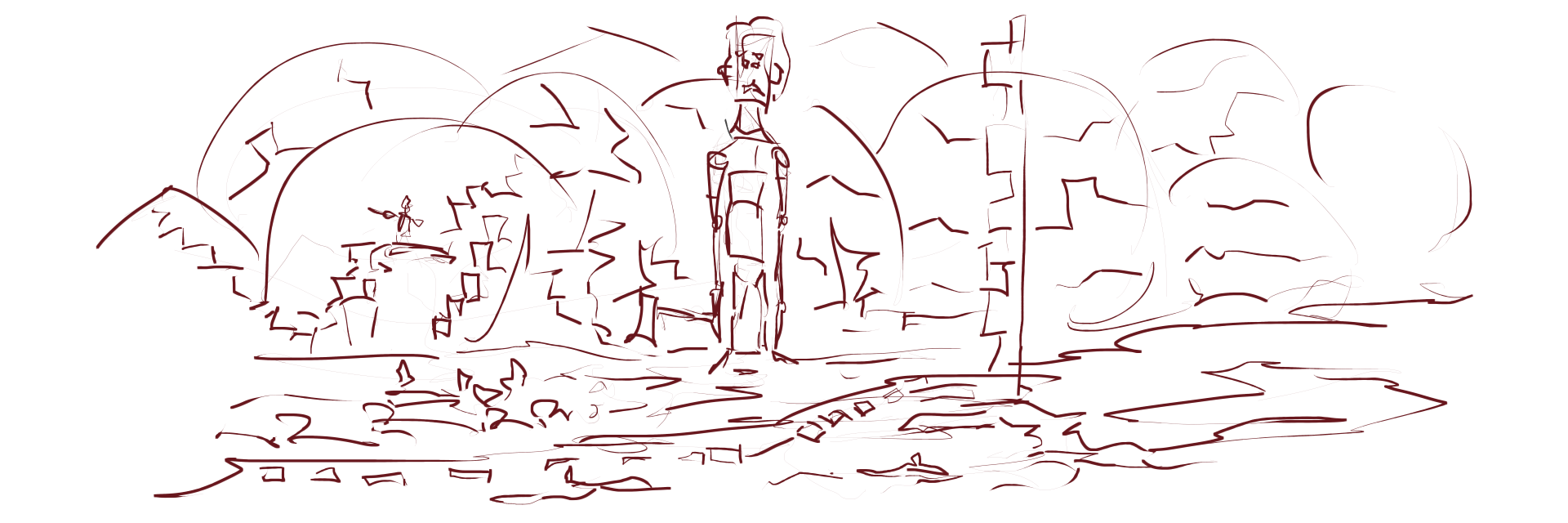
I started with the figure, then added the floor. For the background I went with large circles as hills. I was told to add a cave into the mountains, this is visible on the left. There is a figure rising from the hill.
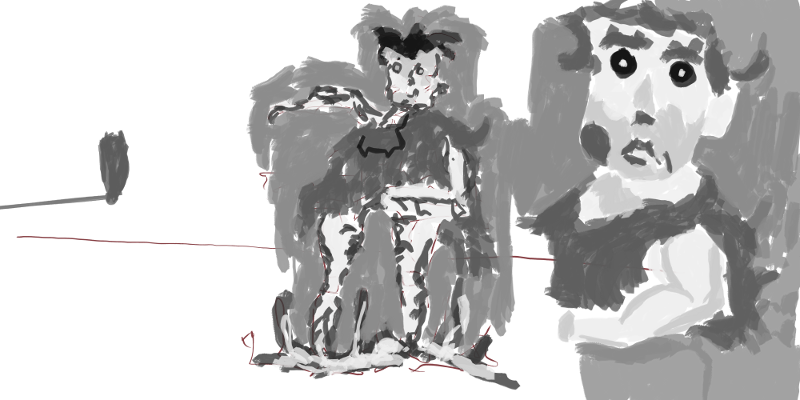
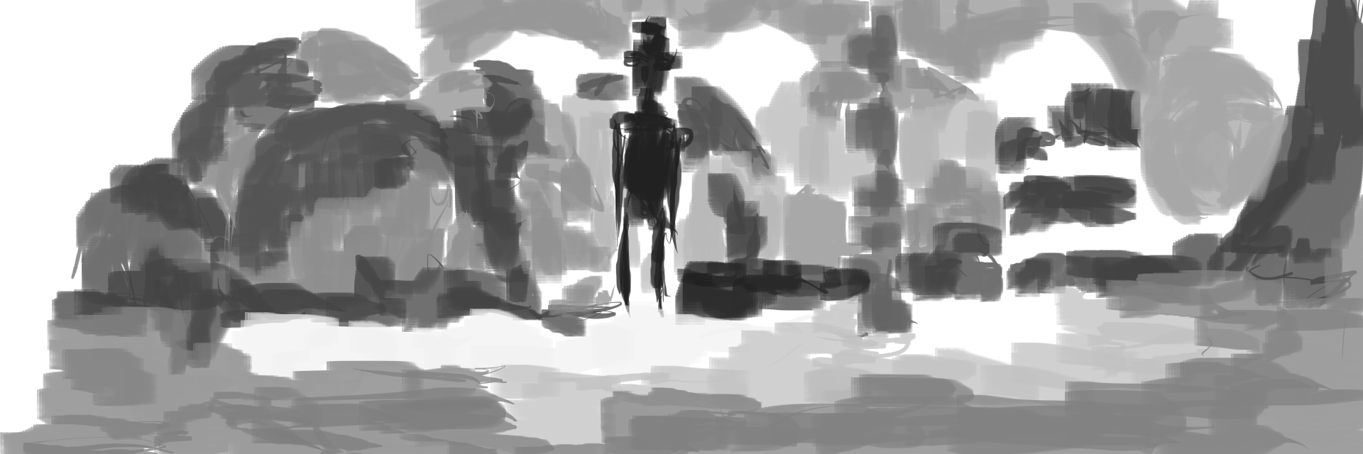 Tone added. Much of the detailed areas in the line version are removed. Added though, is tone and shape.
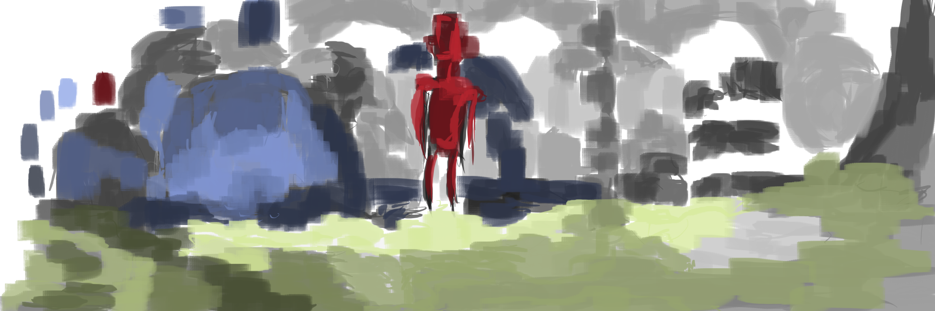
Color. I explained how I use a restricted amount of colors - three here, and that I use a range of tones (3 usually) of the colors. This isn’t finished, yellow could be added.
Read more →
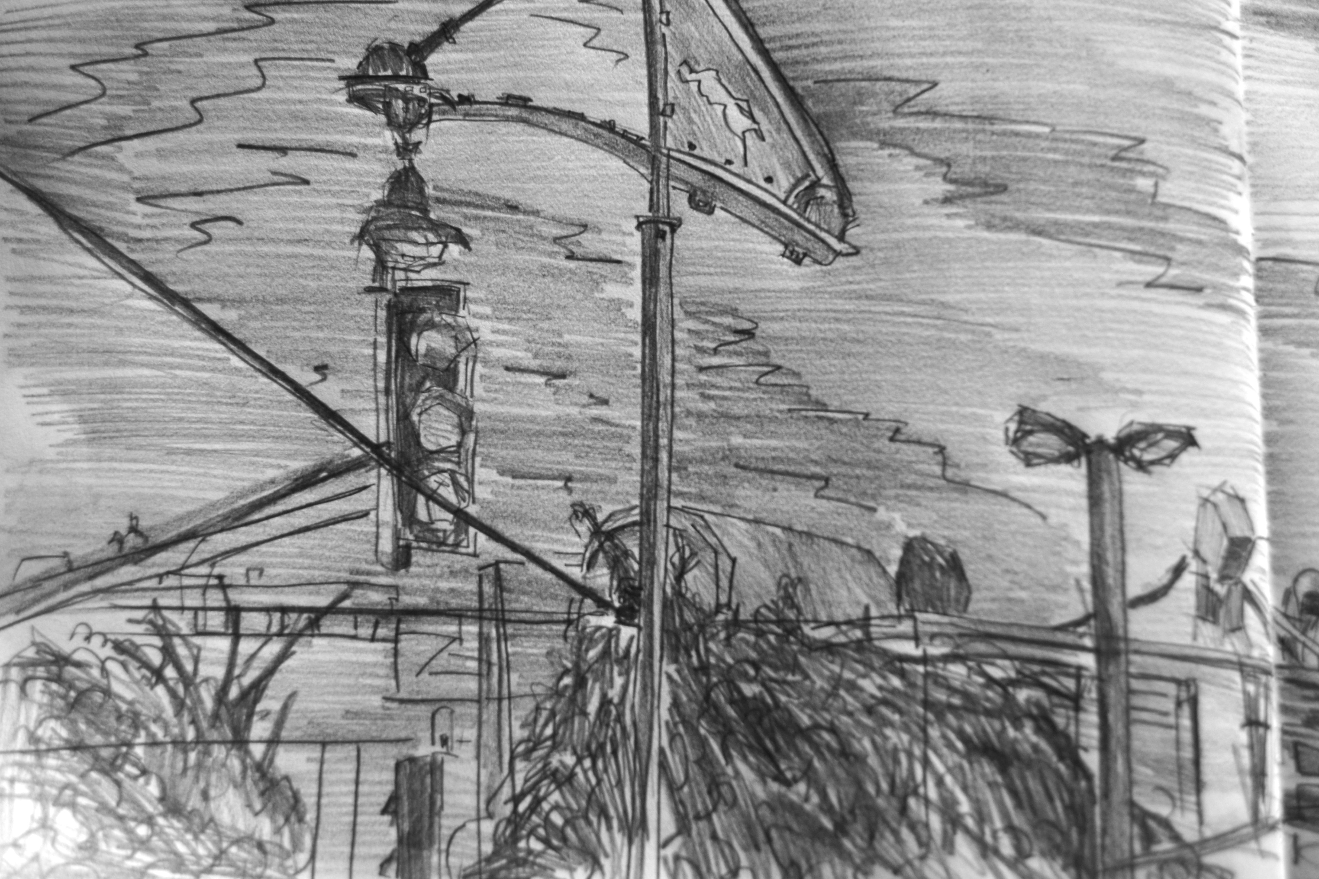
It’s been a long time since I’ve uploaded pencil drawings. Everything has been digital. During my time in Wellington I got a new clutch pencil and did a bunch of pencil drawings. I’ve photographed the works and here they are. These ar drawings from photos on Reddit Gets Drawn.
Enjoy.
RedditGetsDrawn
I got myself a new visual diary from Gordan Harris - A5 landscape style. I haven’t got a new journal since my birthday day, and I lost that during my time in Auckland.
Married couple. Classical pose. Multi figures are easier to draw than a single figure due to the ability of lining up points of interest. I like the flower in her hand. 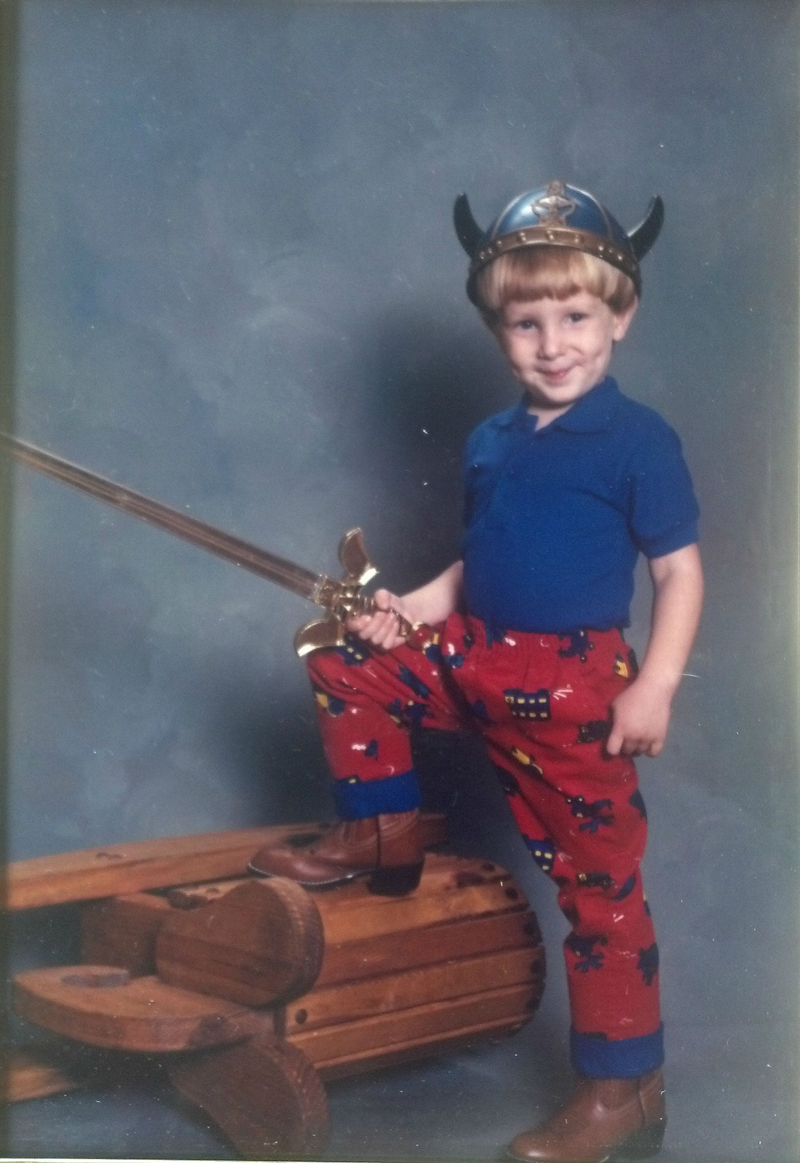
Viking child. Majority of these pencil works are of children. They are good subjects, and I don’t draw them enough. Slayer!
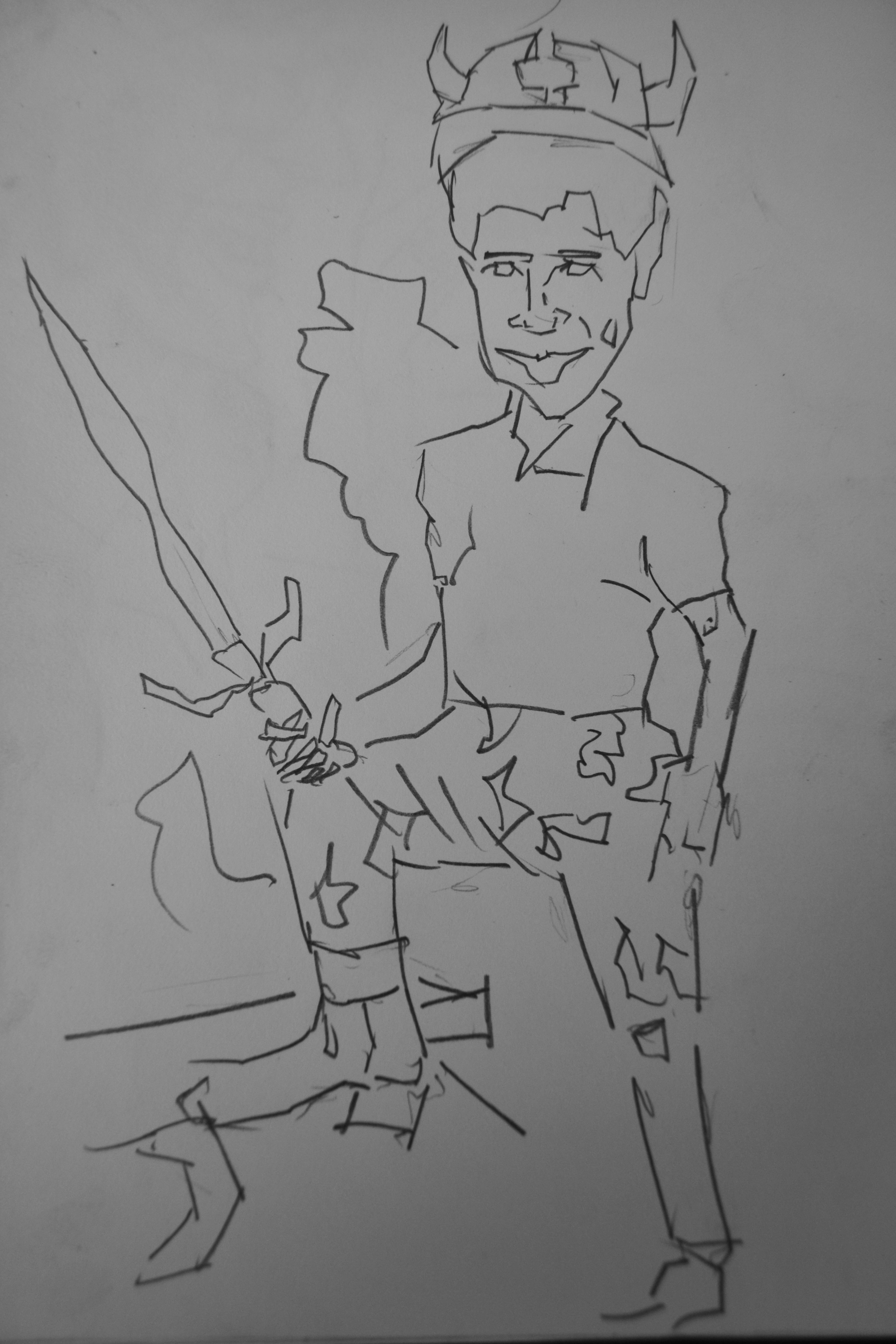
And the result. I’ve been treating my drawings similar to digital works - with building up the line first, then tone, then color. Since I have a new clutch pencil I plan on drawing more. Every night before I sleep there is no reason why I can’t get a character drawing done! 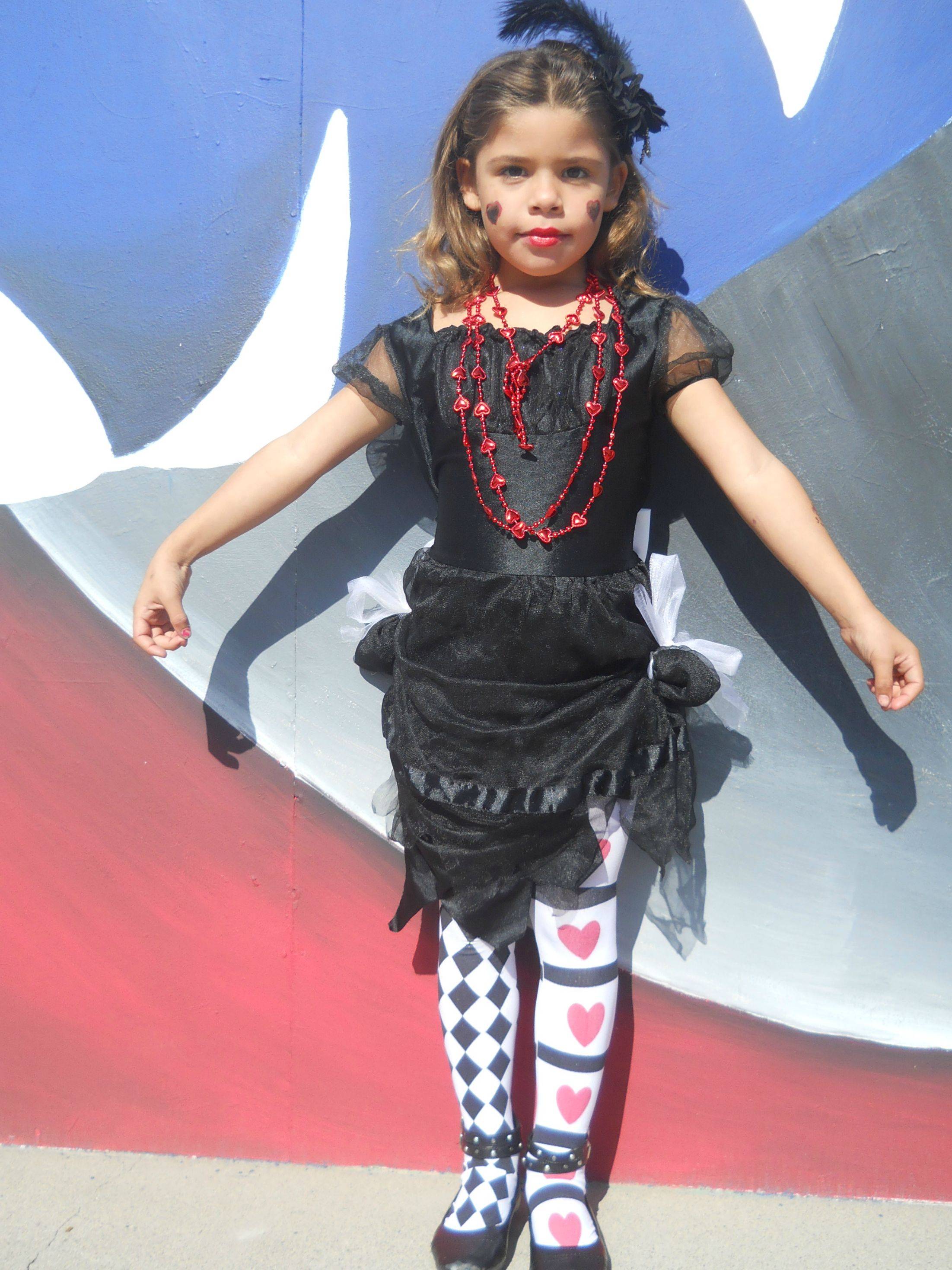
I had to draw this outfit. It’s amazing.
Sadly I haven’t got the line version of of this, which i was super happy with. But still, the tone version is alright. Nice to be able to draw the full body. I need to practice those legs/feet.
And color. I used my Derwent colored pencils that I’ve had forever. They rarely get used as I don’t like the lack of detail they give. 
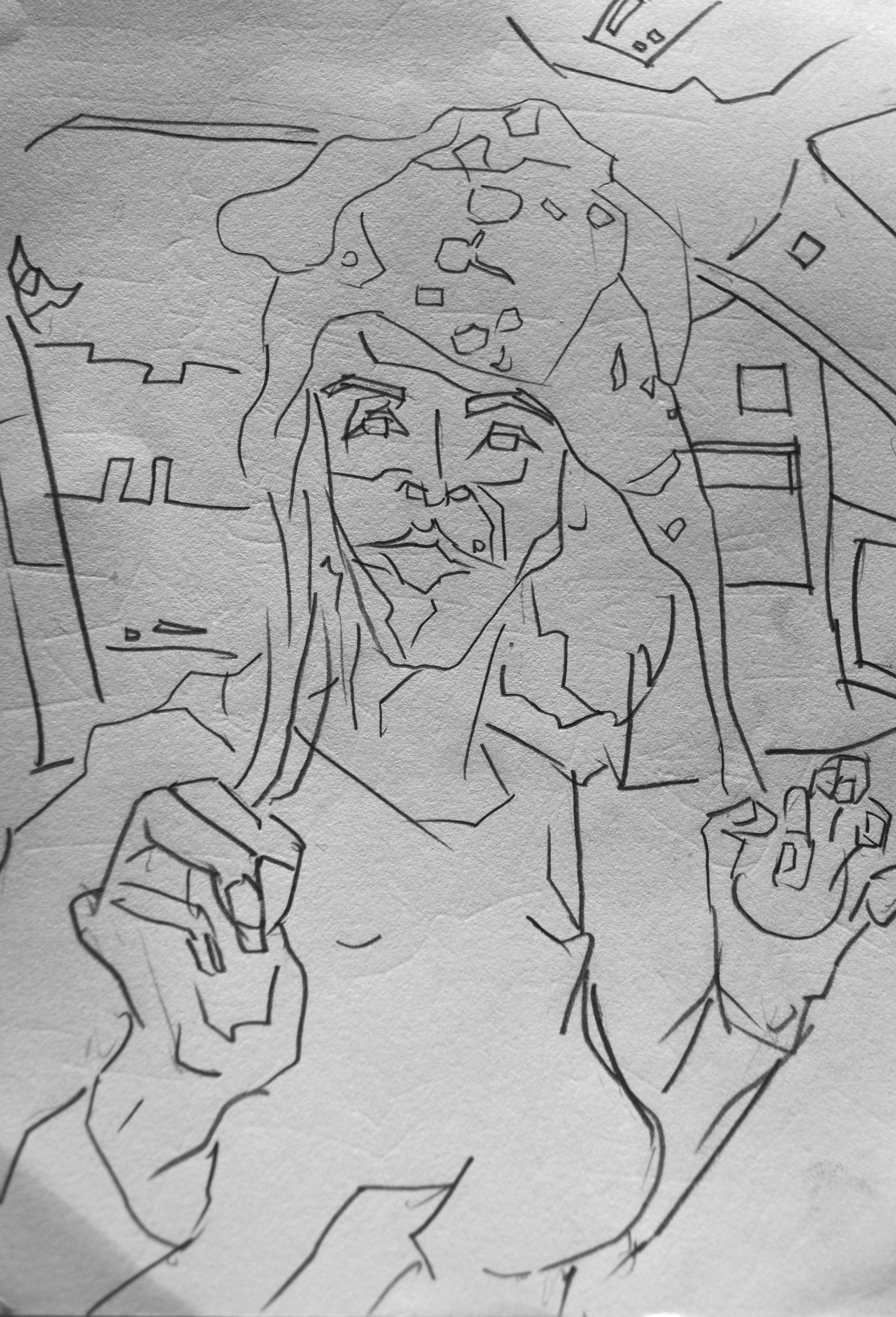
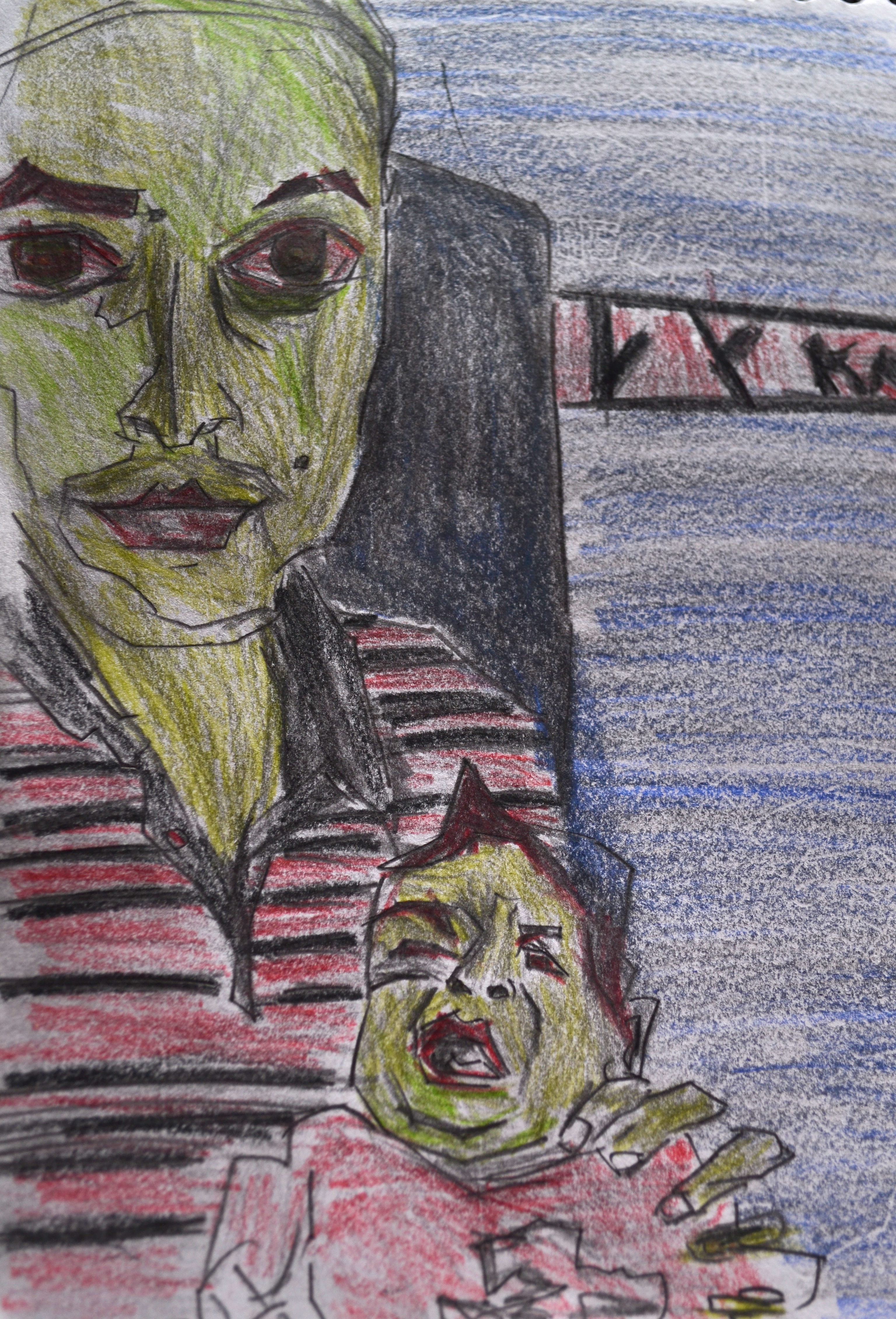
These are some of my best photos of artwork I’ve done. Taking the photo in direct sunlight seems the best. I convert to black and white, and change the levels. I like how you can see the texture of the paper. I like how the girl is wearing an animal hat - similar to mine!
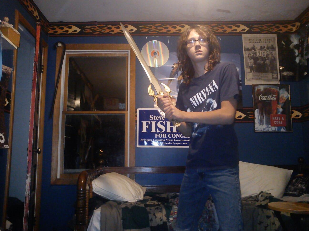
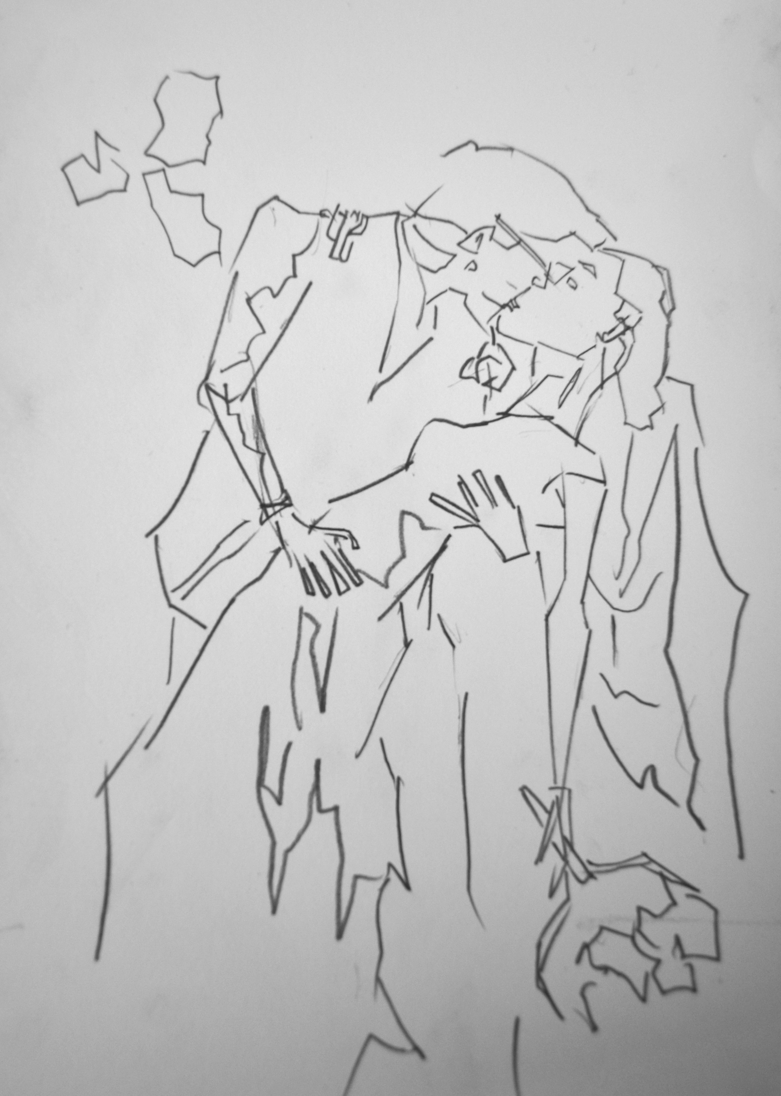
Another sword based reference. This time a teenager in his room weilding a sword. Full battle armor would be great - but the swords a fantastic accessory.
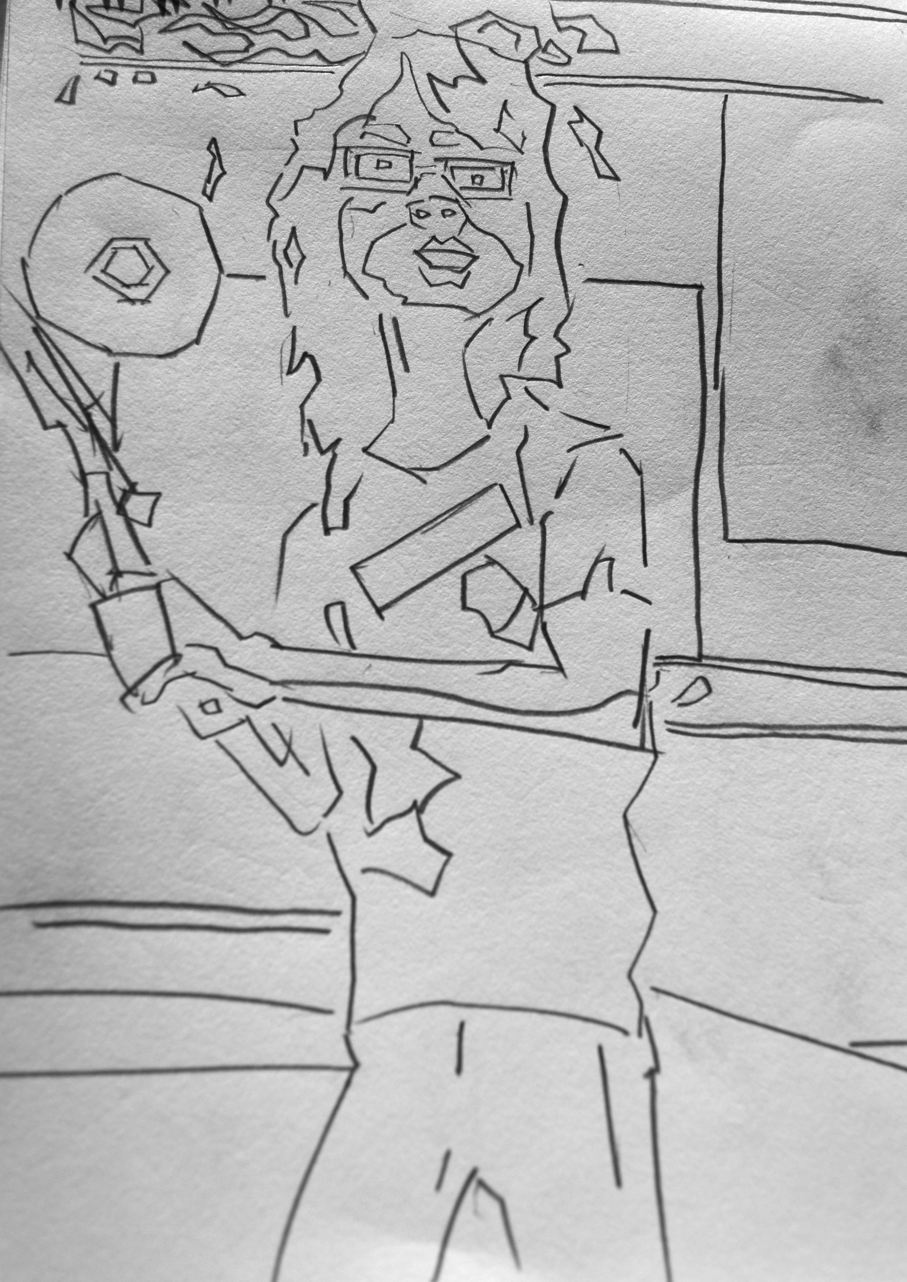
For the drawing I zoomed in and cut off the bottom of his legs. The drawing pad I’ve been working with is only a5 size (landscape stype) so it forces me to work smaller than usual. It’s important to work in a range of sizes - and I have been working the long landscape format for a long time so great to try something different. 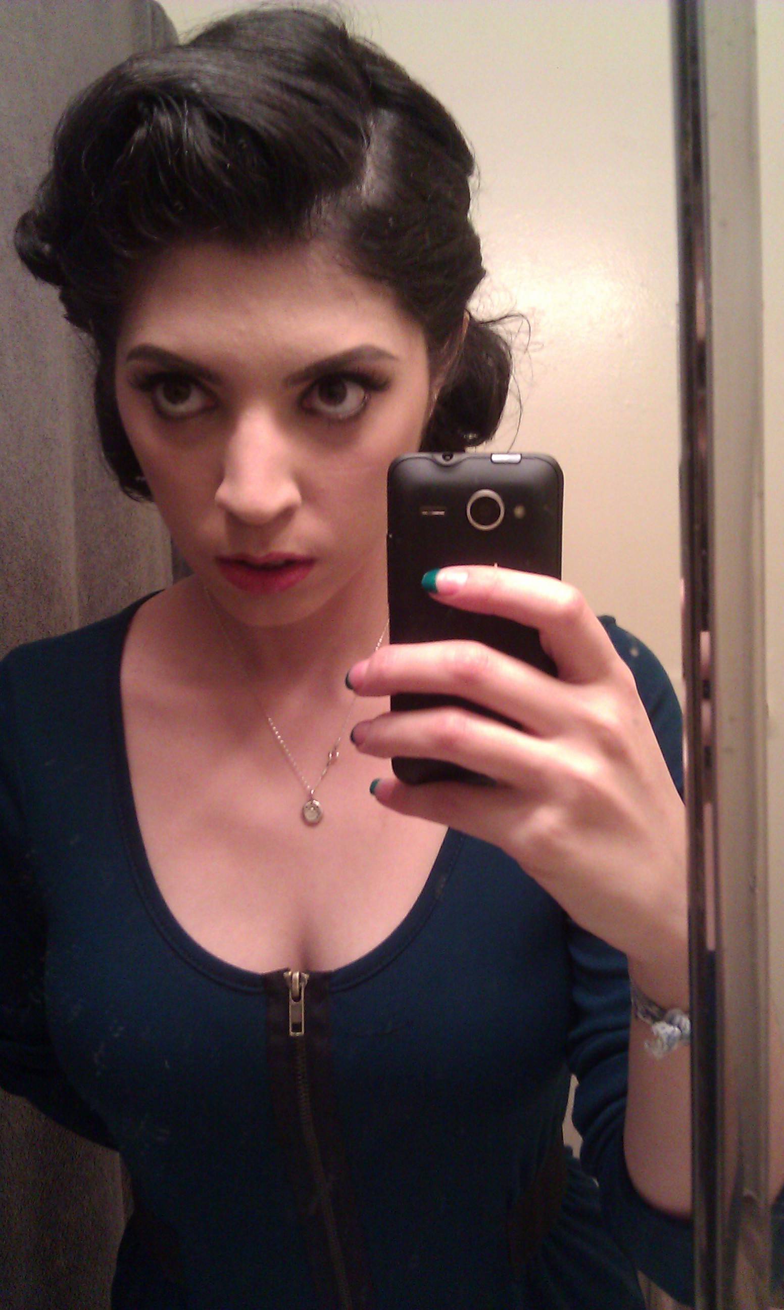
Portrait in the mirror. Wedding practice time. I’m impressed by the hair style and makeup so had to draw it. 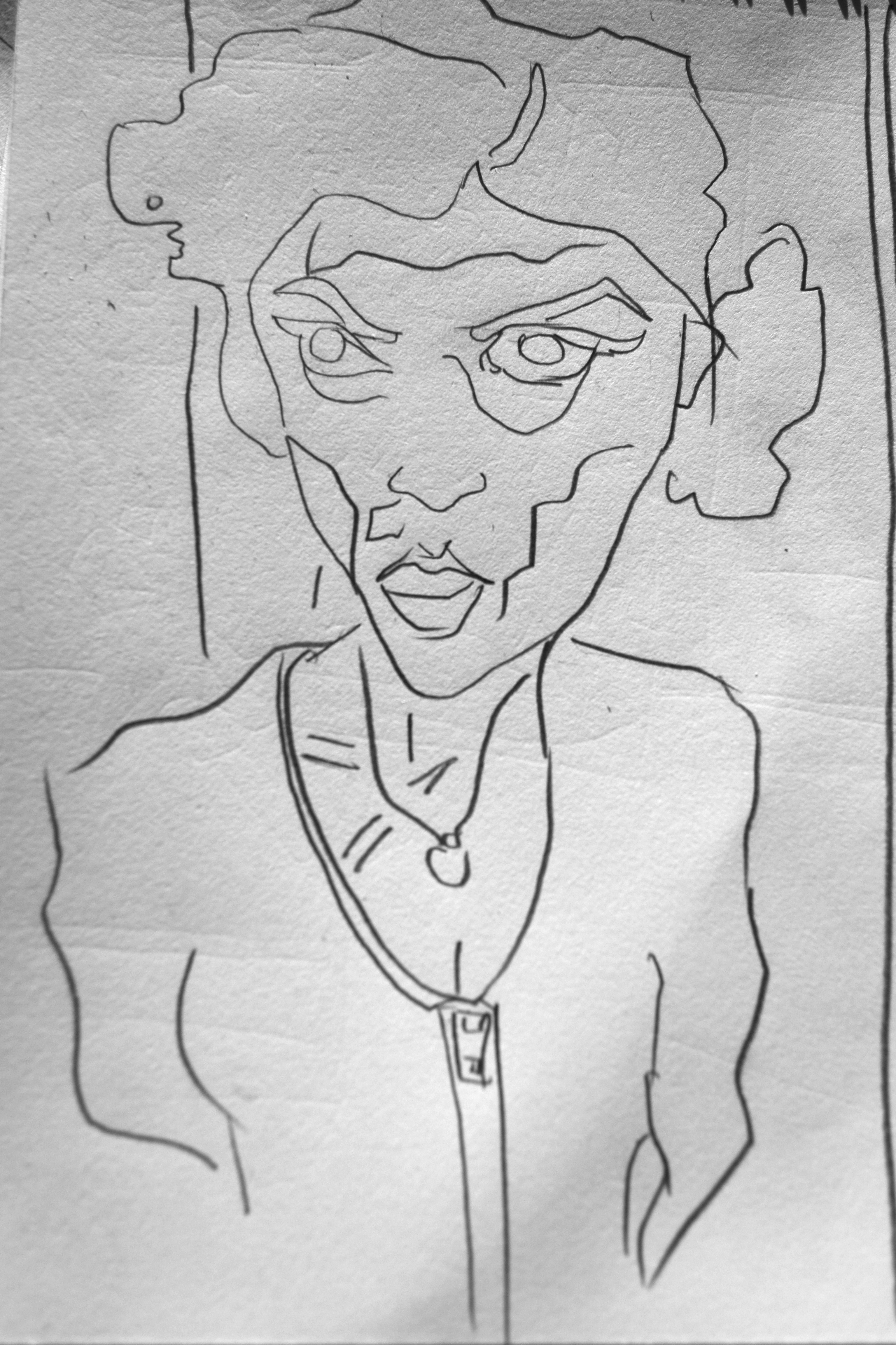
There was a request to remove the cellphone, so I did. This one is very simple, nothing happening in the background. 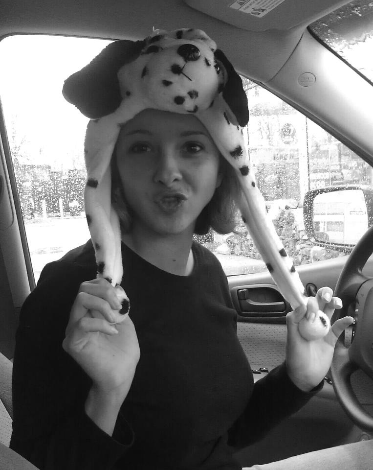
Another awesome hat related reference. The rain in the background also helps to make it an interesting photograph.
Problems with drawing her chest- - just couldn’t get it work. It really is a challenge without the nipple.Struggled with the arm as well – as you can see the line has been repeated several times.
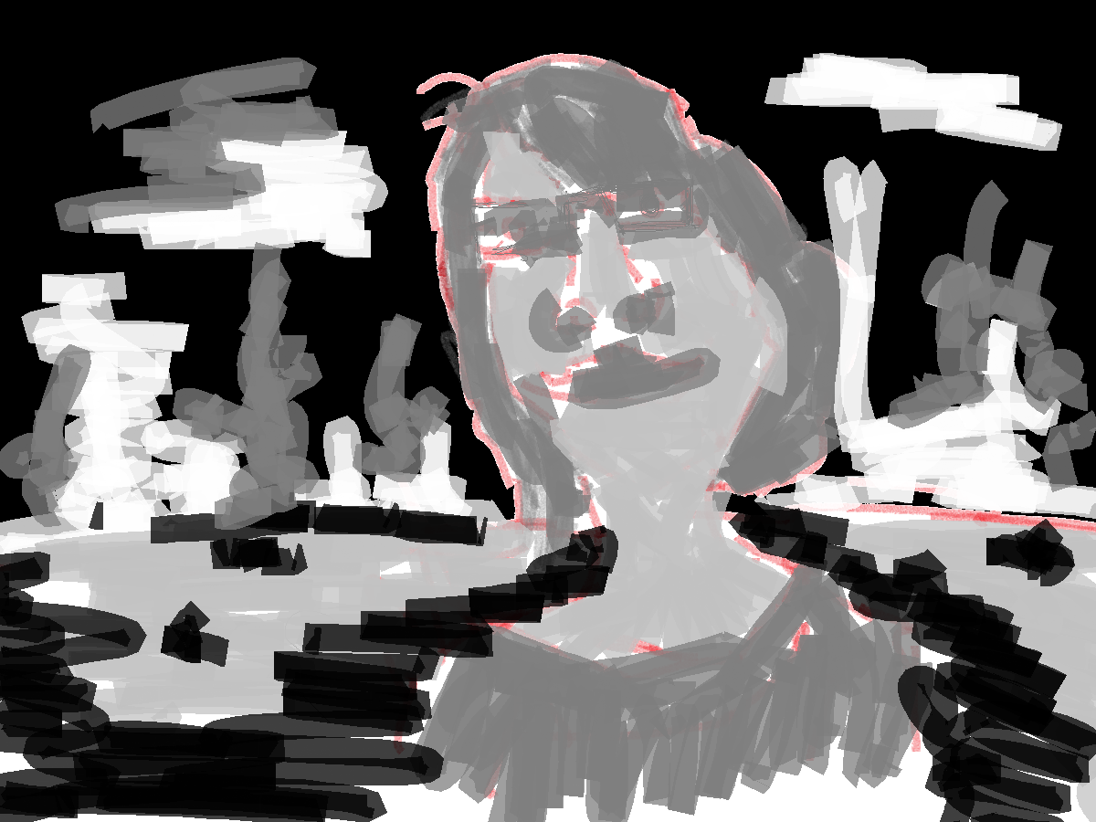
I believe this person is Indian. He requested to get drawn with his son. Both look not very unhappy. Again sorry that I only have the color version of this work - I did have a line and grayscale tone version but sadly my SD card in my camera corrupted and I lost the works
Read more →
Currently in Wellington.I have my tablet with me but likely it won’t get much use - the weather in Wellington is beautiful. I plan on getting out and photographing and maybe drawing. Spent one night in the city and snapped off 100+ photos.
Anyway, here’s a painting before I left to Wellington - 
Photo reference. I choose to paint this photo because of the makeup. She looks like a girl I went to The Learning Connexion with. The photo is OK, if it wasn’t for the makeup I would struggle with the tones in the skin. I like how the top of the hair is cut off - in December 2011 I did a series of drawings of Harry Potter characters with the top of their hair removed. I was working landscape instead of portrait and it can happen.
Anyway, here’s the painting -
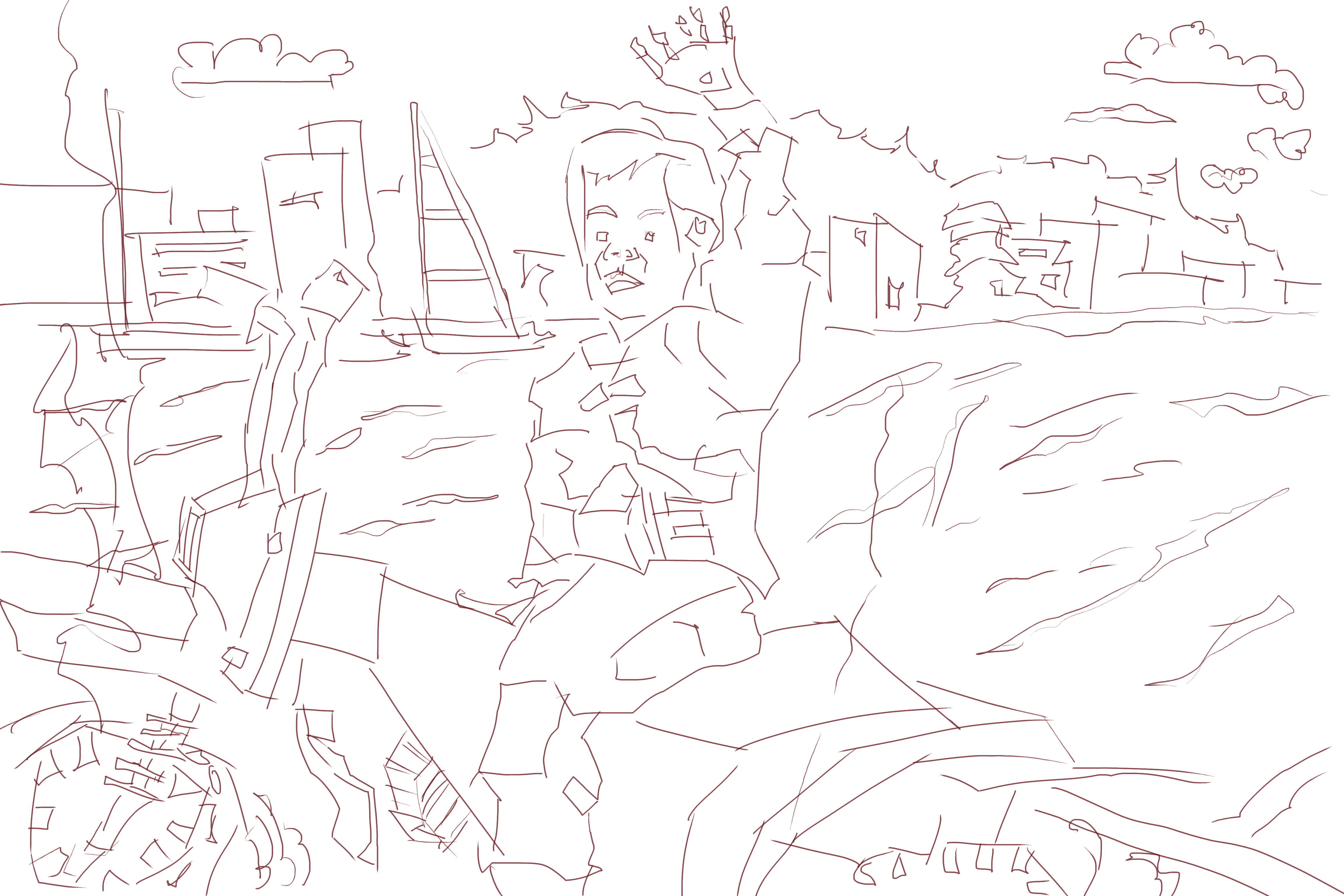
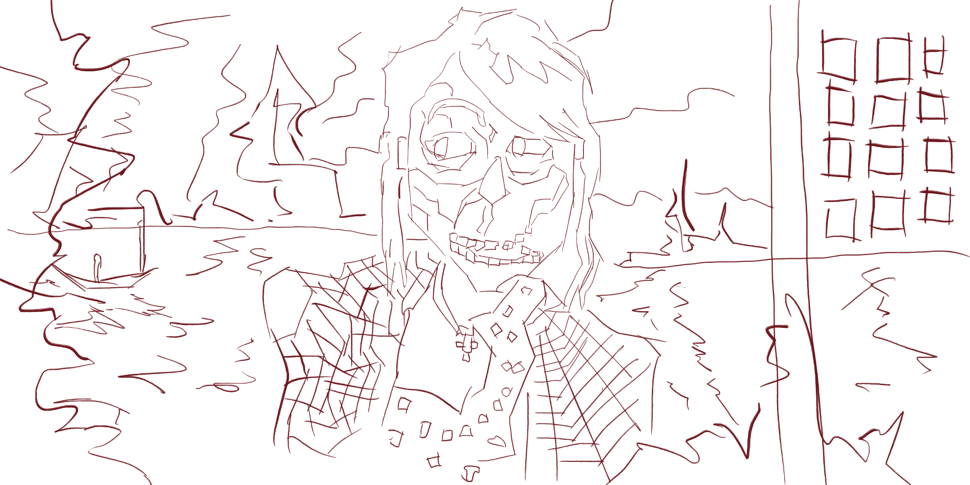 I started with line. Adding line to the face to define the light areas from the dark For the shirt I created long strokes of lines in directions to give an impression of the checked shirt. I created a horizon line on the same level as the mouth and added water movement below this line. In the water I also added a boat shape. Above I created jagged shapes for the hills/land in the distance. I repeated this pattern on the left edge. This creates depth in the painting. On the right side I created a vertical pole and square shapes. I’m thinking this could be a building with the squares being windows.
 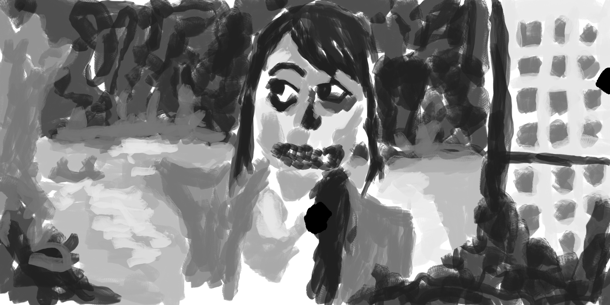 Black and white tone. I used a dark gray for the hair, eyes, nose, and mouth area. Slightly lighter for the sky in the distance, and repeating this in the foreground . Water is created with a light tone. Darker for the boat. I modified the design slightly with the squares on the right - created squares on the bottom half of the screen.
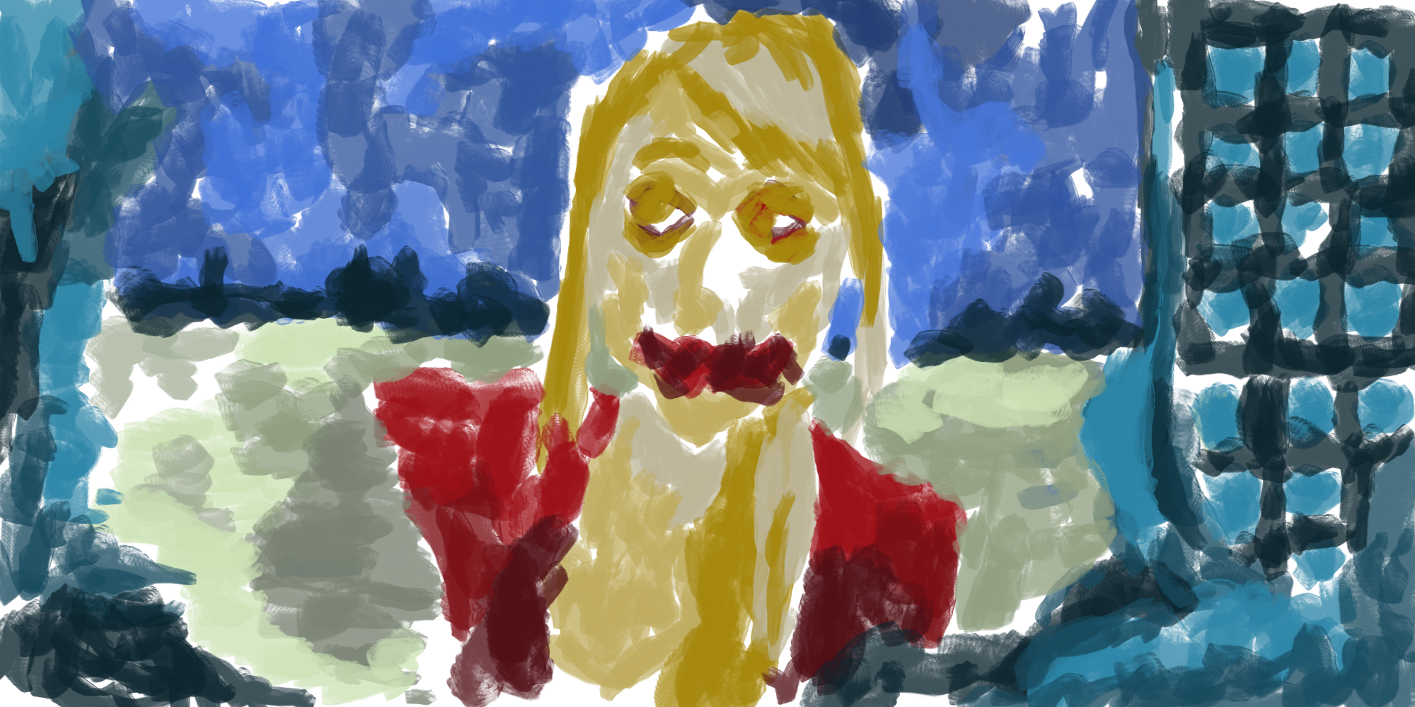
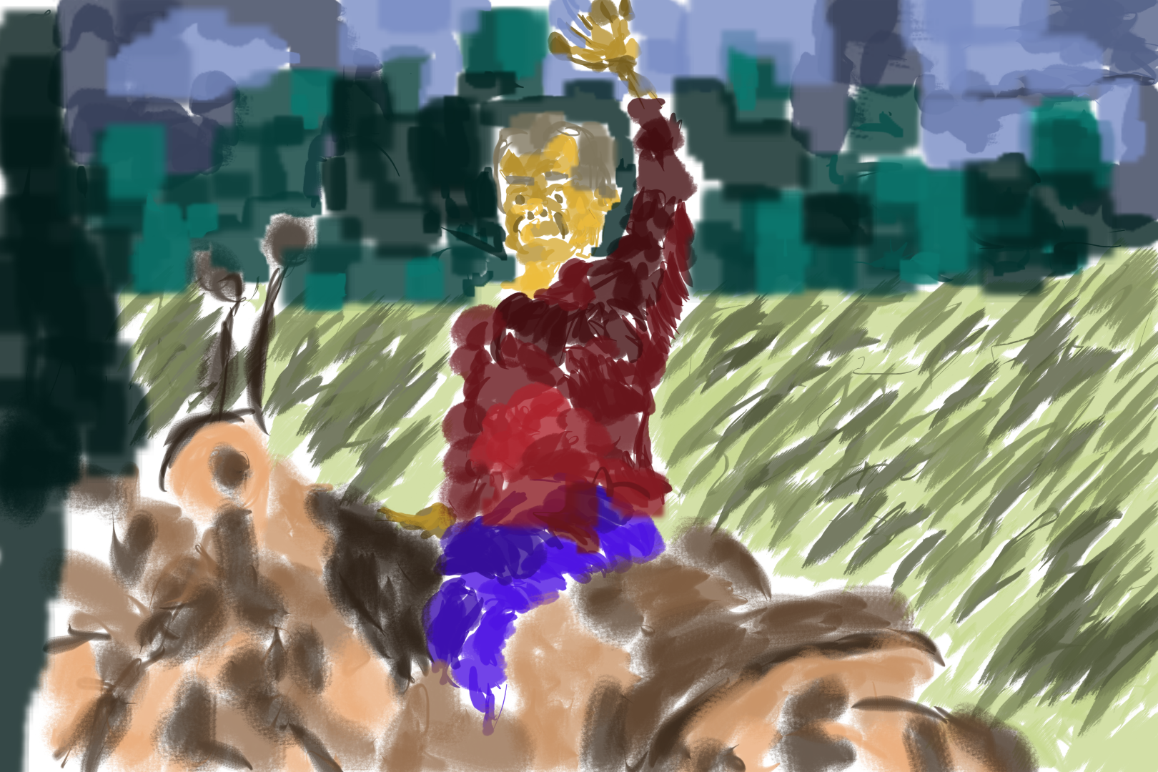
Colors added. Similar to the previous few color paintings - working with 5 different colors and a range of different tones of each color. For the skin this is my usual yellow. The hair is a new yellow/orange. It’s not much different to the skin tone.
For the sky - blue as usual. The land mass in the distance is a dark turquoise with a lighter version in the foreground - tone from the distance is also used to give it the areas common elements. There is a balance of dark and light tones of this blue spread around the painting.
The red is used is the same as the same as the skirt I used in the dress of a girl earlier in the week, It’s different to the red I usually use, very exciting! This same red is used for the mouth - something different. I used a light tone on the top of the clothing and darker at the bottom. 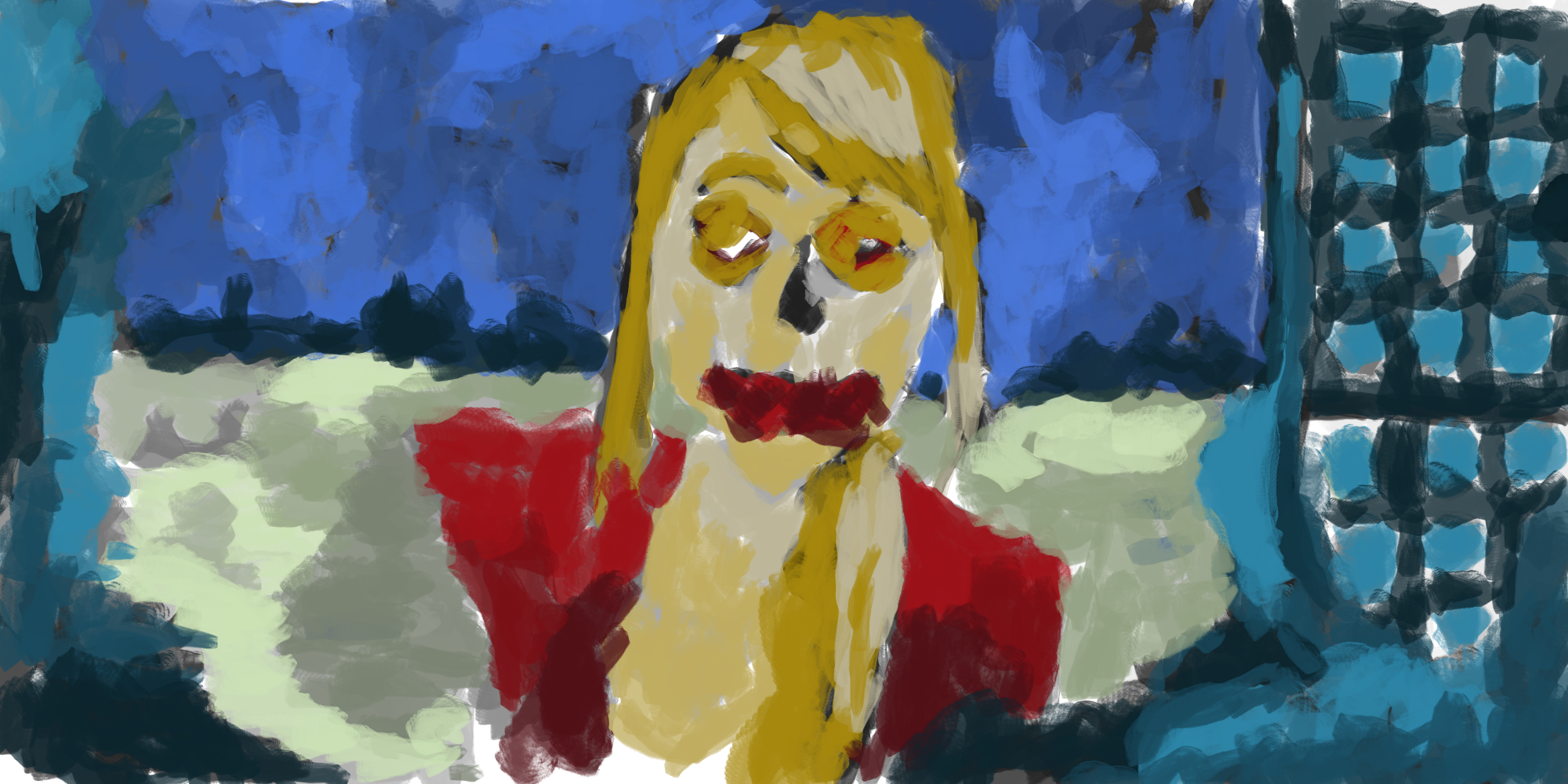
Color/black and white tone layers mixed together. Makes it feel complete.
Here’s an extra painting -
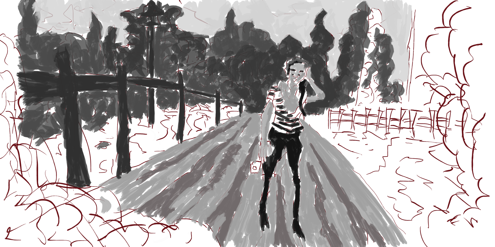
This was another from RedditGetsDrawn. I did the line and forgot to create a new layer for the tone layer, and never ended up finishing the tone layer. I like what I’ve done though. Figure is standing in the middle of the road. On the left side there are power-poles
Read more →
Read more →
This is Wellington Railway Station Digital Painting, I’ve been producing plenty of RedditGetsDrawn works lately, these have been a character focused but have included basic environments I don’t like the idea of just painting a portrait or character, it has to be within an environment I decided to go back to an older pencil drawing that I’ve worked from previously and produce a digital painting of it. 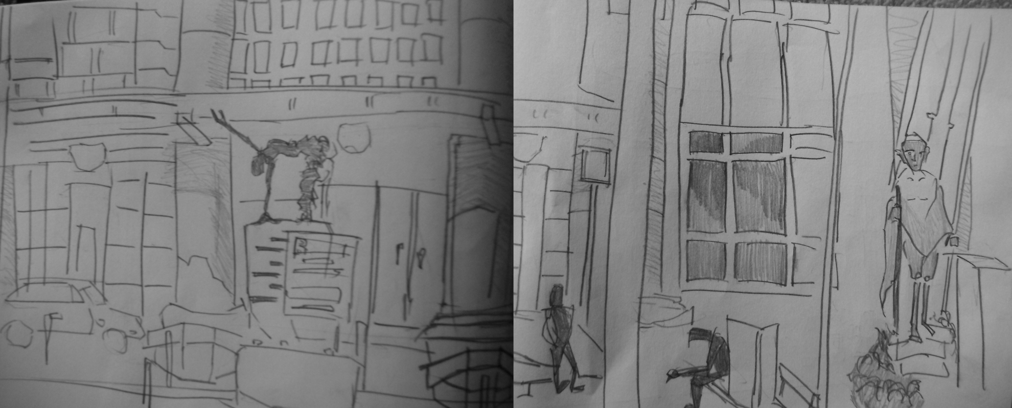 This is the pencil reference I used. This was drawn during a trip to Wellington in 2012, The scene is out front of the railway station in central Wellington. It’s one of my favorite drawings. Like previous works I’ve done like this I opened this up in GIMP and created a new layer for the line
 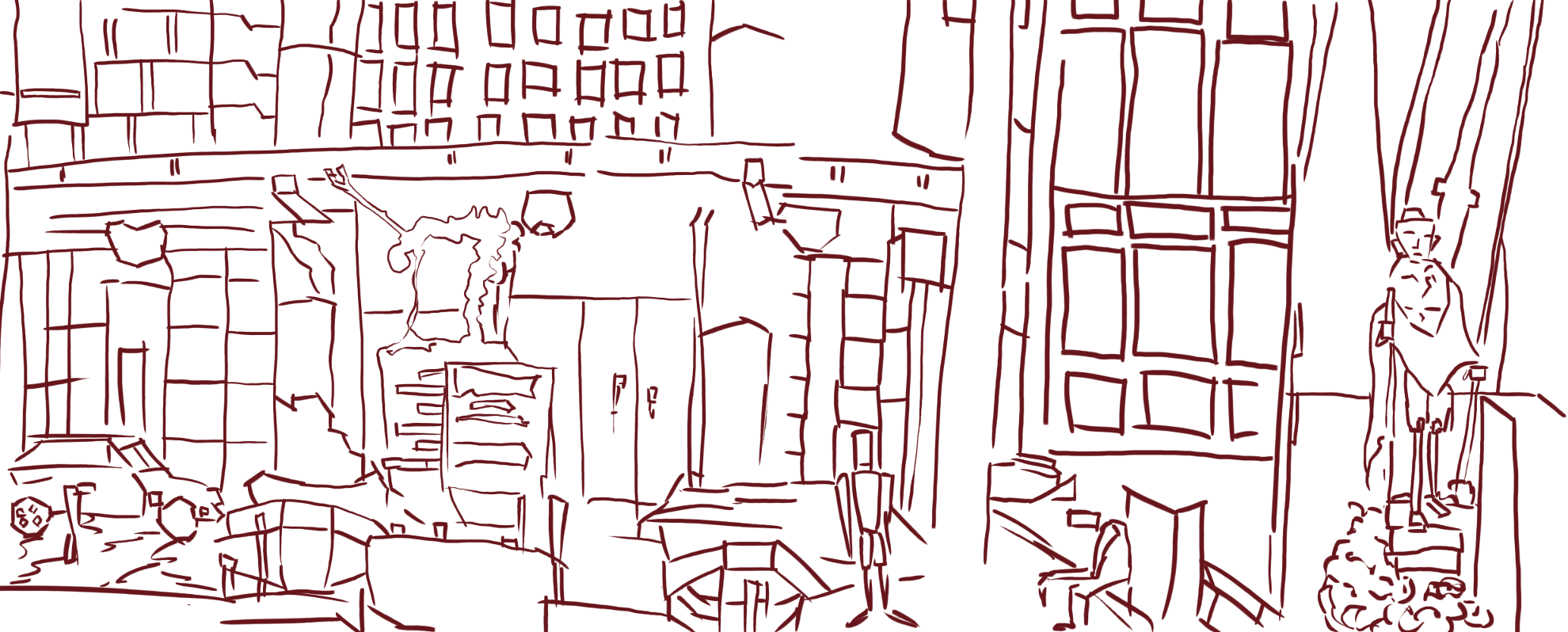 Line. I traced over the reference. Used my laptop computer for this - usually I use my desktop. The settings are a different for the paint dynamics and I’m not getting the best thick to thin. It’s something that I need to fiddle with.
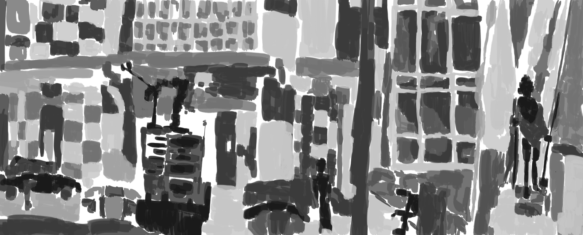
And tone. Harsh dark for the figures in the work, and a mixture of mid to lights for other areas. I just guess the tone and made it up as I went. I started a color layer for this - only did a little before I got distracted with something else. I’ll likely just keep this a black and white tone work. I want to produce more of these environment works - maybe look though more of my older drawings and develop works from them.
Read more →
Today has been a bad day. I have an awful headache and feeling sick. I’ve managed to half finish a painting (just have the color to do). I am broke if anyone would care to donate. Web-hosting renew is happening at the start of March so somewhat worried. The ads on the sites aren’t making me anything, sites barely get any traffic, but I stopped worrying about low traffic years ago, I make the site, art, and write for myself.
If anyone wants art let me know, I’ll do it for cheap. I like working from photographs.
Another color painting from Tuesday. This one was for RedditGetsDrawn:
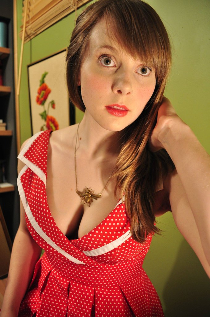 Lovely photo, clear, and crisp. I would of preferred a full figure (don’t get to practice legs often). At least I get the waist and part of the arms. I took notice of the flower painting in the background. Bookshelf was ignored.
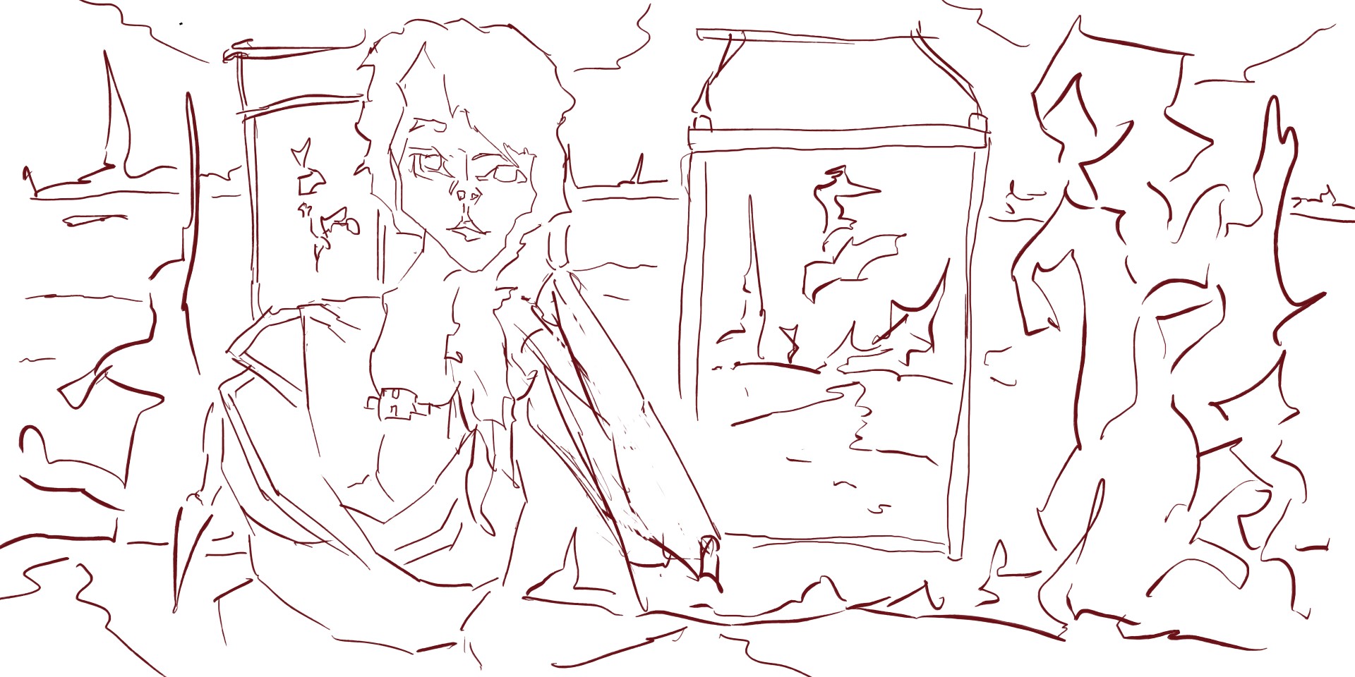
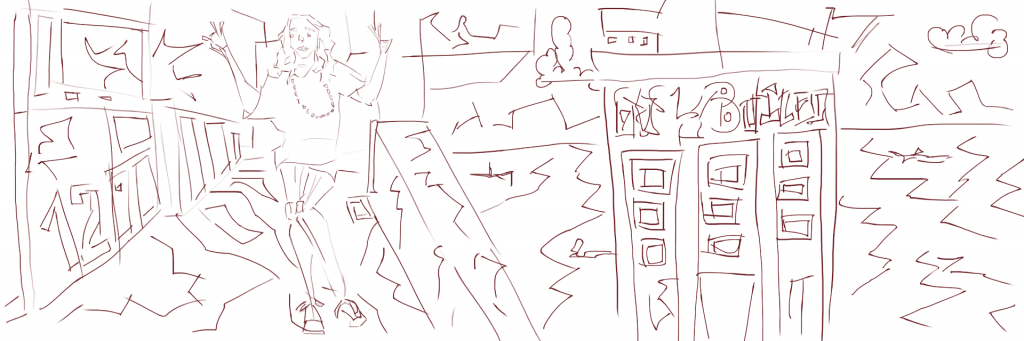
Line. I developed the flower painting multiply times and spread it around the work - in the background I also made the usual spiky pillars of land. For the figure I worked off the reference mostly but had to make up the elbow, It took several lines to make it right. 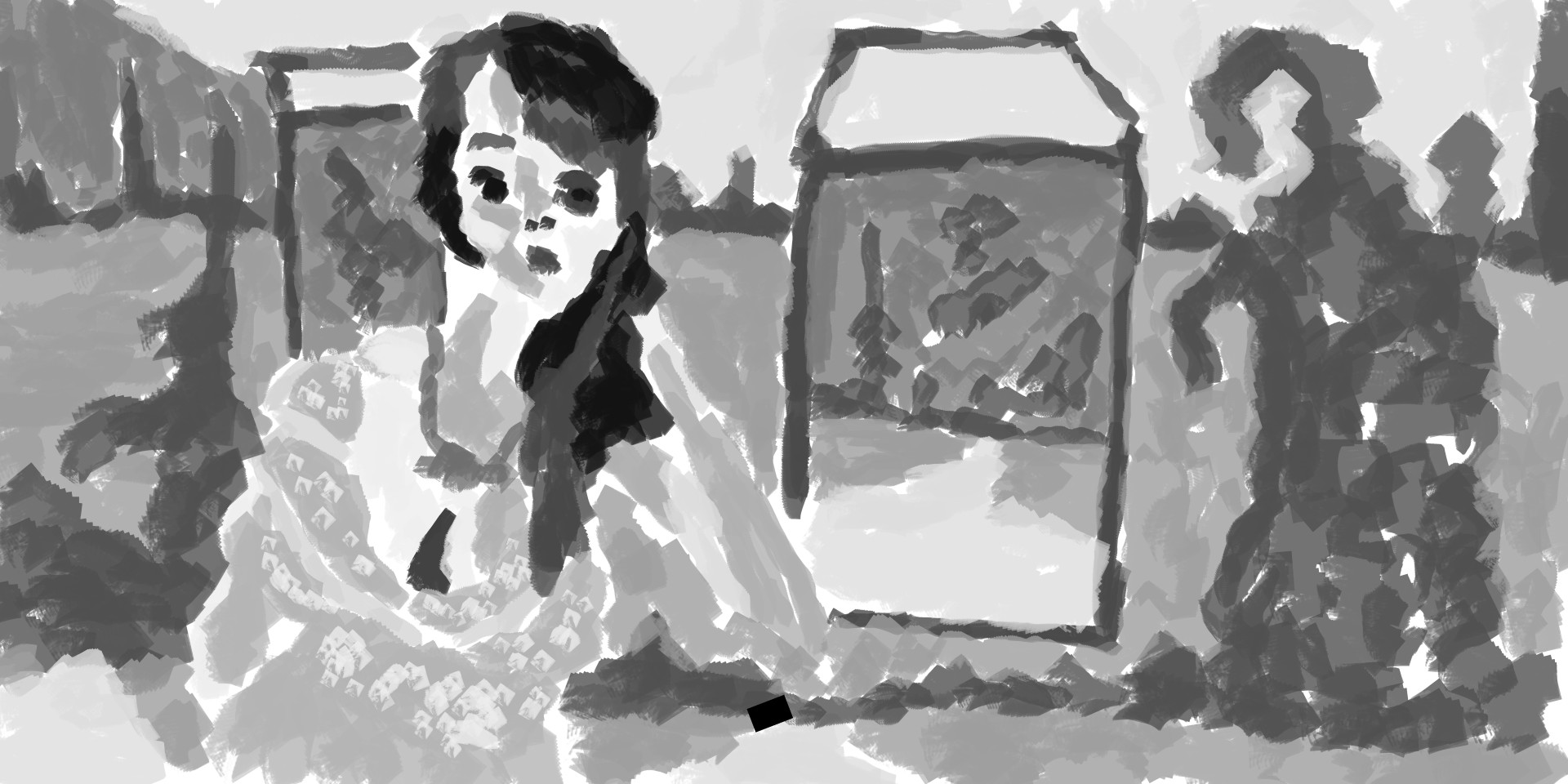 Tone. For her dress I used a dot effect for the white highlights.Painting the figure is alright, but the area I enjoyed the most is the environment. It’s all imagination I really should be using reference photos for it. I used a reference photo for another work I did yesterday - a cityscape. I’ll upload this work later.
Alright, onto the color layer now -
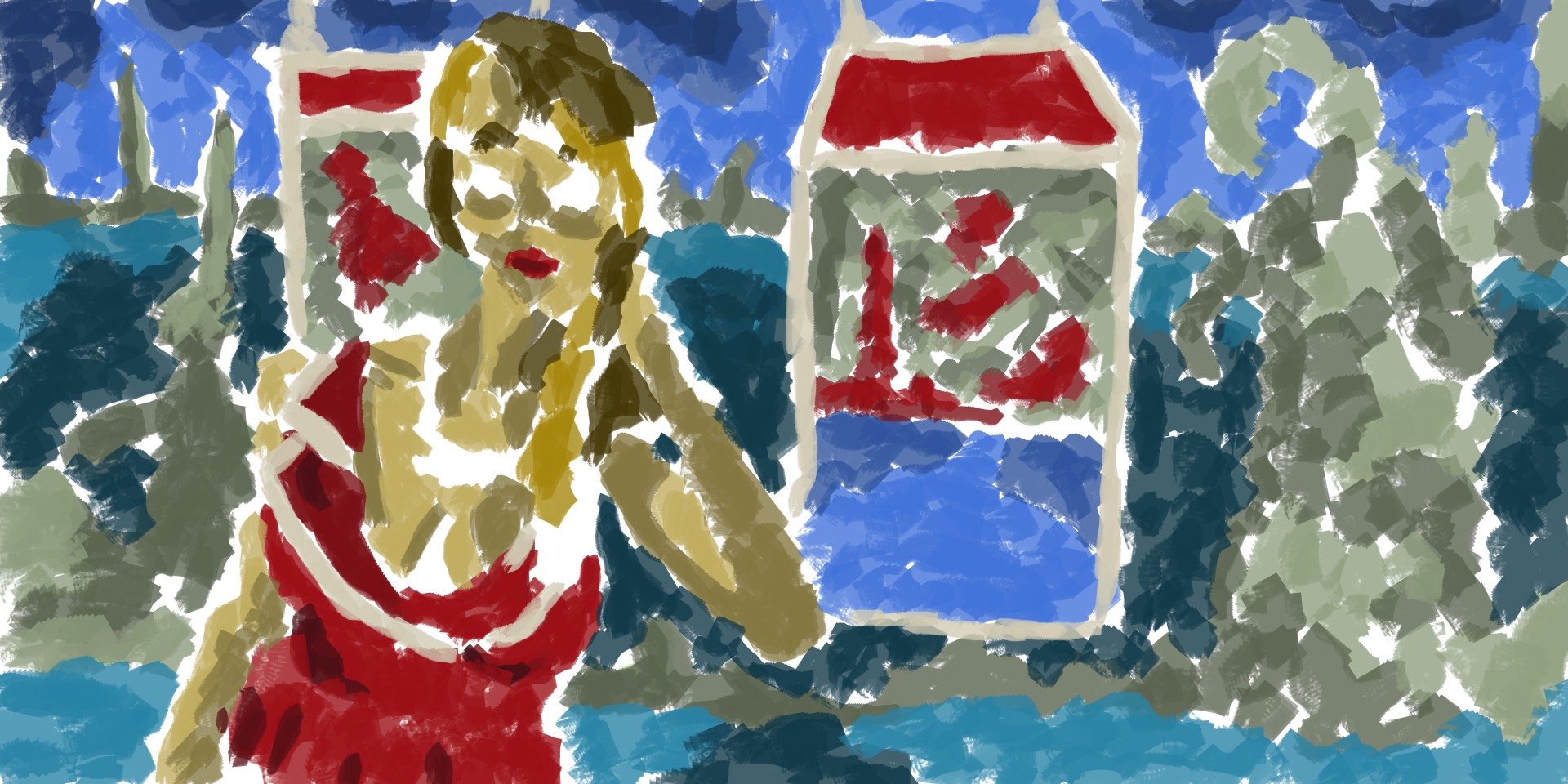 Color. I used a new red for her dress and the land in the paintings on the wall. It is similar to the red in the reference photo dress. For the sky and water (in the painting on the wall) I used the blue I often use. The floor has a new blue - turquoise even. Something different to work with. Often when I start using new colors they develop into my other paintings. I need more color though, and to not fear introducing new ones into the paintings. I’ve done it here though! New color! For the land in the distance I used the usual green that I use in the paintings - this is usually used for the floor - I use it to create a water.
 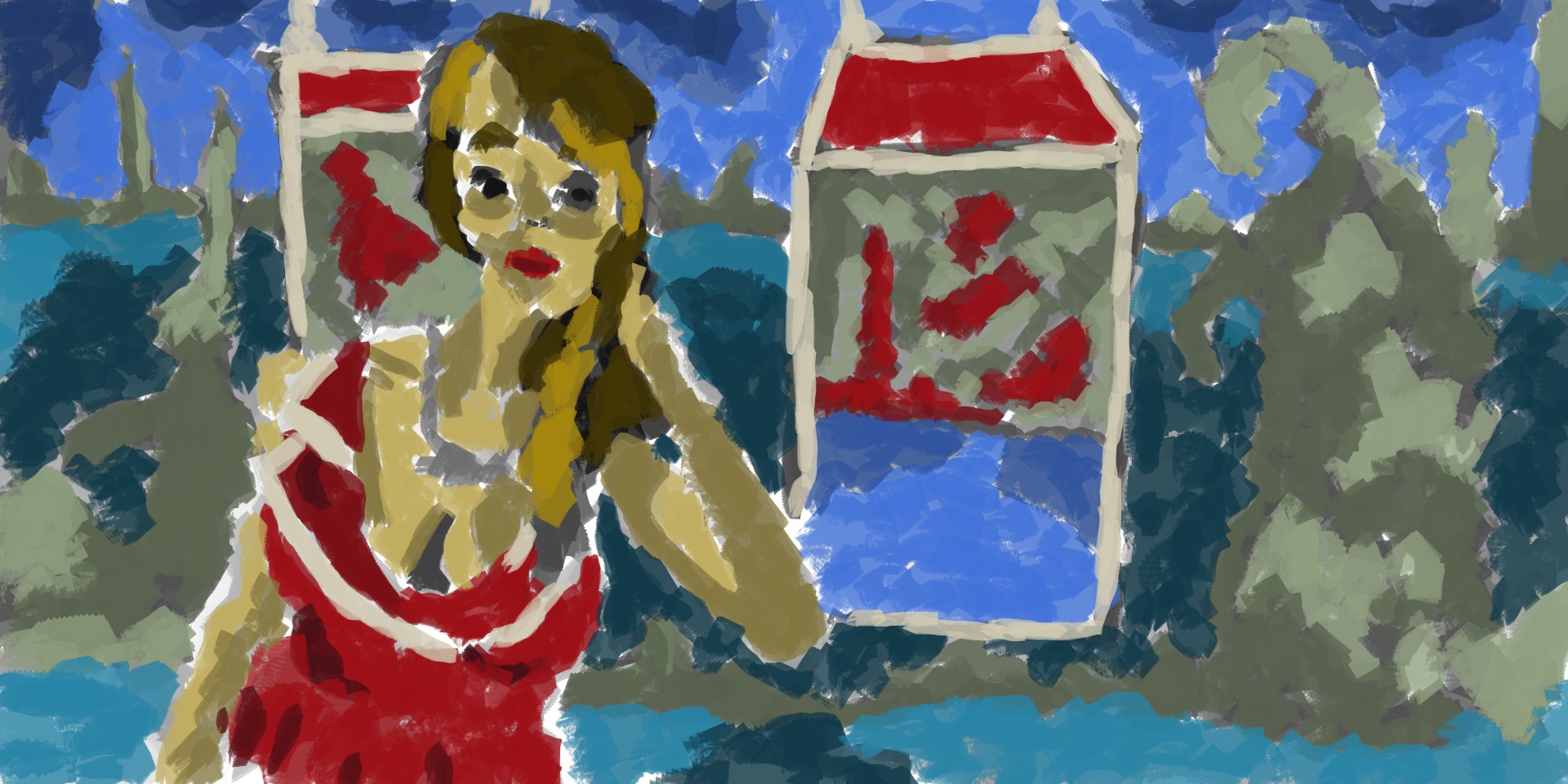 Mix of the tone and color layer. As I said in the previous post - It feels finished.
I hope you have enjoyed this post. I aim to keep bringing you regular artwork.
Read more →