Back from Napier. Visited my Granddad. I had my laptop with me but no internet - I noticed several shops in the CBD that offered free WIFI. I didn’t worry - instead spending the time offline on my laptop and watching CI, Sky Sports (cricket),One News and the horse racing with Granddad.
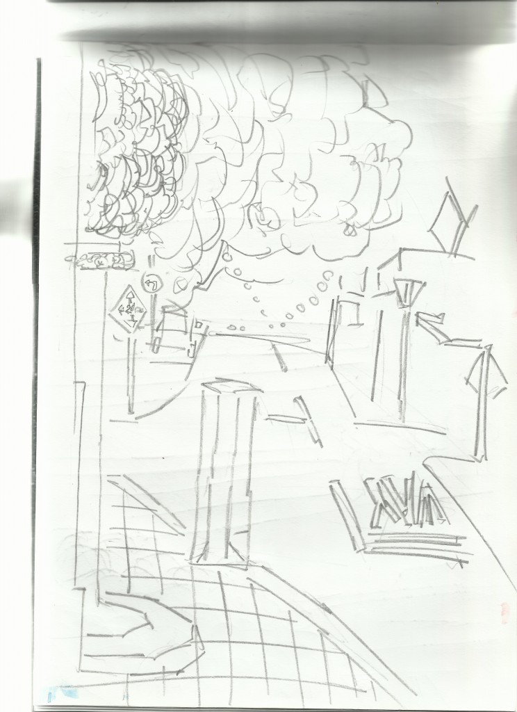
I got out each day and drew. Here are the street works from around Napier:

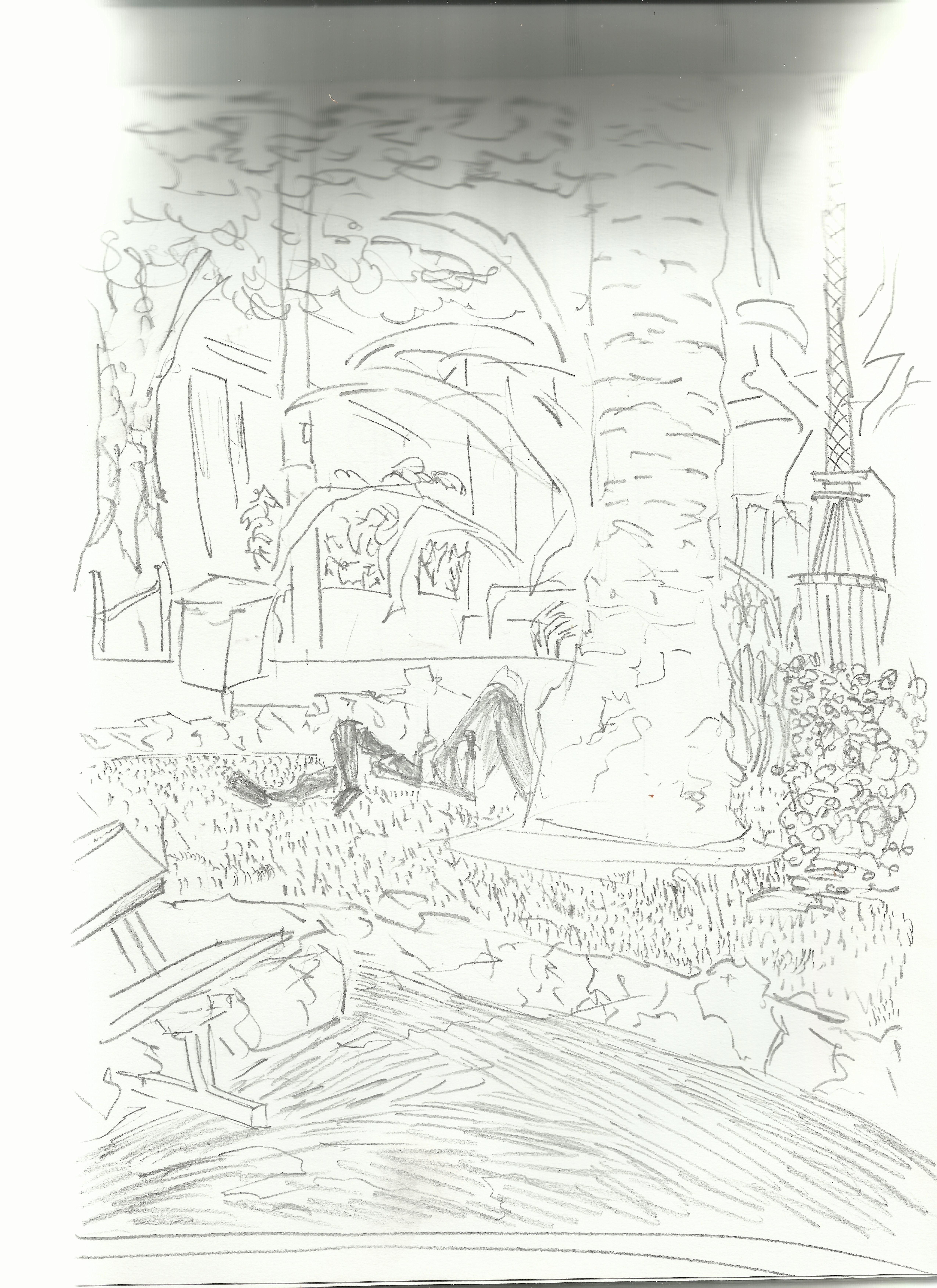
Square. I sat here several times and drew. This was a favorite piece of mine. I’m looking forward to taking it into GIMP and painting over it. With the line I attempted to create a range of marks in order to show the texture.
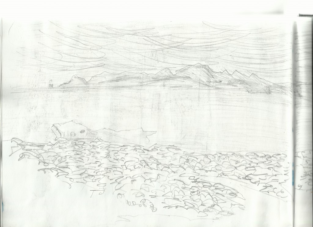
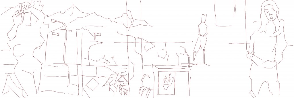
Waterfront. Sitting on a bench and looking South. It was beautiful weather - especially in the evening. This is the left side of the page… I continued it onto the second. 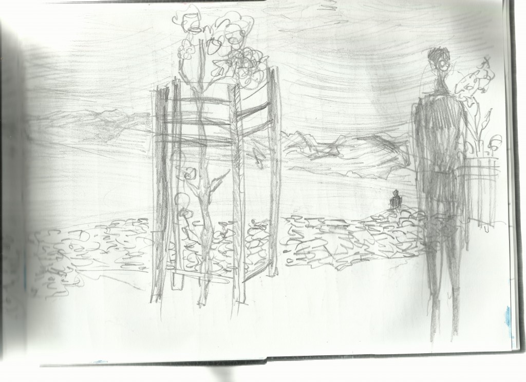
Plant in the foreground. I captured someone walking but - mostly to give proportion to the image. Thinking about it now - I really should of checked on life drawing classes. Oh well, I enjoyed the drawing on the streets. Plenty of people on the street that I was able to capture.
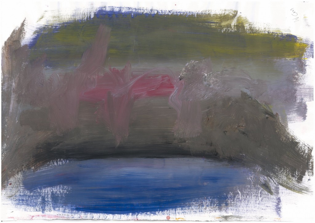
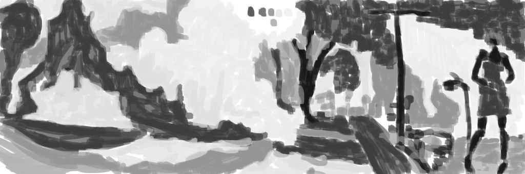
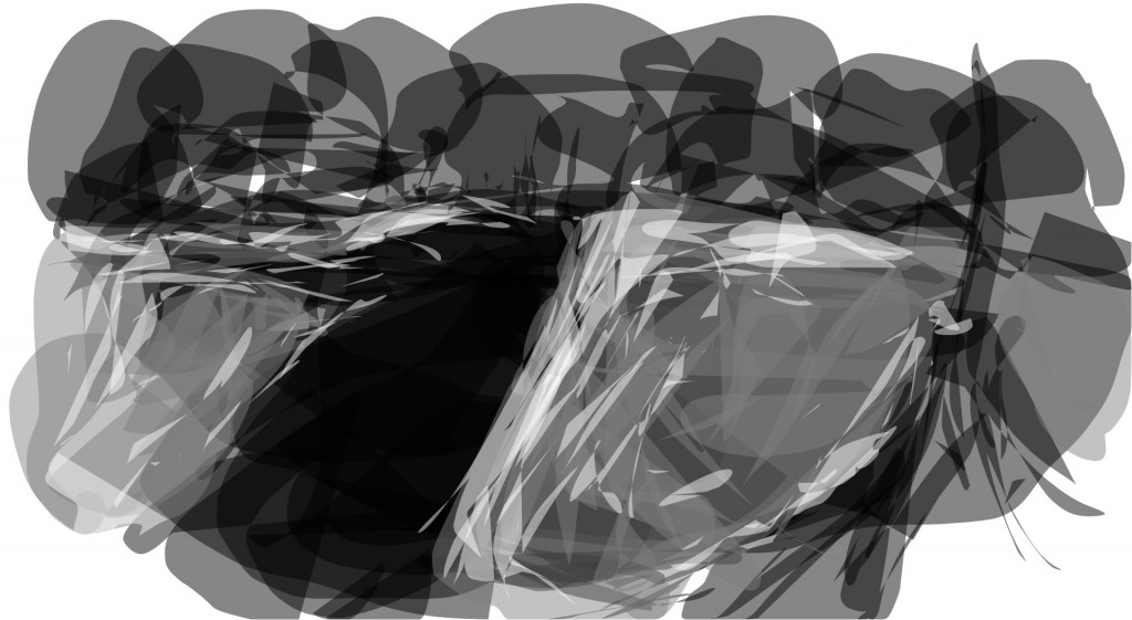
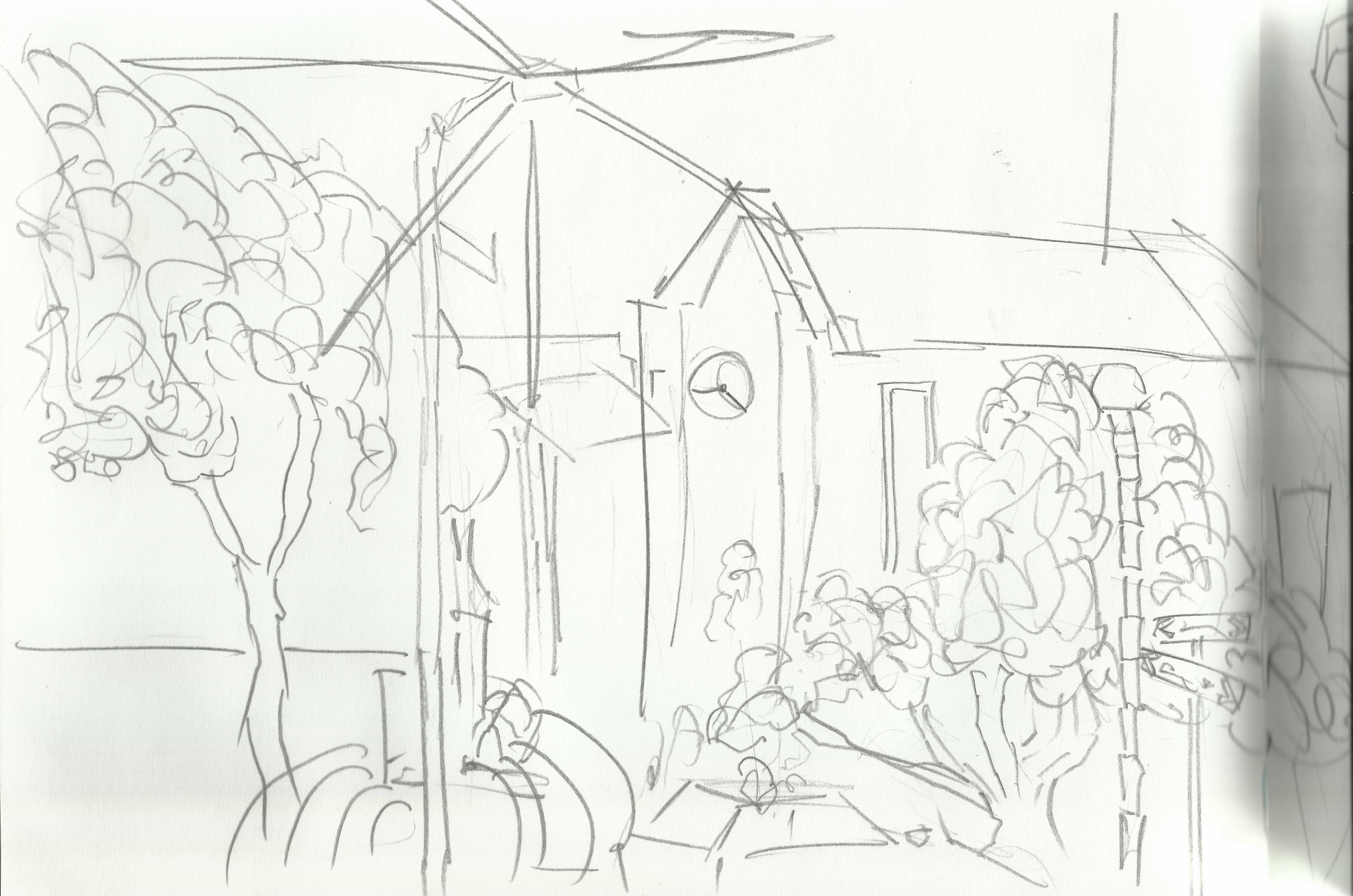
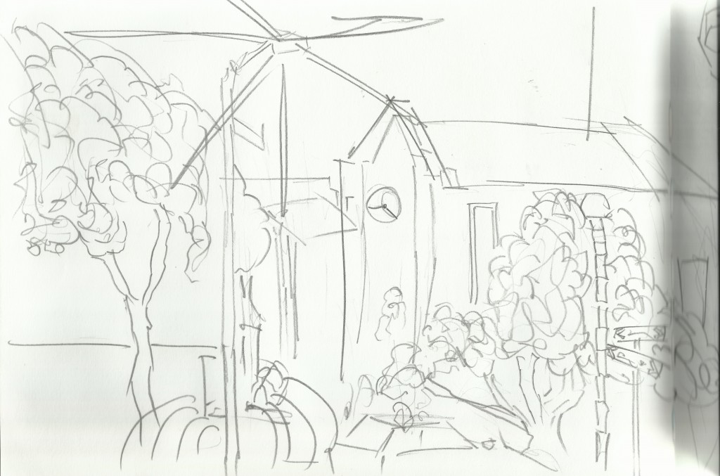 This was on Friday night. I sat near a car park and drew the church and plants across the road. They had a water fountain that I especially enjoyed drawing.
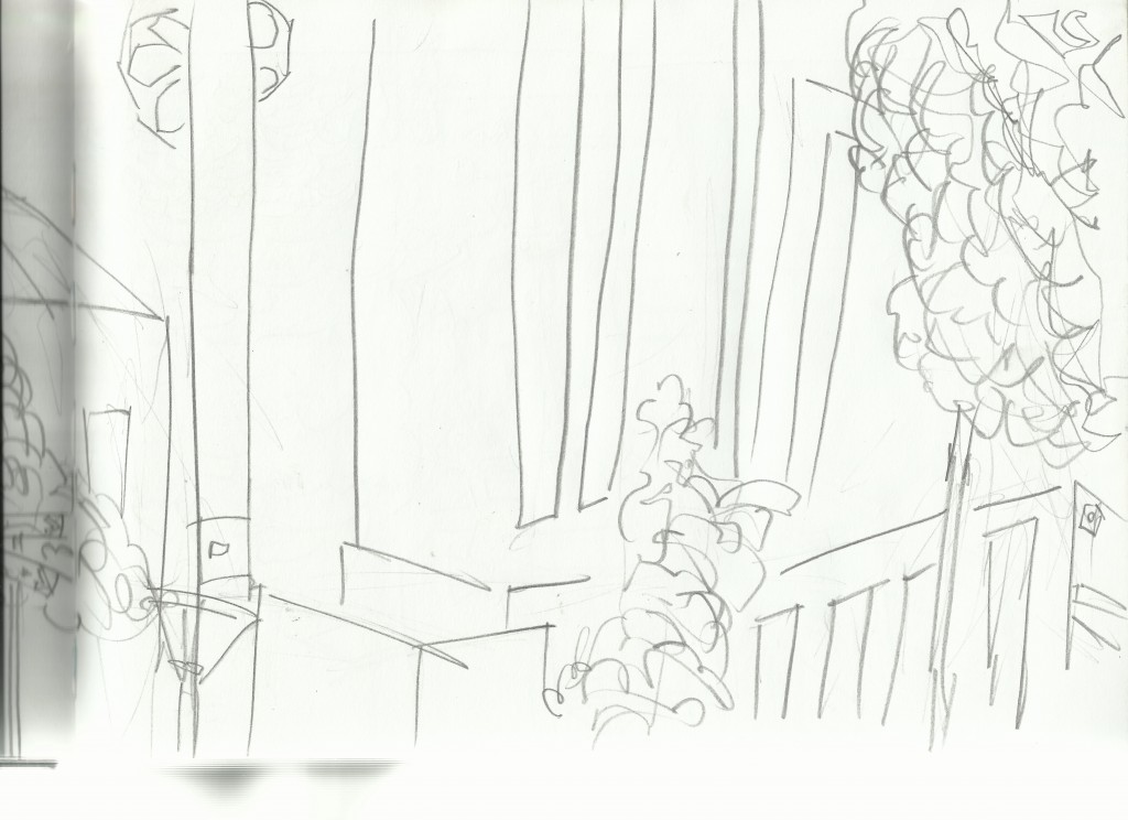 Second page of the church drawing. Less detail in this one - just quick
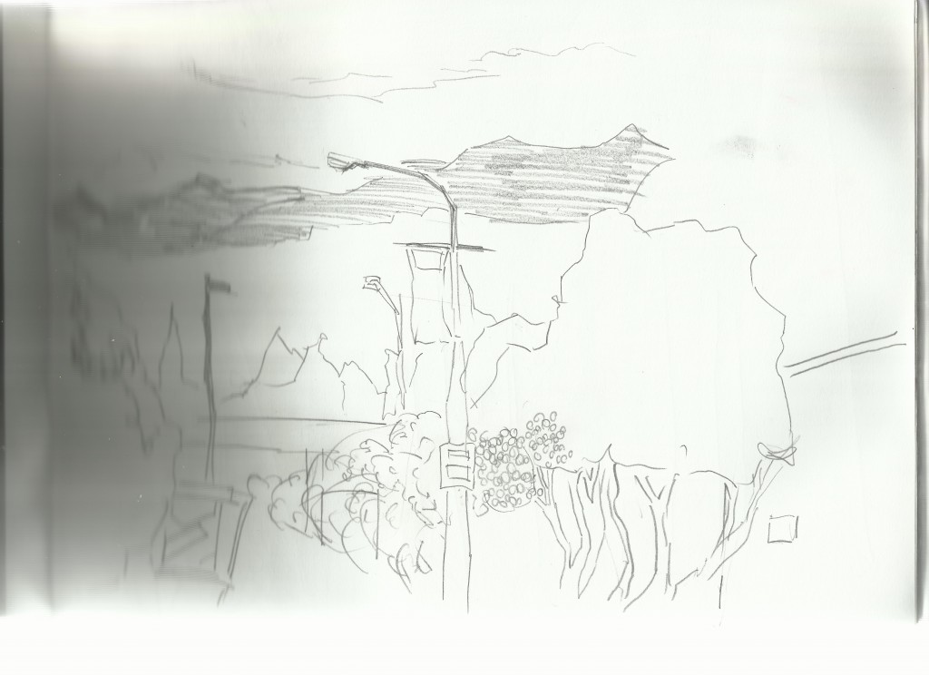
Before the trip. This was drawn in Levin.
This was a night drawing. I sat on a street that reminded me greatly of Cuba Street. Looking out towards where I walk to my Grandfathers home. It’s quite the wak, but I got out at least once a day.
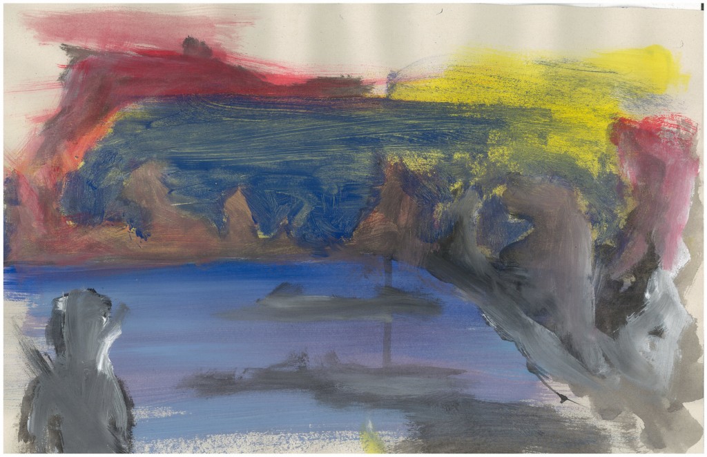
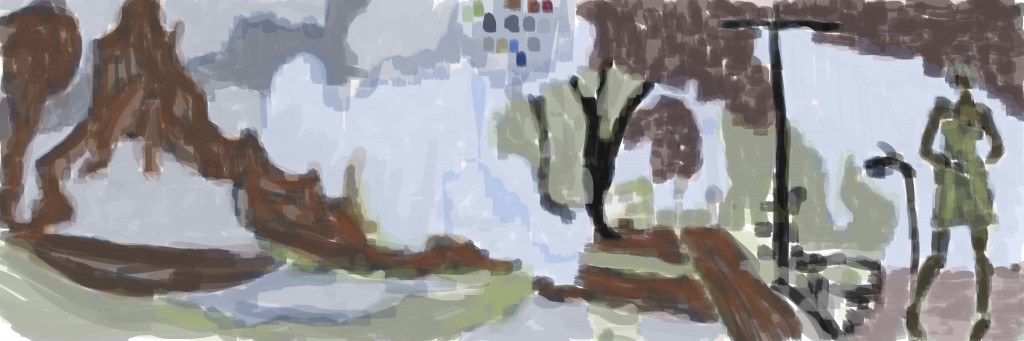
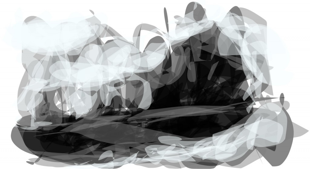
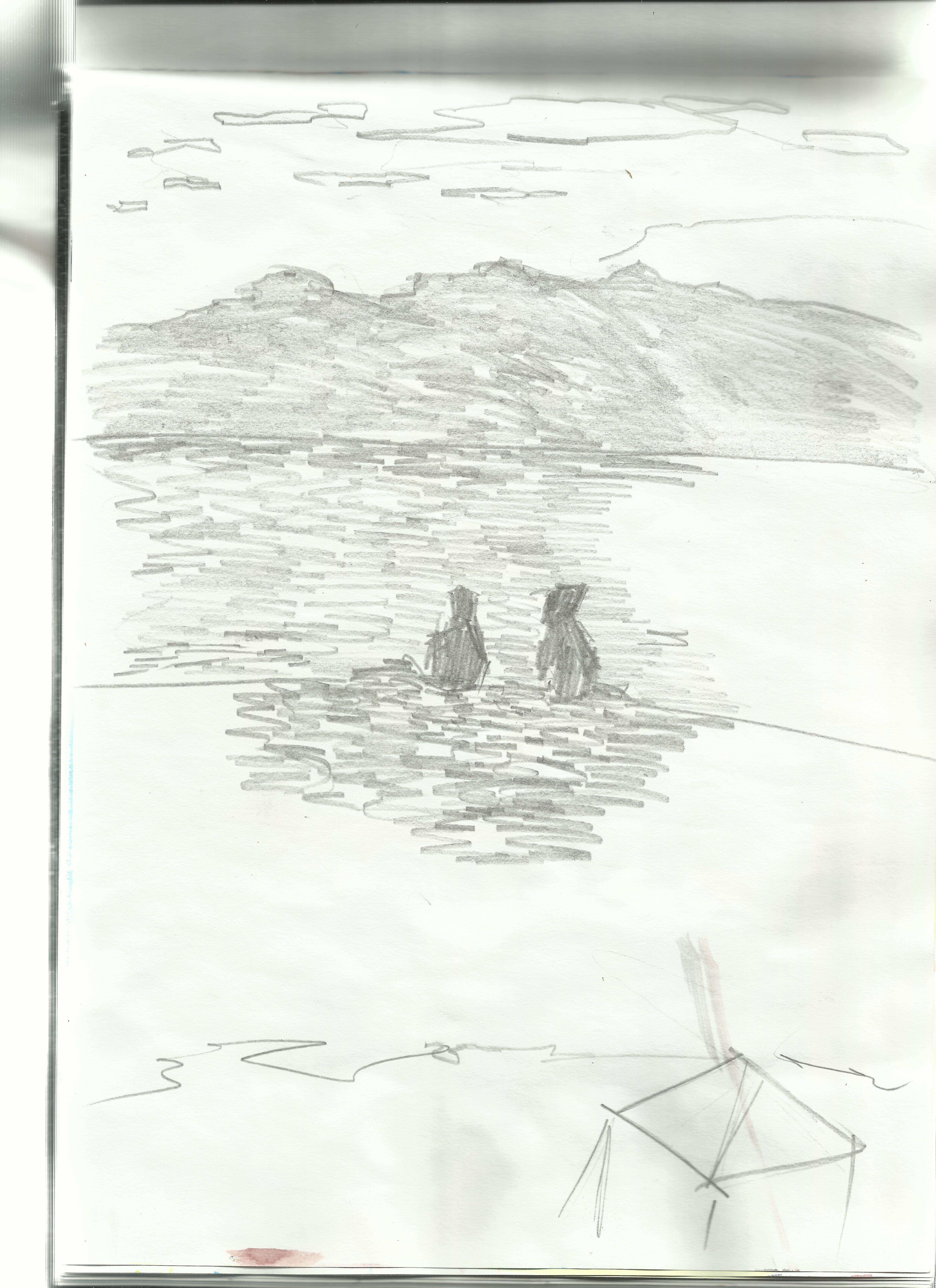
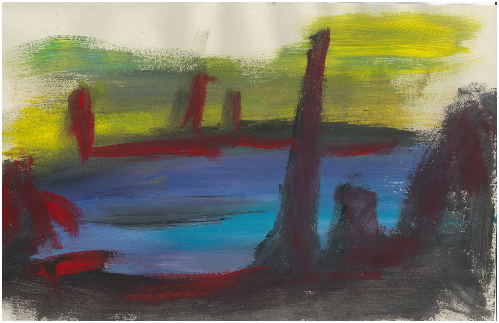
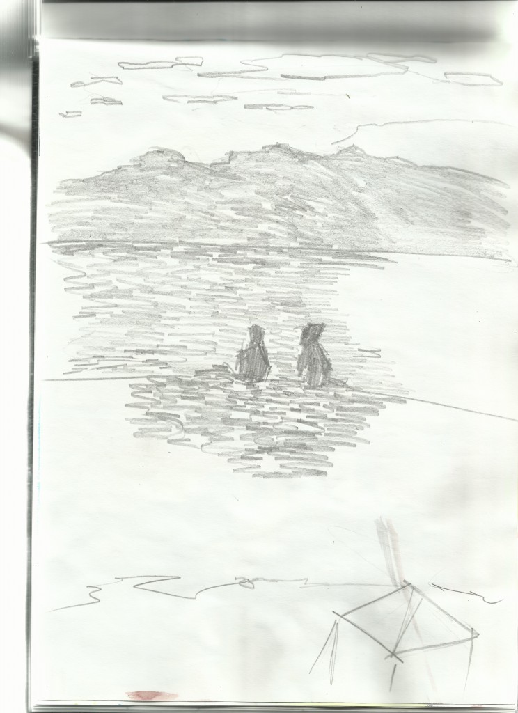 W ater front drawing. I started with Gouache (work I’ll post in a future post). People liked to come to the waterfront, many sitting and eating fish and chips. In this piece two figures sit and watch the hills
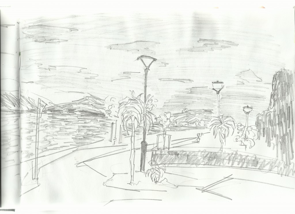
Yet another waterfront drawing. One major difference I noticed with painting was the problem with catching small details - rather impressions of the area. I’ll try to work with goauche more but /i do enjoy the life drawing to digital painting process.
I look forward taking these works into GIIMP.
More drawings and start posting paintings later.
Read more →
This is the paintings I did with children on Thursday. The paint I was using was cheap poster paint - it was cheap but did the job. It’s the surface that totally makes a difference - I used thin white card for these works - certainly better than the brown paper but it doesn’t take the layer of say - wooden board.
Most of these works are painted by me but a couple were collaboration efforts between me and children. We can both learn from one another.
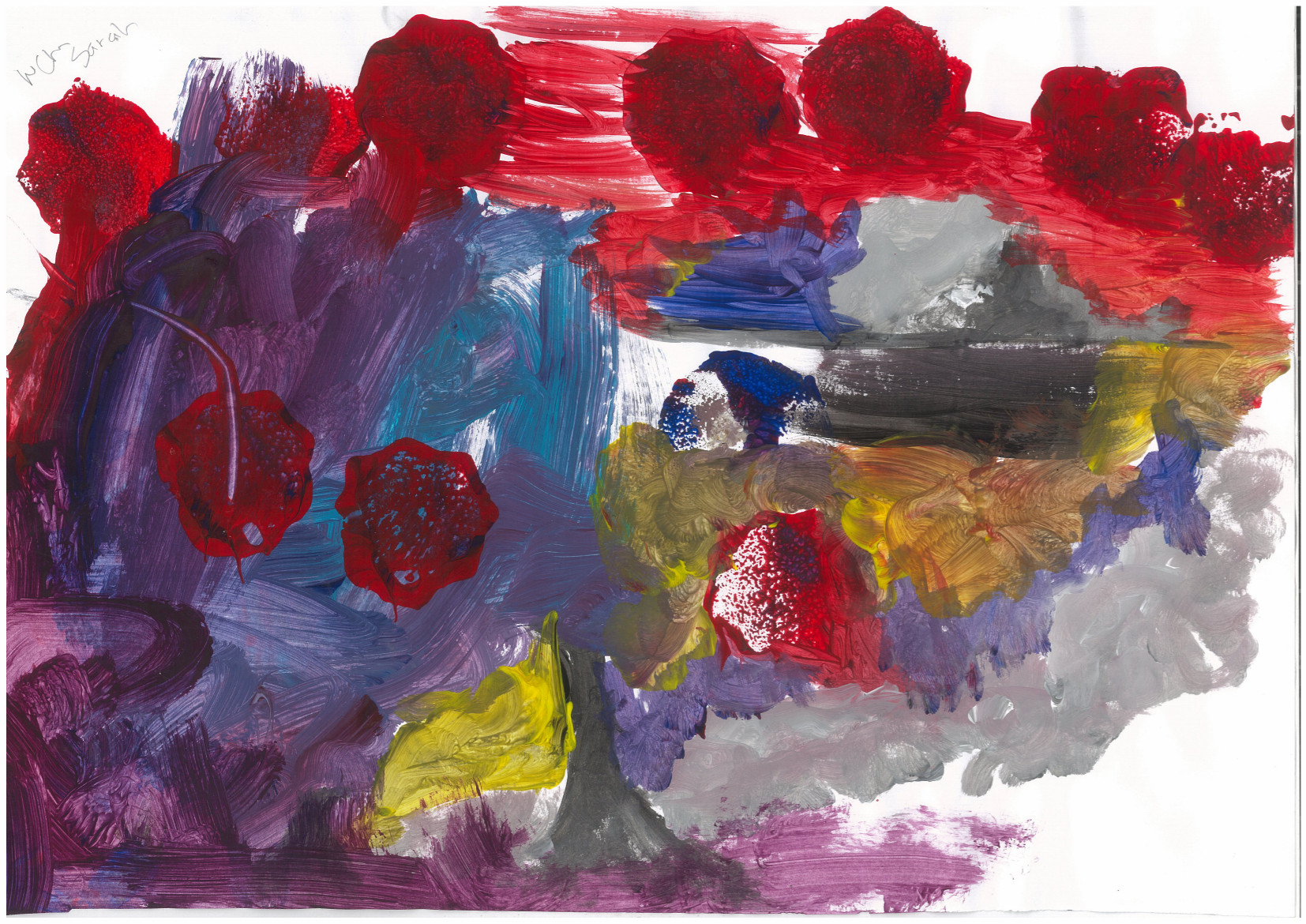
Gross. Not only do I find the composition boring - square ocean surrounding land that scales up to the bottom right. I created landmass in the center and bottom right of the ocean in order to help the composition - it’s still not enough. To help with the scale I painted a figure into the bottom left. Originally this was pure black - I added light highlights in order to help with scale and give more information to the left side of the piece. What could of I done better. More dark (especially on the left)  I like the blue ocean in this work.
  I focused on the right side of the page, and Sarah painted the left. I focused more so on grayscale well she went with more vibrant colors - purples and blues. There is some yellow which was my doing! I like the circular marks being made - they give layers to the work.
 This is an example of a painting gone bad. It’s gray, muddy, and generally disgusting. It lacks substance.
 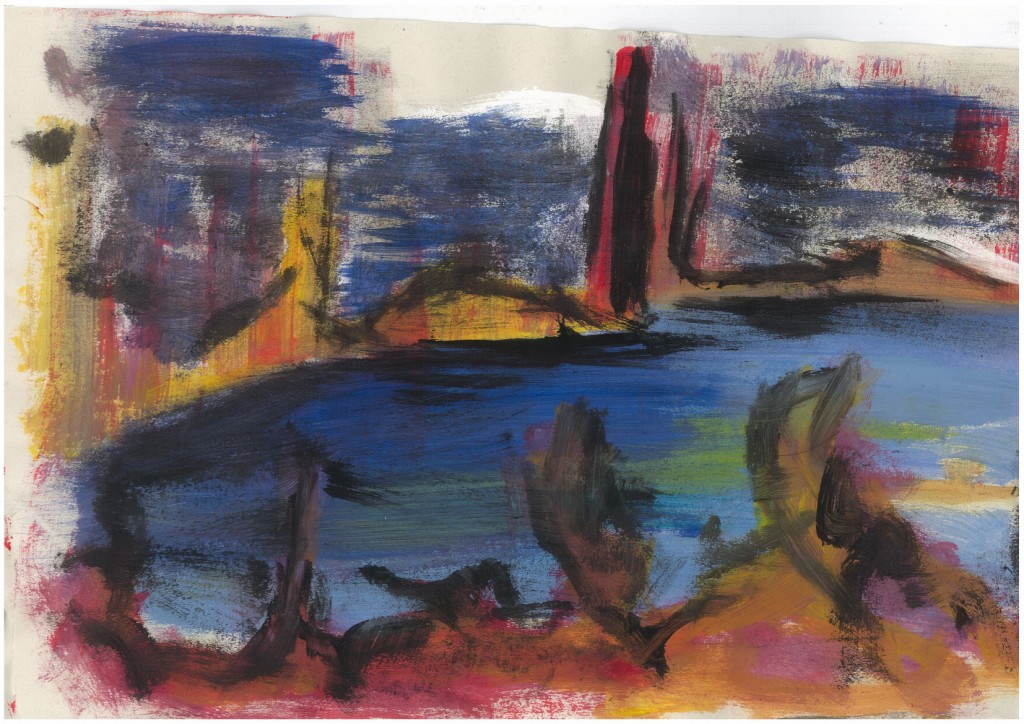 This was a favorite I did - so much so that the kindy ended up keeping it for their wall.
There are more paintings - need to get photos from my Mum.
I’m going away tomorrow so not sure about updates to the site - I will take my laptop with me so may just write up blog posts about older works.
Check out my code blog here.
Read more →
Good morning. The art creation has been slow as of recently. I even tried to draw last night. I sat on a table and had my sketchbook and clutch pencil. I just couldn’t do it. I was unable to draw. It frustrates me.
So I have very little new art to upload, so here are some works from GIMP that I did several weeks ago - they have just been sitting in my drafts - may as well get them posted.
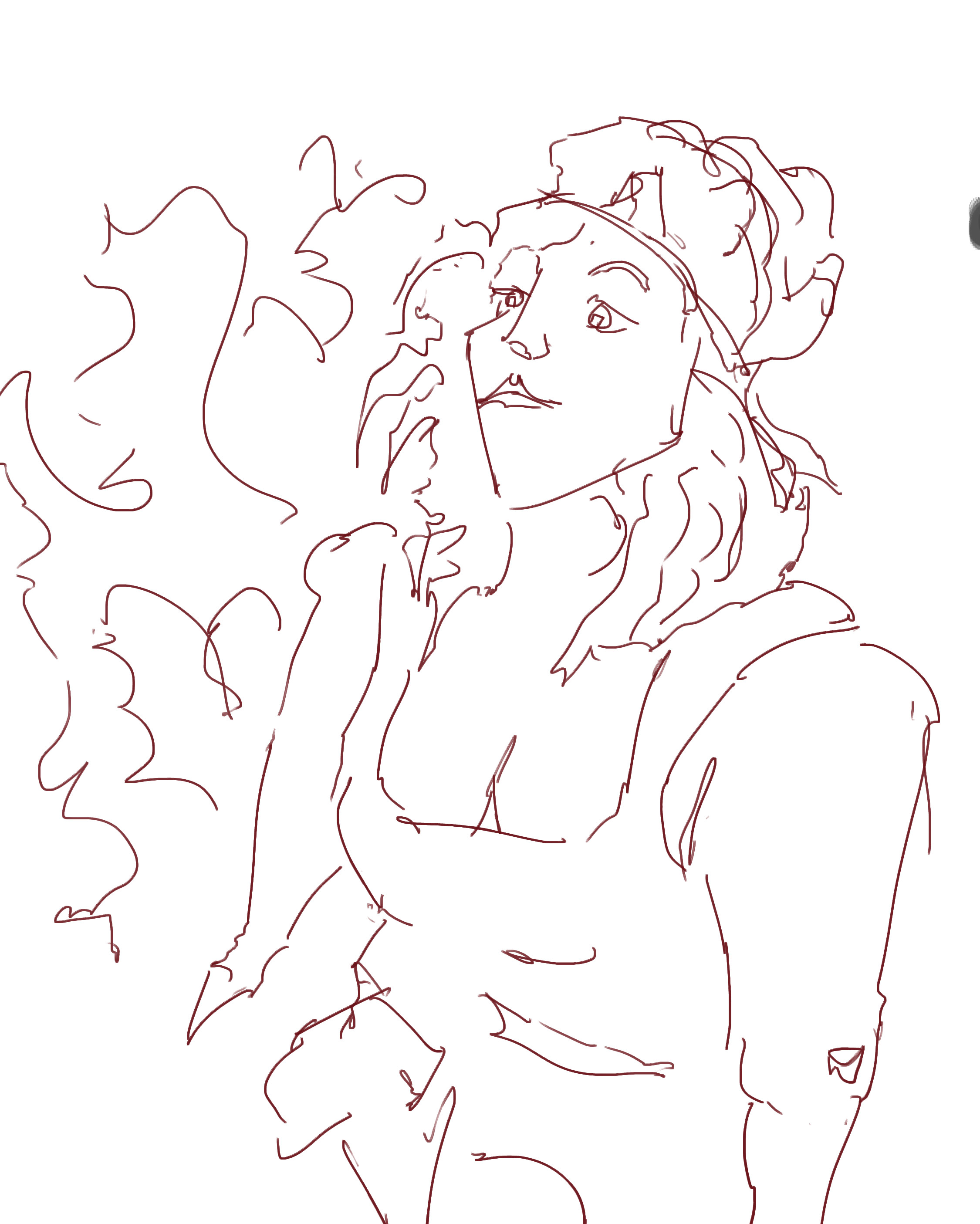
Focus on scale with the shoulder - the perspective seems to be working - large arm (almost too large!). I like this piece, something about it - that cartoonist feeling happening.
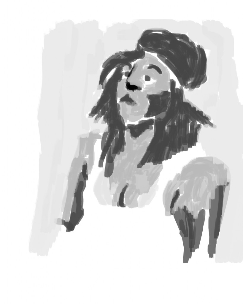 Grayscale added. I used a dark gray for the darks and a mid gray for lights, didn’t bother with tone on the shirt (just left it white) - negative space creates the shirt. In the background I went with a very light gray. One area that is frustrating is the nose - I’ve gone in with a black and it stands out like a sore thumb. This should be dark gray.
 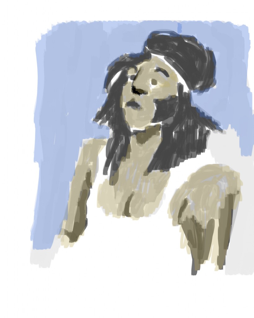 Color added. I kept with color I was use to - dropping their opacity to 20% and using them as a wash over the gray. Yellow for the skin and blue for the background. Maybe I should of gone in with a red in areas?
And the video. Enjoy. 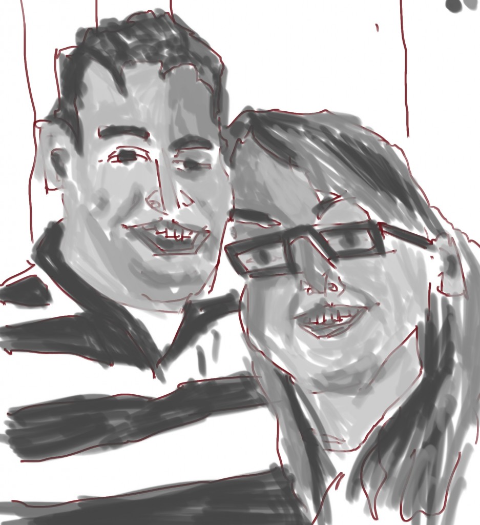
Another portrait. This time was a double. I like drawing multi figures in a piece - makes it easier for measuring! Sorry there is no line for this. Make a mistake and painted the gray over the line - losing the line. There is evidence of the line in there! It must have been a bad day when I did this as I have no color version of the work. Oh well, here’s the video:
Video. Have a great day.
Read more →
Currently sitting in Levin library. Thought I’d better make a post since it’s been a few days. I’ve been more focused on Python code recently than painting. I feel I’m making some large strides forward with Python.
Anyway here’s a landscape painting I did from imagination. 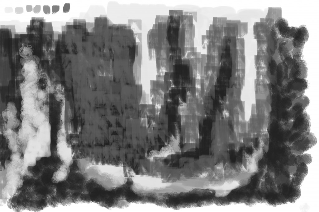
I sniped the line and when straight to tone.. This is quite different to how I usually work - focusing on similar techniques as Feng Zhu - creating chaos and attempting to create a scene out of it. This is something I need to practice, maybe using some of my sketchbook works as inspiration but not painting over them.
I used a range of crushes - a custom flat brush that I often use in my works and also chalk - another brush I commonly use. 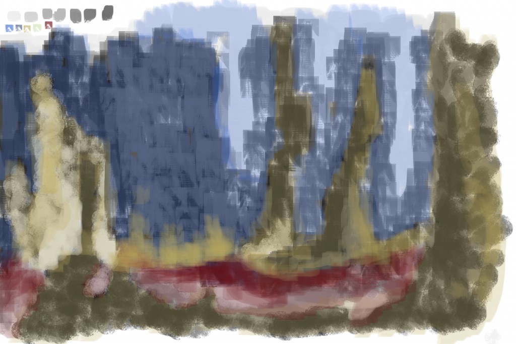
Color. The colors used - blue for the sky, yellow for the pillars and ground. I’ve also go a red along the bottom - this could be some sort of river or lake.
That will do, back to python code. Before I go here’s the video:
Read more →
Several days since my last update. Had a birthday… though I never enjoy birthdays. For the painting today I took a older line work I had done in GIMP and added tone and color. Compard to the origi 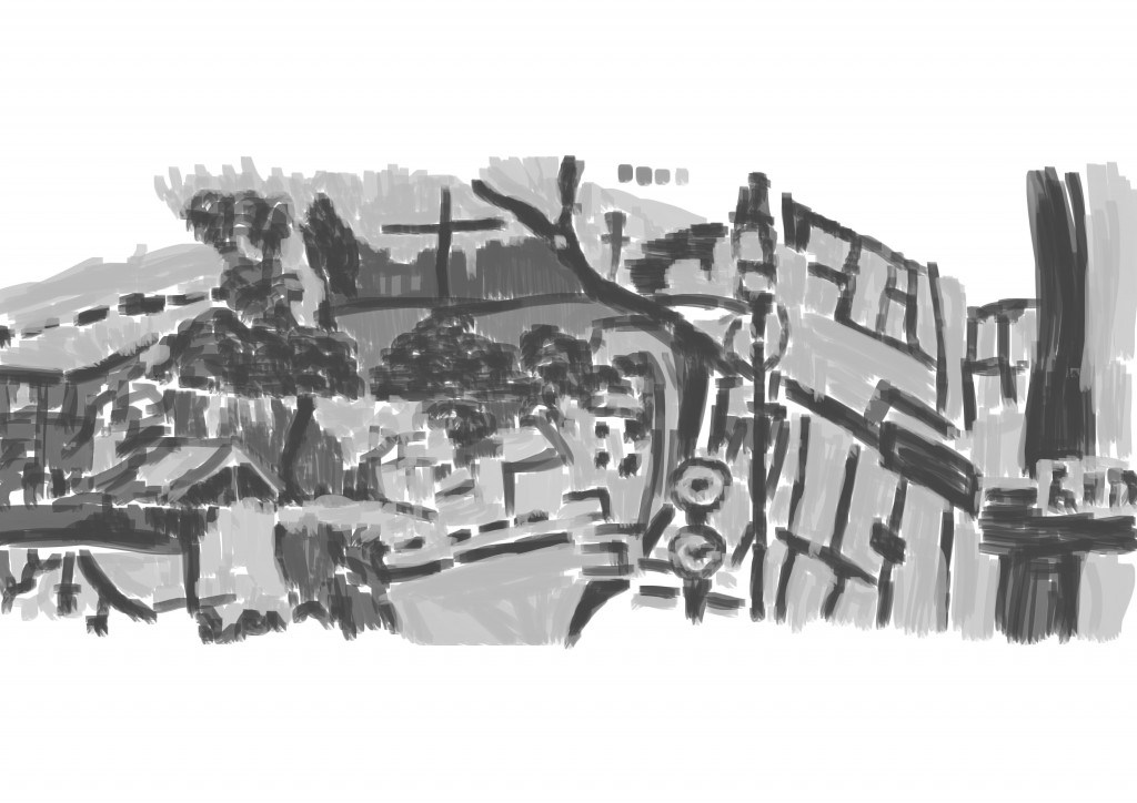 I’ve been sticking with four grayscale tones that I’ve got on my custom color palette. They offer a decent range of tones. I don’t hate this work, but it’s certainly not my favorite.
 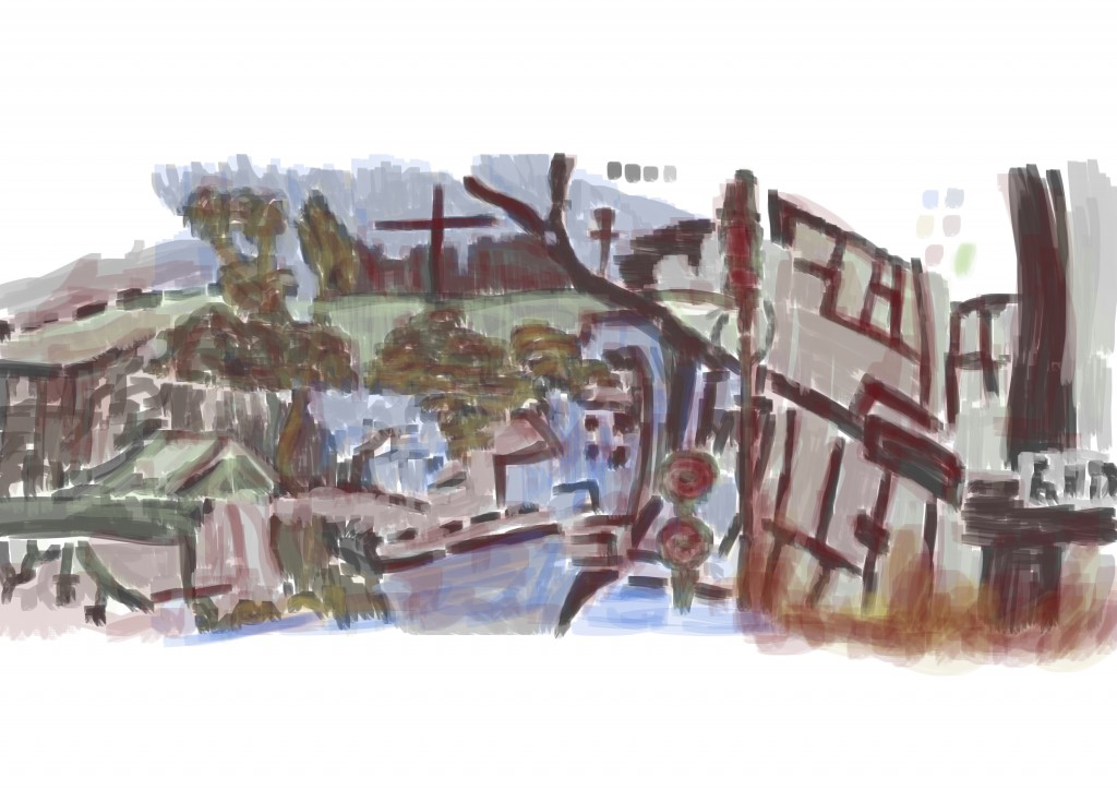 Color. I dropped the opacity even more than usual - 19%. I’m not sure what to say about this. Maybe I need to start working in new ways in GIMP - I’ll go watch some concept art videos for inspration.
Lastly, here’s the video.
Read more →
I used GIMP on my laptop last night to mash together reference for the painting this morning. Preparing it last night meant I was able to get straight into the painting this morning.
Here’s the painting -
 Reference. I searched my laptop folders for files that I haven’t used before - mostly life drawing works and such. I may as well use these works as part of the street scene works. Man of these drawings are not uploaded to the blog it would be helpful to get these uploaded.
Back to the reference. I used oil pastel figures in the foreground on the left and right. I use a pencil drawing of skins character Cassie for the head on the right figure. The drawing in the center was from my sketchbook - a Wellington drawing. At the top traveling horizontal is a photograph, I took this year ago of the Wellington Rowers building on the waterfront.
 Line. I had problems with finding line ares to trace - it’s lacking information and compososion somewhat. I am happy with how the figures turned out - especially the legs on the left and the overall shape of the right.
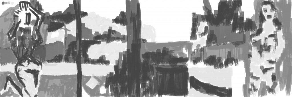
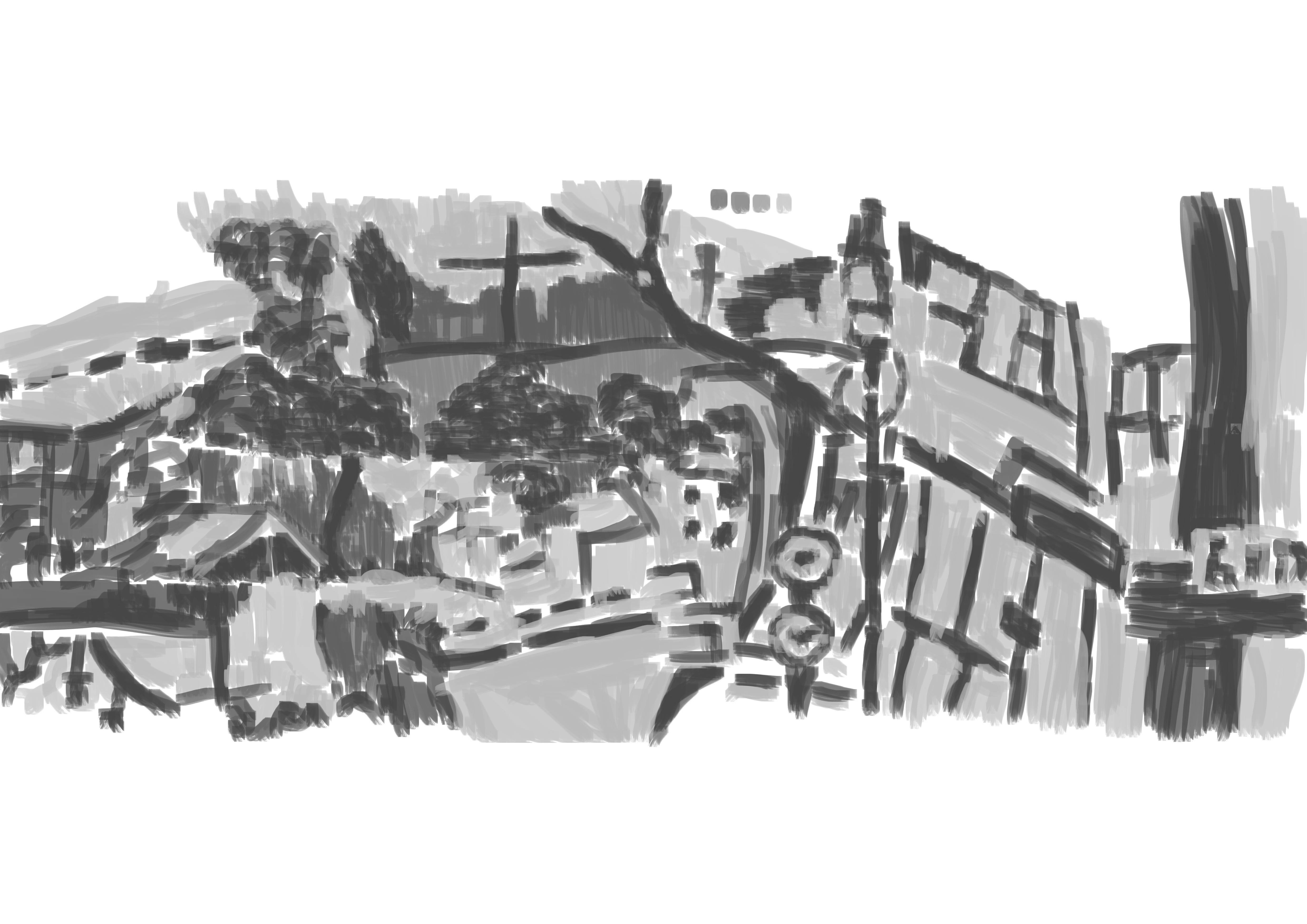
Tone added. Again I’m especially happy with the figure on the right and legs on left figure. The pole in the center, center left and left in the distance helps scale the piece - this is certainly good. There are areas in the environmental that needs more highlights - maybe where light is hitting.
No color sadly - I’ve been bad with my file management and corrupted the color version.
And finally the video:
Read more →
It’s been a busy few days - I’ve been going into my Mothers work and doing painting with the kids - 4 year olds. When I made it home I got stuck into a digital paintings in GIMP. It’s been a awhile since I did an environment work so decided to
Alright, here’s the works:
 Mashed together a drawing from Levin, a landscape from Alchemy and a photograph of the band Yeah Yeah Yeahs - focusing on the singer. I’ve drawn this image of the Yeah Yeahs before - in pencil.
 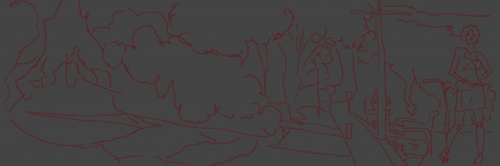 Line. I am concerned with the scale and perspective of the Karon O figure - especially with the cars and pole in the back. The pole looks like it’s coming out of her ankle.
The Gray. I started over the right side and worked left - with an effort to make interesting textures from the same brush. Maybe I should of used multiply brushes. I ignored the reference and focused on the line work - creating a tonal piece that doesn’t feel like a paint over. I have been applying a paint over technique to my works that I have found to be giving a weird look - focusing less on the paint over and more on creating an interesting paint layer.
 Color. I lowed the opacity for the color to 20% and just painted over the gray. I used two blues for the sky, red for the tree leaves and ground, orange for other ground areas. The area on the left - which looks like mountains I used orange on it. I spread a green around the page - Karons clothes, areas in the background and on the ground on the left.
And finally the video. I’m happy that I have started making these videos at full HD - 1080p.
Read more →
As a child where the Wild Things Was a favorite book. For this request on RedditGetsDrawn I was asked too draw this child with Wild Things. I did a quick google search for reference and found this reference that I choose to use. 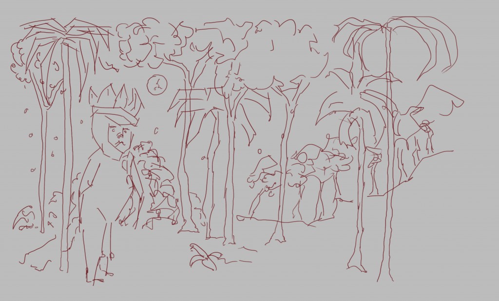 L ine. I had fun using the book illustration as reference - a different look to my usual street scene ones.
  Grayscale. Huge contrast between the figure and background. Looking at this now I think that it could of done with more lights in the trees/sky. In the following stage - color, I fixed this by using a light blue.
 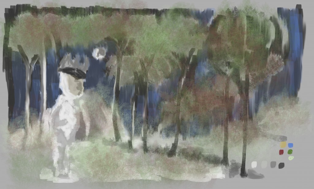 Color. I used several large brushes in this which has given it a misty look.
Read more →
Read more →
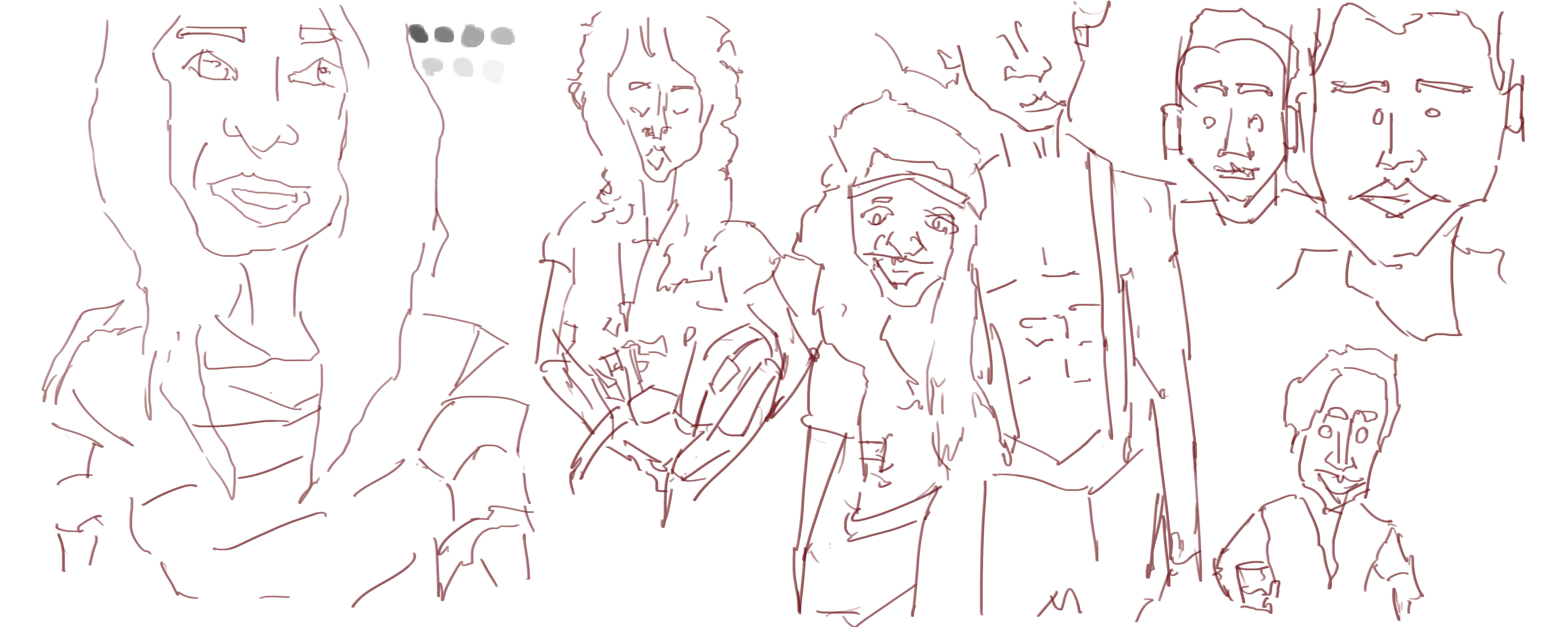
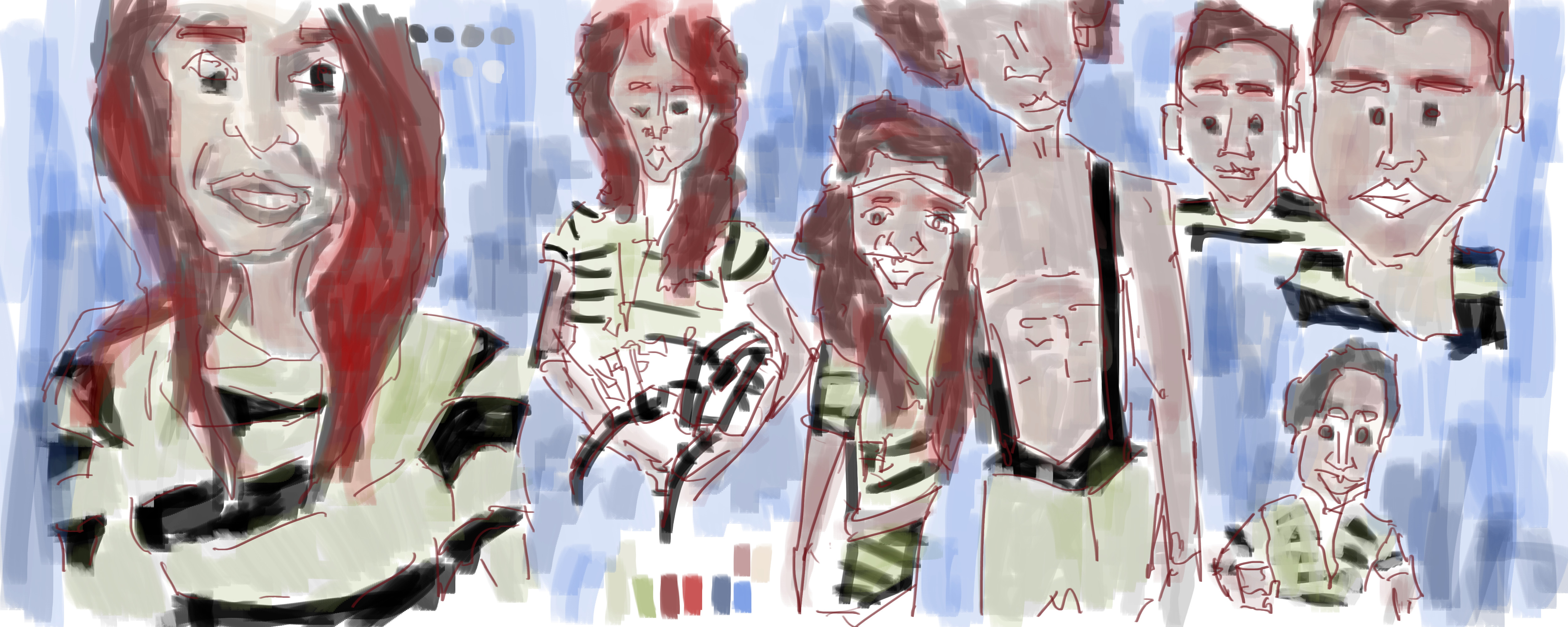
Instead of drawing just a single portrait I decided to fill my page with a range of different portraits - all from RedditGetsDrawn.
I’ve been playing lots of Borderlands 2, working on a comic and arranging images within scribus.
Here’s the portrait work:
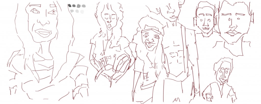
Line, red line. White background. Two of the reference images were doubles - something different. 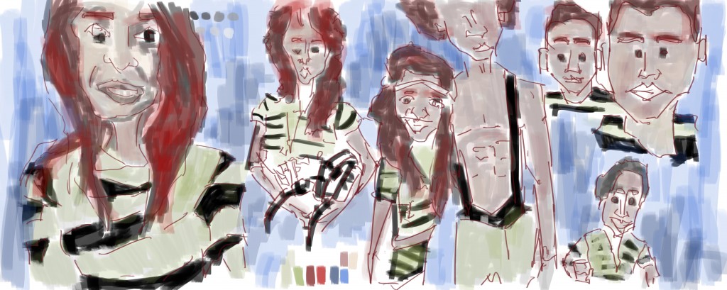 Grayscale and color added. I saved over the gray scale layer - normally I’m good about saving off each later. I used the palette that I created in GIMP.
Read more →
 This was on Friday night. I sat near a car park and drew the church and plants across the road. They had a water fountain that I especially enjoyed drawing.
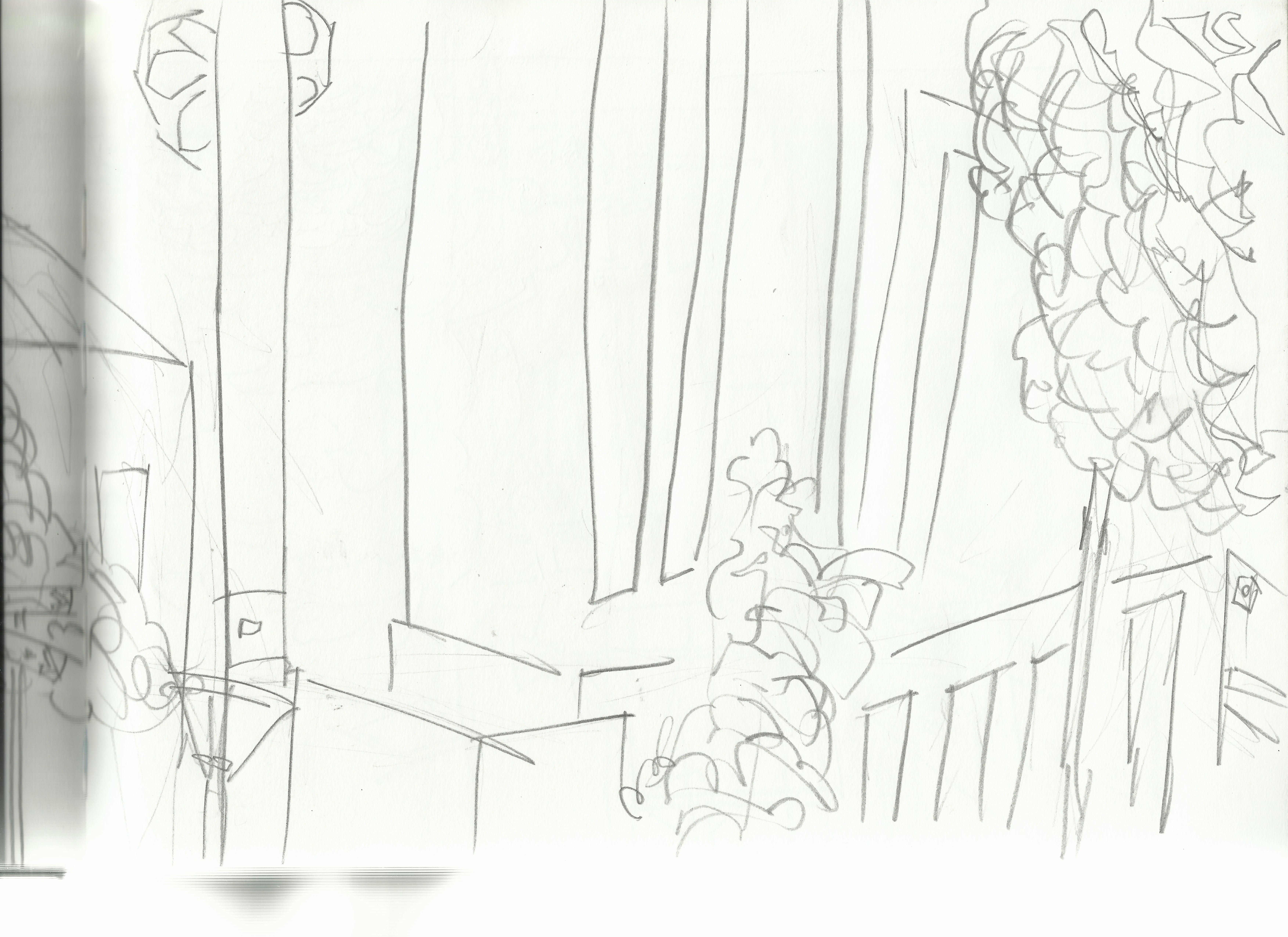 Second page of the church drawing. Less detail in this one - just quick

 W ater front drawing. I started with Gouache (work I’ll post in a future post). People liked to come to the waterfront, many sitting and eating fish and chips. In this piece two figures sit and watch the hills


 I
I

 L
L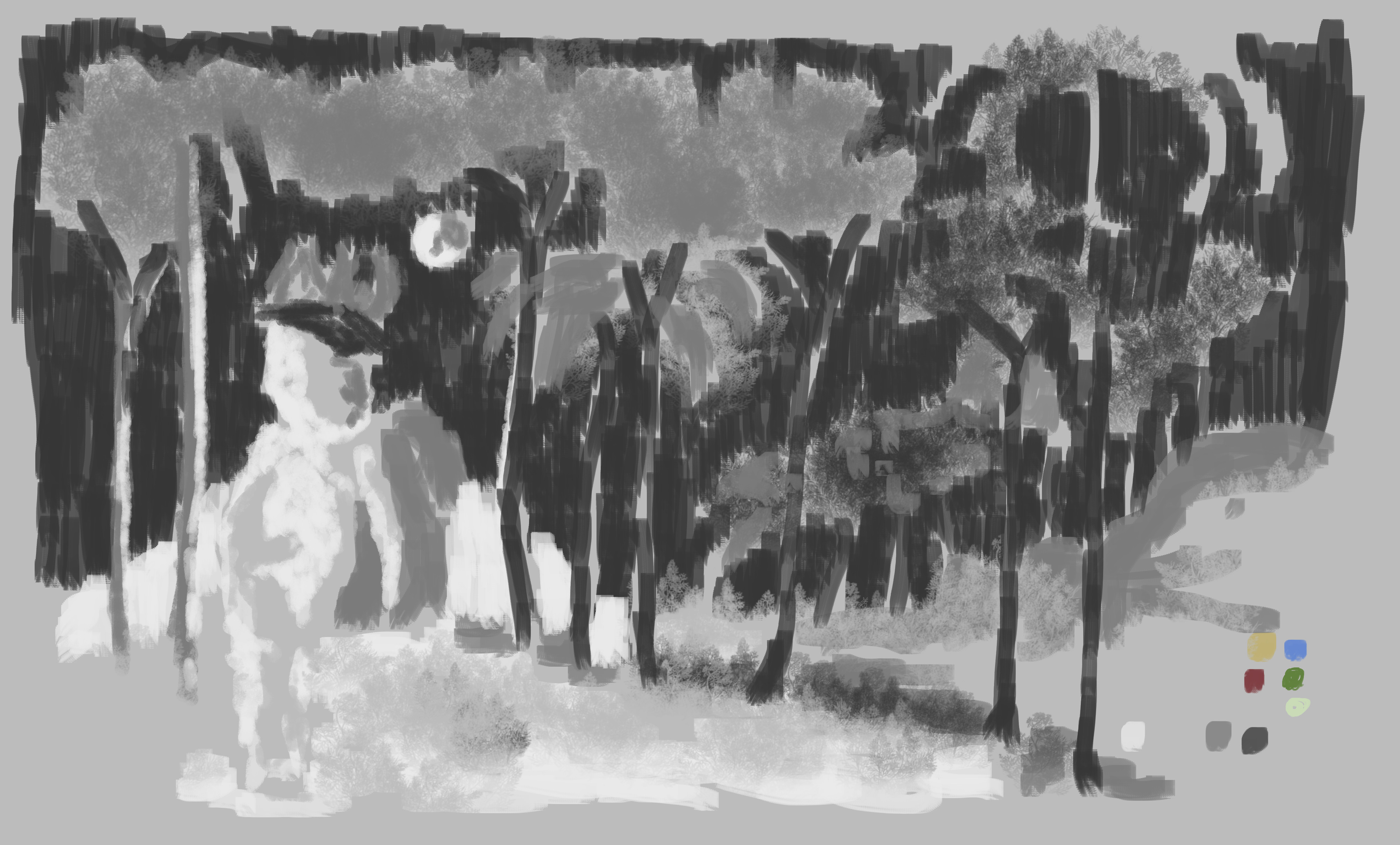


