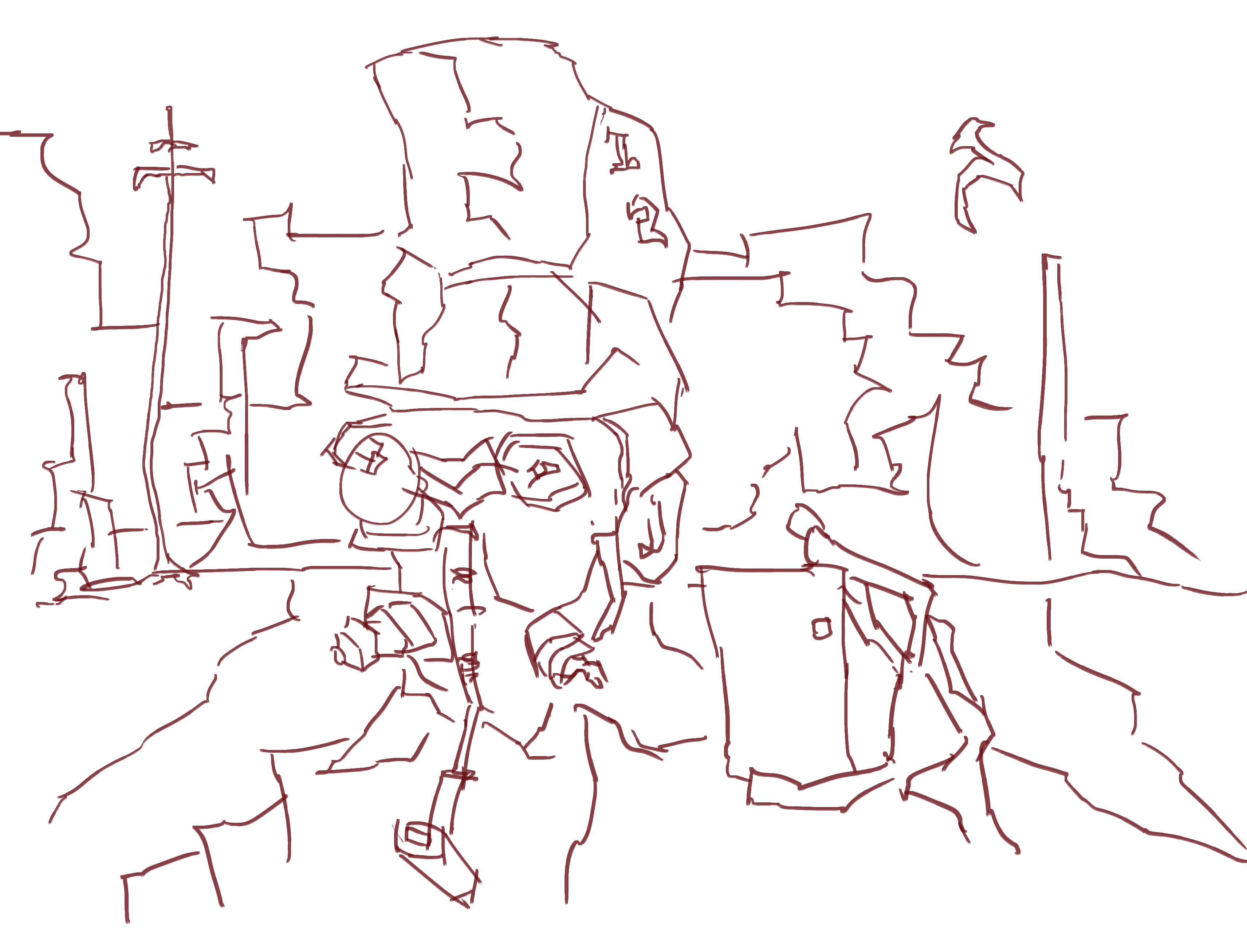
steam punk
Final Fantasy
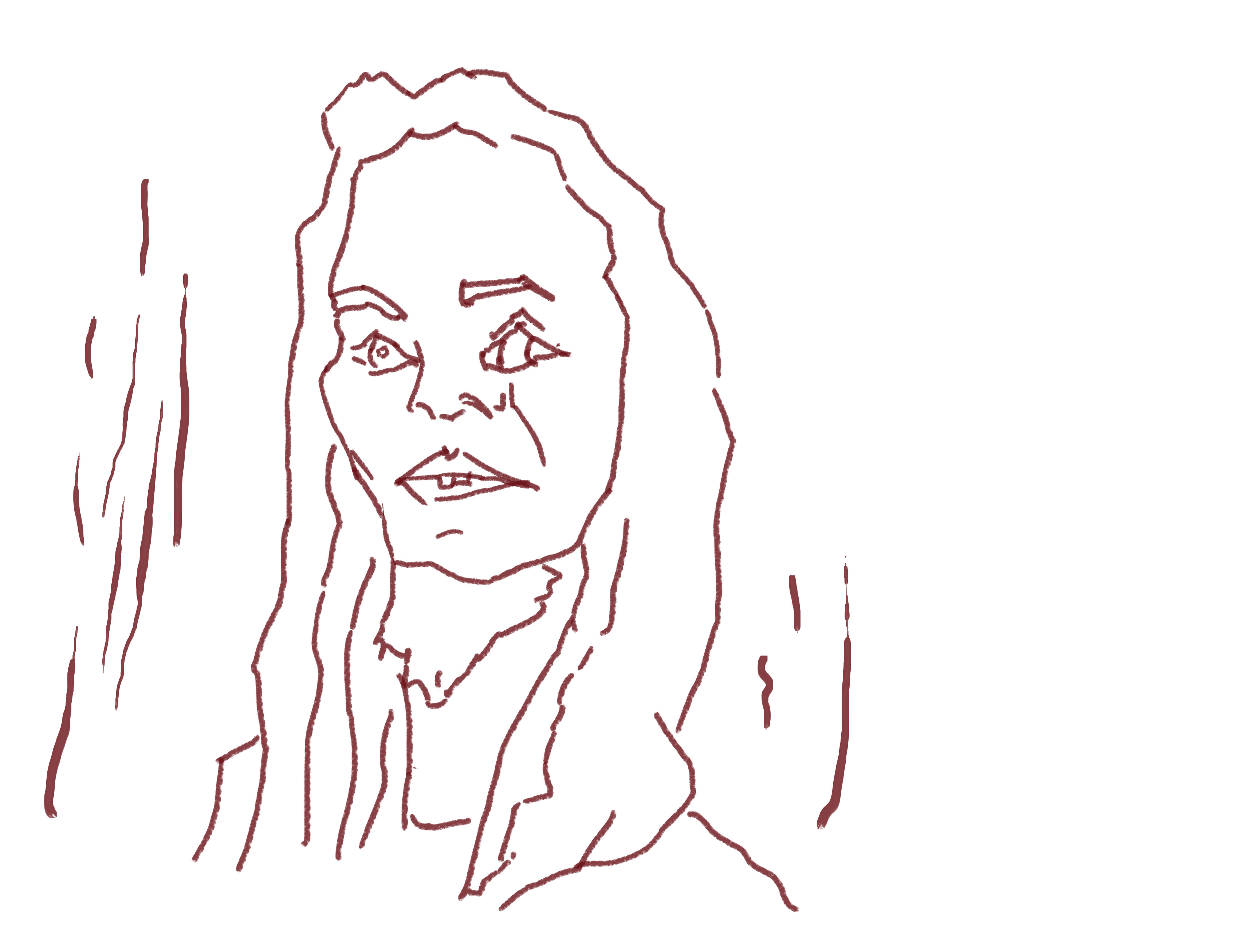
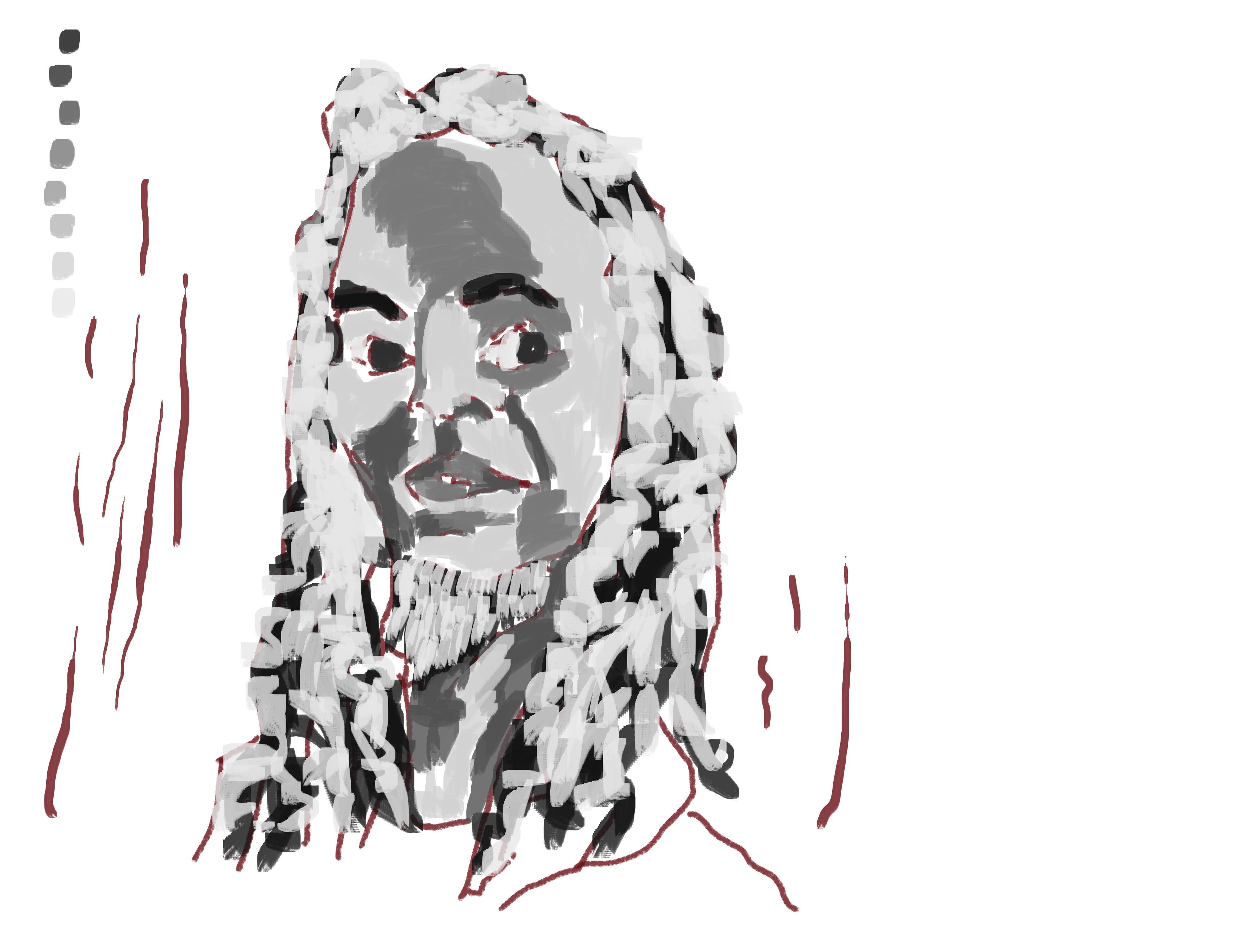
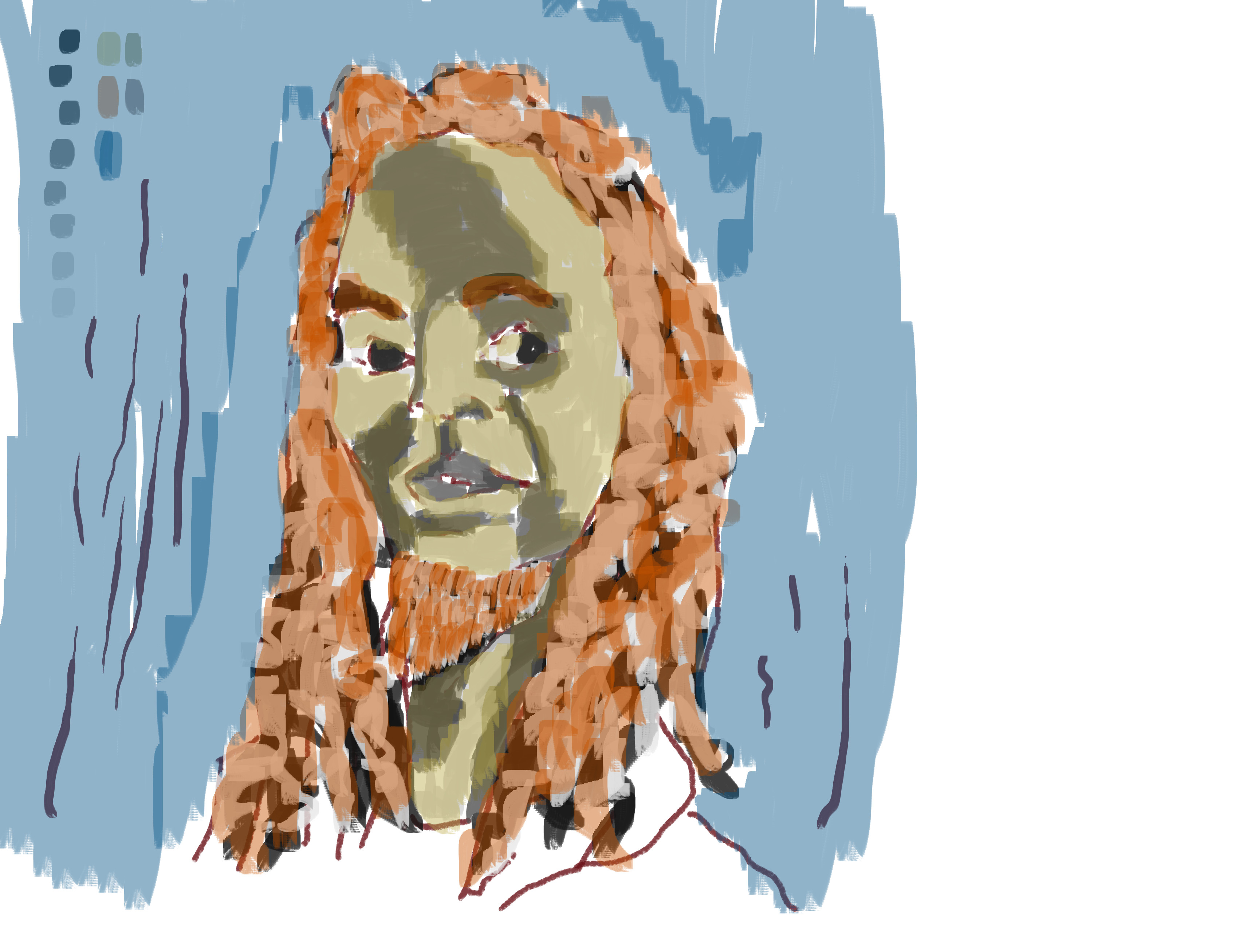
anna new color sample
Now for something completely different. I’ve been using the same color in GIMP forever. It’s been over 6 months with not much change in color. I need to practice with a wider range of colors. Here’s my attempt at increasing my palette and exploring color.
My friend Cathryn once sampled colors from photographs and created paintings from it. She used beautiful fruit and such. I went with cooked food, not so beautiful. The reference I used was roasted veges and eggs. Both are stock images that I took myself. You can go check out the rest of the food photos of eggs and veges.
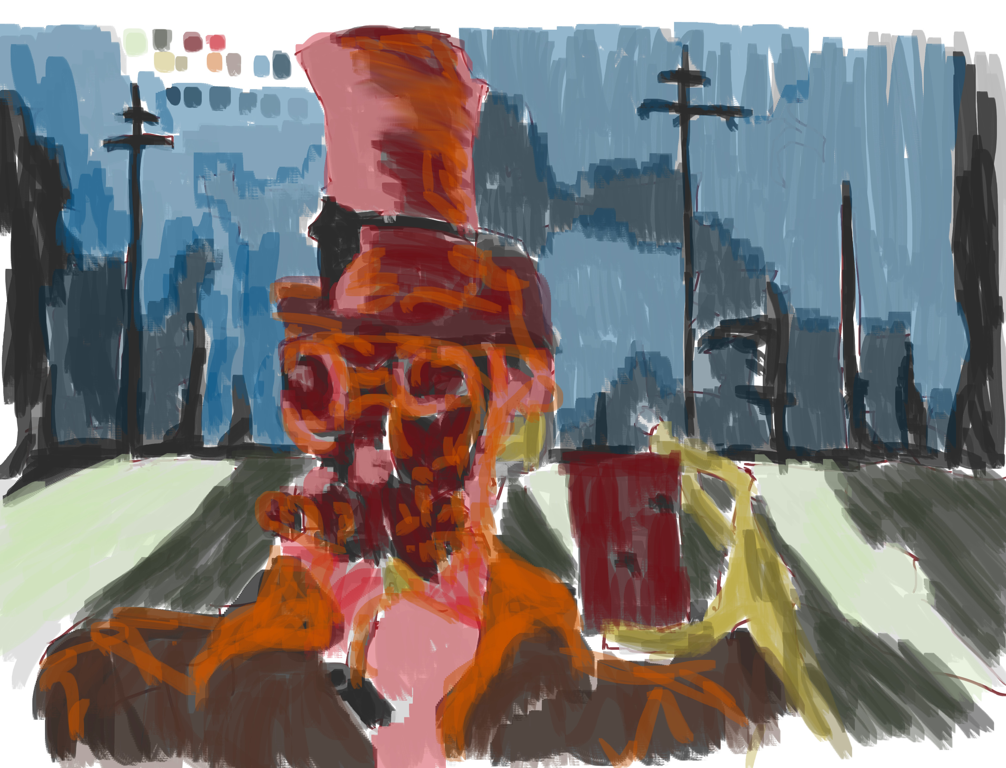
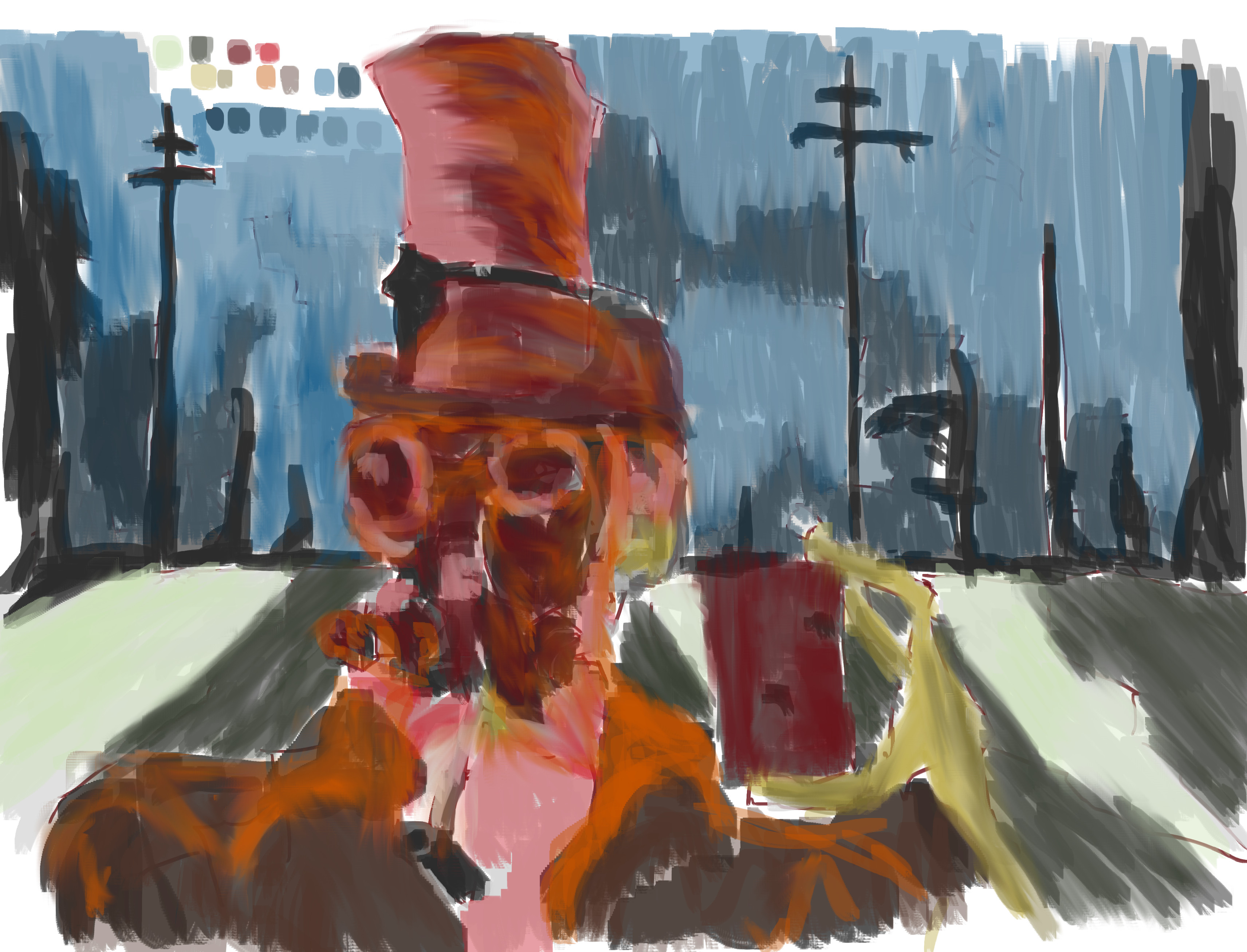
Anyway, onto the painting, even though it’s only one layer:
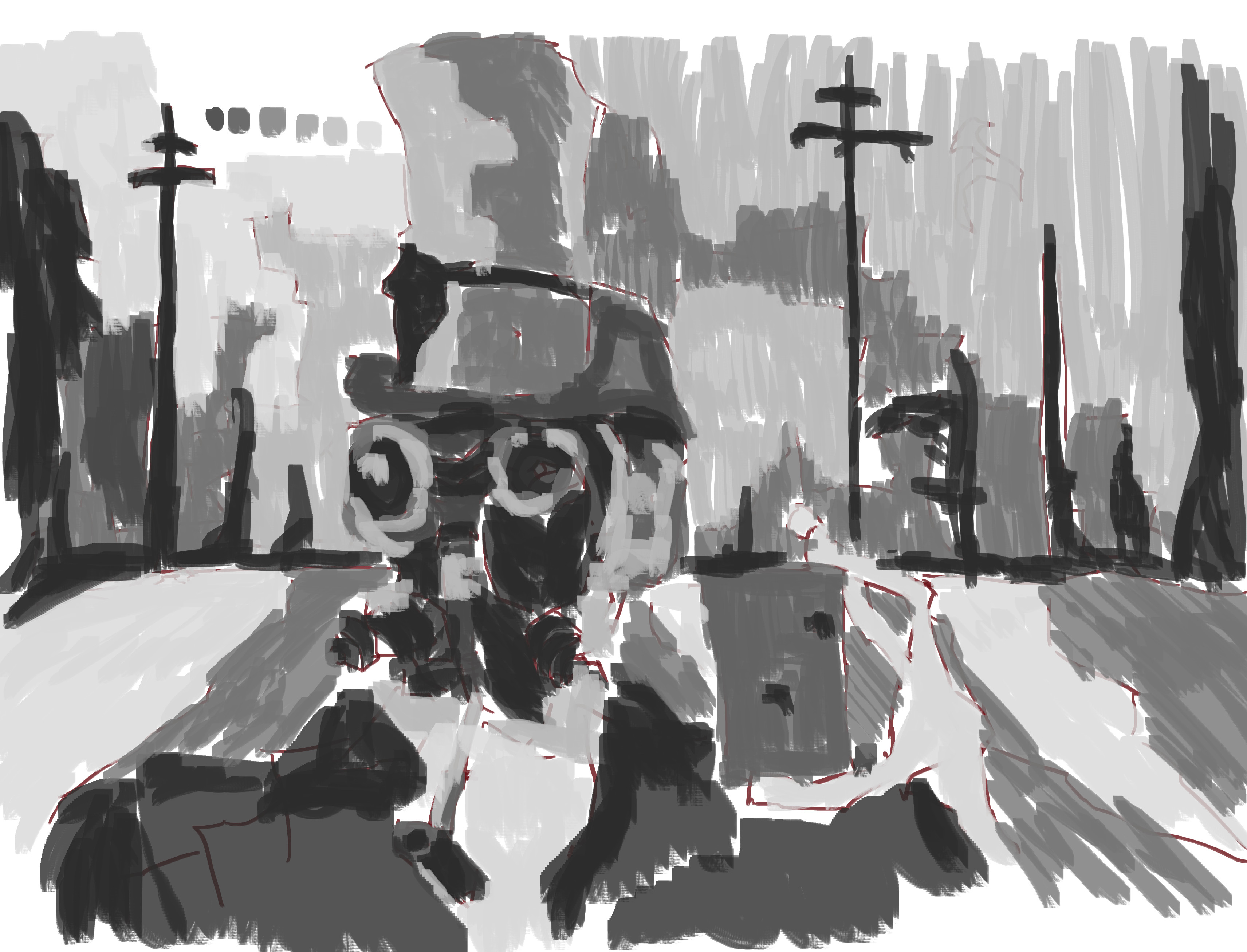
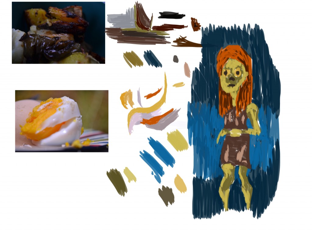 So no line or gray scale in this. It was purely a color exercise.The yellow samples I picked were exciting. Yellow has got to be a favorite of mine. The darker version of it looks rather green! From the roast photo I got some interesting browns… something I don’t normally use. I also picked up a blue from the plate - the dark version is ok, but I made a lighter version of it - which is horrible. Too bright.
As you can see I painted a figure with the new sampled colors - for the reference I used a digital painting that I was open in Blender. The post including the reference is here.
I certainly found this exercise fun to do - I need to do more fun exercises like this rather than just the same process everyday. I took photos at the Rose Garden today - I must use the photos in a similar way.
And to end the post, here’s the video of the painting:
[youtube http://www.youtube.com/watch?v=WyAiF7wRImM]
Stay cool honey bun.
Read more →car
Dads Hens
It’s been a nice day. Went for a walk and took photographs. Pretty flowers, and food! This afternoon I decided to sit down and do another painting (I really don’t produce enough paintings).
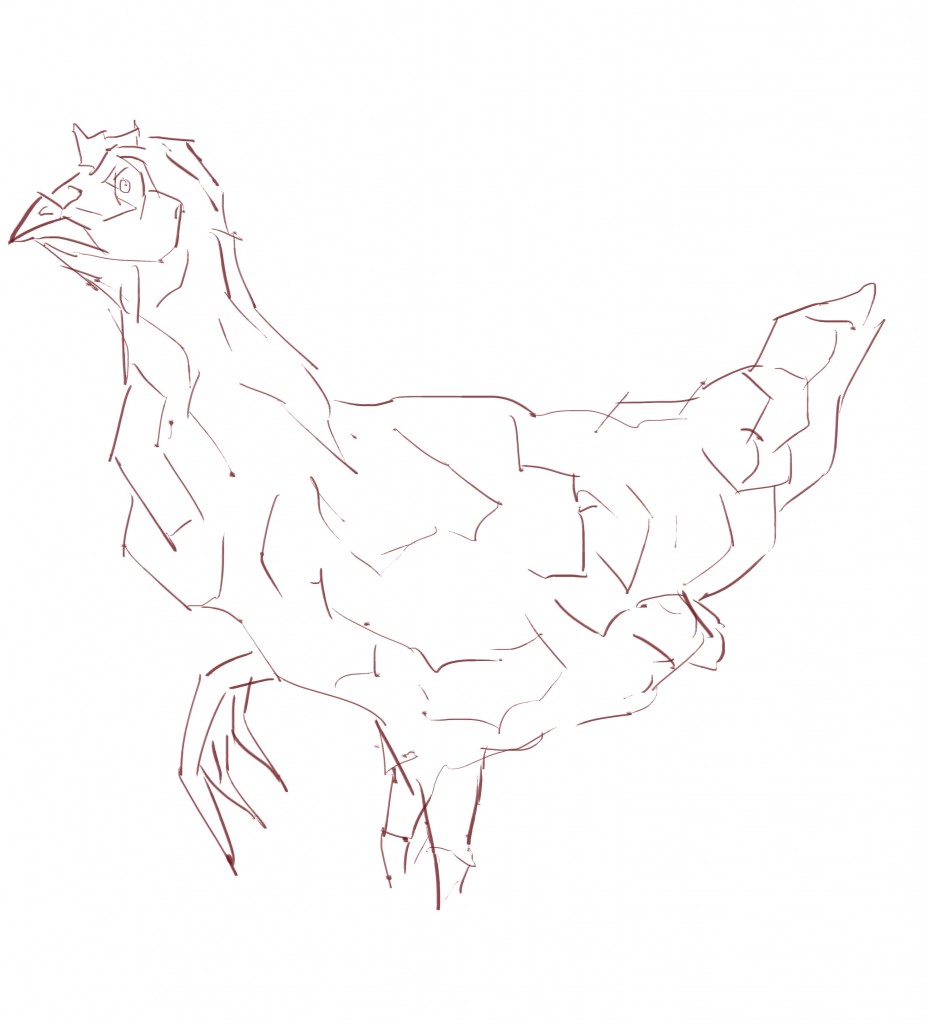
So here’s the painting. Dads Hens:
 Reference I used. This is a photo I took recently of my Fathers Chickens. You can view more of the photos over here. I used this photograph as reference on my laptop monitor - and painted on the desktop.
When was the last time I drew a animal on the computer? It’s great to draw a different subject. This was very quick to get down and certainly helps my visual library.
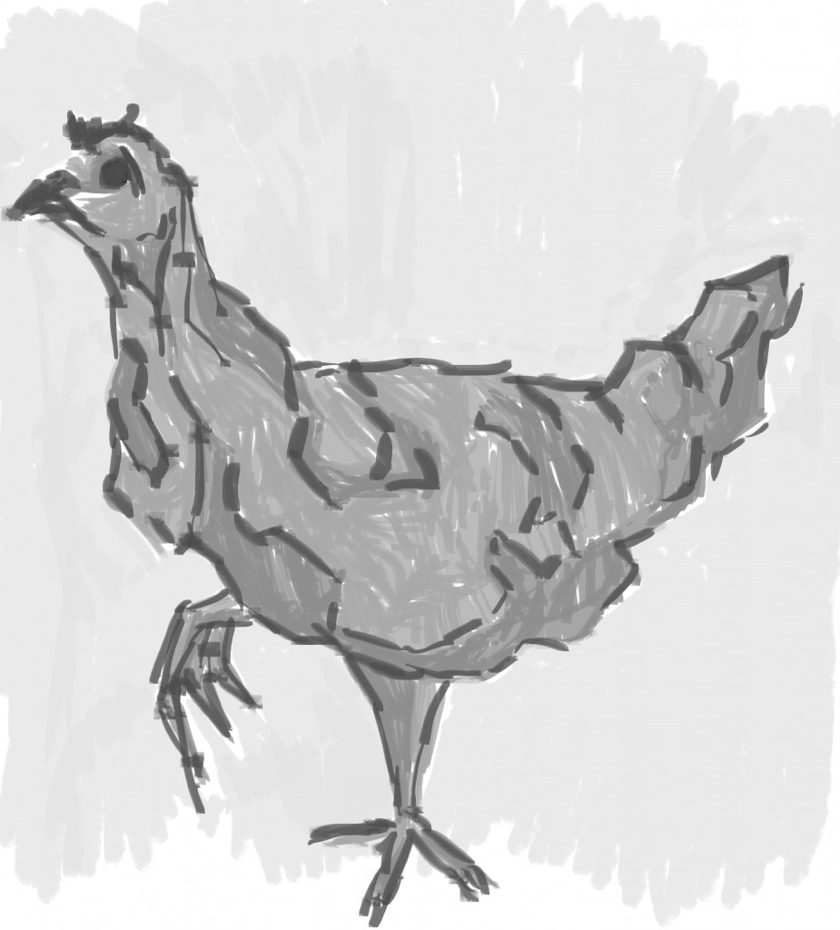 Gray scale tone. I started with the eye- the darkest gray and worked out from there. I decided later it was too dark and make it lighter. That’s the great thing about working digital - if it isn’t working then just paint over it. I used two tones for the majority of the Hen, bringing in a third later for dark highlights. The background, a layer of light gray.
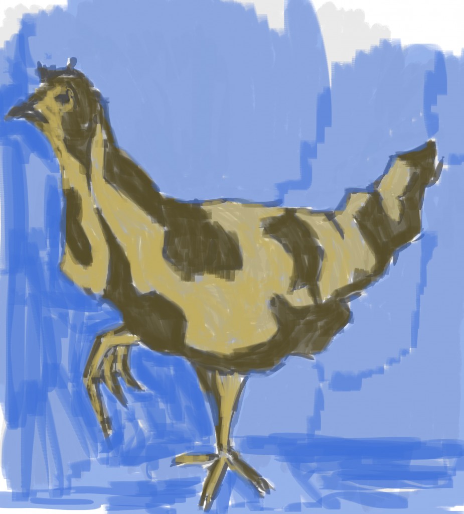 Color now. Used the same colors as the painting I did earlier today. I’m really enjoying these two yellows and how well they work together. No red in here. Maybe I could of created an environment for the Hen to be in. Poor thing, just covered with blueness.
Here’s the video to go along with the painting:
http://www.youtube.com/watch?v=TqWvplhPeAg&feature=youtu.be
Read more →Lvn-Rework
Woke up not as early as I wanted to. I think it was 8:30. Freaked out as I went to paint and was unable to find my tablet pen. End of the world. I gave my room a tidy to find it - sure enough I found it under my keyboard. The freak was off.
Here’s the painting -
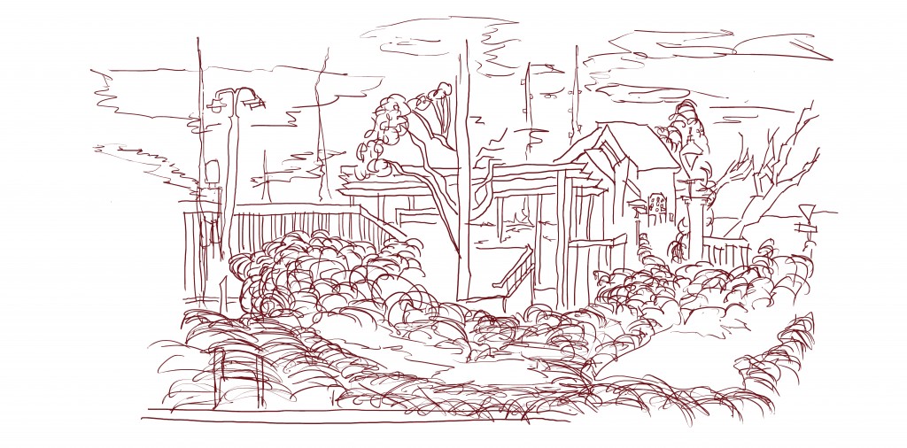
This is the reference I decided to use. It’s the line work from a painting last year that I wasn’t happy with. View the post here. I imported this line drawing into a new GIMP file - slightly larger than the original so gave me room to work around the edge… add extras on.
Here’s the line done. As you can see the drawing has been extended at the bottom, adding in more vegetation and water areas. Other lines have been extended to fill in gaps. Figure added to the left.
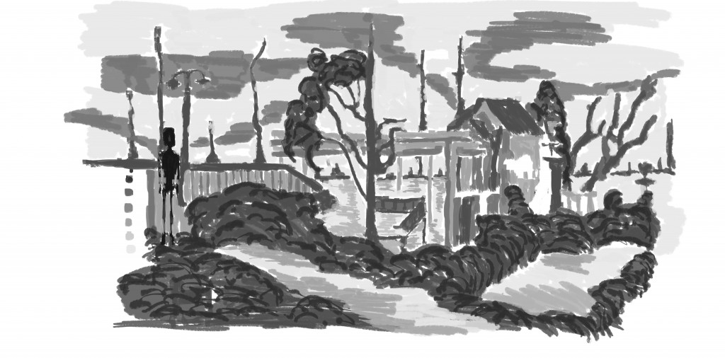 And tone. I started with the figure on the left - the darkest gray. I then moved onto the sky and filled in the rest of the areas with tone. I experimented with making the tree branches in the same gray as the figure but it was too strong, dropped it down so it doesn’t clash.
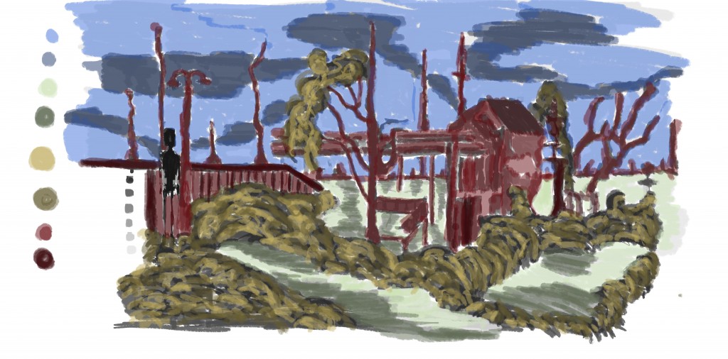 Color. I added red into, something I haven’t been happy with. Decided to use my normal red and a black version, helps with making the color not so dominate and balance it out. Maybe a lighter version of the red? Two shades of green for the water. Yellow for vegetation, and blue for the sky.
Here I’ll include the painting I did previously from the reference:
 As you can see I’ve clearly improved since this painting. There is more detail, areas just made up, and a better sense of depth. I don’t like the pink colors in this work either - the red is certainly stronger.
And finally, here’s the video:
Read more →Levin Water
I woke early this morning. 6:30. I switched on a episode of The Walking Dead and started painting. I mucked around a little but managed to get a painting finished. I’ve spent the rest of the day cleaning and getting washing done. It’s still not 100% but cleaner that what it was.
Here’s the painting I did this morning -
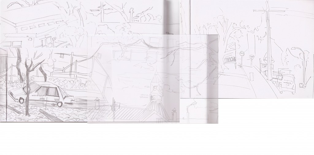 I grabbed random drawings from my Levin drawings folder with the intent of adding water elements into the image. All three reference images offer interesting contrast. The right side is lacking a little with drawings, but I can just fill it in with lines. There is enough here to work with.
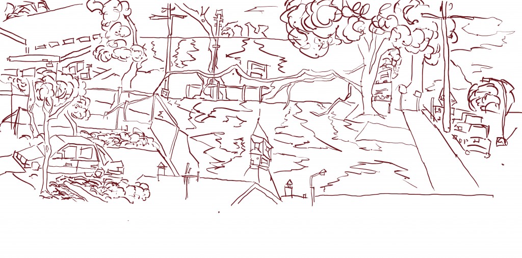 Ok Line done. As you can see I’ve changed the image somewhat, adding water behind the foreground area. Drifts into the horizon. Scatted around the edge are vehicles trees, and buildings. I want my paintings to have a more 3d feel to them, create scenes that could then be modeled out - not just use this painting as a background - but create from within.
 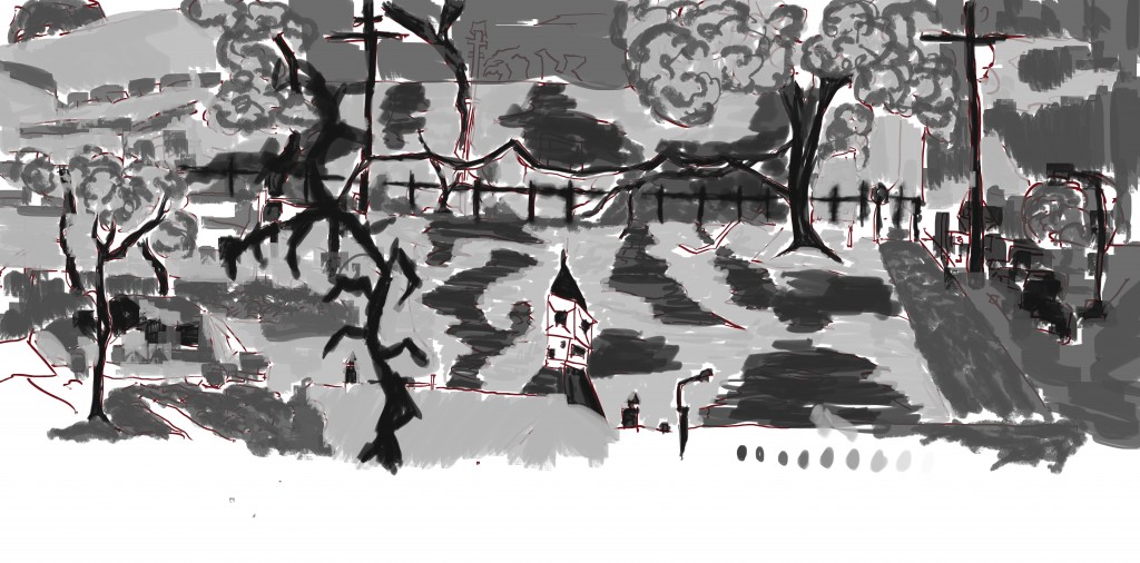 And tone. People are lacking on this work. It’s been quite usual lately for me to include them. I used my standard flat brush but also mixed it up with a watercolor brush.something different. The tree in the middle is strange and out of place. It wasn’t this dominant in the line drawings but I brought it out in the tone. Doesn’t work.
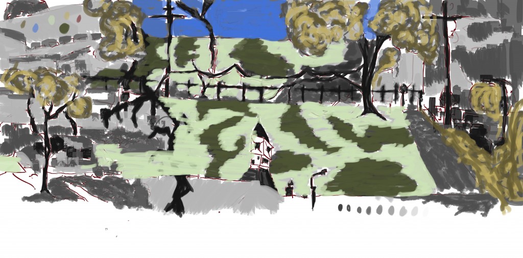 And color. I’ve really gone off using that red. I even tried darkening it to see if it would help - decided to not go with it though. At least I got the yellow in - two versions of it - the light (which i always use) and the dark (which I need to use more). Blue in the background could do with another shade, the opacity was high (90%) when I painted the sky - doesn’t help. 80% is good.
Video (also includes unreleased paintings):
Till next time.
Read more →Cuban Water
Woke up early this morning and got straight into painting. Finished off one I started last night. I’ve been happy with the direction that my paintings have taken recently.
Here’s the painting: 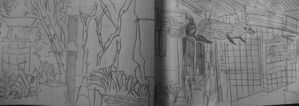 For the reference images I used two sketches merged together - both were drawn on Cuba Street, Wellington. I’m happy with both of these drawings and together they offer plenty of detail.
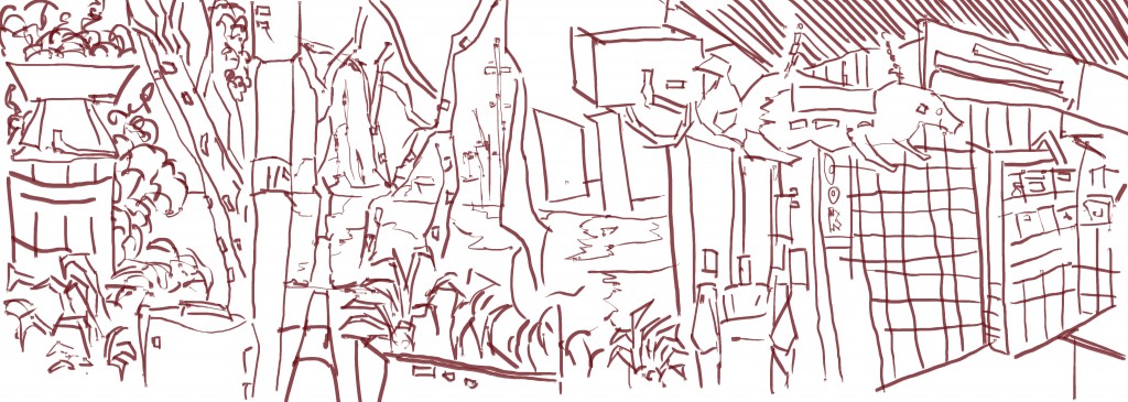
Line. I traced over the reference material and added extra areas. Most notable is the water in the background - water has been a big in several of my recent paintings - something I’ll like to keep developing.
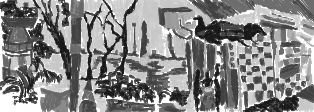
Grayscale tone added. I started with the three figures on the middle right and filled them in with black before moving onto other areas in the painting - the ferret, vegetation and tree trunks. The lightest gray was used for the sky and water, with a mid and dark gray used for the dark areas of the water. A mix of light and medium grays for the building and objects in the foreground.
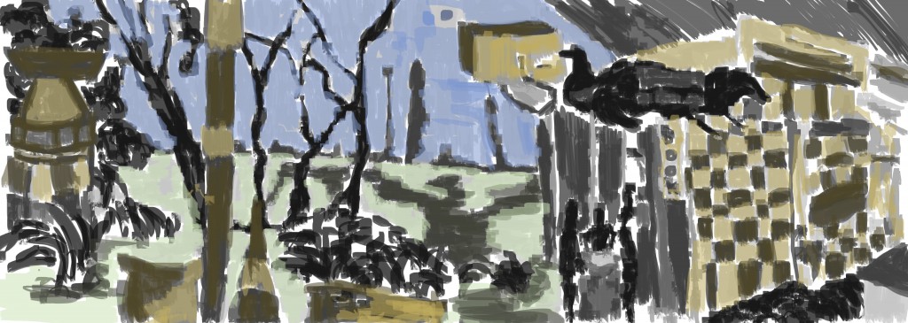
Color. I liked the minimal color I used in yesterdays piece . Today I managed to also color objects with a yellow - and a darker version of the yellow. These two colors work together well - I’ll keep developing it. No reds, often I find the red to be over dominating.
Read more →Bell Water
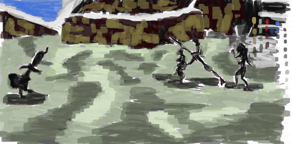
I’ve been spent the majority of my time in Unity working on a game. It’s been fun, but I still believe it’s important that I paint regularly. So I started this painting this morning, got interrupted and had to take a break. I got back to it this afternoon and finished it. I want to take more of my paintings into Blender and model out 3d assets from the paintings. I need to get back into making 3d posts on this site - it’s very dominated by my digital work.
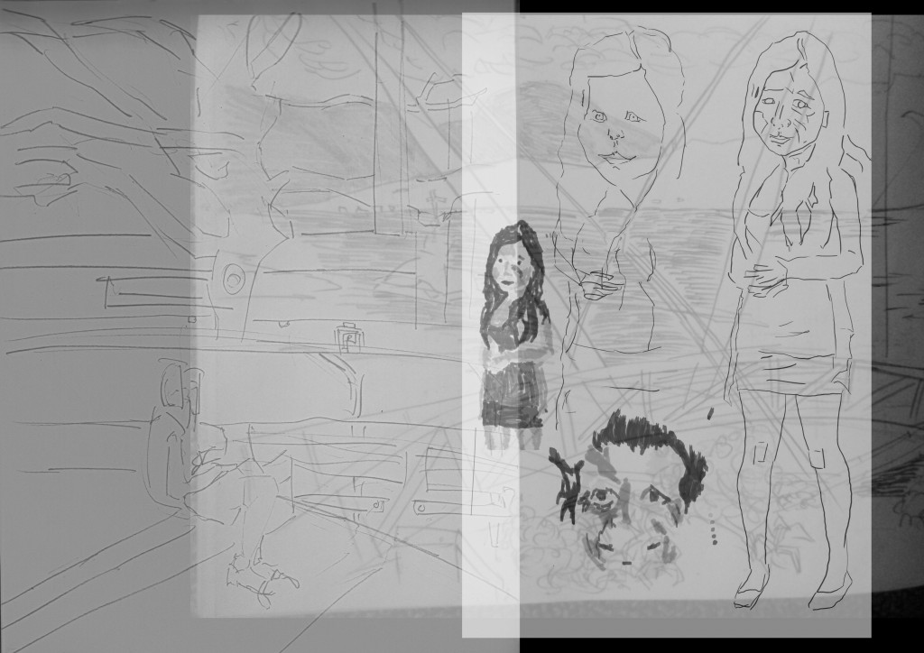 Ok reference. I just grabbed some random drawings off the computer that I haven’t done alot with. Both of the pencil drawings are from Wellington, the best and most developed the waterfront. I really enjoy painting water so want to include it in more of my paintings. The third reference is a line drawing I did over a photograph. I want to include more characters in my work - normally I don’t use reference for figures. Hopefully this figure helps.
 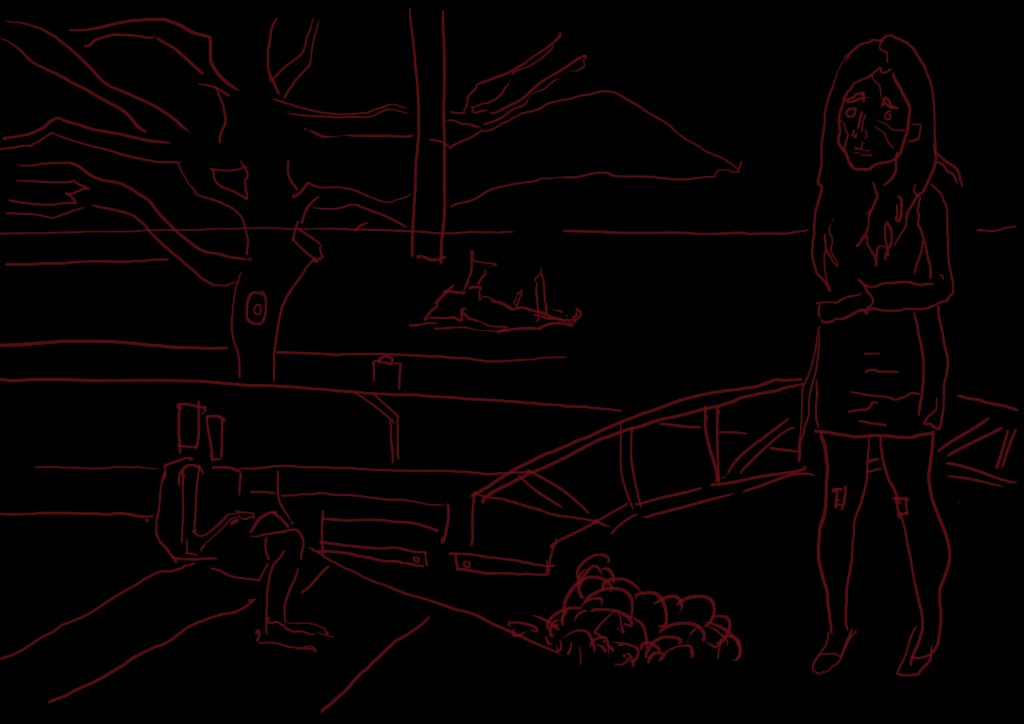 Th[e black certainly makes t[hat red stand out. When I was drawing this I had the reference in the background, so technically I should of used a white background. The line in this is surprisingly minimal, once I get into tone I flesh it out further and add details. The line doesn’t have to be much - it’s just a starting point.
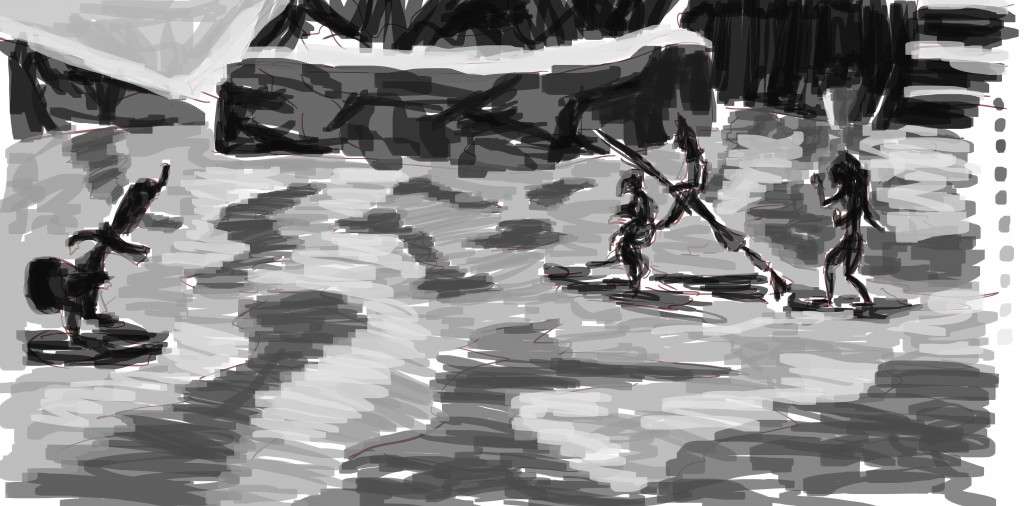
 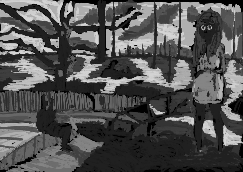 Black and white tone. I had fun with this. Started with the figures first and got those darks into them, before moving onto the water and background. The final area to cover was the foreground. As you can see I added lots that wasn’t there in the reference or line drawing - including land in the distance. This technique adds information and detail to the piece. I’m happy with the figure. Those eyes sure are scary…
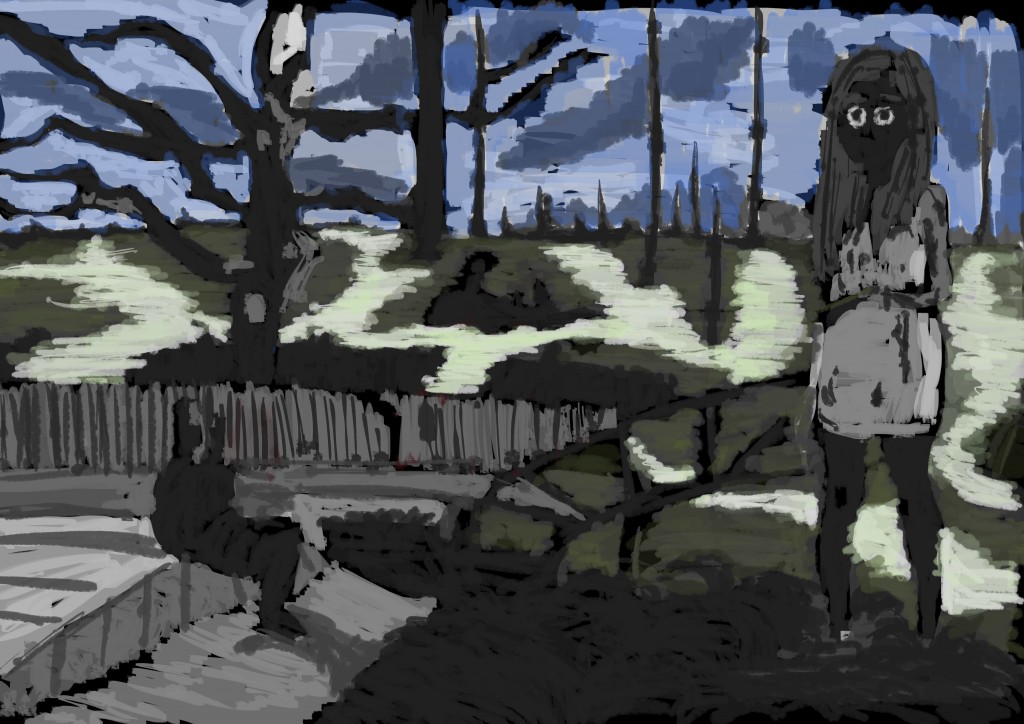 Color is minimal. I started with the sky first, covering it in blue, then the water. I used 2 greens for the ground - the same greens that I worked with previously as Wellington water. Normally I work with just the light green but want to mix in the darker. Having a light and dark of each color is helpful.
