I’ve been taking photos. The majority of these have been landscape or street scene, but I have taken some photos of people. You can check out my new stock photography website - FreshFigure.
For this painting I used several of my photographs and painted characters. I normally paint enviorments so it’s always refreshing to paint characters. Here goes:
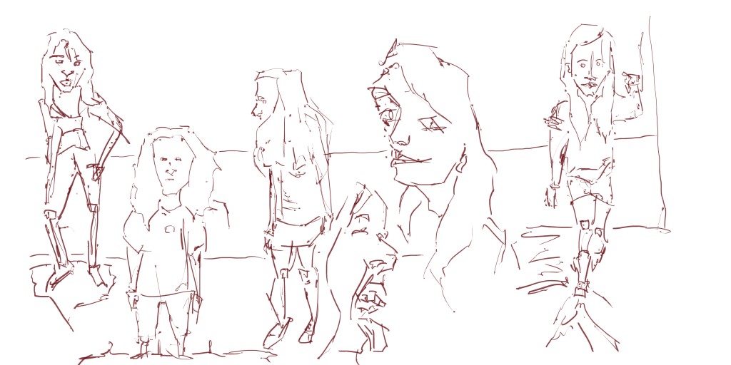
Line. The four figures are all the same height with the two portraits slightly wider than the figures. I especilly enjoyed doing the line on portrait with the tongue out - it’s very unusal and nothing like a normal portrait. Yay for differences. 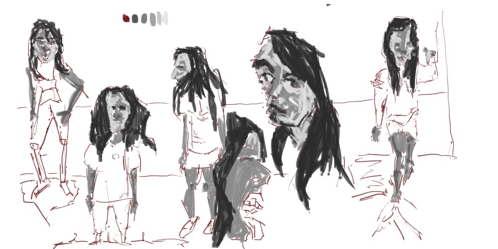
Grayscale tone. I focused on skin and hair - missing the legs on the left two figures. I went in with the middle gray and just covered areas before going in with dark to the hair areas. I used a light gray in certain areas of the skin to increase the contrast.
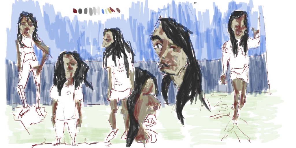 Color. I dropped opacity to 30% and covered the skin with yellow. Next was red for the darks (just laying over that yellow). Finally I used two shades of blue for the back wall and a green for the floor.
Here’s the video:
Read more →
Good morning. I got back to Levin yesterday - my Fathers place. One of the first things I did was open GIMP on the desktop computer and produce a digital painting - and record it. I didn’t record the color stage, but managed to record all up to grayscale tone.
Here’s the painting:
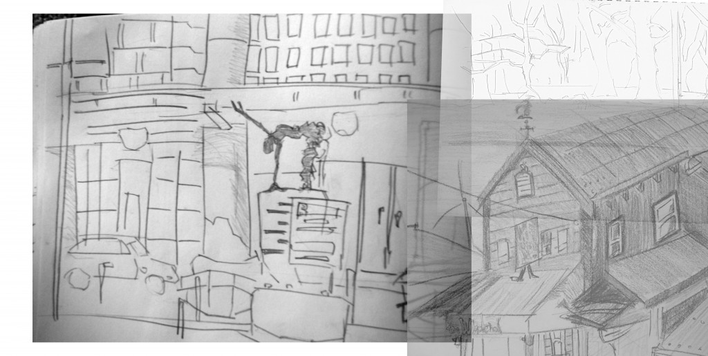
The far left reference is a sketch book I did in Wellington at the railway station. I’ve taken this into GIMP previously and was happy with the result. I thought it was about time to have another go. On the right I added a drawing of a cafe in Takaka, and above that trees in Christchurch. 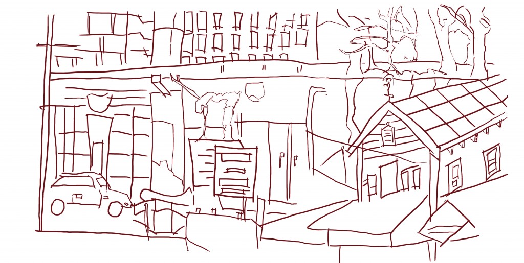
Line. I modified my pressure settings in GIMP to get more variety in my line - you can see this in the figure sculpture in the middle - very thin line. I’m happy with this line as it gave me enough information to develop good tone over it. 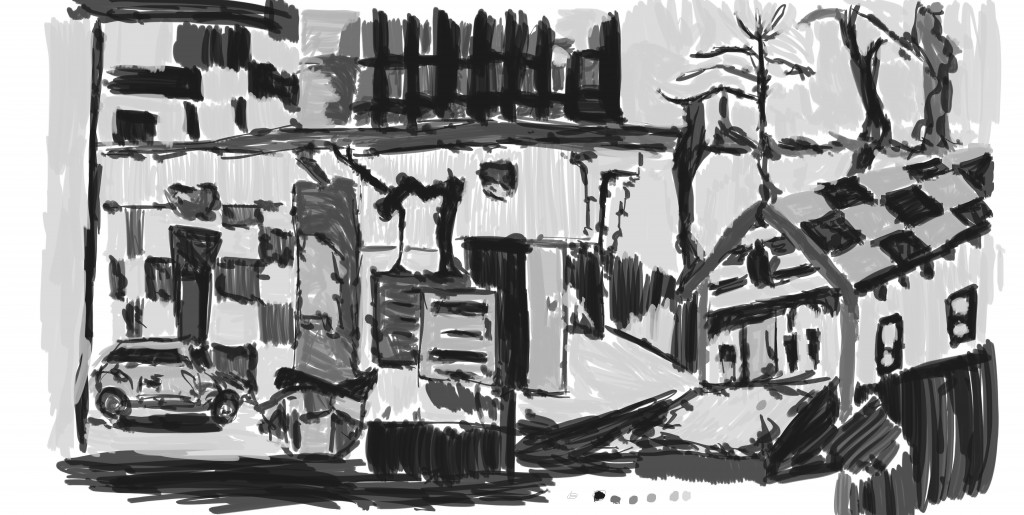
Grayscale tone. I made up the tone as I went by just applying a range of tones over the page. For more important areas or foreground I used dark and light for less important areas. Darks for figures always seems to work best. Now, color. 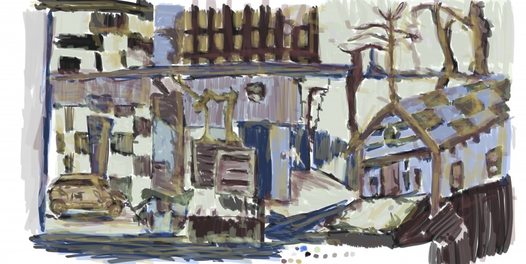
I had lots of fun with the color on this. Mixed and layered. The colors are my normal ones, but I also included a different tone of the red that I use for the line
And the video, sorry for missing color. Better than nothing!
Read more →
Busy today taking photos - over 500. Managed to start a painting in the morning and finish it once I got back from this Auckland Game Dev Meet Up. I’ve also included a painting that I started during my time in Highbury, but never finished it. I don’t have the high res file of this so can’t go back and finish it. Still, happy with the painting I did today.
First up, the Highbury painting. The reference I used for this was a combo of Poringa and Napier sketches. Here’s the reference I used:

Sorry for the small size. Having problems with the upload - stupid connection. The mix was simple on this - on the left a drawing I did during my time in Poringa and on the right, a drawing I did on the waterfront in Napier. I do enjoy waterfronts, but don’t like swimming.
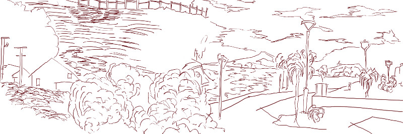 Line added. I didn’t add anything to the line but rather just traced over. Looking at it I think I could of continued the fence posts at the top across - to mix the two drawings further. The bus in the center was extended somewhat to help this. Next up, some tone added:
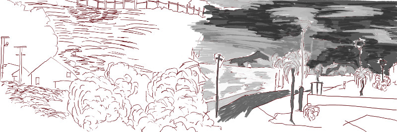
Though it isn’t finished I was happy with this tone. I had used a layer mask on it and hid everything - painting out the tone. I tried this technique again today but couldn’t get it working - the color was very transparent. I’m not sure what I’m doing wrong with it. I’ll try again in the next painting as the layer masks meant I could change the color to whatever I wanted - will make it much faster especially with recycling layer. Finally, here’s the painting I did today:
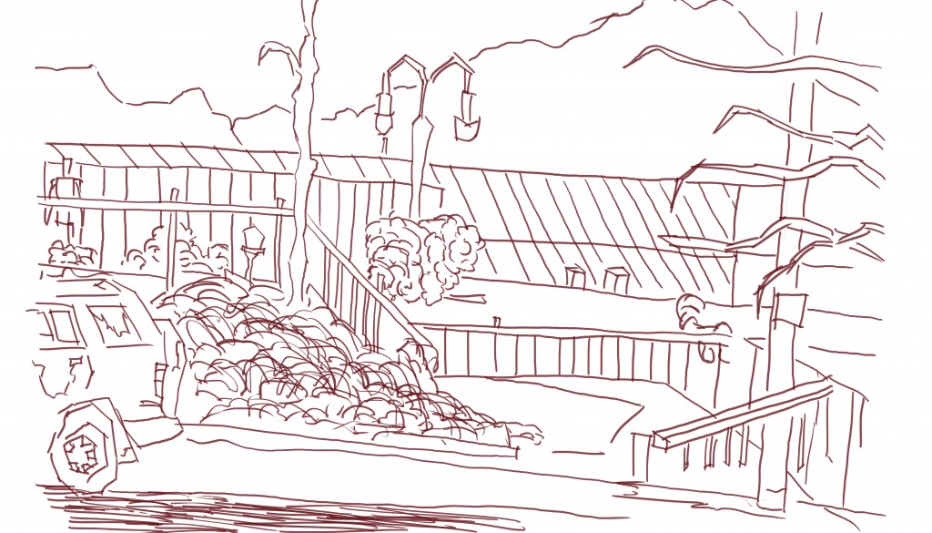 The reference I used for this is a pencil sketch drawn in Levin - at the skate park. I’ll be back in Levin tomorrow so will try to get out and draw the town again. Despite being such a small town I always enjoyed getting outside and drawing. Normally I don’t add so much line to the vegetation - but I did on this. Maybe I should have a go at using different colors for the line version? Getting layer masks working would help with this.
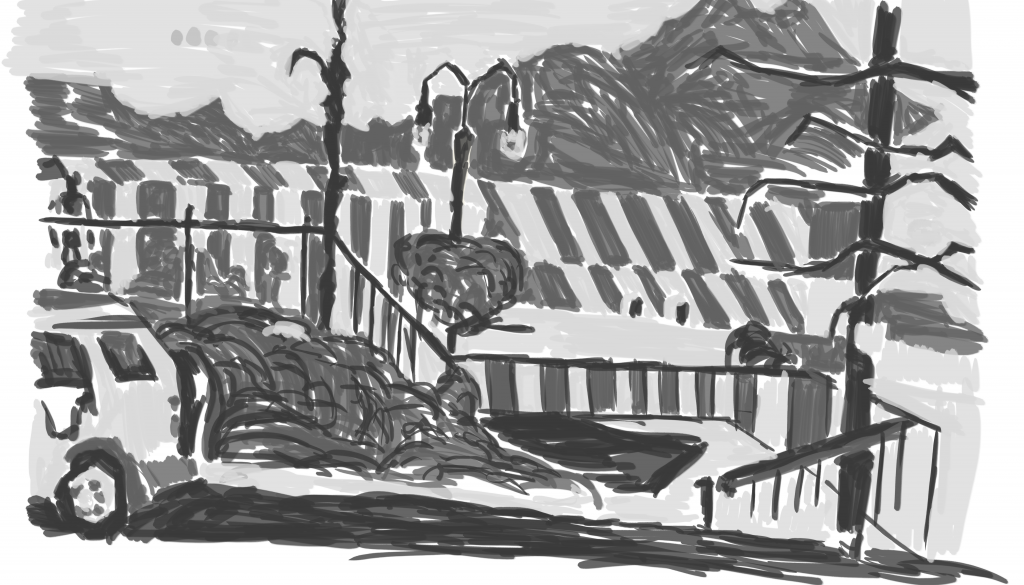 And tone added. I’m rather happy with this piece. I used the same brush on the whole thing, something that I should avoid. I guess using the same brushes causes me to have to use a range of different strokes in order to show the range of objects in the scene. The marks I did for the hills are completely different to the fence-posts and tiles on the buildings. Does the building need sharper edges? I decided not to do a color layer, though color can be added quickly.
Read more →
Continued with more digital painting today. I’ve been on such a roll it’s just worth getting plenty done. Recently I uploaded portrait and figure drawings I had done several years ago. I decided to take one of these into GIMP and digitize. Since I need more figure works to use in my environment works I decided against a portrait - though I may come back to some of the portraits later.
Here’s the painting - 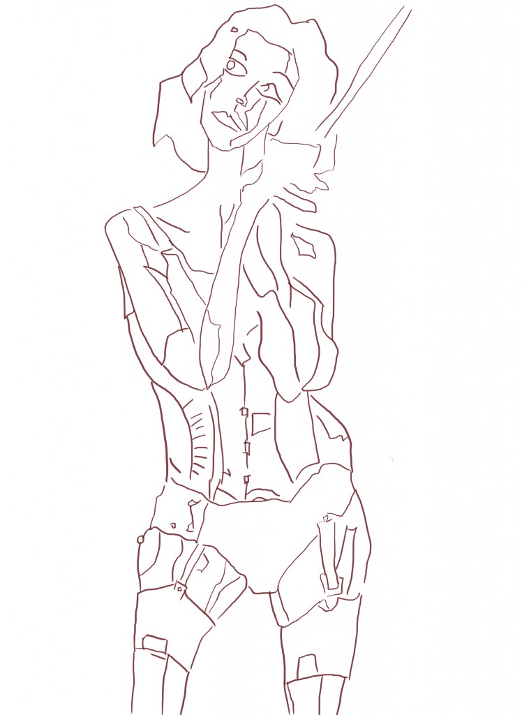
Line. Overall I’m happy with the line - especially from the elbows down, the level of detail is working. The arms are a bit strange - even on the reference not alot was happening with them and seems to be dark to hide features. 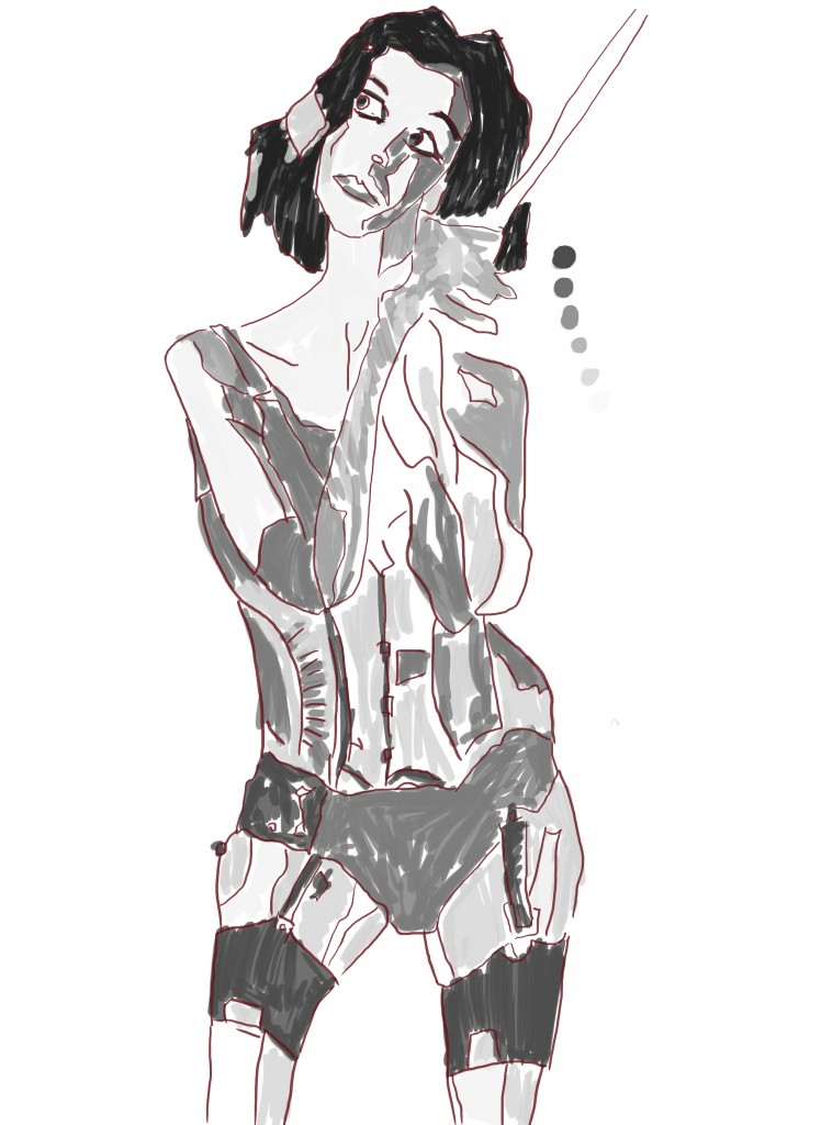
Grayscale tone added. The portrait looks great, I attempted to fix the arms somewhat by adding in a range of tone to them… I’m still not sure about them though. The chest and below has quite a steam punk feel to it.
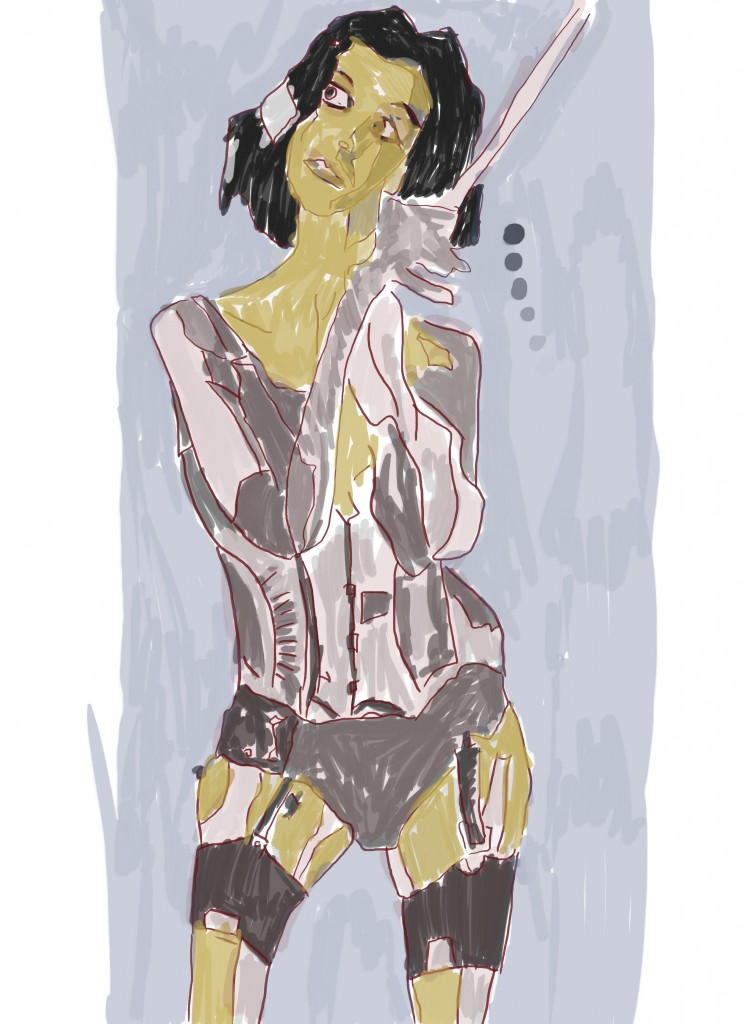
Color added. With the color layer I did something I had never done before in GIMP - used masks. With the mask I hid everything and then revealed it by painting. This allowed me to easily change the colors and have more control over the painting. I used this feature before in Photoshop… but that would of been a long time ago. I need to get into the practice of using layer masks for all my layer - line, gray scale, and color.
Read more →
Long walk today to St Lukes but afterwards I opened up GIMP and imported pencil works to work on.
I choose to work on two works - the first, a figure drawing I did during my time in Wellington last. Seems like such a long time ago now.
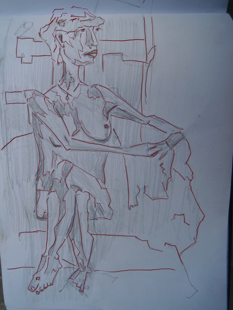
The line was created on the same layer as the drawing sadly. Normally I’m good at creating a new layer first - but this time I messed up. It’s alright. I normally don’t use the line for much but rather develop the painted layer further. I decided to draw the light and dark separates inside the figure rather than just tracing around. This makes it easier for the next stage…. 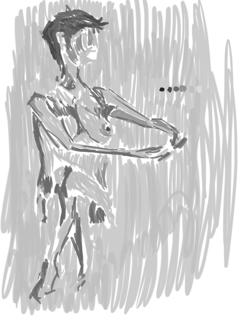 Black and white tone added. My favorite area is the top half, but I guess the bottom is interesting as well, how it fades into the background. Maybe some more dark in the bottom/right could help the contrast?
ok, onto the second painting I did today - 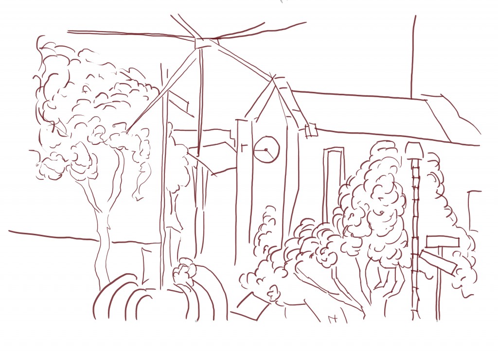 The reference for this was a drawing I did during my time in Napier visiting my Grandfather. It was one of my more successful drawings during the time. As you can see I didn’t make the same mistake as the previous work and it’s on a new layer. The detail is somewhat lower than some of the previous environmental works I have done. I had considered adding the right page drawing onto it - at one point I began scaling this image down in order to make room. I decided against it in the end, though I could mix other line drawings into this in the future and repaint.
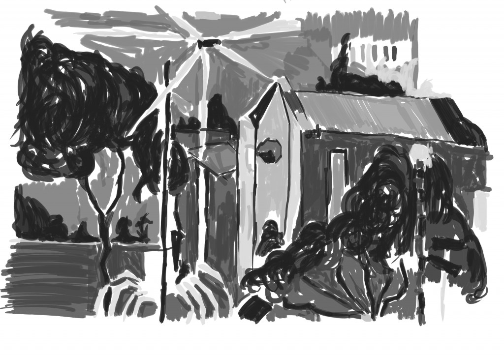 Gray-scale tone added. I used two brushes for this - the first a standard flat brush that offered no texture and the second a charcoal. I guess it’s good I’m trying new brushes, but maybe I should be making my own. I used the smooth brush on the Church and charcoal brush on the trees to give a contrast in the objects. For a long time I just kept with a single brush but looking at this I know it’s very important to create a range of textures using several different brushes.
You may notice there is no figure or other object to help show the scale. I added in some figure that I had recently painted.
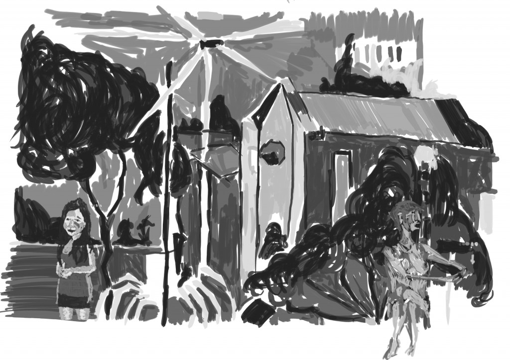 Ok. I played around with this for awhile, experimenting with scale and location of the figure. In this mock up I added Annabels figure to the left and scaled it large - in other versions I had scaled her right down and added her higher (where her face is currently). This didn’t look right and it worked bigger as a larger figure. I also tried adding the nude to this side of the page also but wasn’t happy - mostly because of the strange angle of the arms (still not happy about those arms). Added the nude to the right seems to work better.
I am going to the Auckland library today, I’ll look for concept art books for some inspiration.
Read more →

Read more →
So it’s been sometime since I’ve done digital painting. I did plenty of it last year and felt I improved greatly. This year it’s my goal to produce even more paintings. With already almost a week into the new year I thought I’d better get onto it.
Sorted though my sketch book drawings I took them into GIMP and began a paint over process. Here’s what I’ve done so far:
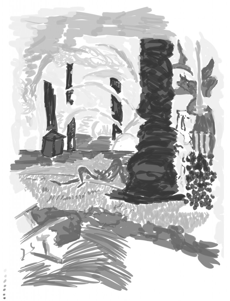 This was one of my favorite drawings I did during my time in Napier. I had attempted to digital it in the past but was not in the mood. Having a holiday from the digital painting felt good, I felt refreshed.
Sadly I wasn’t able to use my favorite custom brushes in GIMP as they are only on my desktop, and I only have my laptop with me in Auckland. Once I’m home I’ll transfer the brushes onto the desktop.
My favorite area of this painting is the right side, with the large tree trunk I managed to create a interested texture (working 80% opacity). And the pole to the right of it worked out well. I created textures by using a range of difference marks - for example to create the hedge I used a dot action. This is something I want to explore further this year. 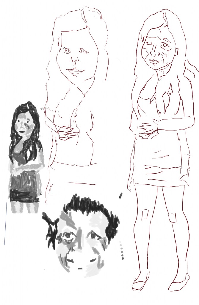 I received a new camera for Xmas. Decided to upload the photos I take to FreshFigure.com/art: Stock Photography. These photos are licences under creative commons so feel free to do what you like with them, but I’d love to hear about it.
I used a several of the photos I had taken to do some figure and portrait studies. It had been sometime since I had worked like this and I think it’s always important to keep up with studies of people. The process is the same as always - red line, followed by gray scale tone. 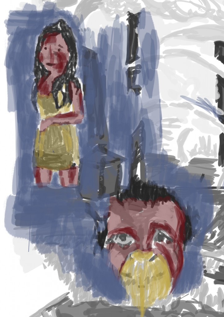 Here I added the figure and portrait to the Napier painted scene. I played around somewhat with scale and composition I’l keep working on it. I also did a quick color paint over - red for the skin, yellow clothes, and blue for the background. For my Mums portrait I worked different - adding the yellow into the mouth area. Adds somewhat of a horror effect - something out of Hannibal maybe?
That’s all for now. I now have no excuse to work on a digital painting everyday and upload it - I have plenty of reference photos and drawings to work from.
Almost forgot - I’ve recorded these paintings but have problems with Movie Maker on my laptop so unable to upload to youtube. Once I’m home (later this week) I’ll get them uploaded. I think it’s better that I just get paintings done even if I don’t get everything recorded than not paint.
Stay cool honey bun.
Read more →
Uploading a bunch of photos from my Mothers computer. All of these are very old - drawn in 2008/2009. I’ve uploaded 160 artworks so will take sometime to work though them, for now I’ll post some portrait focused works.
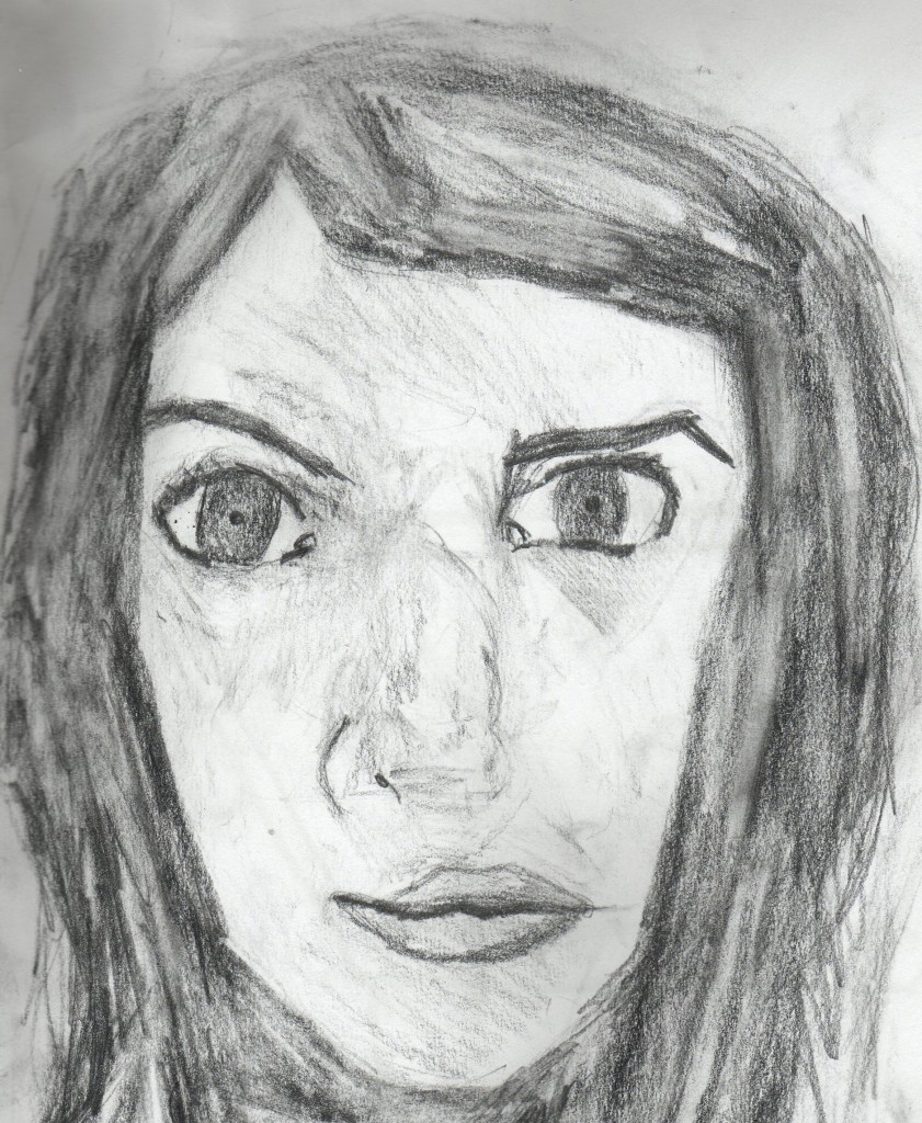 My style has developed greatly since this. No longer do I use a 2b or softer pencil, instead keeping with a HB pencil in order to show the details of the line. Contrast in this is strong, between the lights and the dark One thing I’ve developed is working soft and building up. I tend to not work so dark as here.
 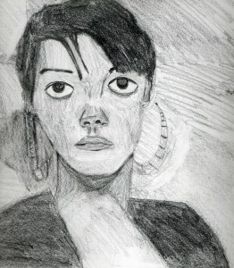 Lily Allen. I’ve always enjoyed drawing Lily Allen. The eyes look somewhat wonky in this, with the right eye being higher than the left. My measuring skills have certainly improved with my increased observational skills.
 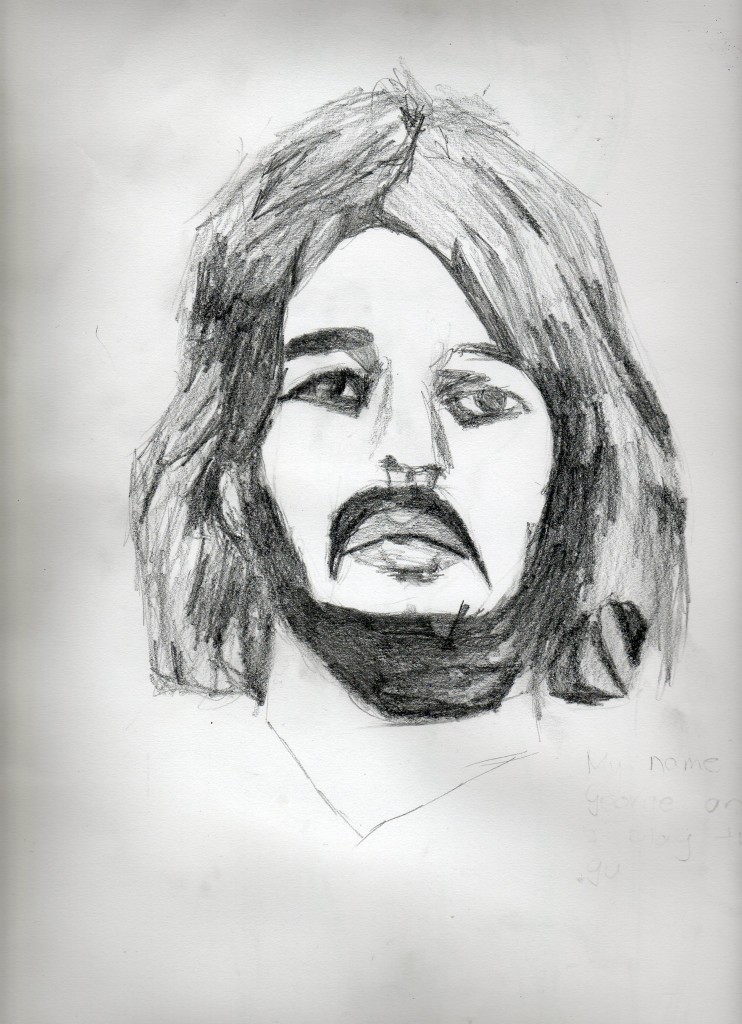 Ringo Starr. I see he’s coming to Auckland later this year. Spotted posters for it around Auckland. Certainly a concert I wouldn’t see. I would of enjoyed drawing that beard.
 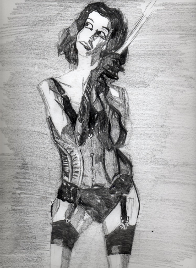 This was drawn with using a stock image as reference from DeviantArt.com. Very strong contrast between the lights and dark…. nowadays I wouldn’t leave areas white but rather color with light amounts of
 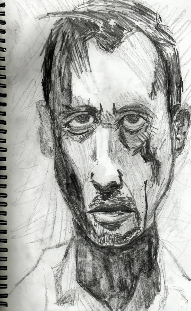 Prison Break. Again the dark really stands out to me. I’m not sure I could do something like this anymore. I guess I’ve finished my angry teenage years and now create more subtle, pieceful works. I still age people 20+ years when I draw them.
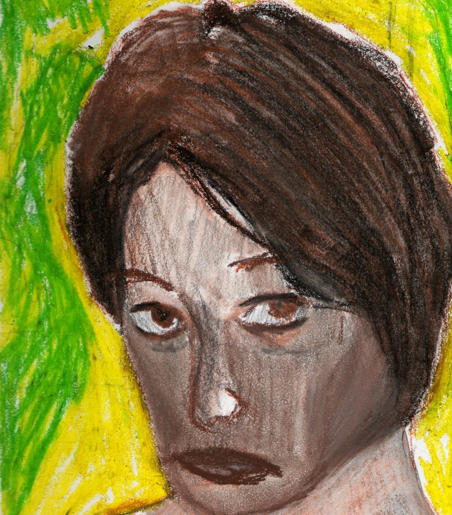 L oretta from Outrageous Fortune. This was mixed media. Pencil for the portrait, then layered with brown and black chalk conta. I rarely used this media as I didn’t enjoy the smudge it caused. Pencil is the future.
 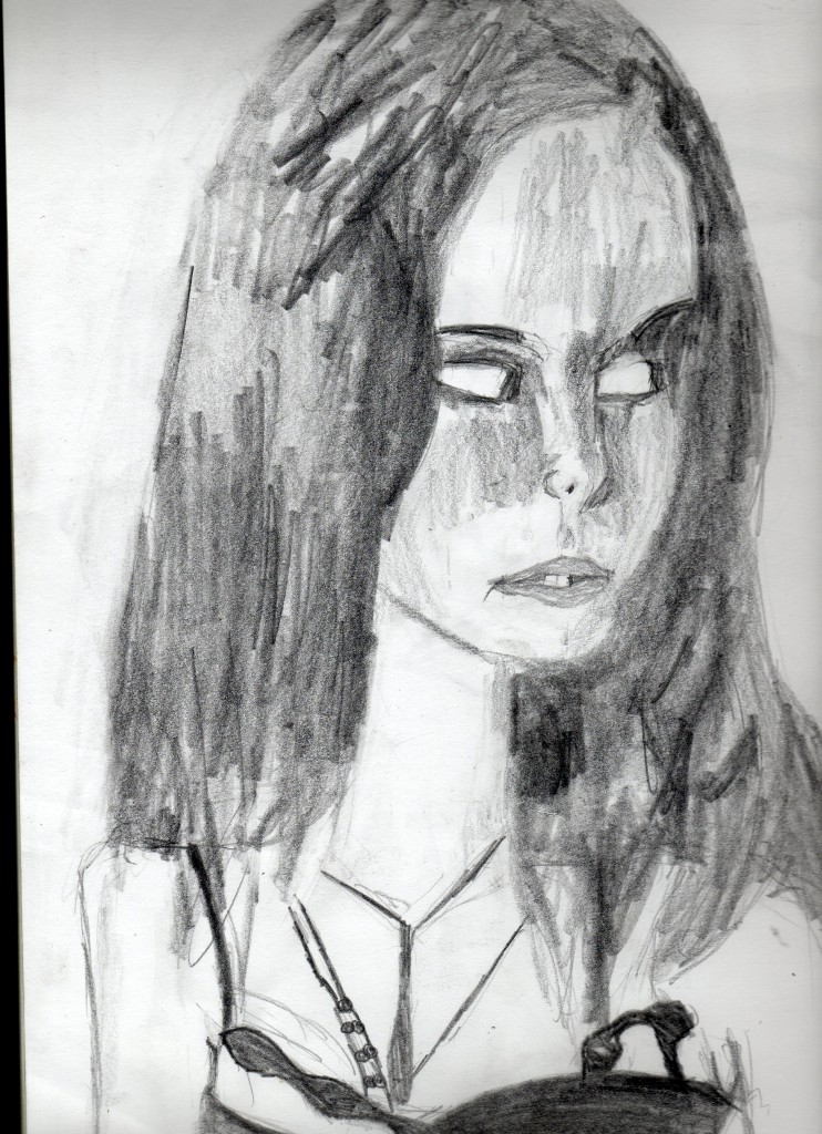 A hh classic. Effy from Skins. This will always be one of my favorite portraits for this period of time. I love Effy.
 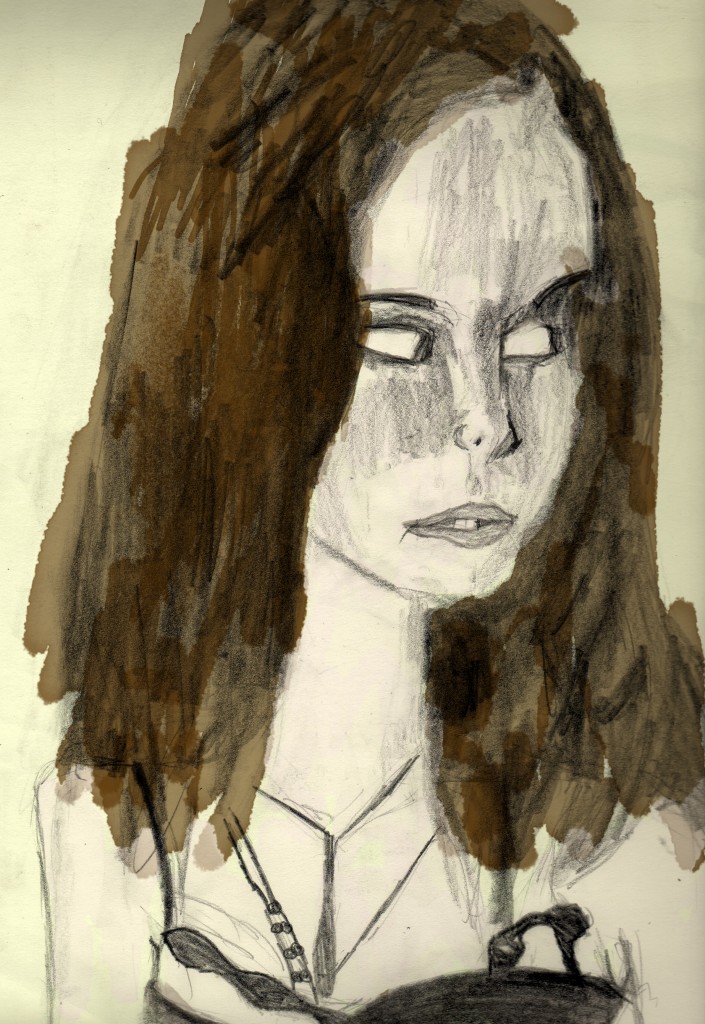 Here I took the Effy portrait into Photoshop and painted over with a watercolor look.
 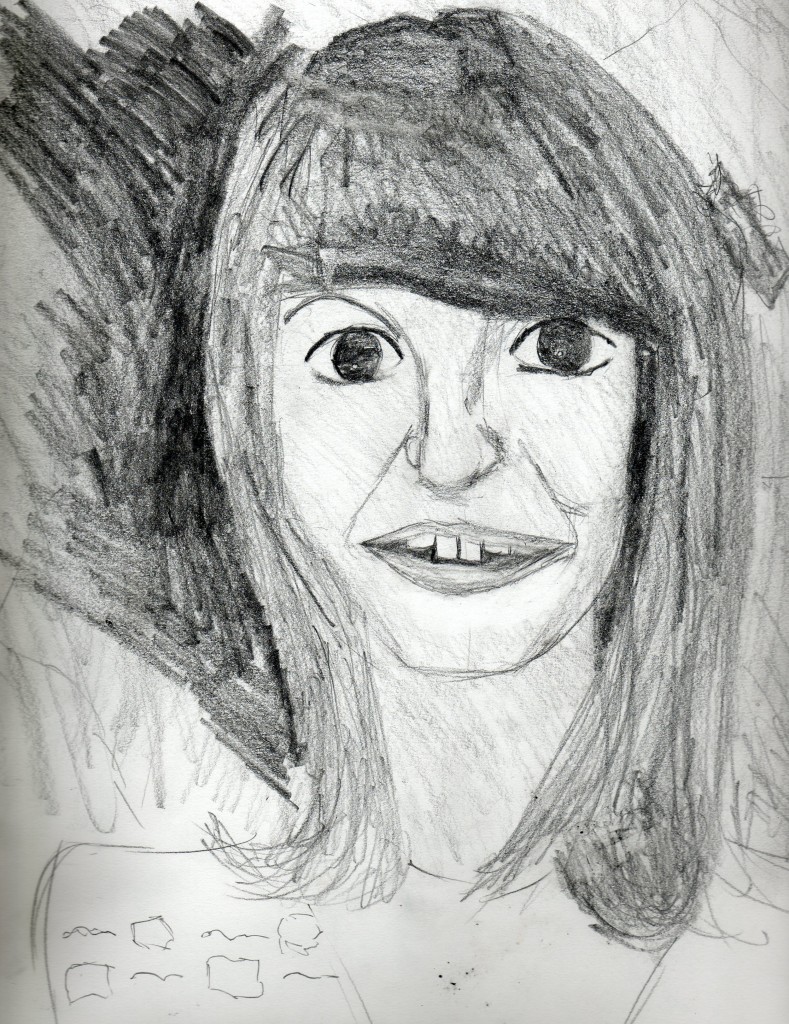 Another Skins portrait. This one is of Emily from season 3 and 4. I like it how I left areas unfinished - around the bottom of the neck. I continued this idea with life drawing.
 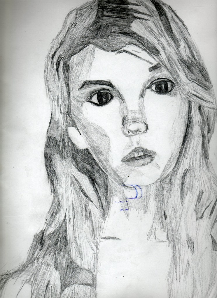 ' oh wow lovely'. Cassie from seasons one and two. This was drawn with a HB mechanical pencil - which allows for much finer lines than previous drawings here. I was given this pencil during my time at the Palmerston North School of Design. I like the blocky shapes created in this portrait.
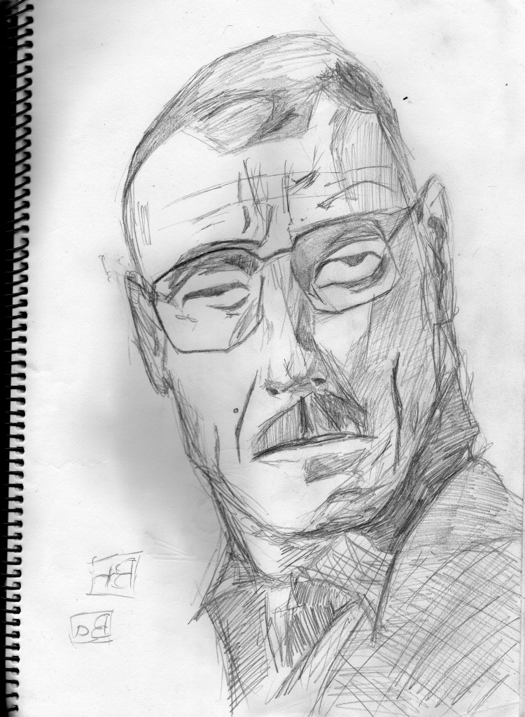
Breaking Bad. Walter White. As you can see the line is becoming more ovious - but it’s still lacking balanced tone in areas.

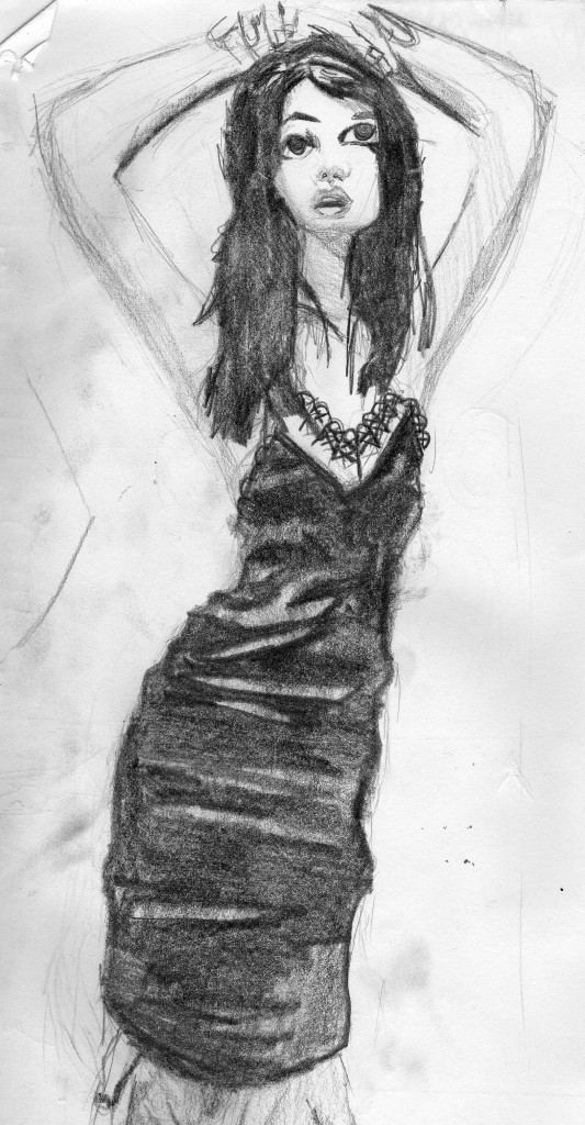
Her dress and hair are very dark, with minimal tone on the arm area. The reference for this would of been a deviantart.com stock image.
That’s all for now. Have a great new year.
Read more →
I’m currently in Auckland. I got a new camera for xmas so able to take plenty of photos. So far I’ve taken over 1500.
When away on holiday like this I don’t spend much time on the computer but here are drawings that I have done recently: 
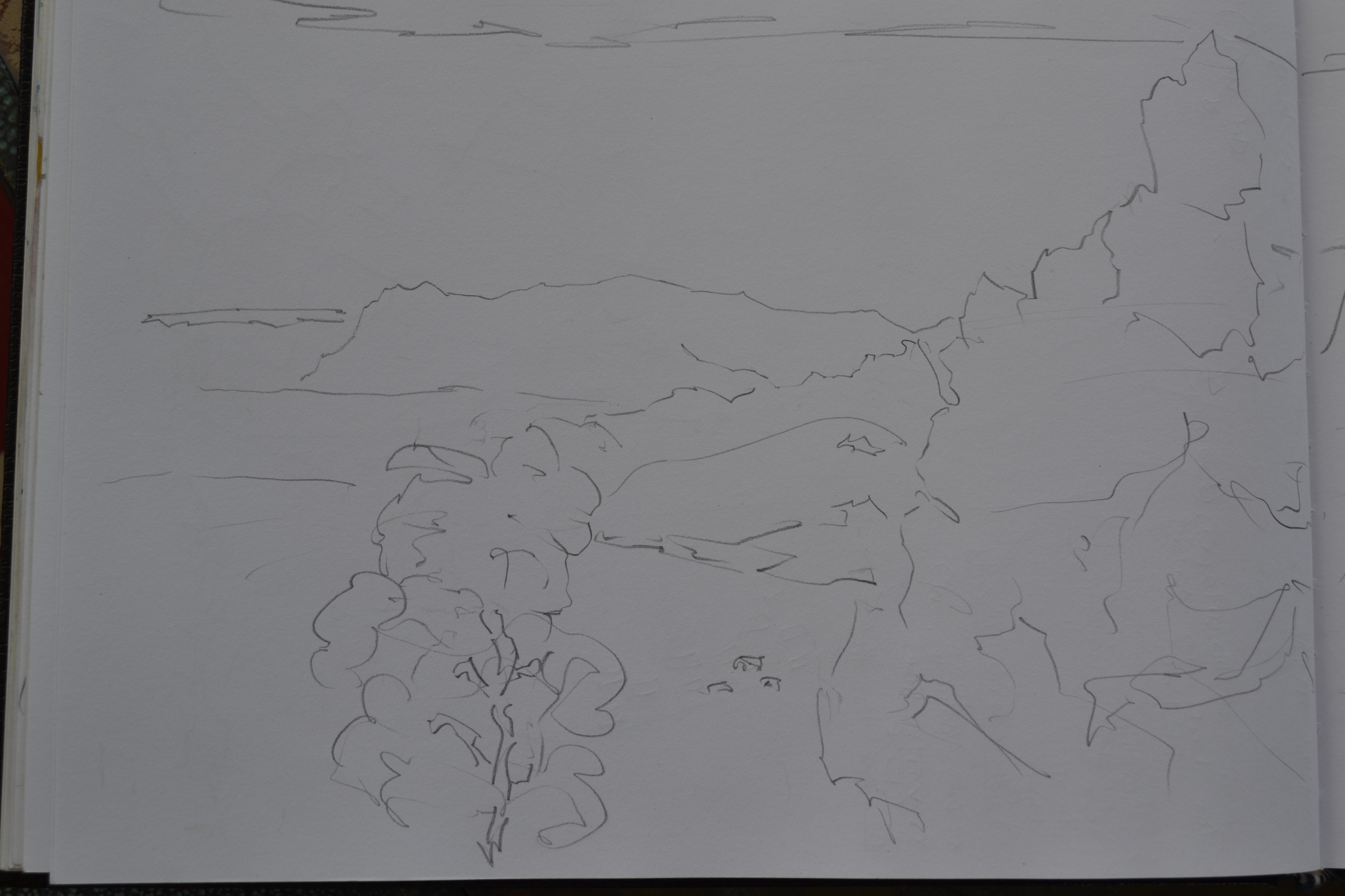
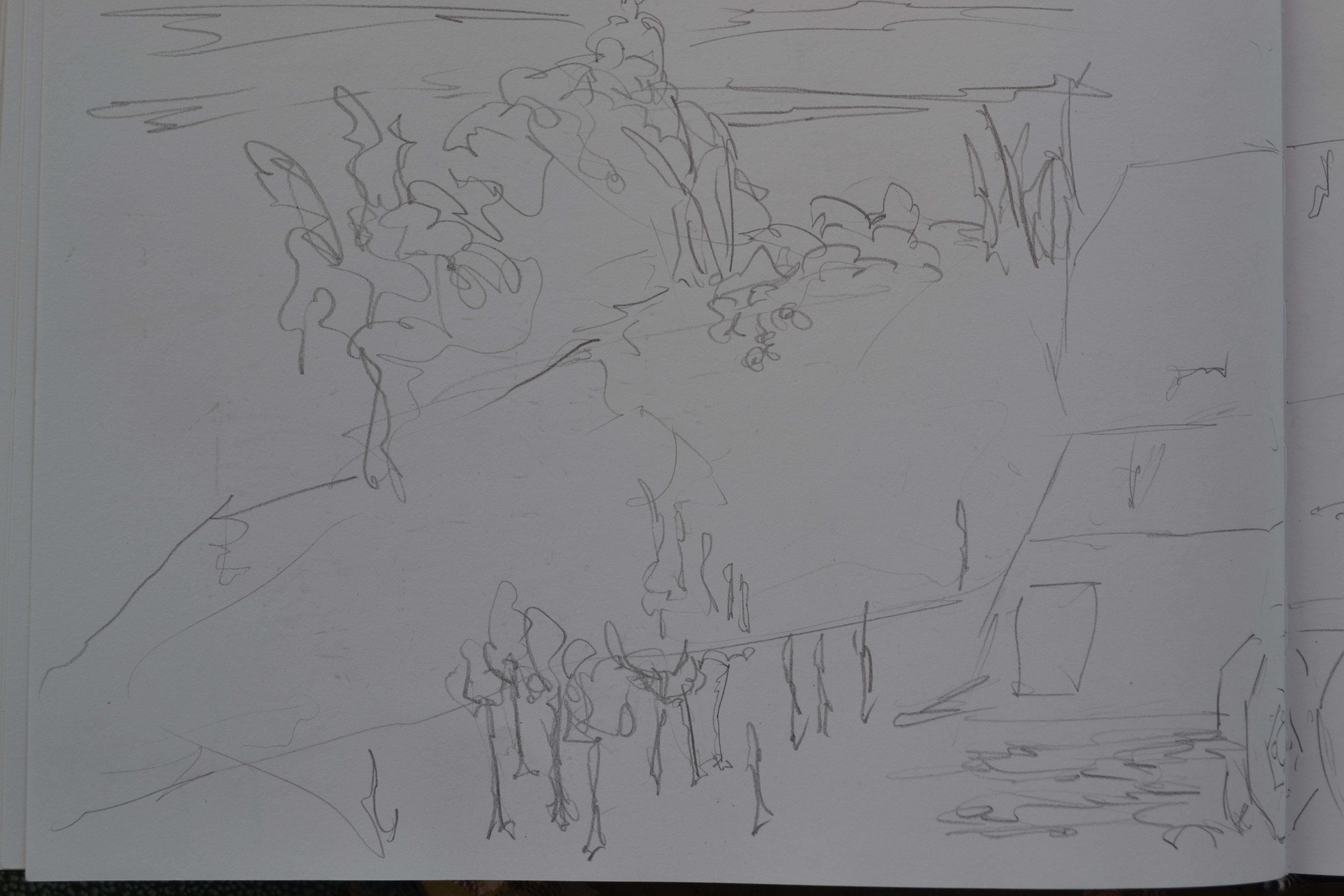
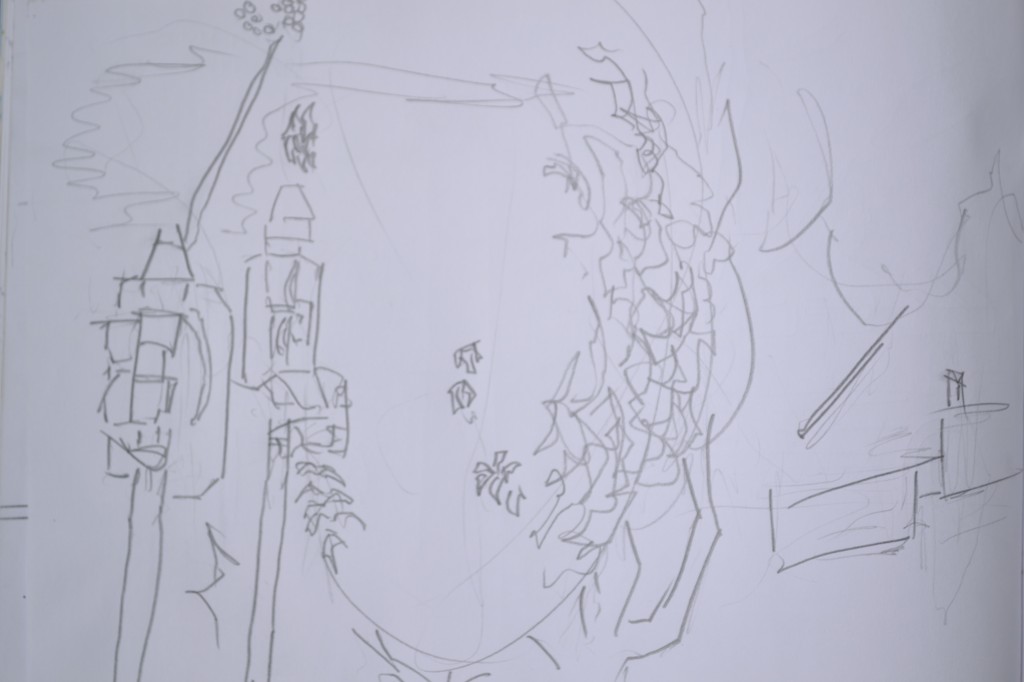
View of the hills from my Mothers home in Poringa. I didn’t get much drawing done over xmas, instead I spent the majority of the time on the computer working with pygame. Over the past few day’s I have been taking plently of photos of enviorments that I plan to use in my artwork somehow. So the drawing has been low. 
The other side of the page. Very minimal lines in this. I’m not sure if I will do much with it. It’s quite boring. 
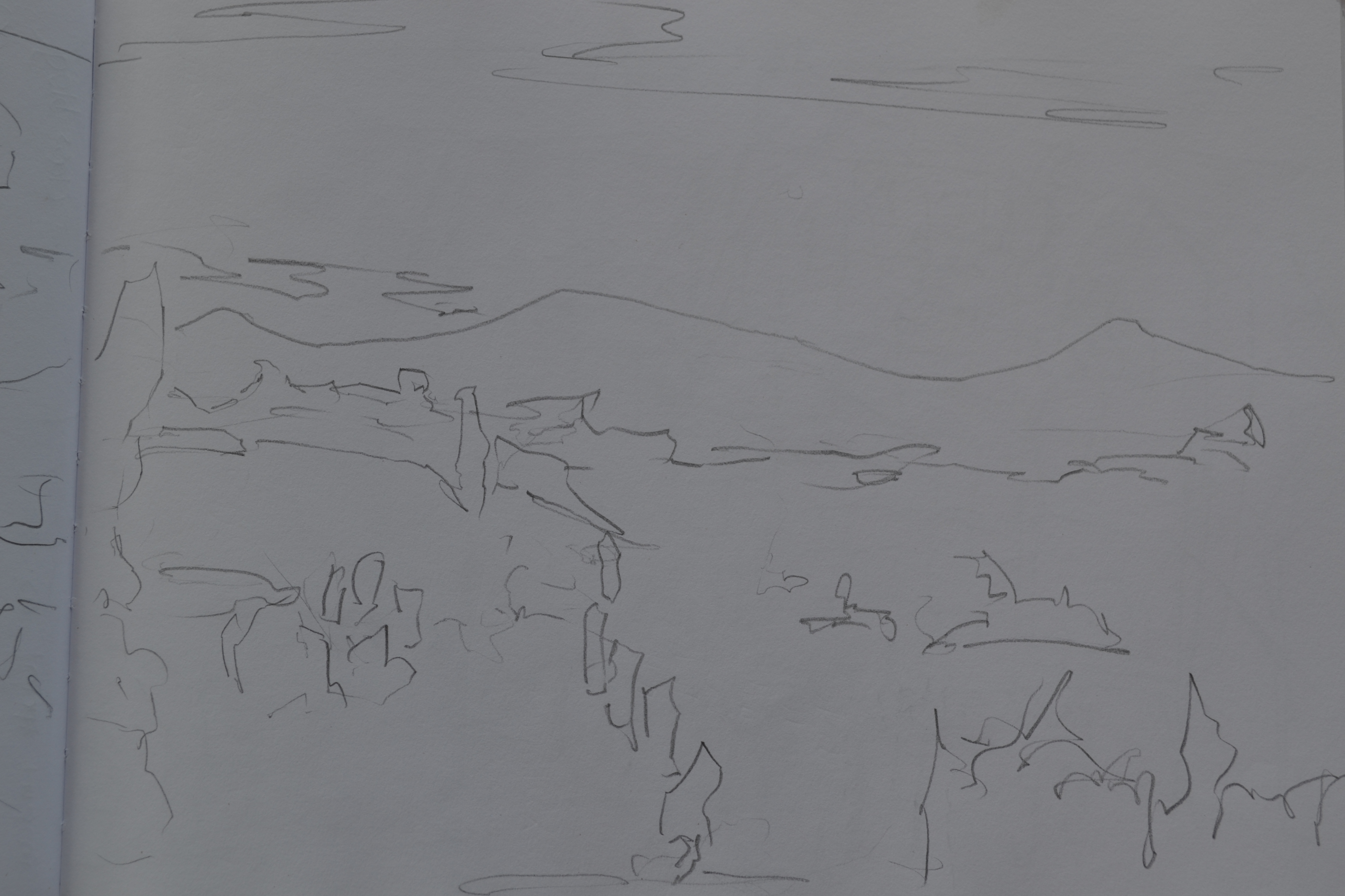
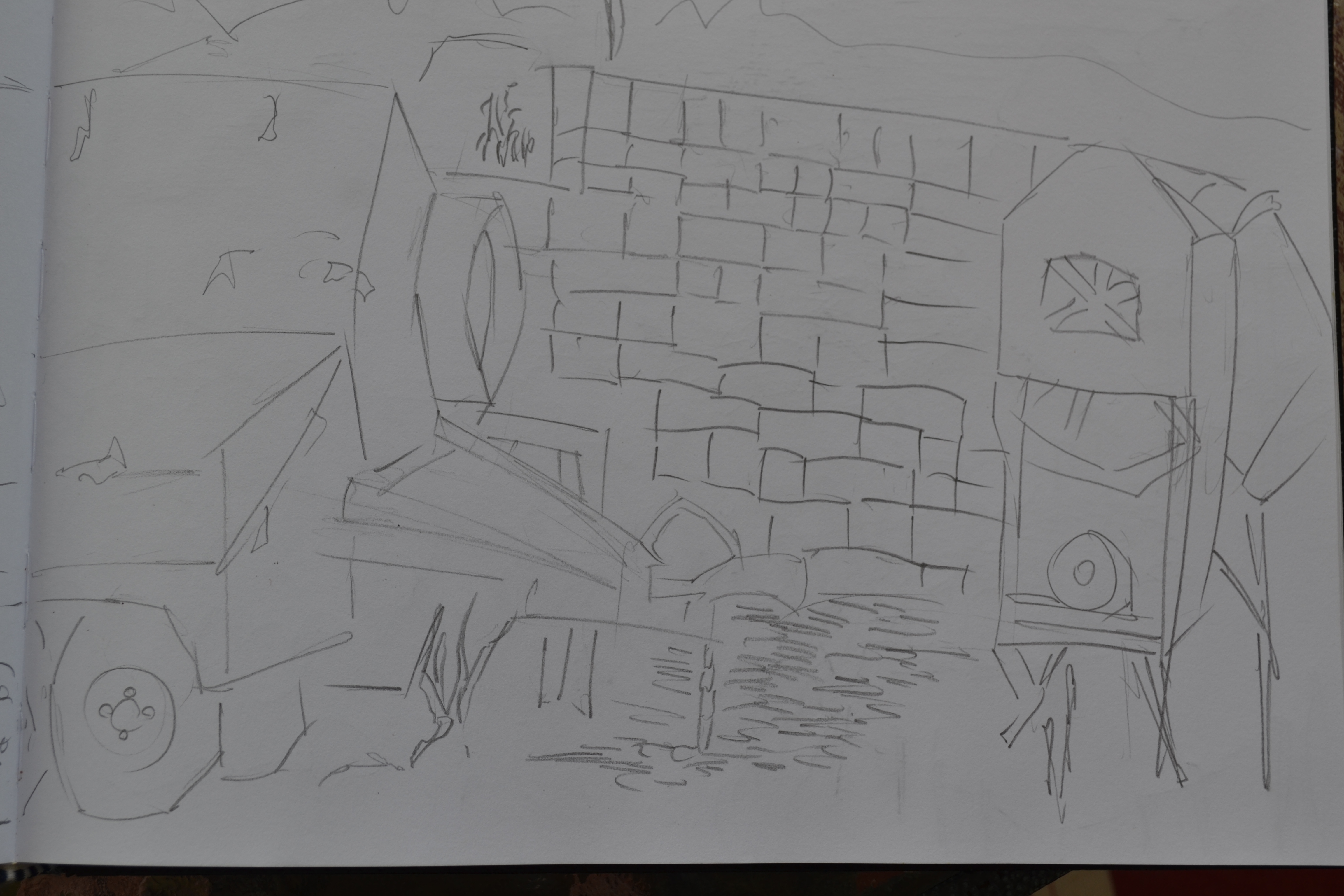
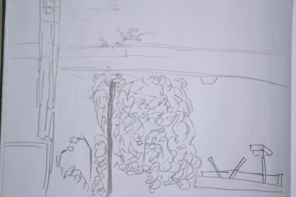
Another view from Mums home. This was a closer view. To the right is a concrete mixer, very top the sky, and below vegetation. 
I’m happier with this one. Far more structure to the piece. The concrete mixer was fun to draw. It was similar to drawing cars, but a different shape. To the right of the mixer, a concrete wall in progress. Bottom is grass. I used a straight line vertical stroke to show this. I only drew part of the grass so repeating mindless tasks like this calls for a for loop. Here’s dreaming.

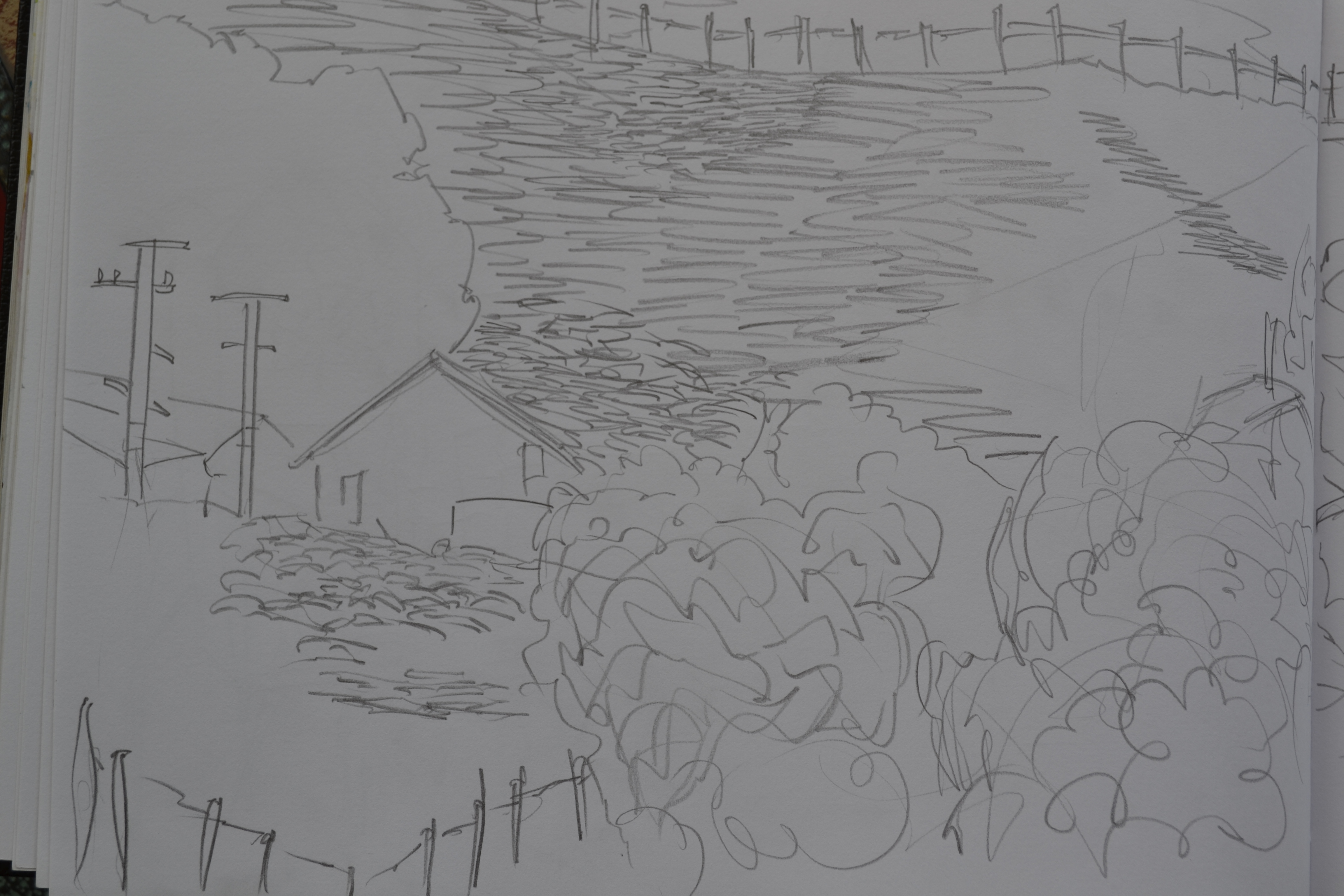
Another drawing of Poringa. I started with drawing part of the neighbors house and drew vegetation fences and the hill behind it. A fence ran all the way across the top of the fence.
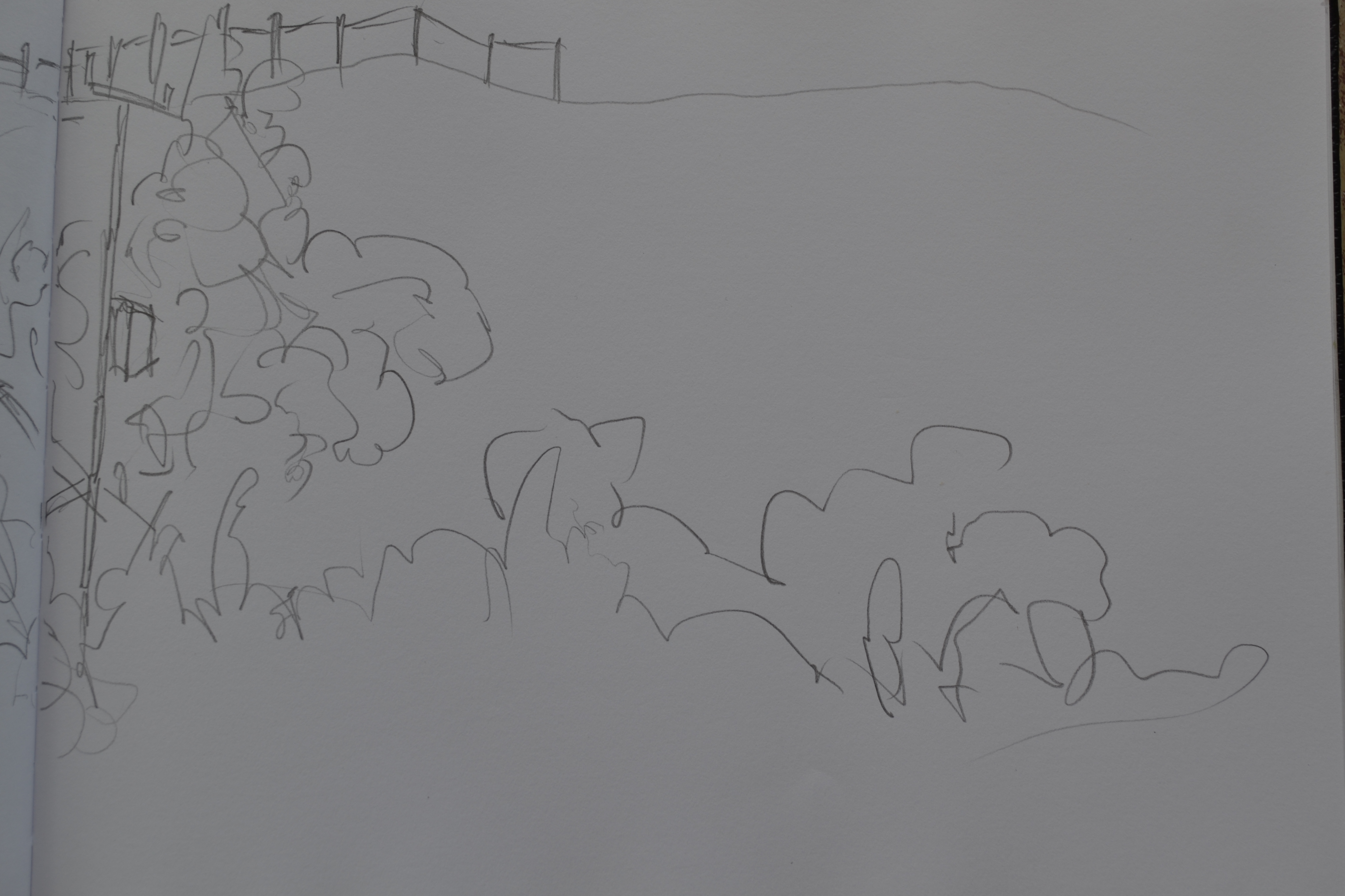
 Right side of the previous drawing. Not as much happening here, I guess I lost interest and went inside to the computer. The very left is a power pole, followed by vegetation At the top the fence continues along The hill twists and turns.
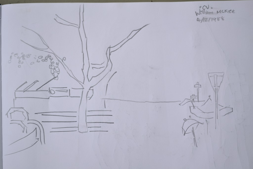
 This was a drawing I did in Hamilton. I spent the day there before traveling to Auckland. Nothing much happening here. Lets move on.
  Another Hamilton drawing. Again, very minimal. I wasn’t really in the mood for drawing so closed the book and walked.

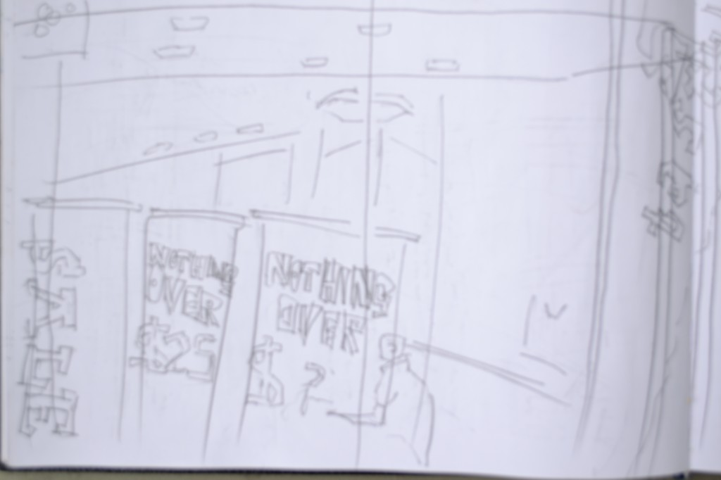
 This was drawn in Hamilton at the base. My Mother, Sister went shopping and I was free for several hours to draw and look around the shops. It was a beautiful day in Hamilton and I enjoyed drawing the store fronts. This is a drawing of a clothing shop well drinking a glass of water and eating a scone.
This will do for now
Read more →
Blogs been neglected somewhat. I’ve been busy with Python lately - creating stuff with pygame.
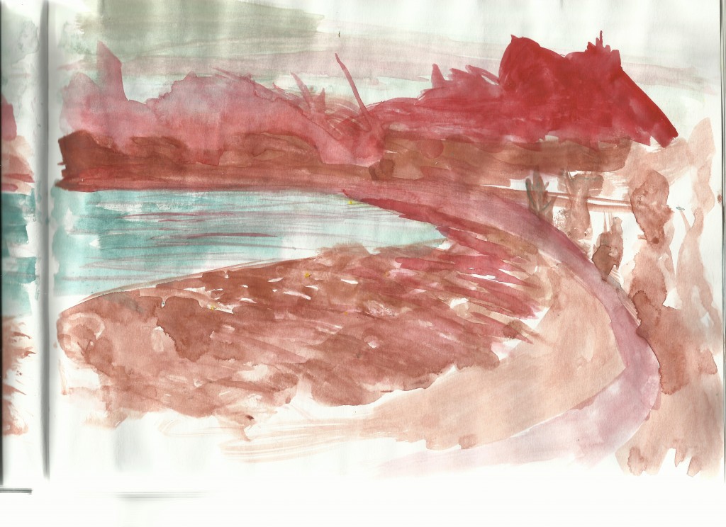
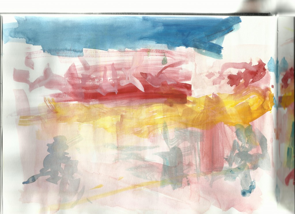
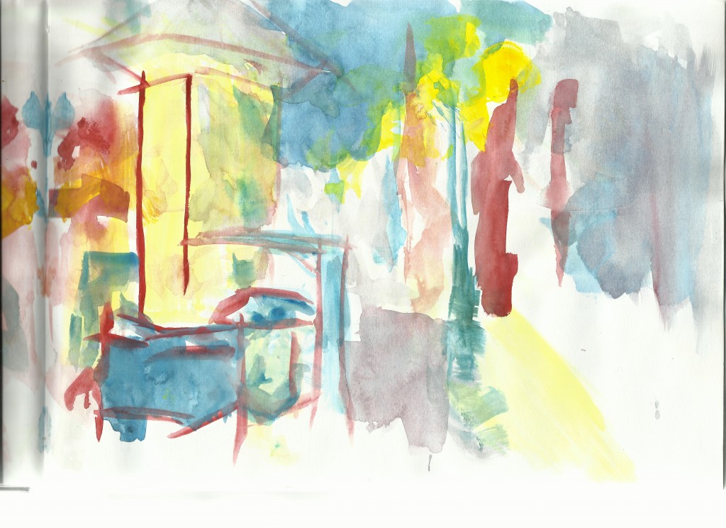
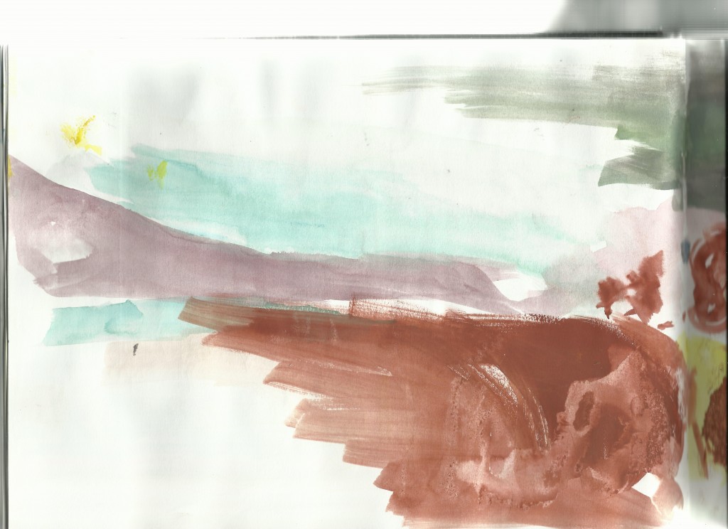
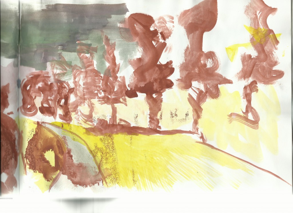
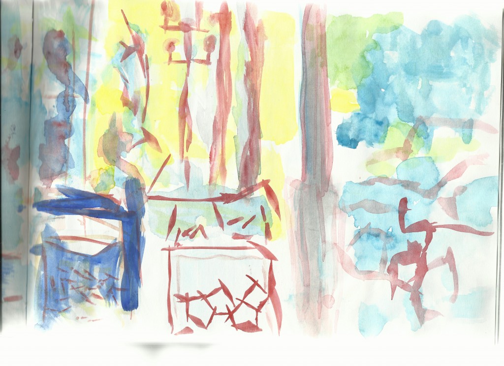
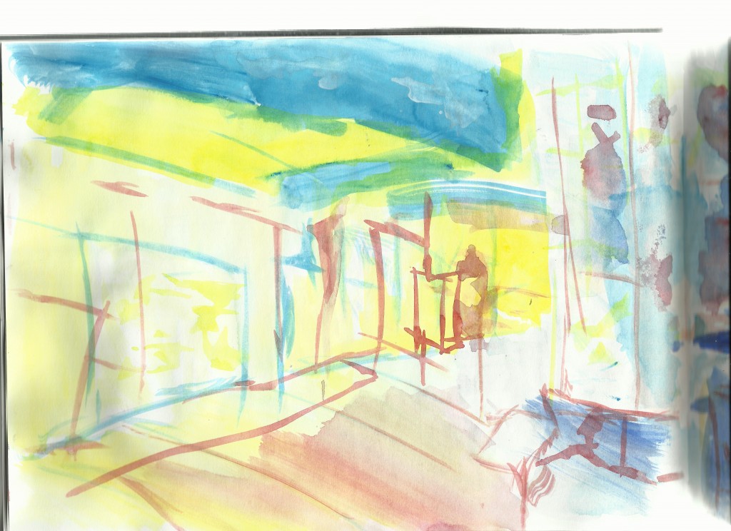
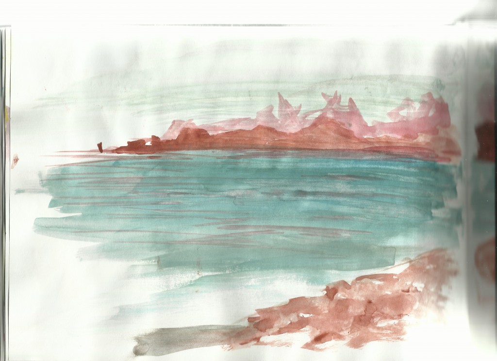
Here are paintings I did from life during my time in Napier.

Everyday I went for a walk when I was in Napier. Majority of these walks were into town - to the waterfront. It was very hot during the day so the evening was the best time for me to be outside - it didn’t get dark till late. 
I painted the same landscape multiply times - the view was South. This was one of my first ones - where I’m still warming up 
This was one of my first paintings I did in Napier. I did this outside a suburbs shops - so not directly in town. The paper only handles one layer of paint - I really should be using thicker paper. 
My least favorite out of the lot.

Right side of the previous painting. Capturing the trees scaling into the foreground. A nice blue would help. 
One of the major differences I notice with painting is the lack of detail I’m able to get - with drawing I can capture small drawings - painting tends to be more of a impression. I think I will always enjoy drawing more. 
Another street view. Paints great with how quickly it spreads. Roger always said ‘painting is easier because it spreads quickly’ when comparing it to painting. Very true - I can cover more of a area with paint than draw and not get tired. 
This was a favorite landscape. The reds in the sea helps.
That’s all for now folks.
Read more →

 Color. I dropped opacity to 30% and covered the skin with yellow. Next was red for the darks (just laying over that yellow). Finally I used two shades of blue for the back wall and a green for the floor.


 Line added. I didn’t add anything to the line but rather just traced over. Looking at it I think I could of continued the fence posts at the top across - to mix the two drawings further. The bus in the center was extended somewhat to help this. Next up, some tone added:
 The reference I used for this is a pencil sketch drawn in Levin - at the skate park. I’ll be back in Levin tomorrow so will try to get out and draw the town again. Despite being such a small town I always enjoyed getting outside and drawing. Normally I don’t add so much line to the vegetation - but I did on this. Maybe I should have a go at using different colors for the line version? Getting layer masks working would help with this.


 This was one of my favorite drawings I did during my time in Napier. I had attempted to digital it in the past but was not in the mood. Having a holiday from the digital painting felt good, I felt refreshed.

 My style has developed greatly since this. No longer do I use a 2b or softer pencil, instead keeping with a HB pencil in order to show the details of the line. Contrast in this is strong, between the lights and the dark One thing I’ve developed is working soft and building up. I tend to not work so dark as here.
  Lily Allen. I’ve always enjoyed drawing Lily Allen. The eyes look somewhat wonky in this, with the right eye being higher than the left. My measuring skills have certainly improved with my increased observational skills.
  Ringo Starr. I see he’s coming to Auckland later this year. Spotted posters for it around Auckland. Certainly a concert I wouldn’t see. I would of enjoyed drawing that beard.
 Prison Break. Again the dark really stands out to me. I’m not sure I could do something like this anymore. I guess I’ve finished my angry teenage years and now create more subtle, pieceful works. I still age people 20+ years when I draw them.
 L
L
 Here I took the Effy portrait into Photoshop and painted over with a watercolor look.
 '
'