 Now for something completely different.
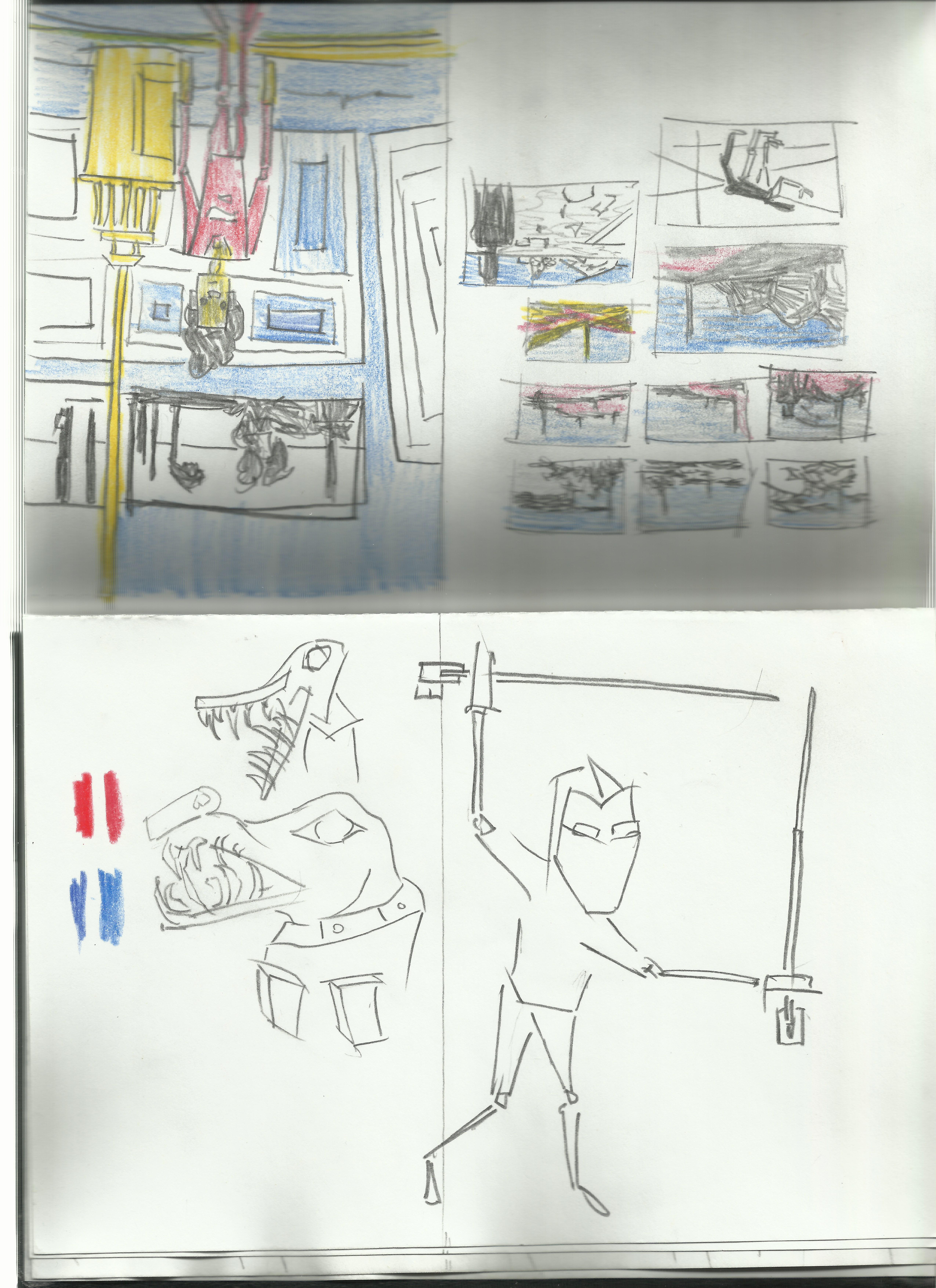
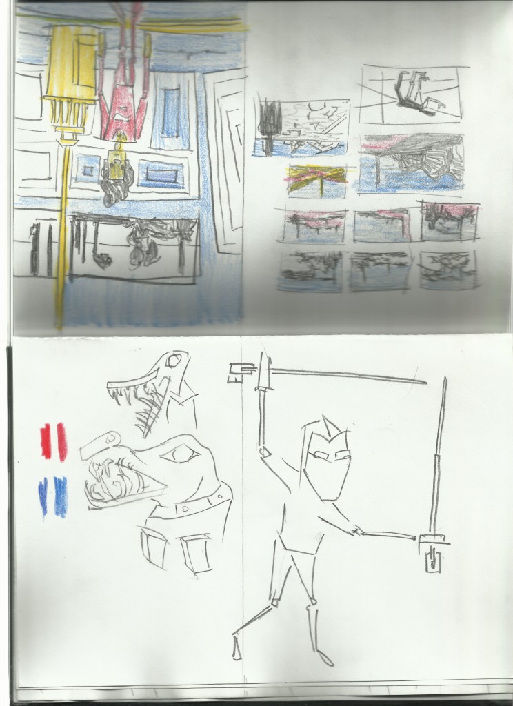
I was inspired by PixelTuners video that I watched earlier this week decided to open Alchemy (was happily surprised to find it on the desktop). The focus was create interesting landscapes from imagination Later I would like to take these into GIMP and develop them further - maybe use them as brushes and such.
I’ve recorded a video of the process but also included images. Enjoy
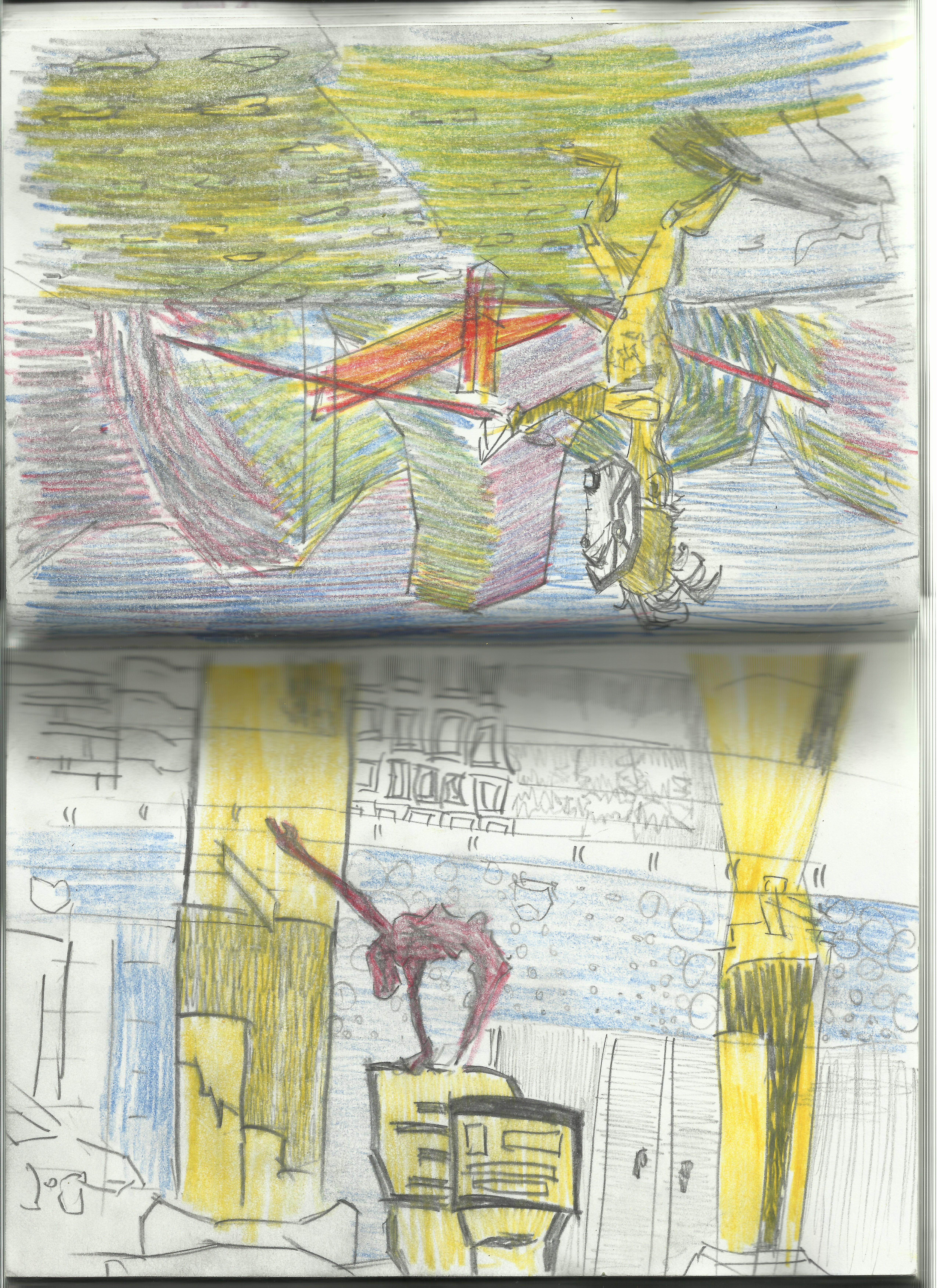
 The bottom left is working well, I like the cut up transparency look. Looks like mountains in the distance!
 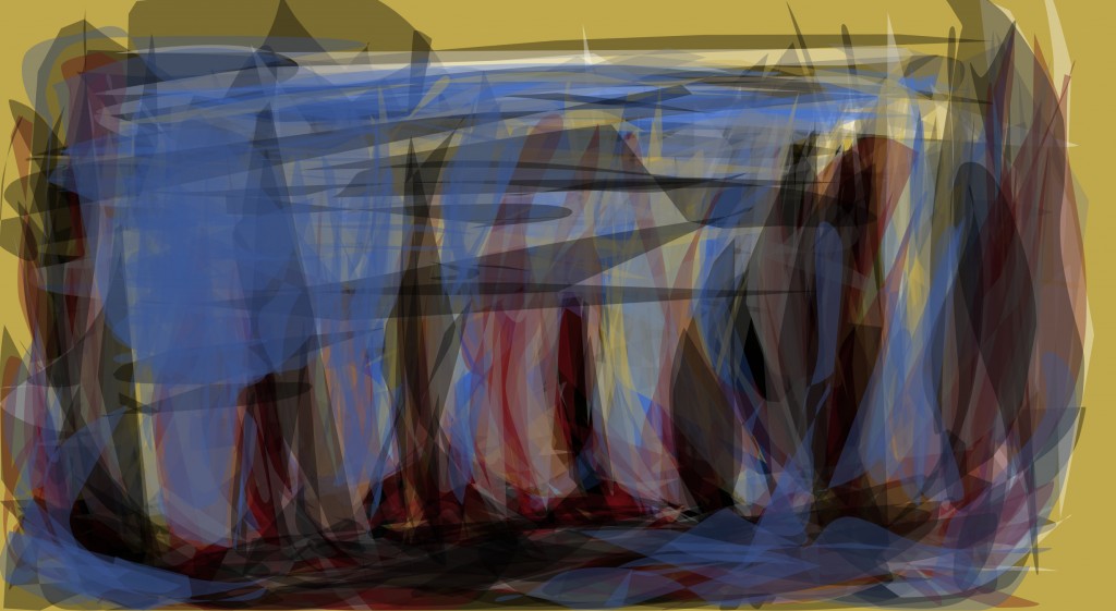 Flat but the colors are interesting. I especially enjoy the yellow and red reaction with one another.
 Attempt to get some perspective into the work. The black scaling off into the distance looks like figures. Not sure how I feel about the left - the large blob of black feels out of place.
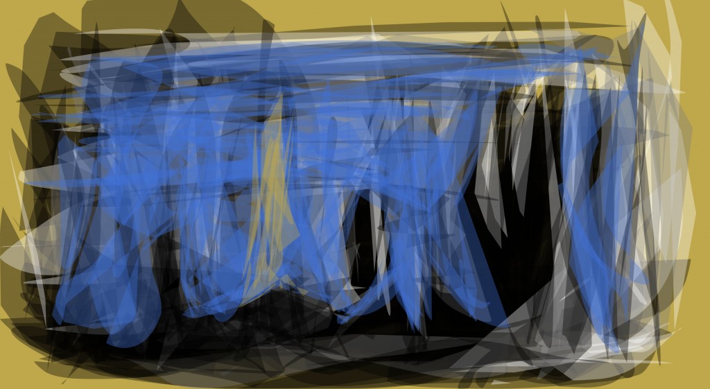
 Earier version with no blue. I like the sharp directional shapes that are being created.
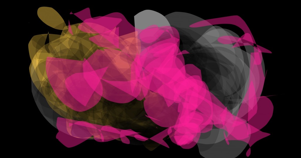
 Some interesting shapes here. But most of all I enjoy the colors.
  Surrounded by blue.
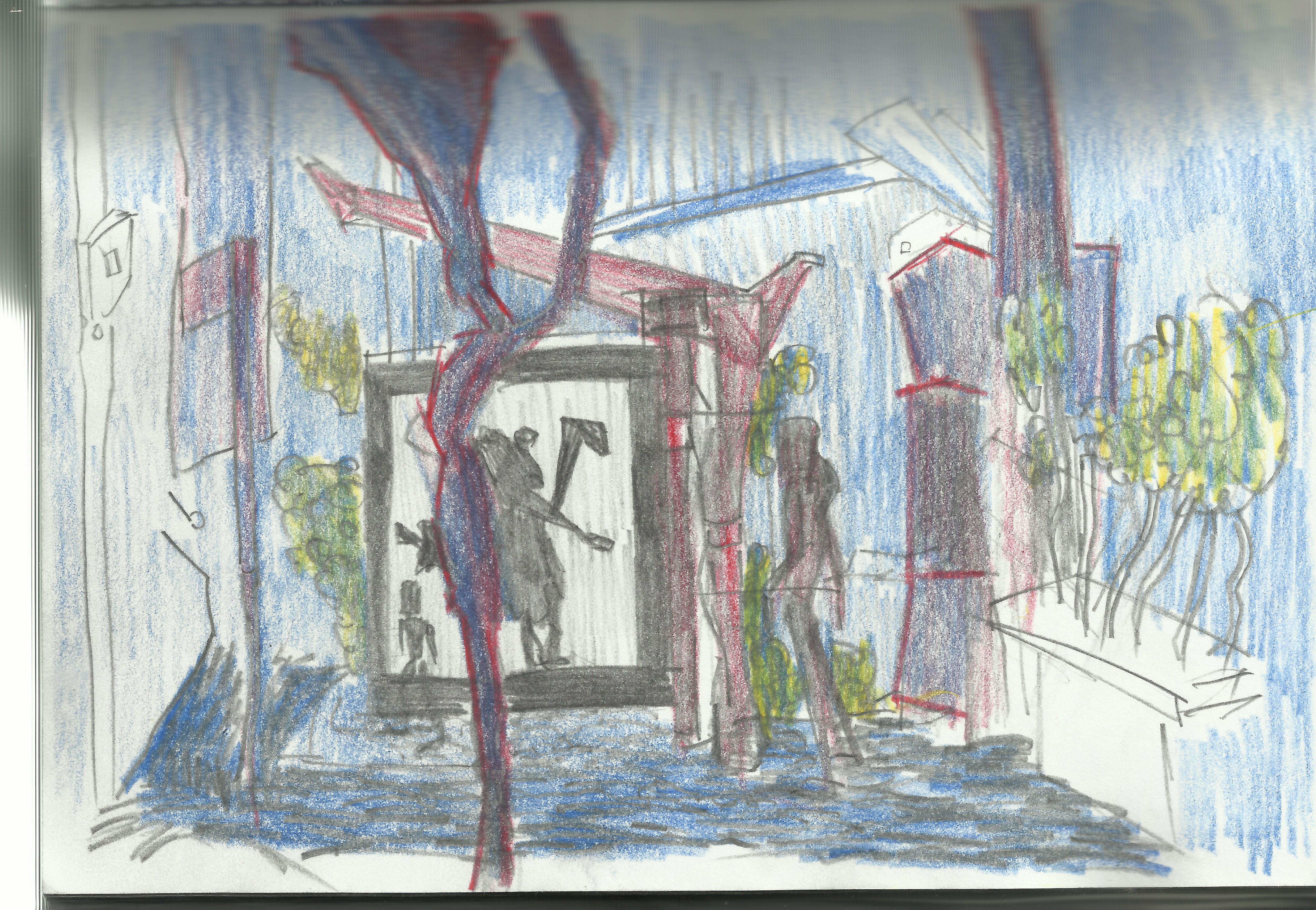
  I used the black in the foreground in order to give the image some depth. One of my favorites.
And finally - the video:
Read more →
I’ve decided to change my video settings to 1080 up from 720. The quality is worth it. I’m not partically happy with this painting but happy that I’m trying new things in GIMP - full screen and color palattes.
The fuzziness is frustrating me, I need to go look at tutorials instead of making the same mistakes.
I watched this video today. The other day as I was walking to my Mums place I did quick thumbnail sketches in my visual diary. I need to work with thumbnails more. I’ve used the program alchemy before - zzit was a few years ago now. Watching this video has motivated me to re-install on my desktop - I only ever had it on my old mac laptop.
Anyway, here’s the painting I did today.
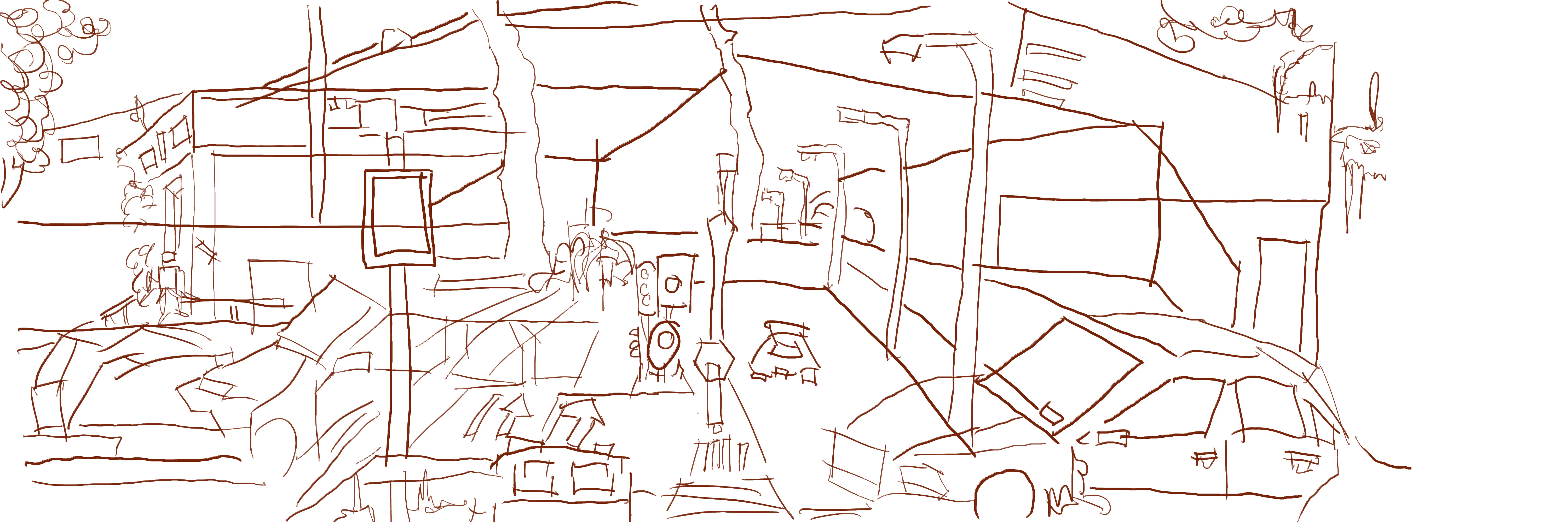
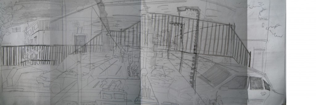
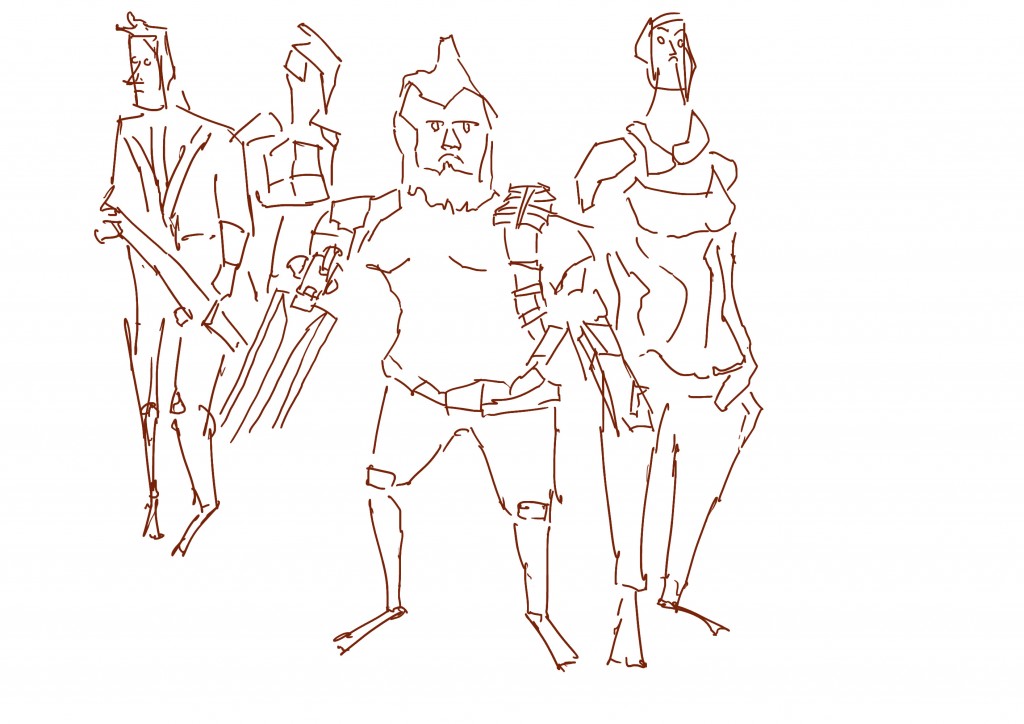
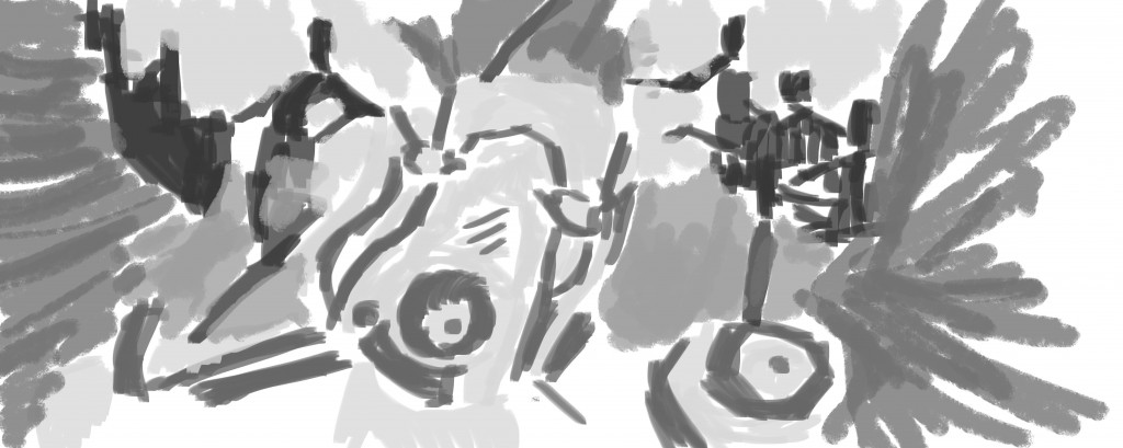
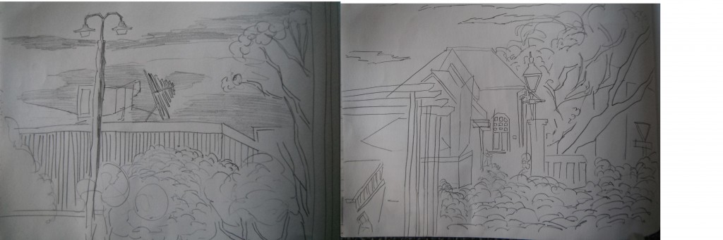
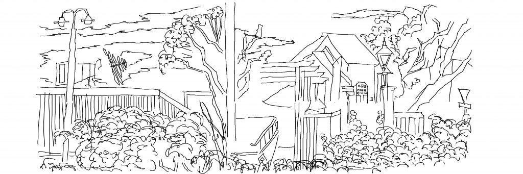
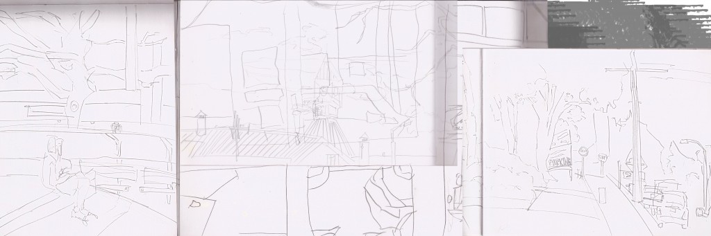
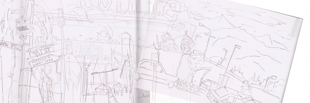 Reference I started with. A mashup of drawings from Wellington and Levin. I decided to rotate the image on the right to give the image an interesting angle - in the past I’ve only scaled and mirrored.
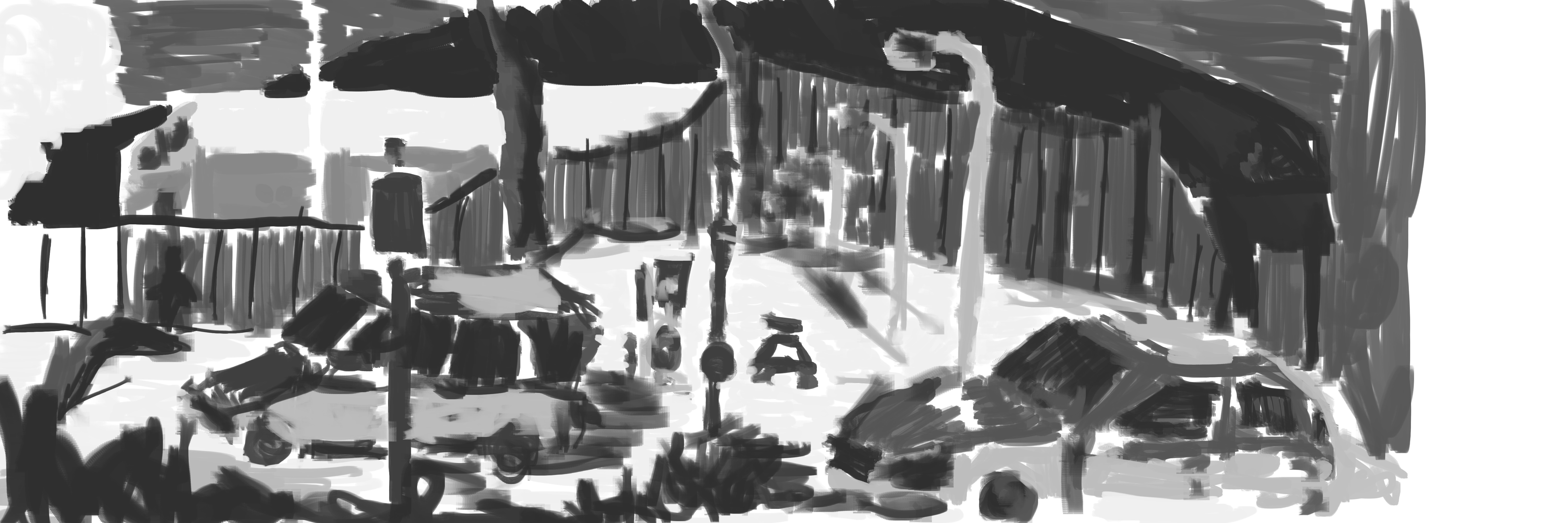
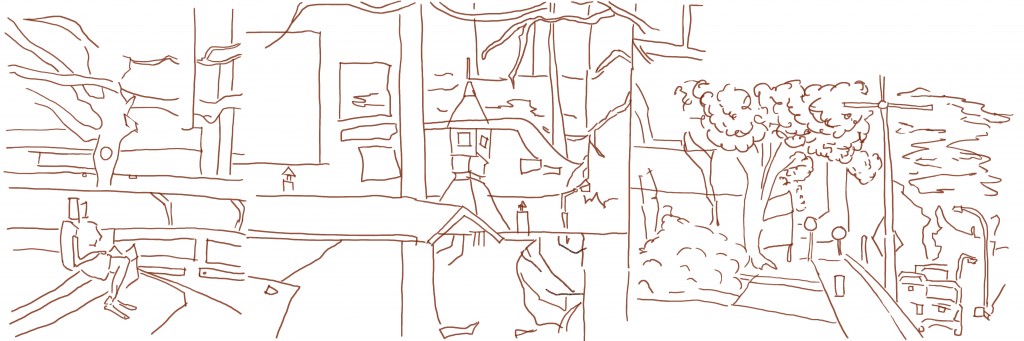
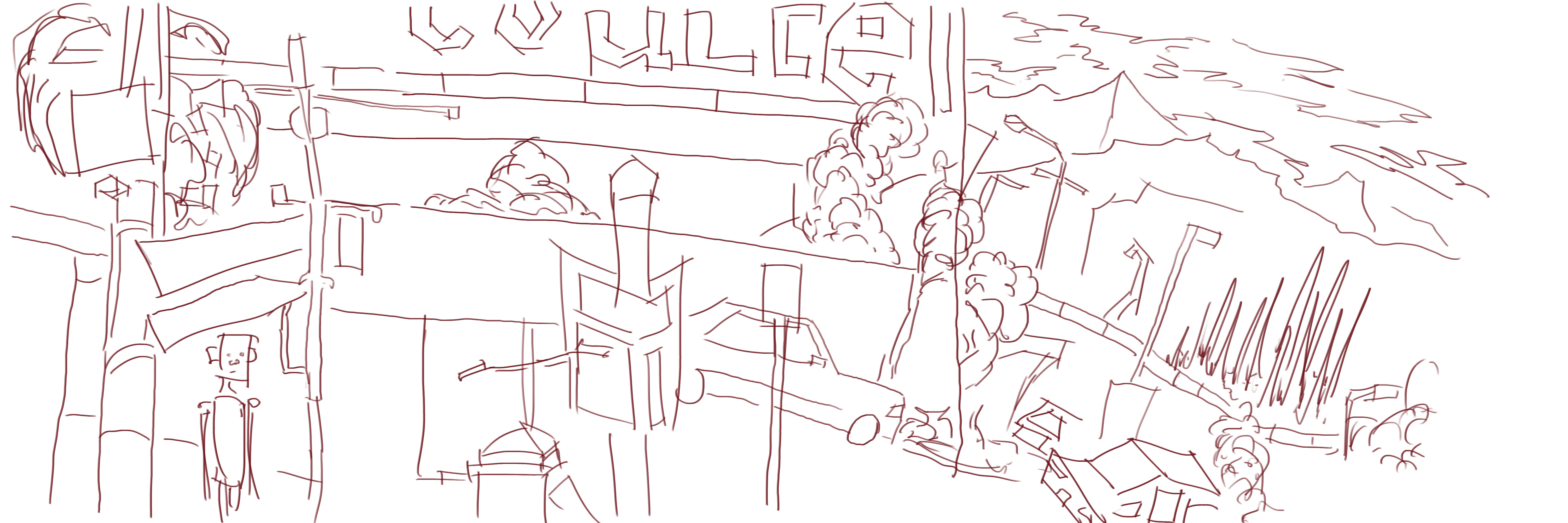
 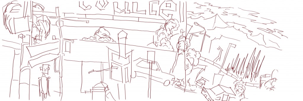 L ine work. It was different working in 1080p - I had to stop the recording more often. It’s not a problem as it gives me more break periods during the painting. This line work is ok, I think my favorite area is the sin on the top
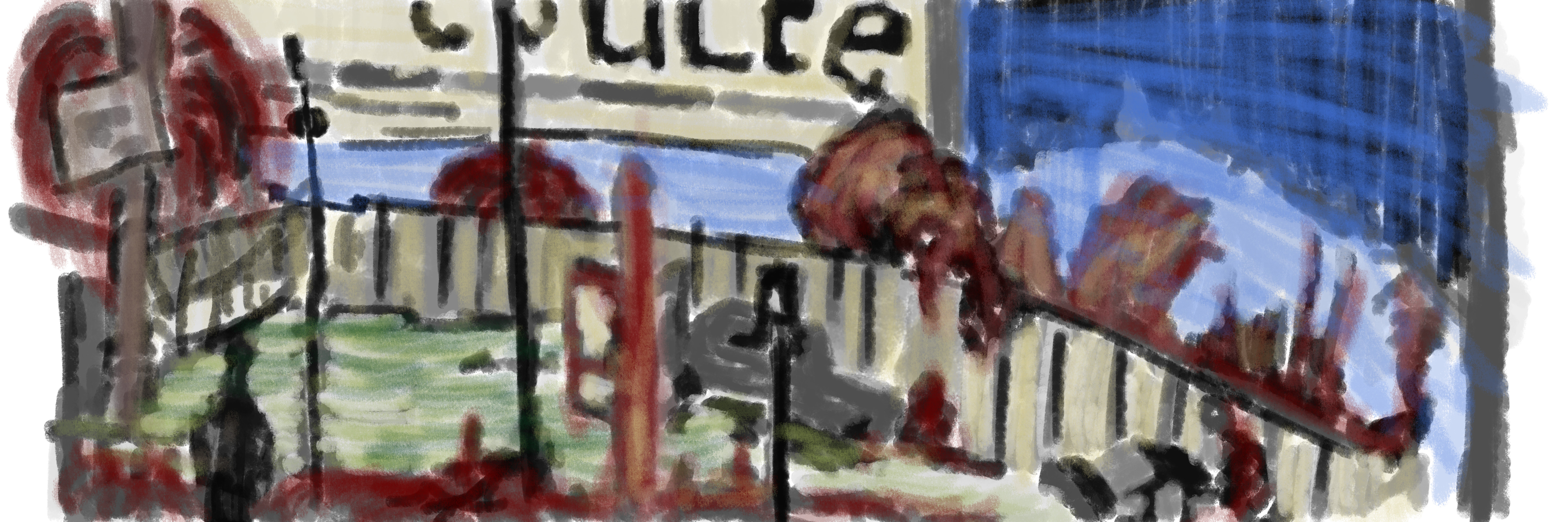
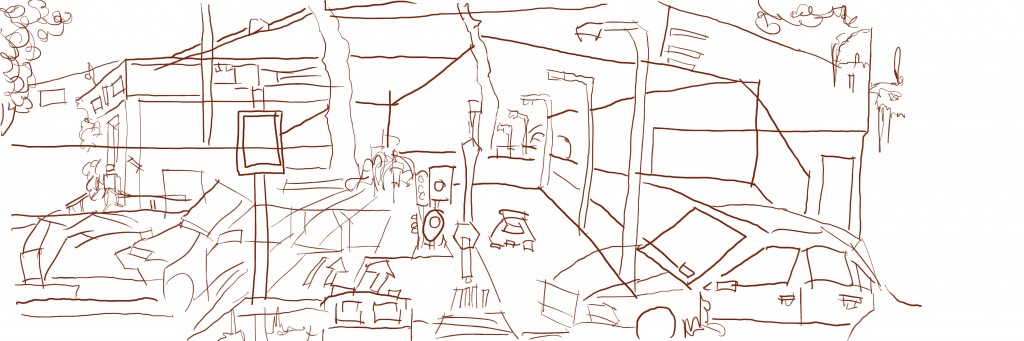
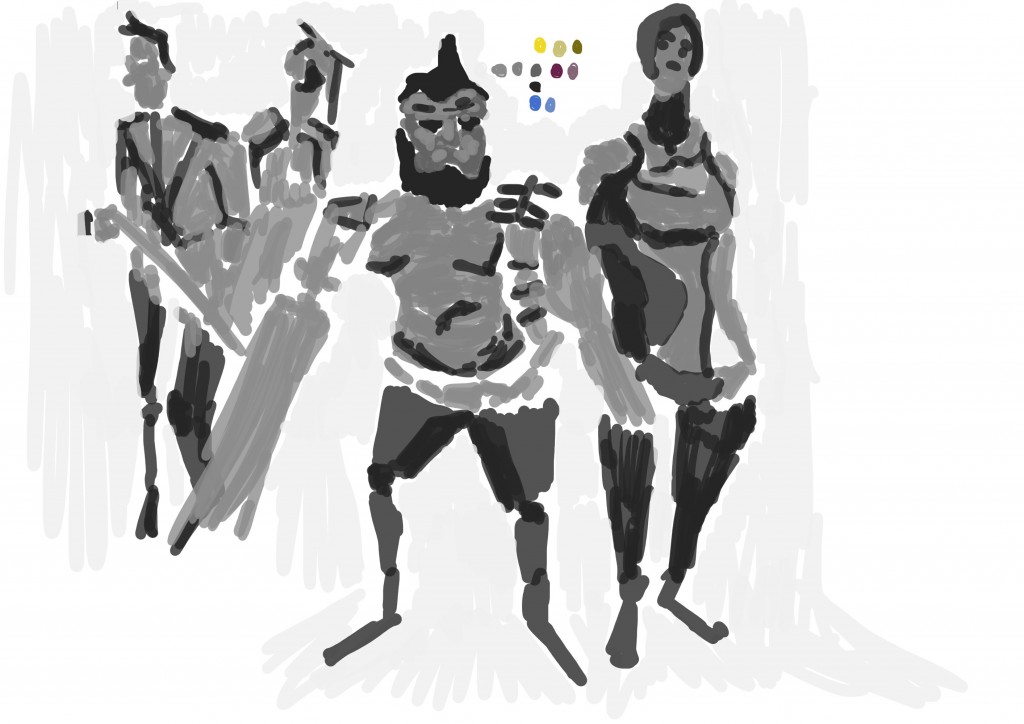
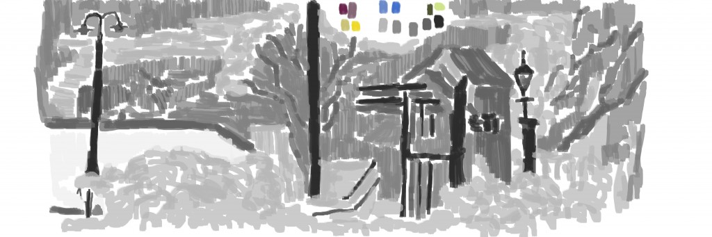
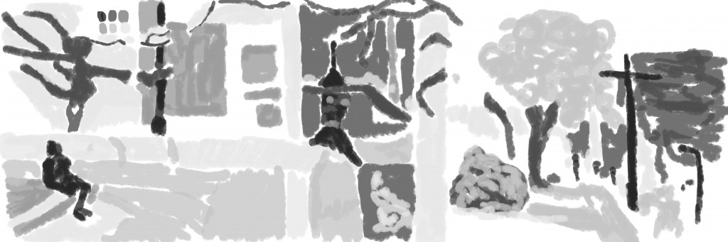
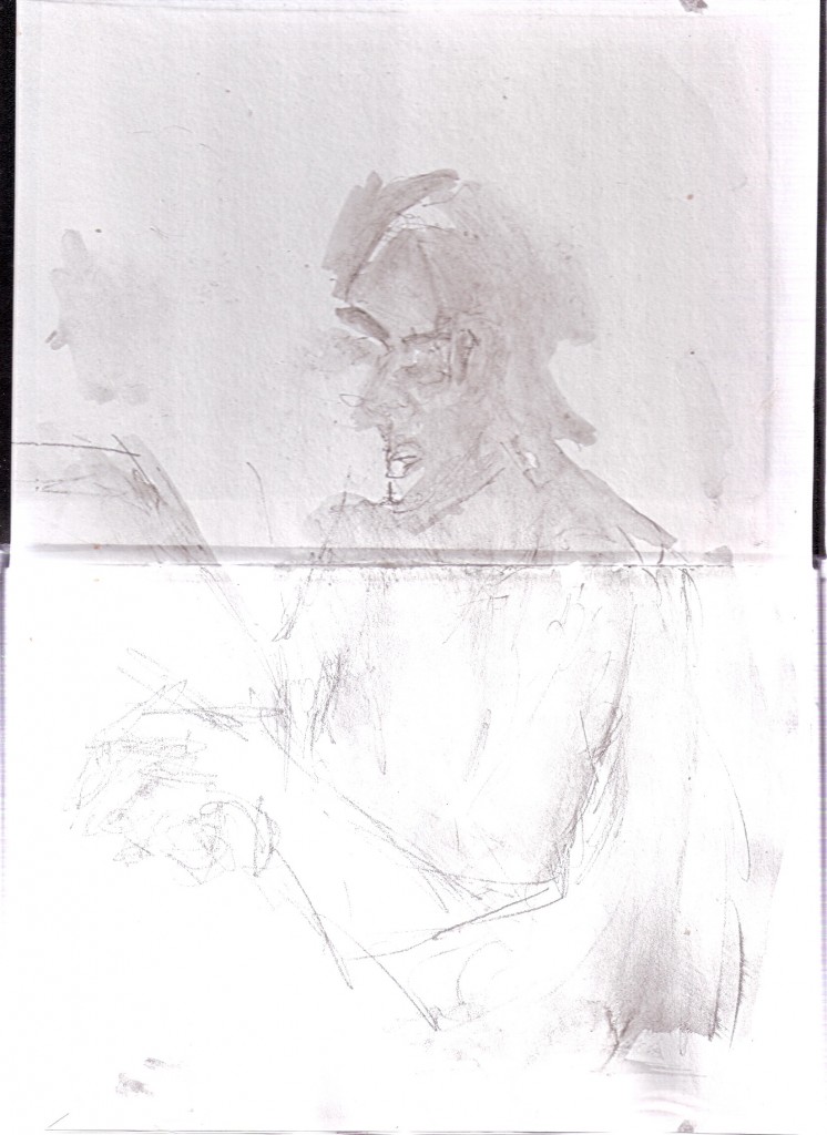
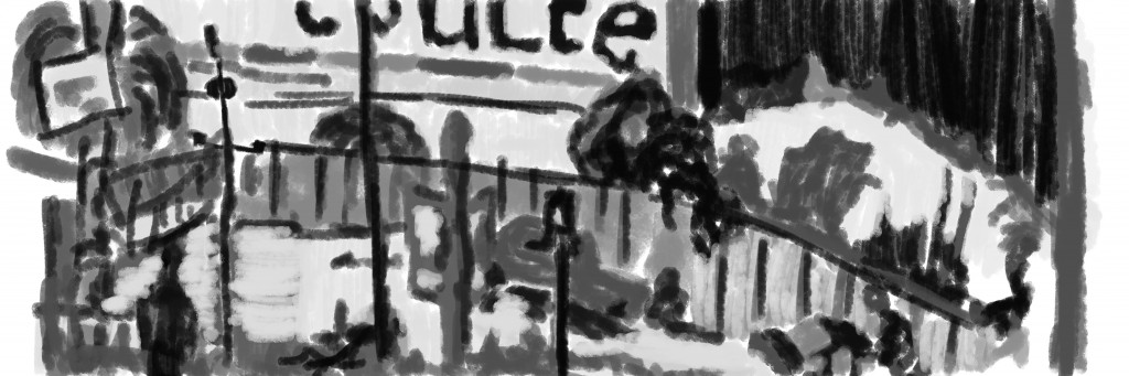 Tone added. Again my favorite area is the sign - the tone and contrast is working well. My least favorite area is the car in the center - it needs lights - or maybe more darks. The top right is a problem - I don’t know what the hell is happening.
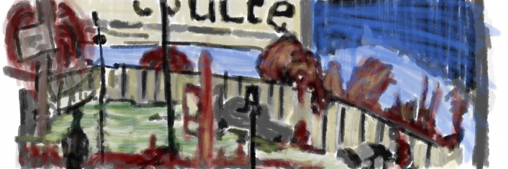
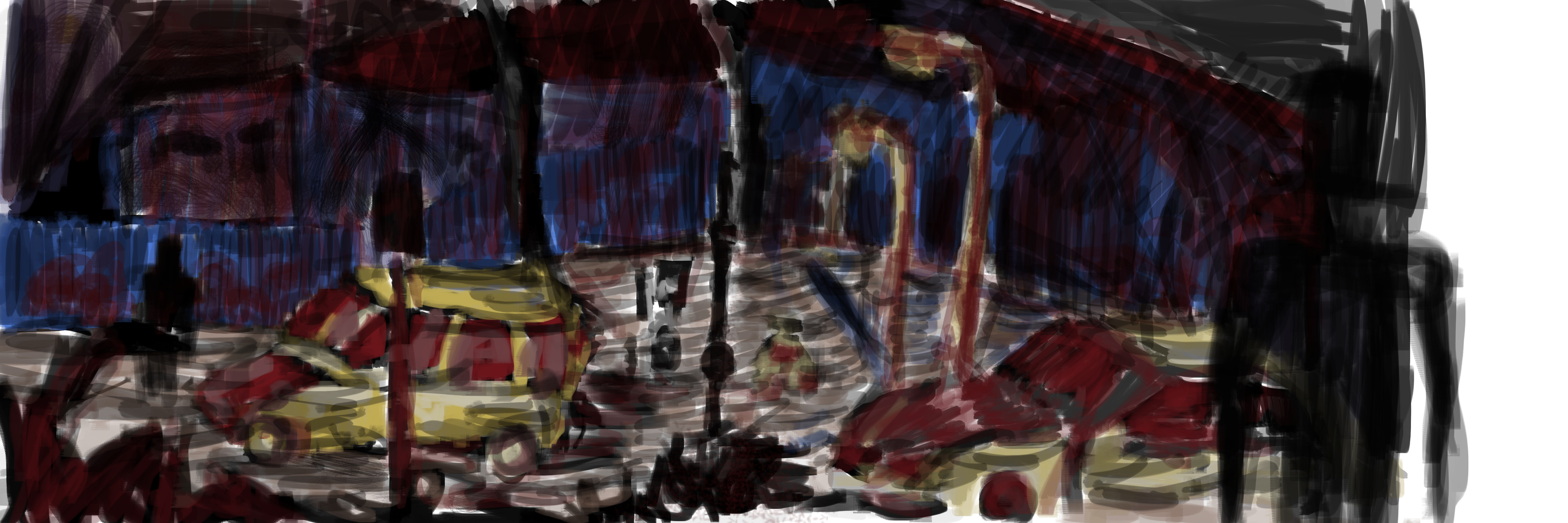
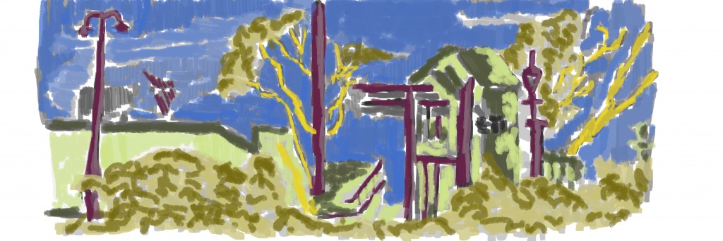
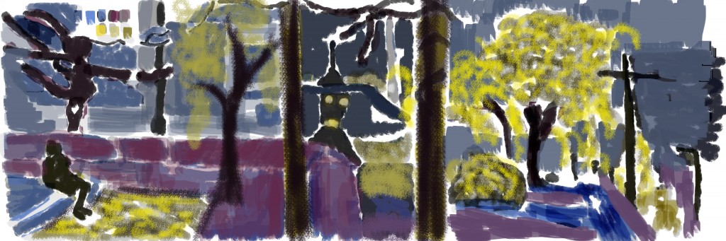
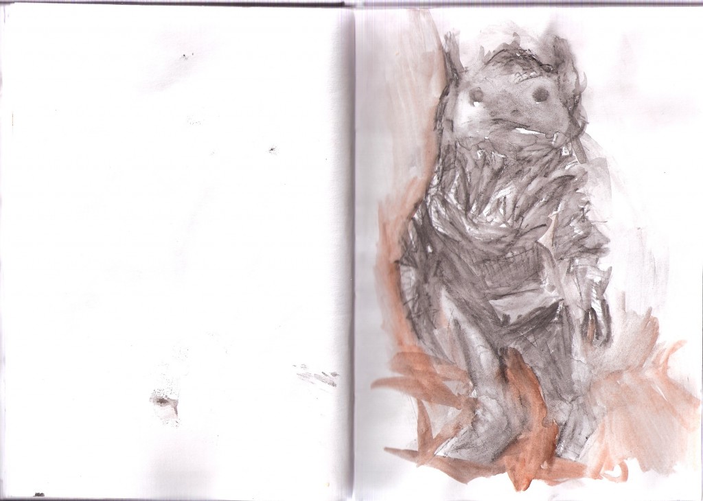
Color. I used the palette option within GIMP for the first time. It seems easy to use. Pasting the colors on the page would be optimal as I don’t like working with open windows - either that or a shortcut added to open/close the palette tab.
I dropped the opacity down to 30% for the color - this allowed the gray to still have a effect on the work. I hate Sky.
Read more →
I have been changing a few brush settings in GIMP to get different effects. Most notable I enabled opacity pressure sensitive. In the past I’ve always had this pressure sensitive set to just size - so the harder I press the larger the line. Turning both on really execrates the effect - the smaller line seems further away since the opacity is lower etc…
I have also started using full screen mode in GIMP which removes the top bar - the result - the painting taking over my whole screen Great.
Anyway, I had to ink this work 3 times - my first three attempts resulted in my video file being over 2 gigs. I use CamStudio which has a bug in so that if a file hits over 2gig the file corrupts. I’m normally really excellent at not letting files hit this 2gig mark - but this morning it went wrong twice. CamStudio has a option to auto stop after a certain amount of time - I’ve got this set to 1700 - but it didn’t stop for me!
On to the painting:
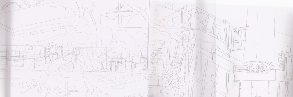
The reference is a combo of 3 drawings in total. The first is a drawing I did in Palmerston North sitting in the square. This is one of the rare perspective drawings I have done - the road fades off into the distance. I mashed this up with another two drawings of the Levin Skate Park. This is technically one drawing spread over two pages - but i scan them in separably. Opacity is dropped to 50% in order to seen drawings underneath.
 Line done. Holley saw me do this inking and liked it. The opacity changes certainly helps the line feel more flow.
  Tone added, Small detailed areas ignored and focused on large shapes. My favorite areas are the cars, Added vegetation to the foreground in order to help with the depth.
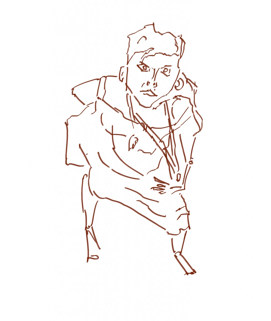
 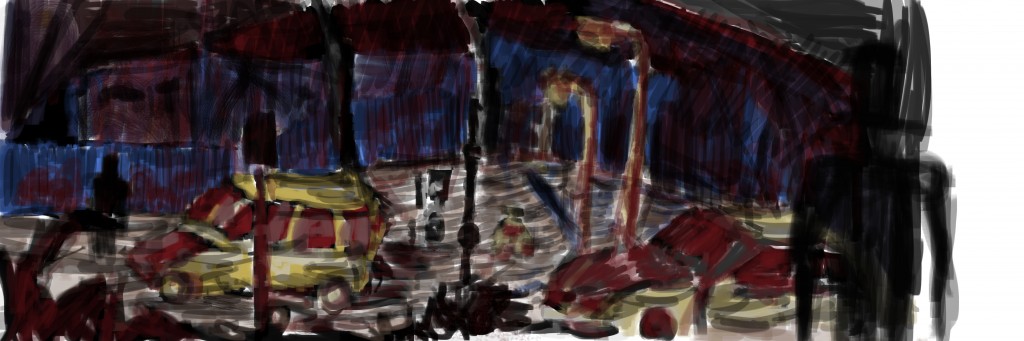 Color. I had lots of fun with this. Mixed colors on the palate - something I don’t normally do. Added a figure to the right - felt it needed something in the foreground. Certainty not my favorite work as I feel it’s still too fuzzy. What if I used the smudge tool?
Read more →

 video vieo

jjjjj
jknjkbn
jkjbkb
jkbnkjb

Read more →
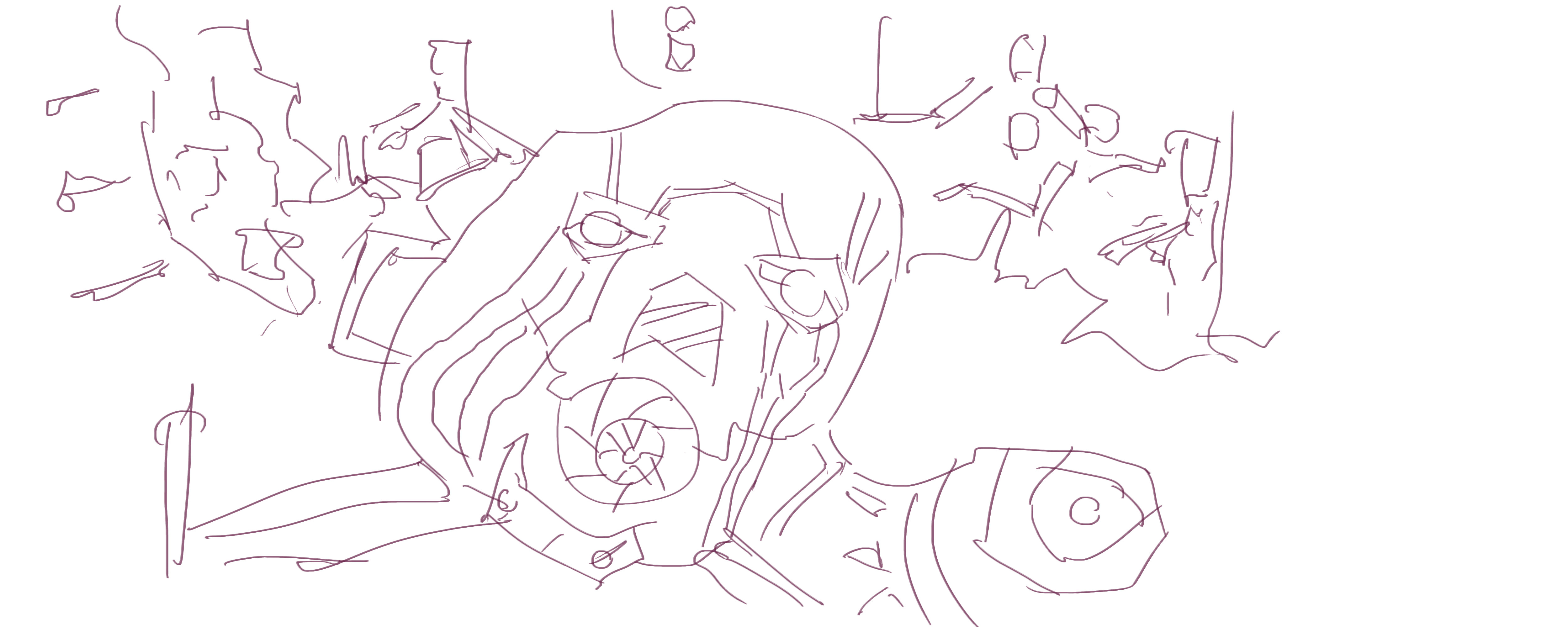
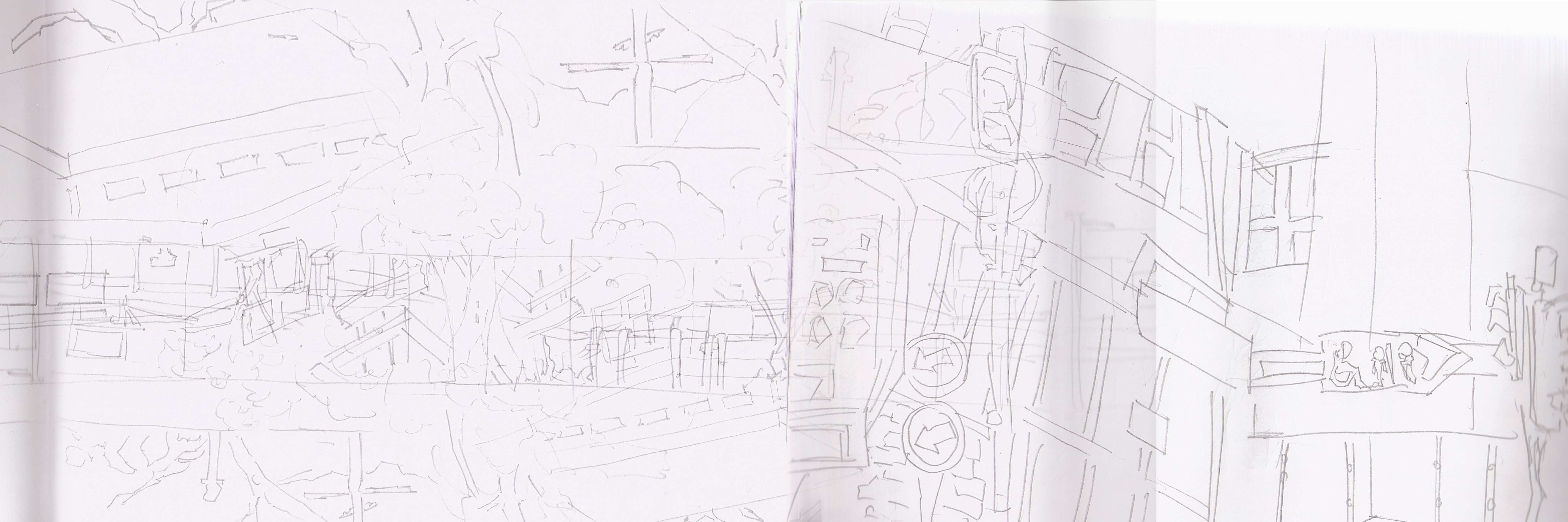
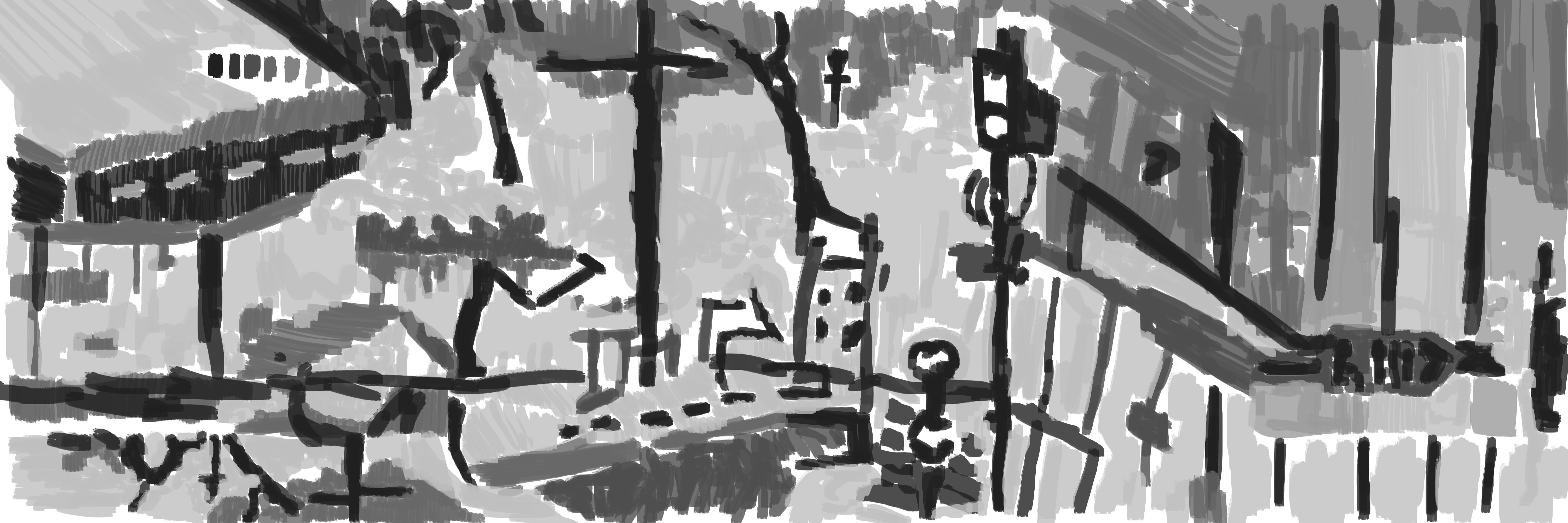
 Reference used. In total this is three drawings. The top left is a view from Levin North School, below is the same image rotated 180 degrees. This is scaled down as well. I wanted to attempt a reflection look. On the right - a scene I drew in Wellington.
  Line. It’s been a few days since I’ve painted something I’ve liked. At this moment. I like this.
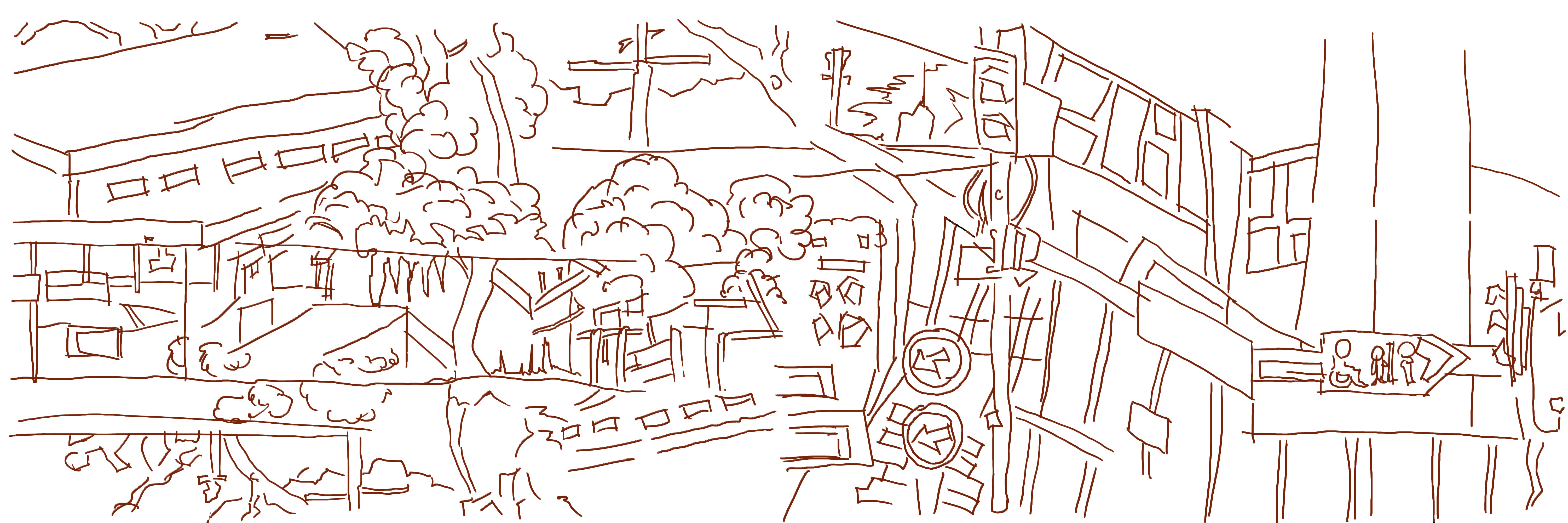
 Tone added. Again some detail is lost through the painting process Certain areas blend into one another - especially the bush and sky. This can be fixed when color is added, My favorite area is the traffic light on the center right.
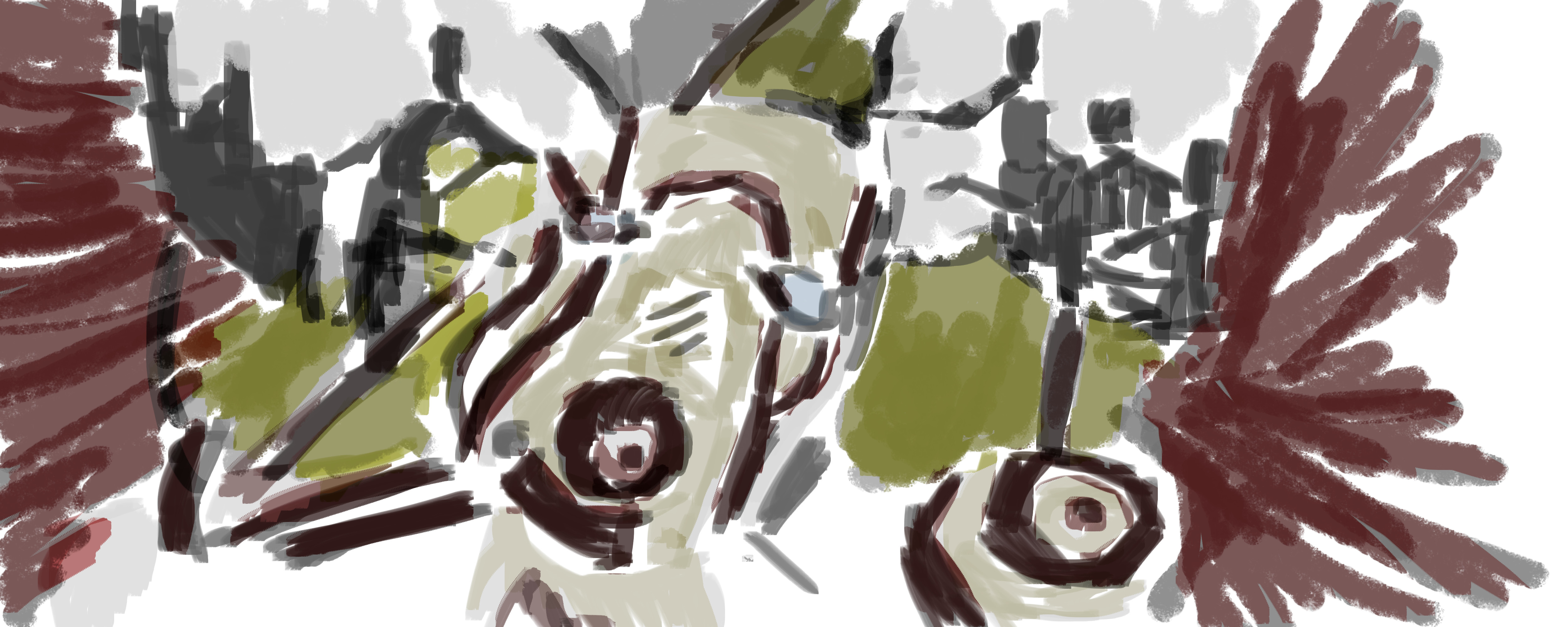
 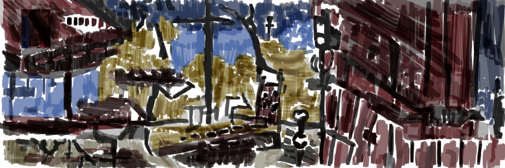 Color. With color I was able to define certain areas that were getting mixed up with the gray scale tone. Blue for the sky, yellow for bush (and reflections) and red for objects (buildings/advertising box). This is very loose, I’d like it to be tighter. I’m not sure how I feel about these colors as well - I’m using mulitipy. I think I prefer the works that I paint over the gray scale normal with low opacity
Read more →


 f
f 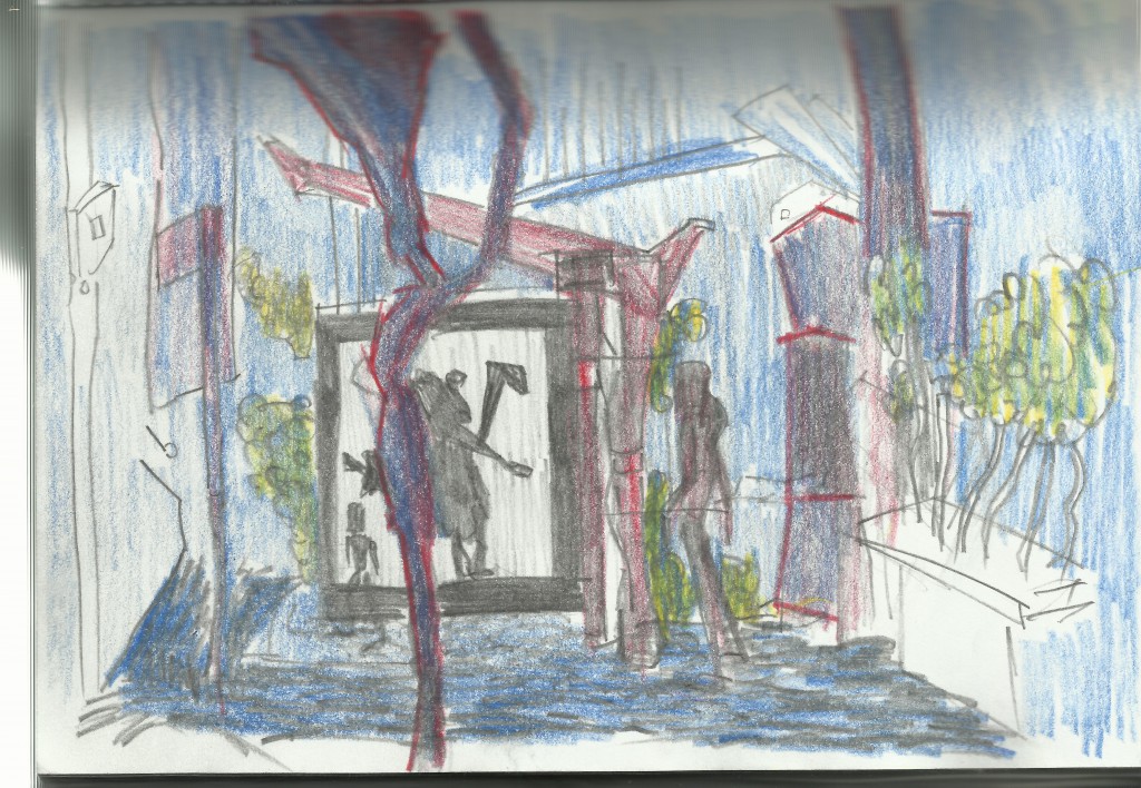
Read more →
Digital painting fom the sketchbook reference. This was done a few weeks ago - I’m just catching up on the digital paintings I’ve missed uploading.
So here we go - taking two drawings I did into GIMP - line, gratscale, and finally color.
The left drawing is at the Levin Skate Park, the right is of the Levin Rose Gardens.
Line added. No detail has been lost - I always try to capture all my pencil lines with the line process.
Next up is gray scale tone. You can see along the top of the scene I’ve layered out all the colors and tone I’ll use in this painting. This helps me keep my colors minimal and keep unity between the series of works. Comparing the tone to the line I notice that I do lose details in areas but the image has a more complete, and fleshy feel.
 I’m not sure how I feel about this. It feels empty, especially compard to the line verstion. Maybe there needs to be more happening in the background? Trees and objects scaling down into the distance. This is flat, but it’s how I’ve always liked to work. Getting some depth may help rid me of the empty feeling I get. Or maybe it’s fine as it is.
Here’s the video:
Read more →
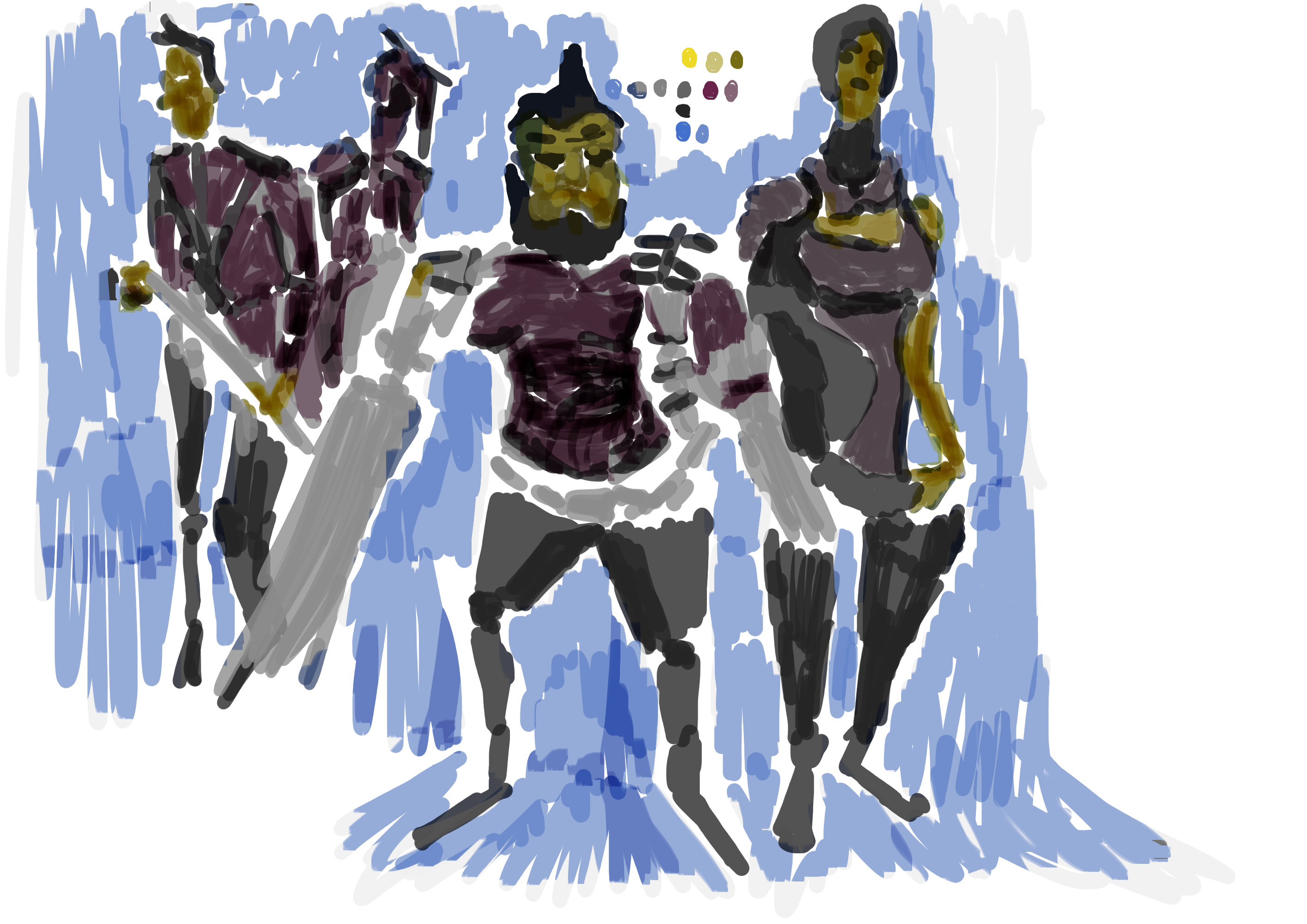
Spent the morning organizing files and posts. Working on getting a large Borderlands 2 painting post together - it’s been a fun side project.
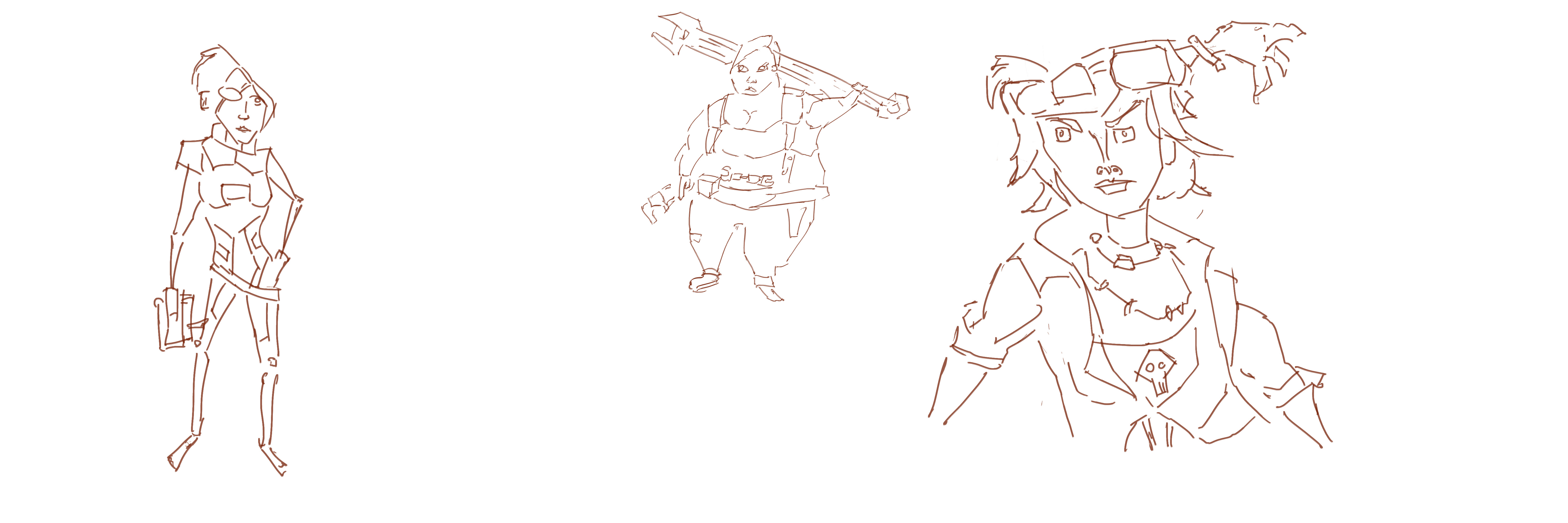
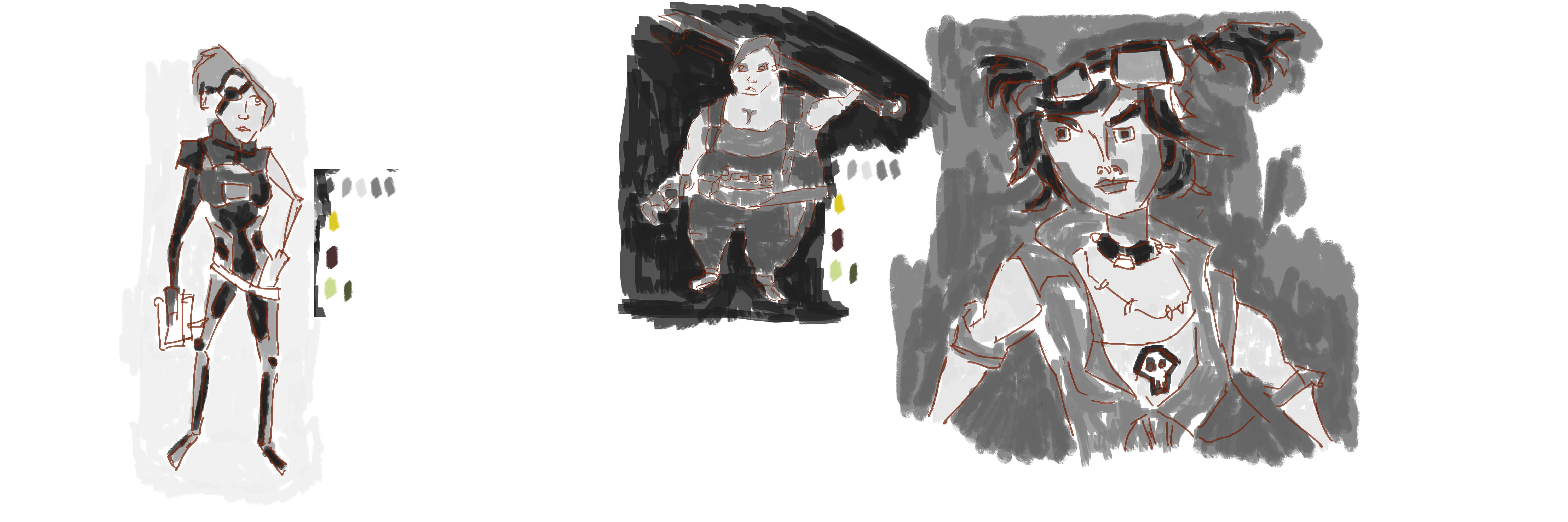
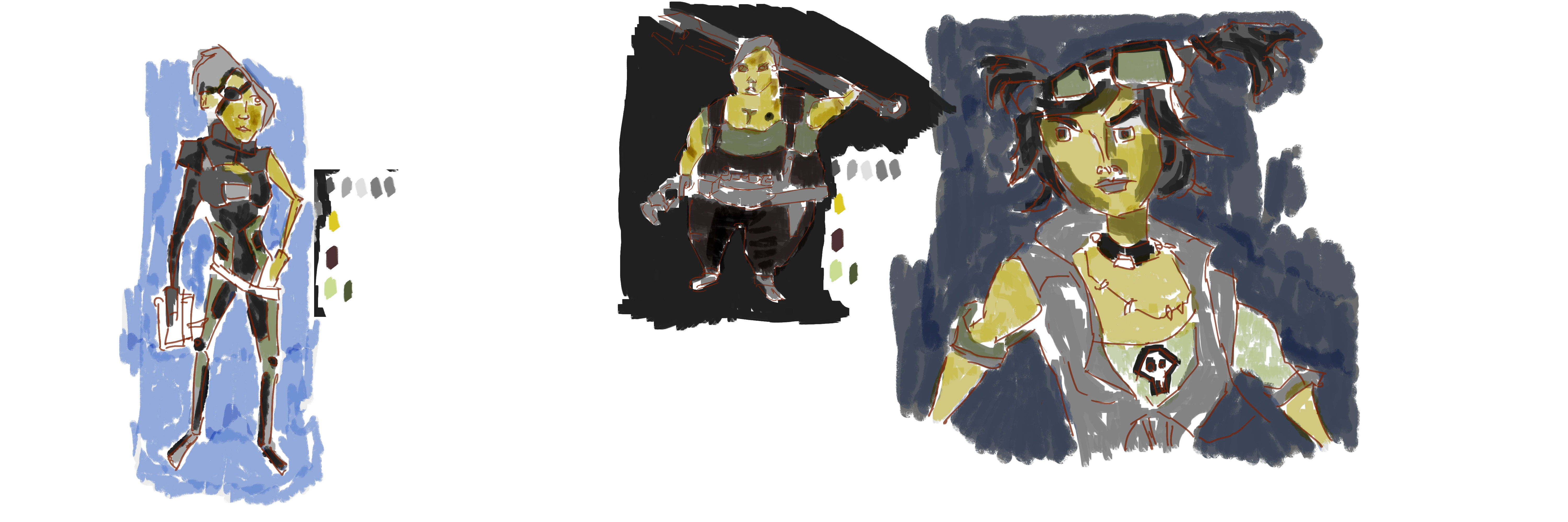
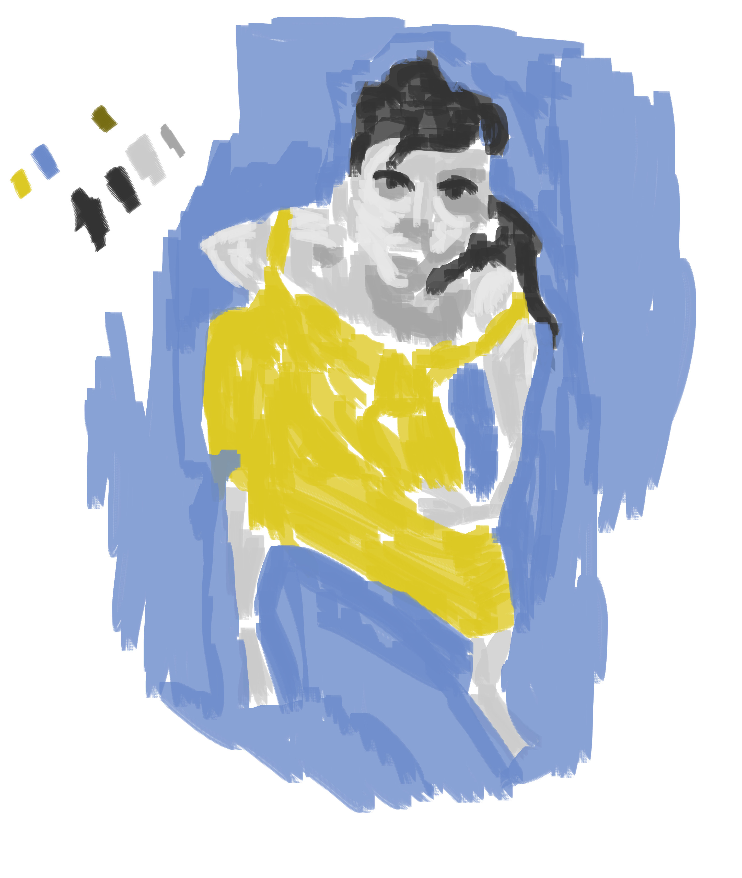
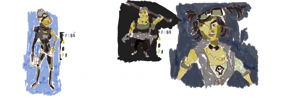
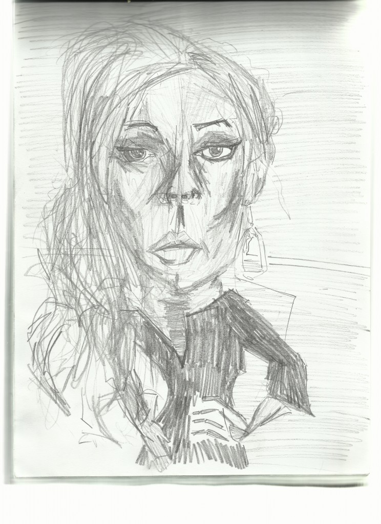
For now though - here’s a Lily Allen figure and portrait I painted recently in GIMP. I’ve drawn this image several times before - it’s always interesting going back to these old reference photos and taking a new approach with the work.
 Line work. Still keeping with the red. I kept this quick and loose - knowing I’d be covering it over with tone and color.
  I kept the color very minimal - keeping with just yellow for the dress and blue for the negative space. In other recent works I’ve used yellow on the skin and red for the clothes - this I decided to keep the clothes grayscale.
And the video of the painting process.
Have a great weekend.
Read more →
I haven’t been happy with the latest digital paintings I’ve been doing. It’s been a struggle. Oh well. I got Dads scanner working on my laptop so I can go back to scanning my sketchbooks in.
I did one street pencil drawing today - but spent the evening working from photo reference in my sketchbook. I’ll get these images uploaded over the next few days. For now, a mash up of my drawings in a attempt to turn it into a scene..
This is the reference I started with. I just imported the drawings into GIMP - scaled down - and decreased the opacity. The opacity is around 60%. In the background is a mid gray tone texture that I will use for the tone stage.. For now - line.
Line. Still sticking with the red. I prefer it over the black. It’s interesting mixing these drawings together - it’s allowing me to work with drawings that are lacking detail. I’m not sure where I will go from here - but I feel I’m progressing with creating more complex and interesting scenes.
Gray tone. I recorded the painting up to here but forgot to torn the screen recorder on for the color. I was frustrated with myself - normally I’m really good about recording all my digital painting.
Like I said earlier I struggled with this painting. And this is the stage I had problems with - more so than the line stage. It feels empty and lacking depth. My favorite area is the clock tower in the center. There is something about the tones working together - other areas lack the detail. I thought taking it into color could help fix this emptiness I felt - it only made it worse at first - but towards the end I started to get somewhere.
 Color. It certainly helps create a base. I still feel it’s lacking.
Read more →
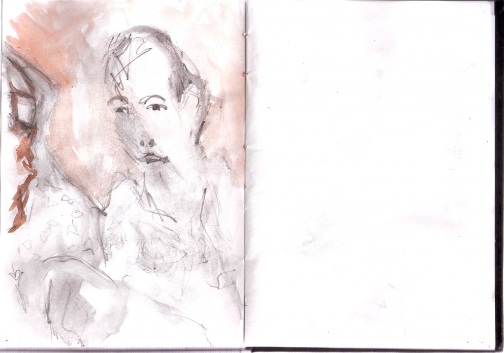
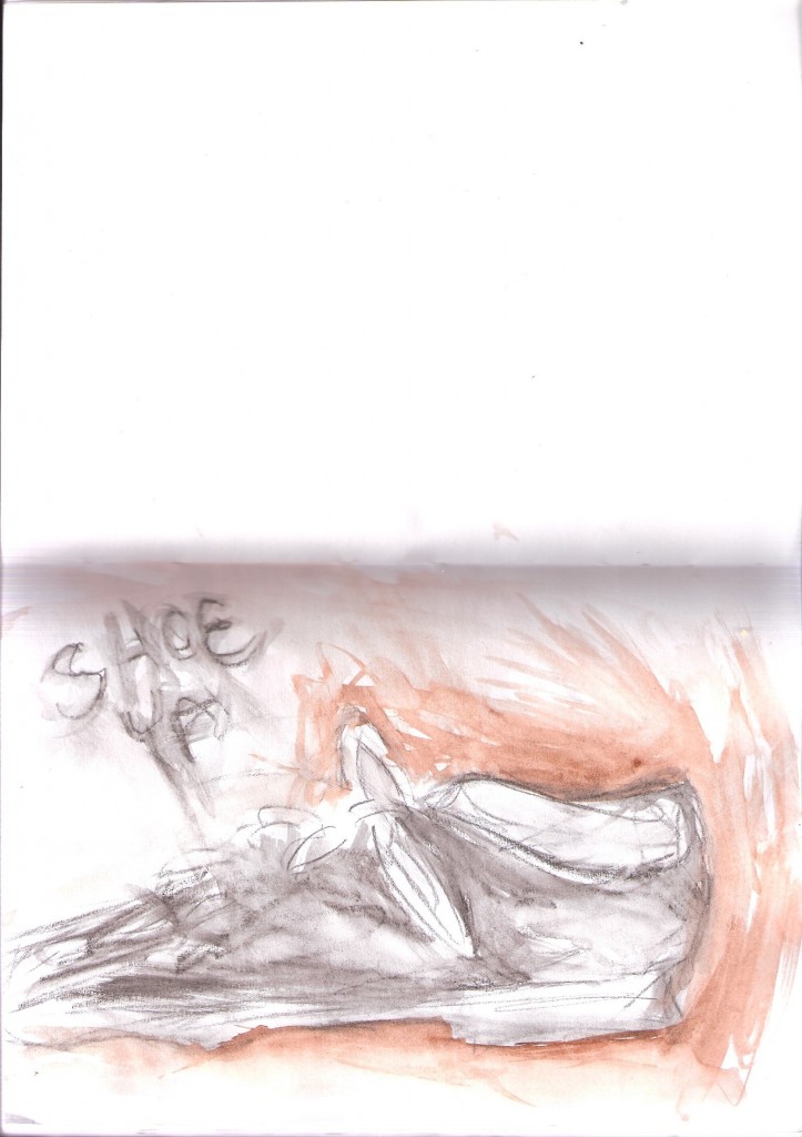
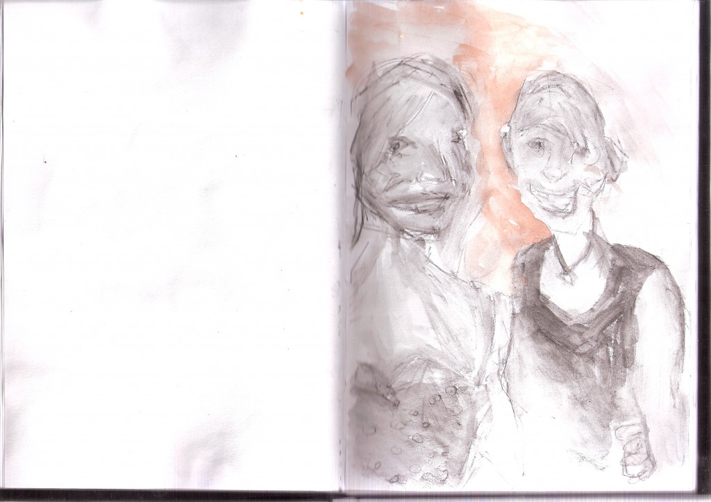
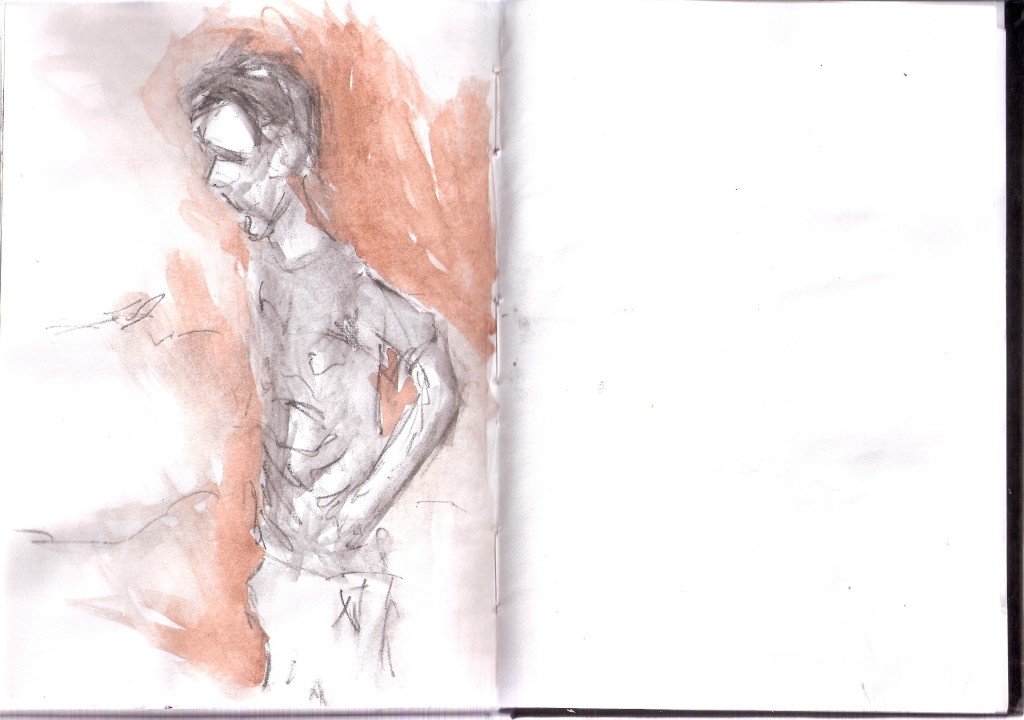
Watercolor below here 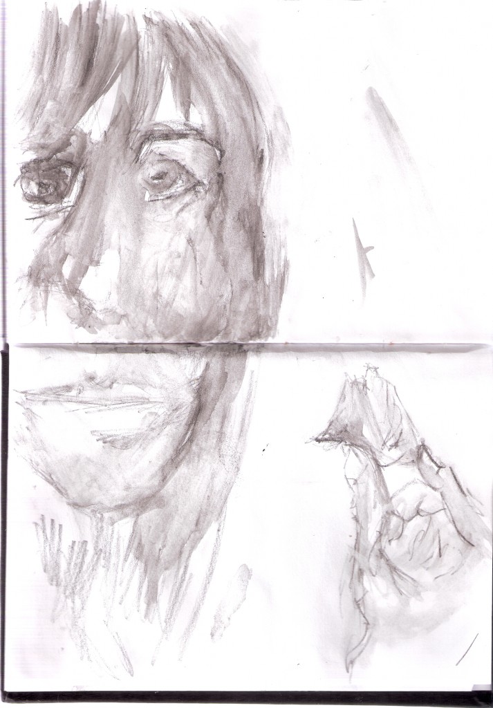
Read more →
 Now for something completely different.
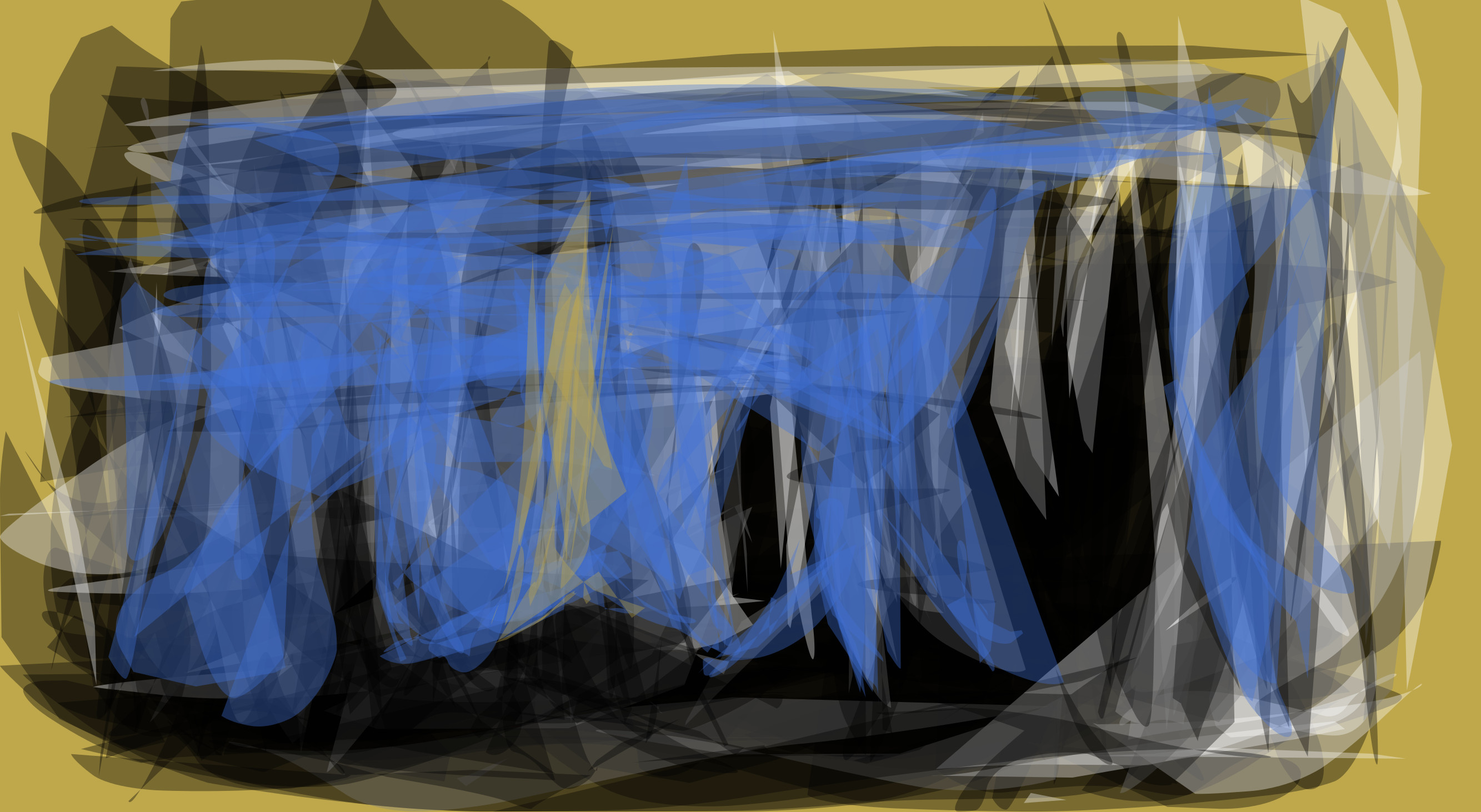 The bottom left is working well, I like the cut up transparency look. Looks like mountains in the distance!
  Flat but the colors are interesting. I especially enjoy the yellow and red reaction with one another.
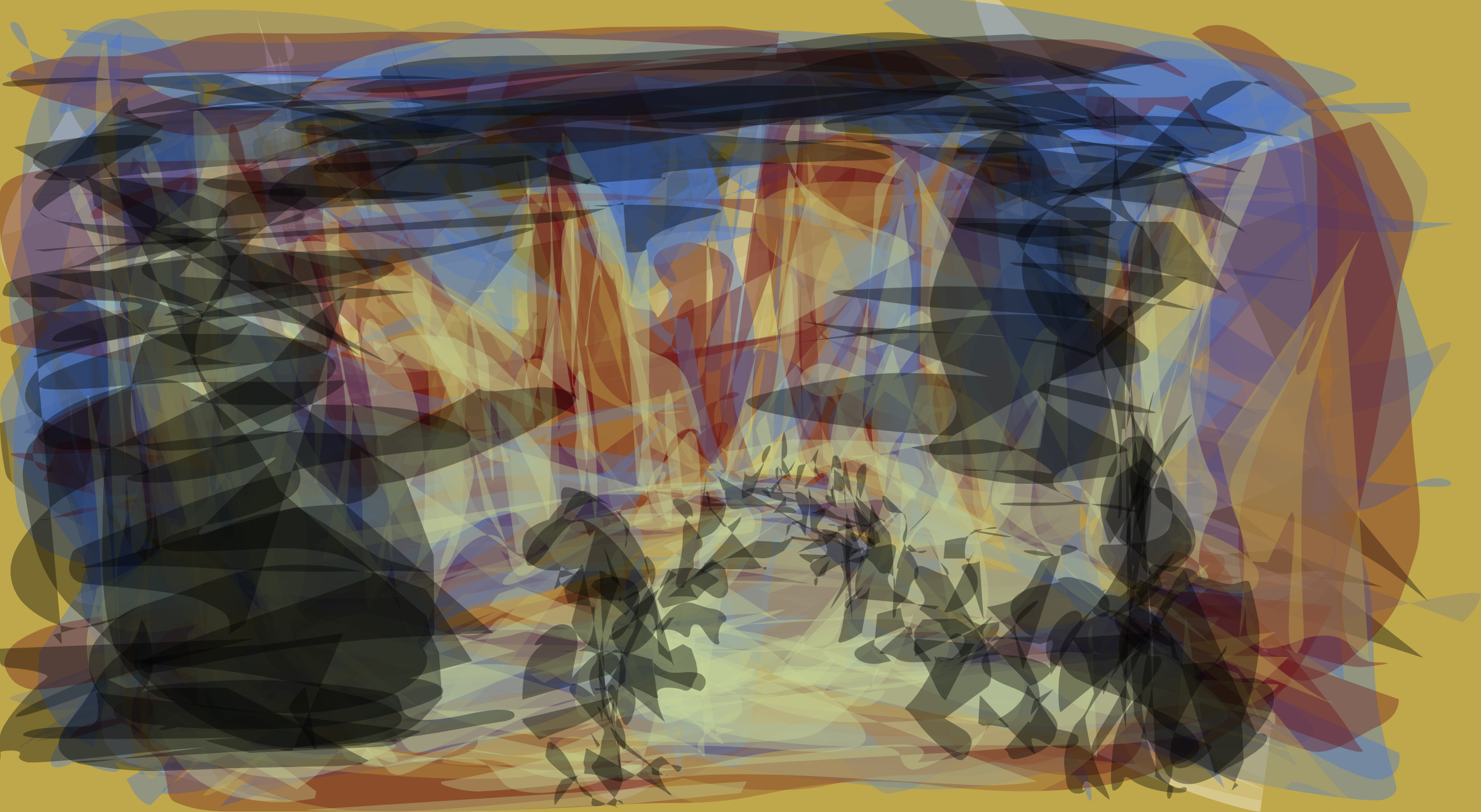 Attempt to get some perspective into the work. The black scaling off into the distance looks like figures. Not sure how I feel about the left - the large blob of black feels out of place.
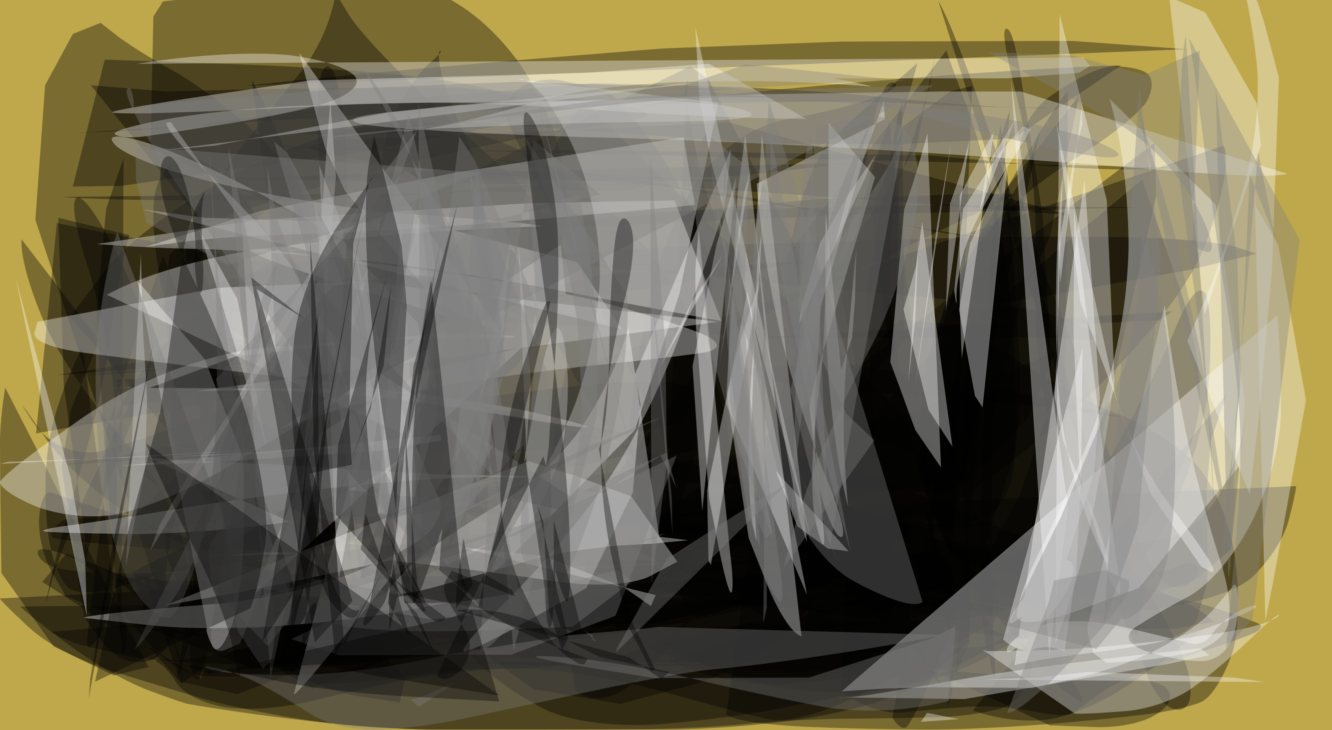 Earier version with no blue. I like the sharp directional shapes that are being created.
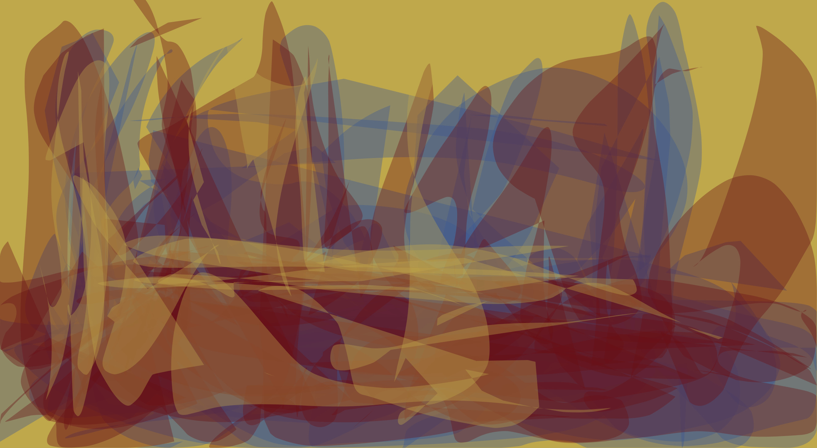 Some interesting shapes here. But most of all I enjoy the colors.
 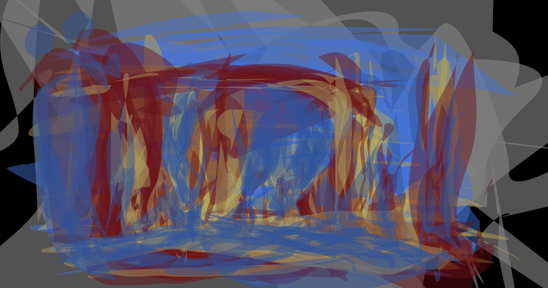 Surrounded by blue.
 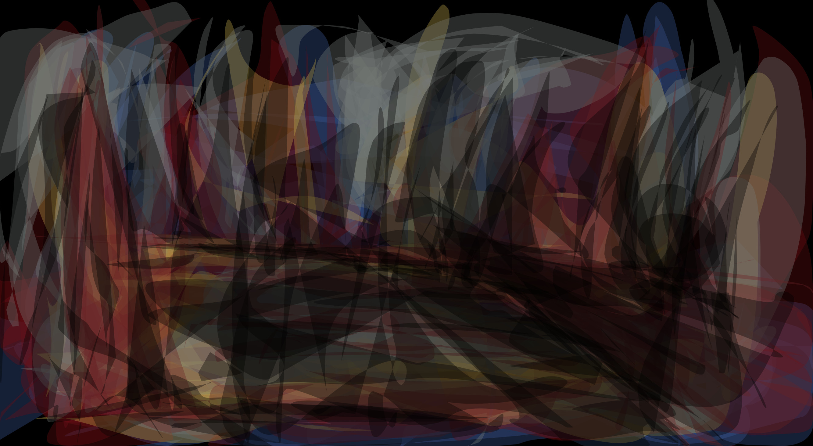 I used the black in the foreground in order to give the image some depth. One of my favorites.
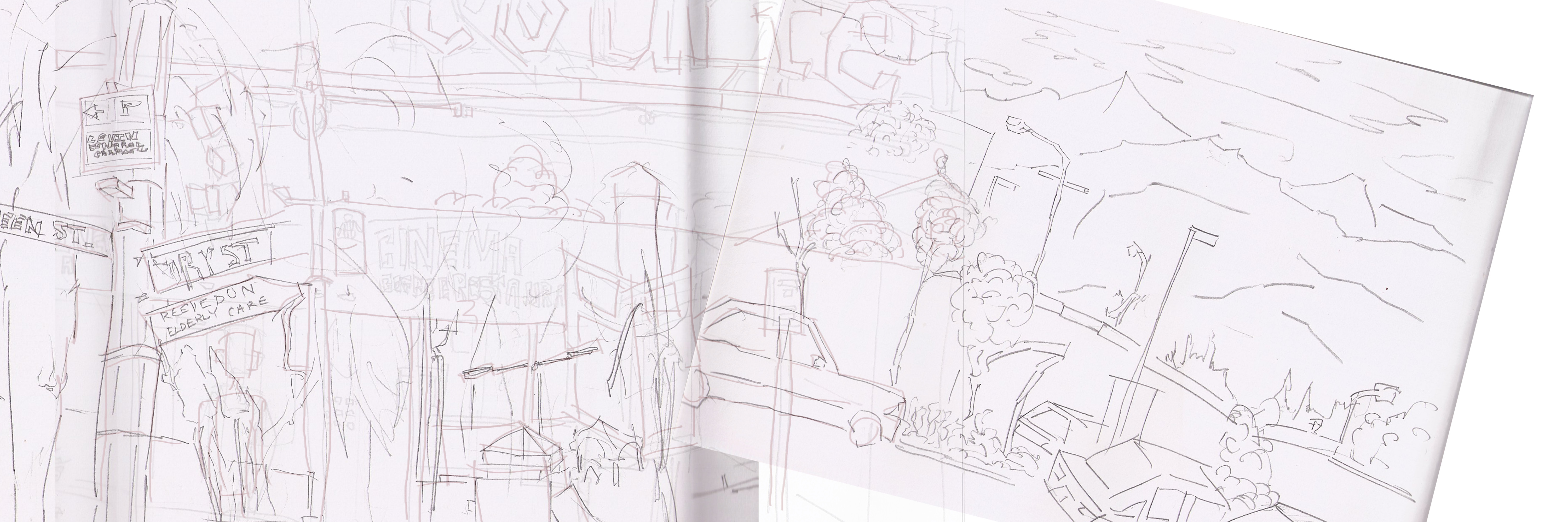
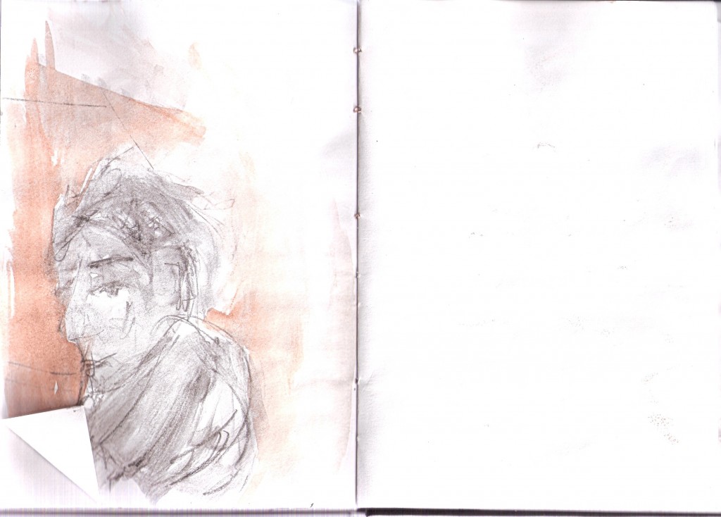
 L
L