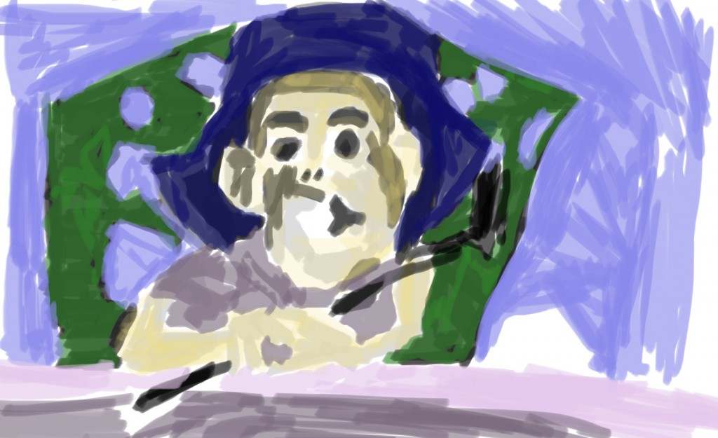
I’m currently in Wellington. So my usual SketchDaily hasn’t been happening. I’ve done life drawing though, which has been a nice change.
Here are some Reddit SketchDaily environment works that I have done recently. Once I’m back in Levin (early next week) I’ll scan sketchbook works and upload videos of digital life drawing.
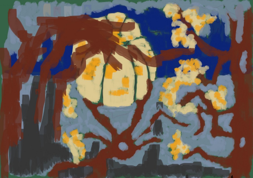
The theme here was pumpkins. I found a pumpkin photo on the internet to use as reference, then used my imaganation for the rest. Certainly doesn’t feel like it’s working. I gave up quick on this. 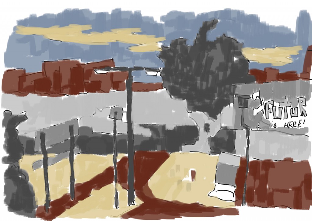
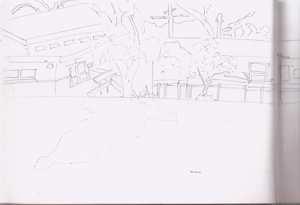
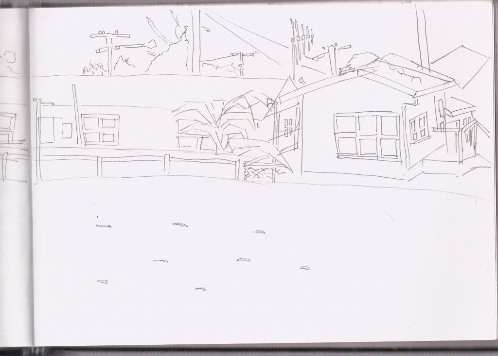
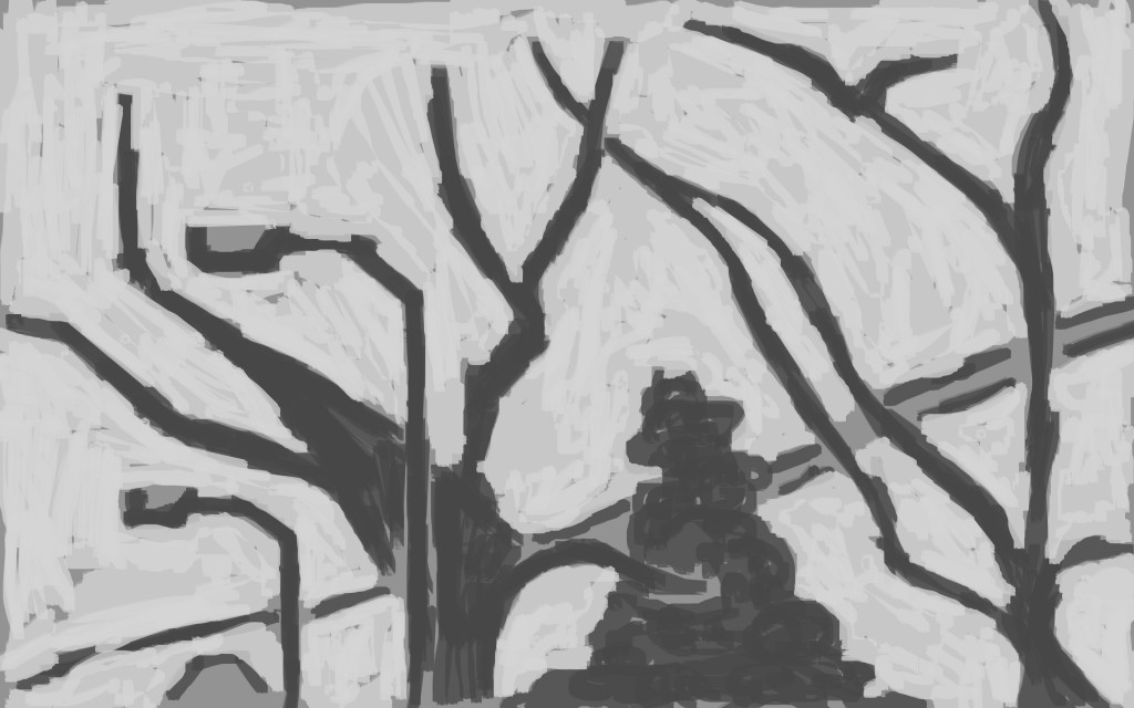
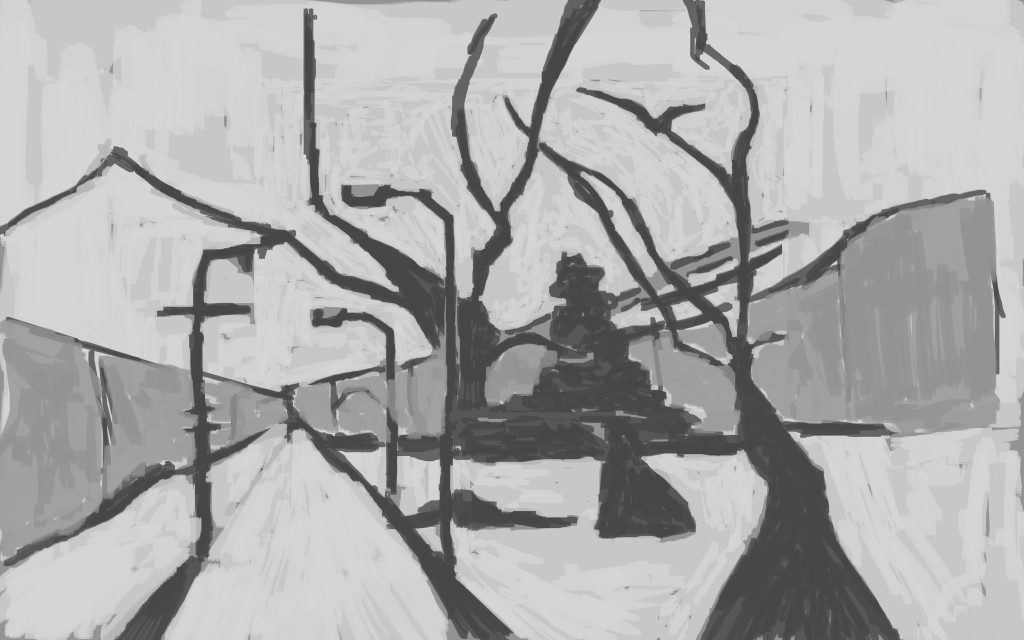
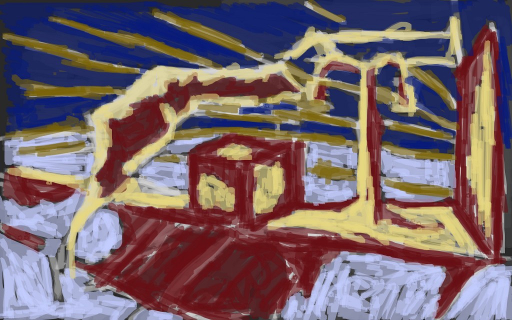
This is working. The theme was time travel. I took a sketch I drew in Levin (one of my favorite sketches to digitize) and referenced it to create this matt painting. The composition is working - there are interesting objects in the background and foreground The yellow/red/blue mix together well - along with the gray. One area I do have a problem with is the tonal value of the tree against the background.
The future is here!
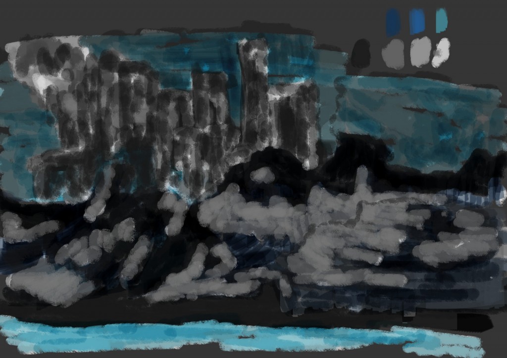
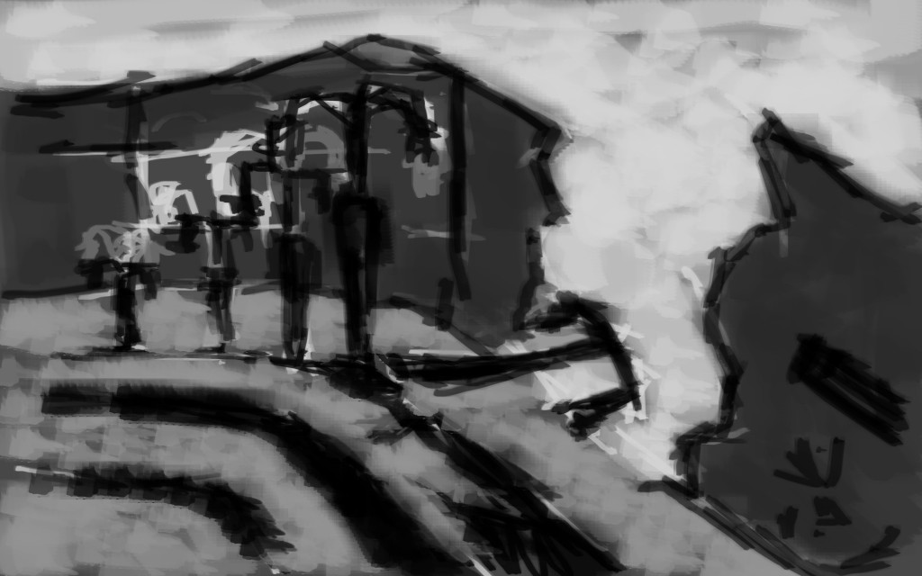
Northern was the theme here. I wanted to create something cold and icy feeling. I’m not happy with this.
Read more →
Follow the blog:
RSS Feed
API
Find me:
last.fm twitter email reddit stumbleupon youtube
Links:
Sketchdaily
conceptart.org
creative uncut
polycount
Read more →
I haven’t been drawing people recently. It’s all been streetscape works. A combo of nature and manmade structures. I think that’s the best way to suggest it.
Here are portraits I have drawn and painted digitally. The reference is photos from REDDITGETSDRAWN. For each piece I used GIMP on my main screen and had the reference open on my smaller screen. For the reference I used my laptop.
I’ve been playing Borderlands 2.
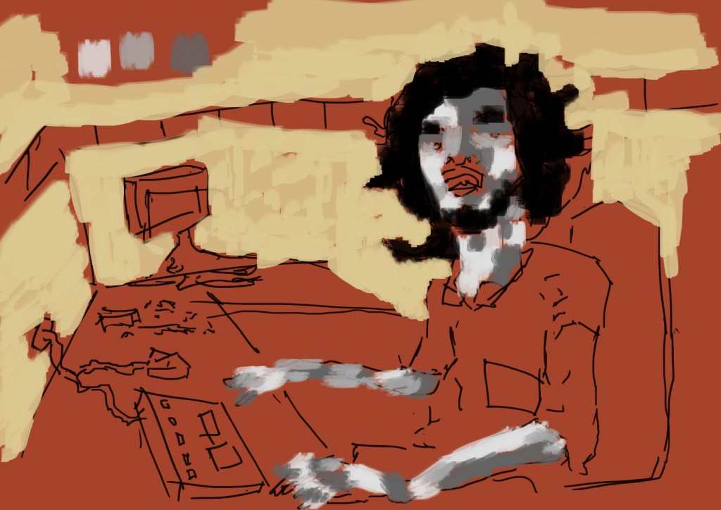 Johnny_Jon_John had the request this photo to be painted. I used an orange from a previous painting as a base. Normally I use white, black, dark grey, or a mid grey. Using color for the start background is something new.
From there, line, grey tone, and a lighter yellow for the background area. I did ponder over coloring more of the work in color - maybe the desk, his shirt, the desk chair. Instead I kept the black and white tonal studies as the main focus point. Opacity was 80%
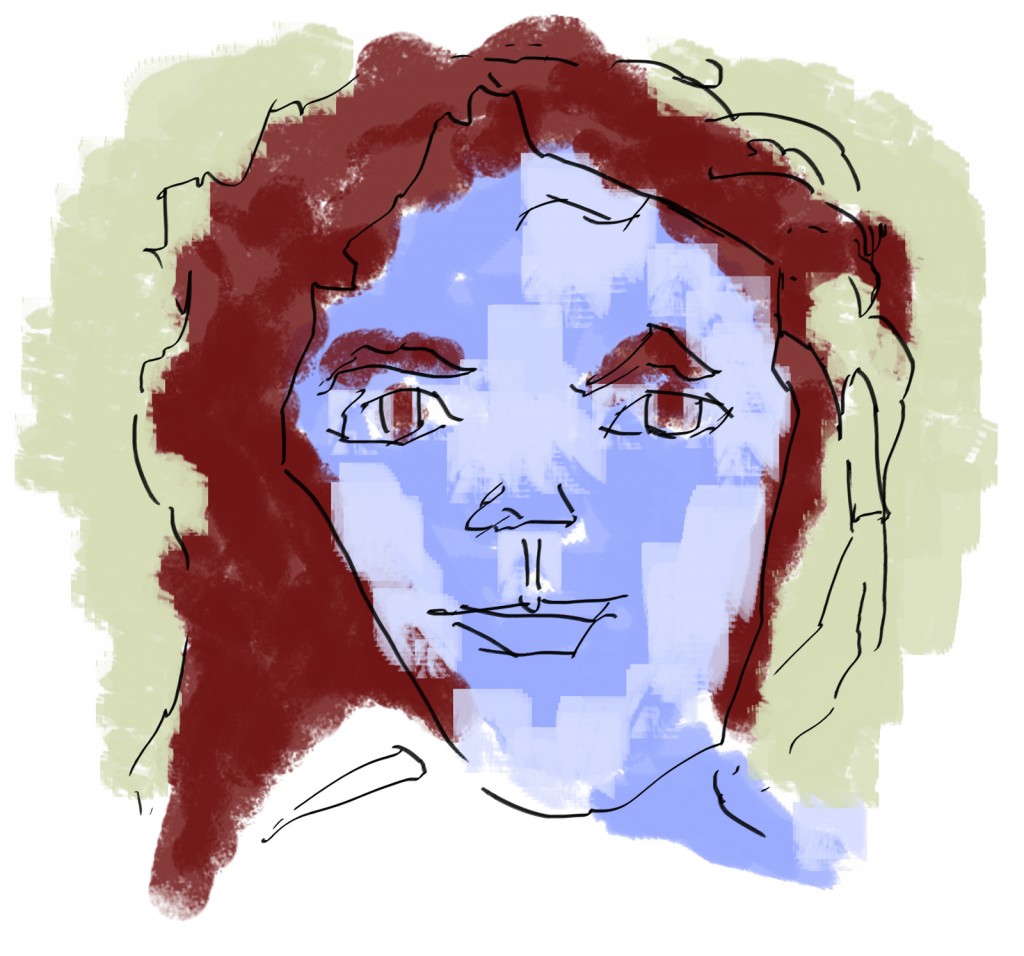
Superhero.
It’s nice to take a break from drawing figures. Going back to it I felt very refreshed. I want to keep these works up.
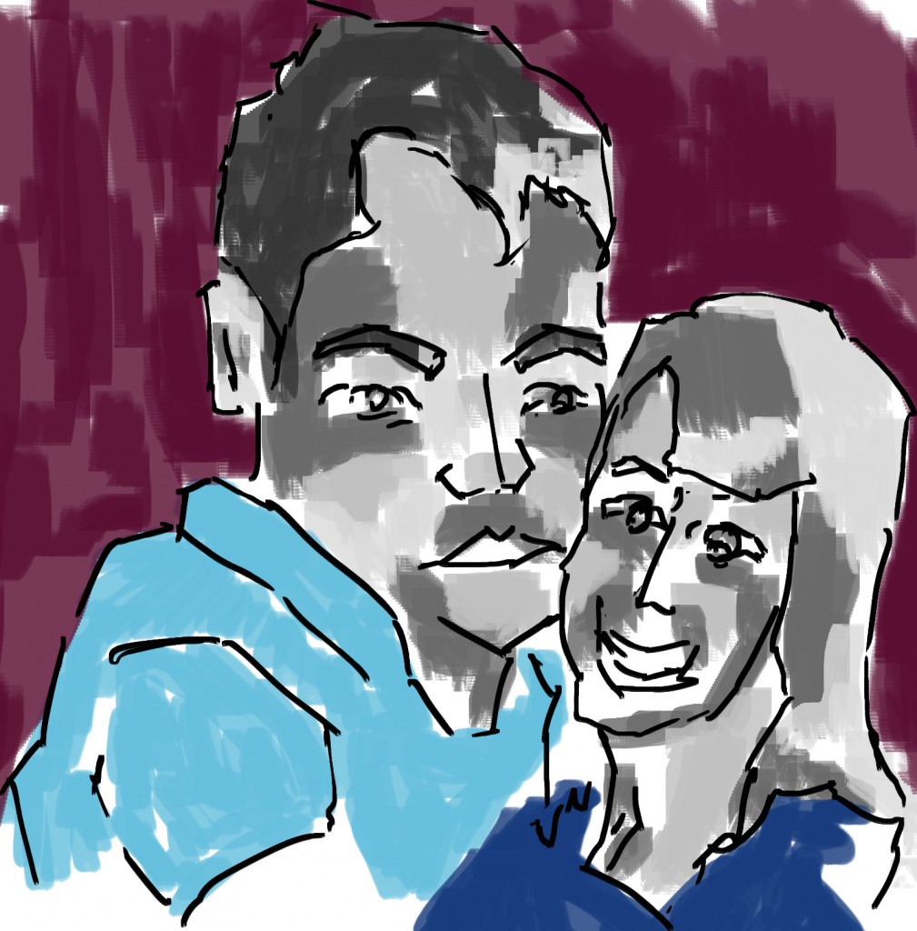 For the bnchwarmer926 I did this. It was the first I did… so not bad considering the break I’ve had. The line looks thick on this - in future works I scale the brush down somewhat. Having the line as the top layer also reinforces this. Blues were fun!
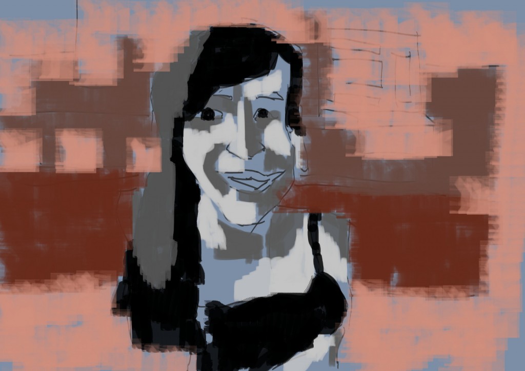 ieatcows requested for his girlfriend to be drawn. This is my result. Again I started with line, tone, then colored background with three different oranges.
All the brushes are custom made by me. I felt there was a real lack of decent flatbrushes so have been focused on creating them, but I’d also be interested in creating more textured brushes - similar to the chalk brush. I’ll experiment with tonal ranges within the brushes and see where I go. 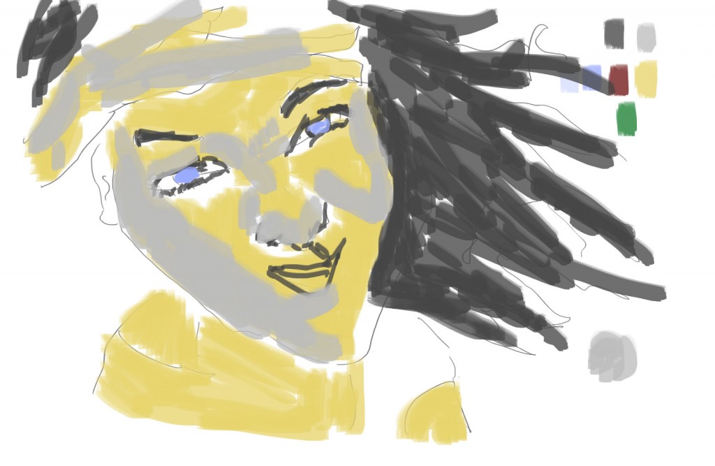 Reddit user http://www.reddit.com/user/kawaiian Kawaiian had the request to turn this into something for Halloween.
This is my result. One of my final works for the day. I had done many and was growing tired by this point. I’d like to think the image had a witch feel about it. Especially the hair.
She needs a black cat.
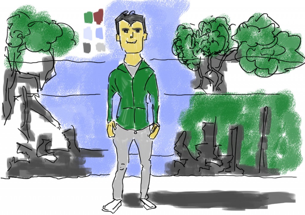 GreenFin83 had requested for this to be drawn. This is one of my favorite works. I especially enjoyed drawing the clothes. For the background I wanted to use my visual library and construct a scene. Alot of this inspration currently is the works I’ve been drawing around Levin.
Read more →
Instead of character focused SketchDaily works I’ve been focusing on environments … done mostly with taking my sketches - inking and adding tone. I want to digitize the majority of my sketchbook works so using SketchDaily as motivation works.
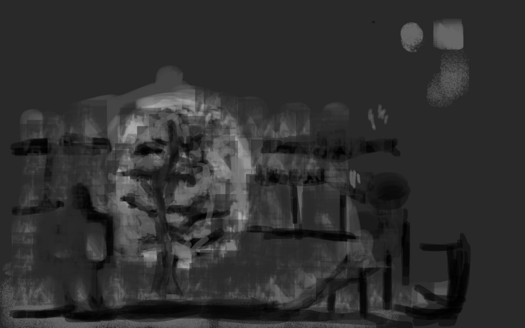
Day one of these works. The theme was Robots with an alternative being Moon. I started with a image of the moon and went from there. Instead of starting with painting the whole work I went with thumbnail drawings - something I must practice As you can see in the video I had fun drawing Robot character on the moon.
After the drawings were done I went in with a mid gray - fleshing out the work and creating texture. I’m always a fan of painting light on dark so for the moon I painted it black then covered it with a light gray. I want to use a larger range of brushes in order to create more textures in my paintings - difference in surface!
I took the line out completely, just leaving minimal tonal areas. The image certainly evolved - hardly anything from the beginning is left.
I’m not that happy with the result.
Here’s the video:
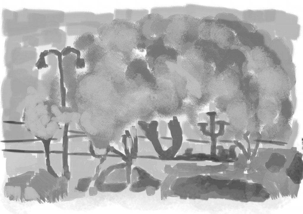
Tim Burton. I’m no Tim Burton fan but for this I went with plain black and white. Other than that it’s not much different to some of my other paintings like this.
Again, the video:
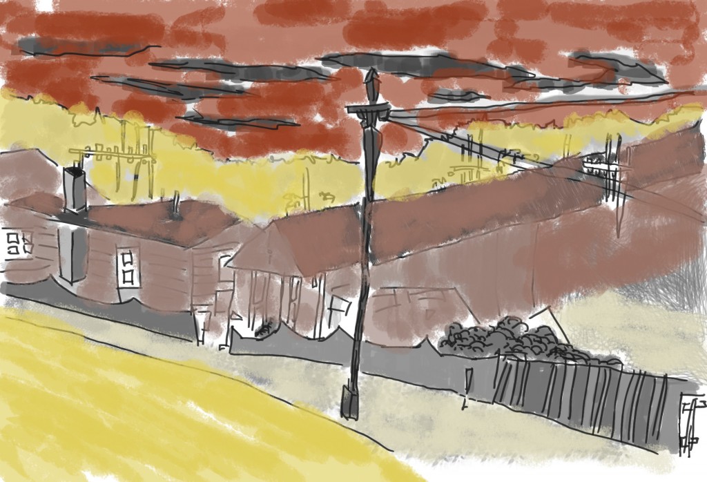
Western. This one was fun and I’m some what happy with the result. The western influence is in the colors.
Here’s the video. I think I’m getting better with editing together these videos, all its missing is sound:
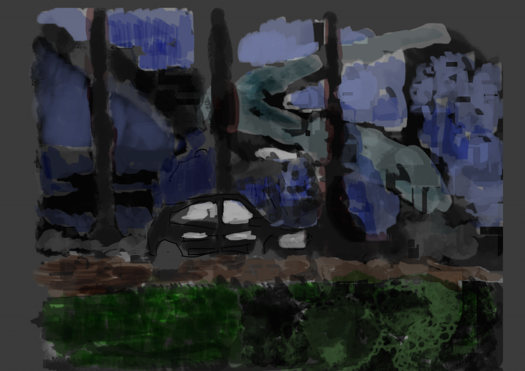
Eastern. Again like Western the influence is in the colors. I looked at Eastern imagery and decided to go for cool colors over the very hot Western look.
I struggled painting this - my brush tool is broken in GIMP and causes it to switch between several brushes/colors. This causes a mess and I loose control of the painting. When I was doing the tone layers this wasn’t really a problem, it added effects to the image. I’d like to figure out what is causing this though as it does add frustration. I had a go with Photoshop CS5, but it’s lame.
No video for this sadly. I painted this on my laptop in the library and I’m still having problems recording on the laptop. Desktop is winning.
Read more →
Final works of this sketchbook. I’ve got a new book the same which I have started. This old sketchbook is falling to pieces so it’s great to finish it and start a new one.
All these works are around Levin, with a focus on tone. It certainly helps when I take these images into GIMP if I have some tone, gives me a better idea of what the objects look like.
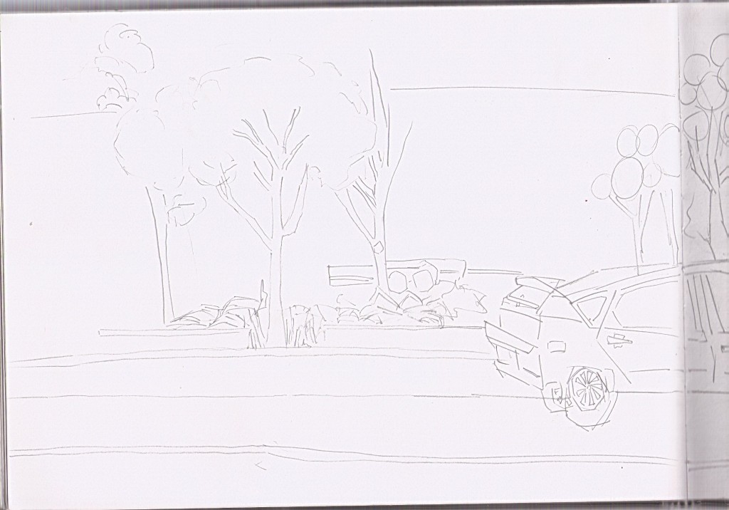
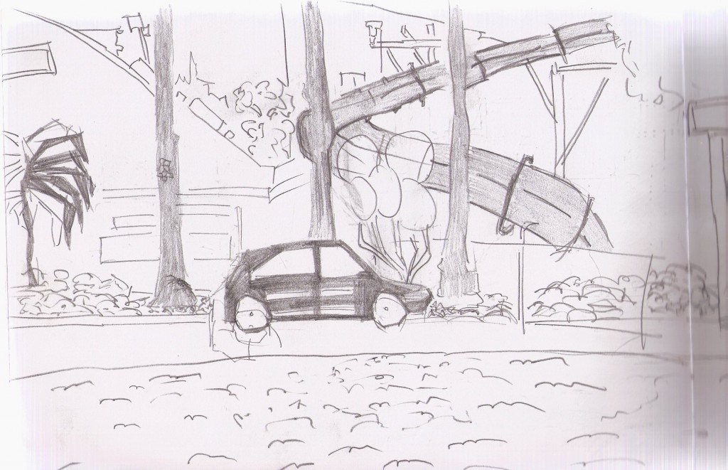 Here I’m sitting at the skate park looking towards the swimming pool. I filled the trees, car, and hydro slide with tone. This tone is certainly helping put the objects into the 3d space.
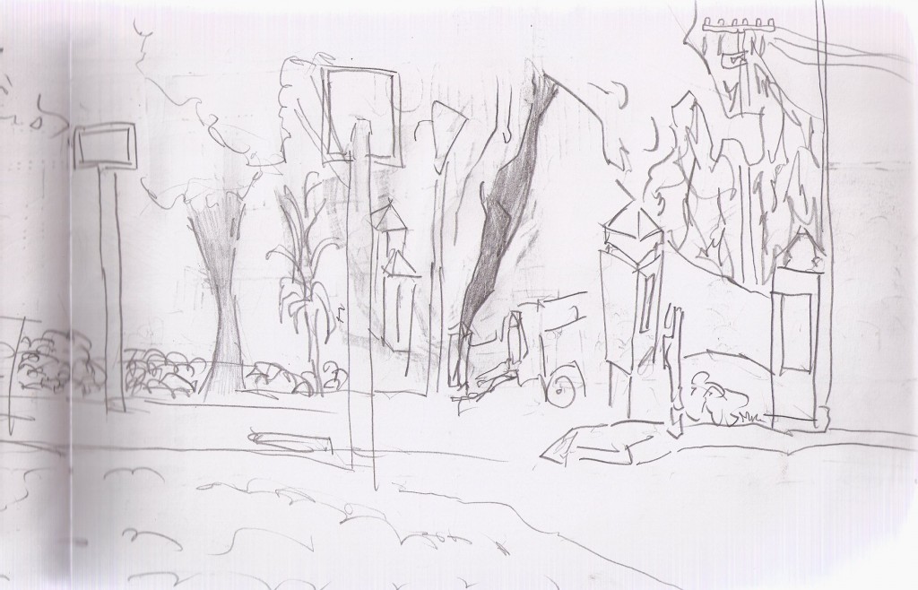
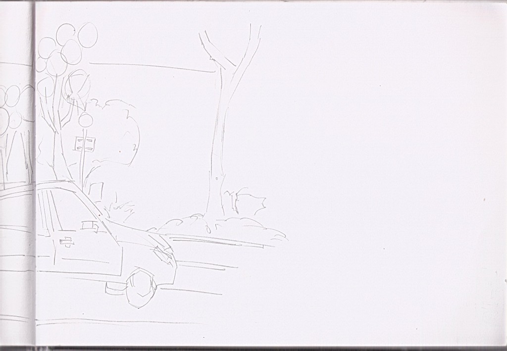
Right side of the drawing. Quite a bit of information here but not as much as a focus on tone. I have to watch out for smudging, this is prob the worst thing about using tone. Using an HB helps - couldn’t work with a 6b - even 2b would be a headache.
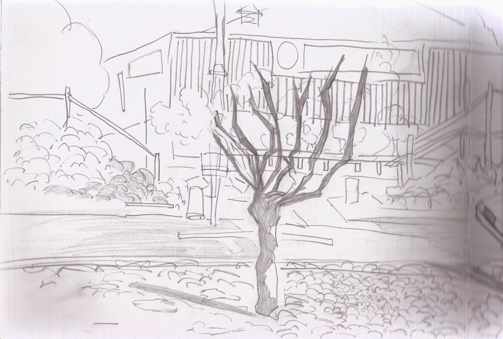
This is the opposite view to the previous view. Here I’m sitting on a bench outside the swimming pool looking towards the skate park. In the background is the Farmers building. Rails from the skate park are on the left and right. In the front center - a tree which I’ve covered in tone. I’ve even added a shadow to this tree. I’ve been using different marks to show a range of surfaces - this is important for the grass and vegetation especially.
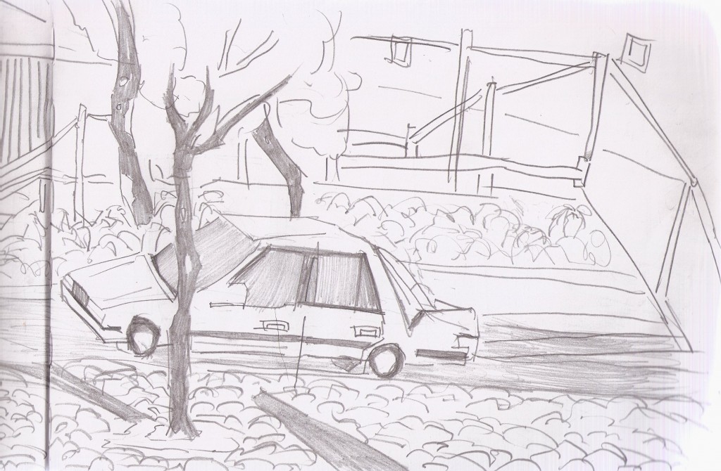
Right side of the drawing. Finally a right side that I’m happy with. Probably one of my better car drawings. I’m not really a car person but happy to draw them if they are part of the scene. Again here I’ve added shadows the the trees and texture for the grass.
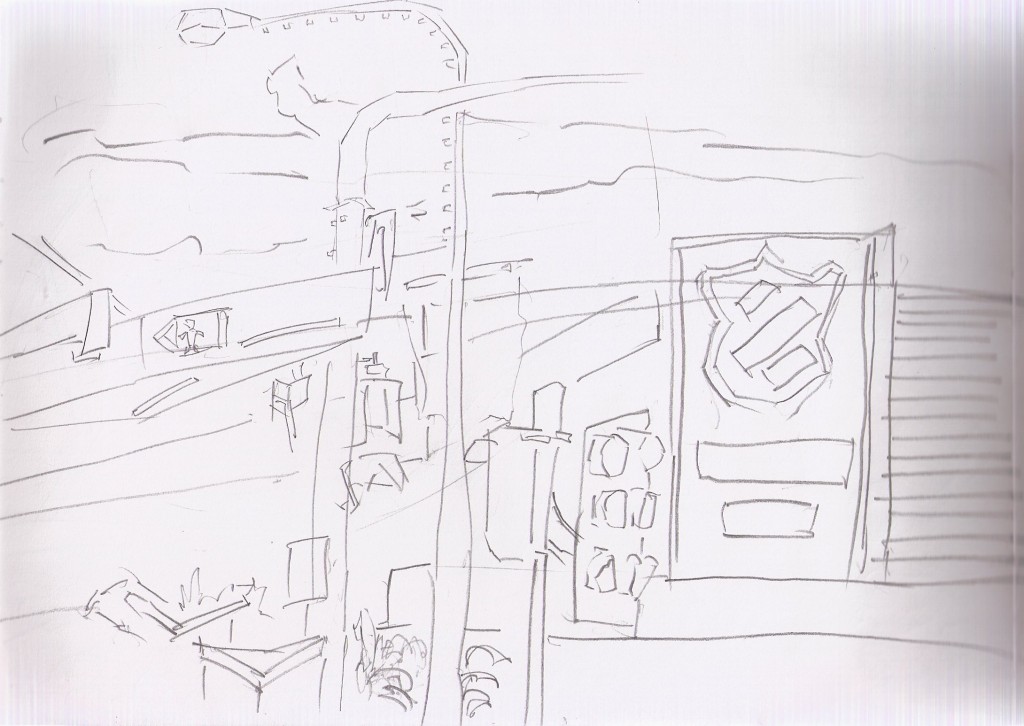
Out the front of New World, looking towards Oxford Street. On the right is the Salvation Army sign. Classic favarites are all included - lights and street lights. I didn’t spent long on this - was sitting up on the wall and wasn’t the most comfy.
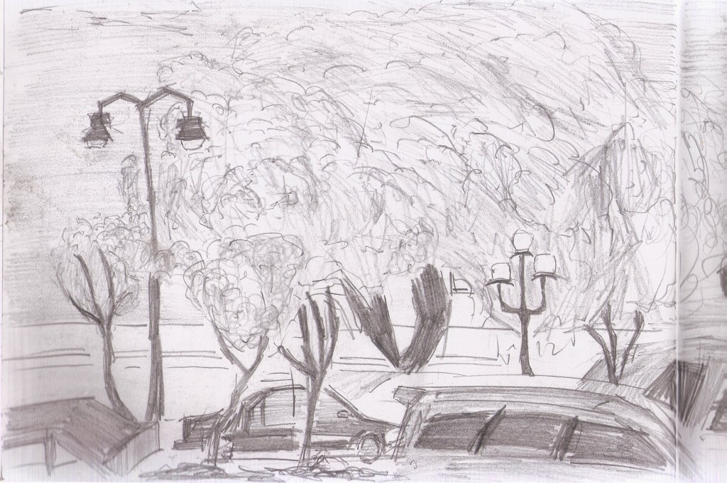
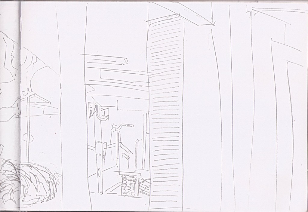
Sitting outside the new Levin library looking towards an area I often draw. Mostly trees with the bottom scatted with cars. 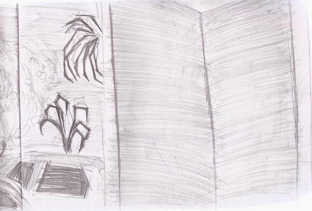 Right side. Large pillar objects cut my view. I don’t why they made these useless boring objects. They are no fun to draw. White and plain.
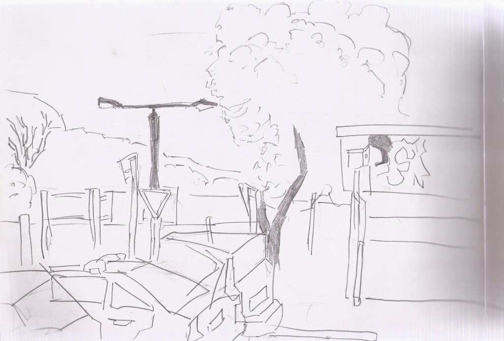
Waiting at the bus stop. On the right, part of the Focal Point cinema. The cars are the best thing. I’ve focused on the 3d shape they have.
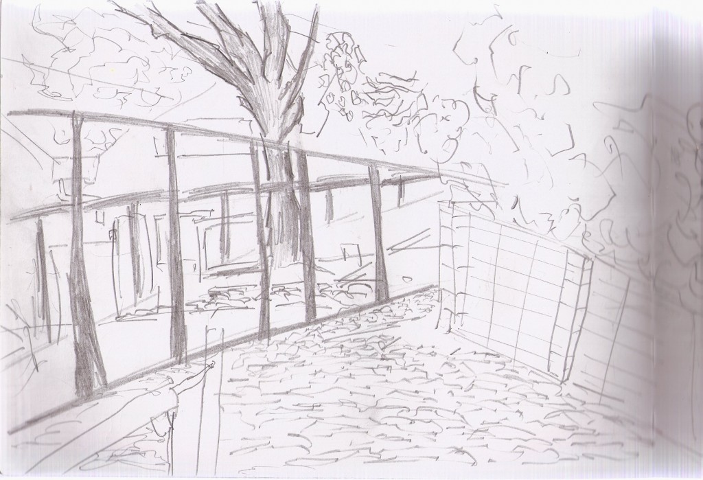
It was late and cold when I went out for this drawing. Left is part of the tennis courts. Time was spent capturing the large tree behind it - and filling with tone. On the right, a brick fence coming towards me. Top is filled with trees. Using a basic scribble movement to capture the grass and keep it separated from other areas in the drawing.
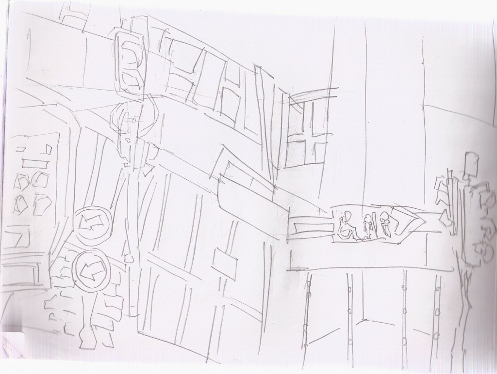 And the final. Extremely loose with the pencil in this. There are areas I like, such as the very right side. Other than that. Onto the next book
Read more →
Nibs for my Wacom tablet arrived on Tuesday so I’ve had a couple of days praticing… oh boy it’s nice to use over my old one. So much control. I’ve been focusing on taking the Levin street drawings into GIMP, using them both as reference and paint overs. I’ve been trying to take the computer out of the house more as well - setting up in the local library and at my brothers place.
Though I haven’t done any of the SketchDaily themes these past few days (busy with Python and the street paintings) I plan to get back into them'
Here’efs some recent work:I
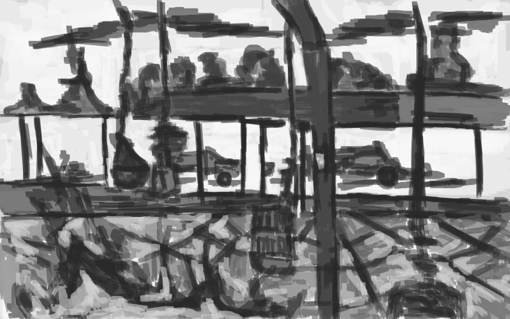
This was with my old tablet. I did this over the weekend, before my new nibs arrived. The reference I used for this painting was a drawing in my sketchbook I did in the new Levin library, looking outside.
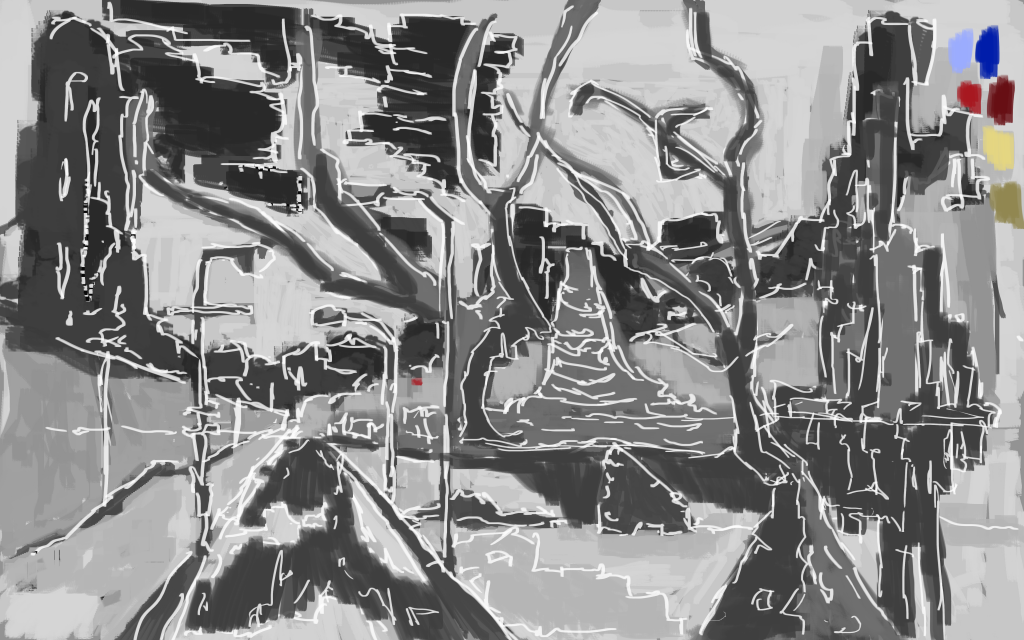
Now here’s a painting I did with my new wacom. Notice much of a different? I used much the same techniques as the previous painting but get a much nicer outcome. For this work I took a digital painting I had done and worked on it further, something that I need to do more. I could even scale this down and extend the painting further. I think this scale down technique will help me develop detail in my works.
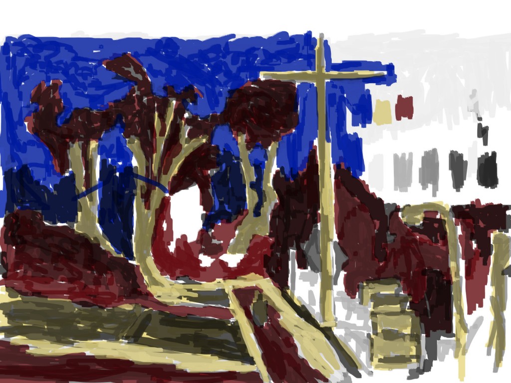
This is with the old wacom but I have managed to get color in there. I like to use the multiply brush effect. It allows me to layer up those colors without losing the grayscale tone underneath. In the past if I wanted to show the under layers I would drop the opacity or use the eraser and cut back into the painting I’ve been using the screen option as well, but not in this one.
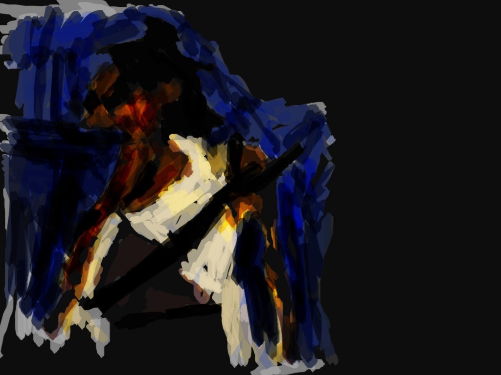
Zombie girl for skethdaily. I got some feedback for this:
– louisecyphre
So, do you want some help with your painting?
I don’t know what you’re drawing with, do you use a mouse, a trackpad or a tablet? If you use a mouse, and can afford it of course, switch to a tablet. If you already do, you’re off to a good start.
I’d try to reduce the palette. Choose three to four colours and stick with them. Keep a neutral background, so far the black background smothers all the details you put in. As far as I can see you use Gimp for your paintings. That’s totally okay - at least it’s a lot better than Paint! If I were you, I’d try using a smaller brush - or even a pencil tool. Start by learning to draw outlines, do colour as a secondary step or not at all. But for the sake of practice, I’d abstain from using colours until you get the basics down.
I don’t mean to offend, but so far one can’t really make out what you’re trying to paint. As I can see in your videos, you do have an idea you want to put down, but ultimately struggle with the outcome. Some more refined edges would help in the long run. Try using bigger areas of colour, if you must. As far as I can see, you also always use the same brush size. Use bigger sizes for the foundation, and smaller ones for details! Right now, everything blends together to a conglomeration of similarly sized lines, which lack definition.
Anyway, keep doing what you’re doing! Only practice makes uses better!
They made some good points. In terms of the comment about brush size, using the new tablet has this feature so won’t be a probem now, it’s also much easier to draw with it. I need to use more of a range of brush types in my paintings. I guess that’s one thing I’ve been working on. Maybe release a brush pack once I’ve made a few.
Since I’ve been getting back into using Python again it’s time I wrote scripts for GIMP. One script I had in mind would do this. Open a file, divide it up, export the divided pieces as brushes. This could be a great way to produce 50 or so brushes quickly.
Here’s the final SketchDaily - Demon:
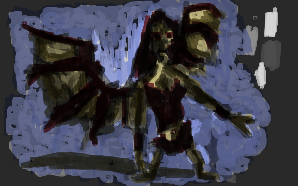
I used a World of Warcraft reference for this. Again multiply color brush used over the grayscale underpainting.
Read more →
I’ve taken a break from the digital painting till my new nibs arrive later in the week. Instead I’ve been working with Python - Pygame and Autopy. Something different.
Still trying to get out and draw everyday - have had some beautiful days here. Here’s some of my drawings that I’m planning to take into GIMP in the near future.
No traveling currently so all these are around Levin…
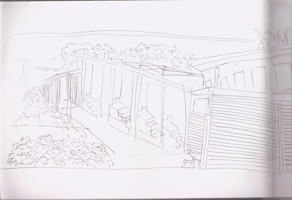
Levin North School again. Sat in a similar place I did as last time. The perspective of the steps was certainly a challenge - I still struggle with it.
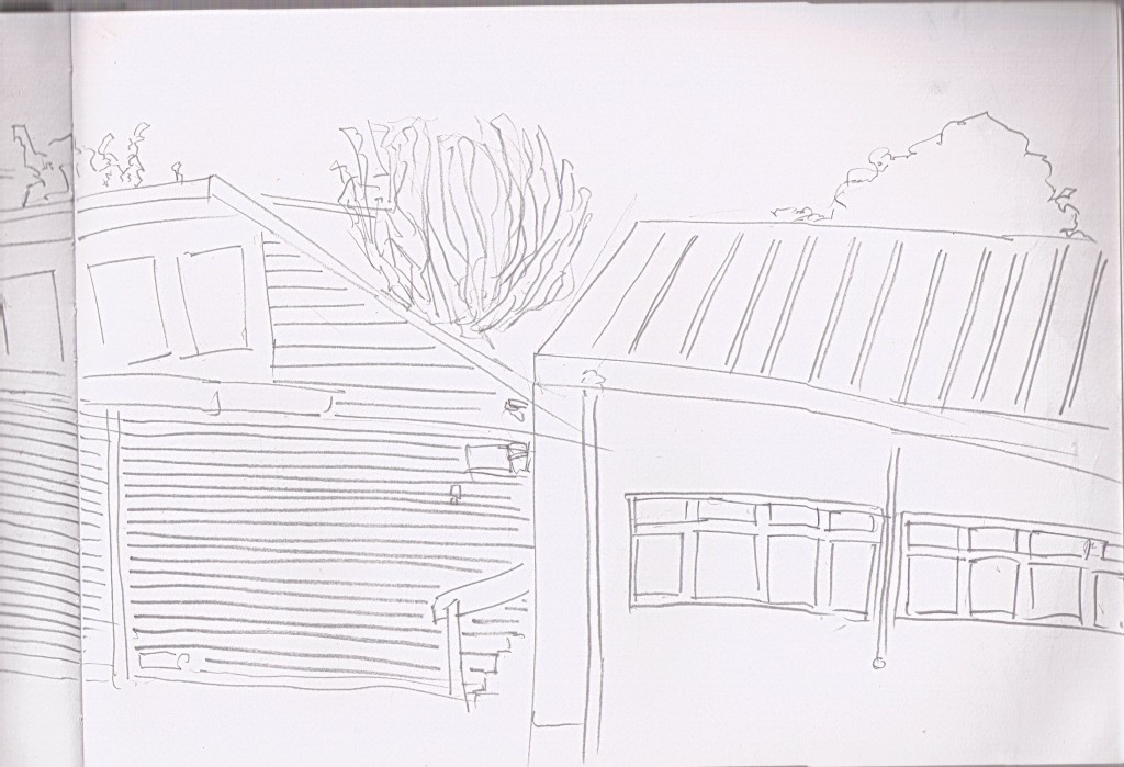
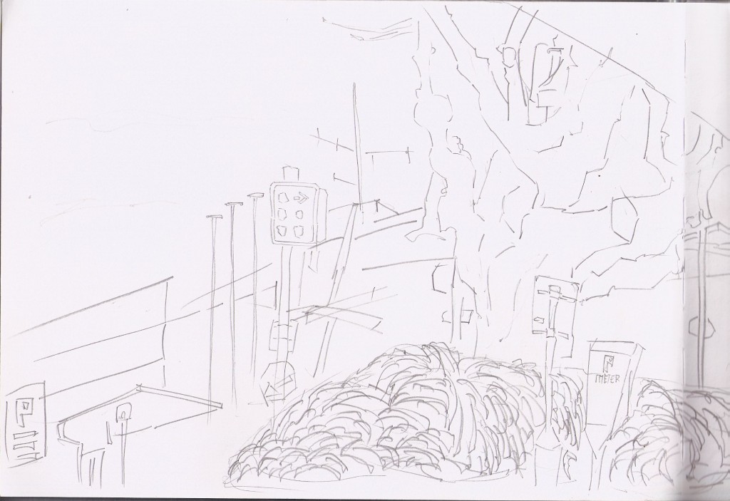
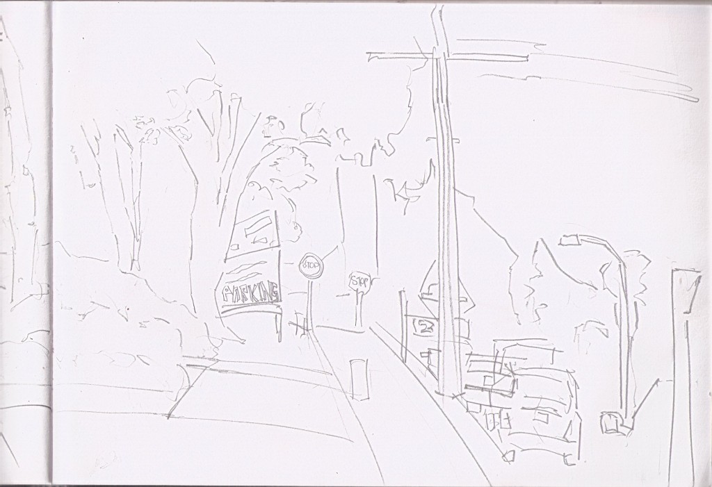
These stripes are used to show the bump in buildings. Helps with the directional feel to the image.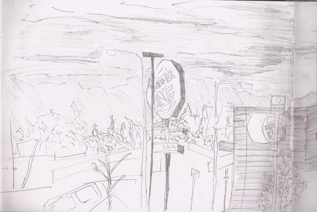 A quick shop in New World before this one - rice crackers, humus, and a creaming soda. I was able to relax in a chair well drawing this scene over looking the New World carpark. Burger King is new for Levin. I hold no interest in it but the sign was fun to draw.
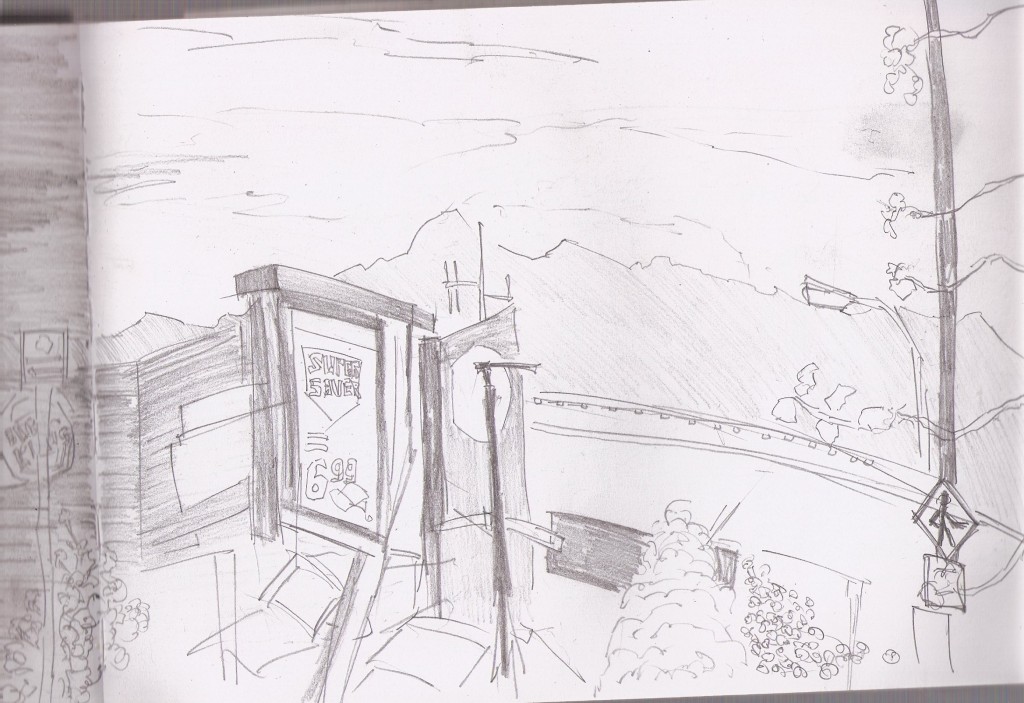
New World billboard on the left. Mountains in the background which I’ve covered with a 45 degree shading movement. Couple of plants peeking out in the bottom. 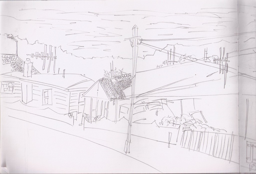
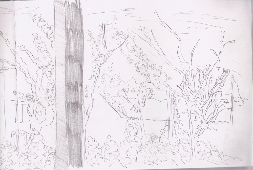
Sitting out front of my old High School - Horowhenua Collage. VIew of the start of Bath street. Powerpoles, fences, gardens. What more could one want? 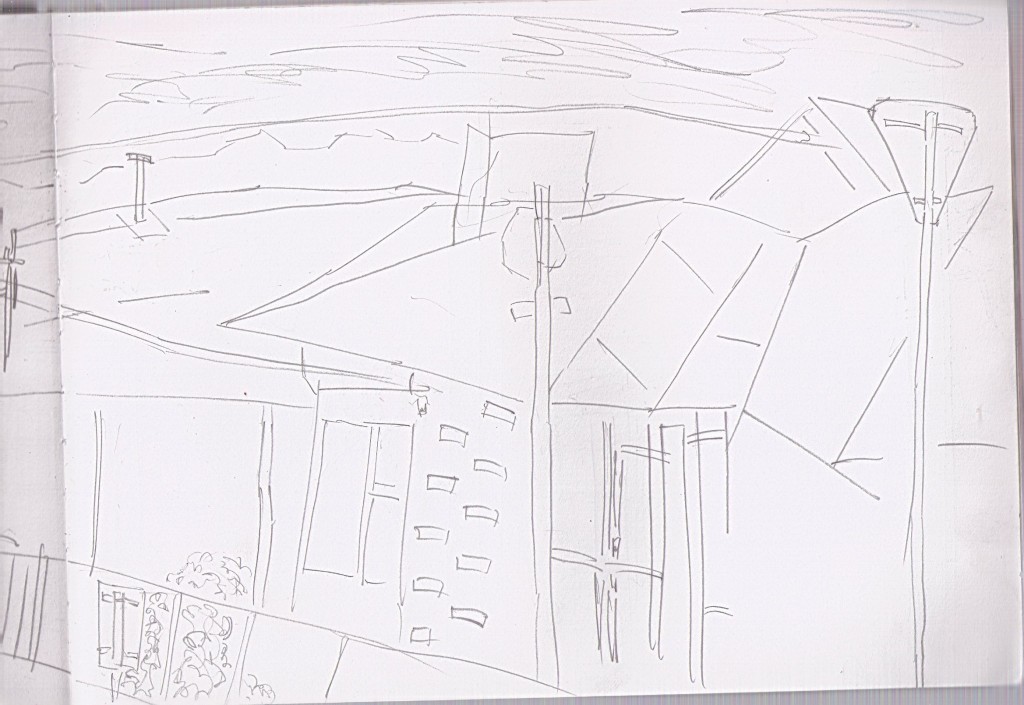 That first page is nice after looking at this garbage. Carry on.
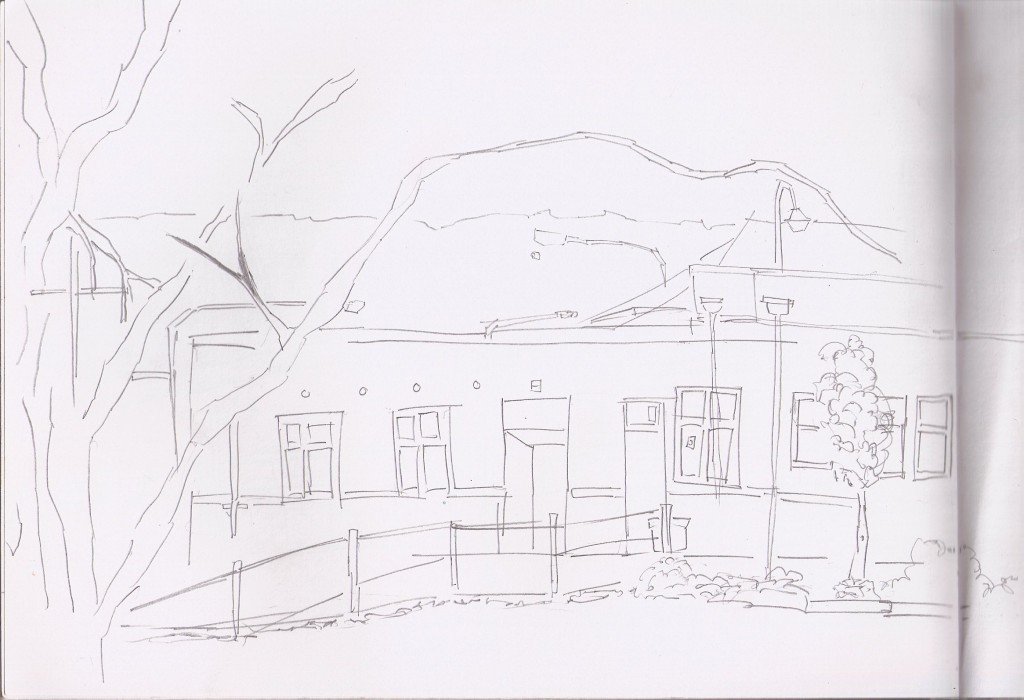
Sitting outside the swimming pool drawing the building behind the skate park. I’ve been trying hard not to mess up the scale of items, it’s just about taking your time and really looking. Any fast moves and it’s all over. 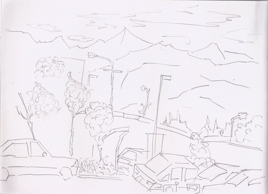
The mall carpark. Cars are becoming more frequent. I don’t think anything is harder than something else, it’s just about looking. 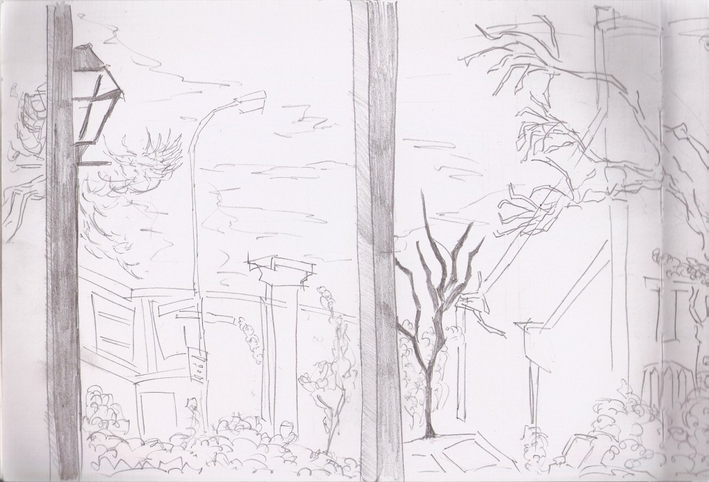 Plants plants and more plants.
I do enjoy drawing those plants. In the past I had just focused on the branches but those leaves are becoming more frequent.
Read more →
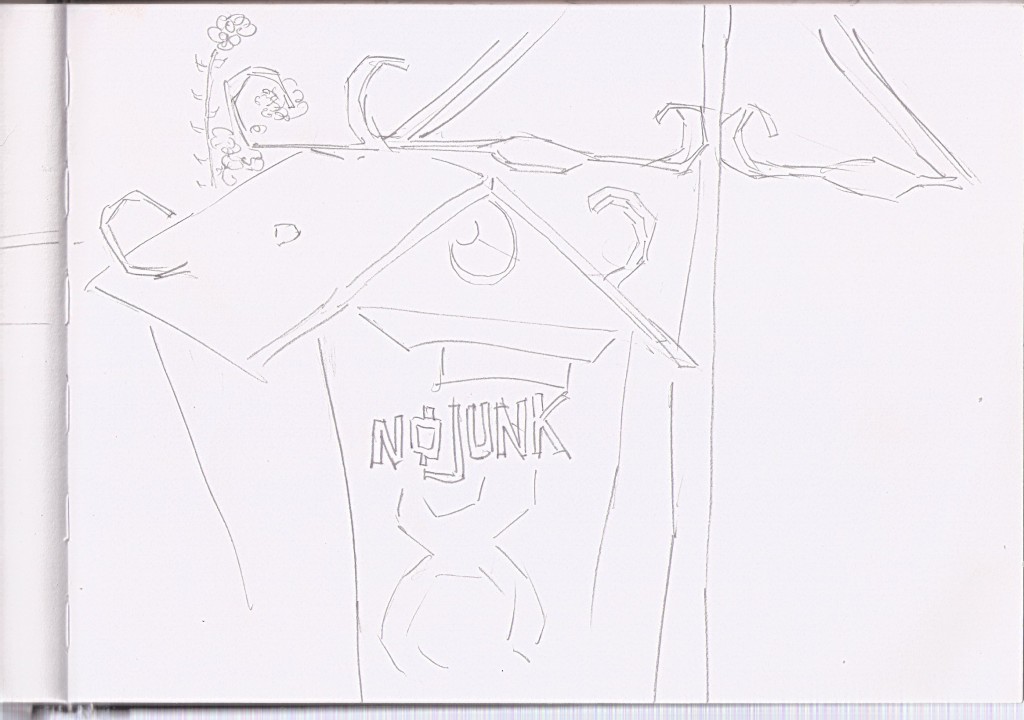
After uploading so much digital works lately I thought I’d better scan in sketchbook works. It’s important to me that I can out of the house everyday with this sketchbook and get two drawings done. Not everyday this happens, but when it does I feel good. These works are all from various locations in Levin.  Old letterbox in my Mothers backyard. It was a beautiful afternoon and I sat on the deck with my sketchbook, drank a beer, ate lemonades, and sketched. This is one of the more zoomed drawings I’ve done recently. The box was painted with spraypaint by me. The ‘No Junk’ is a Russian font I found on the internet and copied.
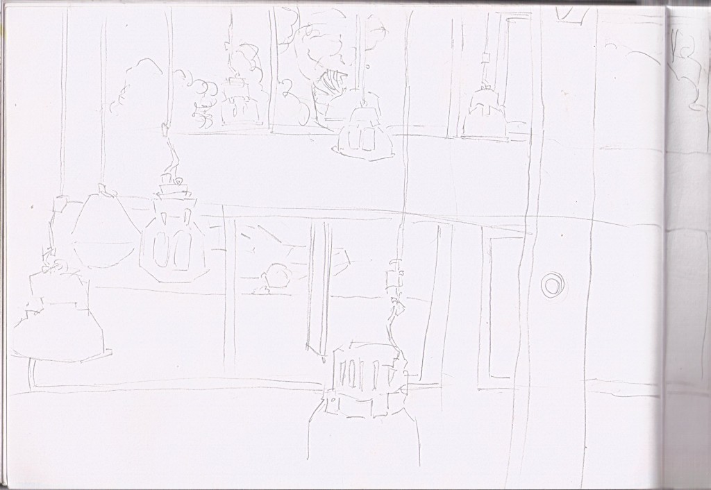
  View in the new library. I sat on the 2nd flour and drew the view looking outside. Lights were the main focus. Some vegetation/cars outside can be seen.
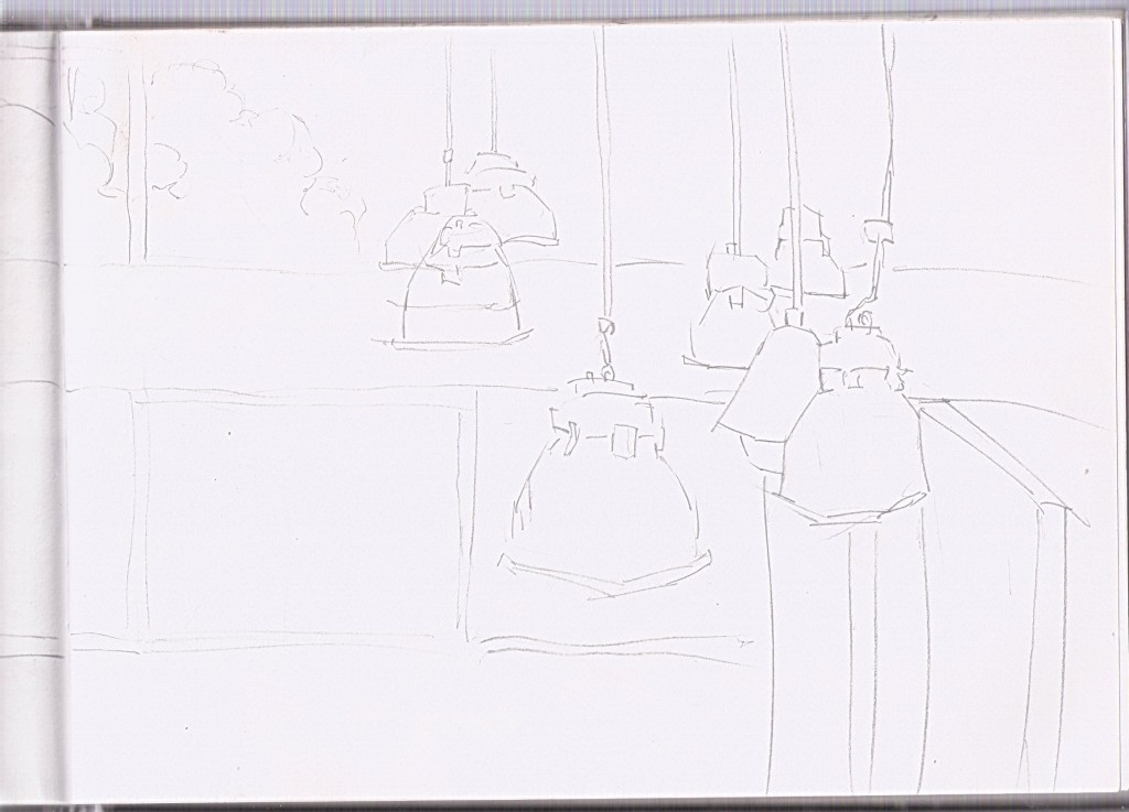
  2nd part of previous drawing. Not so much detail as the previous page. Lights hanging down are plentyful though. I focused on scaling the lights in order to show the prespective of the room. It was certainly refereshing to draw a different scene over the usual light pole and trees.
  View of the Levin mall that I’ve drawn several times before. Focus this time was less on the building and more on the trees and car.
  Front of the car, trees and vegetation in the background. Again, not alot of detail in this one.
  View of Oxford Street. I like how I’ve rendered the plants, It’s created quite a mass of information The top left is certainly missing information .. maybe I should of added clouds to this area. During this drawing I talked to a man called Rex. He has a video production company in Levin. I need to get in contact with him and visit his studio - should ring tomorrow.

Scale! Light pole scaling off into the distance. I talked to Rex for sometime so headed home shortly after. Strugled somewhat with the right side. I’m really happy with the left though. so I guess it makes up for it.  View from a seat on Queen Street. I’ve drawn this scene many times before, but it’s always a new experience.
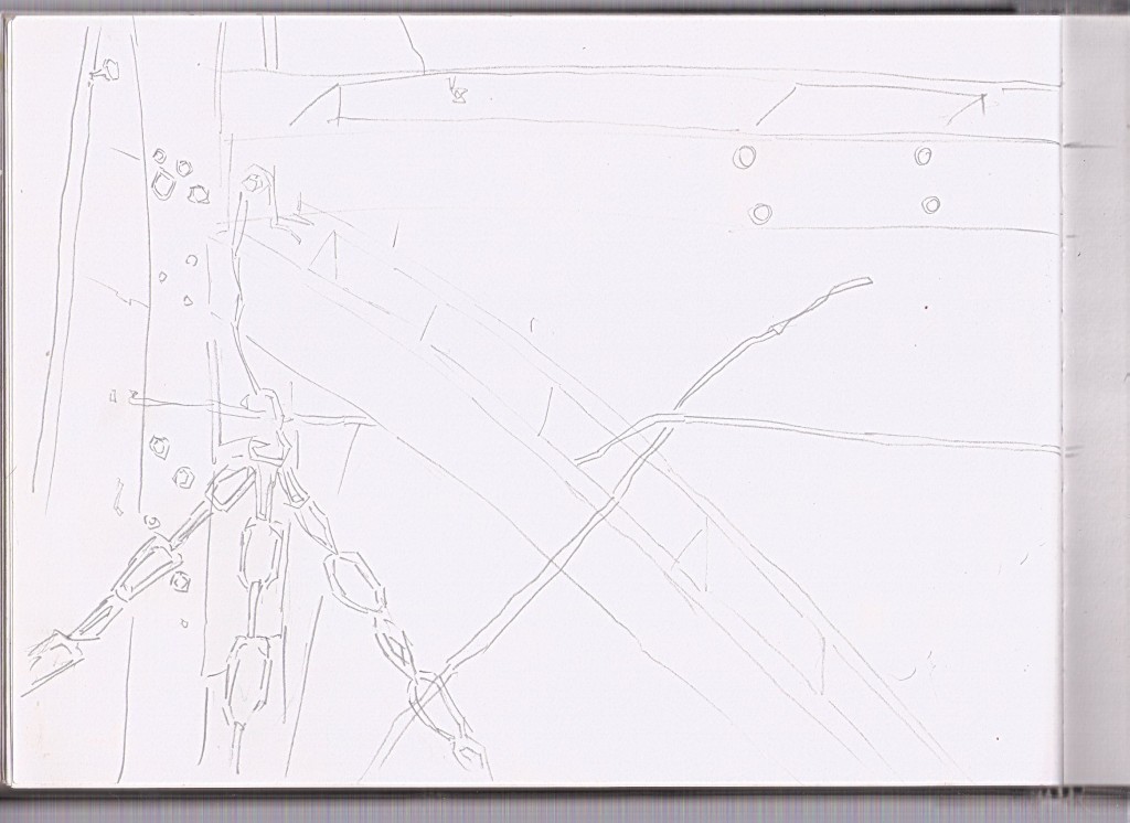
  This was drawn at home, in the tunnel house. I don’t normally draw at home but it was a sunny day and I was relaxing with a Double Brown, talking to Dad and some friends from down the road.
This drawing is of the wooden pillars in the tunnel house and a chain holding up a plant.
 Queen Street. My sister came for a walk with me and I brought her lunch. Sadly I had forgot my clutch pencil - it was a disaster. I was going to go home without drawing - oh the horror. But I decided to pop into a shop and buy a pack of two HB pencils. These were ok but I still preferred my clutch. I found it once I got home, we were reunited.
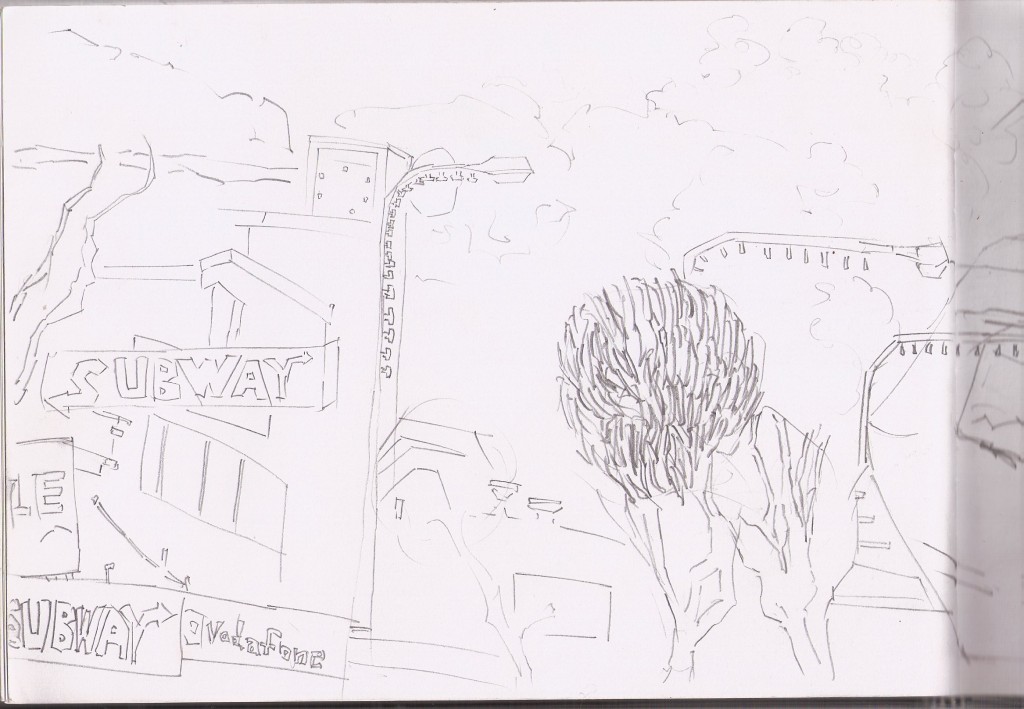
Typical scene that I have been drawing recently, Subway is on the left. For the tree leaves I just made
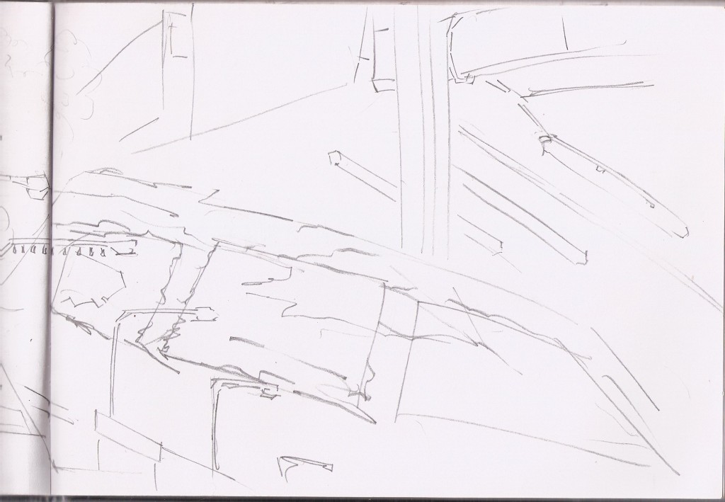
 The right side of the page. This was a disaster. I got the perspective wrong and added the car in - when really the car is much further to the right. I tried to fix this by attempting to change the car into clouds. The poles scaling down are correct. Holley was getting cold and wanted to head off so I gave up on this one. Happy with the left page though
 I need to draw in a variety of locations. I get sucking into drawing the same scenes several times, which isn’t a bad thing, but it is refeshing to draw something new, and keeps me on my toes.
This scene is a drawing of a local school - Levin North School. I attended this school in the late 90s. It hasn’t changed and it was nice to sit on the field and draw the buildings. Many wonderful memories here - mostly role playing television and movies characters with friends (Batman and Stargate SG1)
 I’m especially happy with how the building on the far left. It’s working well. Looking forward to taking these drawings into GIMP and producing paintings.
Read more →
Here’s a couple of images I’ve been working with. Trying to get something done for the EOW. I’m not partially happy with them. So I moved onto working with more of a straight street scene. Which I’m happy with. 
I used a drawing I did in Levin as reference on my other monitor as I painted this. The brush I used is a custom brush I made myself. It has a very flat brush feel to it. Love it! I’m going to keep working on making brushes out of areas. Maybe release a brush pack? 
Here I scaled down the previous painting and worked on adding more content to the painting. I feel my paintings often lack information and want to work on adding more. This is a good start
I’ll add the other paintings… but I’m not happy with them… 

Read more →
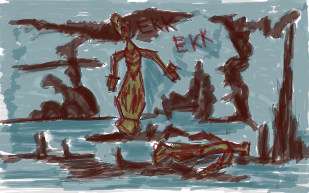
More digital paintings in GIMP. I’ve gotten good at recording all my painting I’ve been doing, editing and uploaded to Youtube, No sound on it because I’m not a sound person and don’t have the time to do a narration to them all.  Merpeople was the theme for October 5th. I was inspired by my sister who often makes the noise Ekk Ekk. Being a fish. As always, spent time working on the background even more than the characters.
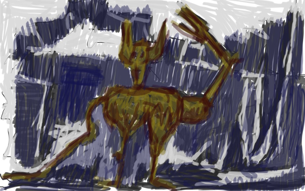
  October 6th. Cats. And Spider People. I went with the cats and people theme.
  This was a portrait I did for someone on Reddit. They wanted their child drawn so I painted this.
Short blog post. Much of my time is being spent on Guild Wars 2…. inspiring Concept Art with the loading scenes!.
Read more →


 Here I’m sitting at the skate park looking towards the swimming pool. I filled the trees, car, and hydro slide with tone. This tone is certainly helping put the objects into the 3d space.


 A quick shop in New World before this one - rice crackers, humus, and a creaming soda. I was able to relax in a chair well drawing this scene over looking the New World carpark. Burger King is new for Levin. I hold no interest in it but the sign was fun to draw.

 That first page is nice after looking at this garbage. Carry on.

 Plants plants and more plants.