So back in Levin after the Wellington trip. I havn’t gotten alot done since I’ve gotten back. Mostly rested and cooked a little. I’ve started getting into a route with digital painting. I’ll get there
Attempting to apply a few techniques from Bridgman - Guide To Drawing From Life. I looked though it when in Wellington City Library and back home got hold of a digital copy (though a physical book would be great). I’ve mostly been working in a new visual diary, making copys of his drawings. I’d like to do the same with digital drawings.
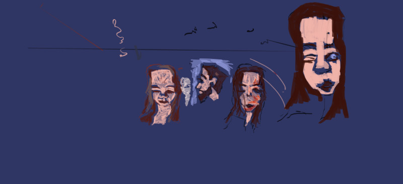
Portrait practice. Was inspired to try a new color palette. It’s very different to what I usually work with. Needs more yellows.
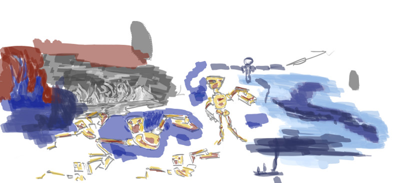
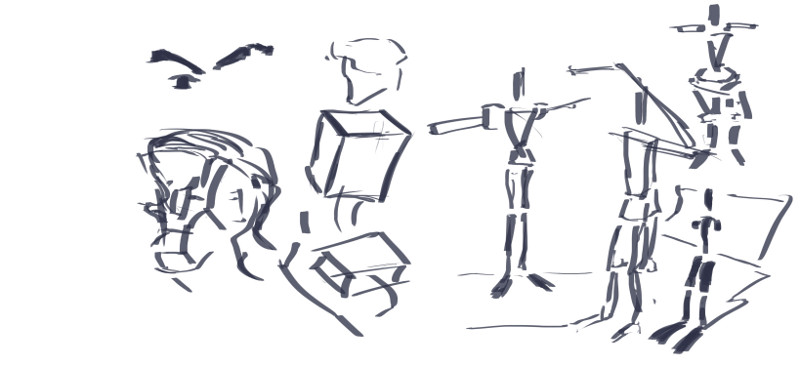
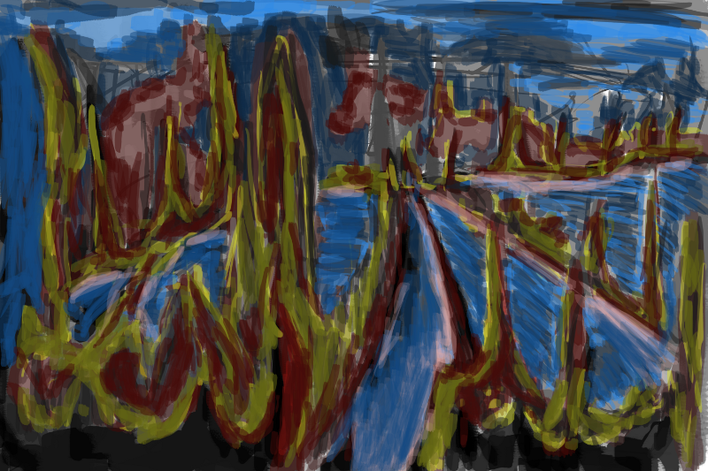
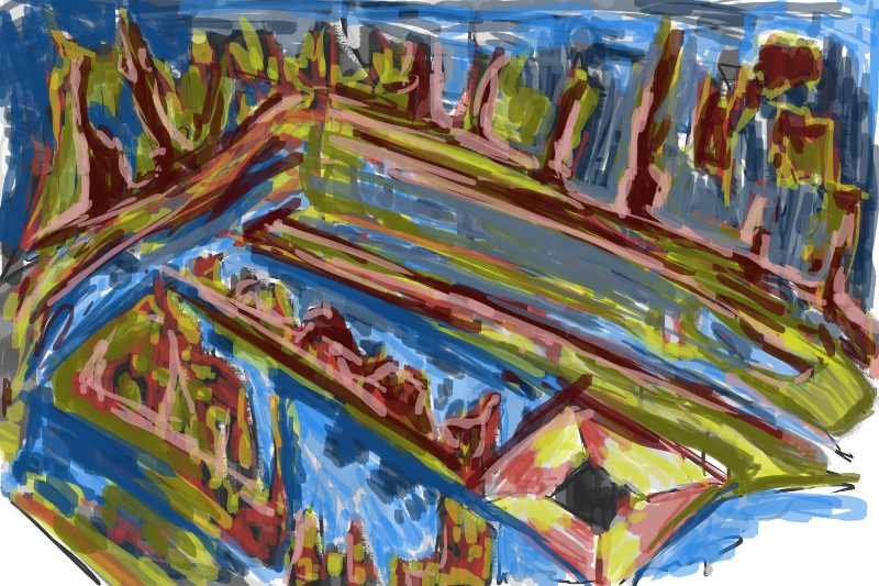
Exploring the robot. Yellow and reds on the figure are familiar. Plenty of focus on the environment - sketches of areas.
I have drawings in my visual diary that I should upload. Thought I’d better upload something tonight, and this was the only art I had done.
Read more →
 Hello thest
Read more →
Took a break from Unity today and worked on just digital painting. I also left the house and went for a trip to Upper Hutt. The view overlooking the Hutt was quite stunning. I got a friend to take some photos so I have some new reference for digital painting.
These are all much the same as my recent digital works. Keeping with the single layer and 60% to 80% opacity. conceptart.org has been a big inspiration… I’m inspired to better my artwork because of the works I see on the site. Practice, practice, practice!
Using the same colors and ideas throughout these paintings helps create a series and harmony. Feng Zhu suggests working on multiply paintings… so I do!
My least favorite of the bunch. Might be the angle I don’t like. But something about this I don’t like. It’s just not working.
Here’s a lapse of these digital paintings. No sound sorry.
Some of the process of the paintings is missing, but the video shows the switching between paintings. I’m going to produce more of these videos - I’m just having trouble with file sizes and types. I’m using the software CamRecorder but it saves as .avi - making it useless to take into Windows Movie Editor (crappy I know, but it works for me). I’d like it if CamRecorder was able to save it as a compressed movie file that I was able to edit in Windows Movie maker. If anyone knows how to do this - please let me know.
Tomorrow I’ll be heading into Wellington for two days - I’ve been in the Hutt. I’m looking forward to heading back to Levin. The Hutt has been fun… but so cold.
I’ll try to get in some digital painting tomorrow… and maybe some sketches in my sketchbook I have taken some photos of recent sketchbook work and just need to upload to the blog. I havn’t put up any traditial drawing works for ages so it’s about time. I do like working digital though - it’s fast, cheap, and not messy (not that working colored pencils is messy@)
Read more →
I’m currently in Wellington for several days but have had time to work on projects. I’ve decided to give Unity3d a go - and move on from Blender. I still enjoy Blender but feel I need take my artwork into Unity. I’ve tried UDK and Hammer but Unity seems to suit me best.
I’ve managed to create a 3d first person environment using my artwork as textures. This was rather simple as I was able to use the standard character library within Unity. I used the basic cube to create the area then textured with my own artwork.
I also managed to make a fixed camera 3rd person camera view and a follow cam 3rd person. I’d like to experiment with these further as I’m more interested in creating something 3rd person over 1st.
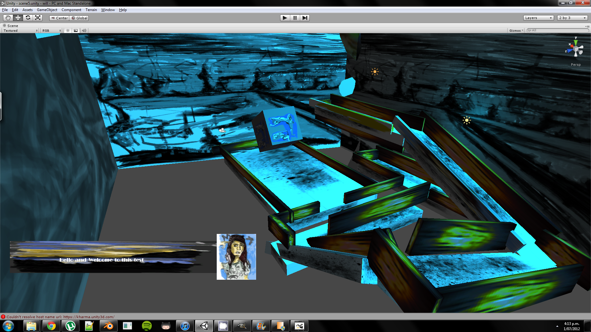
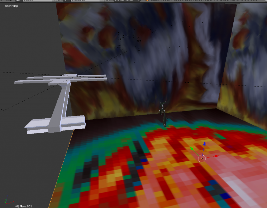
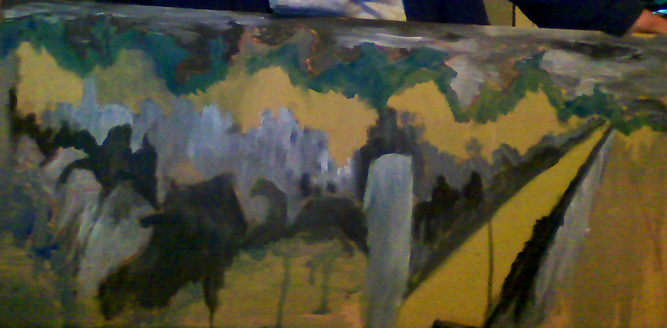
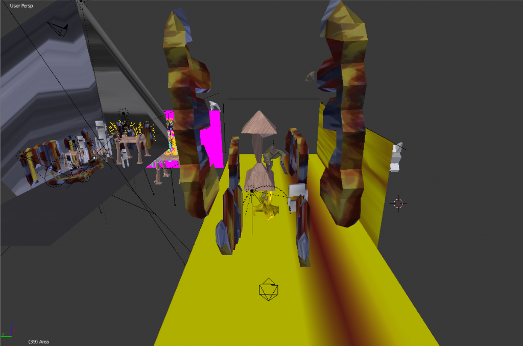
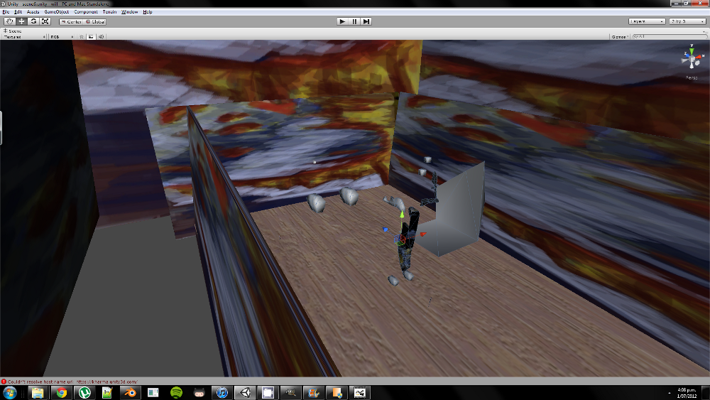 My latest scene I’ve created. This started with a first person camera but I replaced with a 3rd person. I wanted a fixed camera as in my previous scene I had a 3rd person follow cam. This hasn’t been successful so far but I’ll keep working on it. The ground texture is a simple wood texture that I created with wood workshop - the textures on the side are recent digital paintings created in GIMP.
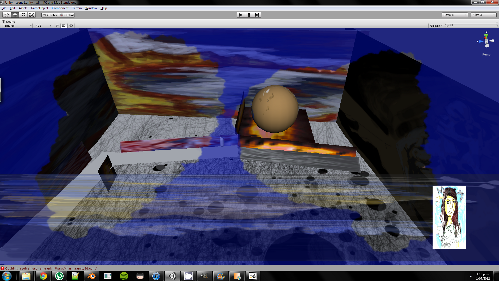 First person view. In this scene I worked with HUD - masking off areas to create a goggle effect. I’d also like to work with in game dialog - using my portrait skills to create portraits in game for character. The landscape is for the dialog…. I’ll work on improving this later but wanted more then just a blank color.

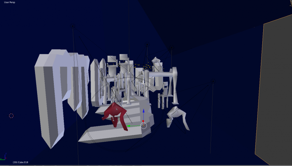
The 3rd person scene I was working on. I used the build in character and this was working great till I started messing with some settings and broke it. The third person camera still works but no character is showing. I’ll like to replace the default character with one of my own that I’ve created in Blender. I’m having problems working with the imported blender files. I need to figure out how to convert them to the same mesh as the created in Unity. 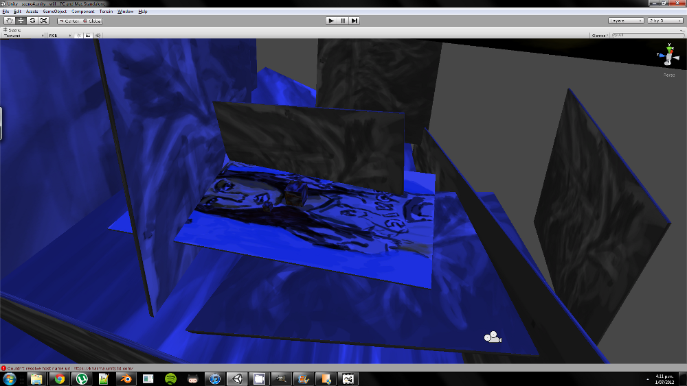
Third person fixed cam working. A simple cube was the character.
And finally a video of a first person scene:
Read more →
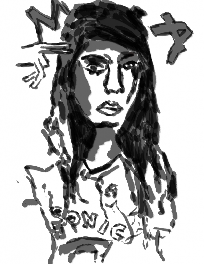
Before I started at TLC I was really into drawing portraits of famous people. Especially music and television.
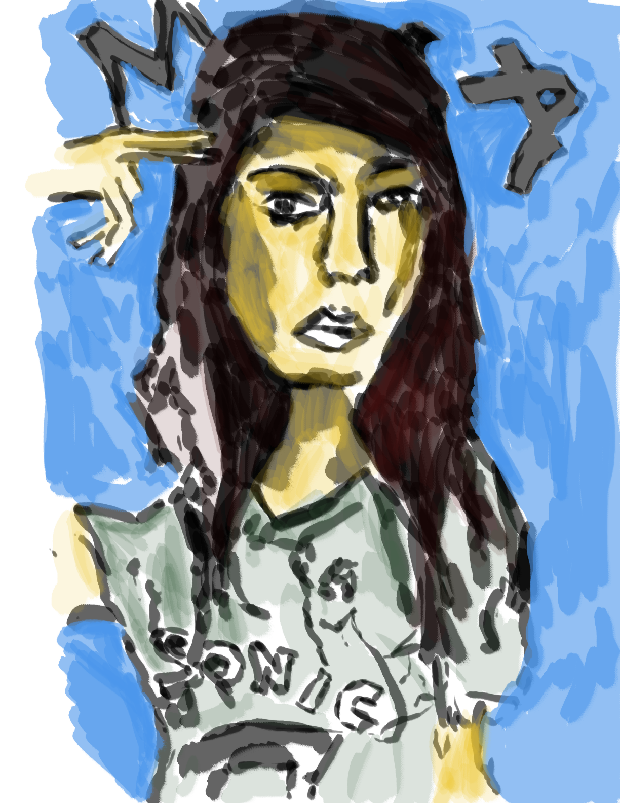
In 2010 I did a drawing of MIA - pencil. I then took it into image editing - I think it was my ipod touch - Sketchbook Pro.
Decided to take that old drawing into GIMP and paint a portrait with the new tablet. Here’s the results.
Black and white start as always. Well digital painting the other day I thought to myself - I should start making my own brushes in GIMP. I could create these by cutting up my digital paintings or even using some areas of my paintings as stamps for brushes. I know it’s easy to make brushes so I should explore.

Color added. Inspired by my usually colors. Opacity has been dropped dramatically in areas - sometimes going in with eraser to enhance the effects more.
This is just a quick update. I have a folder of Blender renders - ‘Sunday Render’. I’ve started calling my Blender render files by days of the week. It helps me keep more organised. Having 500+ img and mpeg files in one folder is not fun - unless they are sorted correctly. Even then - it’s still a mess. ‘Sunday Render’ should be published tomorrow - I’ll just need to work on some more Blender works to render first. There is only 30 seconds of footage… I’d like 1.5 mins minimal for the animation now.
I opened Unity today. It had been a long time since I’d used it. Imported a first person package and created a small game of a character walking around an emptiness area. I need to experiment with it further - Need to get the .blend import sorted to show textures and such. Currently it’s only showing textureless models. Animation is working though! I’d love to create some NPCs walking about - maybe make them interactive.
Read more →
Sunday was spent working from PixelLovely and on Joy’s Massage business cards. Business cards - completely different to what I usually do. I had hoped to bring some of my drawing and painting talent into the cards but Dad and Joy seem to both want something that’s just large text and no graphics. I disagree with this as I believe imagery is far more powerful then simple text. It’s up to them at the end of the day though so no point arguing with them. Plain cards it is.
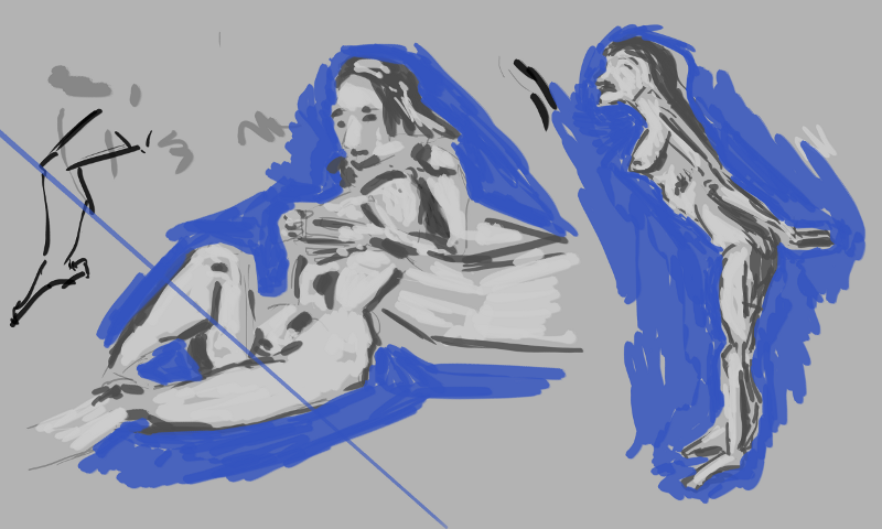
I did have fun with PixelLovely No environments (though small doodles that could turn into something). As always the focus on these studies was looking for the light and the darks. I sketched in the overall figure first then filled it in with two tones - back and white. Color wasn’t really a focus - though I did use a blue for the negative space.
The largest of the days studies. My canvas was huge - working 5000 by 3000 px. The legs were hard to see in the reference photo so I got them completely wrong - once I went in with the black for the negative space I noticed they were in the wrong spot altogether. I didn’t bother with attempting to finish these off - instead just started a new drawing
The blue around the figure helps to guide me on what’s working with the anatomy and what I’ve got wrong. It’s a great safeguard I enjoy working with a plain color for this but should look into creating a scene more. I did this with perspective towards the end of term 2 at TLC. Maybe take some of these ideas into digital?
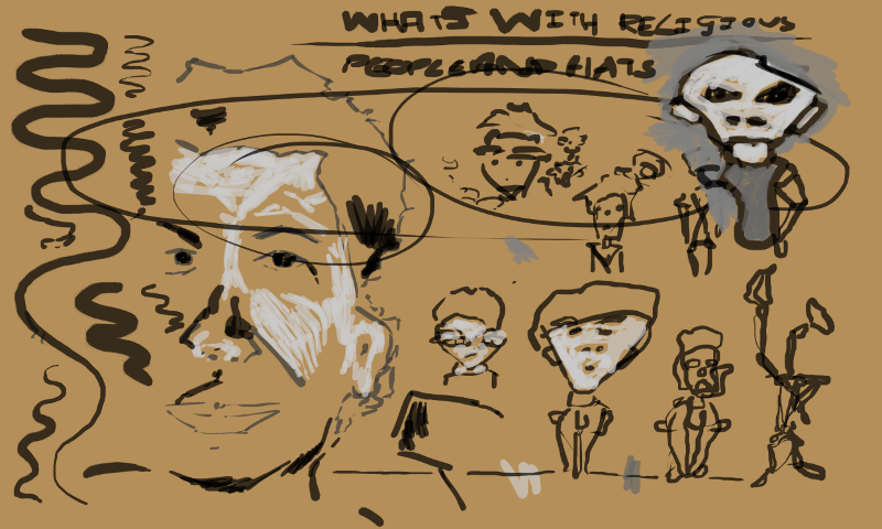
Doodles and such. The large face on the left is traced from a oil painting I did of my Nana. These rest is experimenting with the new tablet - attempting to use my elbow to create the line over my wrist. Also practice curvy line - going on light, then heavy, then finally coming off light. This is something that Marc Hill gets people to practice with the transitional pencil. The same principal are applied to digital.
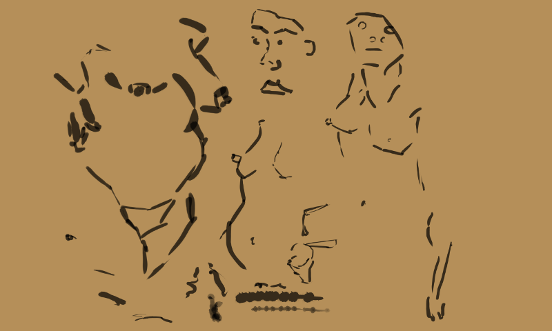
Tracing some of my favorite life drawing. There wasn’t a whole lot of information in the life drawing but taking it digital will allow me to develop it further with tone and color.
Portrait study on the left. Quick work but helpful. On the right I doodled with environment ideas. I need to work o compassion - maybe thumbnails of ideas. I notice this is done for the EOW on Conceptart.org
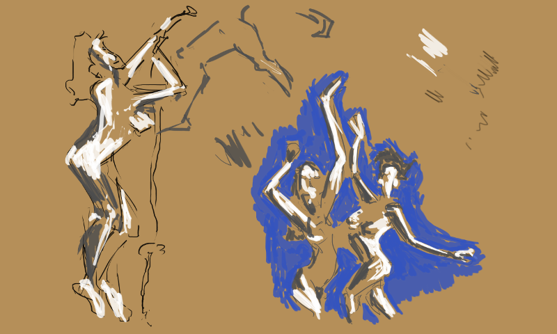
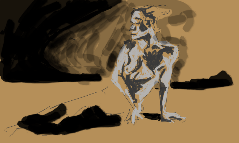
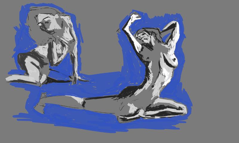
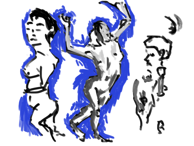
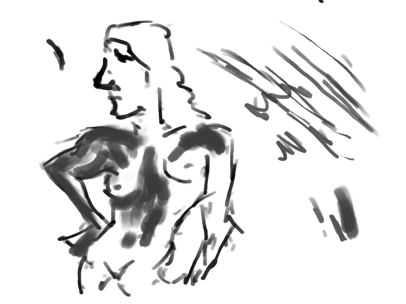
Was happy to get a double figure reference on pixellovely. So often it’s just a single figure. Double is easier as you have more points to line the figures up. Working brown on the background has been helpful it’s allowed me to focus on a range of greys for the figure rather then finding the off greys. Easier to notice the incomplete areas.
Going back to the grey for the background. I like these figures - especially the right. There is something special about standing poses. I’ve really noticed them this ear with my increase want to capture the full model. Often the sitting or lying poses hide reads of the body. This is much harder to do with a standing pose. Standing pose ftw!
That’s all with the figure works for now. My sister took some photos on the trip to Palmy the other day. She needs to email me these as I want to use them for some digital painting. It’s annoying that my camera broke. I should just buy a new one. Maye I’ll look on trademe.
Read more →
I’ve been aiming to render off more content with Blender - I have a goal of 2 mins a day when I use Blender. These last two days I’ve taken a break but on Wednesday and Thursday I managed to render off a lot of content. It’s still mostly exploring lights and camera angles. Basic stuff. I’ll like to learn more about rigging models and particle systems - youtube videos could be helpful here.
Taking this into Unity would also benefit. Wonder if I’d be able to use Python within Unity? Javascript/C# and another language are the supported ones though. I think I’m far better to use a modding or game engine for my ideas rather then try to build something from scratch.
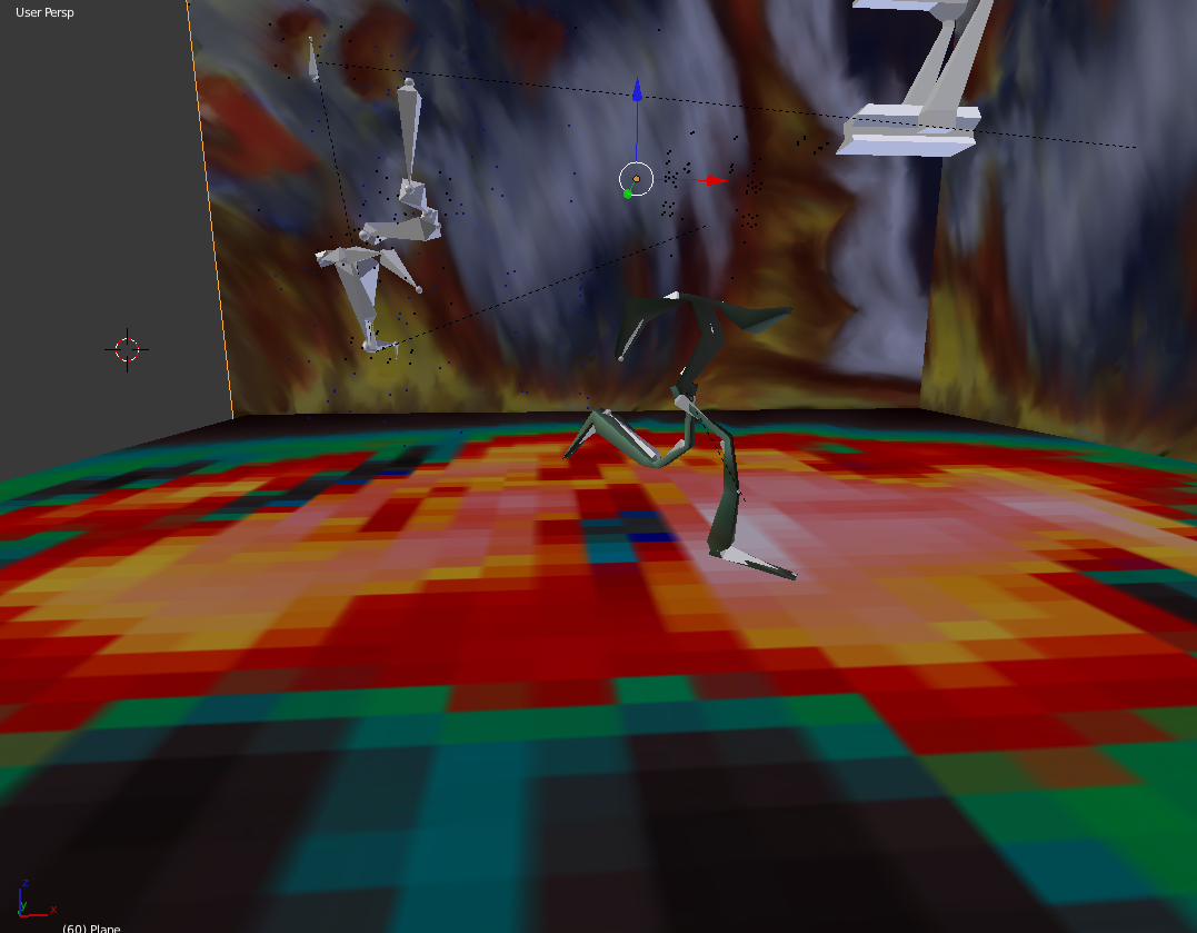
In this work I took a old scene and created a walk cycle with a background and floor. The only thing that’s old is the ship… it was quite a empty scene. I have lots of these older scenes that I’d like to update with newer techniques that I have learnt in Blender.
The background in this is a recent digital painting. I really love the idea of taking my artwork into a 3d space - and using as 2d art assets. It gives something truly unique over using normal textures that I have found on the Internet (though I do enjoy wood workshops texture generator). 
This was a strange walk cycle - I twisted the lefts around at the back. This caused some problems with the modeling - twisting within the body. I had to tone it back somewhat so I didn’t have strange movements. 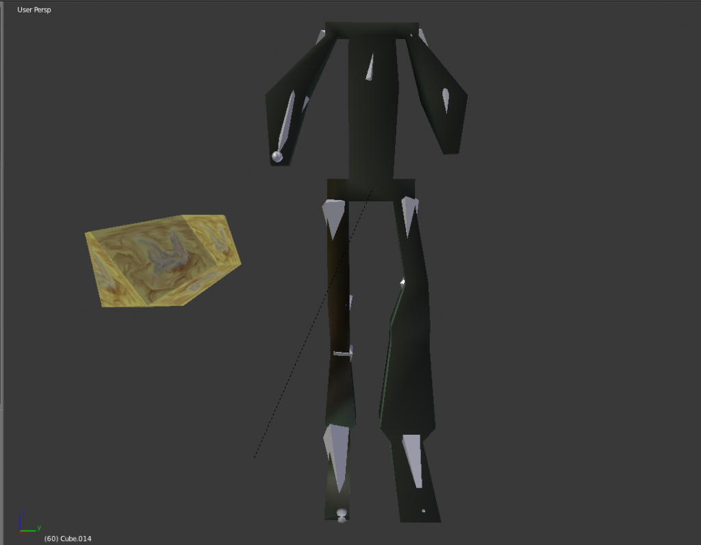
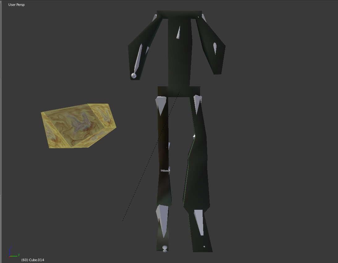
The model before it was animated. Model and bone structure. Noticed I’ve gotten much quicker with this whole process. I need to aim to make a new model and cycle at least weekly. Most of my time is spent experimenting with lighting.
Here is the video:
Read more →
Today my new tablet arrived. I had given my old one to my sister last weekend so had taken a break from digital painting for a few days (though I filled in time with Blender works - will make a post of it this weekend).
So today has been spent testing out my new tablet. It’s huge compared to my old one - so use to doing wrist movements rather then using my elbow which I can do with the new one. I’ll practice larger strokes and get use to it over time.
I havn’t drawn people for a while and am going to be doing life drawing next weekend so thought I’d better keep the skill up and work from some models over at PixelLovely. Good chance to learn the new tablet as well:
Sine the new GIMP 2.8 has been released I’ve struggled with the new dynamic options - before it was easy - now it’s fill of sliders and confused me. I wanted to create a thick to thin line with pressure - I tried setting this up but couldn’t get it working… so created these without the dynamic tools. I guess at the end of the day they are just quick studies and it doesn’t matter.
More experiments with dynamics over on the right. I’m getting somewhere with them now but still not happy. These works were very quick - timer was set for 5 mins but I spent most of the time messing with settings within GIMP. 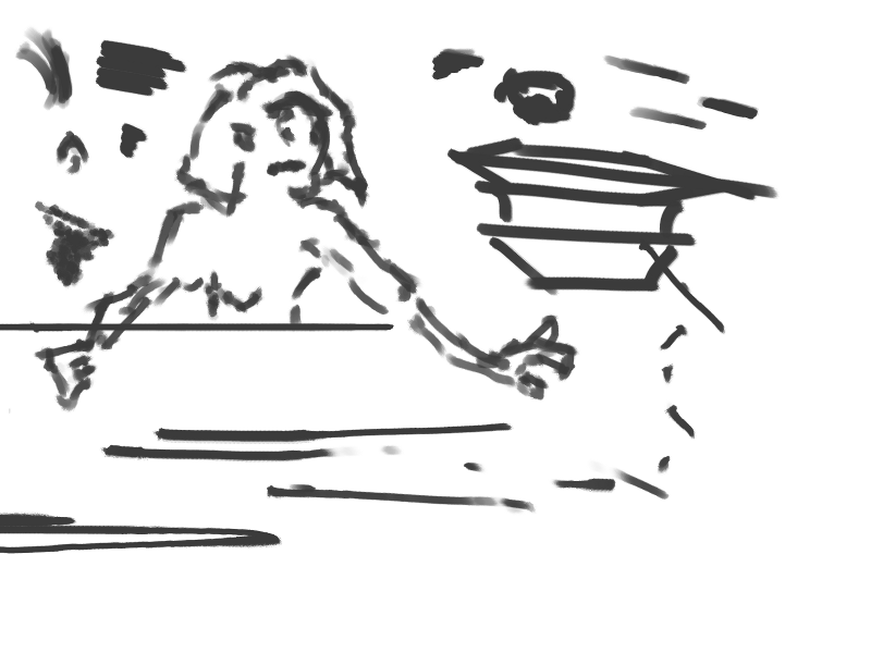
Interesting line created with the figure in this. I believe the dynamics were set to random.
Here I’m practicing long strokes - something I need to develop my skill further in. Quick exercises like this are very helpful. 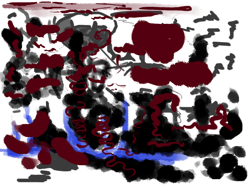
Finally figured out how to create a nice thick to think line with pressure. Great success! I was happy :)

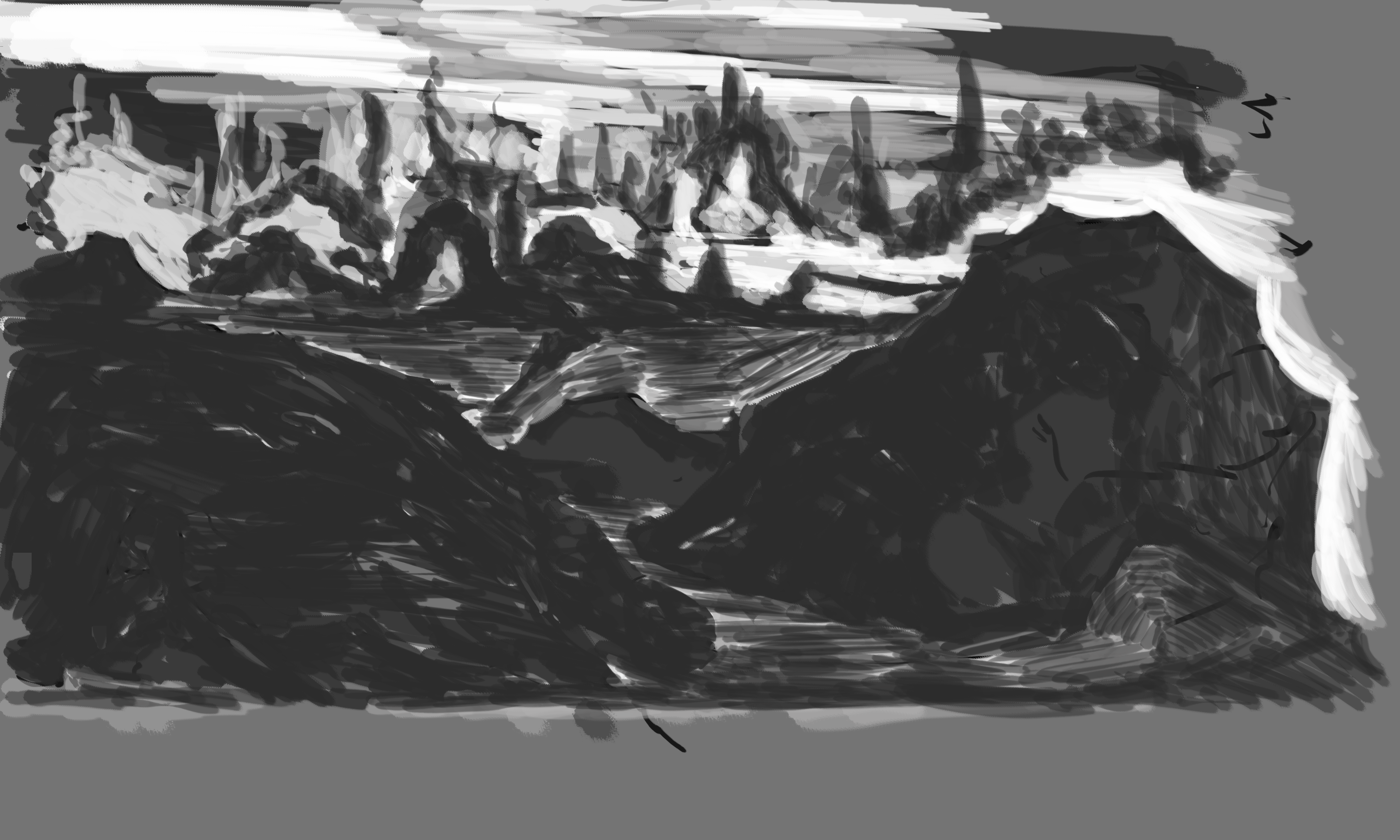
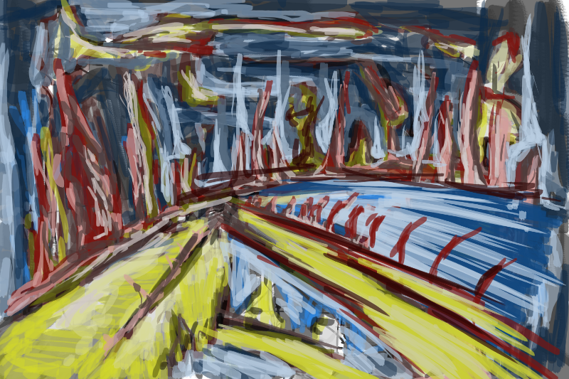
Landscape I started. Went in with a quick drawing then developed a painting over top. I’m happy with this start. Areas I need to work on are the bottom left. It needs similar shapes to the background (long pointed towers) to help unify the piece. I’m especially happy with the large island on the right of the screen - thanks to the light.
I started this with the EOW in mind - Lost Fleet. Currently it’s all my own work but the idea is to turn it into a collaborative work. My flatmate Andrew will be helping me develop this further.
Tomorrow I’ll write up a post discussing all the Blender work I have been doing. I’m exciting about this new tablet and can’t wait to develop more work with it - and take it into Blender!
Read more →
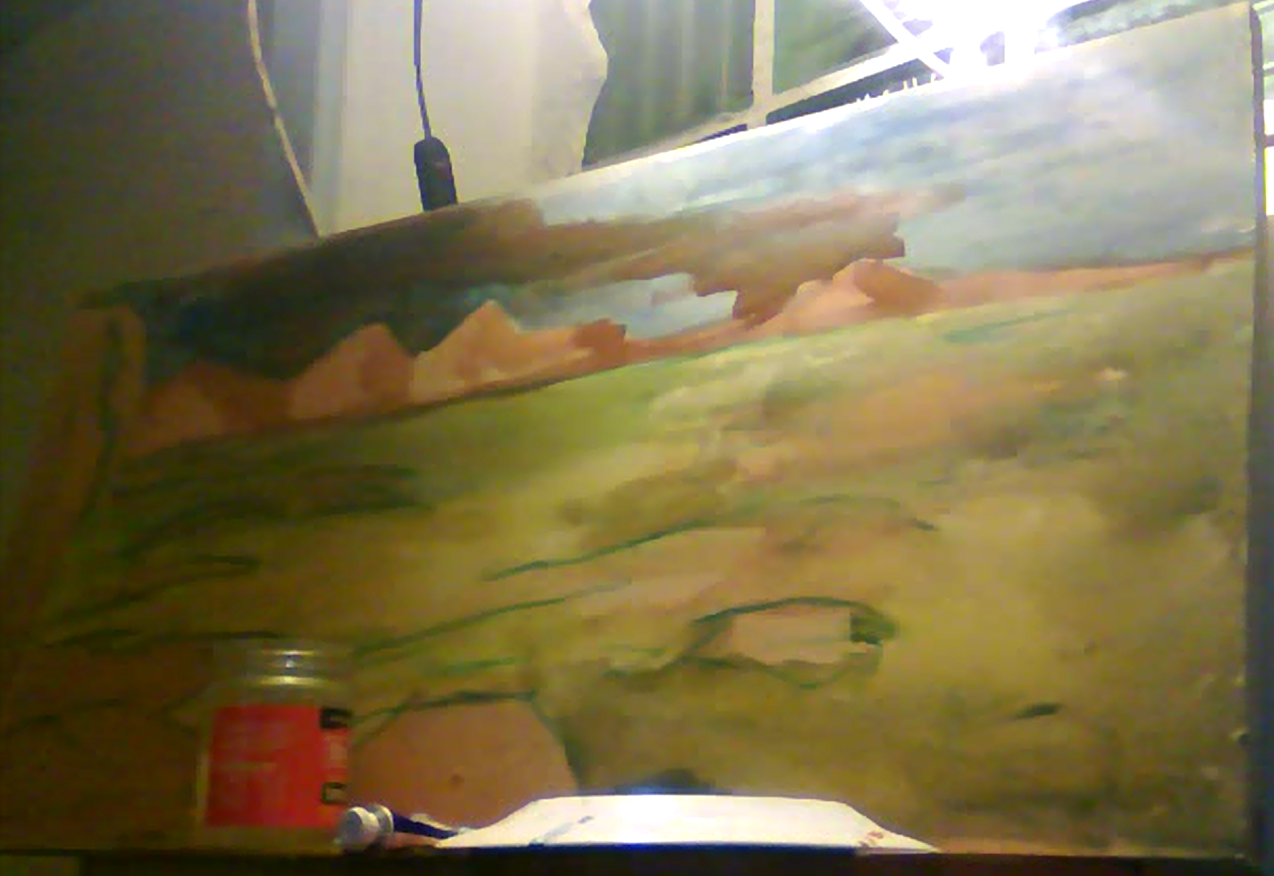
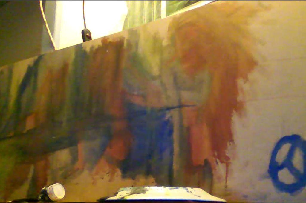
Since my move I’ve had room to paint. I never painted in my last flat, except for a little in my journal. I don’t really consider this painting though - painting is working large on a board.
Since I have the space I’ve setup of paintings next to my computer
I started with gouache. Then moved onto acrylic. Once I’m happy with the acrylic layer I’ll lay down oils.
All of these paintings have been recorded - I’ve only uploaded one to youtube…
I’ll do a voice over and upload the others at some point.

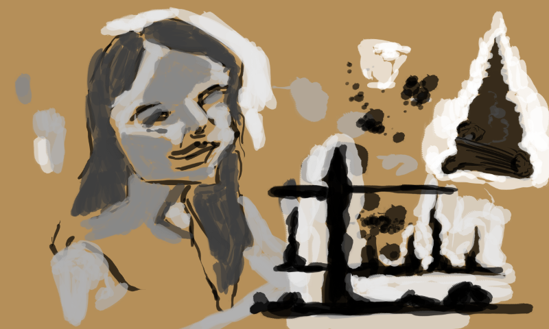
I wasn’t happy with this as a gouache but once I turned it to this:

Extremely happy with this. I felt I was able to give it real depth to areas with tone. The brush `I used was resemble small. I brought it last year when I got my oil paints. The hair on it is thick so it can hold a decent amount of paint. Helps to mix multi tones onto the brush and flip the brush in order to get a different tone. Bit like the technique that Roger tea 
I was happier with the gouache painting then the previous. Maybe because it had stronger perspective.
Acrylic paint added. I wasn’t on the same flow as the first acrylic… had lost my wind. I wouldn’t say this ones bad… I just feel it isn;’t as strong as the previous. With some more time I can get it up to scratch.
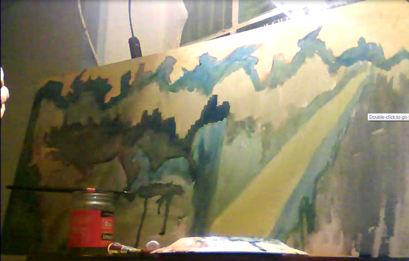
This was a bunch of portraits but I didn’t like it so decided to turn it into a landscape. I’ve already started the landscape with the goache. It’s a bit of a mess since its a mix of landscape and portraits…. the perspective isn’t in there. I was hoping that acrylic would hellp…

And the acrylic applied. It needs more areas defined. Currently there is too much empty areas. More layers to add depth would help. I’m using a larger brush then the other acrylic - helpful to cover areas quicklly. Working with a slightly smaller brush and adding more contrast to areas will help.
Read more →
I’m getting a new drawing tablet soon, I thought I would get it this week but when Mightyape tried to charge my credit card it declined as I realised they had an outdated one. I’m going to have to ring up Kiwibank, change my address and order a new card. It’s a bit frustrating… I’ve been really careful with my wallet over these last two years. So weird to lose it all of a sudden. 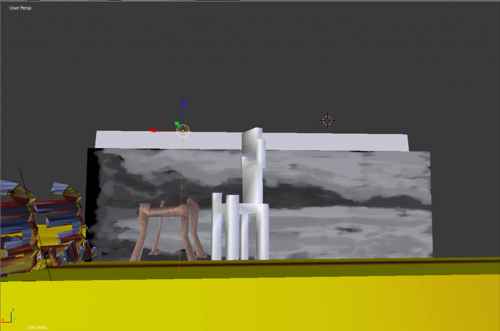
So my old tablet is with my sister now - so no digital painting. I may get it back off her till my new one arrives. Annoying! In the meantime I’ve been working in Blender - created a new model and animated it. It’s the most strange creature animation I’ve done so far… quite digging it though. Working on creating longer animations - rendering out between 100 and 200 frames per animation instead of 50ish. This should lead to more finished and polished looking word.
I’ve also been taking several of my digital paintings into Blender and using them as background. These create something truly unique within Blender.
I’ll keep working with Blender and animating these scenes… though I would love to develop this work further into a game engine.
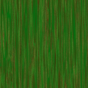
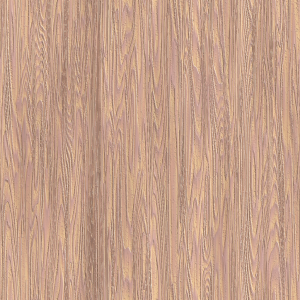
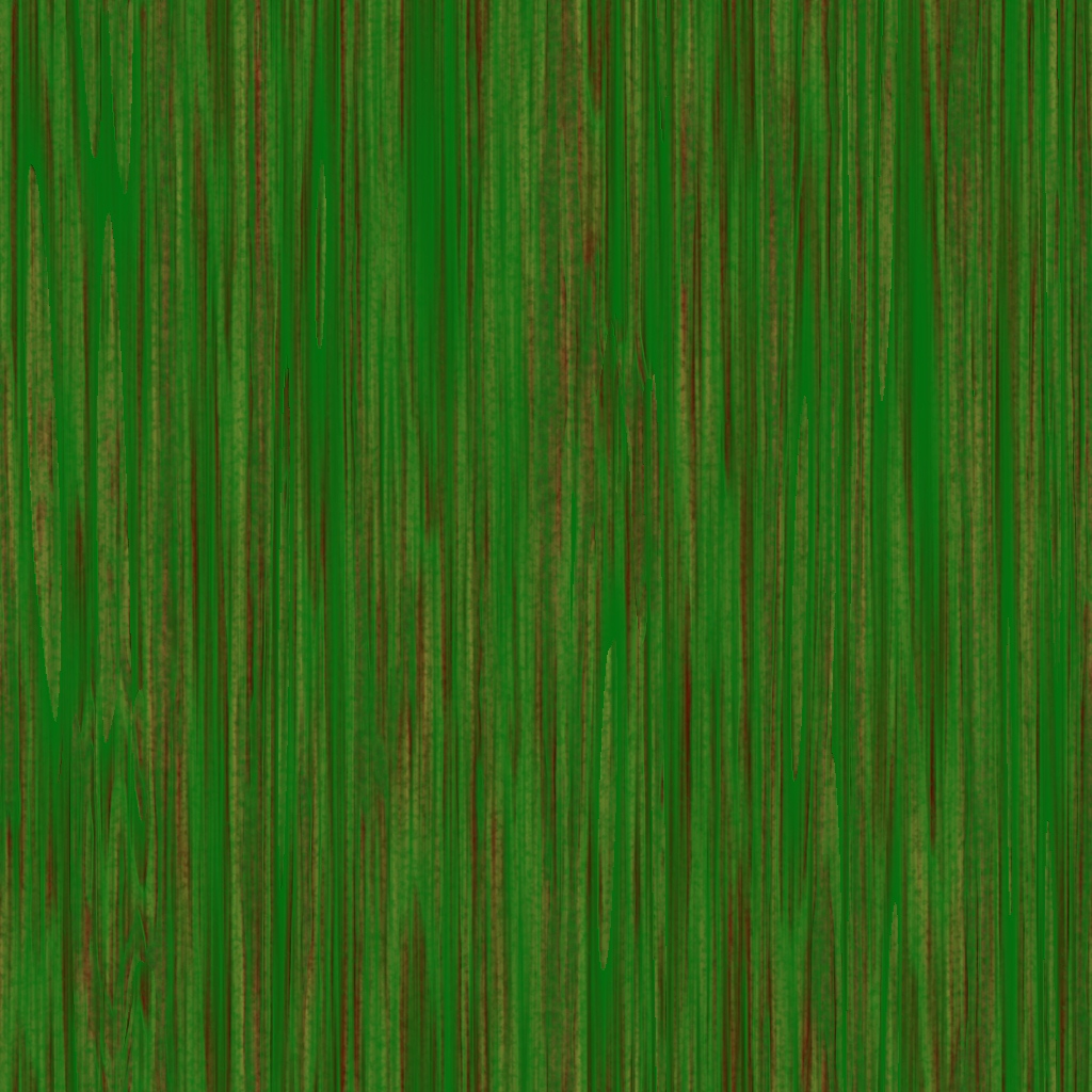
Textures I’ve been using in Blender. Thanks to Wood Workshop.
And the videos:
Read more →