ArtCtrl

Open licenced artwork by William Mckee

Old Master Techniques

This evening I sumbedupon the site Drawspace. I checked their advance section – and found a section that looked at Old Masters. Last year I became interested with Old Master drawings – partially Rembrandt. Though I took a break from this over Xmas I’d certainly look into it again.

I followed their tutorial on drawing a nose in the style of Da Vinci:
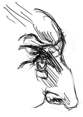
With my digital works I have focused on painting techniques over drawing. This is much different to what I have done for SketchDaily and such. What do you think of it? I’ll certainly like to explore this line technique in future works.

The next tutorial looked at drawing a babys head with similar techniques. I found a reference photo of a baby on DeviantArt and created this:
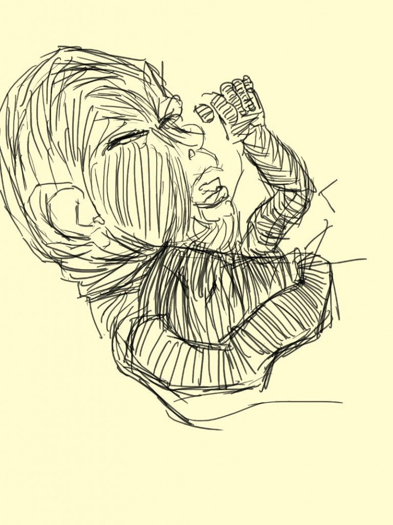
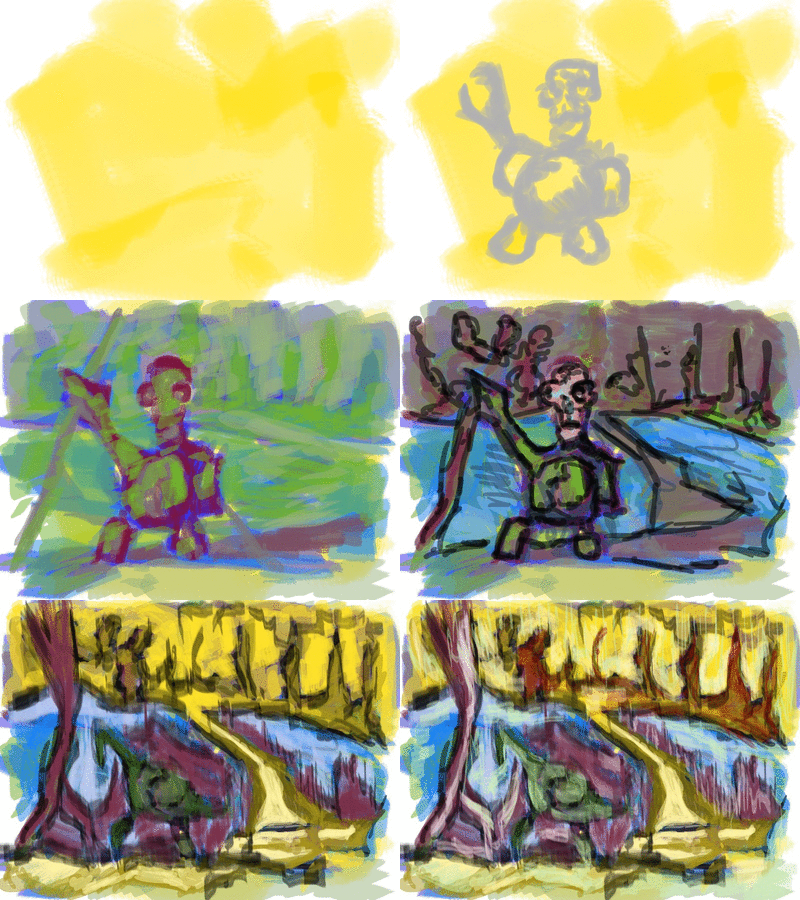
Started with an off white – yellow background. Normally I make this textured with a large brush. Here I haven’t. I used the line similar to the nose study – though it’s rougher. The shape and direction of the lines show the shape I’m attempting to create. Looking at this now I notice I need to slow down and work on areas slower.

I couldn’t leave this as is and added a color layer:
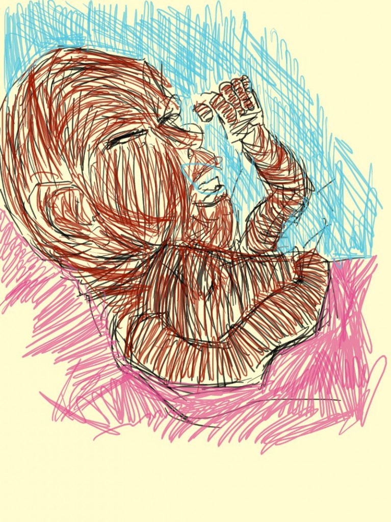
The colour added. It’s just a single layer of color with no effects added to it. Maybe next time could experiment with layers of color and the use of the eraser tool to cut back into colors.

Now I want to do a copy of a Rembrandt or DaVinci work.

Read more →

Strangegrace illustration

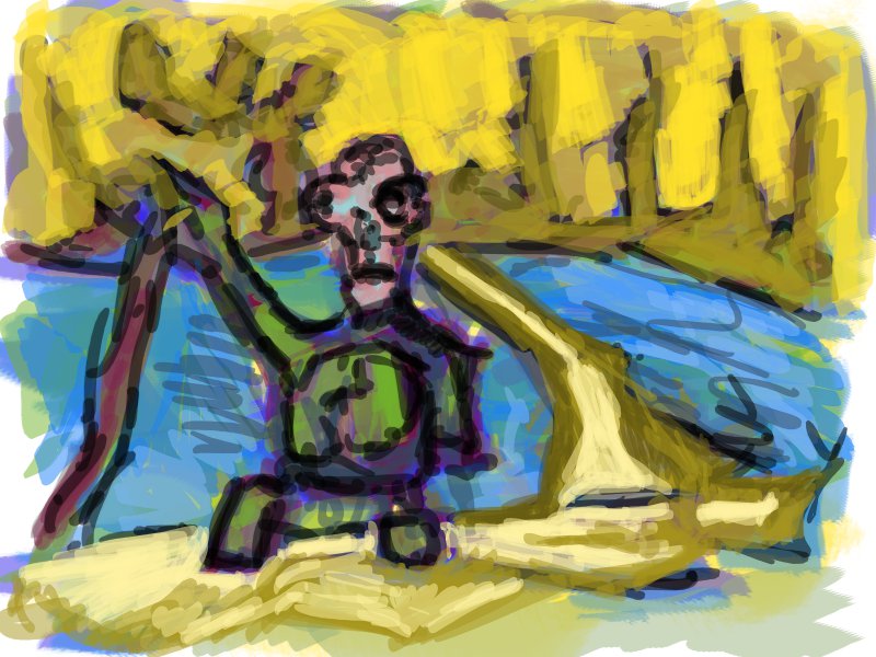
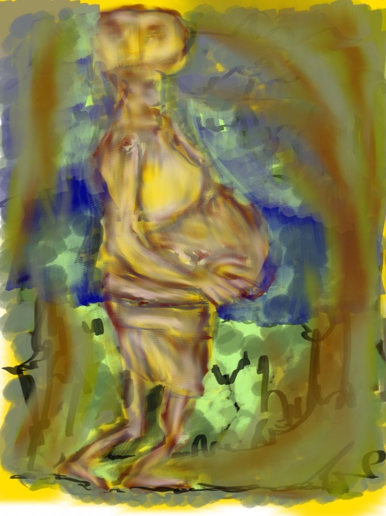
Digital work from UCOL. It was for the a illustration project – creating a character for a video game or movie etc..
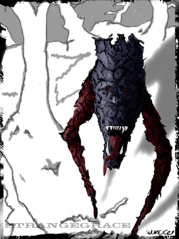
The character I came up with was this two-legged, large head, with sharp teeth. My tutor, Steve really pushed my drawing skills.

Background is minimal – similar style to what I have going now.

I spent a time on Strangegrace, detailed shading and shadows. Doing a project like this now would be interesting… my knowledge of human anatomy would be a advantage and generally better drawing skills. I can’t remember using reference for this. I was never taught how to use reference efficiently.

I’d like to set briefs for myself creating characters and creatures and developing them further. Doing life drawing all the time comes a point where I want to develop an idea further. That’s why these Reddit SketchDaily projects have been fun and helpful – they have gotten me out of my shell and helped develop my work further beyond simply drawing or painting the figure.

I am missing life drawing.

Read more →
To follow a blog or not

To Follow a art blog or not This post is going to talk about art blogs that I follow and reasons behind following them. Why I follow a blog I like finding new blogs to follow. But it’s hard to keep up. My favorite are drawing/painting personal art blogs.Showingg WIP, technique, development, criticical, original content. Many of these are on my blogroll The other, are database blogs. They posts other artists art. DoodlersAnonymous, Art Attacks Online, Lines and colours. I follow to discover new artists and be inspired by a range of artwork. Text and discussion are important. Blogs that only post images lose my interest. I like reading about art. That’s why I’m enjoying the writing blogs, plenty of reading. There is a point when looking at art is too much. Amount of posts is another. Poor post quailty is worse. Art blogs are generally ok when it comes to spammy posts. Political blogs are the worse. I just checked the unread for my politic roll – some blogs have over 100 unread. Builds up quickly. Ii’ll rather visit the site then try to keep up with posts in a reader. ComicTool Thanks to ConceptArt I found ComicTool. This one is going into my FavArt blog roll. The title says everything . It’s focus is on comics and tools. Updated every Saturday the blog consists of interviews with artists, reviews (dip pens, brushes, erasers). Tools of the trade. I follow lots of art blogs but rare to find them blogs about art tools. The reader interaction is great. The blog interacts with readers – answering questions and posts from twitter. Reviews of drawing and art tools would be fun to do. And to finish off Might apply for a job at the French art shop and Gordan Harris. I’ll love to work on their social media presence and a job in a artistic environment. Access to material for reviews/use would be great Penaddict is a similar to comictool. It focuses on pen reviews. I’ve followed it for sometime. I haven’t brought any of the pens but It’s nice to read about different pens and how they do.

Read more →

File Infigment Bill thoughts

This year the New Zealand Govt passed  the file infigement bill. AKA 3strikes/skynet. Yesterday this bill went into effect, my torrenting has increased. Really need some new music anyway, getting sick my currently collection. I’ve been thinking about the reasons why I don’t buy music/movies/games that often and choose download them instead.

Torrent is cheap. Even with the data caps and expensive internet we have here in New Zealand, it’s worth going over cap then buying a album/dvd. Certainly much cheaper then cinema. Prices are over priced. 35 dollars for a new realease. One album is around 100mbs in size. Internet is roughtly $1.50gig. Sure with a CD you get packaging/fancy disc, but really what you are buying is just data on a disk. Fuss is being made by companys over their data being shared by their customers. Business model must change. For too long they have stamped down on file sharing.  Have they thought that this might be benefit? Looking at other ways of generating revenue would be a great start. Advertising, clothing, paid content, streaming, tours, video games…. the list goes on…

The only TV I watch is what I stream online or download via bittorrent. If I couldn’t stream/torrent I wouldn’t watch these shows. It’s the same with music. If I can’t download music and discover new music I’m not going to start going out and buying. I didn’t really buy music as a kid much. Spice Girls, Hanson, Teen Spirit, Pokemon… are prob the only ones. With bittorrent you have easy access to a large range. It’s not costing the record company anything, no server, it’s done p2p. They talk about loss in profits because of bittorrent. Would of they made these sales? I certainly know I wouldn’t be able to afford buying albums as regally as I download.

I’m a good example of try before you buy (though I don’t buy albums or dvds).  I find music from last.fm then using ishunt or Piratebay to download. Once you have me hooked on a band you have me for life. For example. I got really into the Beatles. I downloaded all of their music on bittorrent. I had thought about buying one of their albums after seeing a friends copy. It was quite cool casing. Never did though, and I never will. I did however go out and buy the beatles rock band. I’m wearing a beatles tshirt as well. Is that good enough for the record company? Just because I didn’t buy 250 bucks worth of music (most of it is rubbish anyway) doesn’t make me not want to support bands. Punishing me will only cause anger and way less likely for my to buy.

Ease up. Don’t sue potential customers. We already hate you.

Read more →

Your brain

In Wellington public library the otherday I came accross a recent book on creativity and such. It had some good ideas about exercising your brain for artists. Here are the rough notes I wrote into my book:

Right Brain

Go topsy turny

  • Workupside down
  • Turn an image 180 degrees
  • Recreate using lines and shapes

Colour a word

  • Write down a word representing a complex issue then translate it into a picture

Sing for spontaneity

  • Sing out loud or repeat a ‘mantra’ of any kind

Imagine a photograph

  • Choose a photo
  • Identiy the primary shapes by outlining them with a marker.
  • If you had to break it down to 4-5 shapes what would they be?
  • Create a drawing or painting out of it

Left Brain

Be a critic

  • The left brain is the inner critic
  • Look at a piece of work by another artist. What are the strengths and weaknesses? What could be done to improve the message?
  • Focus on techniques used and not just emotion

Applaud your supplys

  • Start by looking at info on packaging then look up resources like manufactures websites and artists message boards.

Paint with words

  • Chooses a painting and employ as many adjectives to it
  • Have someone read what you have written and sketch it

Step it out

  • List the steps you would take to re-create a famous work of art, whether the artist created it that way or not
Read more →

Just two colours

Two Colours (or fast-track to autonomy in art)

There is a decision which many artists will have to make at some point in their lives. That is the moment they decide to stop drawing or painting what they see in front of them.

The life-model, landscape or apple is just the idea; the trigger from which a work can be created. But the artistic significance of the painting or drawing does not reside with the model or the apple. The essence or spirit of the work comes from the relationship between artist and the medium.

Once the artist recognises this they can start to create works which are autonomous; works which exist independently of the world around them. They borrow shapes colours and ideas from the world, but present them in a way which creates something which is wholly new and self-sufficient, and which can be used to express the ideas of the artist.

Titian, Cezanne and Matisse, even contemporaries like Hockney and Freud, gave classic motifs and colour forms from the real world a different context in their paintings.

No apple looks like a Cezanne apple; no Californian swimming pool looked like Hockney’s nor does naked flesh look like Titian, Matisse or Freud painted it. (think about it for a moment). The point is, each of these artists was not trying to paint what they observed. They were creating a new version of the world: a world which they could use to express their ideas.

The result, I suggest, is autonomy in art.

There is a fast-track to autonomy in art, this is abstraction. Picasso and his fellow cubists discovered this in the first decade of the 20th Century and artists ever since have been using the fast lane to autonomy.

Abstract art weakens any connection to, portraying of the actual world to breaking point. In such a state it is possible for the artist to express their ideas about the world without needing to replicate its forms and colours. They are on the high diving board and the only way is down. When they jump they inevitably create a work which is no longer recognisable as the world around them. They are saying explicitly forget the apple, the swimming pool, the human body; these are not important as objects, only as ideas; as memories.

The work is autonomous, but the ideas are the artist’s. This is a blissfully satisfying discovery for the artist, and it is achievable on a fast-track.

All you need are two colours, ignore everything else you see.

http://whichsongtitle.posterous.com/two-colours-or-fast-track-to-autonomy-in-art

Read more →

What I’ve been enjoying about oils

More and more oil painting has been done. Although I’m half way though most of the painting so taking my time.

Liquin + Turps = ???

Using a liquin and turp mix stirred up I add it to my oil paint.

Colours I’ve been using:

Colbolt Blue

Casmium Yellow Deep

Titanium-Zinc White

English Green

Raw Sienna

Naples Yellow

Thats bascially all of my paint. What I have been playing with is making gray. No black though. That’s something that missing! Keep the colours muted. Adding white  destroys the colour. I’ve been told to use the oil paint as it is and don’t use liquin/turps. I’ve found playing with mixing it down really fascinating. It’s much smoother to spread, and it dyes quicker. Glazes applied.

Glazes are a whole other story. I’ll keep going with the Gray. So yeah, these gray mixes have been fun. I’ve made a few types, yellow, purple, blue. All still gray just tints.

Read more →

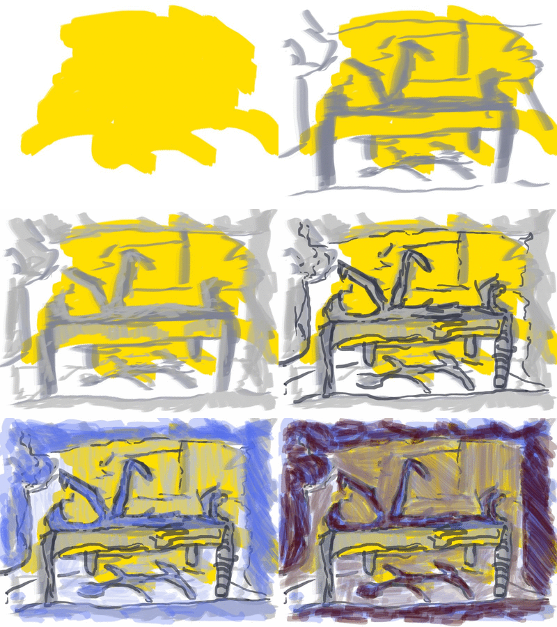
underpainting

I'’ve been giving underpainting a go since i got my oil paints. I want to experiment more with it. www.conceptart.org has a great thread talk,ing about  this and giving tips. Check the thread: http://www.conceptart.org/forums/showthread.php?t=64674.

Heres some of the main points, you should check the thread out yourself though:

1. A value painting is done in grays or another “neutral” color like umber, bluish violet or whatever. This is extremely accurate except for being in a funny color. Then glazes are layered onto the piece to build up the real and final color. It’s not unusual to have 200-300 seperate applications of glazes in a complex piece.

2. A value painting is done as above, but in the primary complementary color of the piece. For example, if the piece is a sunny city scene with a lot of sun-drenched yellowish buildings, the underpainting would be in deep purple. A greenish outdoor scene would require a red underpainting, and a flaming warthog from hell would require green. The initial glazes would form a luminescent neutral shadow system, and the final strokes would usually be applied more opaquely.

3. In dry brush, especially on a rough painting surface, the initial sketch is blocked in with fairly bright areas of color that are complementary to the final colors desired. The painting is then done rather opaquely and “roughly”–with lots of underpaint spots showing through. This make the painting “sparkle” a bit because the all the areas have complementary spots throughtout–blue sky has orange spots, grass has red undernearth, sunny people have bright lavendar and purple spots, etc. In this case, the underpainting isn’t necessarily as accurate as the drawing under the above two examples.

4. A much more extreme version of Number 3 above. This is close to the Pointellist and extreme Impressionist methodology. The final paint is applied rather opaguely, or in layers that gradually get more opaque, but the strong complementaries underneath are left highly exposed to interact with the final colors on top. The visual mixing of these spots can be controlled to give a lot of depth to the painting, creating imagined OPTICAL colors rather than true mixed shades of various real colors.

5. an underpainting can be done as a mid tone, as if you were working on a strongly toned paper with charcoal and white chalk. A layer of paint is put done with the image accurately depicted as a kind of ghosty image. This would approximate the middle tones of the final piece. then darks and lights are applied sparingly to create the final piece. Nice way to do the human figure.

And a exercise to try!

Here’s an experiment that anybody can try really fast…

Rough pencil a bunch of 2" squares on some board. Fill two with a solid bright green, another two with a deeper darker green, and another with a washy slap of a bright green so there are obvious brush strokes showing.

Make sure everything drys.

On one of the solid bright greens, wack on some cad red med or something similar (bright red) as if you were doing a water color. Use a lot of med so its fairly transparent in some spots.

On the second bright green square, make up some OPAQUE bright red and using a small brush, cover about 85-90% of the green with a random pattern of daubs of red. You want to end up with a red square with just touches of exposed green showing through.

Do exactly the same thing to the two squares with the much darker green in them.

On the fifth washy-looking green square, take your transparent glaze of red and cover the entire square with red in a washy manner, just as you did to the underpainting.

When these all dry, take a good look at them. You will see a completely different effect with each, and if you squint, you’ll start to see various little bits that surprise you. The fifth square may seem to vibrate a bit in some areas, and you’ll notice areas that are more red, areas that are more green, and areas that are just wierd color. When you squint at this one, you should see a lot more luminosity and depth to the colors. This is the primary benefit of underpainting over solid color. It makes your brain work, which makes the viewing of the art more pleasurable.

1. Underpainting Compliment Base Color: A key to the school of painting you are studying is “contrast”. Appropriate choice of value, temperature, and saturation/intensity contrasts will help the image retain vibrancy of color and reflection of natural color/tonal light vibration in the eye of the viewer. You are entering into the area called “color theory”.

Paint and canvas are not as vibrant as light in life. You are studying light and how to create that feeling in the eye that “light actually has” within a painting(which does not because its mud and solvent and not the sun or a candle or a lamp). Your teachers are pointing you down the path of understanding how to “fake” the feeling of natural light in your paintings…and how to use those devices to control your communication and narrative with color composition

There are ways in which you can get colors to vibrate as light does. Having complimentary undertones is perhaps the easiest way in which you can get your light and shade to dance visually. This has to do with optical color mixing, which happens every day in front of you when your eyes are open. It has to do with the fact that light and shadow are COMPLIMENTS in all ways. Using an “opposite color underpainting technique” assists you in getting “light compliment theory” accomplished in the image. There is technique in the process of getting strokes of mud and oil to mimic what light actually does in life.

Often, light and shadow are not just to be seen as lighter or darker…but unsaturated and saturated…color compliments…warmer and cooler….LOOK FOR THESE THINGS in life if this is your path of study. You will find true subtlety of these theories and at times will even find ways to prove them wrong.  That is what I love about art theory. It is a constant search to prove oneself wrong so we can learn. By having pieces of your underpainting in contrast you can begin to lure they eye around compositionally. You can create focus. You see, your teachers are simply trying to get you to control color…to see. LOOK.

2. If you paint over the entire underpainting then the compliment color underpainting technique can be used along the way so that you can make color choices. It allows the artist to be aware of colors that are brushed on the canvas as they have colors to compare against. However, there will be places where the underpainting color would be used anyway so at that point the only reason to paint over your underpainting is to gain a particular finish to the paint quality and paint surface. It does not nullify the underpainting if you are using it as a guide for accuracy or perfection of your expression. Some artists believed it to be a waste of time, others swore by it as it allowed them to do things they could not do otherwise with the paint. The underpainting is like the scaffold for which the rest of your painting sits. Some artists wouldnt use it as they believed it took from the freshness of the painting process and the loose qualities they appreciated. Most extremely polished paintings use an underpainting process. But, loose images can also do this. Rembrandts rough paintings are still using the underpainting process and they are far from stiff and clean. It all comes down to what you want to accomplish with your paint.

Your teachers are teaching a slew of painting theory from different time periods at you. What you are getting is a cross section of art theory from different time (Baroque, 19th century, Impressionist, 20th century illustration). You could study into the bones of the different periods of painting in terms of technique, color, composition, idea, feeling, mood, expression etc. This will allow you to choose which way of working best suits your needs for communication. Now that you are getting into painting 101, dig deeper.

3. Gray is a cool..or a warm…  If you put any other color on it, it will seem to be a color. If you put a green gray stroke down on that gray surface and then put down a violet gray stroke the canvas base would seem like a blue gray..or a yellow gray…depending on what gray you have as your base. If it seems to be a blue in comparison and you put a warmer blue gray down then the painting base will seem like a cooler blue. Do you see where this is going?

A gray underpainting or “grisaille” was the foundation for most painting happening in the baroque time period. It was explored prior to that but became one of the primary techniques around the time of rembrandt. The easiest way to explain it is that it was used as a base for warm light paintings. There is a technique developed that requires many oil glazes and washes to be used over the gray underpainting to develop deep transparent shadows. Then, the light is painted on opaquely and this helps to reflect the light off the paint surface and back to the viewer..where the transparent glazes in the shadows draw in light and fill the shadow paint with “fill light”.

Typically at that time, if the paintings were of a warm light source, the underpainting was gray. If it was a cool light source the underpainting was based in the burnt sienna range. This allows for easy and immediate seperation of temperature between light and dark as you paint…assuming you are paying attention.

Another reason to build off middle values (like gray) is that most of the things in your environment when you paint are not pure darks and pure lights. Working from middle values toward light..and toward dark…allow you to save your lightest lights and darkests darks til last more easily in an art school setting. It is simply easier for the eye to judge lights, darks and colors when there is a base down to paint on.

There many ways to use an underpainting. These are just a couple.

4. for compositional color unity…i.e. your painting looks like it is all made up of parts from the same color world and atmosphere…you can have your colors sprinkled about throughout the composition. focal areas are where you place all your best contrasts…balanced to work with your color composition. Too many contrasts might make it garish…perhaps…or perhaps not. It all depends on your image and balance of color/tonal composition and light. If your underpainting is the appropriate contrasting color for that area, then you could leave it..or paint over it with the same color if you wanted to hide the underpainting surface…if it is not the right color for that area then you would paint it out or adjust it. It is all relative. You must be the judge of that.

Watercolor paints are translucent. Guache is opaque. Acrylics and Oil paints have both opaque and translucent colors. Here are some examples (correct me if I’m wrong):

Reds

Cadmium - Opaque (although I found an acrylic one that was transparent)

English Red - Opaque

Alizerin Crimson - Transparent

Blues

Ultramarine - Transparent

Phalo - Transparent

Cerulean - Opaque

Yellows

Lemon Yellow - Opaque

Cadmium Yellow - Opaque

Yellow Ochre - Opaque

Naples Yellow - Opaque

Aureoline - Transparent

Greens

Sap Green - Transparent

Purple

Dio Purple - Transparent

Blacks

Lamp Black - Transparent

Ivory Black - Opaque

Whites are all opaque

2. Underpaintings - why they are helpful. First they can make starting a painting easier, and can save paint. Old Master painters have typically used underpaintings to save time and money. You do this by choosing a limited palette to start, and then working in layers. Another big benefit is glazing, which is used to make reflective surfaces, and the appearance of deep, illusionary shadows.

3. Glazing = mixing a color, either transparent or opaque, with a medium to thin it, and then painting over another color so that they may mix optically. Glazing can create effects that pre-mixing cannot, and is great for shadows, watery surfaces, and shiny objects. It is similary to dry-brush only instead of having dry paint only grip the highest fibres of your canvas/surface, creating a “broken color” optical mix, glazing creates an even surface.

There are four types of underpaintings that I was taught.

1. Black & White, or just Black underpaintings. You can use the surface of the painting for White if you wish. We used Griffon White which is mixed with Galkyd to speed the drying time. Here you make a black and white image and glaze colors over it. You use transparent ones to make the shadows seem rich, and to make certain parts of the picture pop out. Generally, whatever you glaze will seem closer to you, so backgrounds should have some opaque colors mixed in. Then opaque colors are mixed in for lights and shapes to make them seem more solid.

2. Value Neutral Underpainting - you draw out your image on the canvas, and then paint by numbers the various sections, making sure each color you use is of about the same value. No areas should look lighter or darker than the rest. Imagine taking a photo in photoshop and adjusting the contrast to the left, till the whole image seems grayish. Do that. Then go into each area and add some color with glazing. Again, glaze with transparent for depth of shadows, and opaque for backgrounds and objects that pop out.

3. Dark Ground - such as gray (suggested above) or dark red, both of which were used a lot by old masters. I think we were supposed to work in dark colors first and then cover over with lights, so that they seem on top and volumous - like the bodies in Old Master paintings. Previously, in egg tempera, artists had painted lights first, and then gone over with darks. This new technique plus blending made figures much more illusionary and volumous.

4. Apelles Palette. Apelles was a famous ancient Greek artist. None of his works survive, but he was much studied and admired both in his time, and again in the Renaissance. It was said he could mix any color from just these four colors:

Flake White

Lamp Black (basically just charcoal and medium)

Yellow Ochre

Iron Oxide Red (or English Red today)

He basically took the primary colors and substituted black for blue. It works pretty well, and many Renaissance, and Baroque masters used this palette as either underpainting or completed pictures. Rembrandt is an example. It’s a good way to build your skill and impress others, seeing how close your picture looks to reality with just these colors.

Well, that’s my two cents. Hope it helps.

Read more →

Art in high sxhools

Art in high school in NZ is silly. Kids should not be made to copy a painting. Sure its great to analye a piece and even copy to learn techniques and styles. What they need is fundimental drawing and painting techniques - and to be left alone to explore.

From a early age they should be given a book similar to this and encouraged to draw from the world around them. The will create better people. Today walking the streets od wellington looking for interesting areas to draw. I noticed building that I never had before It really teaches you to observe the world around you. Watching people is important. How do they move? Their mannerisms? I spent tim e in the civic centre watching birds and doing quick sketches. How often do you just site and observe the world?

Read more →

Les Barany Advice

Dear Aspiring Artist:

Here is my advice. Think of it as a five-year plan:

Take whatever courses you find the most interesting.

Study closely the work of the Old Masters.

Stop making art that originates only from your own imagination.

Stay with one technique until you perfect it.

On any given day, always be in the middle of reading a book. When you finish one, start the next. Fiction, nonfiction, biographies, autobiographies, history, science, psychology, or how to build a kite. Anything but go easy on the comic books.

Buy and read the first 6 pages of newspaper every day and also the editorial commentaries. Skip the entertainment section. Su Doku is fine. Do the crossword puzzle.

Fill up a sketchbook every month with pen or pencil drawings of the world around you, not from your imagination.

Buy a book on figure drawing. It’s the only art book you will ever need.

Until you can draw an accurate portrait of someone, you don’t know how to draw.

Stay away from the airbrush. You’ll never master it, hardly anyone ever has.

Visit every museum in your city. Often, until you have seen everything in it. Every kind of museum. Not only the art museums but, of course, those as well.

Forget about contemporary art by living artists, at least for the next few years.

Stay away from most art galleries. Go to art auctions. That’s where the real action is.

Learn to play chess.

Take a business course.

Talk to you mother or father at least once a week.

Stop going to the movies until you have rented and seen every film on this list. [link]

Do not watch television unless it’s the news or documentaries.

Do not use an Ipod.

No video games, either.

Learn a foreign language.

Learn to cook.

Spend 8 hours in a hospital emergency room.

Save up money so you can travel to a foreign country within the next five years.

Do not litter.

Avoid politically correct people.

Vote in every election or never dare to utter a political opinion. You are not entitled to one.

Buy a digital camera and take photos every day.

If you see nothing interesting to photograph, you will never be a good artist. Keep only one photo of every ten you take. Delete the rest. It will force you to learn how to edit the garbage from your life, to make choices, to recognize what has real value and what is superficial.

Visit an old age home.

Listen to classical music and jazz. If you are unable to appreciate it at least as much as contemporary music, you lack the sensitivity to develop into an artist of any real depth.

Go to the ballet. Classical or Modern, it doesn’t matter. It will teach you to appreciate physical grace and the relationship between sound and movement.

Wake up every morning no later than 8 AM, regardless of what time you went to sleep.

Learn to play a musical instrument.

Learn to swim.

Keep your word.

Never explain your art. People who ask you to do so are idiots.

Never explain yourself. Better yet, never do anything that will, later, require you to explain yourself or to say you’re sorry.

Always use spell check.

Stop aspiring and start doing.

This will keep you very busy but it can’t be helped.

In my opinion, this is how you might, possibly, have a shot at becoming a good artist.

Hope this helps,

Les Barany"

Read more →