Here are drawings from a protest in Waihi and Aucland.
I love my new landscape sketchbook - the pages are long! These drawings are all in my A4 visual diary.
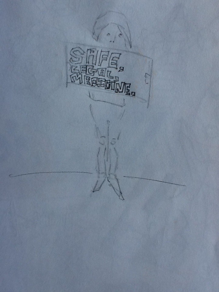
Sketch of Janelle protesting across the street. I held my sign with my legs and just sketched, multitasking. I did several drawings of Janell in my sketchbook - and in return she drew a portrait of herself for me. 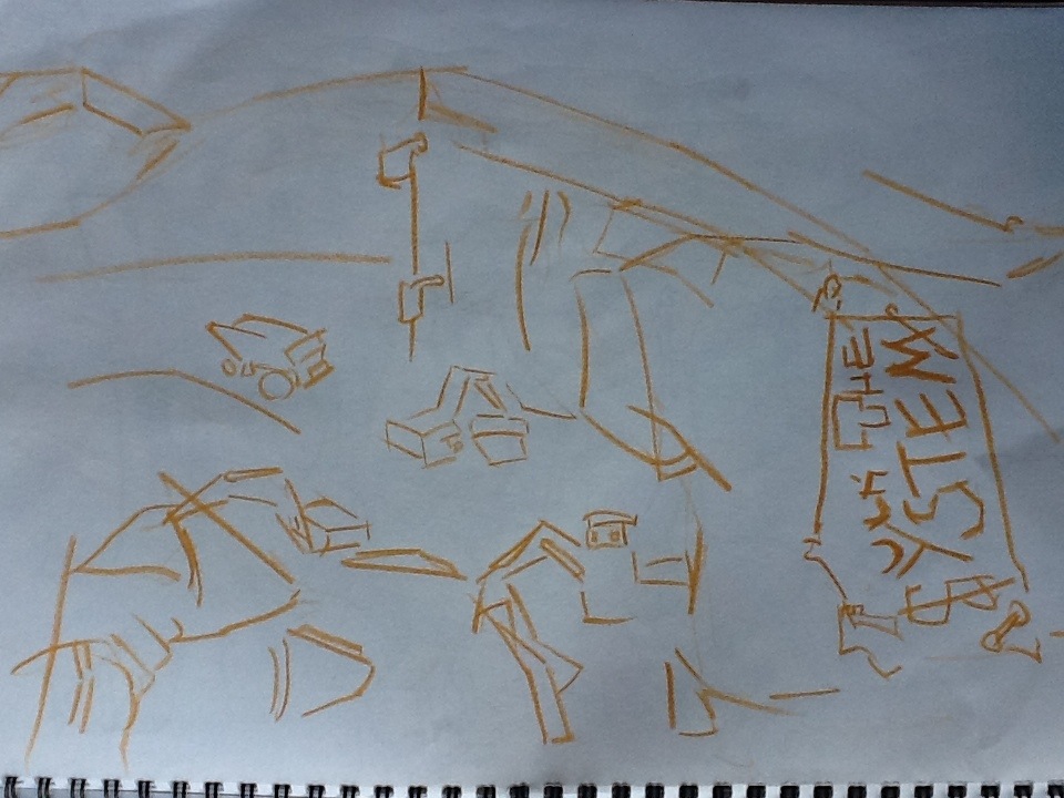
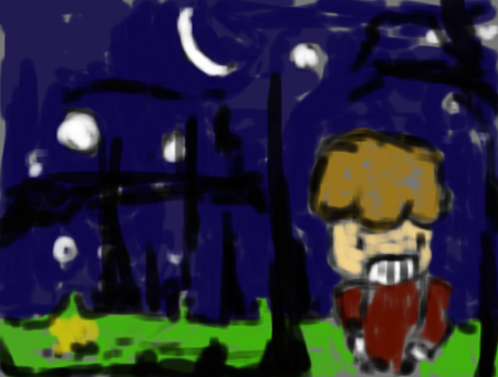
A merge of the ‘Fuck the system’ badge attached to Janelles jeans and the massive hole at Waihi - Mining! The view was incredible - shame I didn’t have my normal pencils - only this yellow. The line is much heavier than pencil.
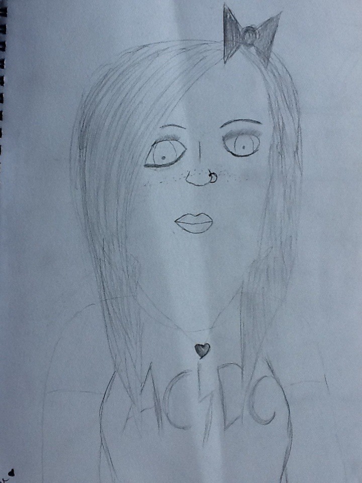
Portrait that Janelle drew in my book during the car drive up to Auckland. I always like it when someone gives me a piece of their own creative lives. 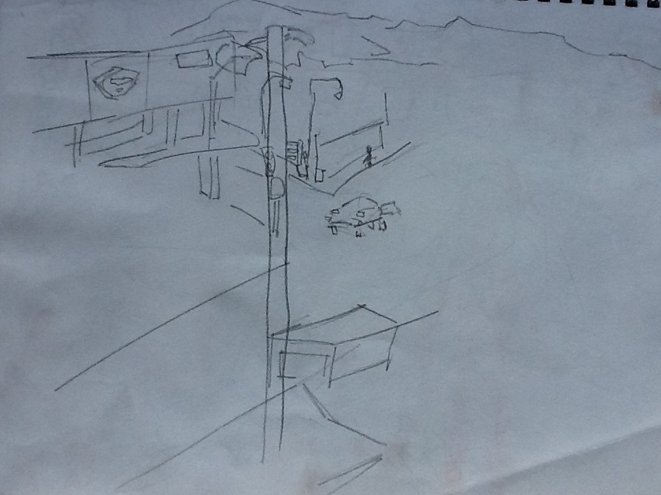
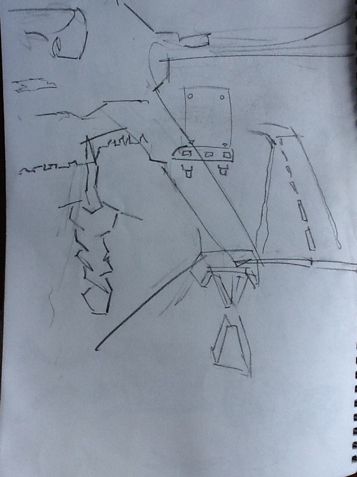
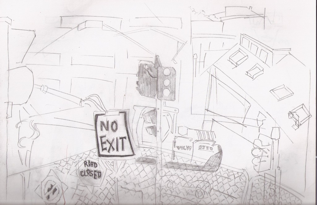
Henderson drawing. This was at the train station - observing an intersection below. Aucklands been fun to explore with my sketchbook.
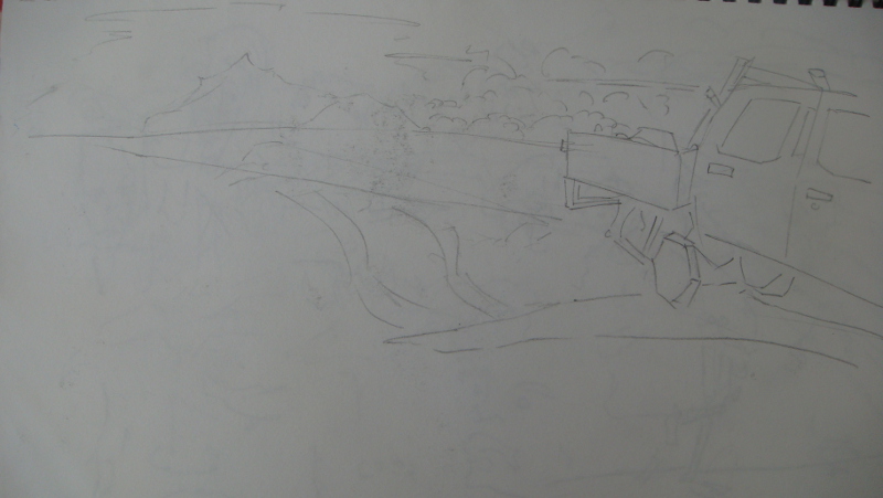
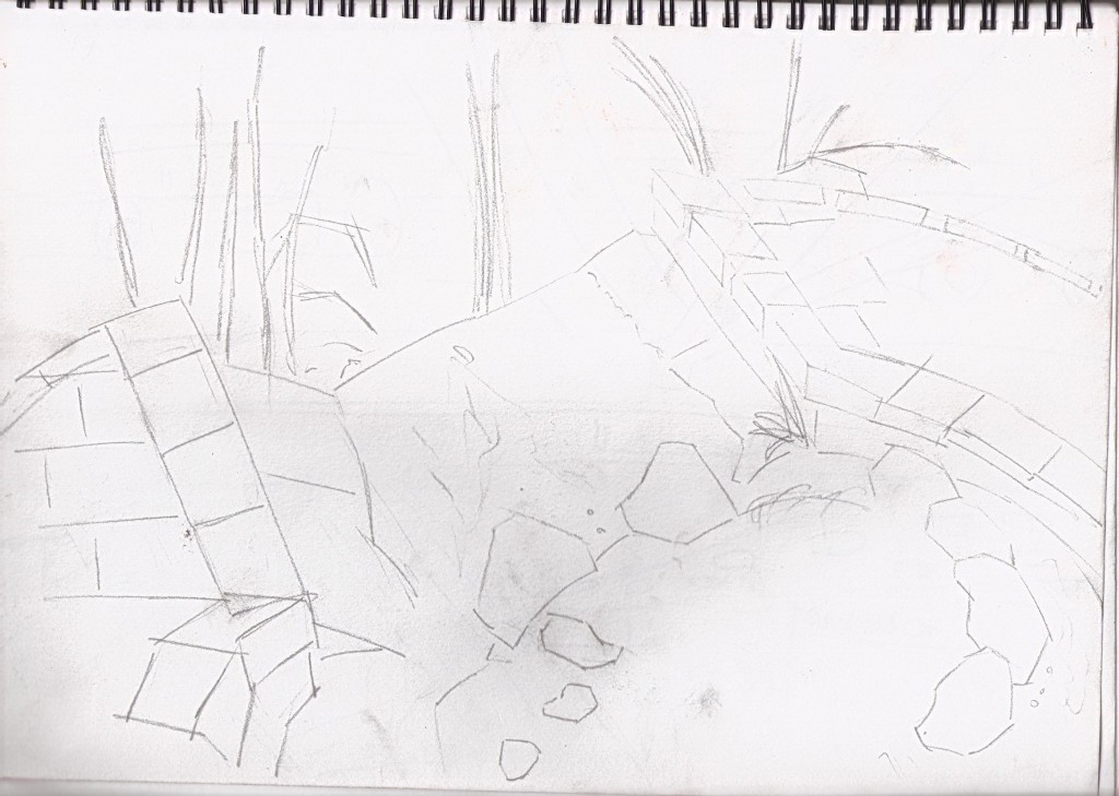
 The drive up north with Gary. I tried to fill in perspective - by using both the view outside the car and the interal of the car. Roads were a large focus of this - attempting to capture the scale and rotation.
 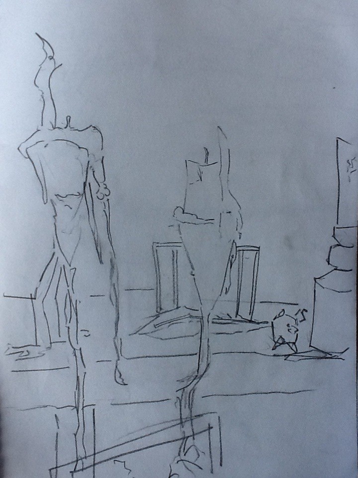 Candles. Where I stayed with Gary. This is the view from the kitchen table- Again working with perspective - candles in foreground and shelf in background.
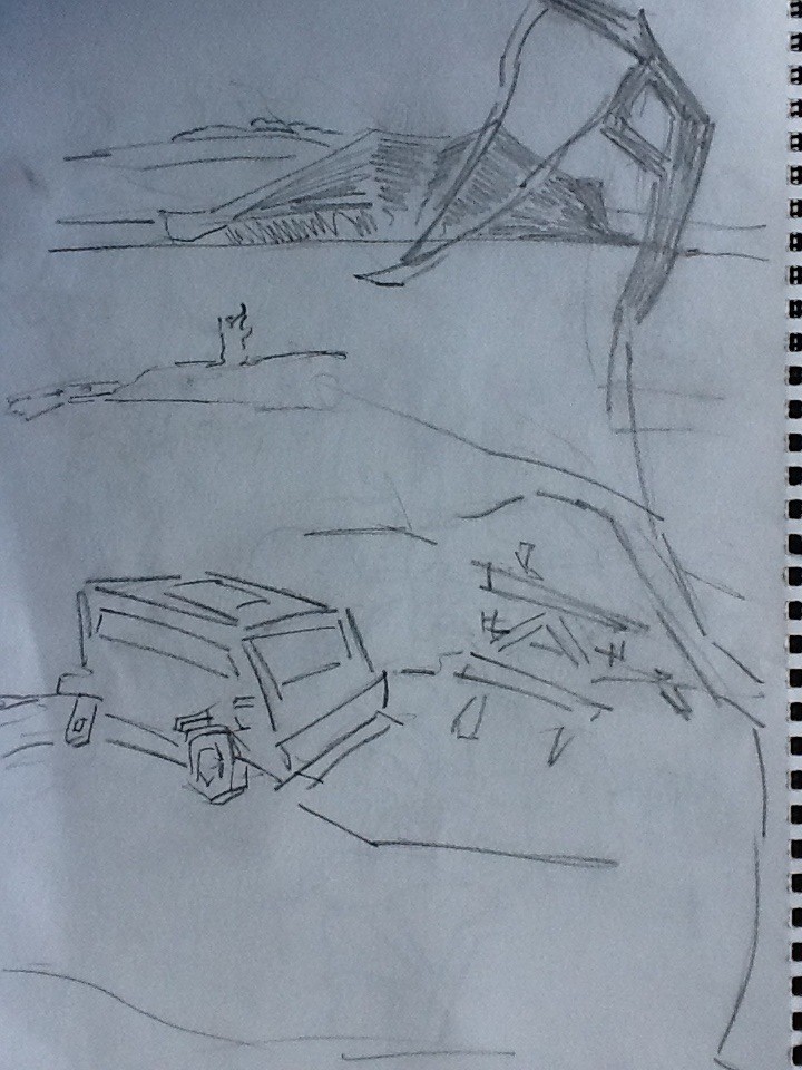 Where me and Gary stopped for the break on the trip. It was a beautiful view so I did a quick sketch. I included someones van for added scale.
Read more →
Here is a digital beach. Vechial is Rogers.
Read more →
I am currently in Auckland, weather has been decent - allowed me to get outside and sketch lots. Here are some digital works I did when in Waihi - reference is recent drawings in my sketchbook. 
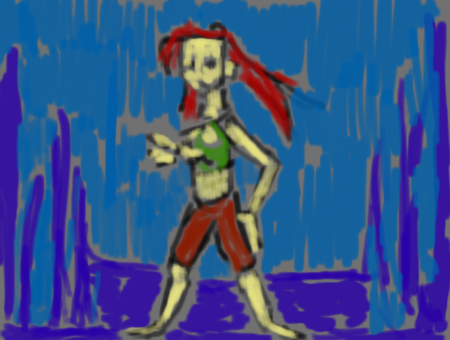
A new color induduced - Green. This was a doodle page, but I was able to paint over it and extract the information I wanted. 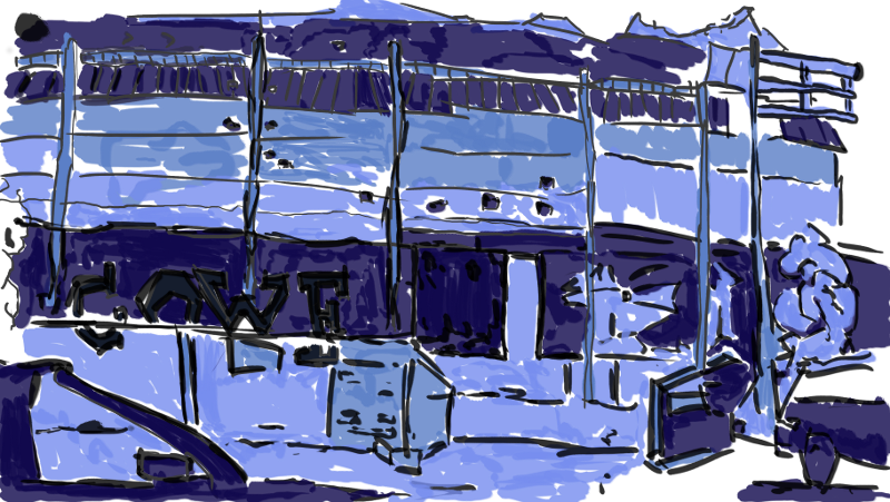 Blue blue blue. Similar idea to the Auckland painting - but this time mighty Levin. I have to do one of these of Auckland. A blue shade of Auckland.
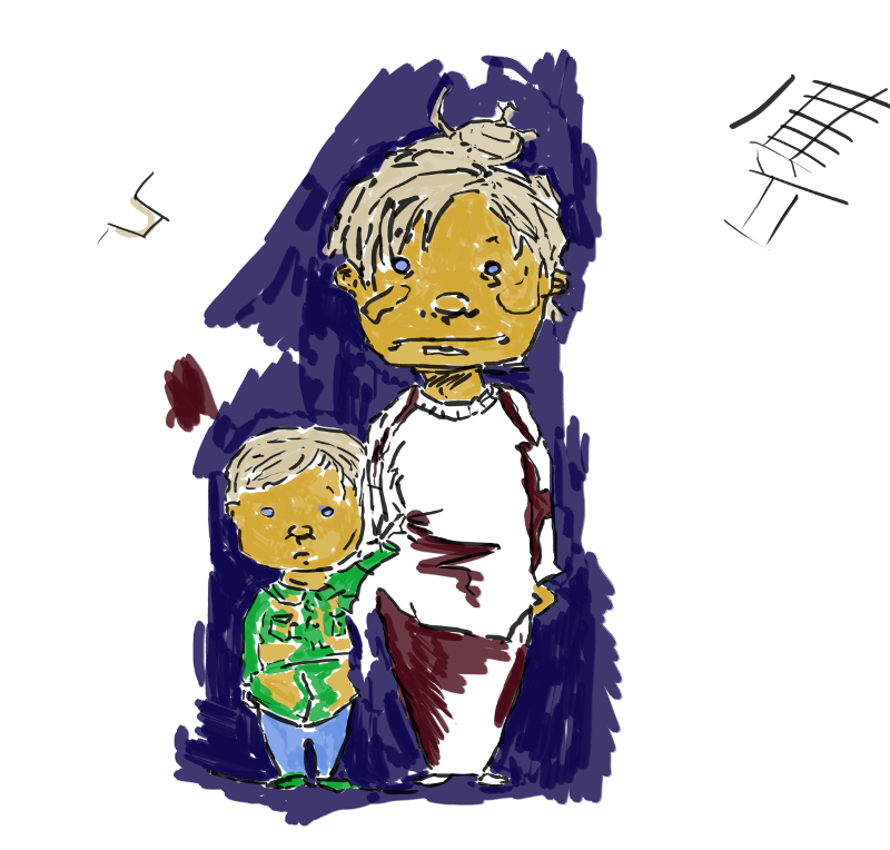
Catherines Character. Just a simple paint over. My lines are improving. It’s important that I work on that line every day - especially with digital, harder to make a perfect line than traditional.
There is a digital camera here so tomorrow I may photograph some of drawings of Auckland and get them uploaded. Tonight I’ll work on some digital paintings.
Read more →
Some recent pencil works in Visual Diary. These works were done well in Levin, mostly from watching television (yay Breaking Bad) and a select few from outings in Levin.
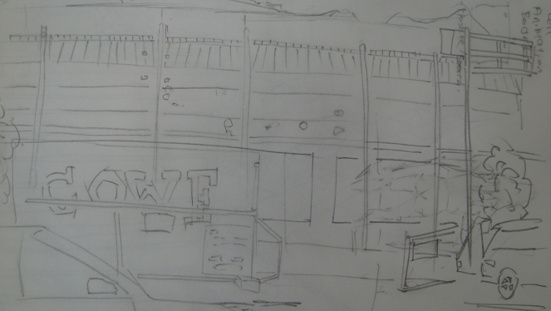
Here I sat in the carpark near the Cinema and drew the new community centre that’s being made. It opens towards the end of September. I’ll be interested in check it out when it’s done. Though I think too much money has been spent. Wasted local govt money. I read a article saying the place will be equipted with the latest ‘macs and pcs’. That statement along frustrates me. They should install Linux on all the computers rather have a mixture of ‘macs and pcs’.
I used my clutch pencil in this - keeping the lines clean and tidy. 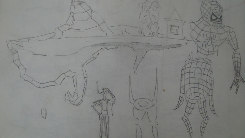
I recieved a spiderman toy from Mums. It’s arms and legs move in 3 places, head rotates and waist. It makes good referce. I’ll like more toys like it for pratice. 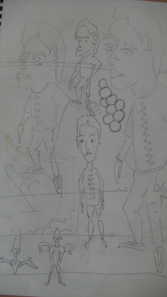
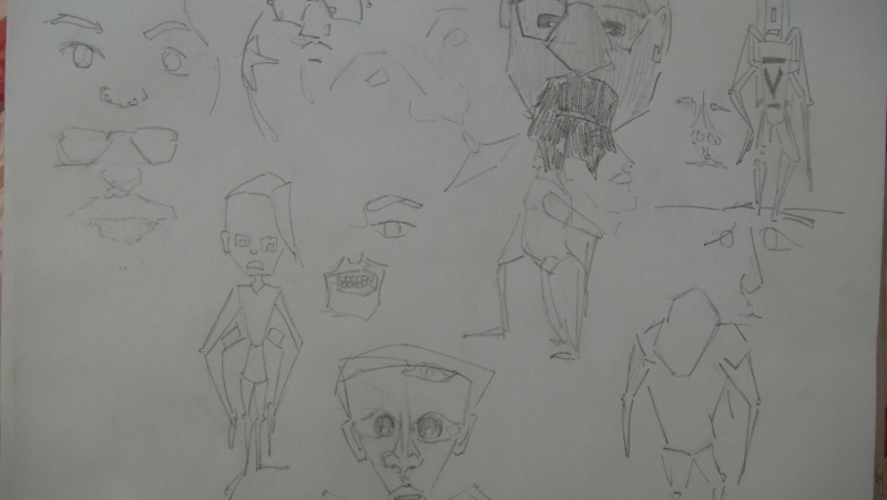
Portraits and character development. I’ll likely take these further in GIMP.
 More ideas on exploring character constriction. The idea is to create more 3d character on paper. This will make it easier when taking the works into blender.
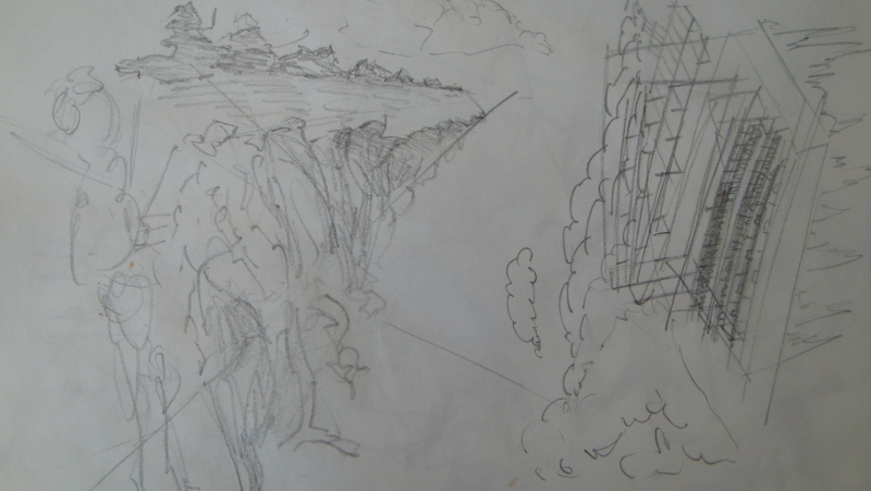
Escape the sandstorm EOW. It was a great theme and I wish I had digitalisted these works earier the week. I’ll see how I get on this weekend but may have time to work on a digital version for the theme.
Got the goache out. Goache in Visual Diary isn’t bad, though I can’t layer it. Praticing poses. 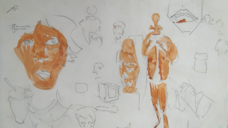
More goache. The brush I’m using is my largee blight brush. It allows me to use the corner so I can create small mark as well as the whole brush to create a large stroke. Amazing large brushes.
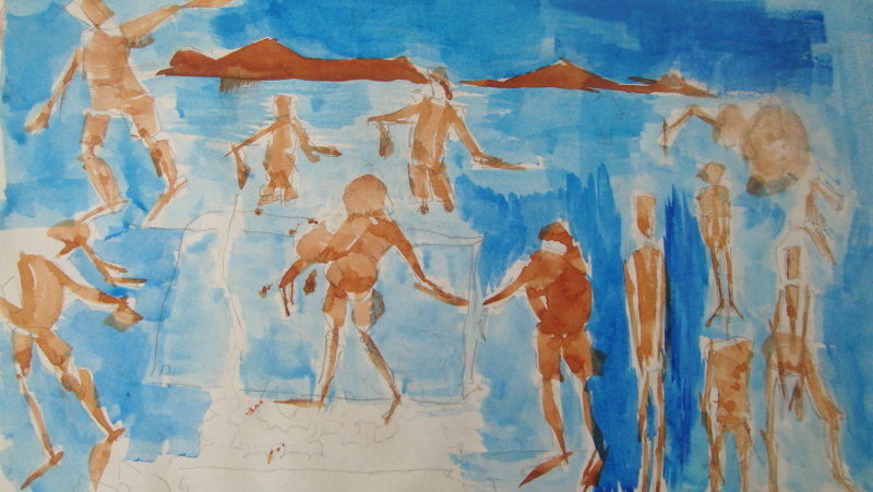
 The beach in Levin. I went out last weekend with Mum, Luke, and Roger. On the right is Rogers car, with the view of land in the distance. Water separates the sand in the foreground with the land in the distance. Again another work I’ll take into GIMP.
Breaking Bad sketches. I like watching tv shows and movies. Having the sketchbook in front of me when I’m watching is helpful - it’s great practice for multitasking and for quick sketches. Develop an idea of what a character looks like from a range of angles/zooms.
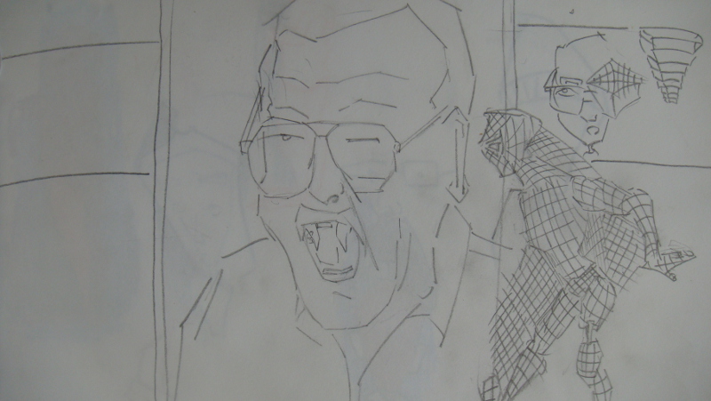
Stan Lee Portrait and Spiderman. I was going to post this on the Stan Lee AMA on Reddit when he does it.
Read more →
I’ve been saying in the last few posts about posting my recent acrylic board paintings. Landscapes from when I returned from ChCh. I borrowed Joys camera and finally took some photos of them. I need to borrow this camera more often (or better yet - buy one!) and take more regular photos of my artwork - it builds up otherwise and it’s an overload of images to upload. There are still works from the South Island that I have yet to post.
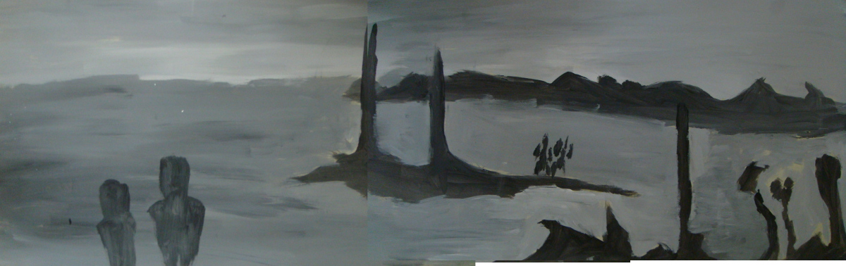
 This is 3 photos merged into one. This allowed me to create a extended view of the canvas - it’s rather long. The acrylic paint I’m using is just cheap poster paint. It seems to work alright. The reference for this painting was a drawing at Collingwood.
 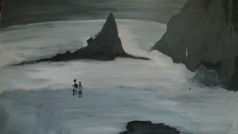 Another drawing to acrylic paint. This is a view in Takaka. This painting has had almost nothing added to it, keeping it true to the drawing. As I layer up color this may change.
 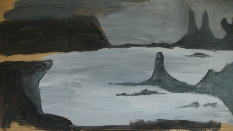 Cardboard. My fathers wife has a bunch of this cardboard, I used some for painting on. I don’t really like the rough, grainy finish, but it holds the paint far better then brown paper. No reference for this, instead just making the shapes from imagination.
Read more →
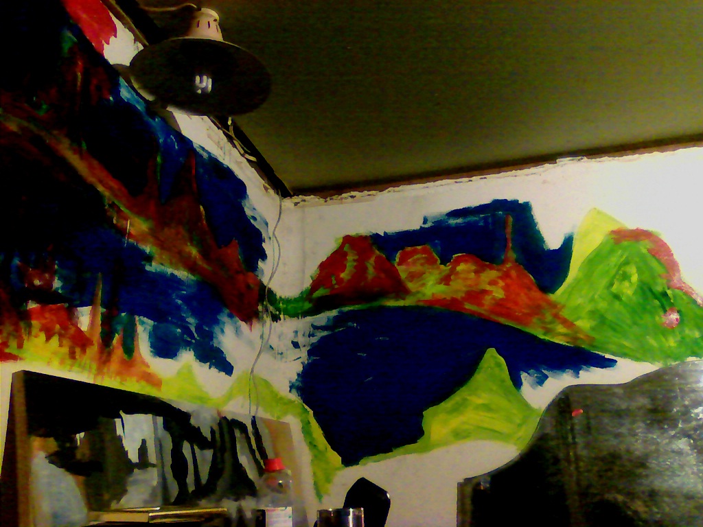
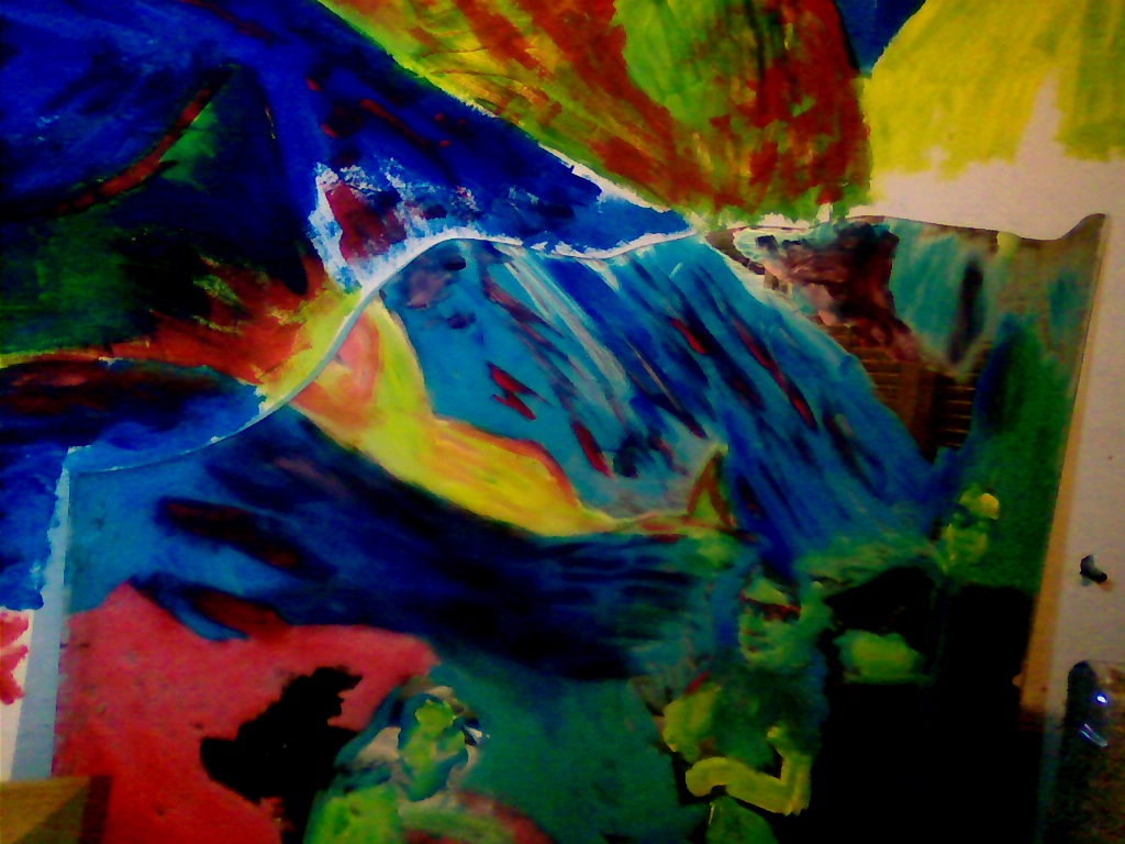
I’ve been cooking (curries, and a cake), and giving the place a tidy, and slight move! Moved all my gear from the lounge to my bedroom - which is now taking a more computer and art studio setup. Works for me though. I haven’t done any digital painting but have had a go with acrylic paint - on the walls.
I had no refernce or ideas - just going on the idea of an enviorment of some sort - maybe a landscape. Straight in with paint - drawing in lines - then covering in tone.
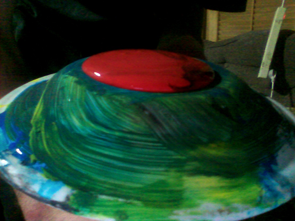
My palette, old plate. Primary colors - yellow and blue have been used. About to do a layer of red, helps the highlights and the balance of greens and reds.
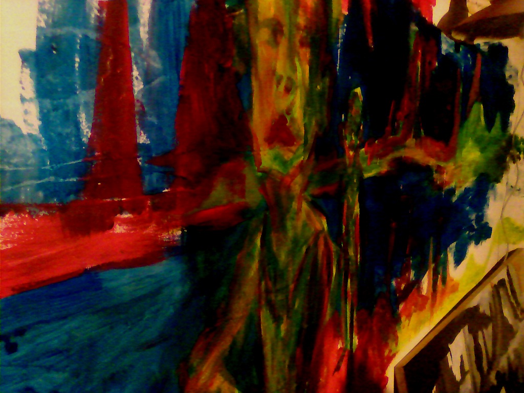
Basic idea, building up the marks. Large flat brush is used. Exploring ideas that I started with oil painting. Leaving areas. Filling areas. 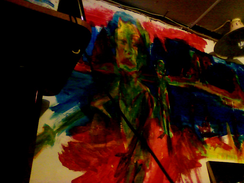 Character in the foregound. Great to have the room to develop a character and the enviroment around him. This is certainly a painting style that works for me.
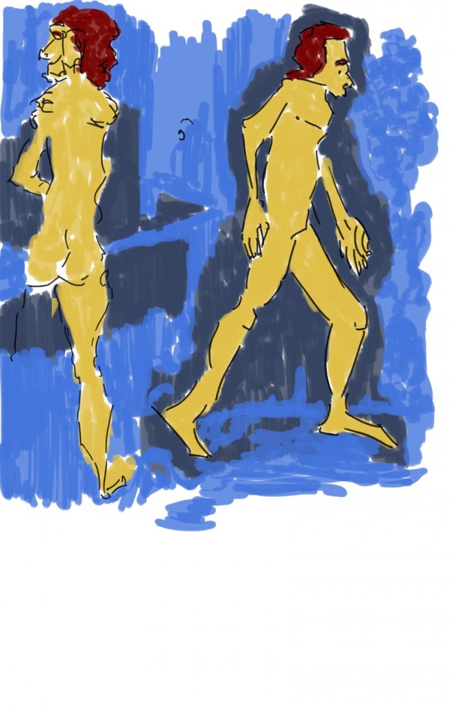
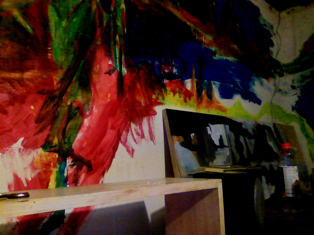 Legs. Very important. How else can he walk? The red in the background is a pillar the two characters are standing on - the the foreground area. Below is the forest and water. Travel on the pillar?
  The corner. Lots of white space still. Needs reds and more blues.
 Some red added over the green. Using opposites works well.
Far right, The other edge of the painting. An oddly shaped mirror rests againist the wall. Several characters have been painting. Reference was me - a self portait! Interesting how the colors change on the surface - darker blue to light. 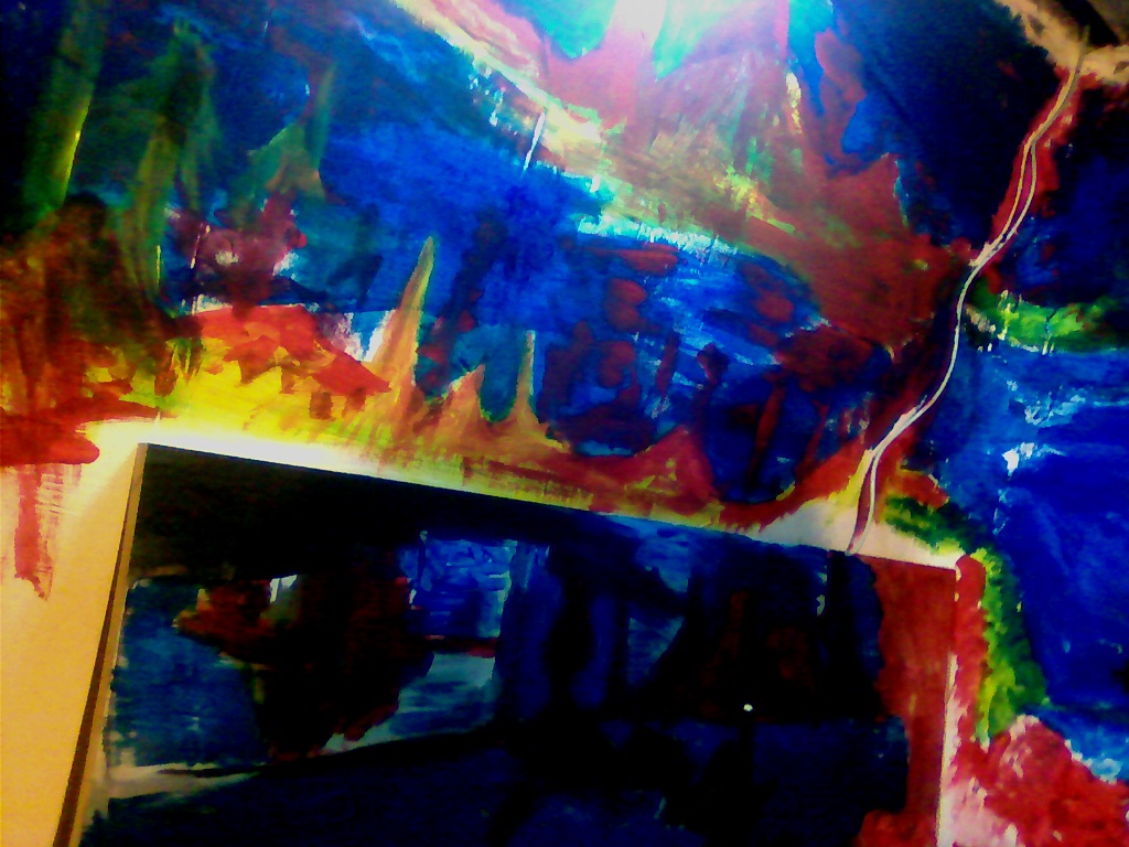 It’s a jigsaw. I can take pieces out and apply new pieces. This is a acrylic painting I did when I first moved back to Levin. A new layer has been added. Blues and reds. Blends into the wall.
Read more →
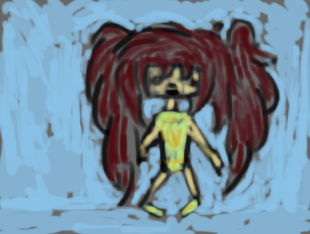
I jumped on DeviantArt tonight and worked though a few of the posts on DrawPlz with drawing requests. It was relaxing, and certainly captured me into the zone. These are quick, gestural, and nothing special.
Mostly they are ‘draw my OP’ which is easy, because I get reference and I don’t need to think, just paint.
The reference was much more zoomed in, I went for a further zoom. I like the curves that I captured in the hair (dat black!). The shirt looks like it could use more work
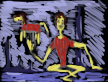 No reference. Post was ‘Draw a person and/or a animal. I started with the character and added the horse character as a toy of some sort for the character. Background was a quick sketch of blues - but continued to explore the idea of vertical pillars.
 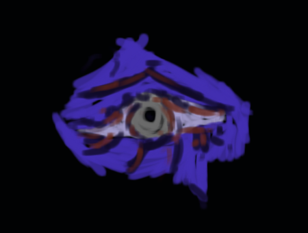 Draw a eye. Very quick. I started one before this but hit back on my tablet by mistake. I really should disable the button when I’m doing painting on DA - it’s frustrating to lose the work - even if it’s only 30 seconds.
 ‘Draw in my style’. I looked though the artists gallery and choose a image to copy. I added the vertical pillars and the scale of the character is different.
Final ‘draw my op’. This was was more detailed then I drew it. I wish the DAMuro was better, it really is a rubbish piece of drawing software, being not much better than MS Paint. Larger sizes would be nice - 600-800 etc would be wonderful. There is also a lack of decent painting brushes, copy/paste, and thick to thin pressure sensitive. GIMP is best!
Read more →
More digital works. It’s what I’ve been focusing on since I’ve been back in Levin. I like to try to put in at least a couple of hours a day into these - usually in the evening. I should try to get out tomorrow or Friday and sketch around Levin. Hell - why not both days?
I still need to visit my mums place and scan in some new drawings from my visual diary, especially the conceptart EOW works - Escape the Sandstorm.
I’ve been looking on trademe for a new camera. My old camera has been broken for months, it’s about time I invested in a new one. It doesn’t need to be too flash, though I’d like an improvement over the last camera.
Anyway, here’s some recent digital paintings I’ve been working on:
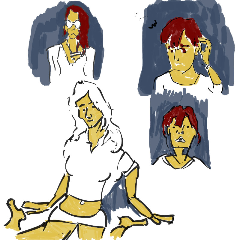
Portrait practice. These were from photo reference - random photos that were sitting on my computer. I’ve kept with the same color scheme that I’ve been working with in GIMP recently. It helps keep a consistency - a series of works.
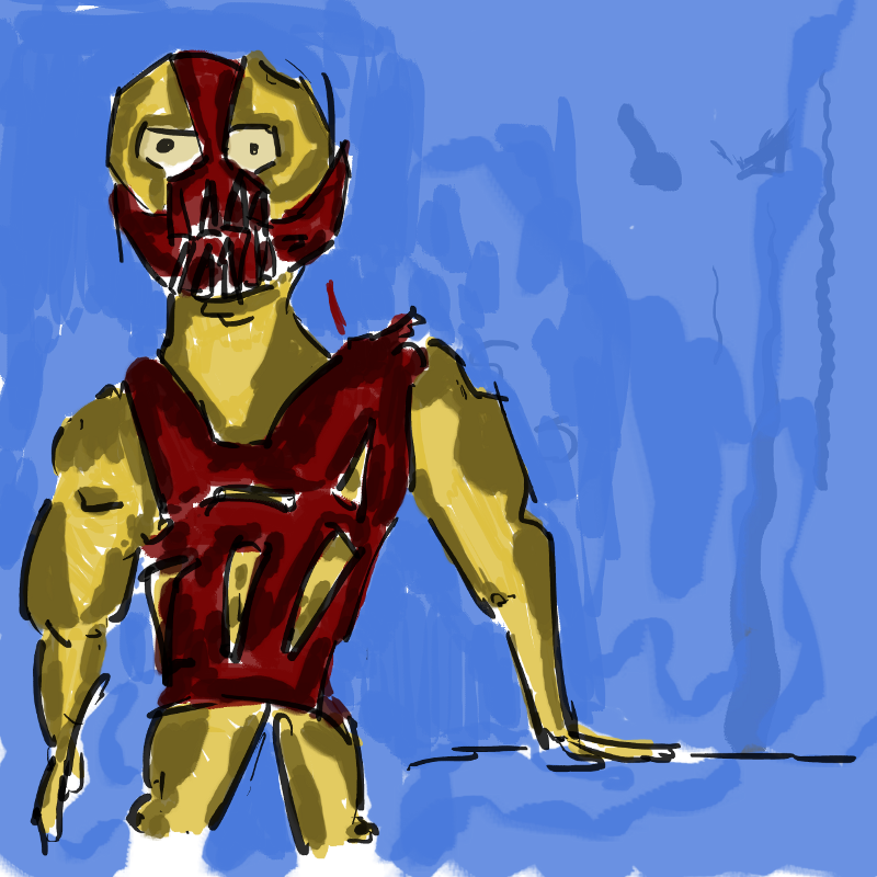
Bane. I saw The Dark Knight: Rises several weeks ago. I was somewhat disappointed with it but I enjoyed Bane. I used a photo reference from the film to paint this fan art of the character. It was first drawn in my visual diary, along with Batman, and the Joker. I could develop these further, maybe into a animation or comic. Batman with a twist of William. 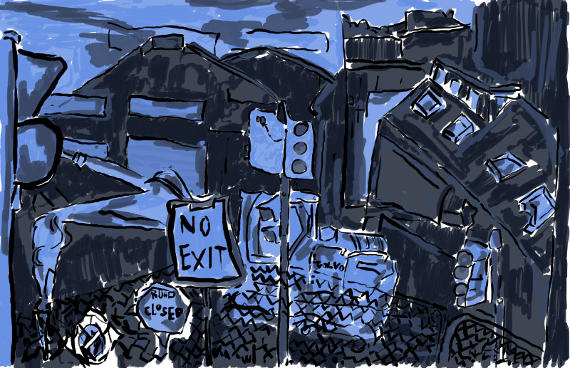 And finally a painting of a Chch scene. I spent the most amount of time on this. Tried to really limit my palette - keeping with the two blues I’ve been using recently and only adding one new one - a darker shade of the darker blue. Since my backgrounds have been done in blue and characters in yellow/reds it only seemed appropriate to keep to this when working on an environment piece. I’ll like to experiment with this further. I have several drawings of Chch that I could develop further like this.
Read more →
Here’s some work from Christchurch. I spent just over a week there recently, staying at my friend Brookes place. She had a large flat with over 8 flatmates. It was a vegan flat so the food was delicious. Since getting back from there I’ve made the effect to cook better - not only is this making me feel better but I’m able to cook for others.
Here is some drawings I did around Christchurch:
 This is my favorite drawing from the CBD area. Most of the place is closed for public - fences around the area. You are still able to get a decent view of the place - idealy it would be great to get inside and draw in the no go zones. I’m not sure if you will be allowed. The place was in such rubble. This is the view from High Street, focusing on various signs and objects in my view.
Another view from the CBD. This is where the tram use to go though the cbd. This street reminded me much of Cuba Street in Wellington - with buskers, cafes, and people generally hanging out. It had a good vibe despite such destruction just meters away. 
Same area as the first drawing - this was the first drawing I did when sitting, my warmup I guess. The perspective is looking decent but drawing this I quickly got bored - maybe the area or zoom wasn’t working - I can’t remember. But I moved on to the second, which captured more.
Sketch at Jelly Park where I stayed. This was an attempt of drawing the pond. Me and Brooke had chips for lunch at the park - then she headed off. I stayed and drew. It’s nice to sit and just draw by myself. Often I get a person talk to me, I’m often friendly and will show them my artwork and talk to them about drawing and art techniques. When you are doing something like drawing you are easy to approach. 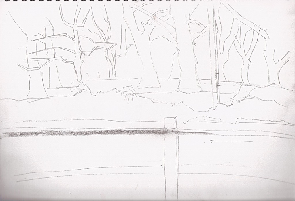 This was a view from the park on the way home from Chch CBD. It’s a long walk (over 2 hours), so I rested at a park bench and drew. Trees have became a large focus in my artwork and I’m enjoying the challenge of capturing something so different.
These are all the drawings I did of environments in Chch. The views and such were certainly not as exciting as I had in Takaka. I enjoyed my visit though.
I had a a5 sketchbook that I brought in Chch and filled with several drawings but lost it the day I walked into the CBD. I must of dropped it - I’ll never see these drawings again.
Read more →
So I scanned in over 50 pages of sketchbook and uploaded it to my blogs server - and only done one post out of it yet. The easiest way to work though these posts will be on my Mums Mac where I can view the files on the local drive easy. I may head around to her place later today to get sorted with this. 50 pages is quite daunting in order and structure, but for now - have some digital paintings that I’ve been doing with some of the scanned pages. I want to work with my scanned sketchbooks more in GIMP so expect to see more of these works.
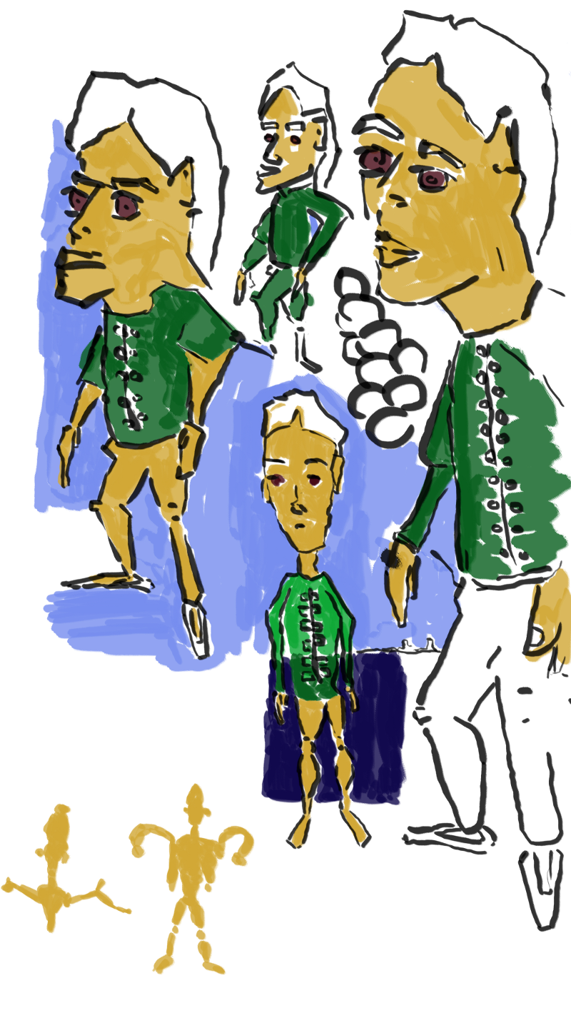
I kept with the same color palette that I have been using in all digital painting recently. Everything is simply paint over so no obsevational skills were using - but it gave me good practice with using the tablet… especially those lines!
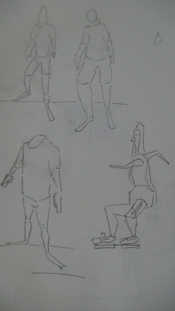
The standing poses. I use to only focus on certain areas - over time I’ve wanted to develop full bodys. I’m not sure if I’ll take these any further but rather just develop other drawings.
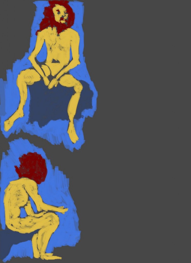
Sitting poses. The box he was sitting on I colored a darker blue, though the backgrounds in all of these works are simple. With the bottom figure I was inspired by the recent red mask attached to characters - he didn’t have a defined head so I just covered it in red. The top figure looks very much like James who I use to draw often at TLC 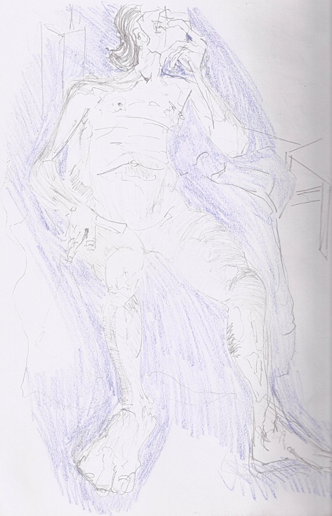
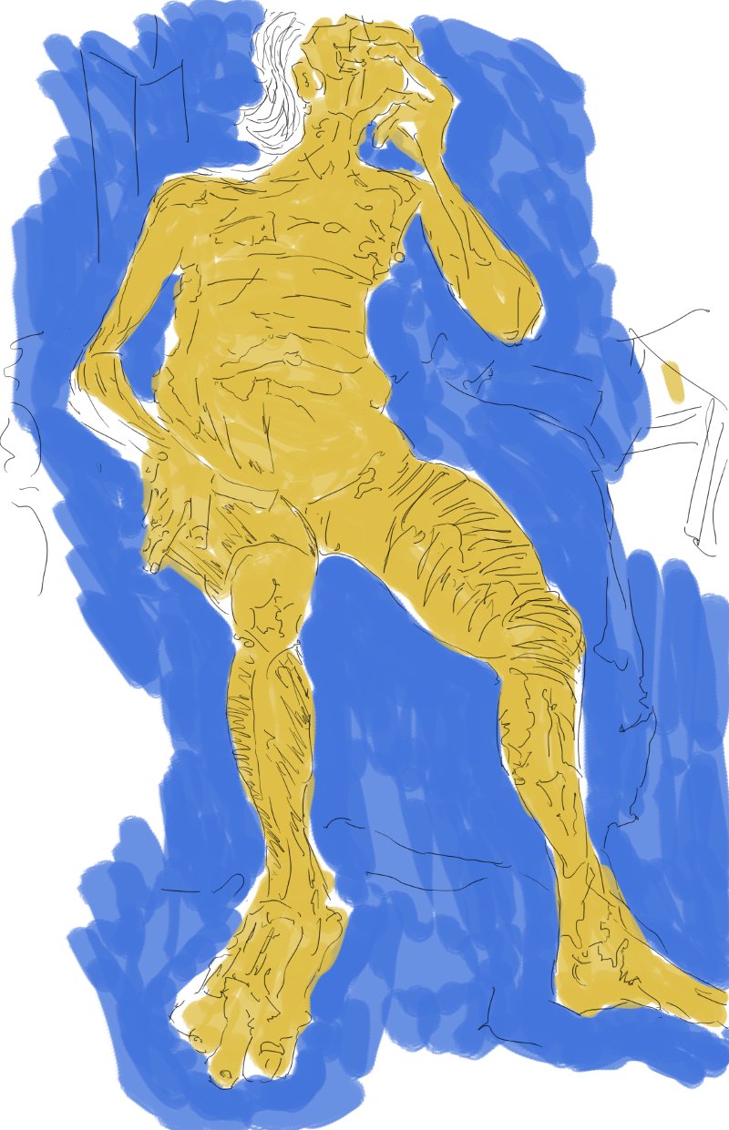
A life drawing that I didn’t upload with the others, missed this during the upload. It’s in fact the final drawing I did of the day.
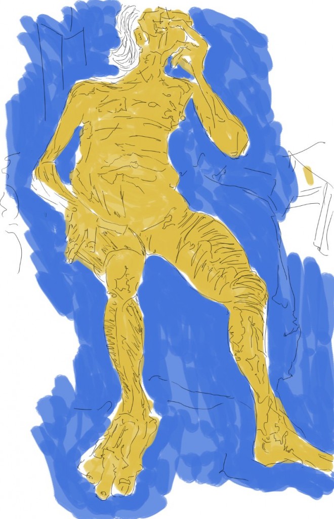
The most developed line work in this - though I wish the lines were thicker. Worked backwards somewhat with this - compleleing the blue background, then the yellow/red, lastly finishing up with the black line. The order doesn’t really matter since I’ve been working with 3 layers in these works.
Escape the Sandstorm is the EOW - I’ve done some sketches that I need to scan in and paint over. Till next time, stay cool honey bun.
Read more →
 The drive up north with Gary. I tried to fill in perspective - by using both the view outside the car and the interal of the car. Roads were a large focus of this - attempting to capture the scale and rotation.
 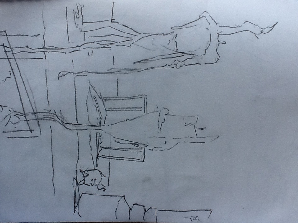 Candles. Where I stayed with Gary. This is the view from the kitchen table- Again working with perspective - candles in foreground and shelf in background.
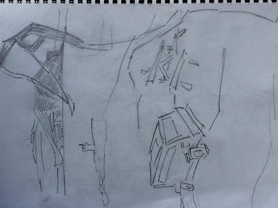 Where me and Gary stopped for the break on the trip. It was a beautiful view so I did a quick sketch. I included someones van for added scale.